
Use element states in conditions
A condition in the Flow & Paywall Builder can evaluate the state of another element on the same screen. For example, show the hint “Accept the terms to continue” only if the Continue button is Disabled.
The following conditions can evaluate element states:
- Conditional visibility: show or hide an element.
- The condition of a Disabled state: disable an element.
- Conditional text: swap the text of a text element.
- Conditional actions: pick the actions that run on a trigger.
For Disabled and Active, you can only use the States tab of the Variable field. For what users picked or entered, such as a quiz answer, use a variable on the Elements tab.
Add an element state to a condition
The steps are the same in all four kinds of conditions:
-
In the condition, click the Variable field.
-
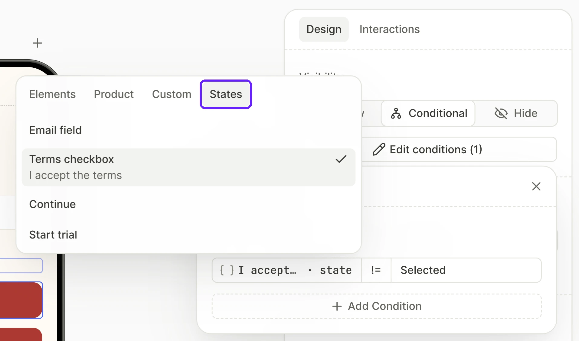
Open the States tab, and click the row of the element to use in the condition. Each row lists the layer name and, if it differs, the text of the element. To find an element on the canvas, hover over its row. On the States tab, you can only pick elements with states.
-
The State dropdown shows the first state of the element, such as Disabled for a button. To use another state, select it from the dropdown.
The Variable field now lists the text of the element and · state, such as Continue · state. If the element has no text, · state follows the layer name.
Explain why a button is disabled
To explain why a button doesn’t respond, show a hint only if the button is Disabled. First, add a Disabled state with a condition to the button. Then:
- Select the hint.
- In the Visibility section of the Design tab, select Conditional.
- Add an element state to the condition: the button,
=, Disabled.
To change when users see the hint, only edit the Disabled condition of the button.
On the canvas, the hint only appears when you activate Disabled in the States section of the button. To edit the hint while the canvas hides it, select it in the Layers panel.
Synchronize element states
To keep two elements Disabled under the same rules, base the Disabled condition of the second element on the state of the first. You then only edit the rules in one condition. For example, the Continue button is Disabled until users accept the terms and enter a valid email. If Continue is Disabled, a Start trial button is Disabled too. First, add a Disabled state with a condition to the Continue button. Then:
- Select the Start trial button.
- In the States section, click Disabled state.
- Hover over Disabled, and click Set conditions.
- Add an element state to the condition: the Continue button,
=, Disabled. - To show users that Start trial doesn’t respond, style its Disabled state. For example, lower its opacity.
Swap text based on element state
To swap the text of a text element when another element changes state, use conditional text. For example, users see “Enter a valid email” if the email field is Invalid, and “Enter your email” in every other state. First, to let the email field become Invalid, select the field, and on the Design tab, select Validate email format. Then:
- Select the text element.
- In the Content section of the Design tab, select Conditional.
- Under if, add an element state to the condition: the email field,
=, Invalid. - Under then, enter the text for the Invalid state. Under else, enter the text for every other state.
While users type in the email field, the field is Active, so they see the text from else.
Which elements and states you can use
The States tab lists the elements on the screen that have states besides Default:
- Input fields, including date and time pickers
- Selectable elements, such as quiz options, product cards, tabs, and toggles
- Any element after you add a Disabled state to it
A button, an image, or a container can only have a Disabled state when it has an On Tap trigger.
On the States tab, you can’t pick:
- Elements on other screens. For a quiz answer or the text that users entered on another screen, use an element variable on the Elements tab.
- Elements without states of their own, such as an image in a product card. The image changes state together with the product card, so pick the product card instead.
- Progress indicators.
- An element, when you edit the condition of its Disabled state.
- Elements that would close a loop of Disabled conditions. For example, if the Disabled condition of Start trial evaluates Continue, you can’t pick Start trial in the Disabled condition of Continue.
- Elements outside a reusable component, when you edit a condition of an element in that component.
For each element, the State dropdown lists Default and the states of that element.
To find out which options users picked in a group, use the variable of the group on the Elements tab, such as quiz.selectedOptionIds, not the Selected state. If an option that users picked becomes Disabled, its state changes from Selected to Disabled. An element is only in one state at a time.
Preview a condition before you publish
To preview a condition, select the element that the condition evaluates. Then, in the States section of that element, activate the state to preview.
For example, to preview the hint from Explain why a button is disabled, activate Disabled for the button. The canvas then shows the hint. To edit the default look of the button again, activate Default.
To see the real state of every element, test the flow on a device.
Troubleshooting
If you see a red label in the Variable field or the State dropdown of a condition, the element or state you picked no longer exists. For example, someone deleted the element or removed its Disabled state. To fix the condition, pick another element or state in the field with the red label.