Screens and layers
A flow consists of one or more screens. Each screen represents a single step in the user’s journey — for example, a paywall, a quiz, or a slide with product information.
The elements on each screen are organized in a layer hierarchy.
To manage your screens, layers, and elements, open the default Screens and Layers view. It will display your screen sequence and the layer structure of each screen.
Manage screens
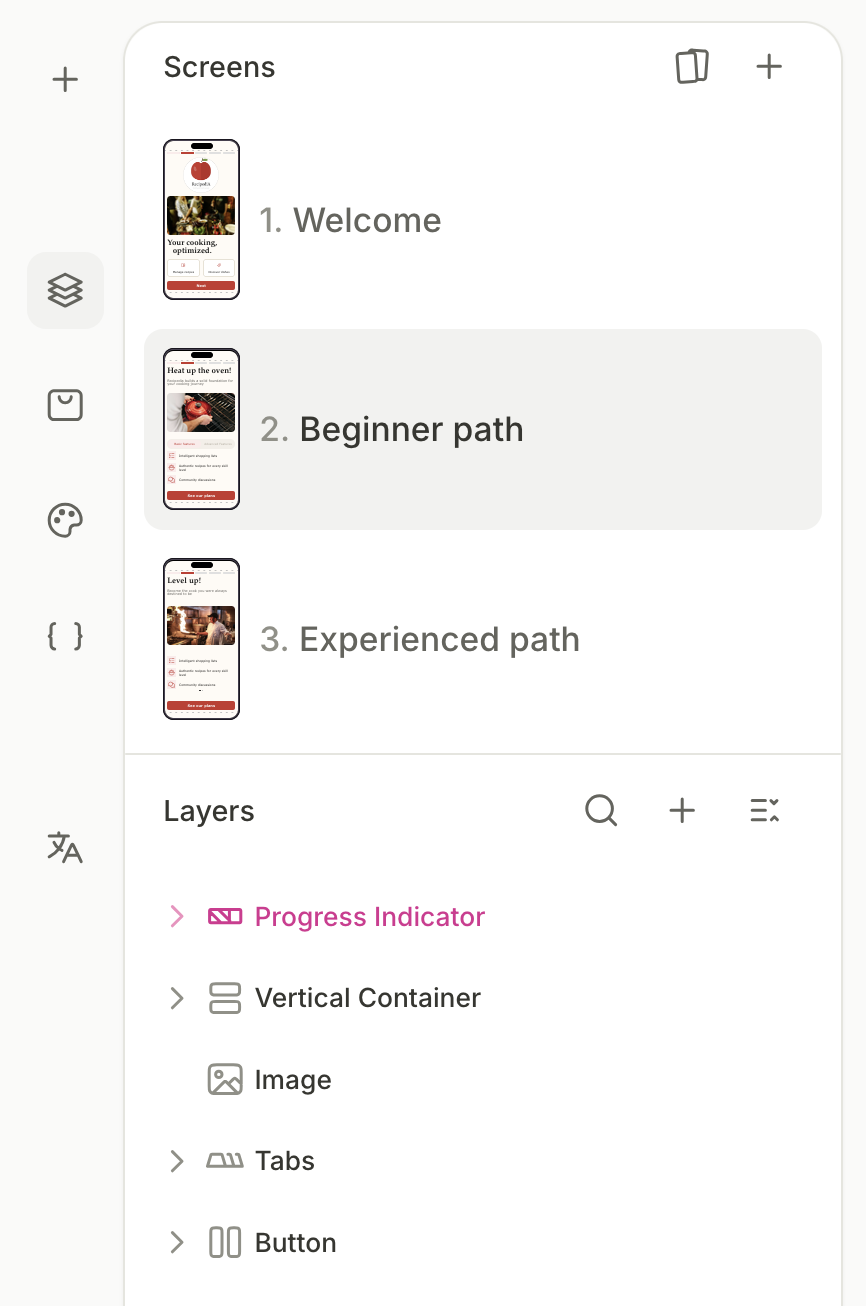
The top section of the left panel lists all screens in the flow. Each entry shows a numbered label and a thumbnail preview.
- Select a screen: Click a screen entry to make it active. The visual editor displays the selected screen, and the Layers section below updates to show its layer hierarchy.
- Add a screen: Click the button at the top of the Screens section to add a new empty screen to the flow.
- Open the Template library: Click the button at the top of the Screens section to browse and apply flow templates.
- Reorder screens: Drag and drop screen entries to change their order in the flow.
If your flow has unused empty screens, you won’t be able to publish. Delete any draft screens before publishing.
Screen actions
Click the three-dot icon on a screen entry to open the context menu.
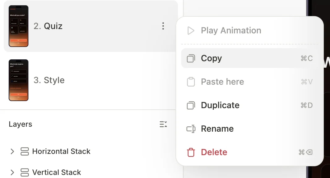
| Action | Shortcut | Description |
|---|---|---|
| Play Animation | Preview animations configured on this screen | |
| Copy | ⌘C / Ctrl+C | Copy the screen to the clipboard |
| Paste here | ⌘V / Ctrl+V | Paste a previously copied screen |
| Duplicate | ⌘D / Ctrl+D | Create a copy of the screen and add it to the flow |
| Rename | Change the screen’s display name | |
| Delete | ⌘⌫ / Ctrl+Del | Remove the screen from the flow |
The clipboard persists across flows. Copy a screen or element from one flow, open another, and paste it in.
When you delete a screen, any Navigate to Screen action that pointed to it loses its target, but the action itself isn’t removed. Assign a new destination or delete the action — otherwise, you won’t be able to preview or publish the flow.
Navigate between screens
Main article: Navigation and interaction
The order of screens in the list does not determine navigation by itself. To connect screens, use element interactions: configure a button to navigate the user to another screen.
Screen settings
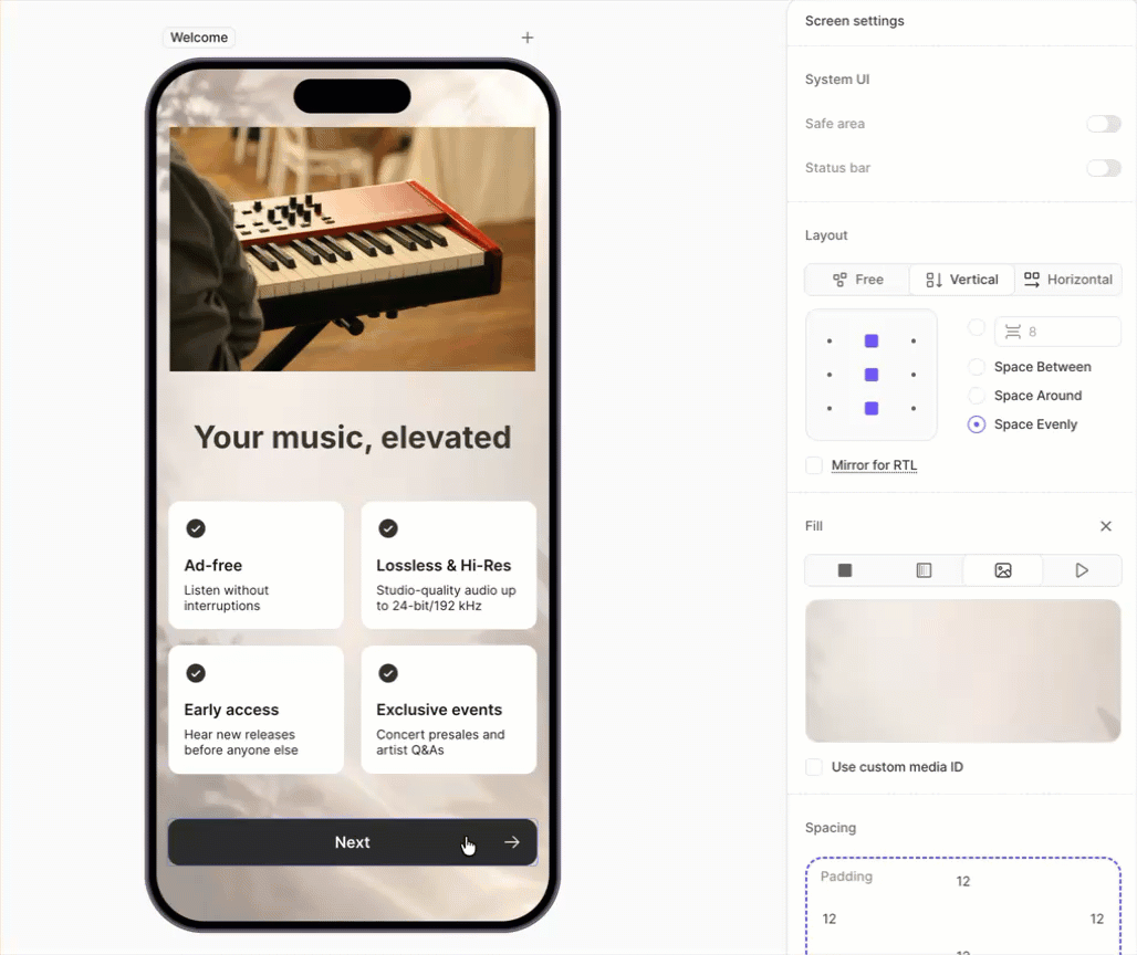
To view the properties and settings of the active screen, click an empty area on the screen preview. The right panel will switch to the screen settings view.
System UI
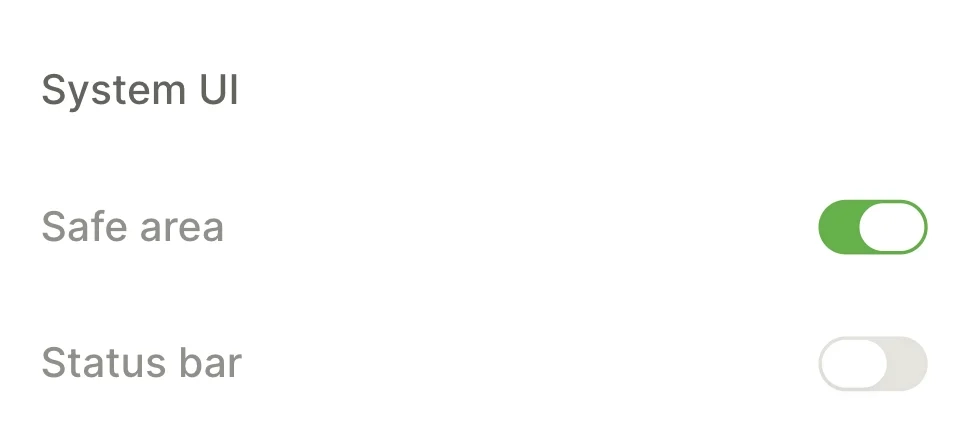
Controls how the screen interacts with the device hardware.
- Safe area adds padding that keeps content clear of the notch and system bars. Individual positioned elements can opt out of this padding — see Ignore safe area.
- Status bar shows and hides the system status bar (time, battery, signal icons).
Include screen in progress indicator
If you add a Progress Indicator element to your flow, Adapty displays it on every screen.
Uncheck Include screen in progress indicator to remove the progress indicator from a particular screen. Use this to clean up the welcome screens, the final paywall, or any step you don’t want to register as progress.
Screen layout
Full article: Layout and positioning
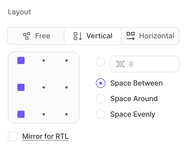
The Layout section determines how the screen distributes its child elements. These properties are available on any container element.
- Free: Child elements are positioned independently.
- Vertical: Elements are arranged from top to bottom, like a flexbox column.
- Horizontal: Elements are arranged from left to right, like a flexbox row.
For vertical and horizontal layouts, you can also configure spacing and alignment.
- Alignment: Element position along the cross-axis.
- Gap: Space between adjacent elements.
- Distribution: Distribution of space between and around child elements.
RTL layout
Toggle the Mirror for RTL checkbox to mirror the layout for writing systems that read from left to right. The order of elements in horizontal containers will flip.
Screen background
Main article: Backgrounds
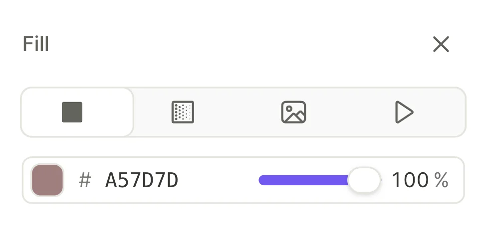
Fill sets the screen background to a solid color, gradient, image, or video. The background fills the entire device viewport, including areas behind the notch and system bars — even when Safe area is enabled.
Loop background video
Enable the Loop toggle to play the background video in a continuous loop.
Assign a custom media ID
As with any image or video, you can assign the screen background a custom media ID to reference it in your SDK.
Screen spacing
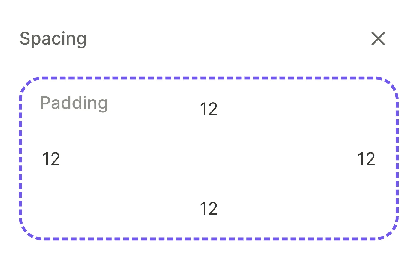
Adjusts the screen padding for each side (top, right, bottom, left).
Scroll
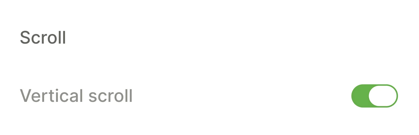
Controls overflow behavior. Enable Vertical scroll to allow the screen content to scroll when it exceeds viewport height.
Use a Footer to pin content to the bottom of the screen when the screen is overflowing.
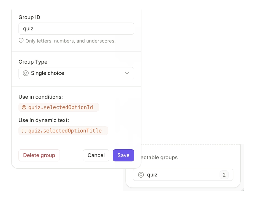
Selectable groups
Main article: Selectable elements and groups
The Selectable groups section lists all selectable groups on the current screen — from quizzes, products, tabs, trial toggles, or any custom selectable element.
Click a group entry to rename it, change its type, view the variables it exposes, or delete it.
Manage layers
Each element on a screen is represented as a layer. The Layers section displays the order of the elements on the active screen.
Flow layers do not overlap like layers in graphic design software. Instead, they represent individual components of the screen. Elements overlap only if they use absolute or fixed positioning. Their stacking order is determined by the z-index property, not their position in the layer tree.
The tree structure reflects parent-child relationships. Click the arrow on any parent layer to expand or collapse its children.
You cannot create layers directly. Every element you add through the Add element view appears as a new layer in the tree.
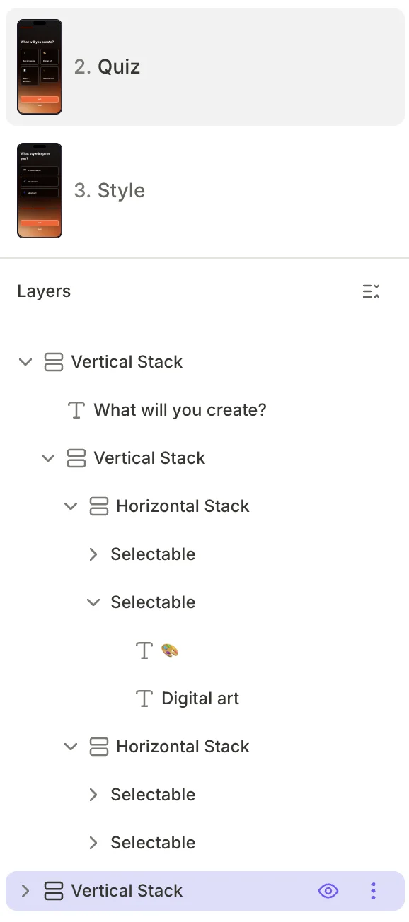
- Select a layer: Click a layer to select it. The visual editor highlights the corresponding element on the canvas, and the right panel displays its design and interaction properties.
- Reorder layers: Drag and drop layers within the tree to change their order inside the parent container. The order in the tree matches the visual order on screen.
- Show or hide a layer: Hover over a layer to reveal the eye icon on its right side. Click it to toggle the layer’s visibility. Hidden layers remain in the tree but do not appear in the visual editor or on the device. To control visibility with logic at runtime, use conditional visibility.
- Collapse all layers: Click the collapse button at the top-right corner of the Layers section to fold the entire tree.
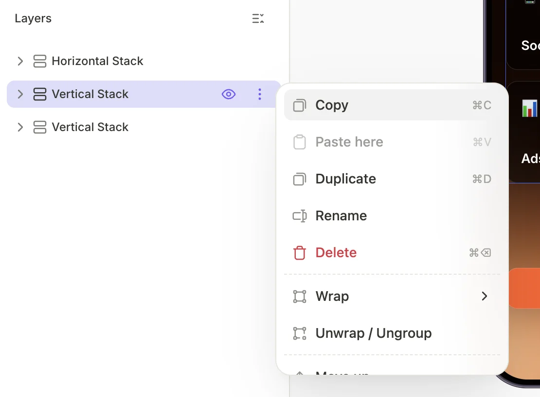
Layer actions
Click the three-dot icon to open the context menu.
| Action | Shortcut | Description |
|---|---|---|
| Copy | ⌘C / Ctrl+C | Copy the layer to the clipboard |
| Paste here | ⌘V / Ctrl+V | Paste a previously copied layer as a child |
| Duplicate | ⌘D / Ctrl+D | Create a copy of the layer in the same container |
| Rename | Change the layer’s display name. By default, layers use their content or component type as the name | |
| Delete | ⌘⌫ / Ctrl+Del | Remove the layer and all its children |
| Wrap | Wrap the layer in a new container: Wrap in Horizontal Container or Wrap in Vertical Container | |
| Unwrap / Ungroup | Remove the wrapping container and move its children one level up | |
| Move up | ↑ | Move the layer one position up in its parent container |
| Move down | ↓ | Move the layer one position down in its parent container |