Set up purchases
To set up purchases on a screen, add a purchase button and configure its Purchase action. The action can target a specific product or whichever product the user selects from a Products element on the screen.
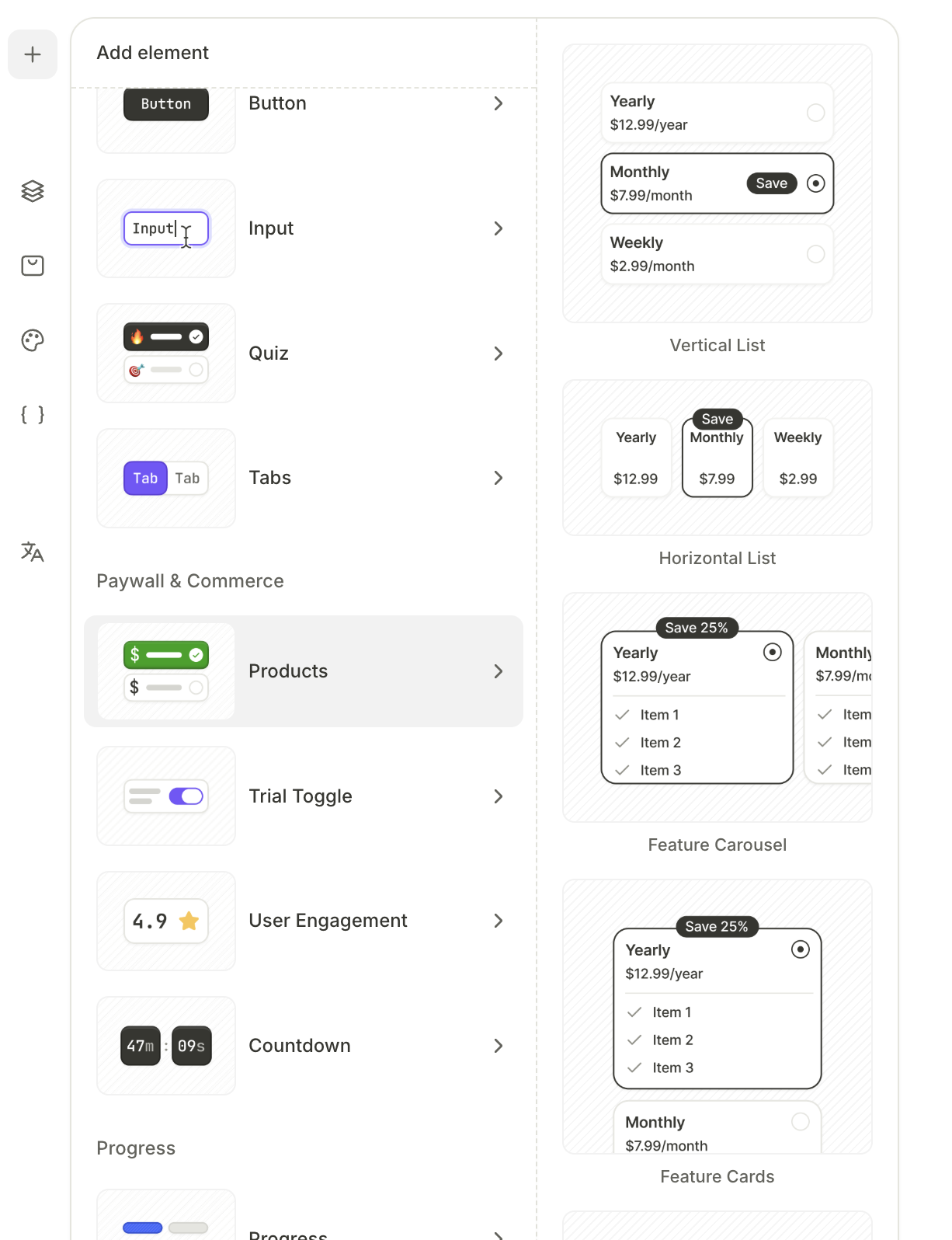
Add products
A product element is a visual card that displays a product on the canvas.
To add a product element:
-
On the canvas, click + on the target screen.
-
Select Products.
-
Choose a layout preset: vertical list, horizontal list, feature carousel, feature cards, banner list, or bottom sheet.
-
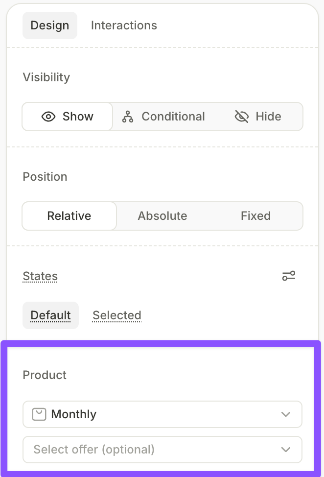
Select each product card and assign it a product in the dropdown in the Design panel.
A product element without an attached product blocks previewing and publishing. Assign a product or delete the element.
To show a crossed-out anchor price on a card, add an Old Price element inside it.
You can also attach a Purchase action directly to a product card’s On tap interaction. Tapping the card then triggers the purchase, with no need for a separate purchase button.
If you delete a product group and replace it with a new one, check that every action and variable targets the new group. References left pointing to the deleted group block previewing and publishing.
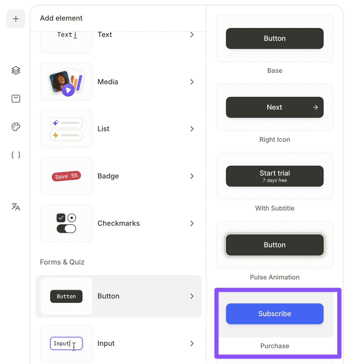
Add a purchase button
A purchase button triggers a Purchase action when the user taps it.
To add a purchase button:
- On the canvas, click + on the screen.
- Select Button and choose a button preset.
- With the button selected, open the Interactions tab in the right panel.
- Click Add trigger > On tap, then click Add action.
- Set Action to Purchase, then set Product to one of:
products.selectedProduct: Buys whichever product the user has selected from a Products element on the screen.- A specific product: Always buys that product, regardless of any selection on the screen.
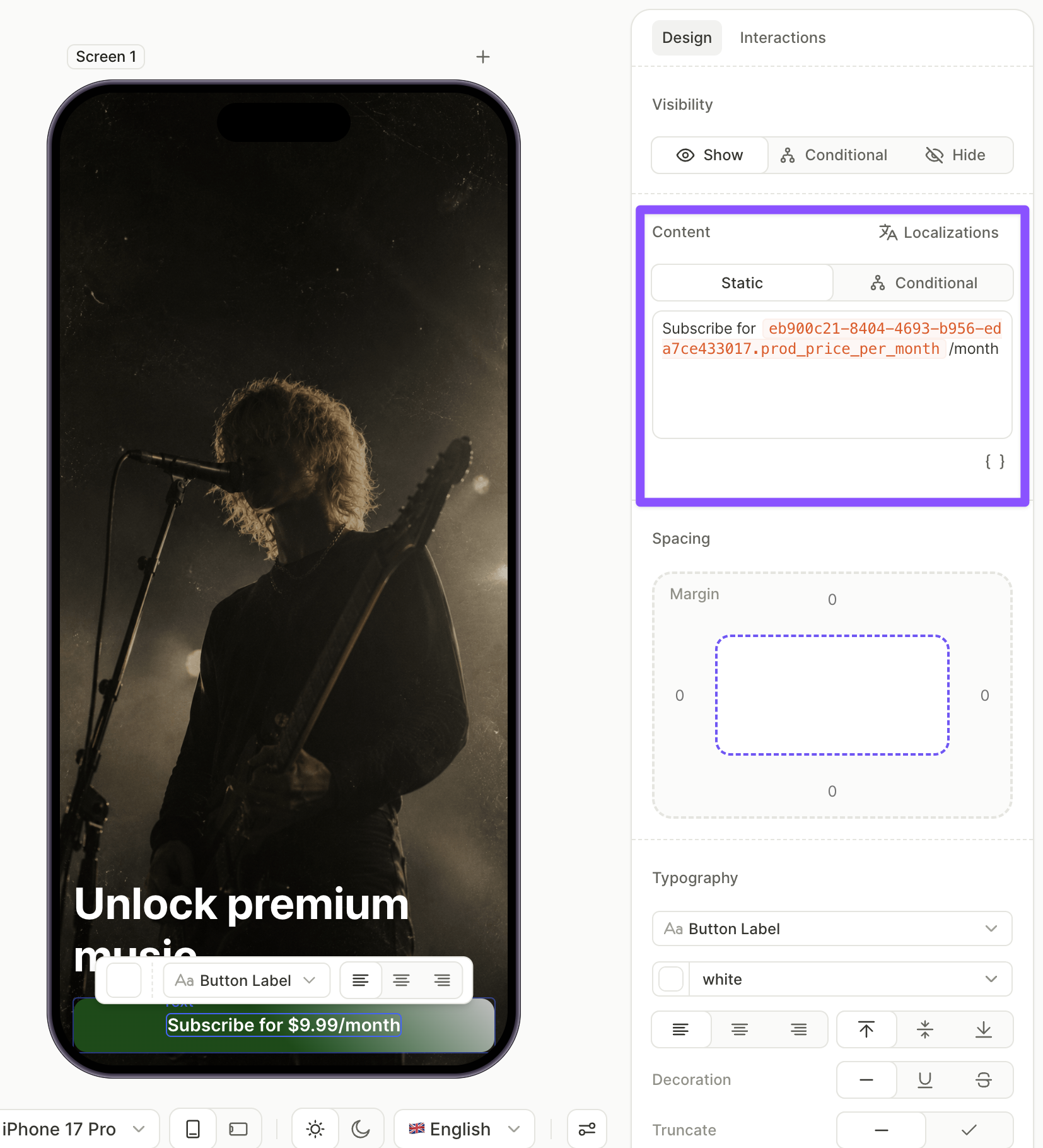
Show the price on the button
To insert the selected product’s price into the button label, use a variable:
- With the button selected, open the Design tab in the right panel.
- In the Content field, place the cursor where the price should appear.
- Click the variable icon, pick
products.selectedProduct, then pick theprod_priceattribute. The full variable resolves toproducts.selectedProduct.prod_price. - Add static text around the variable — for example,
Subscribe for {prod_price}.
The label updates as the user selects different products.
Restore purchases
To let users restore previous purchases, add a restore button or link to the screen.
To add a restore purchases element:
- On the canvas, click + on the screen.
- Select Button, then choose Links for a text link or any other button type for a styled button.
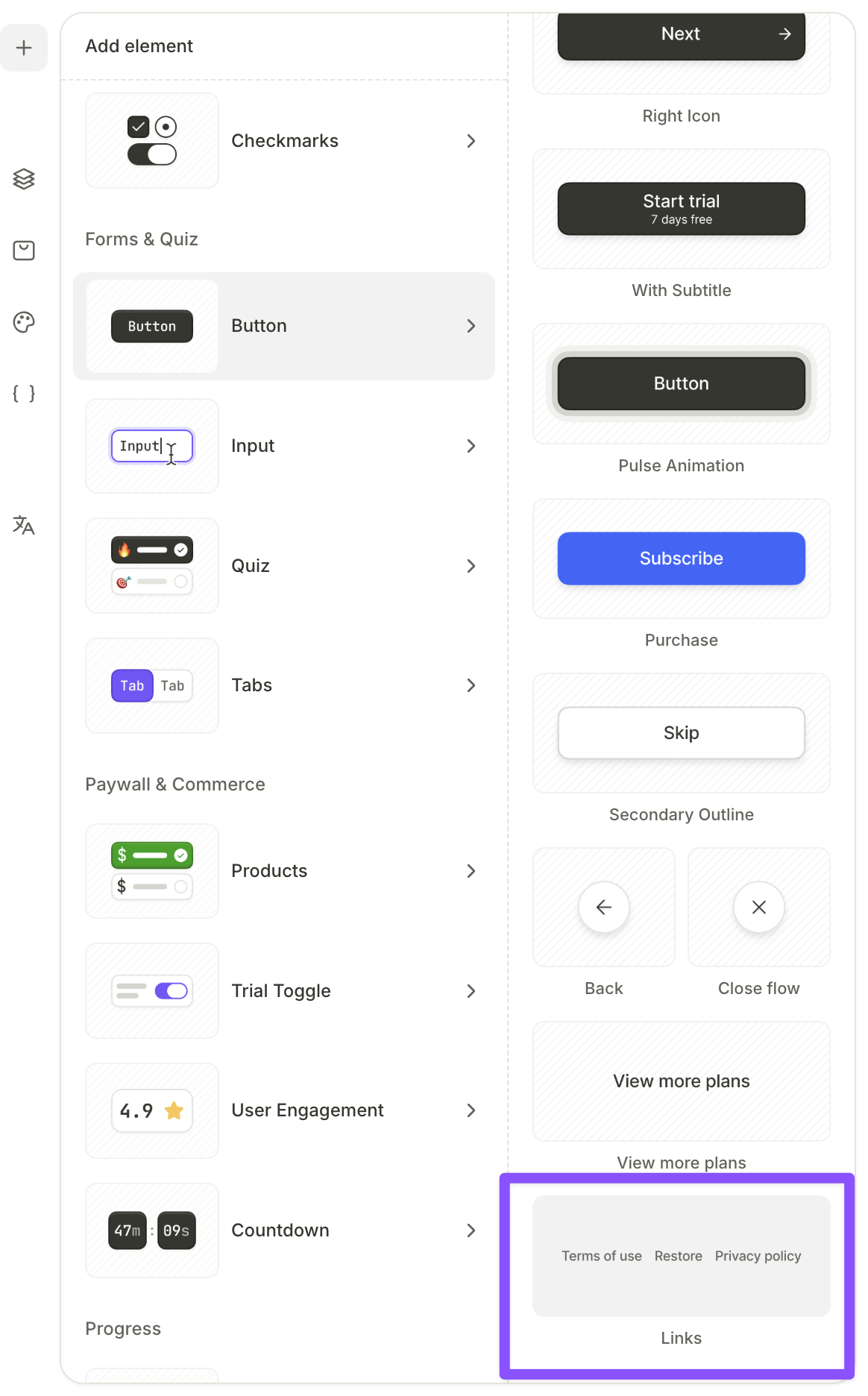
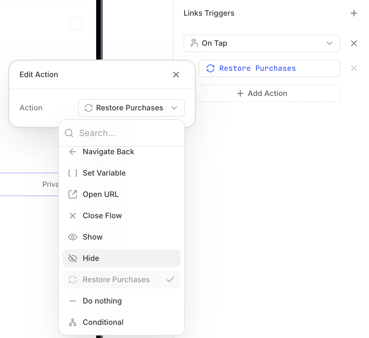
- With the element selected, open the Interactions tab in the right panel and click Add trigger.
- Select On tap and click Add action.
- From the Action dropdown, select Restore purchases.
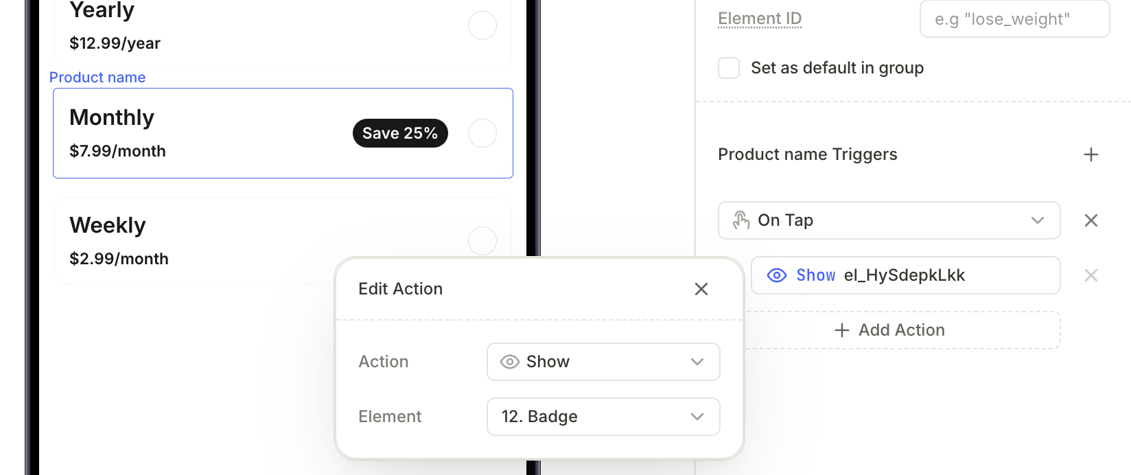
Display additional elements based on the selected product
If a screen has products on it, you can show or hide other elements depending on which product the user selects.
To set up conditional visibility:
- In the Products element, select a product card.
- Open the Interactions tab in the right panel and click Add trigger.
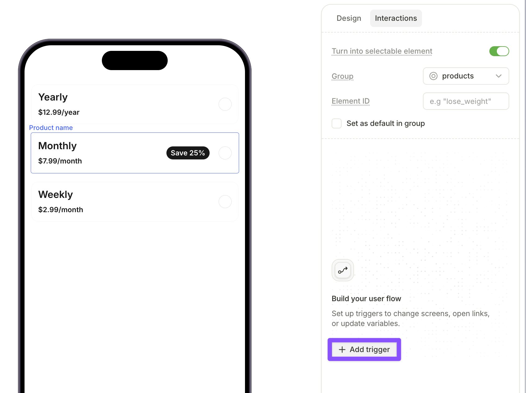
- Select On tap and click Add action.
- From the Action dropdown, select Show or Hide.
- Select the element to show or hide when that product is selected.
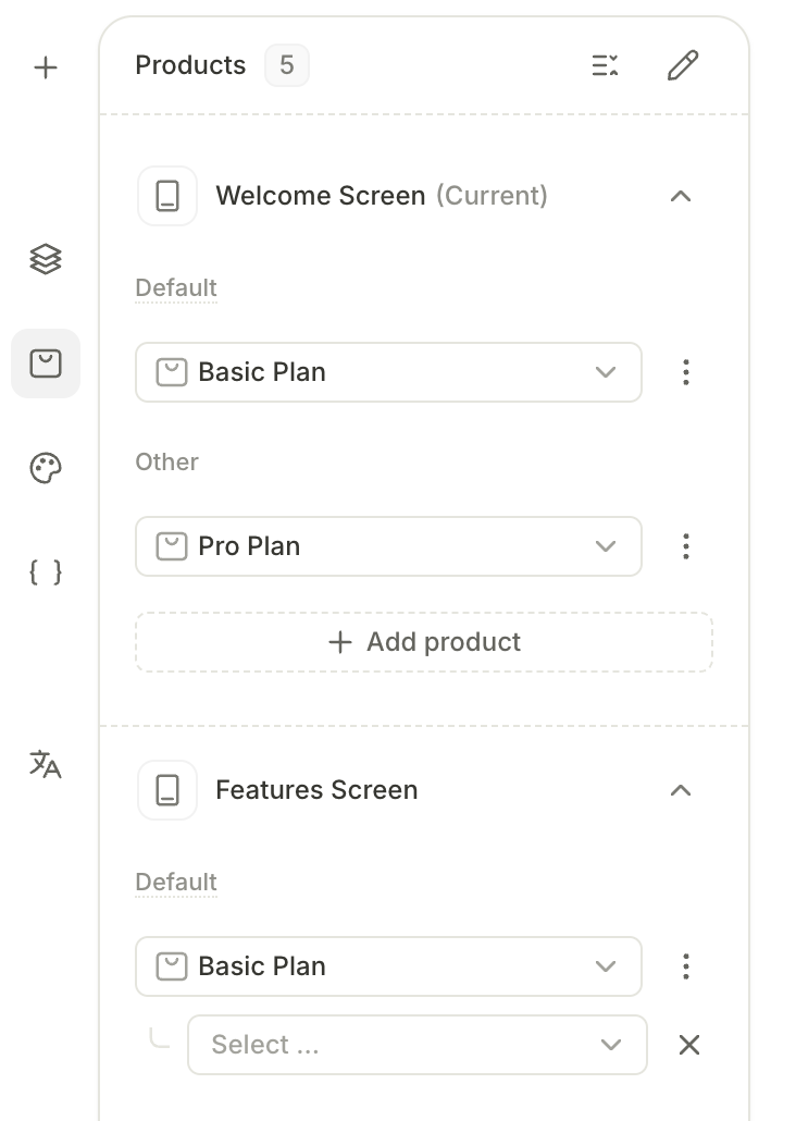
Review products in flow
The Products panel in the left sidebar maps existing products to each screen in the flow.
Each screen has two sections:
- Default — one product, pre-selected when the screen loads.
- Other — additional products available on the same screen.