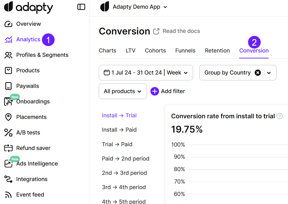
Conversion analysis
A conversion chart measures how many users who reached one stage in the user journey (for example, the trial) later reached another (for example, the second renewal). The selected date range determines when the first event occurred. The conversion may happen at any time after that — long after the date range ends.
Conversion charts answer questions such as:
- How do app conversions change over time? Are there any seasonal trends?
- How do marketing campaigns or other new circumstances change them?
- How do users in different regions respond to your app updates?
- Which product types convert better over time?
To build the charts, Adapty uses the data from your app and the app stores.
How conversions are measured
The conversion chart takes two events (for example — installation and trial start), and calculates how many users who triggered the first event later triggered the second. The date range you set determines when the first event occurred. The second event can happen at any time after that, even long after the date range ends.
You want to know how many trials that started in March turned into paid subscriptions? Open the Trial -> Paid conversion chart, and set the date range to March. Adapty finds everyone who started a trial that month, counts how many of them became subscribers, and shows you the percentage. If one of them cancels the trial at first, but subscribes in June, they still count — the number for March goes up.
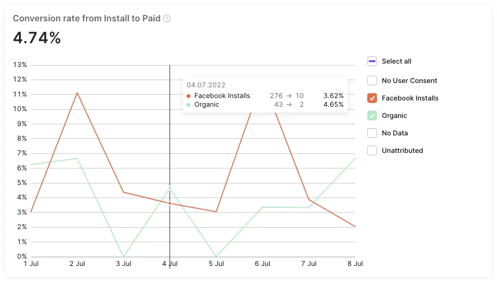
Each data point on the chart is a separate cohort of users, grouped by when they triggered the first event.
Why past values change
The conversion statistics for any time period will keep changing after the time period ends. Users don’t all convert at once. Whenever one of them converts, Adapty attributes this conversion to their cohort date, which can be months in the past.
There’s no way to predict how long a metric will keep growing. Usually, this depends on the gap between its two events:
- Install -> Trial depends on your app’s monetization strategy. A hard paywall may cause the user to convert or abandon the app within days. In a freemium app, users can explore for months.
- Install -> Paid covers everything from the install to the first payment — including the trial period, if any. A promotion that occurred long after the initial install can cause a spike in conversions for a past cohort.
- Trial -> Paid depends on your trial length, and stretches further whenever the store retries a failed charge.
So one metric can settle quickly while another is still climbing for the same month.
Compare months in your reports
To compare months fairly, record each month’s metrics a fixed amount of time after it ends. Adapty does not offer a setting that restricts the date range of the second event, so the wait is what makes two months comparable.
To find how long to wait, monitor the metric for a few months. Open the same conversion chart for the same date range once a week and notice when the number stops moving. Apps with long trials and slow purchase decisions need longer.
Take a snapshot of the metric as soon as its wait is up. A conversion chart always shows the current value for a date range, so you can’t go back later and see what March looked like 60 days after it ended.
Working with incomplete periods
The most recent data points are usually lower than the rest, and it’s rarely a real decline. Those cohorts haven’t finished converting: a trial that is still running, or a subscription period that has not ended, counts in the total while its user still has time to convert.
Choosing the right metric
Adapty tracks the same user journey in several different ways, each with its own purpose. The table below summarizes the differences between the conversion chart and its siblings:
| Analytics tab | What the date range determines | What it shows | When the numbers stop changing | Use it to |
|---|---|---|---|---|
| Conversion | Users who reached a specific stage within the time period | What share of these users reached the next stage | Long after the period ends, by as much as the gap between the two events | See which cohorts convert better |
| Funnels | Users who installed within the time period | How many of them reach each stage of the user journey — install, paywall view, trial, first payment, first renewal, etc. | Long after the period ends, as those installs keep progressing | Find the stage with the biggest drop-off |
| Retention | Users whose trial or subscription started within the time period | How many times they renewed their subscription | Long after the period ends, as those subscribers keep renewing | Spot when subscribers lose interest |
| Charts | The time period of the events | Event numbers — revenue, new trials, etc. | When the selected time period ends, though refunds later revise some metrics | Spot trends and seasonal swings |
Conversion, retention, and funnels are cohort-based. Charts are not. New trials counts a trial on the day it started; Install -> Trial counts that same trial on the day the user installed.
Main controls and charts
Though revenue is often the go-to metric for measuring success, it’s just one part of the bigger picture. Understanding how your business performs over time—across different user behaviors and lifecycle stages—is equally important. That’s where conversion analytics come into play.
You can find more valuable insights about user behavior by setting filters and groups. To identify and analyze trends, monitor how your conversions evolve daily, monthly, or yearly.
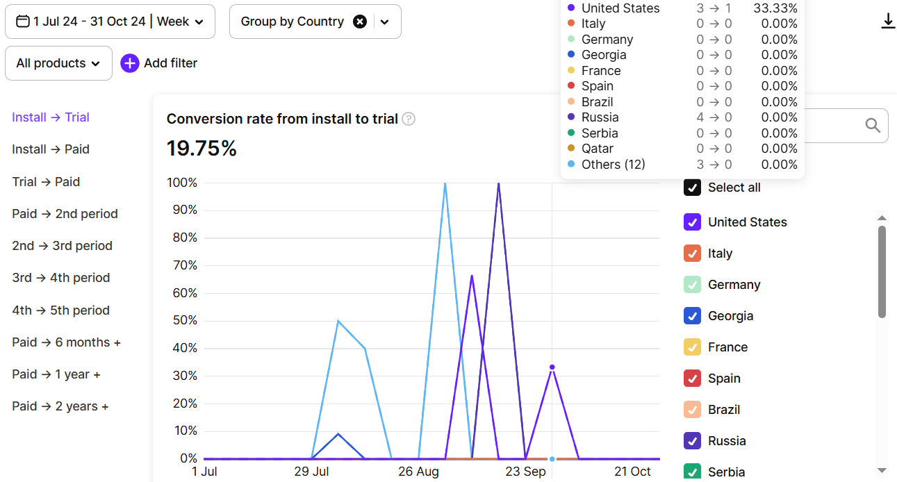
On the left side of the chart, you’ll find the conversion steps control. It allows you to choose which specific conversions to track — such as Install -> Trial, Trial -> Paid, or Paid -> 2nd period.
Please see below for each conversion explanation, along with an example for your reference.
Install -> Paid
This metric shows what percentage of users who installed the app on a specific date eventually purchased their first subscription.
How it works
Let:
-
X = number of installs on a selected date (same for all products, as no product is chosen at the time of installation).
-
Y = number of those users who eventually purchased their first subscription (trial or non-trial).
Formula: Conversion = (Y / X) × 100%
Example:
-
On January 1, there were 100 installs.
-
By January 8, 20 of those users had subscribed.
- On January 8, the conversion for January 1 = (20 / 100) × 100% = 20%
-
By February 1, 30 more users from the January 1 install group had purchased a subscription.
- On February 1, the conversion for January 1 = ((20 + 30) / 100) × 100% = 50%
This means that 50% of users who installed the app on January 1 eventually converted to a paid subscription, up to the current moment.
Install -> Trial
This metric shows the percentage of users who installed the app on a specific date and eventually started a trial.
How it works
Let:
-
X = number of installs on a selected date (same for all products, as no product is chosen at the time of installation).
-
Y = number of those users who eventually activated a trial, at any time.
Formula: Conversion = (Y / X) × 100%
Example:
-
On January 1, there were 100 installs.
-
By January 8, 20 of those users had started a trial.
- On January 8, the conversion for January 1 = (20 / 100) × 100% = 20%
-
By February 1, 30 more users from the January 1 install group had started a trial.
- On February 1, the conversion for January 1 = ((20 + 30) / 100) × 100% = 50%
This means that 50% of users who installed the app on January 1 eventually started a trial, up to the current moment.
Paywall view -> Trial
This metric tracks how many users started the trial after they saw a paywall. A screen of a flow counts as a paywall view here.
How it works
Let:
-
X = number of users who saw a paywall on a selected date.
-
Y = number of users who started the trial any time later.
Formula: Conversion = (Y / X) × 100%
Example:
-
On January 1, there were 100 paywall views.
-
By January 8, 20 of those users had started the trial.
-
On January 8, the conversion for January 1 = (20 / 100) × 100% = 20%
-
By February 1, 30 more users had started the trial.
-
On February 1, the conversion for January 1 = ((20 + 30) / 100) × 100% = 50%
This shows that 50% of users who saw a paywall on January 1 started the trial, up to the current moment.
Paywall view -> Paid
This metric tracks how many users made a purchase after they saw a paywall. A screen of a flow counts as a paywall view here.
How it works
Let:
-
X = number of users who saw a paywall on a selected date.
-
Y = number of users who made a purchase any time later.
Formula: Conversion = (Y / X) × 100%
Example:
-
On January 1, there were 100 paywall views.
-
By January 8, 20 of those users had made a purchase.
-
On January 8, the conversion for January 1 = (20 / 100) × 100% = 20%
-
By February 1, 30 more users had made a purchase.
-
On February 1, the conversion for January 1 = ((20 + 30) / 100) × 100% = 50%
This shows that 50% of users who saw a paywall on January 1 made a purchase, up to the current moment.
Trial -> Paid
This metric shows the percentage of users who started a trial on a specific date and later purchased their first subscription. The chart date is the day the trial started, not the day the user installed your app. While a trial is still running, its start date shows as an incomplete period.
How it works
Let:
-
X = number of trials started on a selected date.
-
Y = number of those users who eventually purchased a subscription after their trial.
Formula: Conversion = (Y / X) × 100%
Example:
-
On January 1, 100 trials were started.
-
By January 8, 20 of those users had subscribed.
- On January 8, the conversion for January 1 = (20 / 100) × 100% = 20%
-
By February 1, 30 more users from the January 1 trial group had subscribed.
- On February 1, the conversion for January 1 = ((20 + 30) / 100) × 100% = 50%
This means that 50% of users who started a trial on January 1 eventually converted to a paid subscription, up to the current moment.
Paid -> 2nd Period
This metric shows the percentage of users who renewed their subscription after the first payment.
How it works
Let:
-
X = number of first-time subscriptions on a selected date.
-
Y = number of users who renewed for a second period, any time later (typically after one subscription cycle; includes grace period renewals).
-
Formula: Conversion = (Y / X) × 100%
Example:
-
On January 1, there were 100 first-time subscriptions.
-
By January 8, 20 of those had renewed.
- On January 8, the conversion for January 1 = (20 / 100) × 100% = 20%
-
By February 1, 30 more users from that group had renewed.
- On February 1, the conversion for January 1 = ((20 + 30) / 100) × 100% = 50%
This shows that 50% of users who made their first subscription payment on January 1 renewed for a second period, up to the current moment.
2nd Period -> 3rd Period
This metric tracks how many users renewed again after their second subscription period.
How it works
Let:
-
X = number of second-period subscriptions on a selected date.
-
Y = number of users who renewed for a third period, any time later (typically after one more billing cycle; includes grace period renewals).
Formula: Conversion = (Y / X) × 100%
Example:
-
On January 1, there were 100 second-period subscriptions.
-
By January 8, 20 of those users had renewed.
- On January 8, the conversion for January 1 = (20 / 100) × 100% = 20%
-
By February 1, 30 more users had renewed.
- On February 1, the conversion for January 1 = ((20 + 30) / 100) × 100% = 50%
This shows that 50% of users who entered their second subscription period on January 1 renewed for a third, up to the current moment.
3rd Period -> 4th Period
This metric shows the percentage of users who renewed after their third subscription period.
How it works
Let:
-
X = number of third-period subscriptions on a selected date.
-
Y = number of users who renewed for a fourth period any time later (typically after one billing cycle; includes grace period renewals).
Formula: Conversion = (Y / X) × 100%
Example:
-
On January 1, there were 100 third-period subscriptions.
-
By January 8, 20 users had renewed.
- On January 8, the conversion for January 1 = (20 / 100) × 100% = 20%
-
By February 1, 30 more users renewed.
- On February 1, the conversion for January 1 = ((20 + 30) / 100) × 100% = 50%
This means that 50% of users who entered their third subscription period on January 1 renewed for a fourth, up to the current moment.
4th Period -> 5th Period
This metric shows the percentage of users who renewed after their fourth subscription period.
How it works
Let:
-
X = number of fourth-period subscriptions on a selected date.
-
Y = number of users who renewed for a fifth period any time later (typically after one billing cycle; includes grace period renewals).
Formula: Conversion = (Y / X) × 100%
Example:
-
On January 1, there were 100 fourth-period subscriptions.
-
By January 8, 20 users had renewed.
- On January 8, the conversion for January 1 = (20 / 100) × 100% = 20%
-
By February 1, 30 more users renewed.
- On February 1, the conversion for January 1 = ((20 + 30) / 100) × 100% = 50%
This means that 50% of users who entered their fourth subscription period on January 1 renewed for a fifth, up to the current moment.
6 Months +
This metric shows the percentage of users who remained subscribed for longer than 6 months from their first subscription.
How it works
Let:
- X = number of first-time subscriptions on a selected date.
- Y = number of those users who renewed at least once after 6 months from the original subscription date.
Formula: Conversion = (Y / X) × 100%
Example:
-
On January 1, there were 100 first-time subscriptions.
-
By the first week of July, 20 of them renewed (e.g. on their 25th weekly subscription).
- On July 8, the conversion for January 1 = (20 / 100) × 100% = 20%
-
By August 1, 30 more renewed after 6 months.
- On August 1, the conversion for January 1 = ((20 + 30) / 100) × 100% = 50%
This means that 50% of users who subscribed on January 1 remained subscribed past 6 months as of August 1.
1 Year +
This metric shows the percentage of users who remained subscribed for longer than 12 months from their first subscription.
How it works
Let:
-
X = number of first-time subscriptions on a selected date.
-
Y = number of those users who renewed at least once after 12 months from the original subscription date.
Formula: Conversion = (Y / X) × 100%
Example:
-
On January 1, 2021, there were 100 first-time subscriptions.
-
By the first week of January 2022, 20 had renewed.
- On January 8, 2022, the conversion = (20 / 100) × 100% = 20%
-
By February 1, 2022, 30 more had renewed after 12 months.
- On February 1, 2022, the conversion = ((20 + 30) / 100) × 100% = 50%
This means that 50% of users who subscribed on January 1, 2021 stayed active for more than one year.
2 Years +
This metric shows the percentage of users who stayed subscribed for more than 24 months from their first payment date.
How it works
Let:
-
X = number of first-time subscriptions on a selected date.
-
Y = number of those users who renewed at least once after 24 months from the original subscription date.
Formula: Conversion = (Y / X) × 100%
Example:
-
On January 1, 2020, there were 100 first-time subscriptions.
-
By the first week of January 2022, 20 of them had renewed.
- On January 8, 2022, the conversion = (20 / 100) × 100% = 20%
-
By February 1, 2022, 30 more had renewed after 2 years.
- On February 1, 2022, the conversion = ((20 + 30) / 100) × 100% = 50%
This means that 50% of the users who subscribed on January 1, 2020 were still active after 2 years, as of February 1, 2022.
Grace period -> Paid
This metric shows the percentage of users who entered a subscription grace period and resolved the issue before the end of the grace period.
How it works
Let:
- X = number of subscribers that entered the grace period.
- Y = number of those users who renewed the subscription before the grace period lapsed.
Formula: Conversion = (Y / X) × 100%
Example:
- On January 1st, 2025, the subscription of 100 people could not be renewed automatically. They entered a 16-day grace period, due to end on January 17th.
- 50 people updated their payment information between January 1st and January 17th, and their subscription was successfully renewed.
- On January 17th, 2025, the conversion = (50 / 100) × 100% = 50%
Billing issue -> Paid
This metric shows the percentage of users who encountered a billing issue, and resumed paying before the end of the billing cycle.
How it works
Let:
- X = number of subscribers who encountered a billing issue.
- Y = number of those users who renewed their subscription in the time between the billing issue and the end of the billing cycle.
Formula: Conversion = (Y / X) × 100%
Example:
- On January 1, 100 subscribers encountered a billing issue when their subscription could not be renewed automatically.
- Note: If a grace period is enabled, the billing issue state begins only after the grace period ends. For this example, assume the grace period ended on January 1.
- By January 8, 10 of those users had resolved the payment issue and renewed.
- On January 8, the conversion for January 1 = (10 / 100) × 100% = 10%
- By January 31 (end of the billing cycle), 10 more users had renewed.
- On January 31, the conversion for January 1 = ((10 + 10) / 100) × 100% = 20%
This shows that 20% of users who entered a billing issue state on January 1 resolved the issue and renewed before the end of their billing cycle.
Grouping and time ranges
The object for the analysis when the conversion is chosen is the chart. It performs how the conversion percentage changes over time. Using the date picker please select the quick options for the time period. The chart usually contains several curves. Up to five of them are selected by default in the list of grouping and you may change the selection by choosing the checkboxes in the area to the right of the chart. When you open the page for the first time the product duration is selected as a default grouping. Then your settings are saved in the cache and the next time you see the group you’ve recently selected. The following groupings are available:
- Product
- Country
- Store
- Paywall
- Flow
- Flow screen
- Duration
- Marketing attribution
If a chosen date range is not enough to show any results, you may see a notification that offers a relevant date and an option to adjust the date range automatically so you may do it with one click.
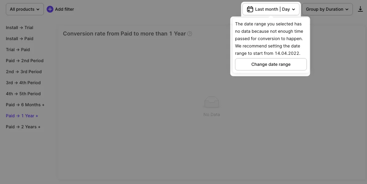
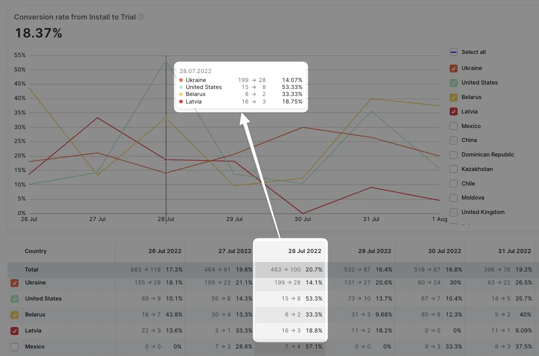
Table view, filters and CSV export
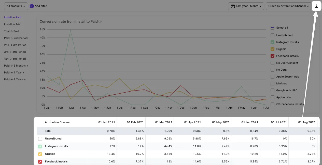
A comparison of the curves gives a bright picture, and to get more use the table view below the chart. The table is synchronized with the chart so hovering over a column you see the associated pop-up over the curves.
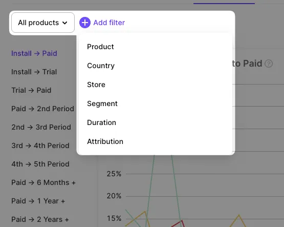
The grouping that was mentioned above changes both the charts and the table. Set quick filter by product or use other advanced ones, including Product, Country, Store, Duration, Attribution.
We know that it’s important to have an option to work with numbers the way you like. So on the right of the control panel, there’s a button to export funnel data to CSV. You can then open it in Excel, or Google Sheets, or import it into your own analytical system to continue analysis and forecasting in your preferred environment.
Notify Adapty if your app is enrolled in a reduced commission program. To ensure correct calculations, specify your Small Business Program and Reduced Service Fee program status in your app settings.