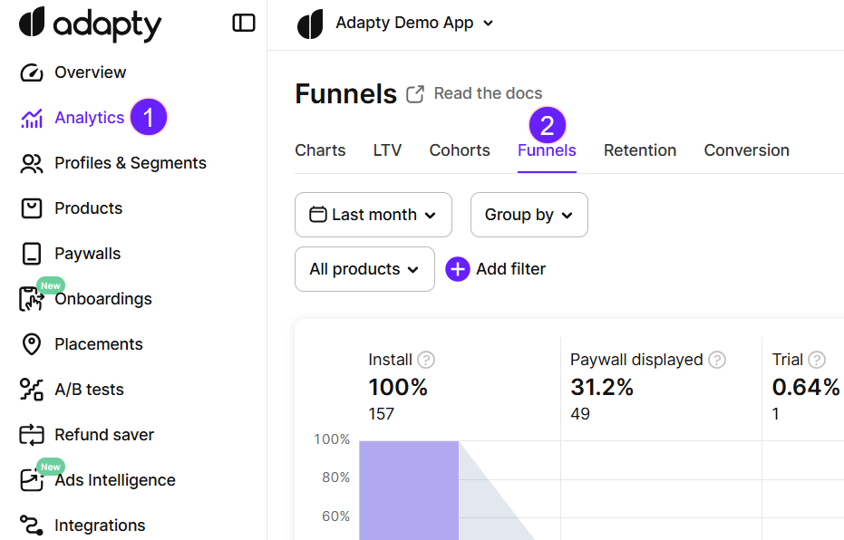
Funnel analysis
Adapty funnels are designed to assist you with such kinds of questions:
- What percentage of installs is converted to paying clients?
- What part of those who tried the product became loyal?
- Which steps show high drop-off and need more attention?
- Why do clients stop to pay?
With a funnel chart, you may also find more insights about user behavior setting filters and groups.
Funnels work with the data that we gather through SDK and store notifications and don’t require any additional configuration from your side.
Funnels reflect install data according to your install definition in App Settings.
Funnel chart step by step
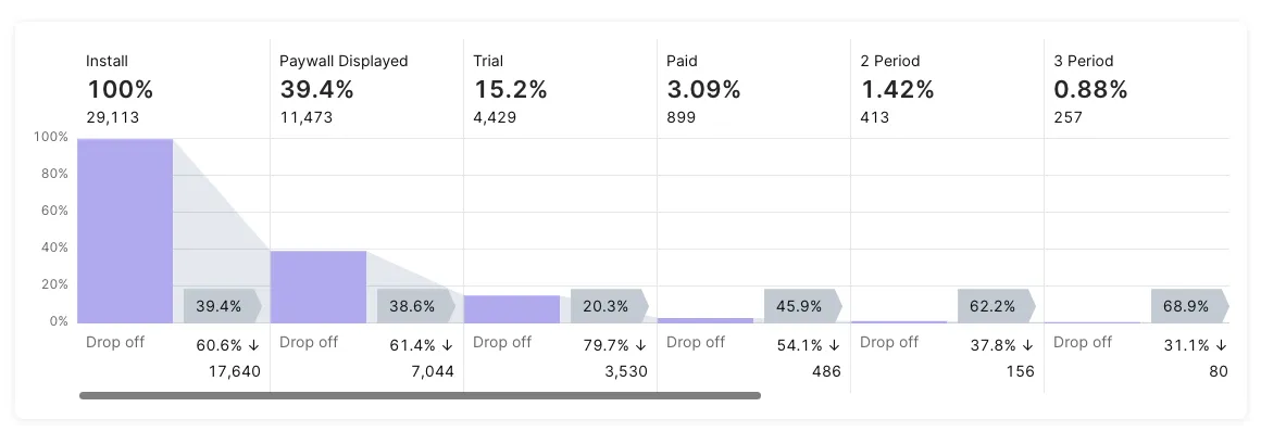
Let’s go through the elements of a funnel to understand how to read the user journey on the chart.
Installs
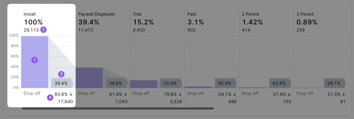
The 1st column (1) is the number of installs. It is shown as an absolute value (2) of total installations (not unique users) and also as 100% - the largest input number for further conversions relative calculation. If a user deletes an app and then installs it again two separate installs will be counted.
A grey area nearby stands for transition parameters between steps. A conversion percent to the next step (Displayed paywall) is shown on a flag (3). Drop off percent and an absolute value of churn are shown below (4).
Paywall displayed
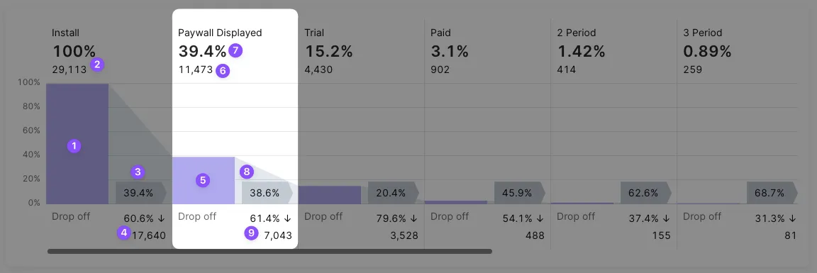
The 2nd column (5) shows the number of users of the app who saw a paywall at least one time (6). They are taken only from those installs that happened in a selected period. If a user sees a paywall in the selected period but his install date is out of range his view is not counted.
There is also a percentage of such views taken from the 1st step (7). You may notice that this percent is equal to the grey flag (3) of the 1st step. This equality takes place only for these first steps.
We collect data for this step from all your paywalls that use the logShowPaywall() method. So please be sure to send every paywall view to Adapty using this method as described in the docs.
A grey area next to the 2nd column stands for transition. A conversion percent to the next step (Trial) is shown on a flag (8). Drop-off percent and the absolute value of churned customers after the paywall are shown below (9).
Trials
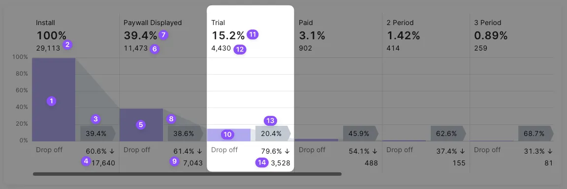
The 3rd column (10) shows the number of trials activated on the paywalls by customers who installed the app within a selected period (11). If a filter is set to non-trial product(s) this value becomes zero and the column is empty.
See also a percent of trials taken from the 1st step, showing the conversion from installs to trials (12).
You may notice that this percent is not equal now to the grey flag (8) of the previous step conversion. This is because we compare the current value with the 1st step at the top of the chart and with the previous step on grey flags.
So a grey area next to the 3rd column shows a conversion percent to the next step (Paid) which is displayed on a flag (13). Drop-off percent and absolute value of churned customers during a trial period are shown below (14).
Subscriptions and renewals
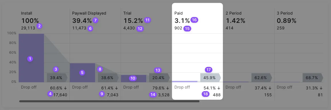
The 4th column shows the number of activated subscriptions (15). For products without trials, this number includes direct subscriptions from a paywall. For products with trials, it contains the number of trials converted into paid subscriptions. If you have both types of products, with trial and without, it will be a sum of both.
The percent at the top shows the conversion from installs (16).
The percent on a grey flag shows conversion to the next step (renewal to the 2nd period) (17).
Drop off before the renewal to the 2nd period percent and absolute value are shown below the conversion (18).
This step starts a sequence of steps with a similar structure. After the 2nd renewal comes the 3rd, then the 4th, etc. If there is enough data in your app history you may see dozens of periods using the horizontal scroll. The logic for these steps remains the same:
- percent from installs at the top,
- percent from the previous step at the bottom,
- the absolute amount of renewal at the top,
- the absolute amount of churn at the bottom,
- a hover for churn reasons pop-up.
Churn reasons
Adapty details churn statistics for the Trial stage and later. Every user who entered one stage, but not the next, counts as an instance of churn.
-
If a specific event (for example, a trial expiration or a billing issue) caused the lack of conversion, Adapty displays the reason.
-
The unknown status is a temporary state. It indicates that the user hasn’t yet encountered the event that allows them to proceed to the next stage.
In the Trial stage, this usually means the trial has not yet ended. This commonly occurs when viewing Funnels for short date ranges or single days, since trials take time to resolve.
Adapty will update the information once the user converts or cancels the trial.
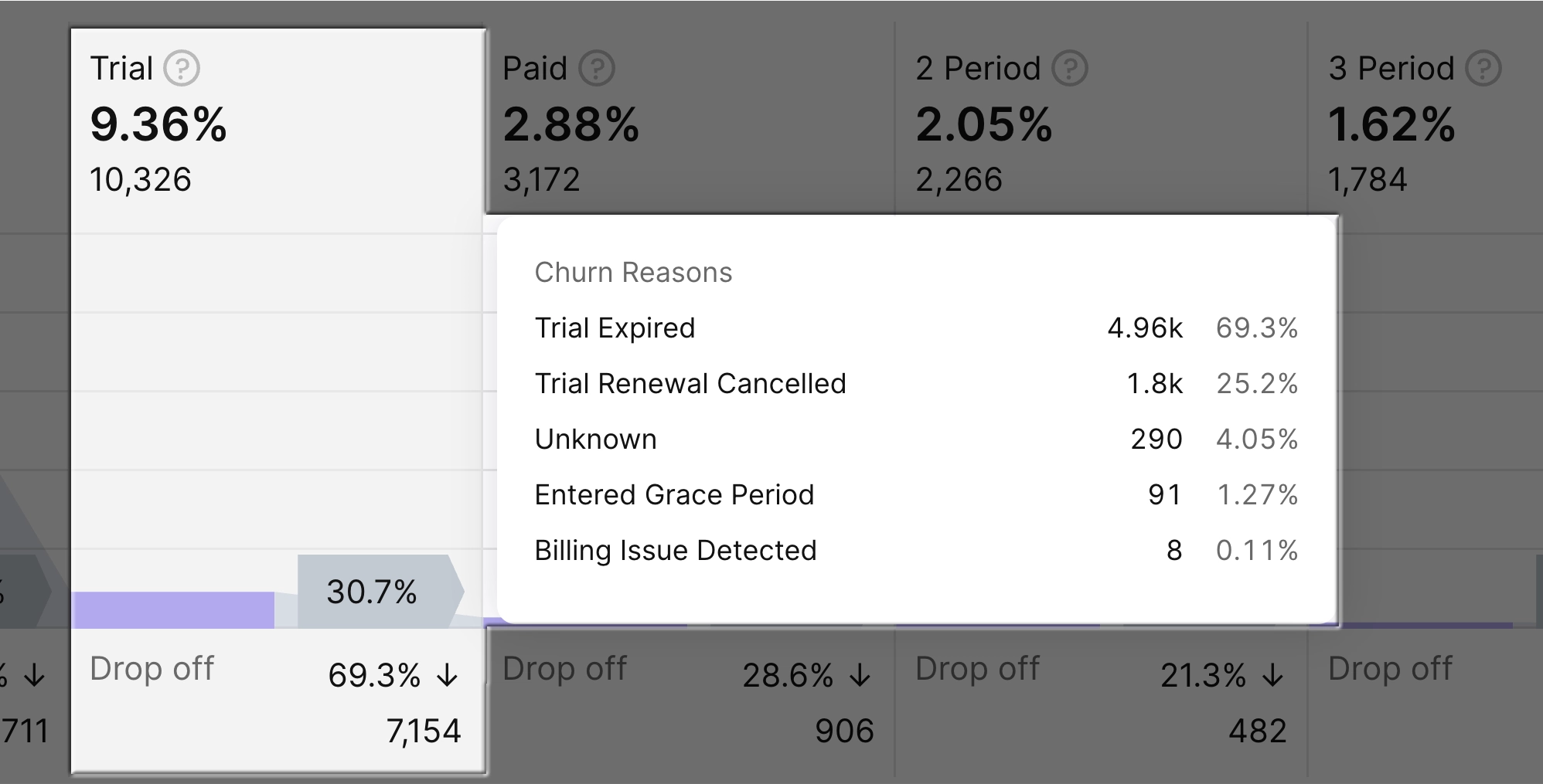
Table view, filters and CSV export
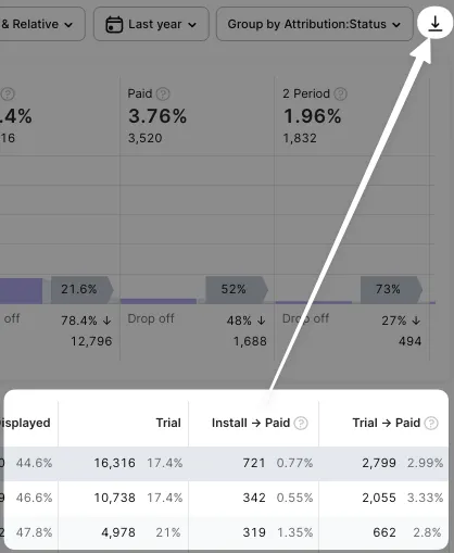
A funnel chart is enriched with data in a table to provide handy material for your work with numbers.
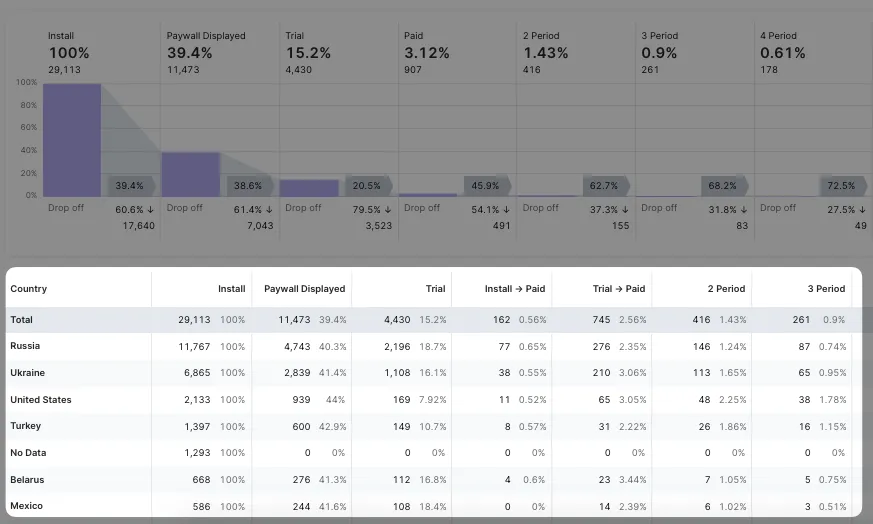
This table repeats the approach of the funnel with some amendments.
There are columns that show data on all steps except for the step of the 1st paid subscription.
Instead of this one, there are two separate: Install -> Paid and Trial -> Paid. They display a core point of conversion when a free user becomes paying.
It may seem that there is a product type division: Install -> Paid column shows only products without trials while the column Trial -> Paid contains only products with trials. But that’s not exactly the way it works. Because we also consider those users whose trial has expired and they purchase a product with a trial like it doesn’t have it at all.
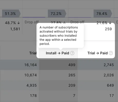
Diving deeper into numbers you will find filtering powerful tools for new hypotheses.
Feel free to set conditions in different dimensions. Collect true insights based on data.
Variate:
- Product type - economy, length, etc
- Time range.
- Country segmentation.
- Traffic attribution.
- Store.
Select Absolute #, Relative %, or both to view only necessary data.

Finally, on the right of the control panel, there’s a button to export funnel data to CSV. You can then open it in Excel, or Google Sheets, or import it into your own analytical system.
Notify Adapty if your app is enrolled in a reduced commission program. To ensure correct calculations, specify your Small Business Program and Reduced Service Fee program status in your app settings.
