Analytics controls
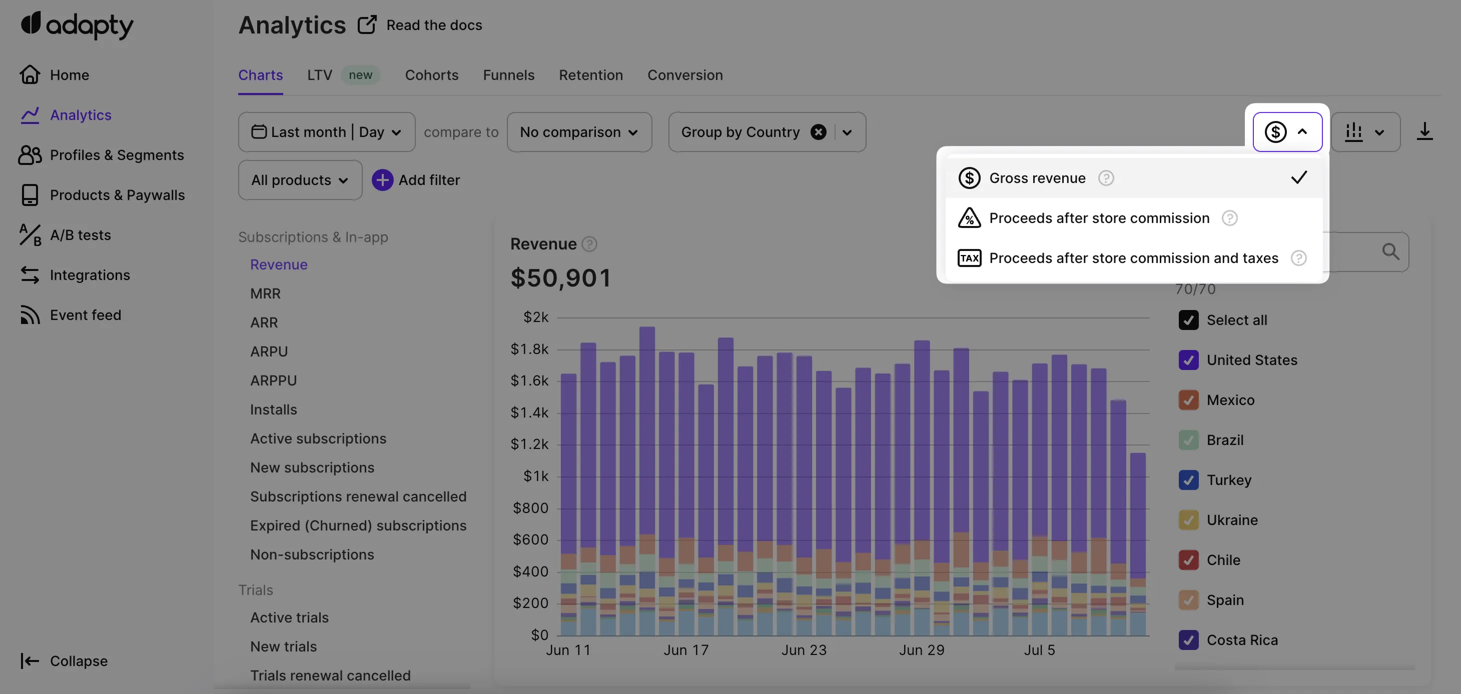
Adapty offers controls to refine the data in each analytics tab: time range, period comparison, filtering, grouping, and chart visualization. Availability differs by tab.
Available controls by analytics tab:
| Control | Charts | Cohorts | Funnels | Retention | Conversion | LTV |
|---|---|---|---|---|---|---|
| Date range | ✅ | ✅ | ✅ | ✅ | ✅ | ✅ |
| Period comparison | ✅ | ❌ | ❌ | ❌ | ❌ | ❌ |
| Filter | ✅ | ✅ | ✅ | ✅ | ✅ | ✅ |
| Group | ✅ | ❌ | ✅ | ✅ | ✅ | ✅ |
| Chart visualization | ✅ | ❌ | ❌ | ❌ | ❌ | ❌ |
| Table view | ✅ | ✅ | ✅ | ✅ | ✅ | ✅ |
| CSV export | ✅ | ✅ | ✅ | ✅ | ✅ | ✅ |
| Commission and taxes | ✅ | ✅ | ❌ | ❌ | ❌ | ✅ |
Set the date range
Use the Date range calendar above each chart to choose the time period. Charts follow your app’s reporting timezone; the Overview page has its own configurable timezone. Third-party integrations always use UTC, whatever you set there.
Preset ranges
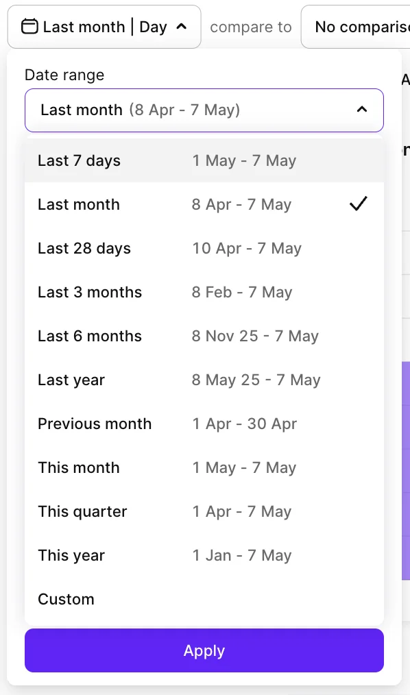
Use the Custom option to specify arbitrary start and end dates. The presets are:
| Preset | Starts | Ends |
|---|---|---|
| Last 7 days | 6 days ago | Today |
| Last 28 days | 27 days ago | Today |
| Last month | Same date in the previous month | Today |
| Last 3 months | 3 months ago | Today |
| Last 6 months | 6 months ago | Today |
| Last year | 1 year ago | Today |
| Previous month | First day of the previous month | Last day of the previous month |
| This month | 1st of the current month | Today |
| This quarter | 1st of the current quarter | Today |
| This year | January 1 of the current year | Today |
Use Last 28 days to track weekly subscription products — the range covers four full weekly cycles, so no partial week skews the comparison.
Time scale
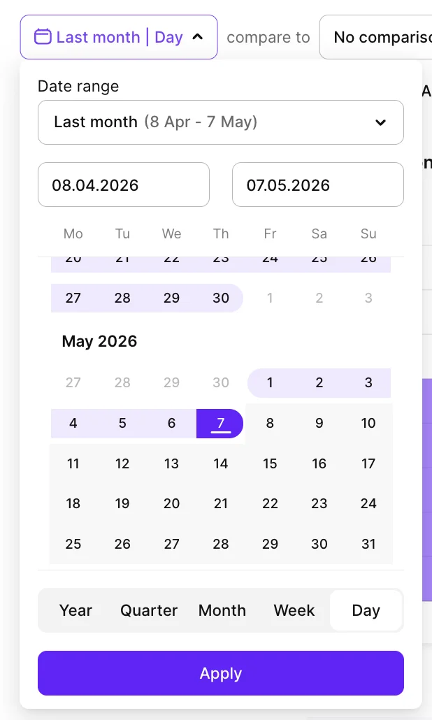
Each data point on the chart represents one block of time — choose between day, week, month, quarter, and year from the dropdown. Day and week show short-term ups and downs; month, quarter, and year show longer trends.
In cohort and LTV analyses, the same setting is called cohort length — see those articles for details.
Compare two time periods
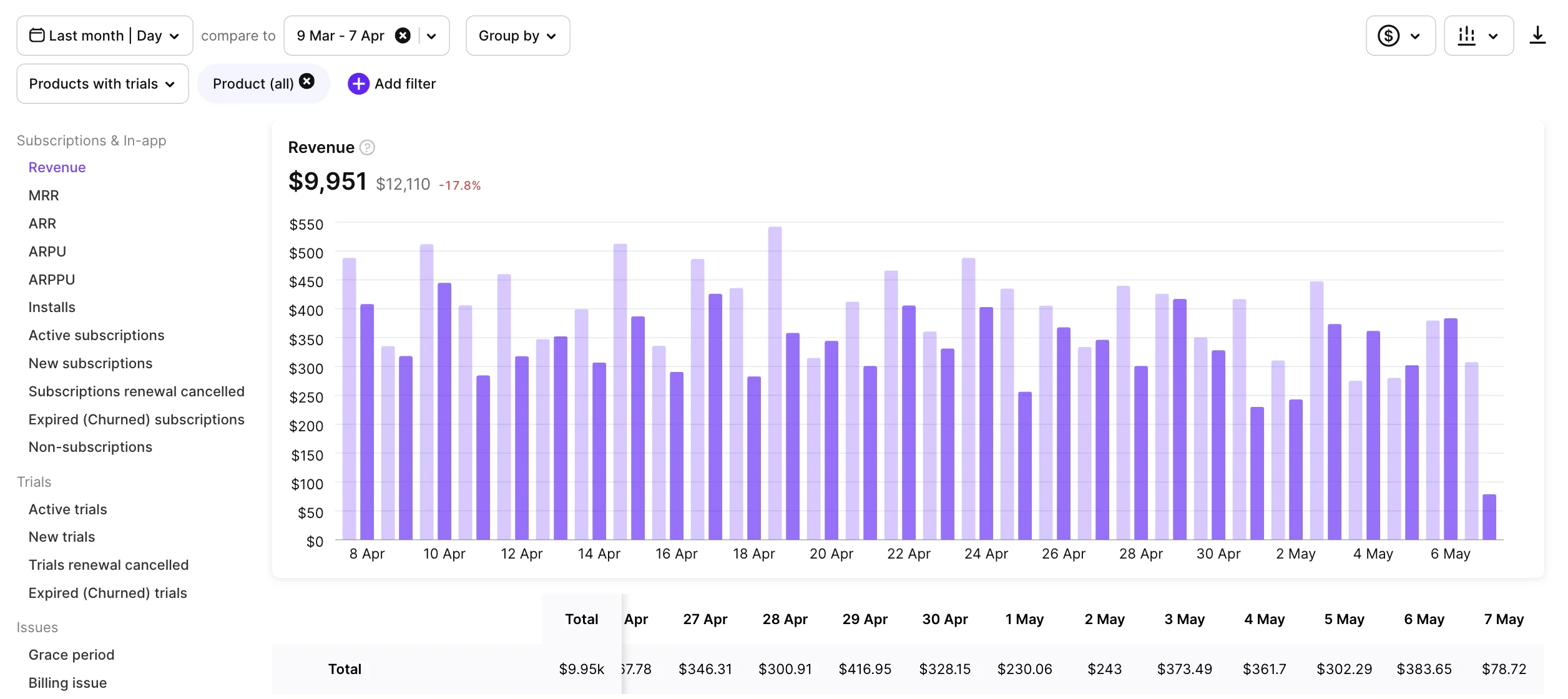
Click the comparison option next to the calendar to overlay the current period with an earlier one. Adapty’s first comparison is the period right before, with the same length. To change the comparison range, click the option again and pick a custom range.
The comparison appears:
- On the chart — overlaid lines, areas, or columns, with zero or one groupings selected.
- As a numerical value — the difference between the two periods, shown in green (higher) or red (lower).
- In a tooltip — hover over any data point to see the numeric difference for that point.
Filter and group data
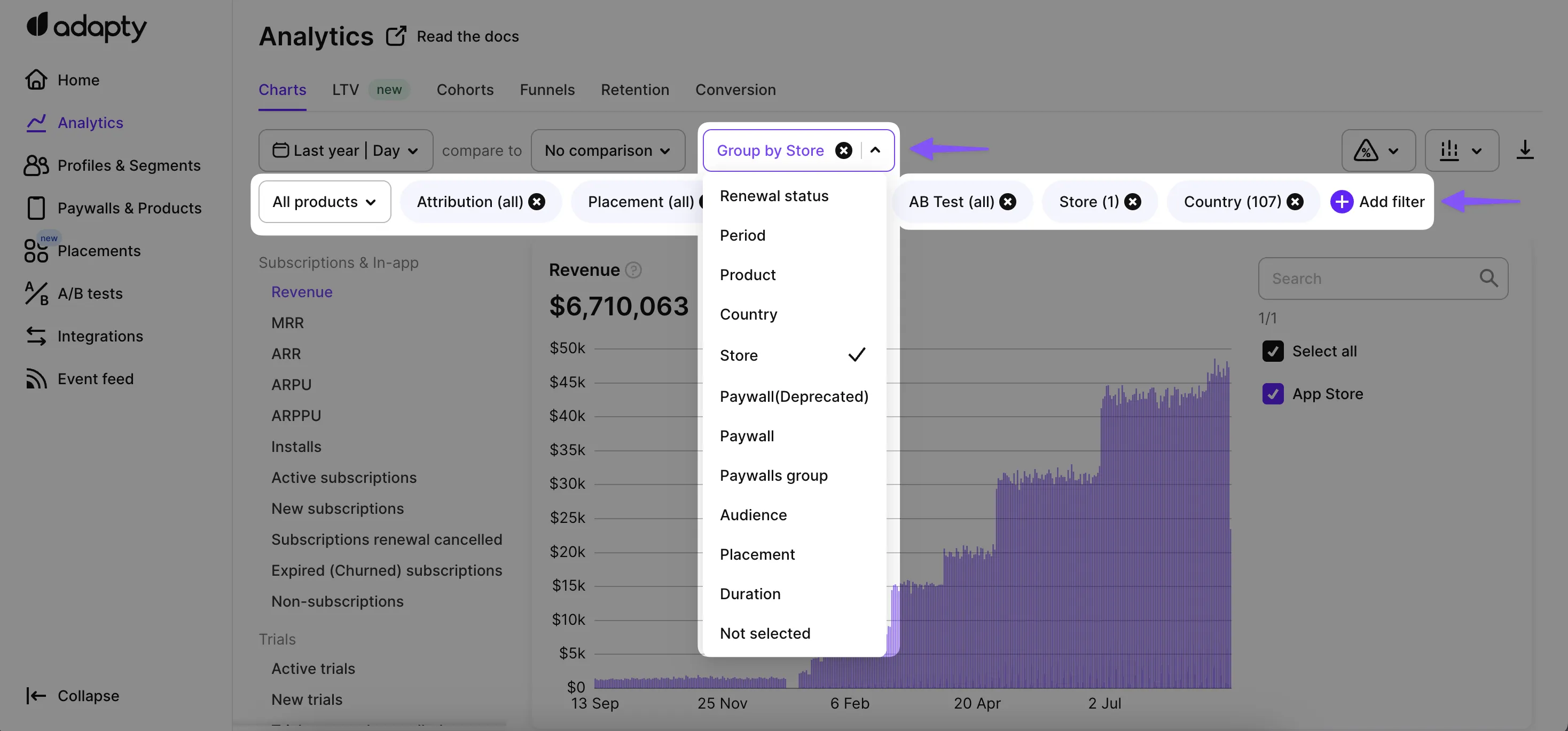
Filter to restrict the chart to data matching one or more attributes (for example, a single country or product). Group to break the chart total into separate series — one per attribute value. For example, group Revenue by country to get a separate revenue line for each country instead of one combined total.
Available filter and group attributes:
| Attribute | Filter | Group | Description |
|---|---|---|---|
| Attribution | ✅ | ✅ | Reported by, Status, Channel, Campaign, Ad Group, Ad Set, and Creative (Keyword). Requires attribution integration. |
| Audience | ✅ | ✅ | The audience the user belongs to. |
| Renewal status | ❌ | ✅ | Whether the subscription will renew in the next period. |
| Period | ✅ | ✅ | Subscription lifecycle stage: Trial, Activation (first payment), or Renewal 1–Renewal 5, Renewals 6+ (subsequent renewals). Counted per subscription chain, or per product when you also filter by product or group by product — so a user who moved between two products counts once in the first case and once per product in the second. |
| Country | ✅ | ✅ | The user’s store country. If unavailable, Adapty uses the IP country, then the purchase currency. See How country is determined. |
| Offer Type | ✅ | ✅ | The offer applied to the transaction:
|
| Offer ID | ✅ | ✅ | A specific offer ID. |
| Offer Discount Type | ✅ | ✅ | The pricing model of an introductory or promotional offer: Free Trial, Pay As You Go, or Pay Up Front. Combine with Offer Type to distinguish, for example, a free-trial intro from a paid intro. |
| Paywall | ✅ | ✅ | The paywall used for the purchase. A screen built in Flow Builder appears here too, listed once per screen under a name like Checkout flow: 9. Paywall A — see How flow screens are named. |
| Flow | ✅ | ✅ | The flow the purchase came from. Use it to compare whole flows against each other. |
| Flow screen | ✅ | ✅ | The individual flow screen the purchase came from. Use it to find which screen inside a flow earns the revenue. In the filter, screens are nested under their flow and only a screen is selectable; grouping labels each series Checkout flow: 9. Paywall A. |
| A/B tests | ✅ | ❌ | The A/B test active during the purchase. |
| Placement | ✅ | ✅ | The placement where the purchase occurred. |
| Store | ✅ | ✅ | The store that processed the transaction: App Store, Google Play, Stripe, etc. |
| Product | ✅ | ✅ | The product — subscriptions and one-time purchases. |
| Duration | ✅ | ✅ | The product’s duration. |
| Segment | ✅ | ✅ | A user segment. Group by segment to compare segment performance against All users.
|
| Refund Reason | ✅ | ✅ | The reason a transaction was refunded (for example, Refund or Upgraded). Available on refund and billing-issue-resolution charts. |
| Expiration reason | ❌ | ✅ | The reason a subscription or trial expired: Cancelled by customer, Billing issue, Customer hasn’t agreed to price increase, Unknown, or Refund. Available on Expired (Churned) subscriptions and Expired (Churned) trials. |
| Cohort (LTV only) | ❌ | ✅ | On the LTV chart, group by cohort length: Day, Week, Month, or Year. Replaces Group by Attribution on this chart. |
Not every analytics view supports every filter or group attribute above. ARPU and Installs in the Charts tab are limited to Attribution, Country, Segment, Store, and (filter only) A/B tests — they count installs, and Flow, Flow screen, Paywall, Placement, and Product all describe a purchase instead. LTV offers no Flow or Flow screen either. The LTV, Cohorts, Funnels, Retention, and Conversion tabs each support a different subset. For exact support, see the article for that chart or tab.
Filter dropdowns list only values Adapty has already received: an option appears after Adapty processes at least one transaction carrying that value. For example, if a campaign exists in your ad network or MMP but no attributed transaction has reached Adapty yet, the campaign isn’t in the list. Segments are the exception — they come from your segment definitions and appear before any transactions.
How country is determined
Each transaction is tagged with a country at the moment it’s created. The source for that country, in order of preference, is:
- The user’s store country — their App Store or Google Play account country.
- The user’s IP country.
- The country of the purchase currency.
The store country isn’t available for web payments (Stripe, Paddle), manually granted access, or transactions where the store didn’t provide it. In those cases, Adapty falls back to the IP country.
The same country decides the App Store commission rate for the transaction.
Because country is captured per transaction, a user who switches their App Store country after install will have different country values on transactions before and after the switch. Past transactions retain their original country.
GB and United Kingdom. Country data is stored as ISO 3166-1 alpha-2 codes (so “GB”, not “United Kingdom”). The dashboard display layer maps codes to full names via a lookup table that includes a legacy 'UK' → 'United Kingdom' alias — which is why both can appear as options when creating a segment.
How flow screens are named
Screen names in the Flow screen and Paywall attributes come from the flow’s published version, in the format <position>. <screen name> — for example, 9. Paywall A. The position is the screen’s place in the builder’s screen list, so the numbering matches what you see when you open the flow.
Adapty resolves the name at the moment you run the chart, not when the transaction happened:
- Renaming or reordering a screen in the builder relabels that screen’s past data too, so a name you fix once reads correctly across your whole history.
- A screen that no longer exists in the published version keeps labelling the transactions it produced, but falls back to its raw identifier — for example,
scr_a1b2c3.
Each screen is one entry, however many times you have published the flow. Publishing a new version creates a new copy of every screen behind the scenes, and Adapty groups those copies back onto the screen they came from. Paywalls built in the Paywall Builder keep their own name and are never merged with flow screens.
Filter and group lists show only screens that have at least one transaction. A screen your users never bought from is absent, even when the flow itself is listed.
Change the chart visualization
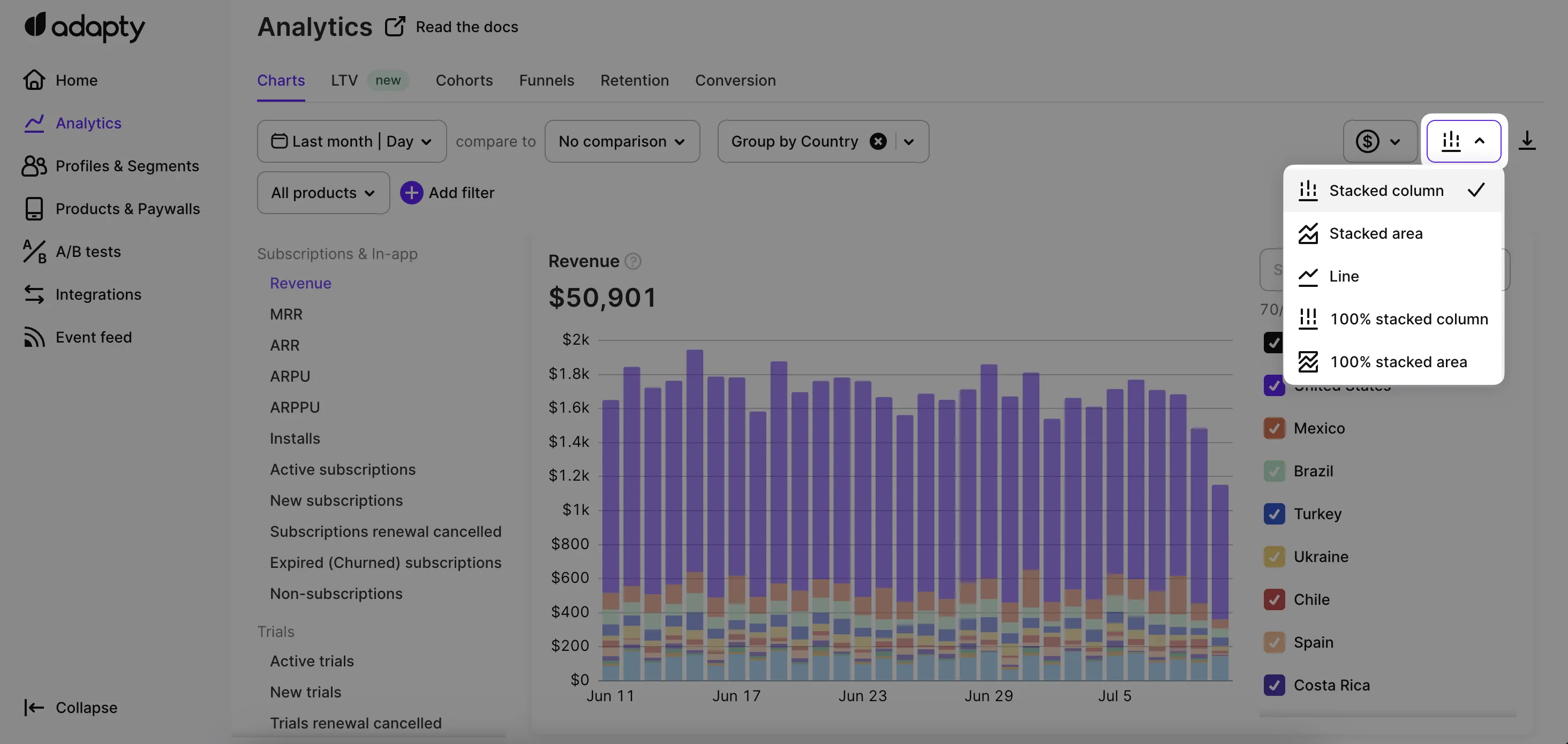
Choose how to display the chart from the visualization dropdown:
- Stacked column — each column shows the total, broken into colored segments per group.
- Stacked area — same as stacked column, but with filled-in areas connecting the data points.
- Line — one line per group, no fill.
- 100% stacked column — each column reaches the full chart height; segments show the relative share (percentage) of each group instead of actual values. Useful for proportions over time.
- 100% stacked area — same as 100% stacked column, but with filled areas instead of columns.
View data as a table
Below each chart is a table of the same data, with dates as columns. The Total row and column show aggregates not visible on the chart itself.
Export data to CSV
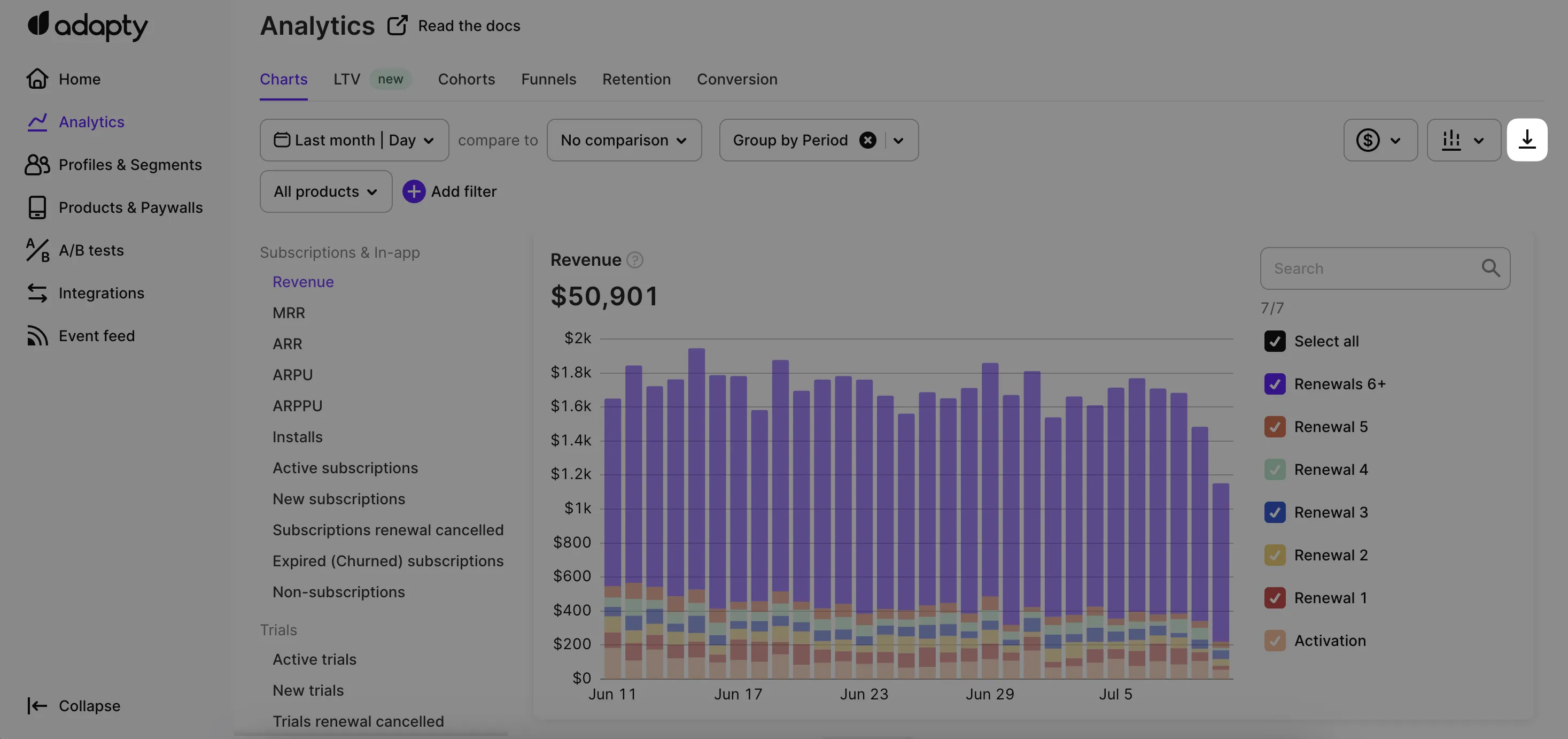
Click the Export button to download the chart’s underlying data as a CSV file.
For programmatic or scheduled access, use the Export API instead — it returns the same data as the CSV download.
Display gross or net revenue
For revenue-related charts (Revenue, MRR, ARR, ARPU, ARPPU), Adapty offers a dropdown with three display modes:
- Gross revenue — total revenue before any deductions.
- Proceeds after store commission — revenue minus the store’s commission, with taxes still included.
- Proceeds after store commission and taxes — revenue minus both commission and taxes.
For details on commission and tax calculations, see Commissions and taxes in How Adapty Analytics works.