Add and style text and lists in the Flow Builder
Add titles, paragraphs, or lists with a single click, style them to match your brand, and use dynamic variables to personalize content for each user.
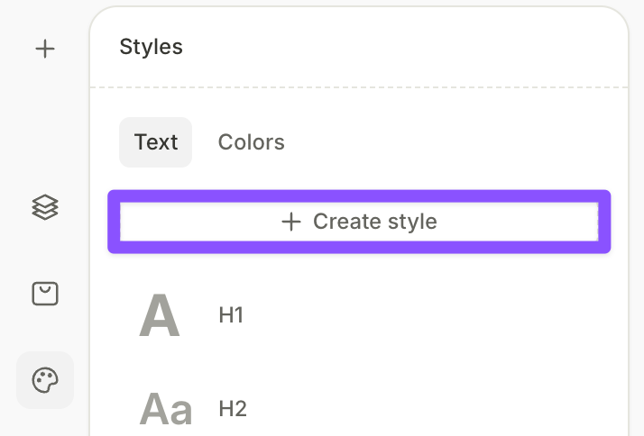
Set up text styles
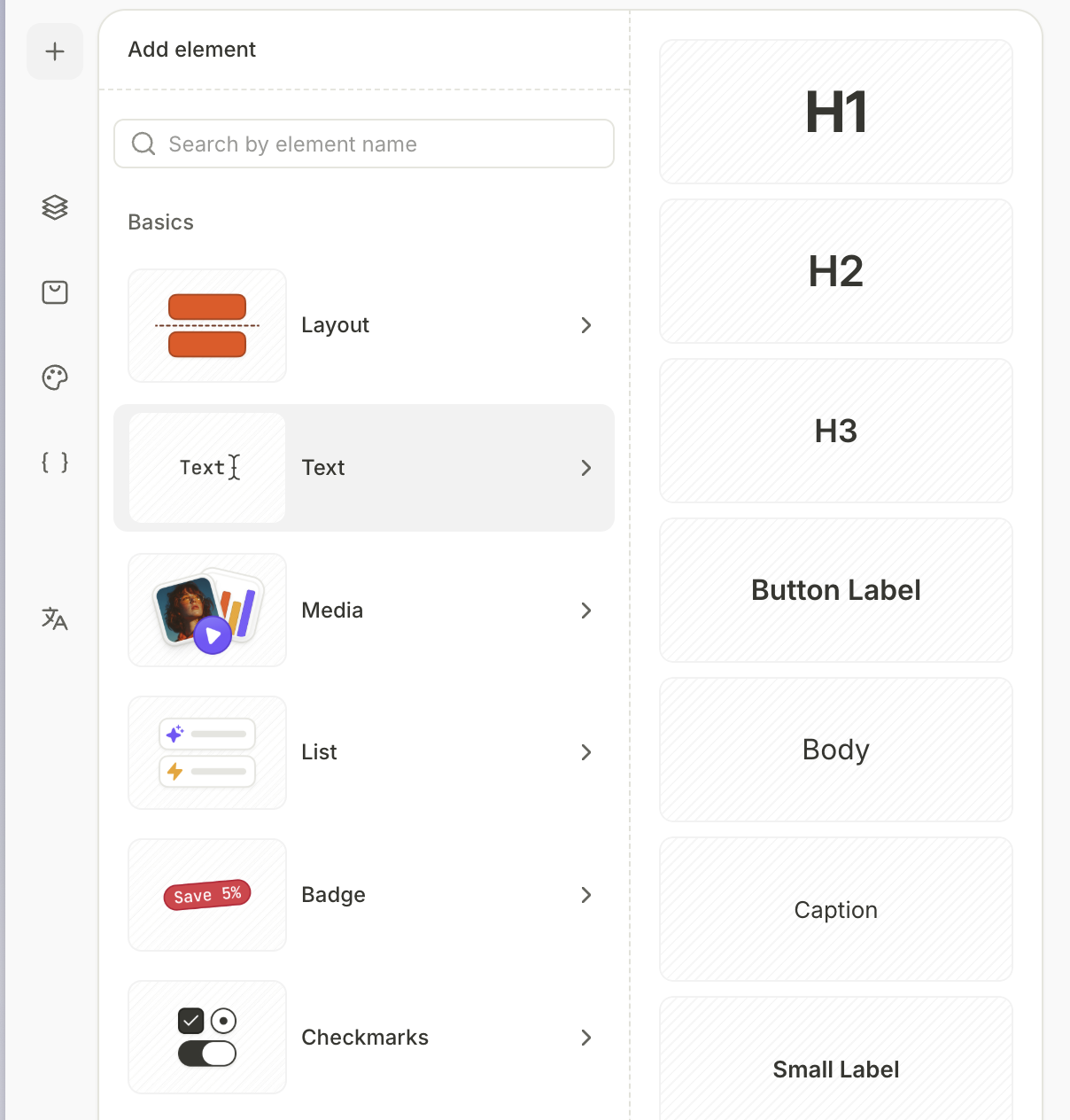
The Styles panel includes pre-configured text styles: H1, H2, H3, Button Label, Body, Caption, and Small Label. Click any style to edit its font family, weight, size, alignment, decoration, and other properties.
When you add a text element, you can choose from one of the styles you set up here.
Changes to a style apply to all text elements using it, across all screens.
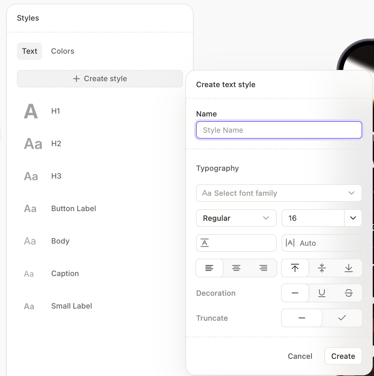
To create a new style:
- Click
 to open the Styles panel.
 - On the Text tab, click Create style.
-
Enter a name and configure the typography — font family, weight, alignment, and other properties.
Custom fonts behave differently from built-in fonts. Read the guide — some controls don’t apply, and each font variant needs its own file.
-
Click Create.
Add text
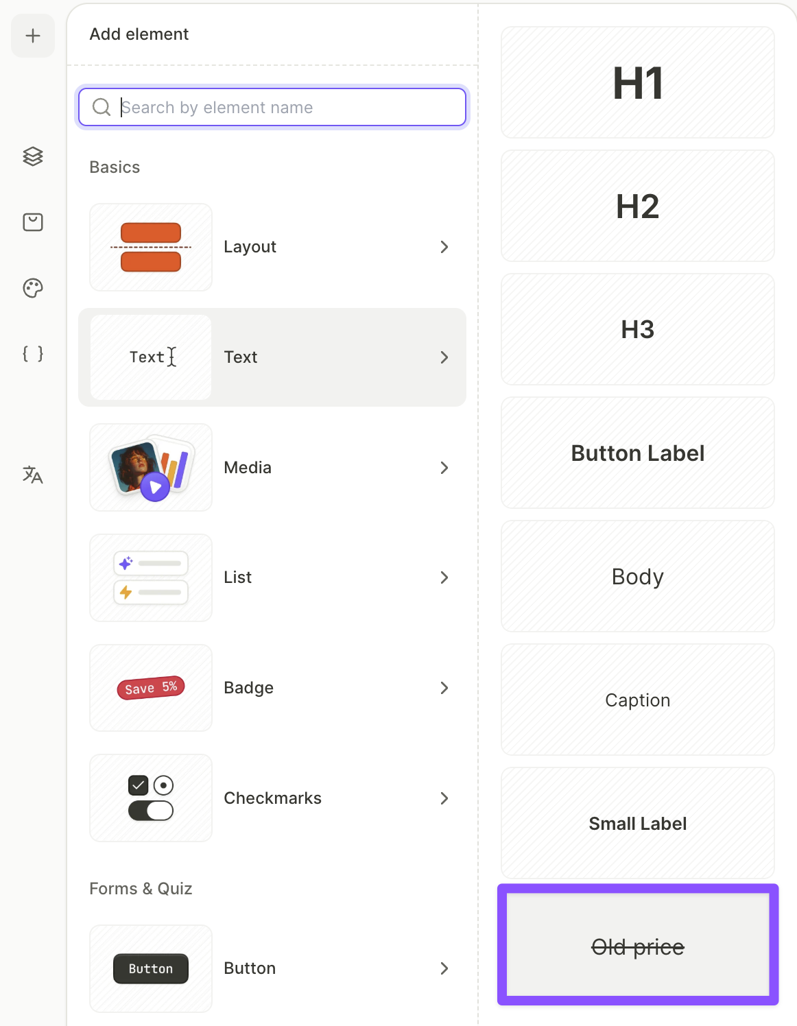
To add a text element:
- Click + at the top left. Select Text. Choose from one of the text styles that were pre-configured or set by you.
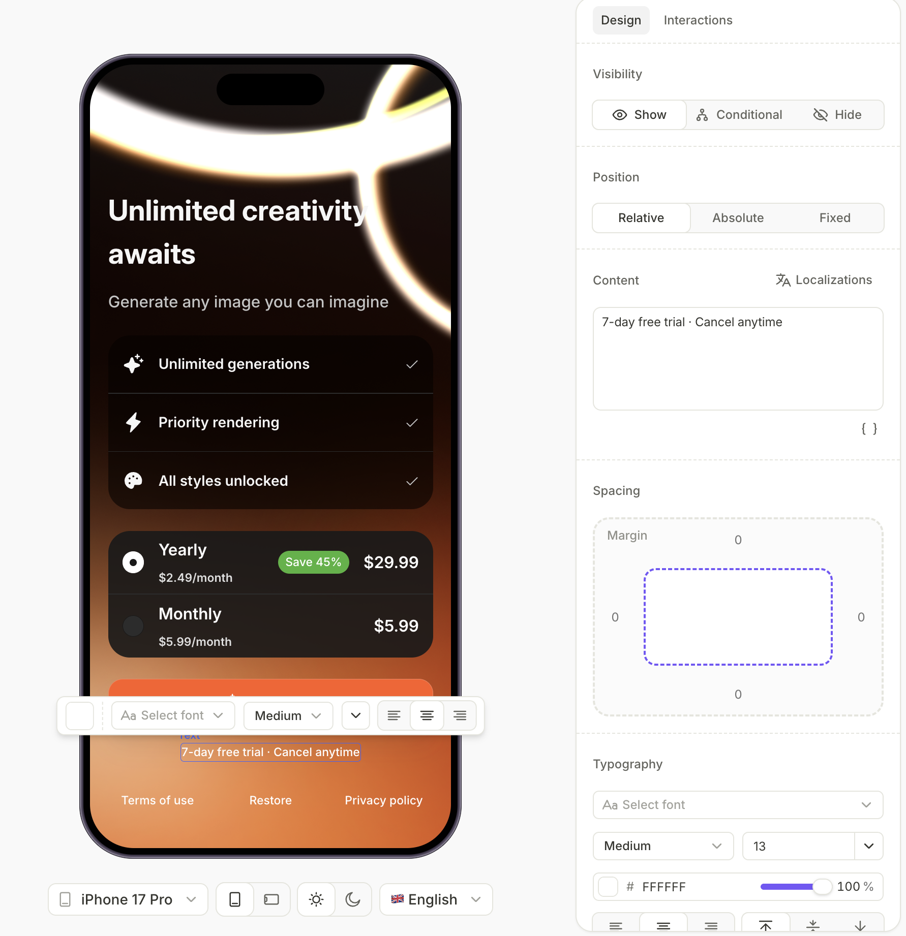
- Click the new element and edit its content in the Content section in the Design panel on the right.
- If needed, adjust the typography properties in the Design panel. Or, select the text in the preview to open a tooltip for quick style customization.
- Optionally, in the Design and Interaction panels, you can also apply any other configurations available for components in the flow. For more details, see Styles and appearance.
If you need to use the same text element on multiple screens, copy and paste it: select the element, press Ctrl+C (or ⌘+C on Mac), navigate to another screen, and press Ctrl+V (or ⌘+V on Mac) to paste.
Change styling for parts of text
Bold and Italic formatting has no effect on text using custom fonts. To apply variants of a custom font, upload each variant as a separate font file and select it from the Font family dropdown.
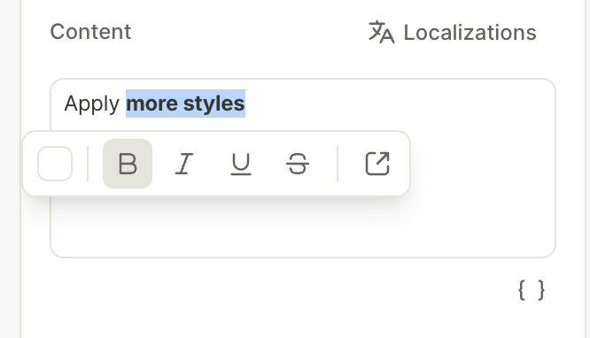
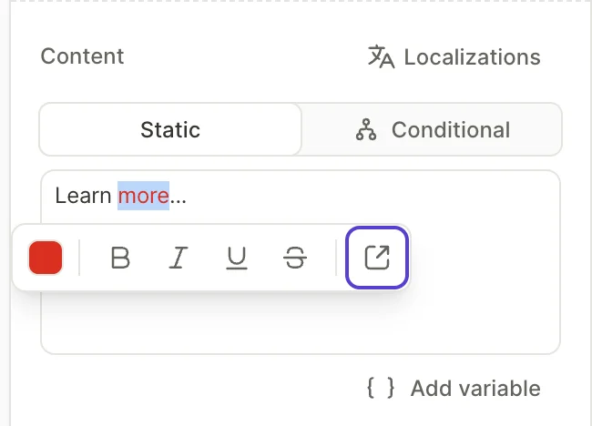
To only change the style for some parts of a text element:
- Select a part of a text element in the Content section.
- In the tooltip that appears, change the text color, apply bold, underline, italic, or strikethrough formatting, or add a URL.
The preview updates immediately.
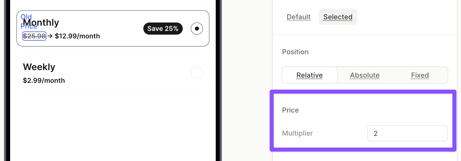
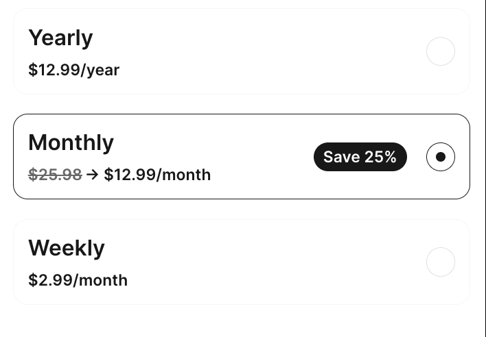
Add an old price
The Old Price element shows an inflated “before” price next to a product’s real price, so the discount is visible at a glance. It displays the product’s price multiplied by a factor you choose and crosses it out automatically.
You don’t edit the element’s content. The value is calculated from the product’s store price at runtime, so the currency always matches the real price.
To add an old price:
-
Click + at the top left. Select Text, then select Old Price.
-
In the Layers panel, drag the element inside a product card. The element also works inside product cards saved as reusable components.
The Old Price element must sit inside a product card — the price is taken from that card’s product. Outside a product card, the builder shows an “Old price” placeholder instead of a price.
-
In the Design panel, in the Price section, set the Multiplier. Adapty multiplies the product’s price by this value. For example, with the default multiplier of 2, a $12.99 product shows a crossed-out $25.98.
-
If needed, adjust the typography properties. The element supports the same styling as regular text.
To cross out another product’s real price — for example, the monthly plan’s price on a yearly card — build the price row from text elements and variables instead. See Show a strikethrough price with a discount badge.
Typography properties
Every text element and text style shares the same set of typography controls:
-
Font family: Choose a typeface — a built-in font or a custom font.
Different devices include different fonts, or may render the same font differently. If the font is not present on the device, the system will use a default font (SF Pro / Roboto). To consistently display the same font across devices, upload a custom font.
-
Weight: Set the font weight.
The Weight, Bold, and Italic controls do not apply to custom fonts, whether set in the Styles panel, the Design panel typography section, the inline toolbar, or the text-part formatting tooltip. To apply variants of a custom font, upload each variant as a separate font file and select the right one from the Font dropdown.
-
Size: Set the font size in pixels.
-
Color: Set the text color.
-
Line height: Set the spacing between lines, or leave it on Auto.
-
Alignment: Set horizontal (left, center, right) and vertical (top, middle, bottom) alignment.
-
Decoration: Apply underline or strikethrough.
-
Truncate: Limit the number of lines displayed. Text beyond that limit is truncated. Useful when content length varies due to dynamic variables or localization.
Add links
Flows support two ways to turn text into clickable links. Pick based on what role the text plays:
- Inline link — for a URL inside flowing copy, like a “Learn more” reference embedded in a paragraph. Always opens in the in-app browser.
- an Open URL action — for standalone tap targets, like a Terms of Service button. Can open in either the in-app or external browser.
Inline link
To turn part of a text element into a link:
- Select the text in the Content section.
- In the formatting tooltip, click the link icon.
- Paste the destination URL into the pop up.
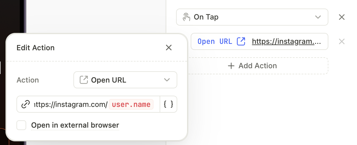
Open URL action
Main article: Actions
To turn an entire button into a link:
-
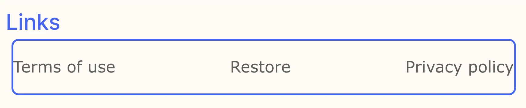
Add a Button — or use the Links preset, a ready-made row with Restore / Terms of Service / Privacy Policy buttons.
-
Select the button in the Layers panel and open the Interactions tab in the right panel.
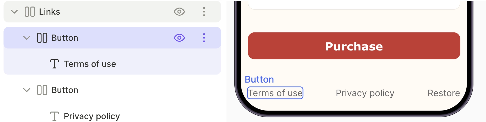
-
Set the destination for the Open URL action.
An empty Open URL action blocks previewing and publishing.
Add conditional text
Conditional text changes what a text element displays based on a condition. For example, a heading can show one message when a user selects the annual plan and a different message for the monthly plan. Conditional text works like conditional visibility, but it swaps the content instead of showing or hiding the element.
To set up conditional text:
- Select a text element on the canvas.
- In the Design panel, in the Content section, select Conditional.
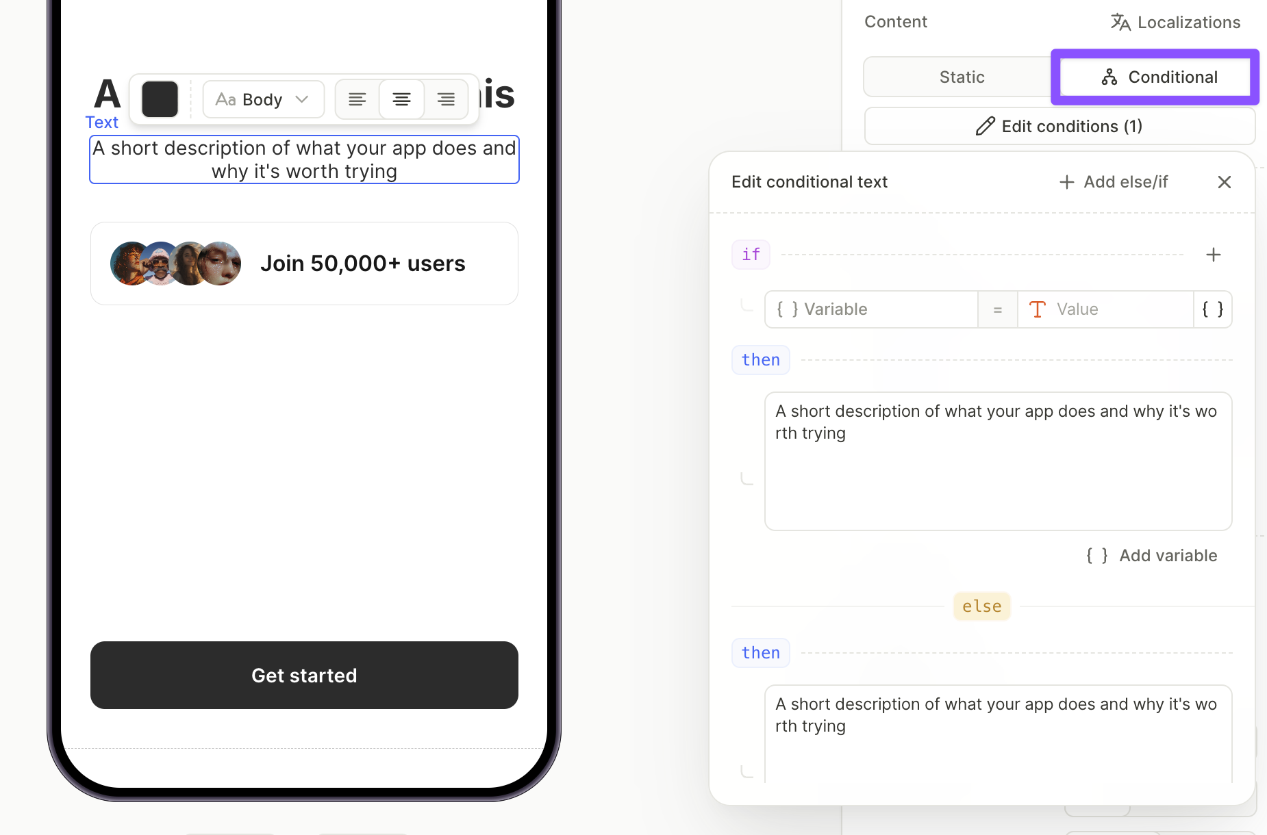
- Build the if condition. Choose a property from the Custom, Products, or Elements tab, set the operator, and enter the value to match. For details on the property types, see Conditional visibility.
- Under then, enter the text to display when the condition is true. Rich text formatting works the same way as for regular text. To insert a variable, click { } Add variable.
- Under else, enter the fallback text to display when no condition matches.
- (Optional) Click + Add else/if to add more conditions, each with its own text.
To edit conditional text for another language, switch the active locale at the bottom of the editor. Add languages in the Localizations panel first — see Add locale in Flow Builder.
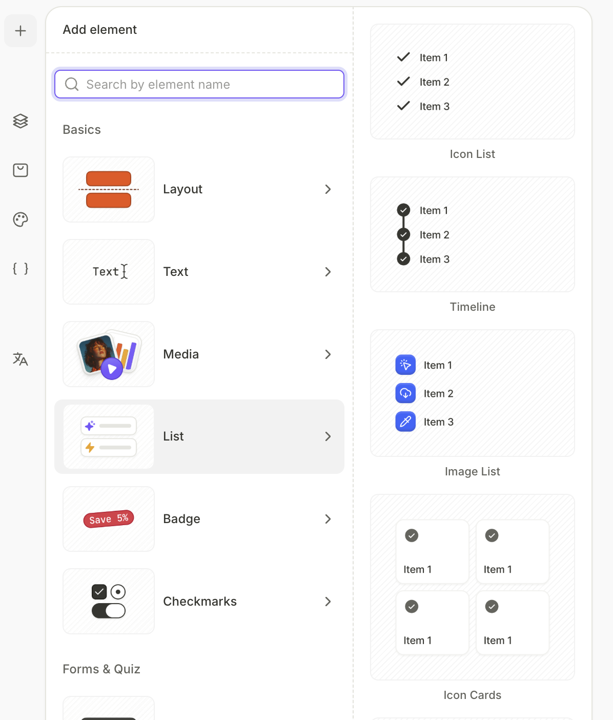
Add lists
List elements are containers made up of individual item components. For simple bullet or numbered lists within flowing text, use a text element and apply the desired formatting via the Design panel.
-
Click + at the top left. Select List and choose one of the list templates.
-
Go to the Design panel on the right to edit list items or upload an image as an item marker.