Onboarding buttons
Learn how to add and configure standard, animated, glossy, and countdown buttons in Adapty’s no-code onboarding builder. Guide users, drive conversions, and close your flow—all without writing a single line of code.
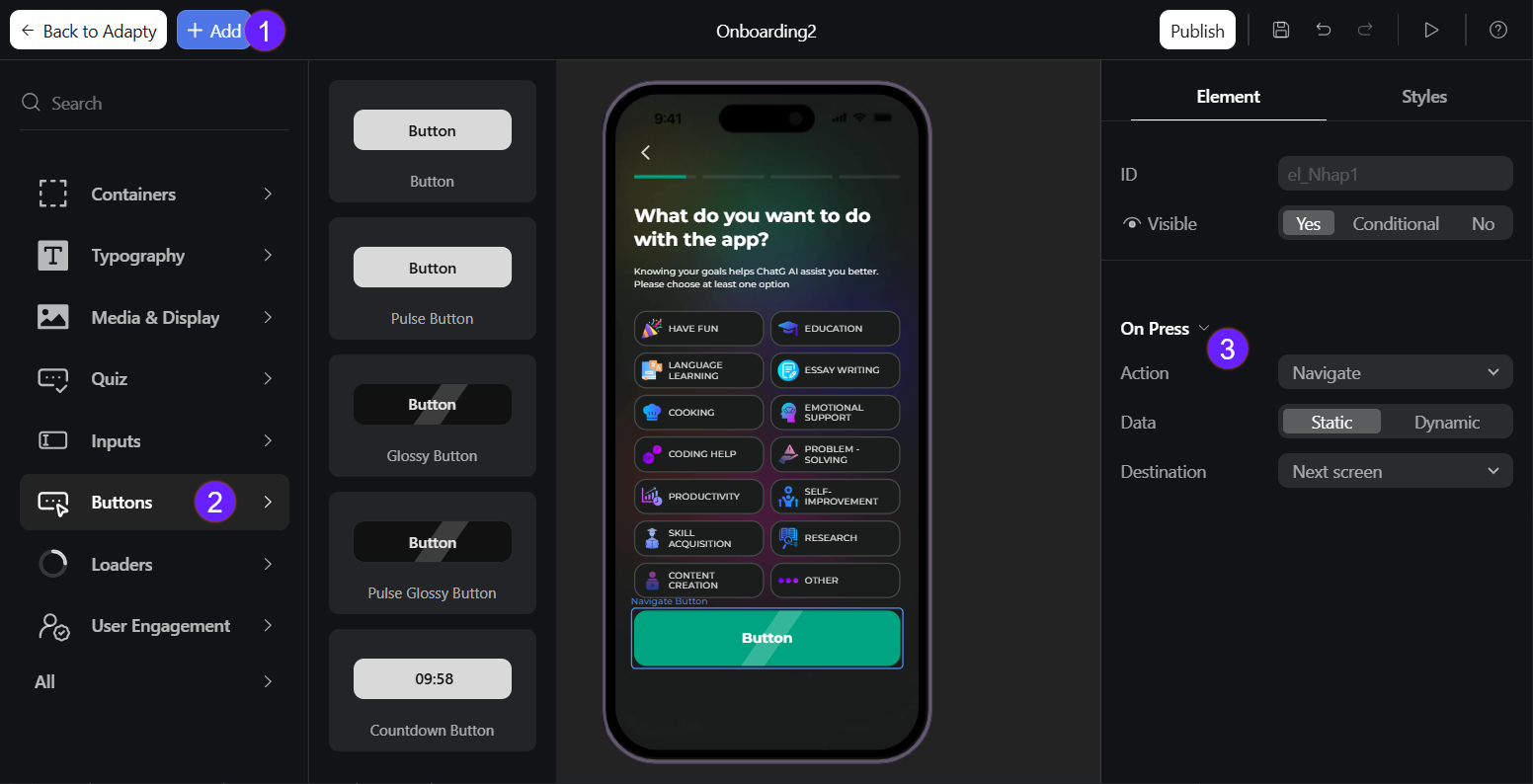
Add buttons
Use a Pulse Button to draw attention and boost click-through rates. Or add a Countdown Button on trial expiration slides to create urgency and increase upgrades.
To add a button:
- Click Add at the top left.
- Select Buttons and choose one:
- Button
- Pulse Button
- Glossy Button
- Pulse Glossy Button
- Countdown Button
- Choose the button action from the On Press dropdown on the right:
- Navigate: Moves the user to a specified onboarding screen.
- Show/Hide element: Shows or hides a target element.
- Open paywall: Opens the paywall screen for purchases. Learn how to handle opening paywall on iOS, Android, React Native, and Flutter.
- Scroll to: Scrolls the page to a specific element.
- Custom: Runs your custom event logic. For example, ut can be used for opening a login window or requesting the app permissions. Learn how to handle custom action on iOS, Android, React Native, and Flutter.
- Close onboarding: Closes the onboarding flow. Learn how to handle onboarding closure on iOS, Android,React Native, and Flutter.
To edit button text, click the button preview and make your changes in WYSIWYG mode.
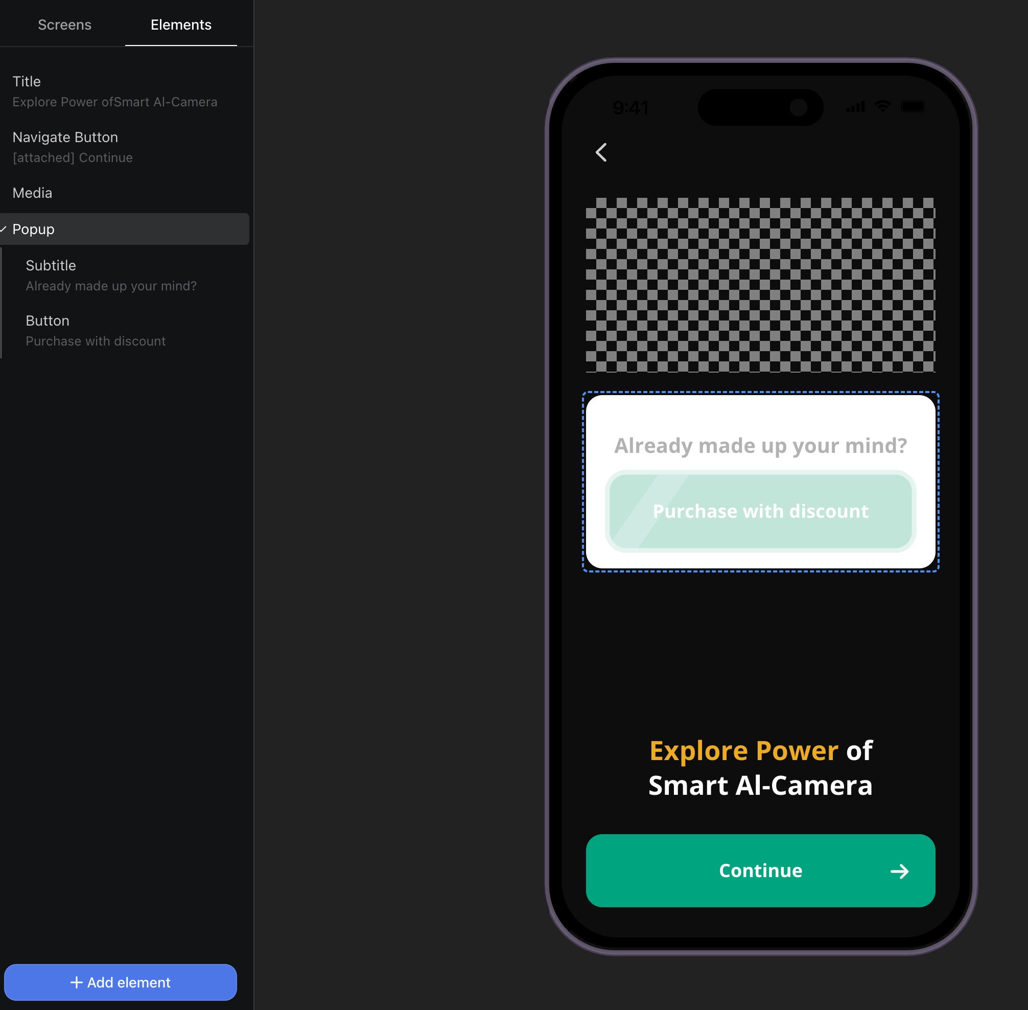
Nest a popup with a Pulse Glossy Button to upsell premium features mid‑flow.
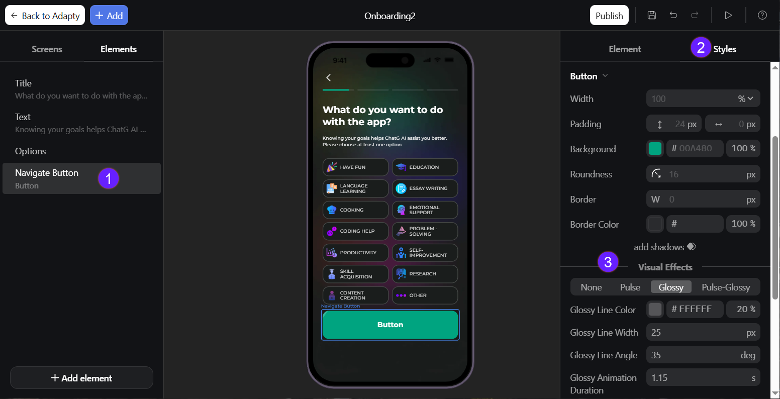
Button customization
Beyond the basic element layout, you can customize button appearance:
- Select the button element on the left.
- Go to Styles in the right menu.
- Based on the button type, you can adjust these options:
- All buttons: Width, padding, background, roundness, border, border color, shadows, next arrow and arrow size, right offset, text or countdown color, font, and line height.
- Pulse Button: Animation duration and easing, shadow color and size, button grow.
- Glossy Button: Glossy line color, width, angle, and animation duration.
- Pulse Glossy Button: Animation duration and easing, shadow color and size, button grow, glossy line color, width, angle, and animation duration.