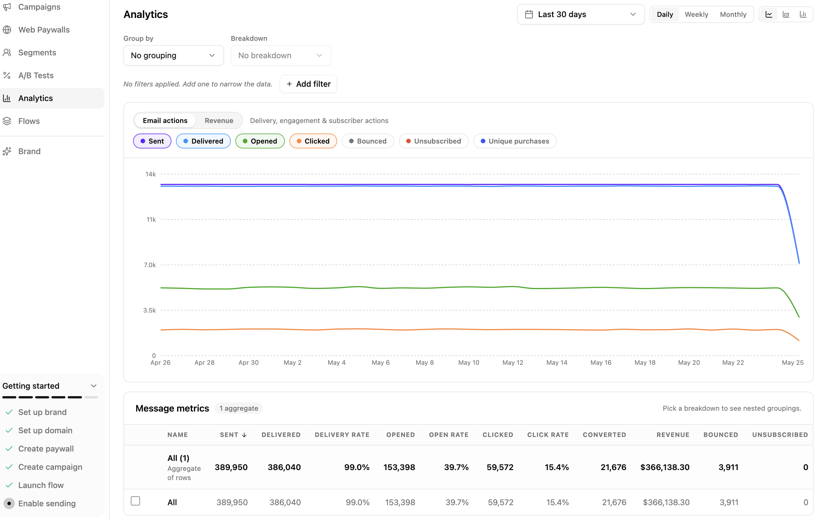
Analytics in Adapty Mail
The Analytics page shows how your campaigns perform across five dimensions: campaign, segment, A/B variant, message, and trigger. It pairs delivery metrics with the revenue attributed to each email, so you can compare variants, find the best-performing segments, and spot where revenue concentrates.
The page has a chart on top and a breakdown table below. Click any row to drill into a single entity.
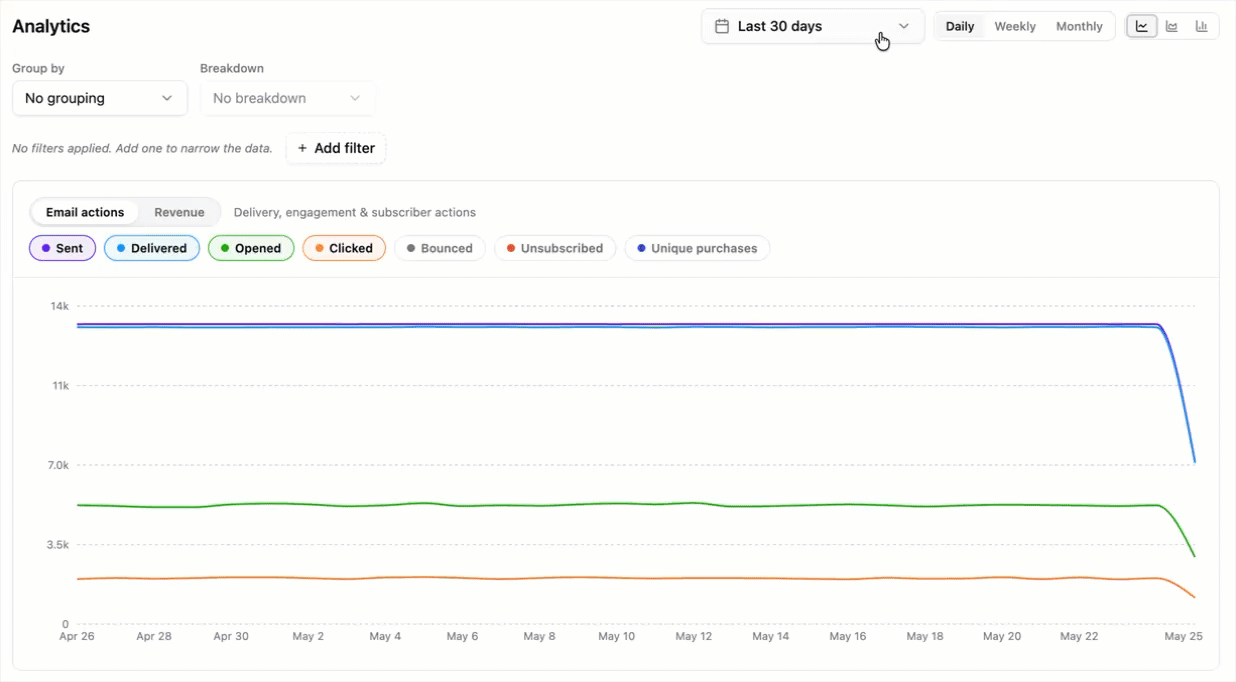
Pick a time range
The toolbar at the top of the page controls the time window and how it’s bucketed:
- Date range: Presets (Last 7 / 14 / 30 / 90 days, This month, Last month, Last 12 months, Year to date) or a Custom range picker. The default is the last 30 days.
- Granularity: Daily, Weekly, or Monthly buckets. Granularity coarsens automatically when the range grows — Daily switches to Weekly past 92 days, and both switch to Monthly past 366 days.
- Chart style: Line, Area, or Bar.
If the page shows a “range too wide” warning, narrow the date range, coarsen the granularity, or apply filters.
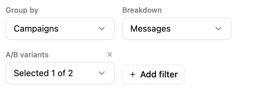
Group, break down, filter
Three controls below the toolbar shape what the chart and table show:
- Group by: The dimension that splits the dataset into rows. Options are Campaigns, Segments, A/B variants, and Triggers. With No grouping, the page collapses everything into a single aggregate All row.
- Breakdown: A second dimension that splits each row into sub-rows. With both Group by and Breakdown set, every row in the table can be expanded to show its sub-groups. Breakdown can be any dimension — including Messages — except the one already used as Group by.
- Add filter: Restrict the dataset to specific campaigns, segments, A/B variants, or triggers. Filters apply to both the chart and the table.
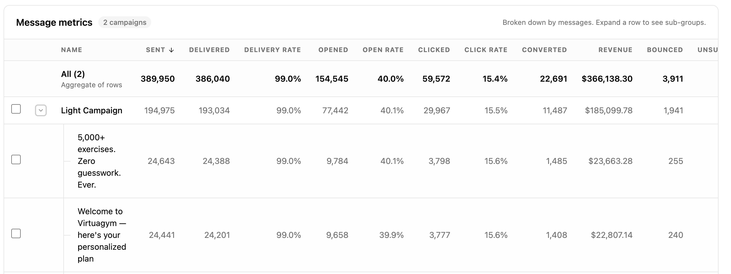
Messages is available as a breakdown but not as a top-level Group by or filter. To analyze individual messages, group by Campaigns with a Messages breakdown, then expand the campaign row or open a message from the drilldown.
Read the chart
The chart renders the metrics you select over the chosen time range.
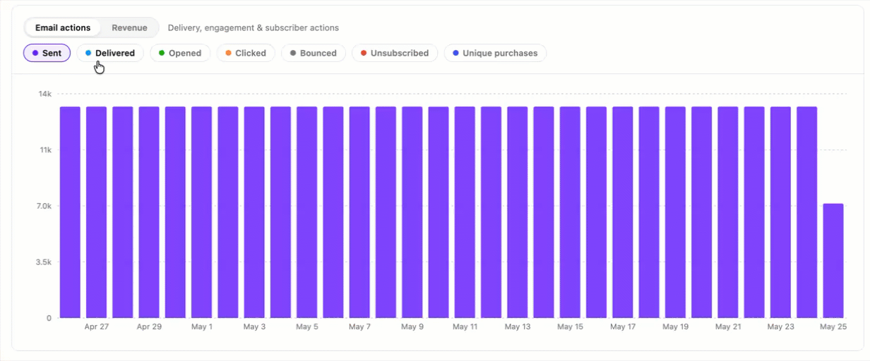
- Metric category: Toggle between Email actions (Sent, Delivered, Opened, Clicked, Bounced, Unsubscribed, Converted) and Revenue.
- Metric pills: Pick which metrics to plot. In aggregate mode (no grouping), you can plot multiple metrics on the same chart. With grouping on, the chart plots a single metric — one line per group — so groups stay visually distinct.
- Legend: When grouping is on, the legend on the right lists every group and lets you toggle a series on or off.
The visibility checkboxes in the metrics table below also control which rows appear on the chart.
Read the metrics table
Below the chart, the metrics table lists one row per group. A summary row at the top aggregates every other row in the table.
- Sortable columns: Click any column header to sort by Name, Sent, Delivered, Delivery rate, Opened, Open rate, Clicked, Click rate, Converted, Revenue, Bounced, or Unsubscribed.
- Visibility checkbox: Toggle whether a row appears on the chart.
- Expand row: When a Breakdown is set, the chevron on the left of each row expands it into its sub-groups.
- Open the drilldown: Click a row’s name to open the focused view for that entity.
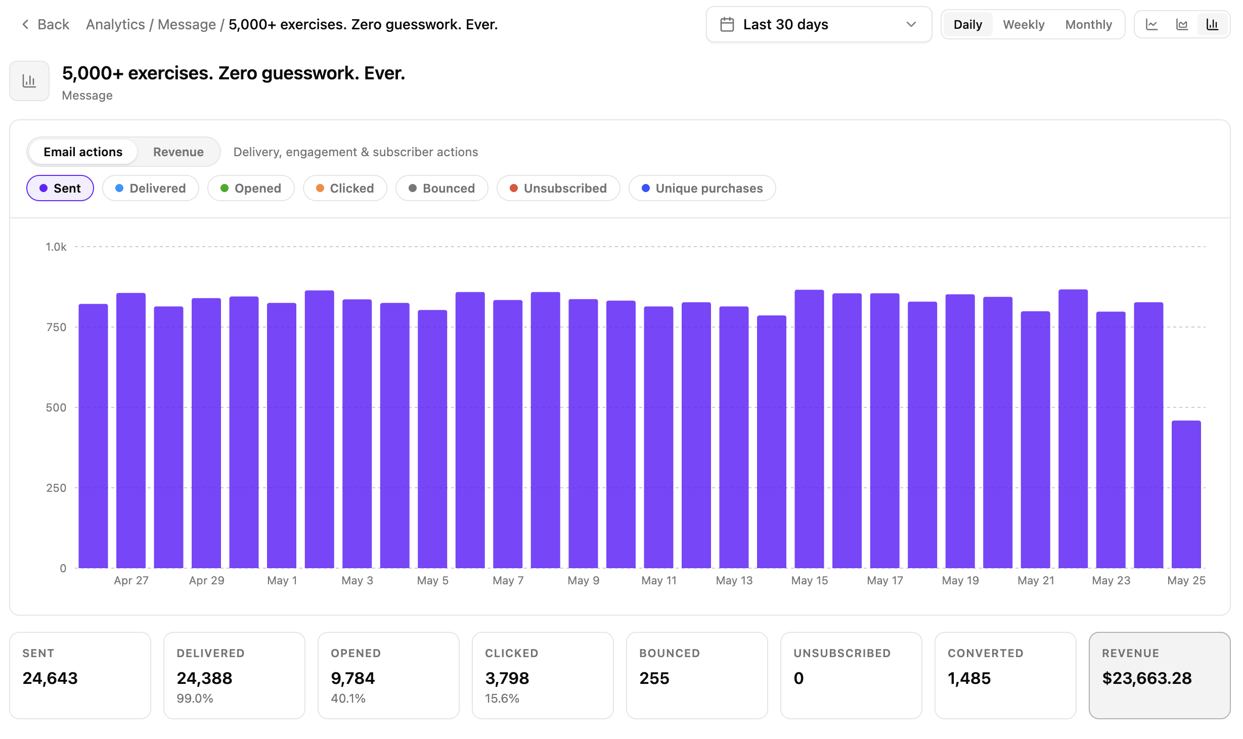
The drilldown shows:
- The same chart and metric selector as the main page, scoped to one entity.
- Eight summary cards at the bottom: Sent, Delivered (with delivery rate), Opened (with open rate), Clicked (with click rate), Bounced, Unsubscribed, Converted, and Revenue.
The date range and granularity carry over from the main page. Use Back in the breadcrumb to return.
What’s tracked
Each row — on the Analytics page, in the drilldown, and in the inline views described below — exposes the same set of raw counts:
- Sent: Emails dispatched to SES.
- Delivered: SES-confirmed inbox deliveries.
- Bounced: SES-reported bounces. Hard and soft bounces aren’t distinguished — both count as one Bounced.
- Opened: Pixel loads. Apple Mail Privacy Protection pre-fetches images on iOS 15+ and inflates this count — rely on clicks and revenue for stronger signals.
- Clicked: Link clicks in the email body.
- Unsubscribed: Unsubscribes from the footer link or the
List-Unsubscribeheader. - Converted: Unique profiles in the group with an attributed purchase in the time range. Conversions are bucketed by the purchase date — a click in March followed by a buy in April counts in April. A profile that purchases more than once still counts once.
- Revenue: Sum of attributed revenue (USD) across subscription starts, renewals, and one-time purchases.
Derived rates
Each rate is computed from the raw counts above:
| Rate | Formula |
|---|---|
| Delivery rate | Delivered / Sent |
| Open rate | Opened / Delivered |
| Click rate | Clicked / Delivered |
The drilldown shows the same three rates next to its summary cards.
Revenue attribution
Revenue is attributed via last-click on a tracked link:
- When a recipient clicks any link in an email, Adapty Mail stores the
scheduled_email_idagainst that profile in a short-term store. - If a purchase event arrives afterward with no existing attribution, Adapty Mail back-fills the stored
scheduled_email_idonto the transaction — provided the purchase timestamp is after the click. - Purchases without a preceding tracked click stay unattributed.
The tracked parameter is scheduled_email_id. The checkout URL also carries the recipient’s identity via the {email} and {external_profile_id} placeholders so the web paywall can personalize the flow — that’s a separate mechanism from attribution. See Set up checkout.
Inline analytics in Flows and A/B Tests
The same metrics also appear inline next to the rows being measured:
- Flows page: Each segment row in a trigger view shows its delivery, engagement, and revenue counts.
- A/B Tests page: Variations are listed side by side with the same metric set, which is convenient for comparing variants directly.
Use the Analytics page when comparing across campaigns or drilling into a single entity, and the inline views when you’re already working in a specific flow row or A/B test. The metric definitions, derived rates, and attribution rules above apply identically across all three views.
Limitations
- No soft vs. hard bounce distinction: Every bounce — temporary or permanent — collapses into a single Bounced count.
- Eventual consistency, not real-time: Counts are aggregated from event tables. Fresh events usually appear within minutes, but there’s no streaming guarantee.
- Range size is capped: Very wide date ranges combined with fine granularity may exceed the chart’s cell cap. The page shows this as a “range too wide” warning — narrow the range, coarsen the granularity, or apply filters.