Elements
To open the element library and add a new element to a screen, click the plus button in the left panel or above the device preview.
Elements fall into the following categories:
- Basics (layout containers, text, media, lists, badges, check marks)
- Forms & Quiz (buttons, inputs, quizzes, tabs)
- Paywall & Commerce (products, trial toggle, user engagement, countdown)
- Progress indicators and loaders
For each element, Adapty offers multiple presets — templates with placeholder content or pre-defined interactions.
Basics
Layout
Main article: Layout Elements
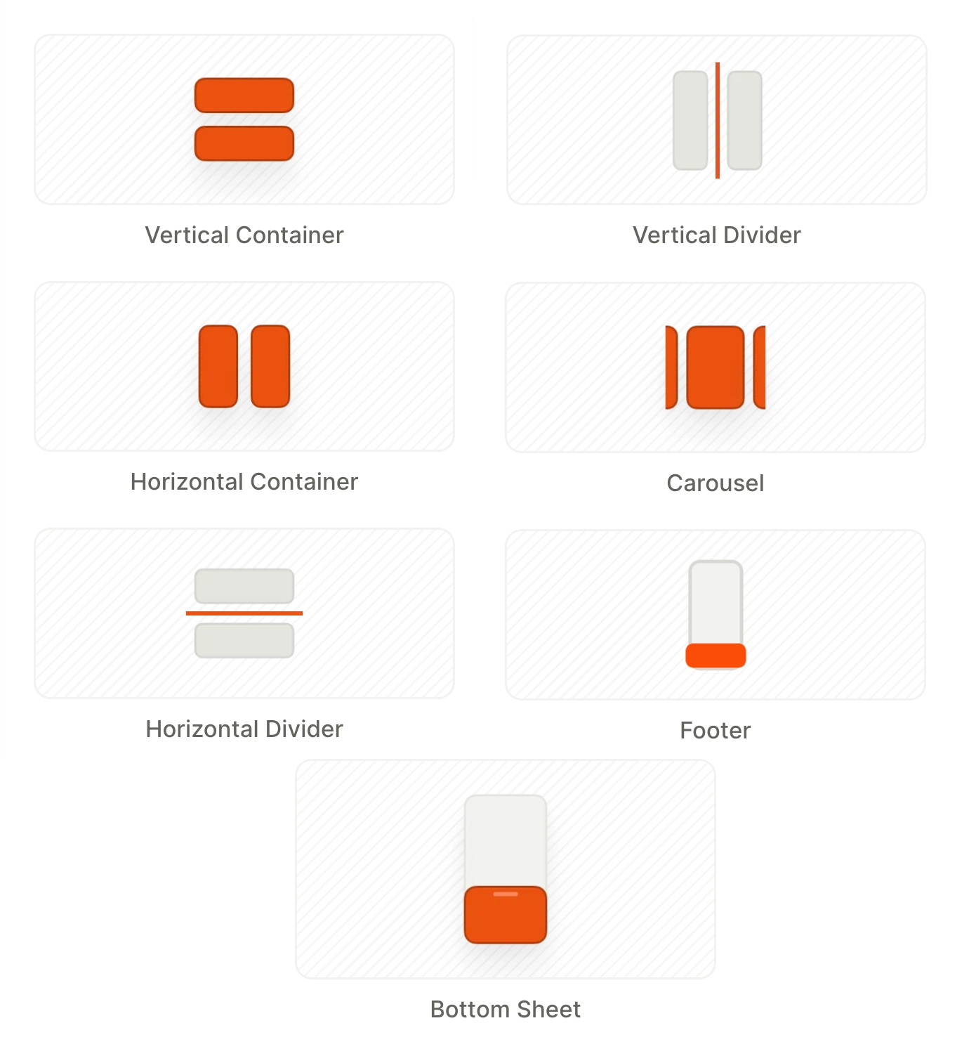
Layout elements are containers that organize elements inside them.
- Vertical Container: arranges child elements from top to bottom
- Horizontal Container: arranges child elements from left to right
- Dividers (horizontal and vertical): lines that visually separate content sections
- Carousel: a swipeable container
- Footer: a panel pinned to the screen bottom, outside the scroll area
- Bottom Sheet: a slide-up panel anchored to the bottom of the screen
Text
Main article: Text content
Text can be static or include variables (e.g., user name) and localized content.
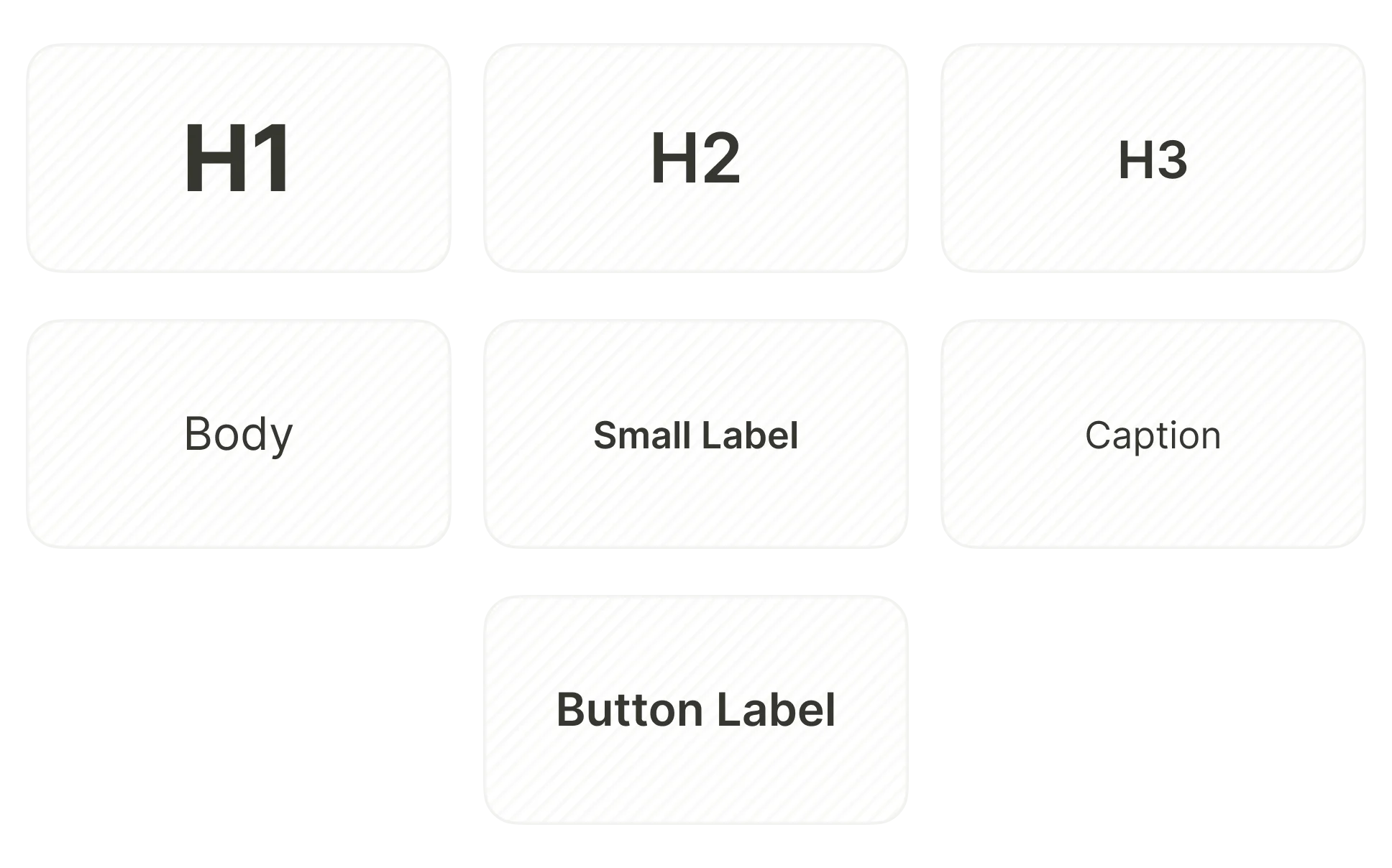
The following text presets come standard. To change this list, add or remove saved text styles:
- H1
- H2
- H3
- Button Label
- Body
- Caption
- Small Label
The Text menu also includes the Old Price element — a crossed-out product price calculated automatically from a multiplier. See Add an old price.
Media
Main article: Images, videos, and icons
This section describes foreground media elements. Change the screen background to fill the entire screen with an image or a video.
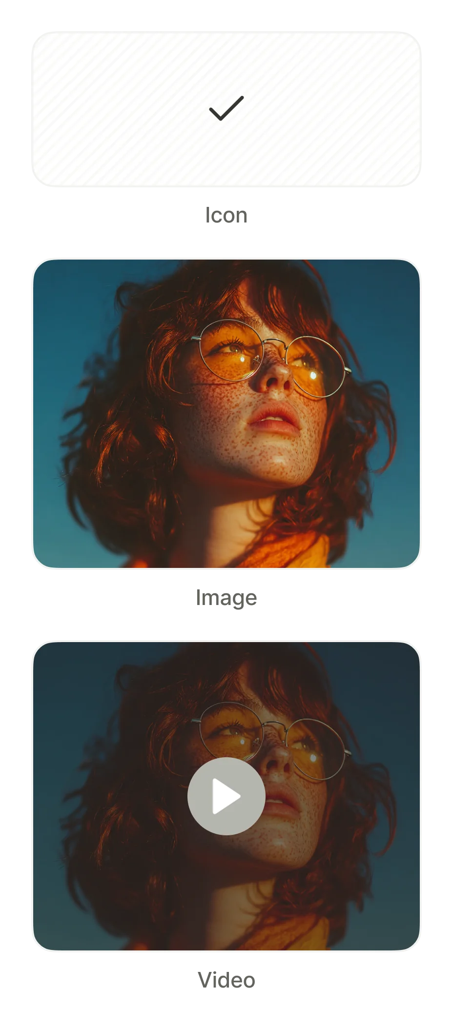
- Icon: a vector icon from the built-in icon library, with customizable size and color
- Image: an image — upload your own or provide a URL
- Video: An embedded video player for files up to 50MB. Supports looping.
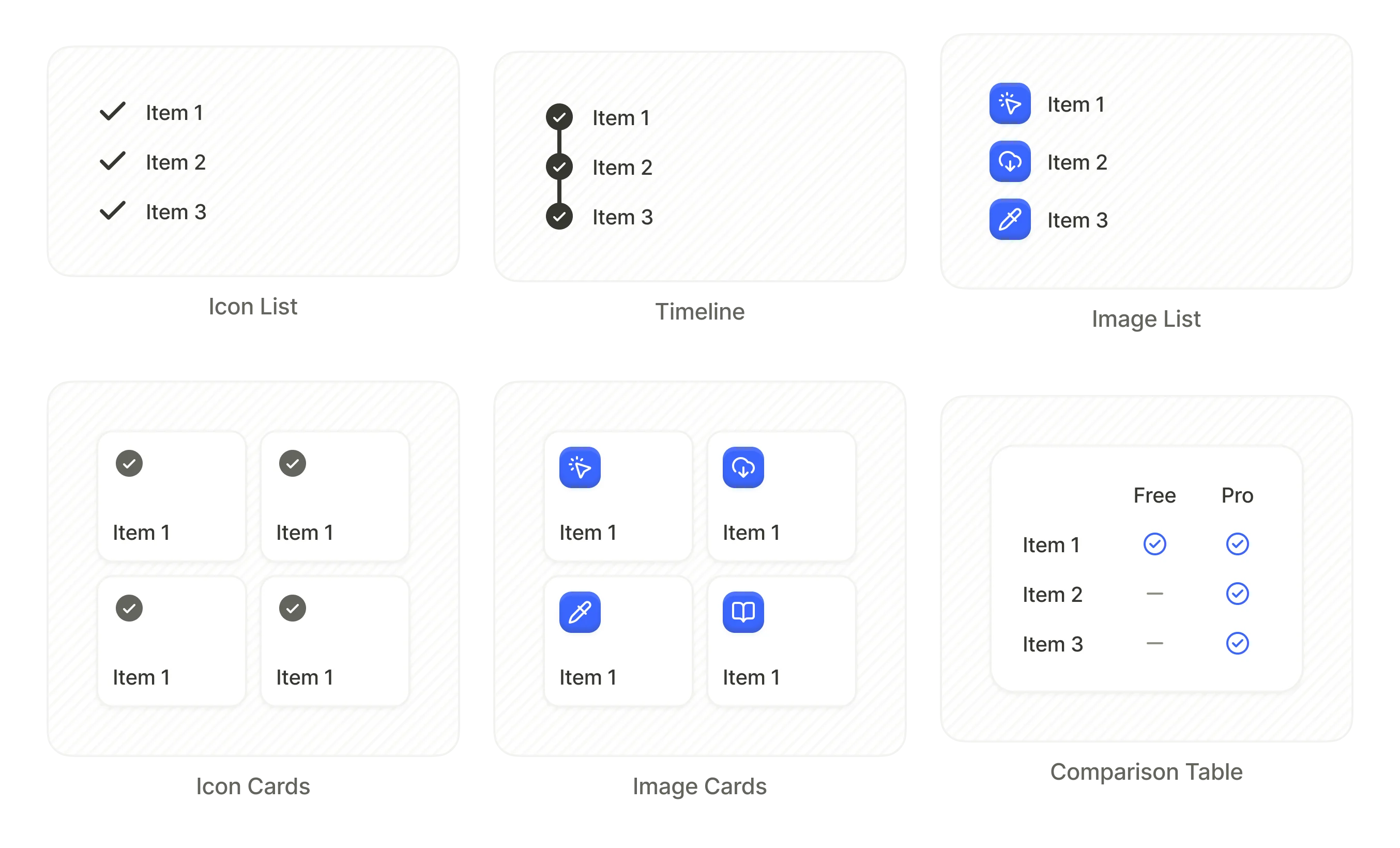
List
List elements organize content into rows and columns to display uniformly formatted data. Under the hood, a list is a container.
- Icon List: rows with a leading icon and text label
- Timeline: vertical sequence with connected step indicators
- Image List: rows with a leading image and text
- Icon Cards: grid of cards with centered icons
- Image Cards: grid of cards with images
- Comparison Table: multi-column table comparing features across plans (e.g., Free vs Pro)
Badge
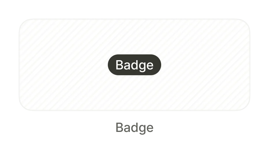
A small overlay label to highlight an element — typically used to promote discounts or specific plans (e.g., “Save 5%”). Use absolute positioning to place a badge over a different element.
Checkmarks
Selection indicator icons for use inside selectable elements. Each checkmark preset includes an on and off state that updates automatically based on user selection.
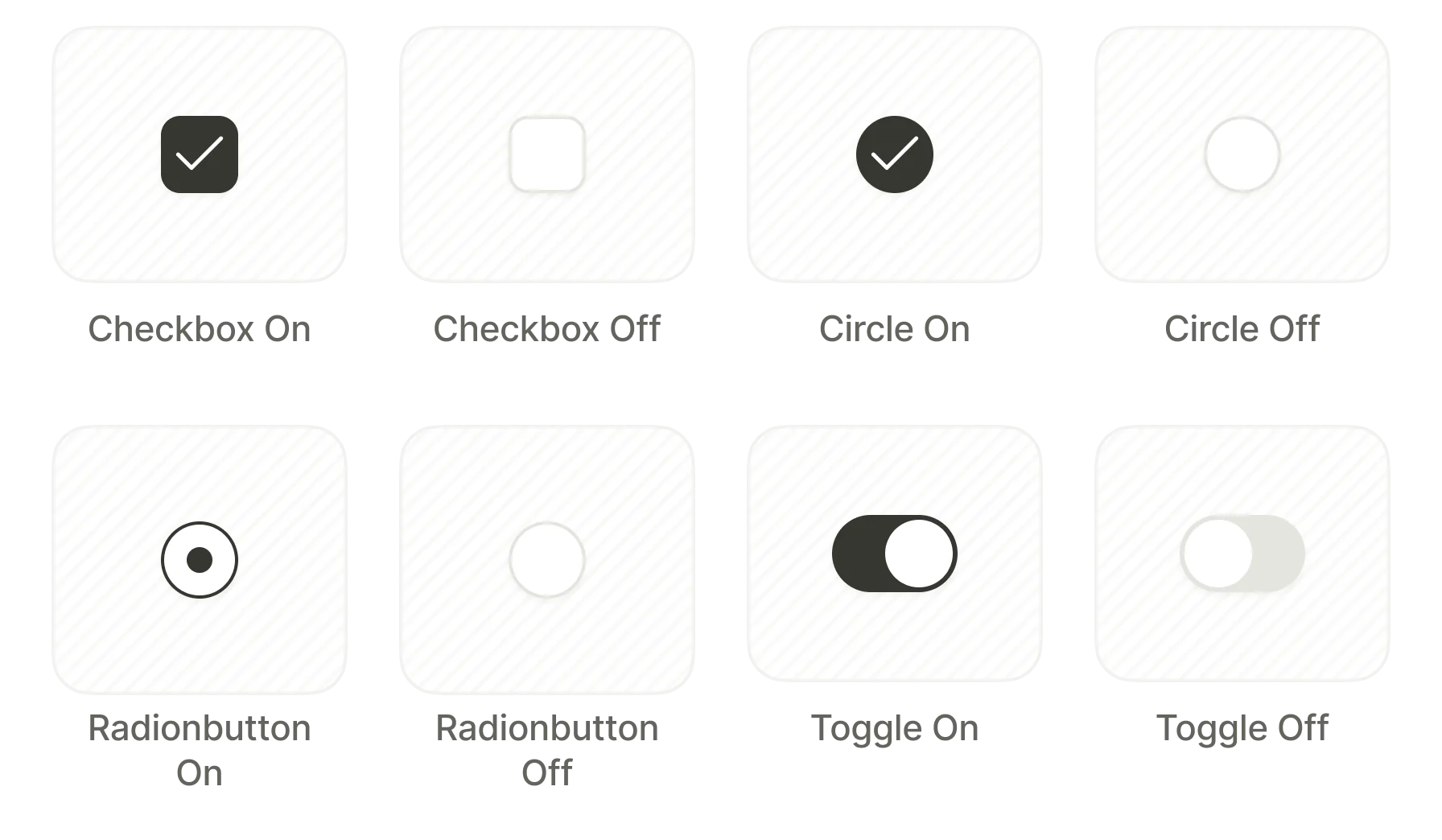
- Checkbox
- Circle
- Radiobutton
- Toggle
Forms & Quiz
Buttons
Main article: Buttons
Buttons trigger actions when tapped — navigating to another screen, opening a URL, or dismissing the flow.
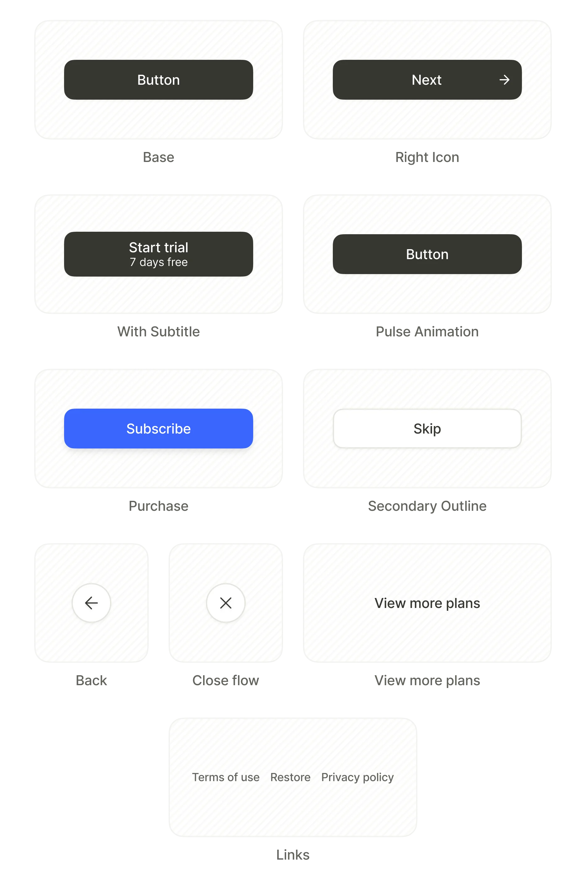
Every preset is a starting point — restyle it and assign any action. Configure button behavior in the Interactions tab.
- Base: regular button with centered text
- Right Icon: button with an icon on the right side
- With Subtitle: includes two lines of text
- Pulse Animation: includes an animated pulse effect
- Purchase: triggers a purchase
- Secondary Outline: outlined button for secondary actions
- Back: navigate to the previous screen
- Close flow: exit the flow
- View more plans: reveal additional product options
- Links: a set of footer buttons (Restore, Terms of Service, Privacy Policy)
Inputs
Main article: Inputs and forms
Input fields allow users to enter data. Each enforces an appropriate input method and validation rules.
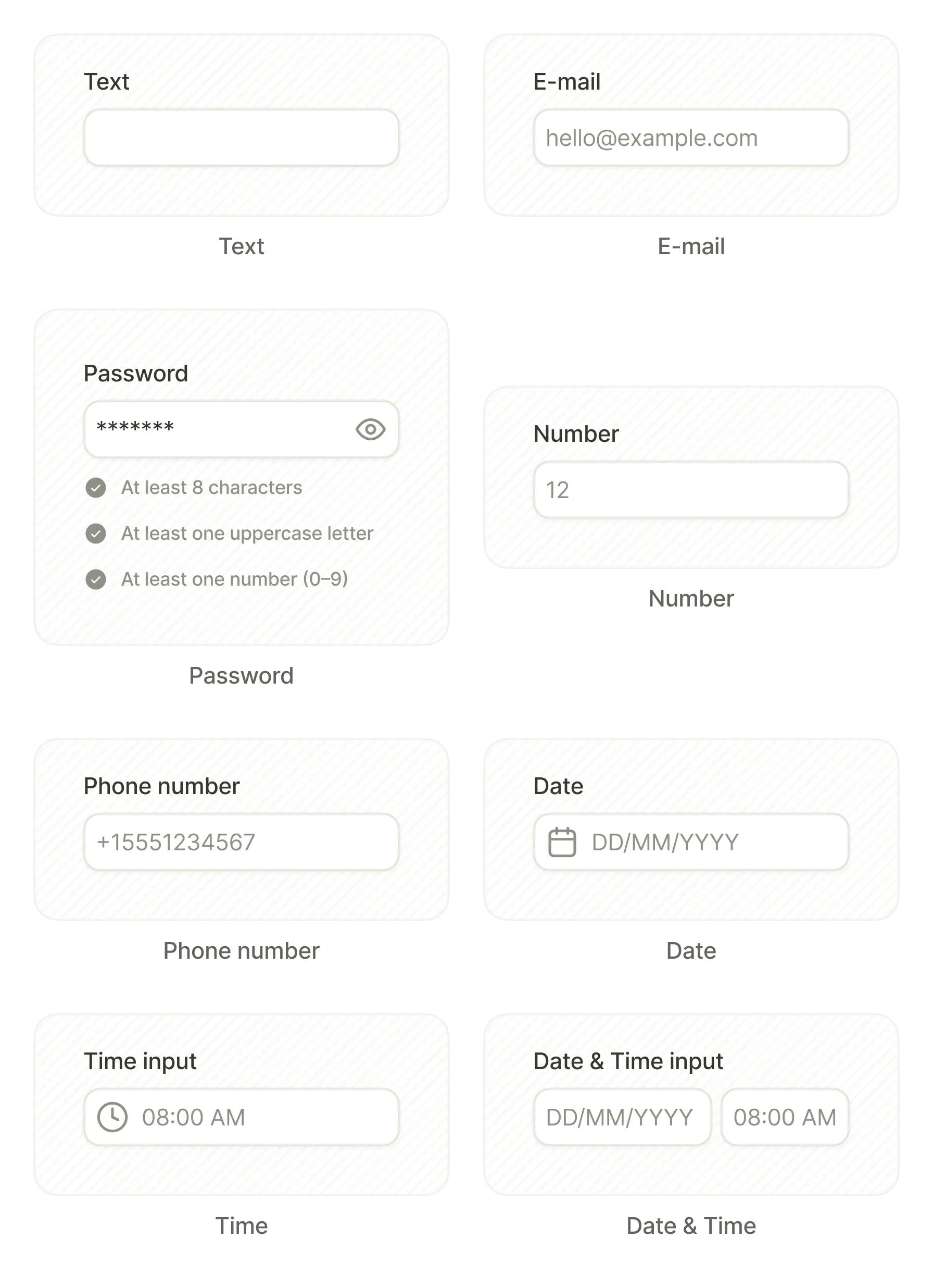
- Text
- Password
- Number
- Phone number
- Date
- Time
- Date & Time
Date, Time, and Date & Time inputs open the device’s native picker (wheel or calendar) when tapped.
Use variables to process user input and influence conditional logic.
Quizzes
Main article: Surveys and quizzes
Quiz elements present multi-option selection screens for surveys, preference collection, and user segmentation. Set up interactions to branch the flow based on the user’s answer.
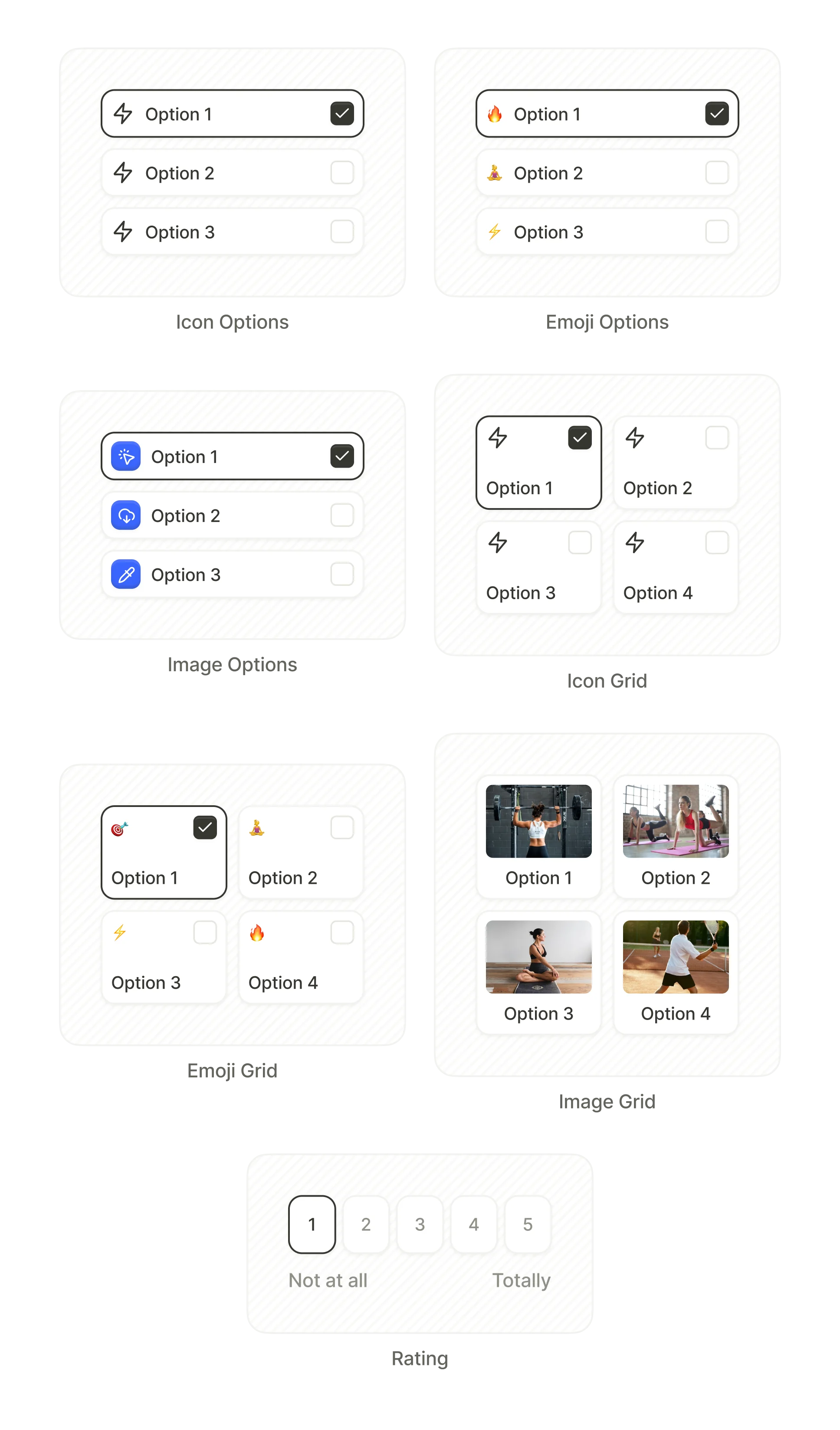
- Icon Options: single-column list with icons
- Emoji Options: single-column list with emojis
- Image Options: single-column list with images
- Icon Grid: multi-column grid with icons
- Emoji Grid: multi-column grid with emojis
- Image Grid: multi-column grid with photos
- Rating: numbered scale (e.g., 1–5)
Tabs
Main article: Tabs
Tabs split a screen section into switchable content panels. The user selects a tab, and the content below updates to match. Commonly used for grouping product plans or toggling between monthly and yearly pricing.
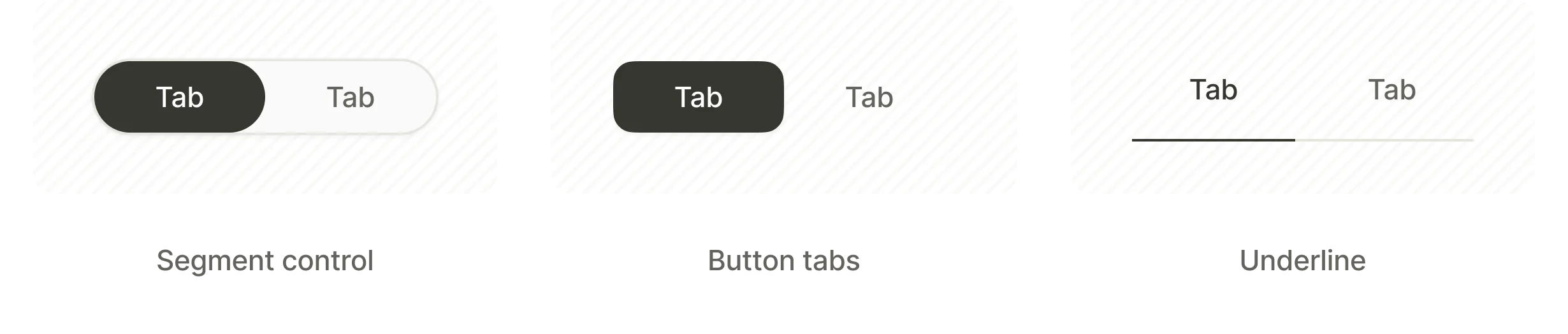
- Segment control: pill-shaped switcher with rounded corners around the selected tab
- Button Tabs: separate button-styled tabs
- Underline: text labels with an underline marking the selected tab
Paywall & Commerce
Products
Main article: Products
Product elements display in-app purchase details and handle product selection. Each preset arranges product data in a different layout. Link your products to populate the elements with real data from Adapty.
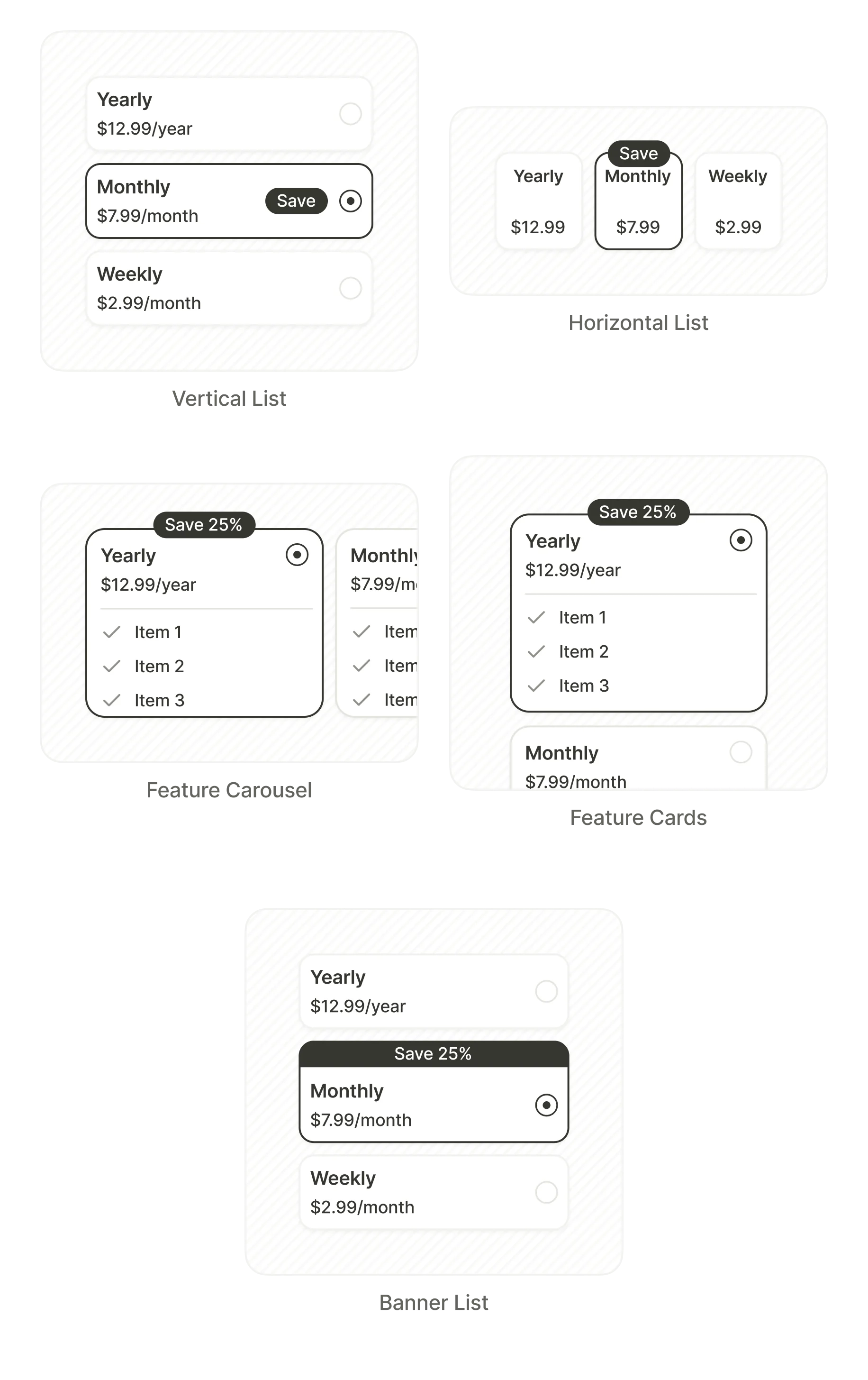
- Vertical List: stacked product cards
- Horizontal List: side-by-side product cards
- Feature Carousel: swipe-able cards with feature checklists
- Feature Cards: static cards with feature checklists
- Banner List: compact rows with inline badges
Trial toggle
Main article: Toggles
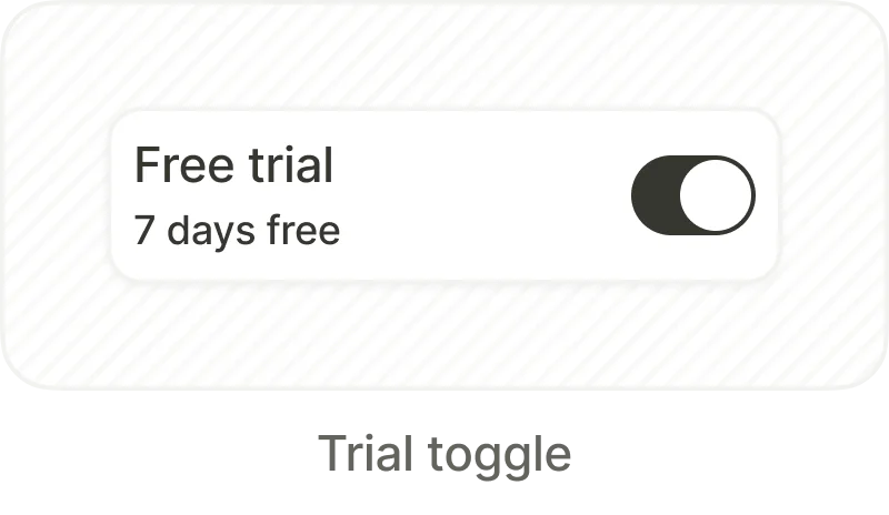
A toggle that switches the displayed product between its standard price and its free trial offer. When activated, the product selection and element state updates automatically.
User engagement
Pre-styled blocks with user ratings that build trust and encourage conversion. The templates are basic containers with placeholder content.
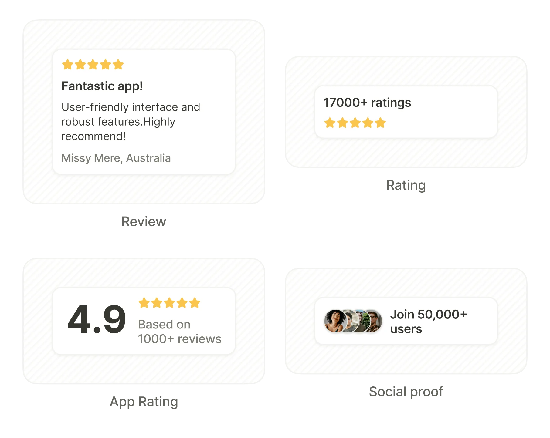
- Review: a star rating with a review and the reviewer’s name
- Rating: a numeric score with star display
- App Rating: a large score with a star bar and a review count
- Social Proof: an avatar stack with a user count
Countdown
Main article: Countdown timer
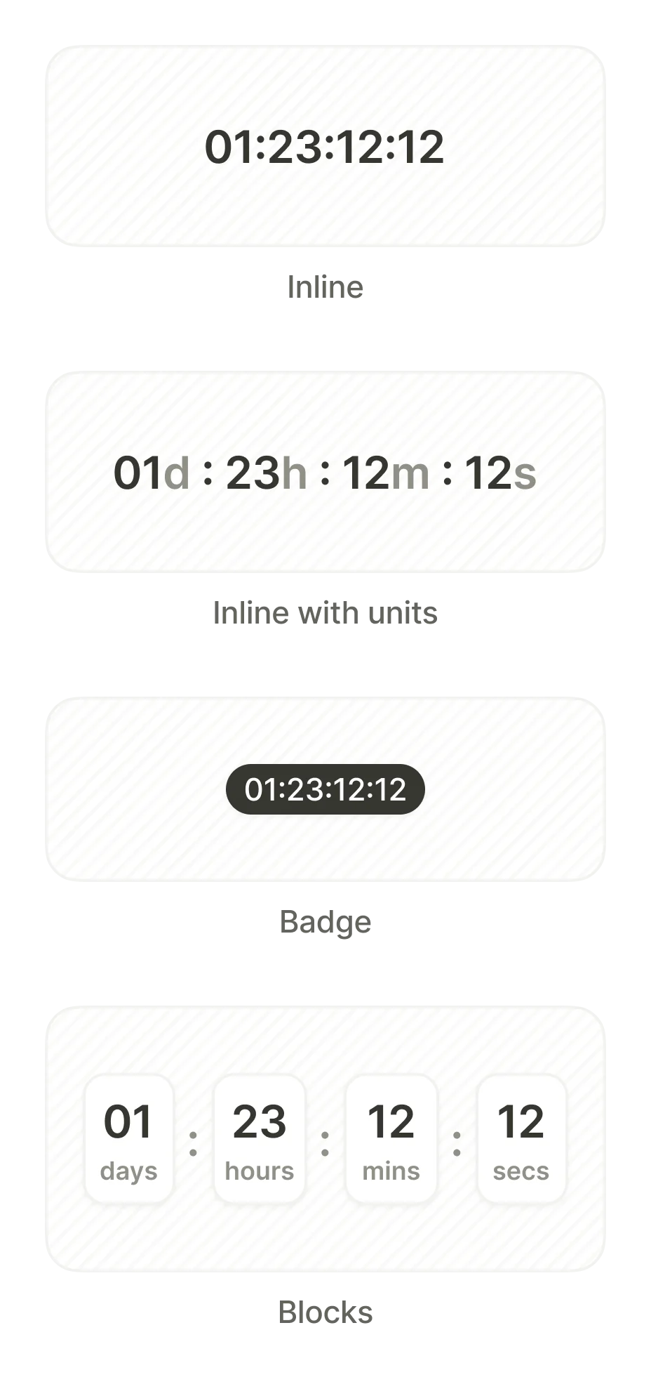
Displays hours, minutes, and seconds ticking down to zero. Use it to create urgency for limited-time offers. The timer can trigger actions upon reaching zero — such as navigating to another screen or hiding the discount badge.
- Inline: compact numeric display
- Inline with units: numeric display with unit labels
- Badge: small highlighted timer overlay
- Blocks: separate cards for days, hours, minutes, and seconds
Progress
Main article: Loaders and progress bars
Progress indicators
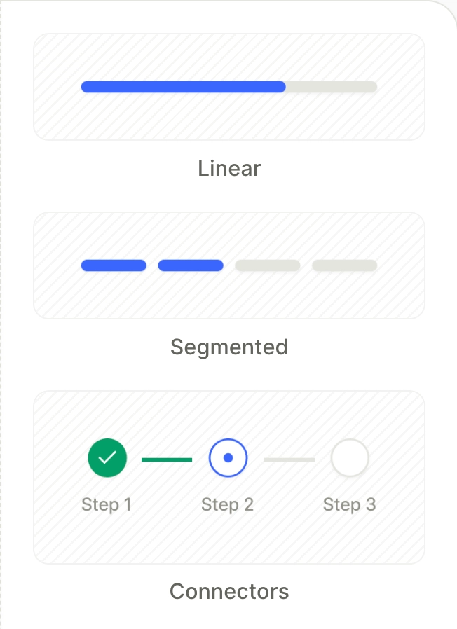
Step-based progress bars that show the user’s position in a multi-screen flow. Useful for onboarding sequences where the user needs to see how many steps remain.
- Linear: a single continuous bar that fills as the user progresses
- Segmented: a bar divided into discrete segments, one per step
- Connectors: numbered step markers joined by short connector lines
Loaders
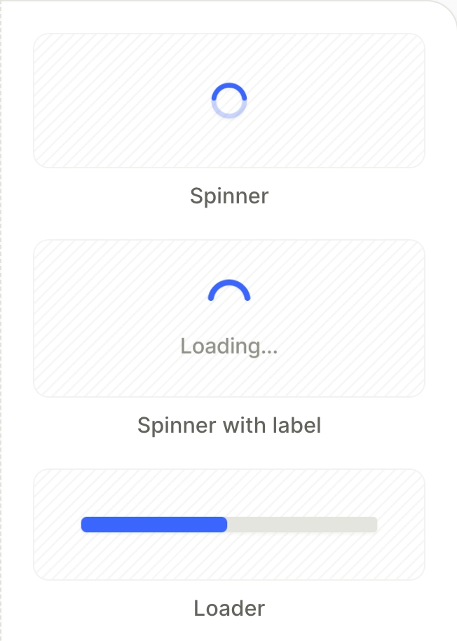
Animated loading indicators for transitions. Use loaders when your app processes user data — for example, after a quiz submission.
- Spinner: rotating circular indicator
- Spinner with label: spinner paired with a text label (e.g., “Loading…”)
- Loader: horizontal progress bar