Element states
Interactive flow elements change their look based on user actions: a tapped quiz option becomes Selected, a focused input becomes Active. Some states are condition-driven — for example, you can disable a button. Style each state separately to give users visual feedback without app code.
Available states by element kind
| Element kind | Built-in states | Addable states |
|---|---|---|
| Selectable elements | Default, Selected | Disabled |
| Inputs | Default, Active, Invalid | Disabled |
| Any element with a tap interaction — buttons, images, icons, containers, and so on | Default | Disabled |
| Progress indicator steps | Completed, Current, Upcoming | — |
Addable states don’t appear by default — open States settings to add them. They are condition-driven: you define when they activate.
How to style a state
-
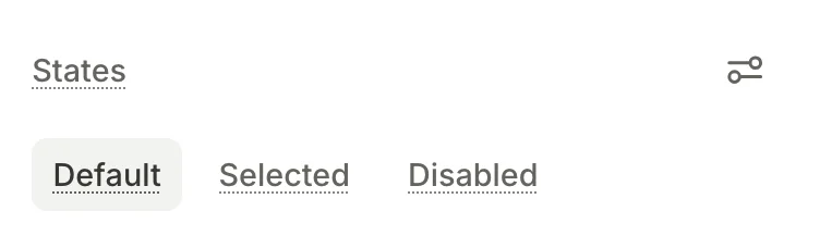
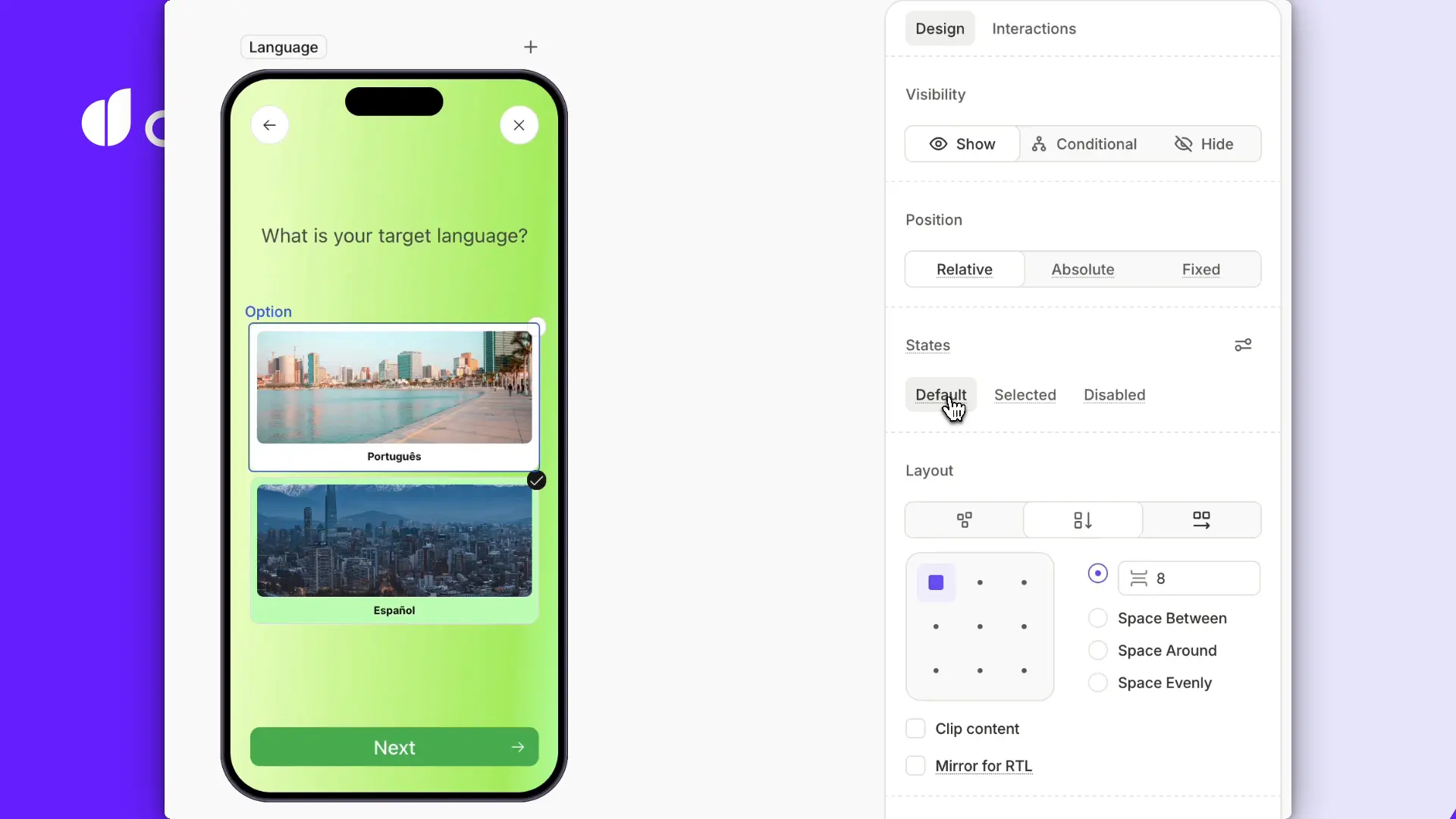
Select an element. The States section in the right panel lists the states the element supports.
-
In the States section, activate the target state. Add the condition-driven Disabled state if needed.
-
Change any property — fill, border, typography, and so on. The change is scoped to that state.
Nested elements become stateful alongside the parent. Any change to a child is scoped to the parent’s active state.
-
The Builder applies the matching style at runtime.
Selectable element states
Selectable elements — quiz options, products, tabs, trial toggles, and any custom selectable element — have two states out of the box:
- Default: The element’s resting appearance.
- Selected: Applies when the user taps the element. The Builder reverts to Default when the user de-selects the element.
In a single-choice group, selecting one element de-selects the others. Multi-choice groups let several be Selected at the same time. Toggles are independent — selecting one has no effect on its siblings. See group types.
Need to style the same state for several elements (for example, quiz options)? Style one element first, then duplicate it. State styling doesn’t carry over between siblings — duplication is the current workaround.
Input states
- Default: The input’s resting appearance.
- Active: Applies while the input is focused.
- Invalid: Applies when the input’s content fails validation. For example, when an email field doesn’t contain
@. See Input validation. - Disabled: The input is not interactive. Add this state manually; see Condition-driven Disabled state.
Style each state the same way as a selectable element: activate the target state, change properties.
Condition-driven Disabled state
The Disabled state prevents the user from interacting with an element. Unlike Default, Selected, Active, or Invalid, the Disabled state does not activate on its own — it requires a user-defined trigger condition.
Disabled is available on:
- Inputs: Any input field — text, email, password, number, phone, date and/or time.
- Selectable elements: Quiz options, products, tabs, trial toggles, and any custom selectable element.
- Any element with a tap interaction: For example, a button, image, or icon that triggers a navigation action.
Add the Disabled state
To add and configure a Disabled state:
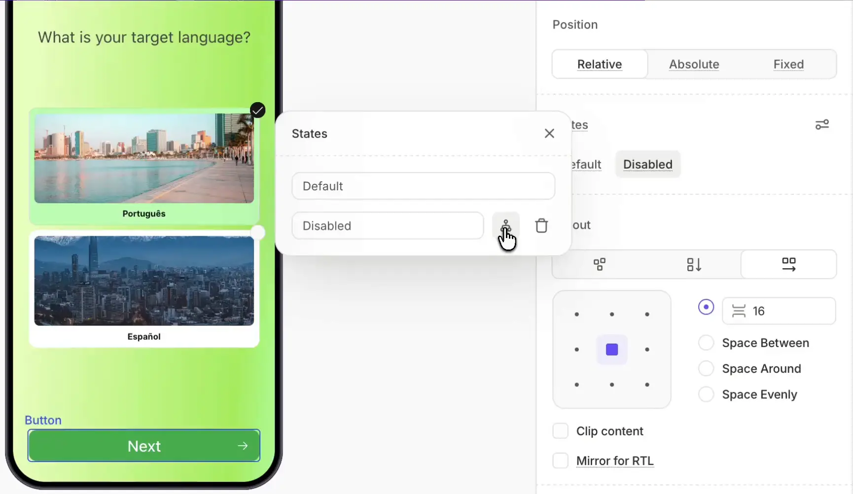
- Select the target element.
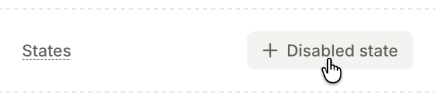
- In the States section, click Settings .
- Choose Add Disabled state. The Disabled state appears in the States section.
- Next to the new Disabled state, click Edit conditional state .
- Add a condition. If you want to disable the submit button unless the input passes validation, compare the input’s
isValidvariable tofalse. - Style the Disabled state to visually communicate the restriction (for example, lower the opacity).
The Adapty SDK evaluates the condition at runtime and applies the Disabled state when appropriate — no app code needed.
Step states for progress indicators
Main article: Progress indicators
Progress indicators show users how far they’ve gotten in an onboarding flow. Each step has three states:
- Completed: Steps the user has passed.
- Current: The user’s current step.
- Upcoming: Steps the user hasn’t reached yet.