Layout and positioning
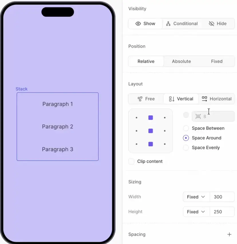
The Flow Builder creates responsive layouts. You do not drag elements to exact coordinates — instead, you nest them inside containers that automatically arrange their children.
The container decides the elements’ direction (vertical or horizontal), alignment, and spacing. Individual elements can then fine-tune their size and margins, or — when needed — break out of the flow with absolute or fixed positioning.
For visual properties like fill, borders, and effects, see Styles and appearance.
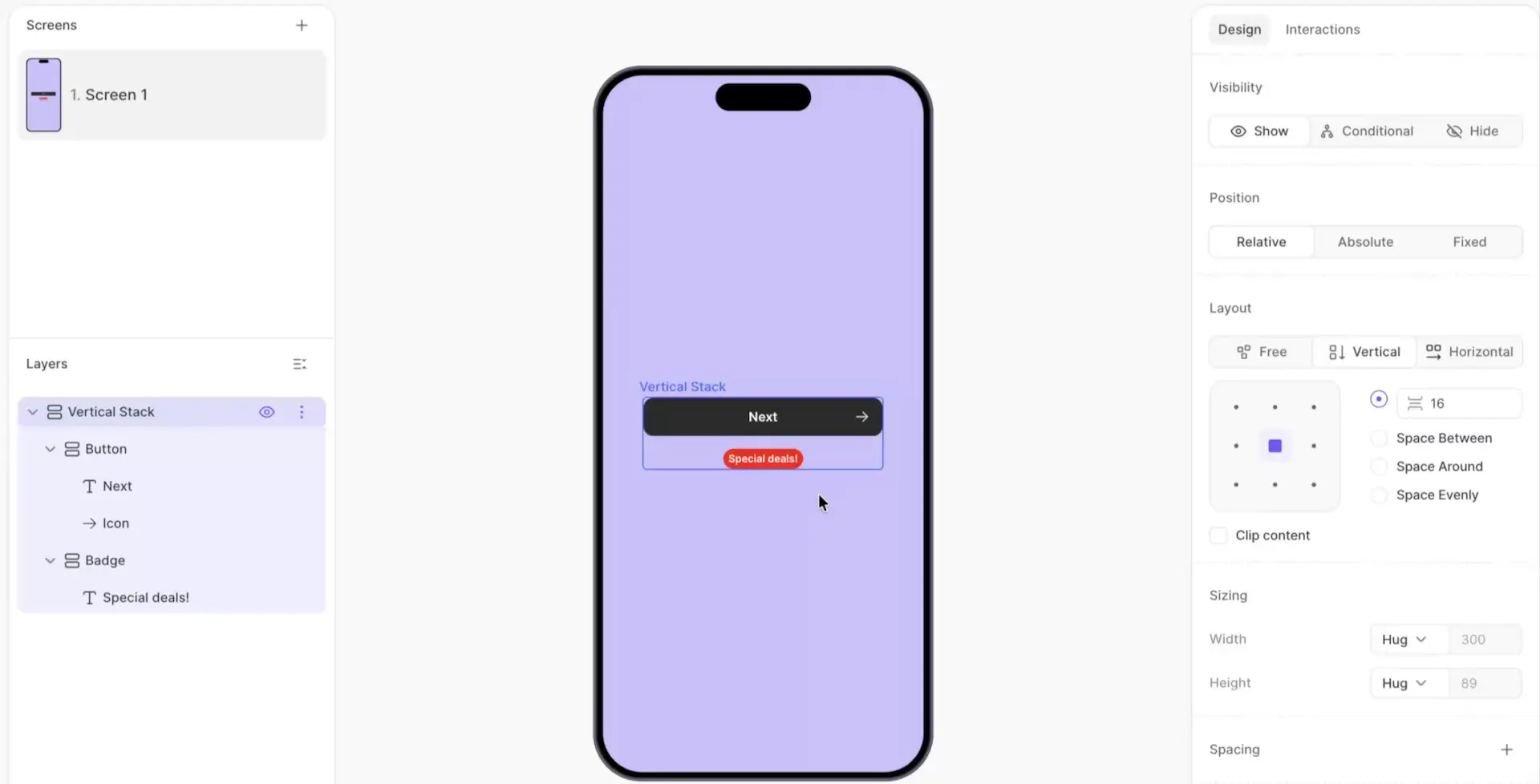
Layout
Layout is the primary tool for arranging elements on screen. Each container automatically distributes its children according to a set of rules — direction, alignment, and spacing. The layout elements available in the builder are:
- Vertical Container: Arranges children from top to bottom
- Horizontal Container: Arranges children from left to right
- Divider: A visual separator between elements
- Carousel: A horizontally scrollable set of slides
- Bottom Sheet: A sliding overlay panel that reveals additional content when the user taps a button
Containers are the primary building blocks of a screen. You can nest them inside each other to build complex layouts. Each container has a Layout section in the right panel that controls how its children are distributed.
To group elements into a new container, use the Wrap layer action. To remove a container and promote its children, use Unwrap.
For details on the screen and layer hierarchy, see Screens and Layers.
Direction
- Free: No automatic layout. Children are positioned independently (useful when children use absolute positioning)
- Vertical: Children stack from top to bottom, like rows in a column
- Horizontal: Children arrange from left to right, like items in a row
Element order
Children render in the order they appear in the Layers panel. In a vertical container, the top item in the list appears at the top of the screen. In a horizontal container, the top item appears on the left. Drag elements in the Layers panel to reorder them, or use Move Up and Move Down layer actions.
Alignment
The alignment grid controls where children sit along the container’s cross axis. In a vertical container, alignment controls the children’s horizontal placement (left, center, or right). In a horizontal container, it controls their vertical placement (top, middle, or bottom).
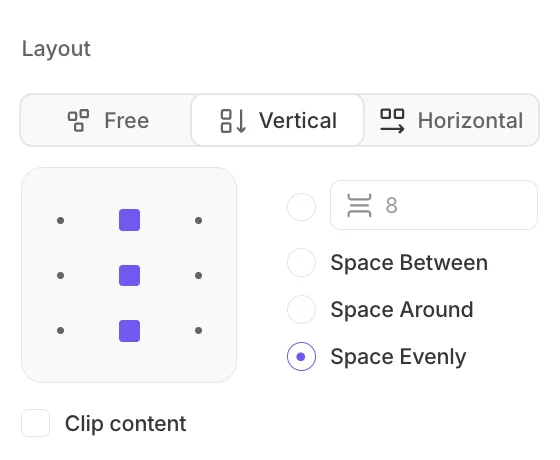
Distribution
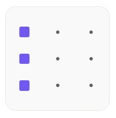
Distribution determines how space is divided among children along the main axis:
- Gap (default): A fixed pixel value between adjacent children
- Space Between: Children spread to the edges; equal gaps appear between them
- Space Around: Equal space surrounds each child, with half-size gaps at the edges
- Space Evenly: Equal space before, between, and after all children
Clip content
Visually clips content that extends beyond the container’s boundaries. Disable this to allow overflow (for example, a badge that intentionally extends past the card edge).
Position
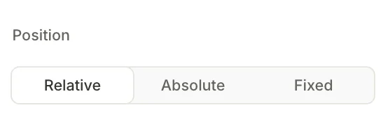
By default, every element’s position is automatically determined by its container’s layout. The Position toggle allows you to break it out of the normal flow and manually position it.
Relative (default)
The element stays in the normal layout flow. Its position is determined automatically by the parent container’s layout rules — you cannot drag it freely. Use Margin to adjust the space around a relative element.
Use relative positioning for the vast majority of content: text blocks, images, cards, buttons, and list items.
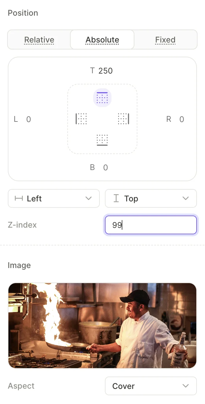
Absolute
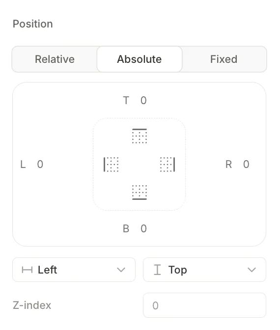
The element lifts out of the normal flow and overlays other content. It no longer affects the layout of neighboring elements.
When you select Absolute, additional controls appear:
- Offset fields (T, L, R, B): Set the distance in pixels from the element to each edge of its parent container
- Anchor grid: Click a point on the 3×3 grid to choose which corner, edge, or center of the parent the element anchors to
- Horizontal anchor (Left / Center / Right) and Vertical anchor (Top / Center / Bottom): Dropdowns that control the same anchor point as the grid
- Z-index: A numeric field that controls the element’s stacking order relative to siblings. Elements with higher values appear on top
Use absolute positioning for decorative overlays, badges, close buttons, and icons placed on top of images.
To stretch an absolute element across the full width of its parent, set the horizontal anchor to Left, then add a Right offset of 0. The element will pin to both edges.
Fixed
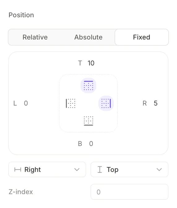
The element ignores its parent container entirely and pins to the screen. It stays visible while the user scrolls — the page content moves underneath it.
Fixed positioning uses the same controls as Absolute (offsets, anchor grid, Z-index). All offsets are relative to the screen’s safe area instead of the parent. For example, an offset of 0 from the bottom keeps the element above the home indicator. To measure offsets from the physical screen edges instead, enable Ignore safe area.
Use fixed positioning for elements that should float over scrolling content rather than reserve space — floating close or restore buttons, persistent top banners, scroll-to-top controls, and navigation bars. For a dedicated bottom action area, use a Footer instead.
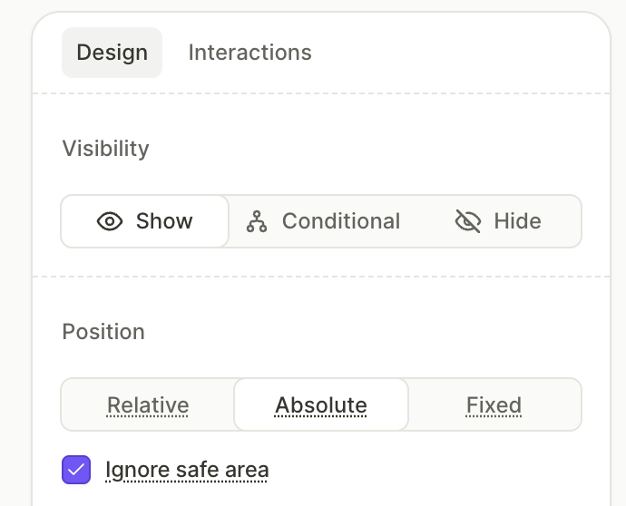
Ignore safe area
The safe area is the part of the screen that stays clear of the notch, the status bar, and the home indicator. By default, positioned elements stay inside it.
Select the Ignore safe area checkbox below the position type selector to measure the element’s offsets from the physical screen edges instead. The element can then extend behind the notch and the home indicator.
Use this for full-bleed media: position an image or video as Fixed, set all four offsets to 0, and select Ignore safe area. The media covers the entire screen, edge to edge.
The checkbox works for absolute and fixed positioning only. For relative elements, it is disabled, and switching an element back to Relative clears the setting.
Sizing
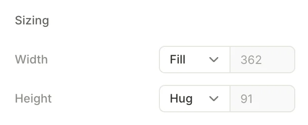
Each element has Width and Height controls. Click the dropdown to choose a sizing mode:
- Fill: The element stretches to occupy all available space in its parent. The pixel value shown is the computed result.
- Hug: The element shrinks to fit its content. The pixel value shown is the computed result.
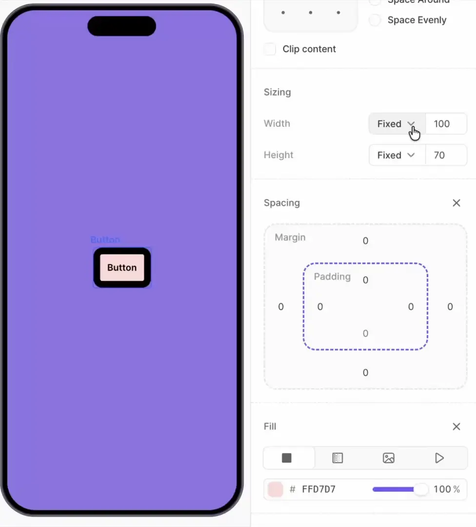
- Fixed: The element uses the exact pixel value you specify, regardless of parent or content size. The only available mode for elements with absolute or fixed positioning.
Spacing
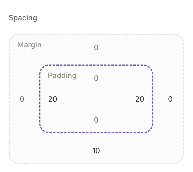
Set spacing values independently for each side of the element.
- Margin: The space between the element and its neighbors. Does not extend beyond the boundaries of the parent container, regardless of its value.
- Padding: The space between the element’s boundary and its content.
Text elements only have margin. Screens only have padding. Both are available for containers and other elements with child content.
Stacking order
Relative elements never overlap each other — each container lays its children out in sequence. Overlap only happens once an element breaks out of the normal flow with Absolute or Fixed positioning.
When elements do overlap, later siblings in the Layers panel render on top of earlier ones — even when the later sibling is relative and the earlier one is absolute.
Absolute and Fixed elements get a Z-index field for finer control: higher values win. Relative elements have no Z-index — layer order alone determines their stack.
Use the Move up and Move down layer actions to change element order.