Dark mode
Adapty flows support dark mode out of the box. By default, color styles have a light and a dark alternative — when you apply a color style to an element, the flow uses the right value based on the device’s current mode. Adapty provides a set of pre-configured color styles, and you can create your own.

Configure color styles
Each color style defines a light and dark color alternative. When an element uses a named style, it switches between the two automatically.
You can manage color styles in Style > Colors on the left.
To add a color style:
- In Style > Colors, click Create style.
- Select the light and dark color alternatives.
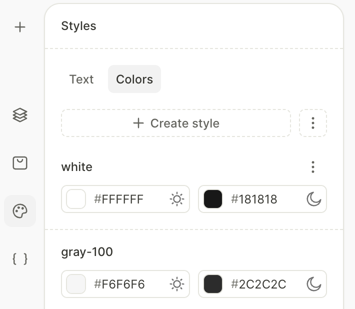
To rename a style, click ⋮ next to it and select Rename.
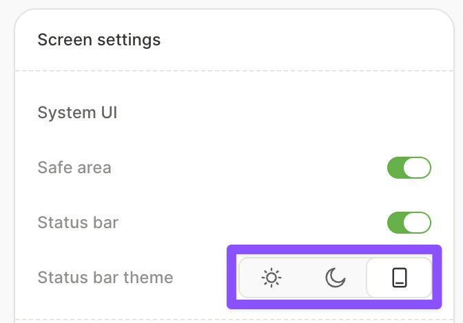
Set the status bar theme
If Status bar is enabled in the Screen settings panel, you can set its theme independently: select Light, Dark, or Auto from the Status bar theme options.
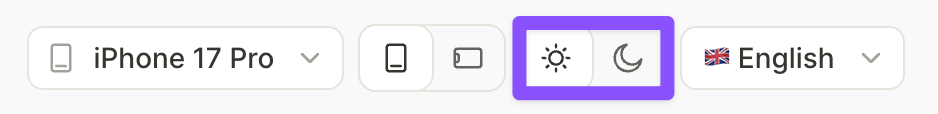
Preview light & dark modes
To preview how your flow looks in each mode, use the sun/moon icon toggle at the bottom of the preview area.
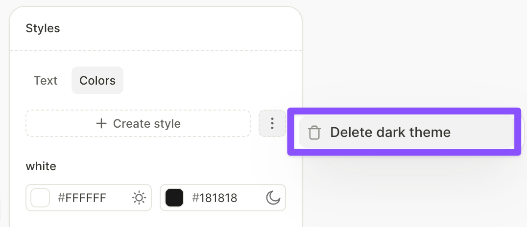
Remove dark mode
To remove dark mode support entirely, in the Style > Colors panel, click ⋮ > Delete dark theme.