Create a basic paywall screen
This is the most common paywall template. Use it as a standalone screen, or place it at the end of a multi-screen flow.
A standard paywall screen contains a heading, a value description, a feature list, a product list, a purchase button, and footer links to restore purchases, terms of use, and privacy policy.
Before you start
- Create products in the Adapty Dashboard.
- Connect Adapty to the App Store and Google Play.
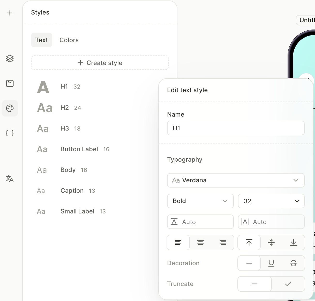
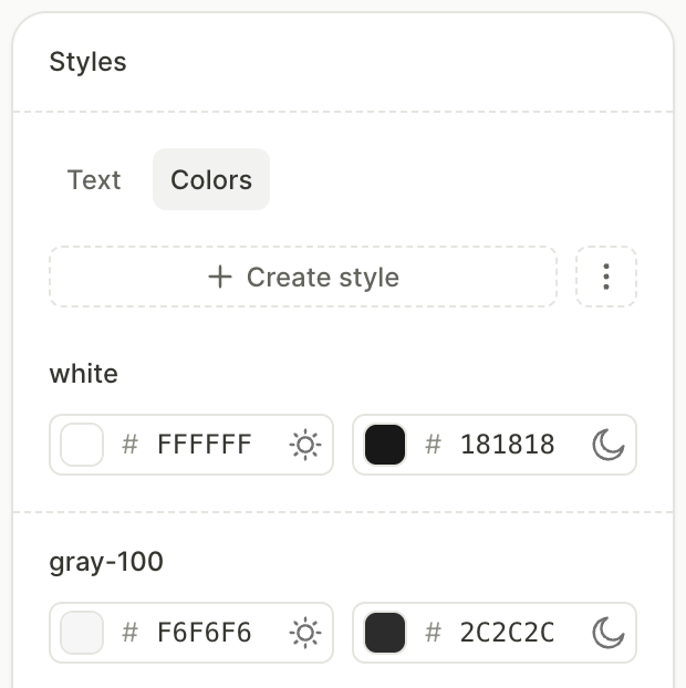
1. Set up reusable styles
Reusable styles let you apply the same typography and colors across every screen with a single click. Every new flow ships with a set of default text styles (H1, Body, Button Label, and so on) — adjust them to match your design before you start adding elements. Add color styles for the brand colors you’ll use throughout the screen.
For full instructions, see Styles and appearance — Reusable styles.
To set up the styles:
- In the left panel, open the Styles panel.
- On the Text tab, click an existing style to edit its font, weight, size, and color. Add new styles only if the defaults don’t cover your needs.
- On the Colors tab, click Create style and add the colors you plan to reuse across the screen.
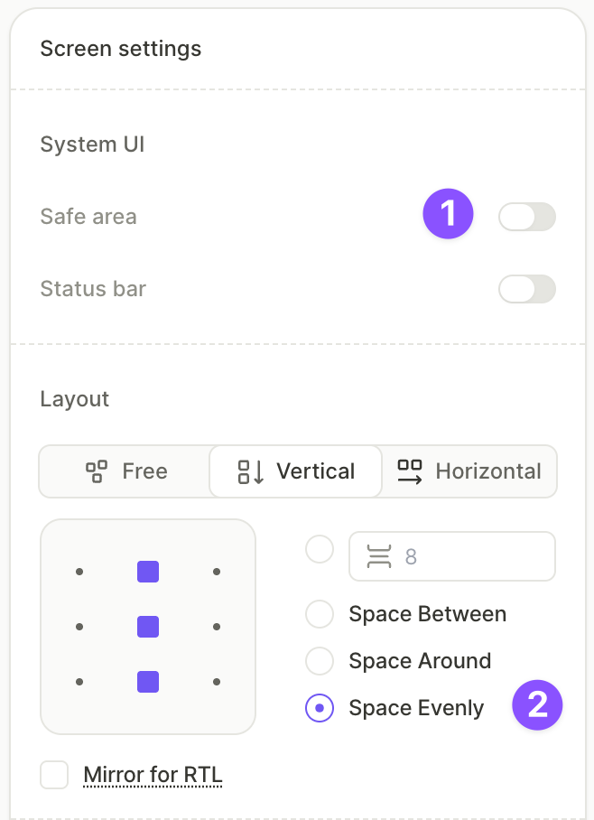
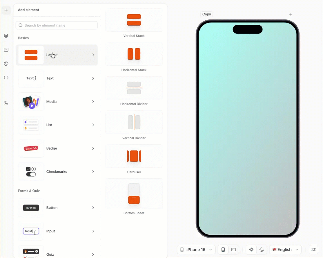
2. Set up the screen layout
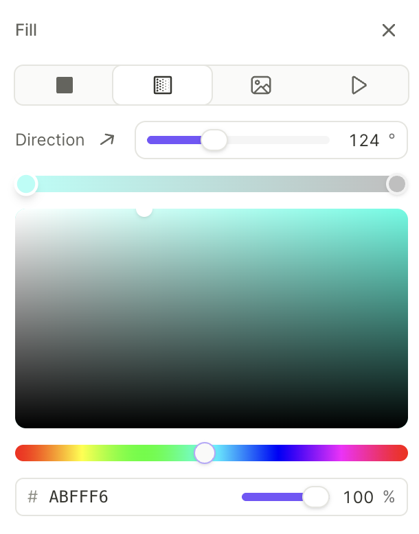
The screen itself acts as a container for everything you add. Configure its layout, background, and padding first so that the elements you add later distribute correctly.
For the full list of screen properties, see Screens and layers — Screen settings.
To configure the screen:
- Click an empty area of the canvas to select the screen. The right panel switches to screen settings.
- Under System UI, disable Safe area so the content extends to the screen edges.
- Under Layout, set the direction to Vertical and the distribution to Space evenly.
- Under Fill, choose a background type — solid color, gradient, or image. This example uses a Gradient with two color stops.
3. Add the close button
The close button dismisses the paywall. The Close preset comes preconfigured — no action setup is required.
- On the canvas, click +.
- Select Buttons > Close.
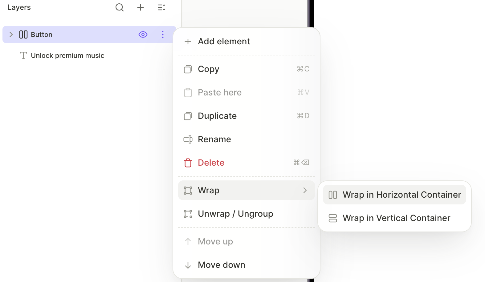
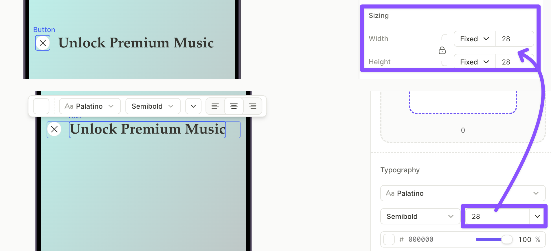
4. Add the title and pair it with the close button
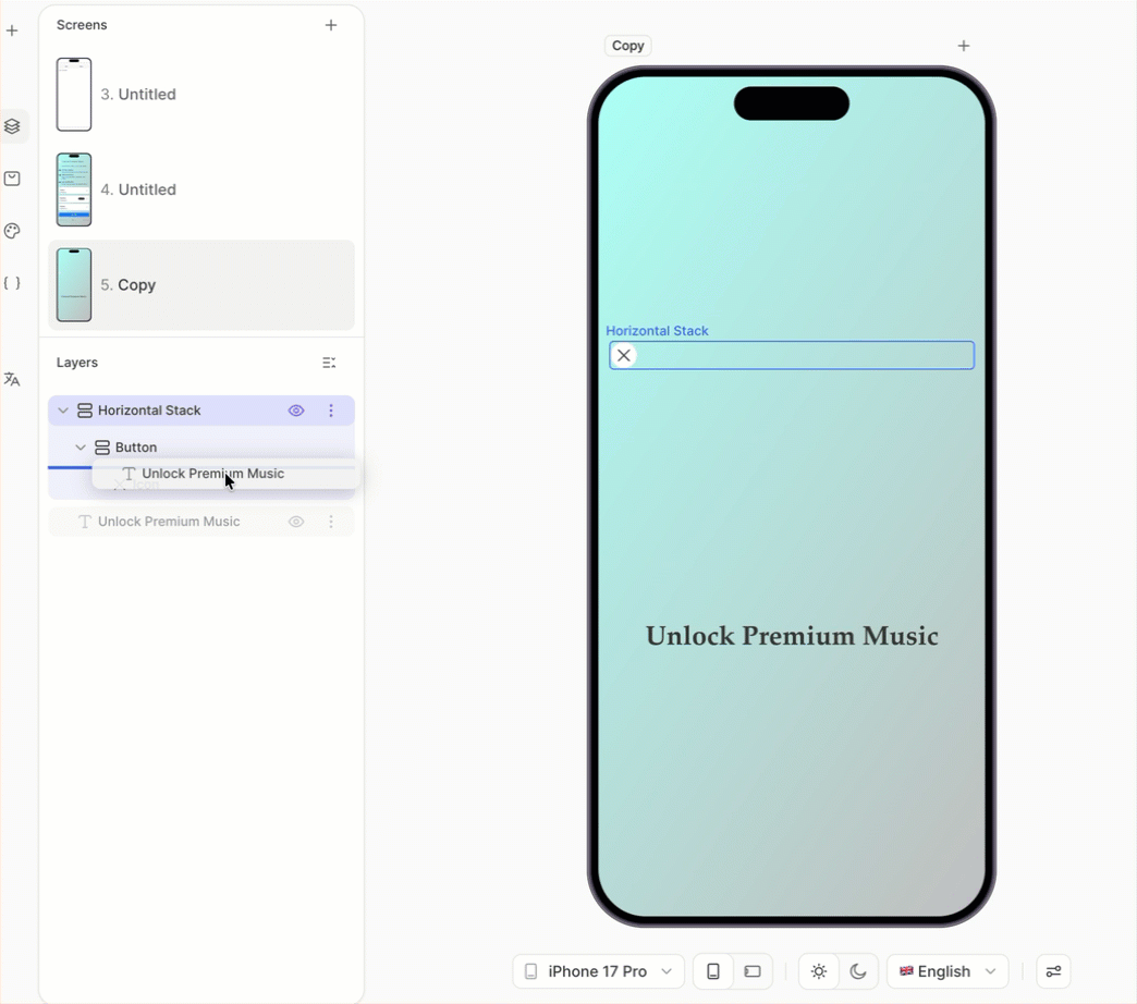
The H1 sits next to the close button at the top of the screen. To align them horizontally, wrap both in a horizontal container.
To add the title:
- Click + > Text > H1.
- With the H1 selected, open the Design tab in the right panel and edit the text in the Content field.
To group the title with the close button:
- In the Layers panel, click the three-dot menu on the close button layer and choose Wrap > Wrap in Horizontal Container.
- Drag the H1 layer into the new horizontal container.
To align the two elements:
- Adjust the close button size and the H1 font size so they sit comfortably on the same line.
- With the horizontal container selected, set the alignment and distribution in the right panel so the elements line up correctly.
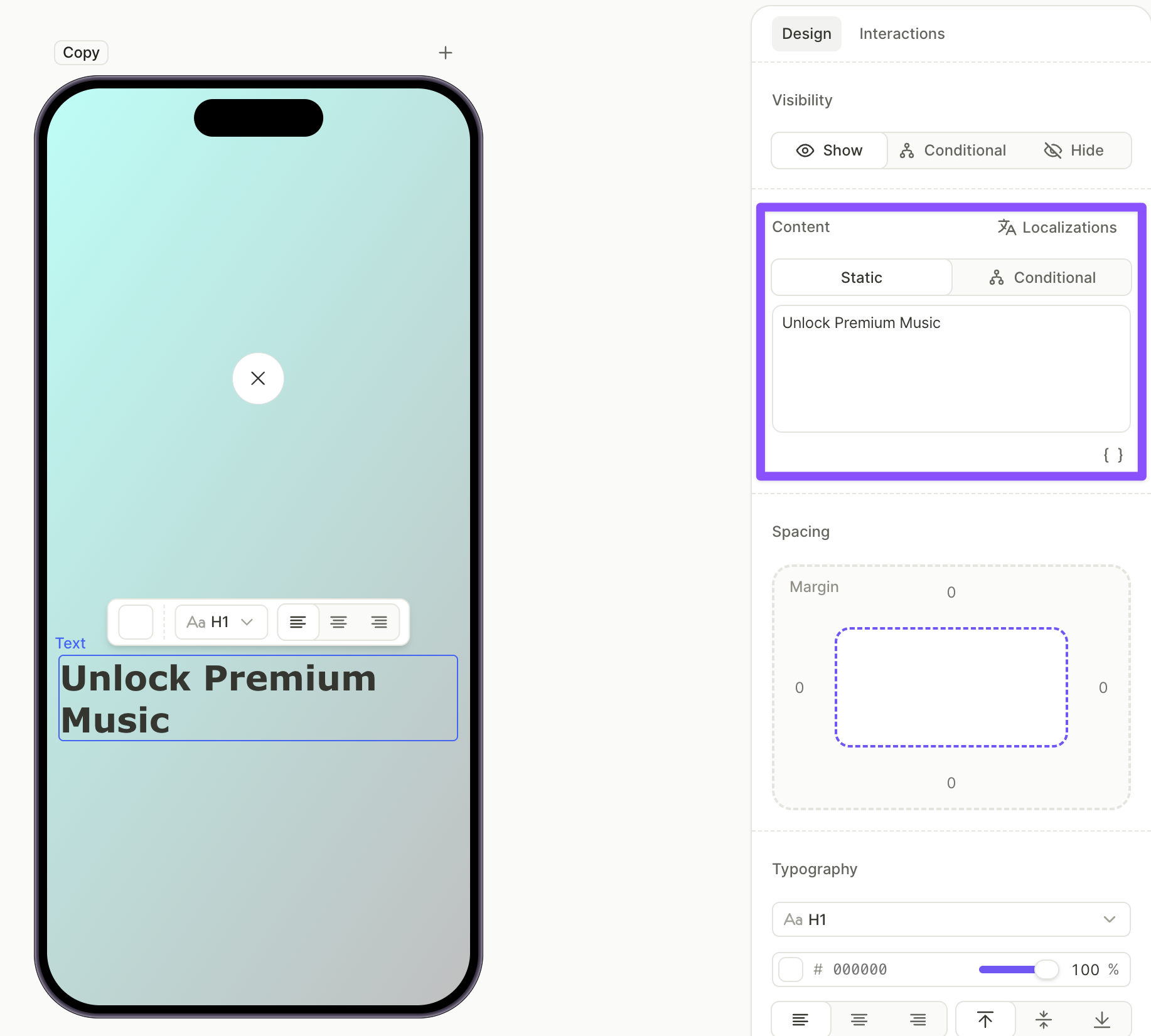
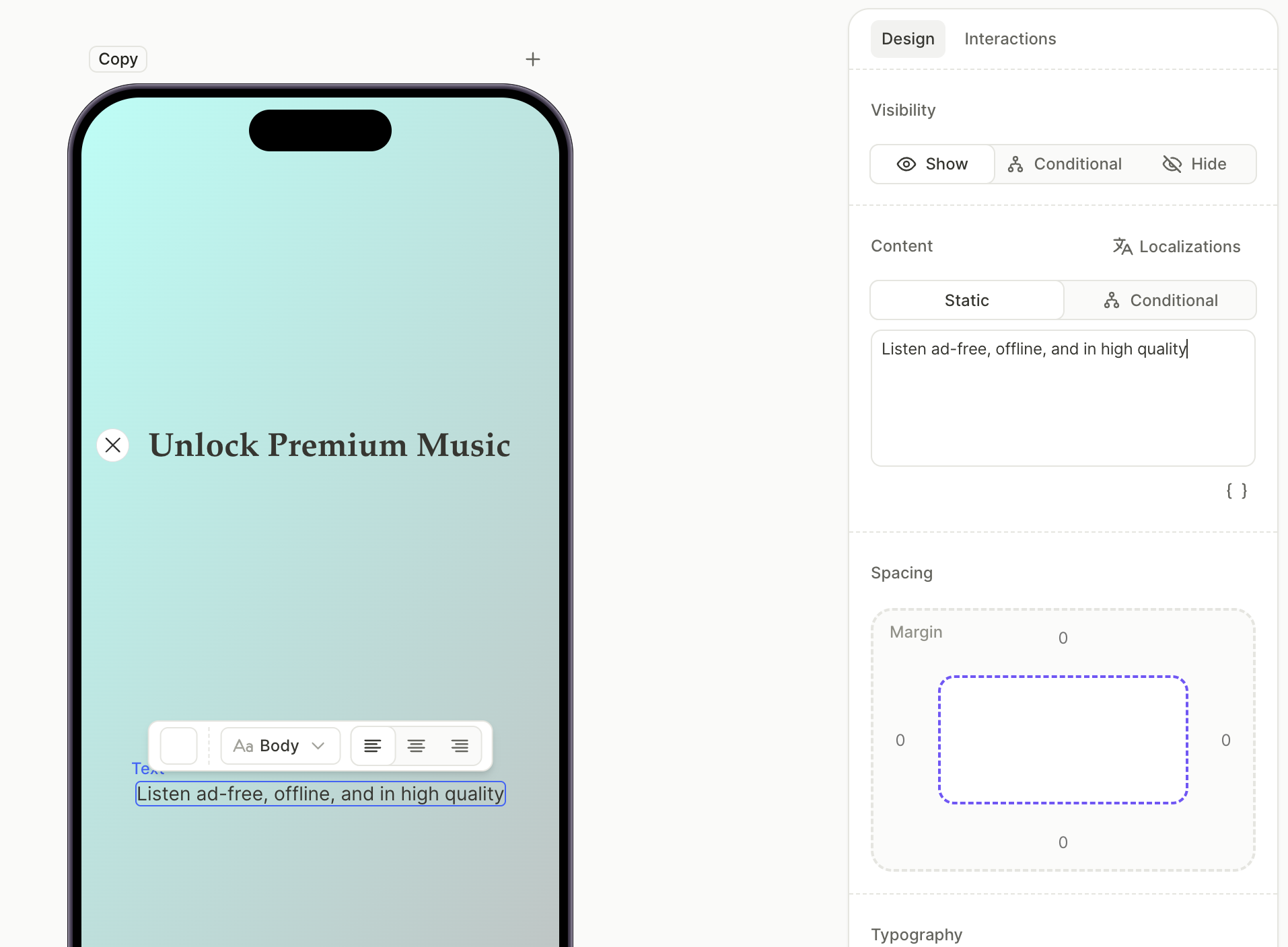
5. Add the value description
A short body line under the title explains what the user gets from the subscription.
- Click + > Text > Body.
- With the body element selected, edit the text in the Content field on the Design tab.
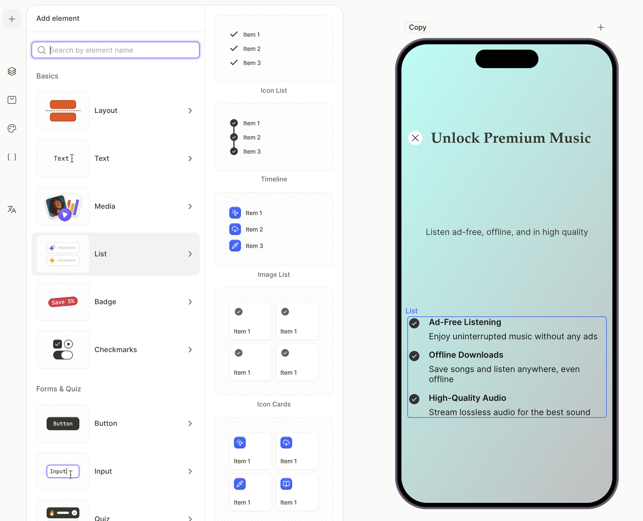
6. Add the feature list
The feature list highlights what unlocking the subscription includes. Each row has an icon, a feature title, and a short description.
For the full set of list presets, see Elements — List.
To add the feature list:
- Click + > List and choose a list preset. Icon List is the most common for paywalls.
- With each row selected, edit the title and description in the Content field.
- To add or remove rows, select the list and use the row controls in the Layers panel.
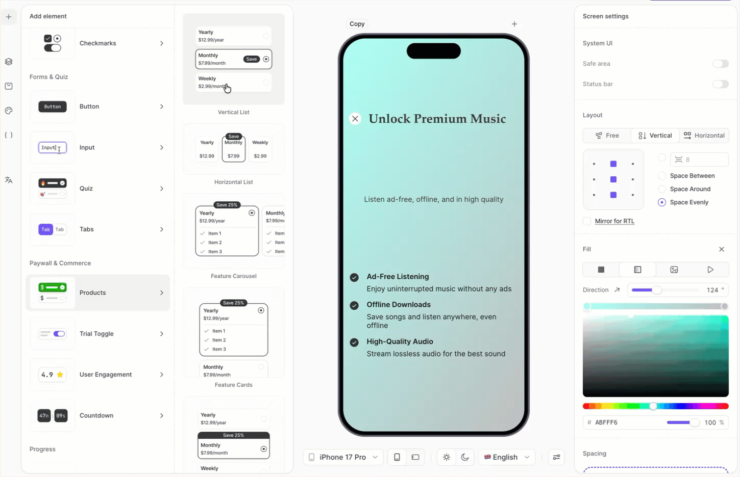
7. Add the product list
The product list shows the subscription options the user can choose from. The Products element renders one card per product assigned to the screen, and one card is automatically marked as the default.
For more on managing products, see Set up purchases.
To add and configure products:
- Click + > Products and choose a layout preset. Vertical List is the most common.
- Select each product card on the canvas and pick a product from the dropdown in the Design tab. The dropdown shows every product configured in the Adapty Dashboard.
- To change the default selection, select the card you want and enable Set as default product in the Design tab.
- To customize the discount badge, expand a product card in the Layers panel, select the badge layer, and edit its text in the Content field. Hide the badge on other cards by toggling the eye icon next to each badge layer.
8. Add the purchase button
The purchase button starts the in-app purchase for whichever product the user has selected. The products.selectedProduct variable always resolves to the currently selected product on the screen.
To add the purchase button:
- Click + > Buttons and choose a button preset.
- With the button selected, open the Interactions tab in the right panel.
- Click Add trigger > On tap, then click Add action.
- Set Action to Purchase and Product to
products.selectedProduct.
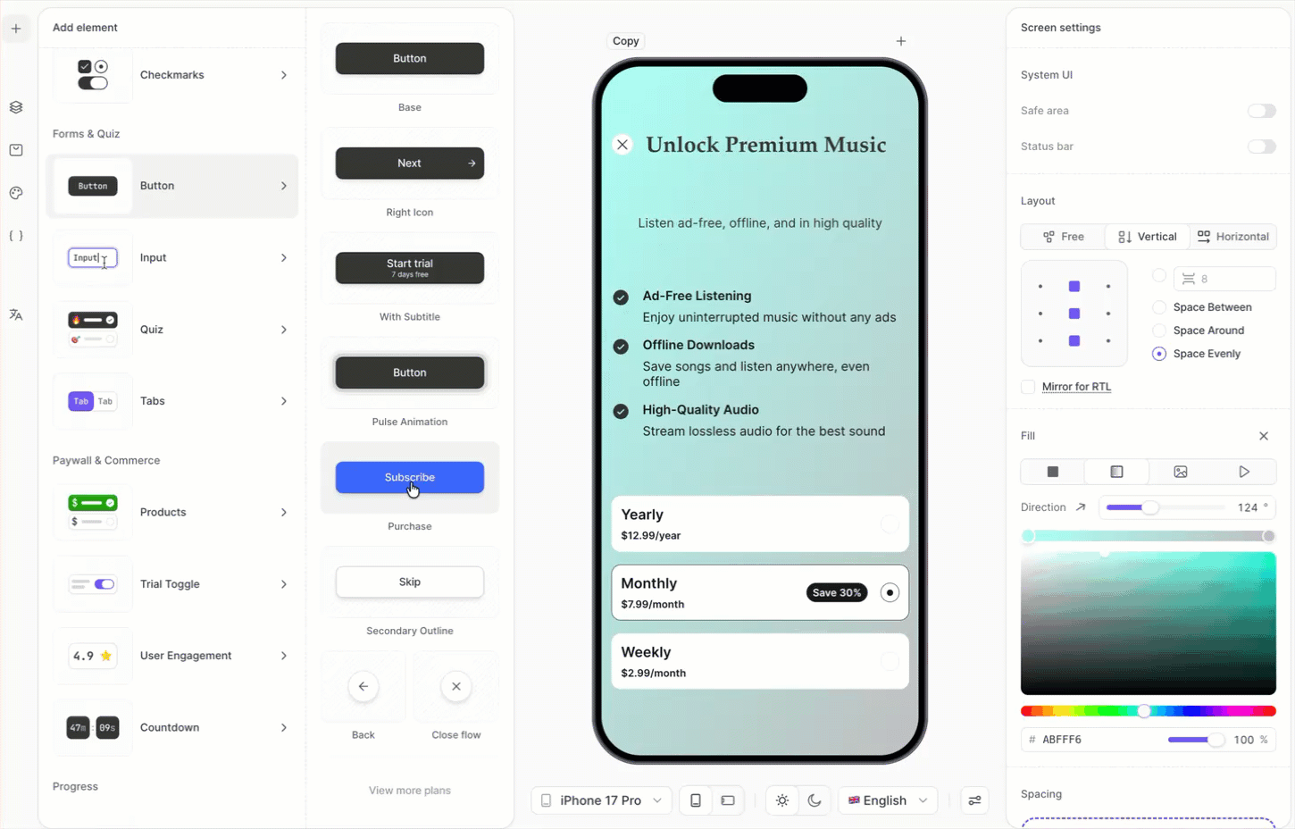
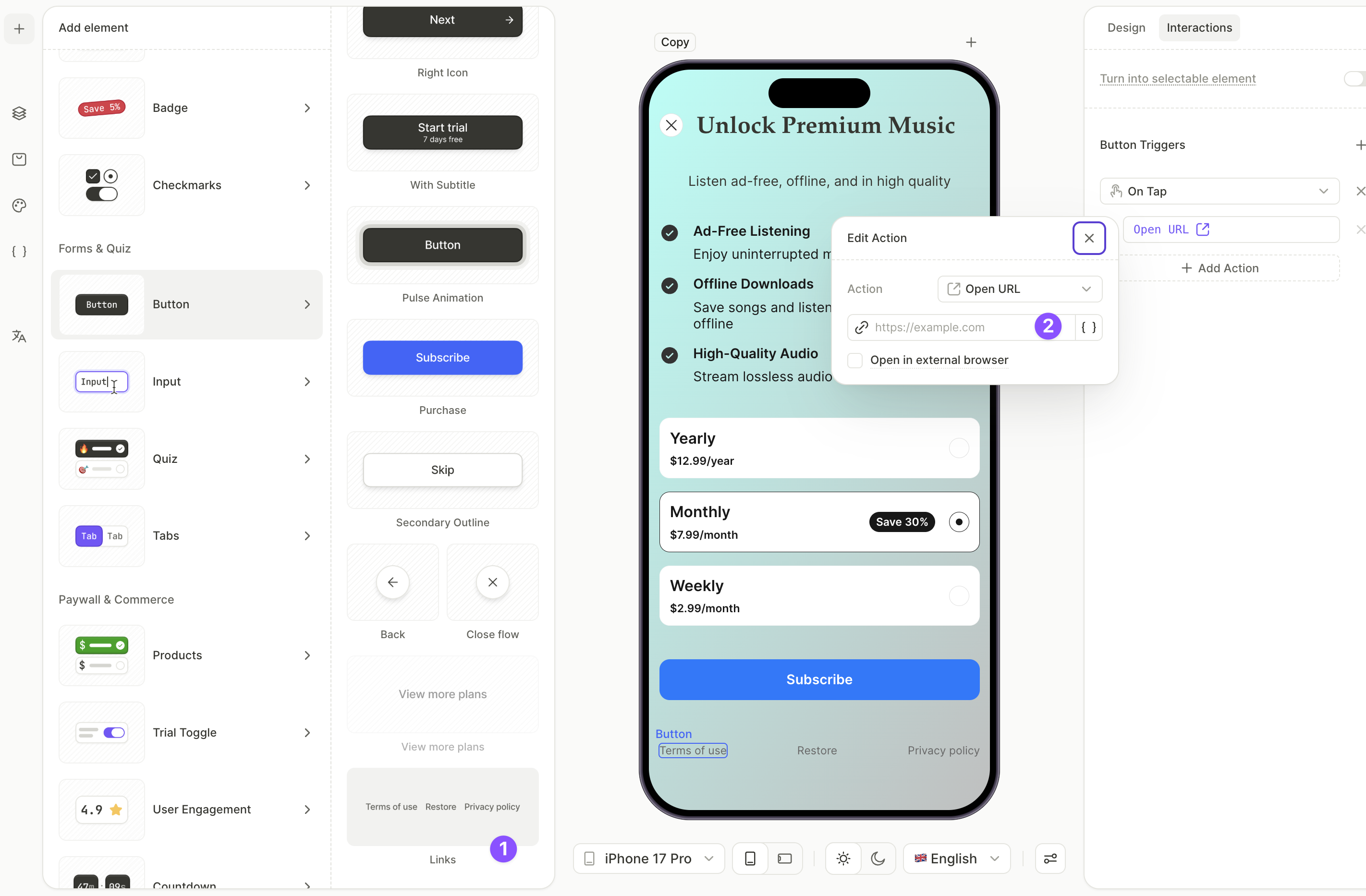
9. Add footer links
The footer contains links to terms of use and privacy policy (required by app stores) and a button to restore previous purchases.
To add the footer links:
- Click + > Buttons > Links. This adds a row with Restore Purchases, Terms of Use, and Privacy Policy.
- In the Layers panel, select the Terms of Use button. Open the Interactions tab — the Open URL action is already attached. Click the action and enter the target URL.
- Repeat for the Privacy Policy button with your privacy URL.
- Leave the Restore Purchases button as is. Its action is preconfigured.
If any element’s positioning feels too high or low, or if you want to add more space anywhere, adjust the element’s margins and padding.
Next steps
- Save and publish your flow.
- Add the flow to a placement to start showing it to users.