Create a paywall with tabs
This template uses tabs to switch between two variants of the same offer on a single screen. Each tab contains its own feature list, product list, and purchase button. Tapping a tab swaps the visible content without leaving the screen — useful for splitting plans by tier, billing period, or audience segment.
Before you start
- Create products in the Adapty Dashboard.
- Connect Adapty to the App Store and Google Play.
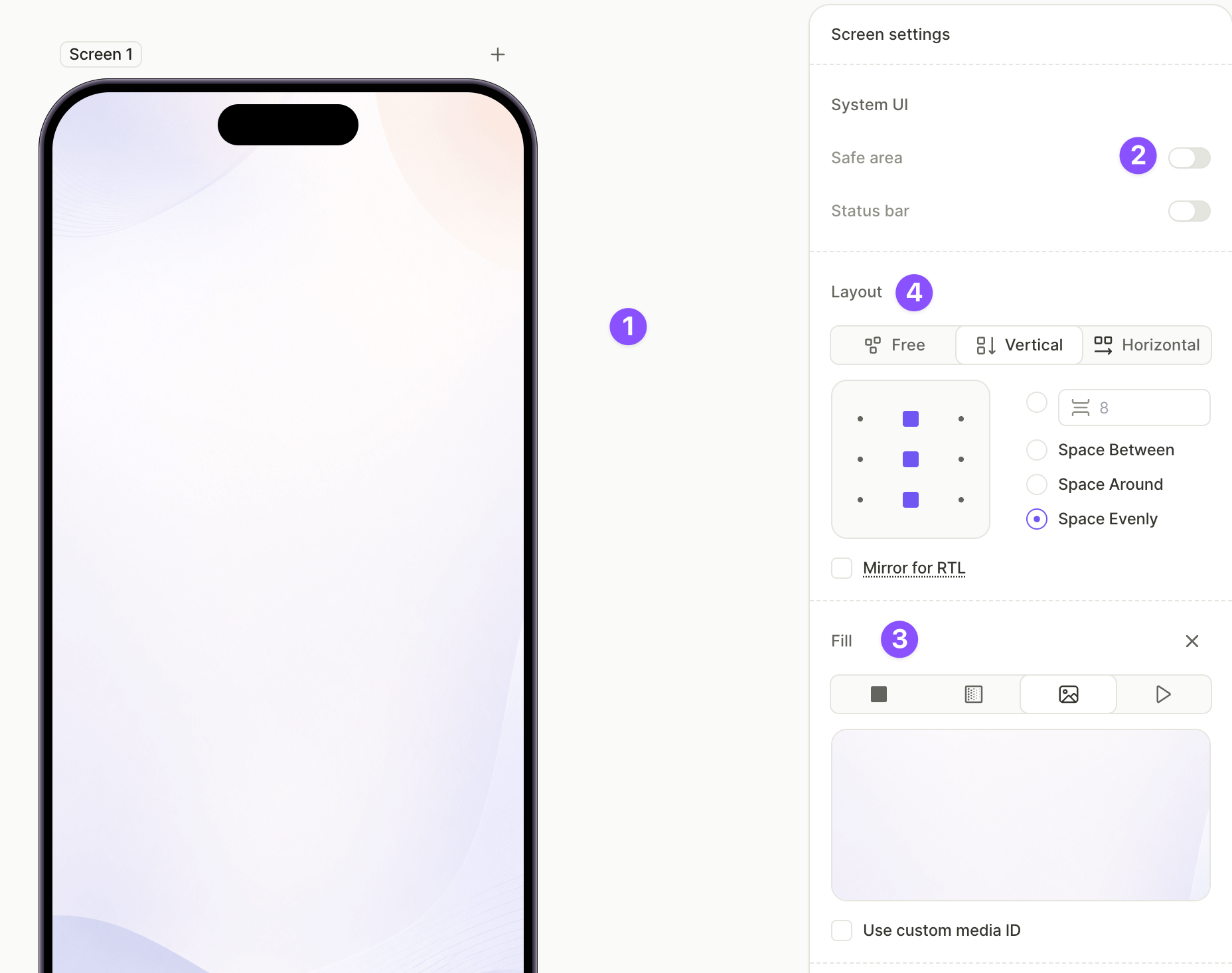
1. Set up the screen layout
The screen acts as a container for the close button, heading, tabs, and tab content. In this example, the background is an image, but a solid color or gradient works the same way.
For the full list of screen properties, see Screens and layers — Screen settings.
To configure the screen:
- Click an empty area of the canvas to select the screen.
- Under System UI, disable Safe area so the background extends to the screen edges.
- Under Fill, choose a background type and configure it. This example uses an Image , but a solid color or a gradient works the same way.
- Under Layout, set the direction to Vertical and configure the gap and alignment so the elements stack from the top with the tab content filling the remaining space.
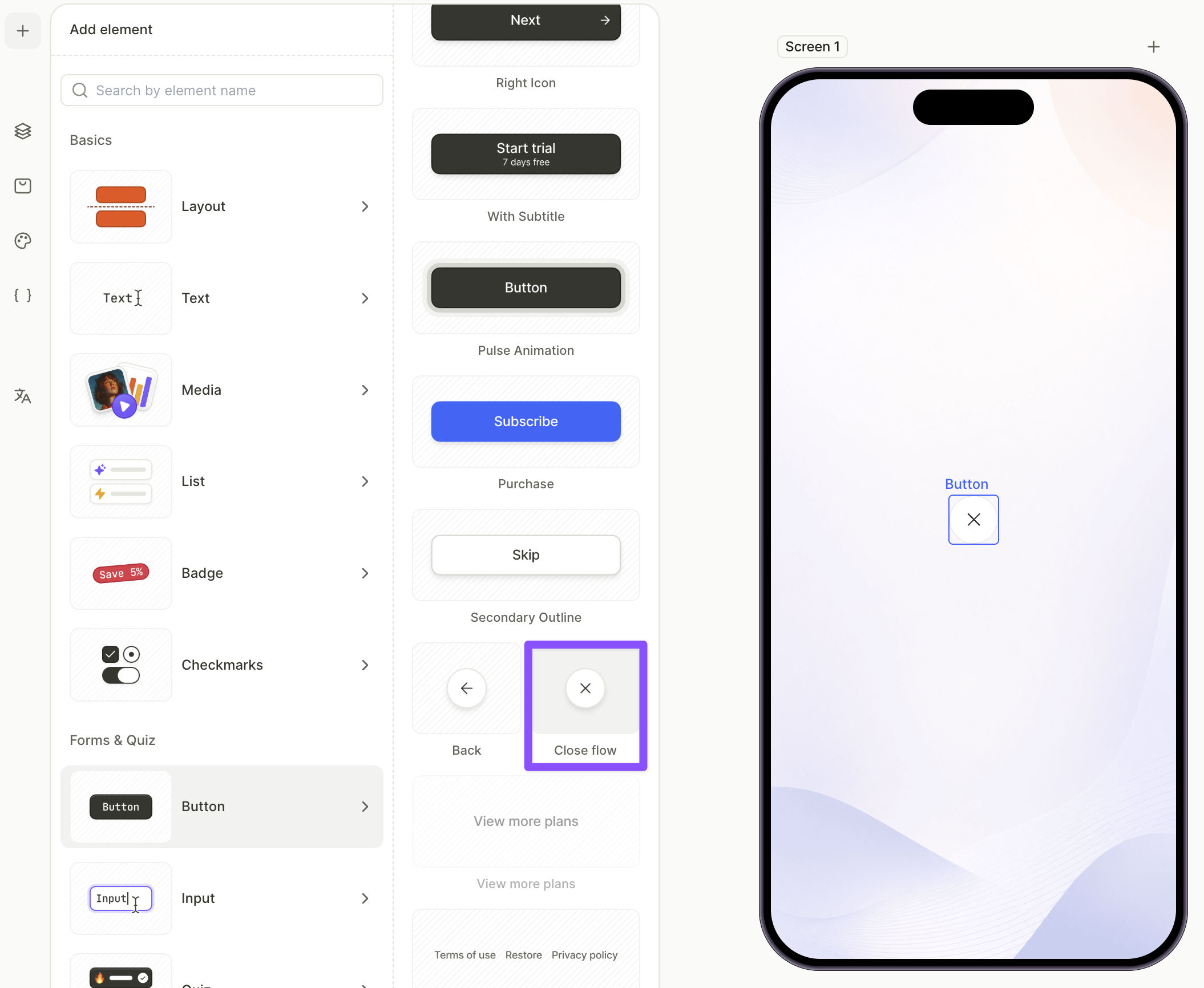
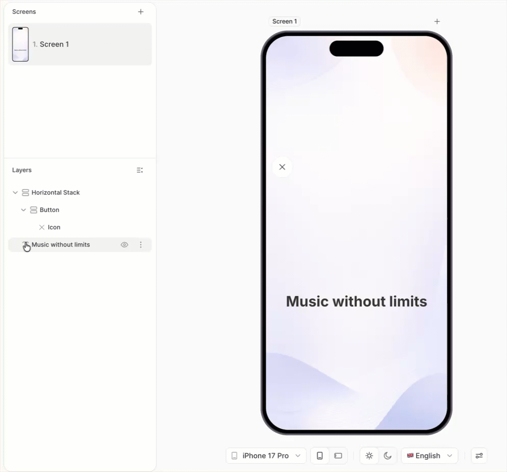
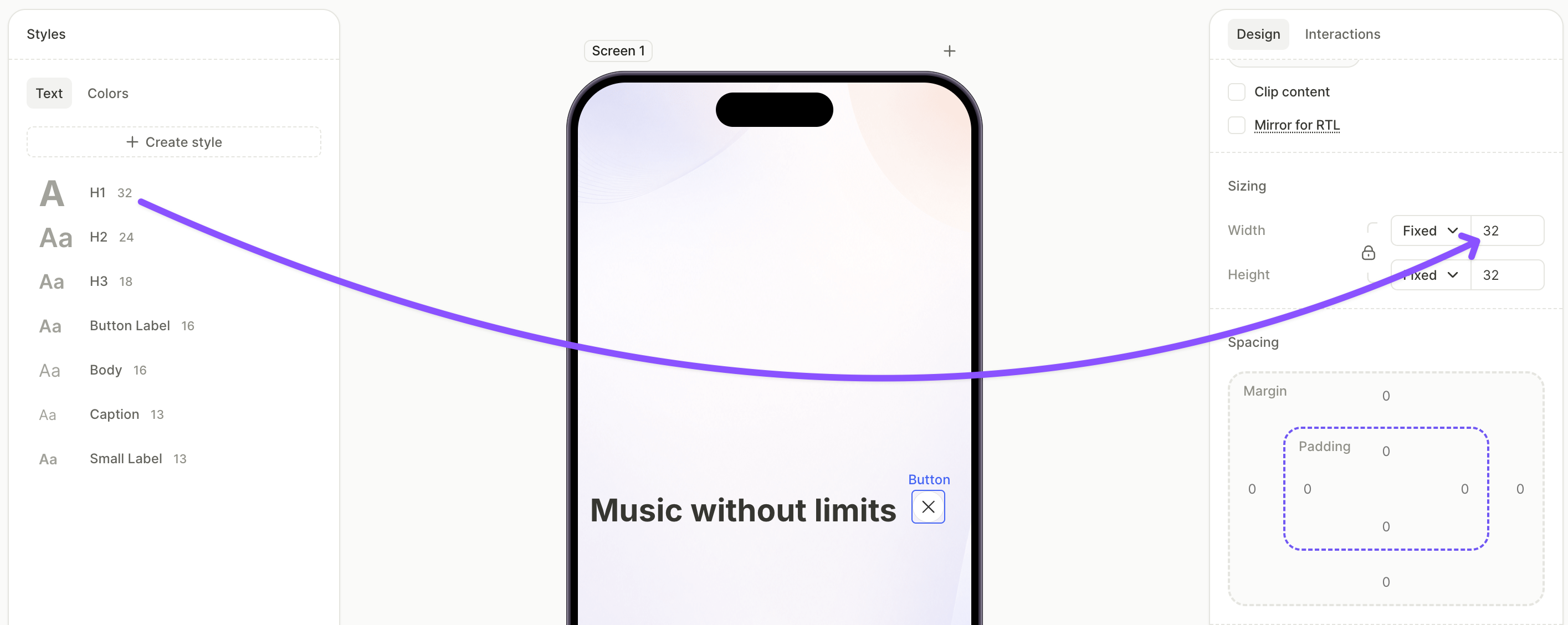
2. Add the close button
The close button dismisses the paywall. The Close preset comes preconfigured — no action setup is required.
- On the canvas, click +.
- Select Buttons > Close.
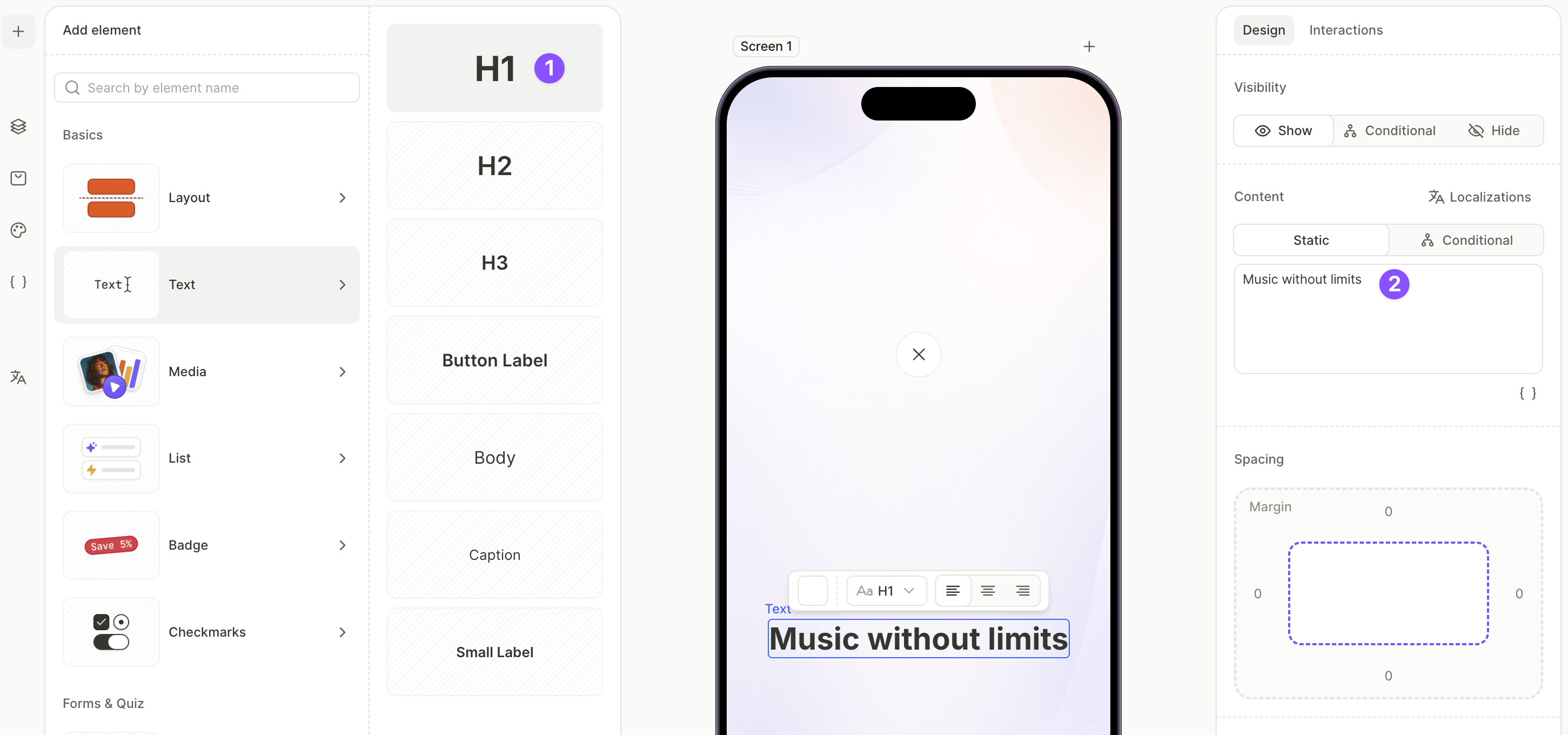
3. Add the title and pair it with the close button
The heading sits next to the close button at the top of the screen. To align them horizontally, wrap both in a horizontal container.
To add the title:
- Click + > Text > H1.
- With the H1 selected, open the Design tab and edit the text in the Content field.
To group the title with the close button:
- In the Layers panel, click the three-dot menu on the close button layer and choose Wrap > Wrap in Horizontal Container.
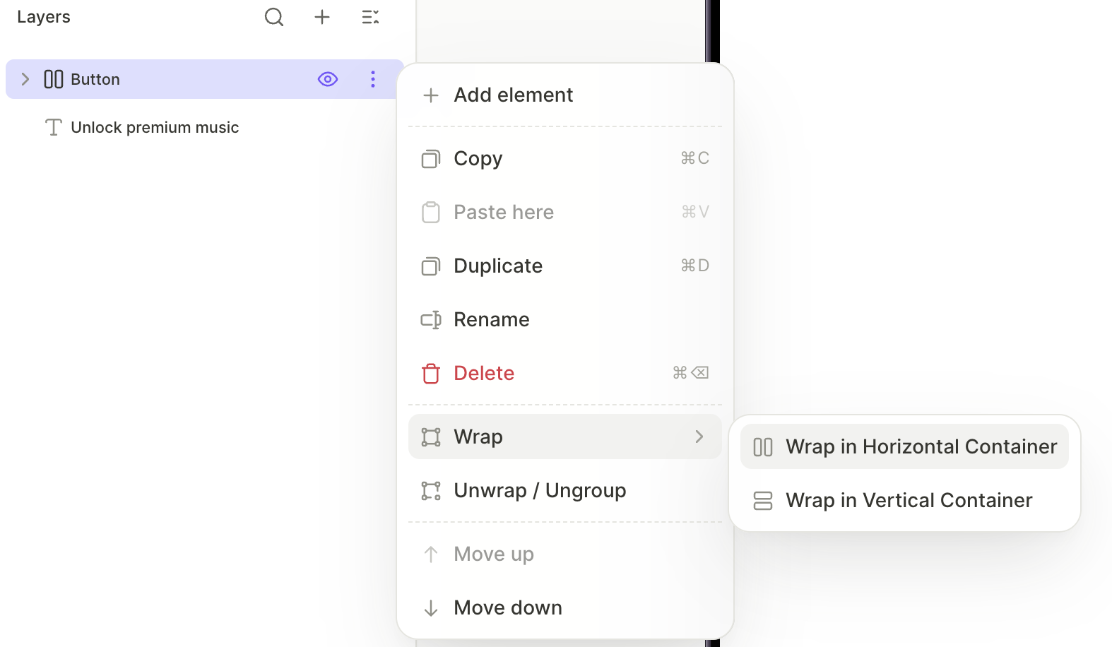
- Drag the H1 layer into the new horizontal container.
To align the two elements:
- Adjust the close button size and the H1 font size so they sit comfortably on the same line.
- With the horizontal container selected, set the alignment and distribution in the right panel so the elements line up correctly.
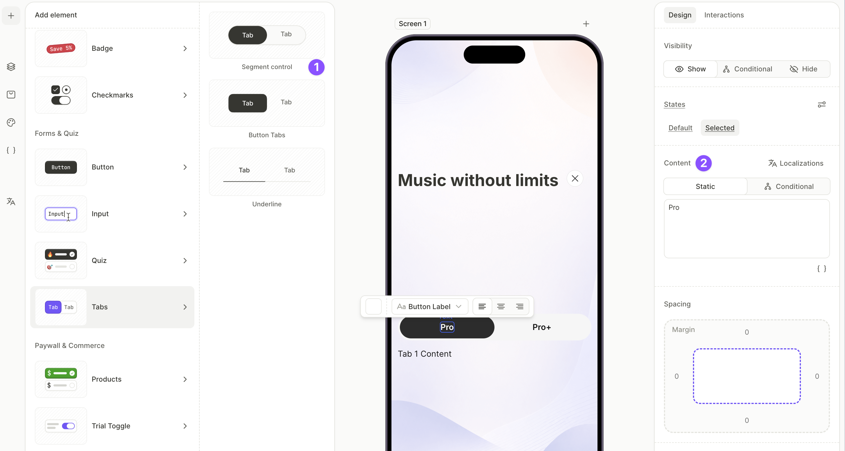
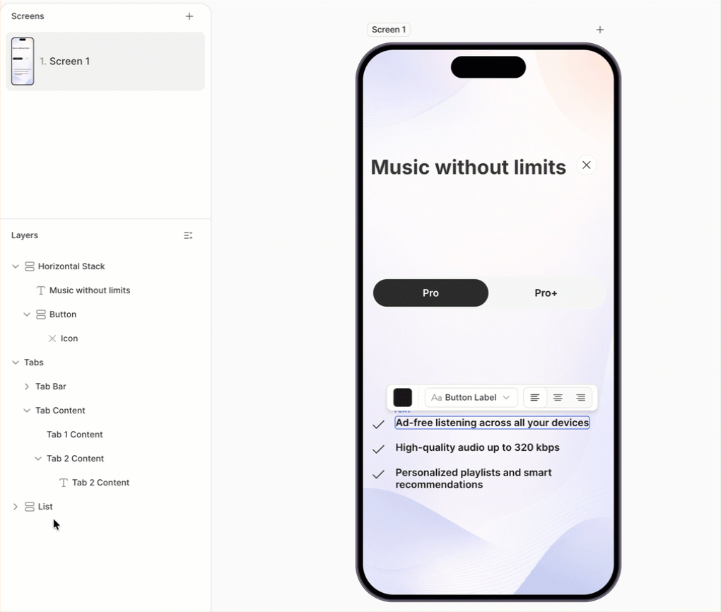
4. Add the tabs and configure their labels
The Tabs element splits a screen section into switchable content panels. Each tab gets its own content container that appears when the user selects that tab.
For more on the Tabs element, see Elements — Tabs. For more on selectable groups, see Selectable elements and groups.
To add the tabs:
- Click + > Tabs and choose a preset — Segment control, Button Tabs, or Underline.
- With each tab’s name selected on the canvas or in the Layers panel, edit the Content field on the Design tab to change the label — for example,
PremiumandPro.
5. Add a feature list to the first tab
A short, compact feature list inside the first tab tells users what that plan includes.
For the full set of list presets, see Elements — List.
To add the feature list:
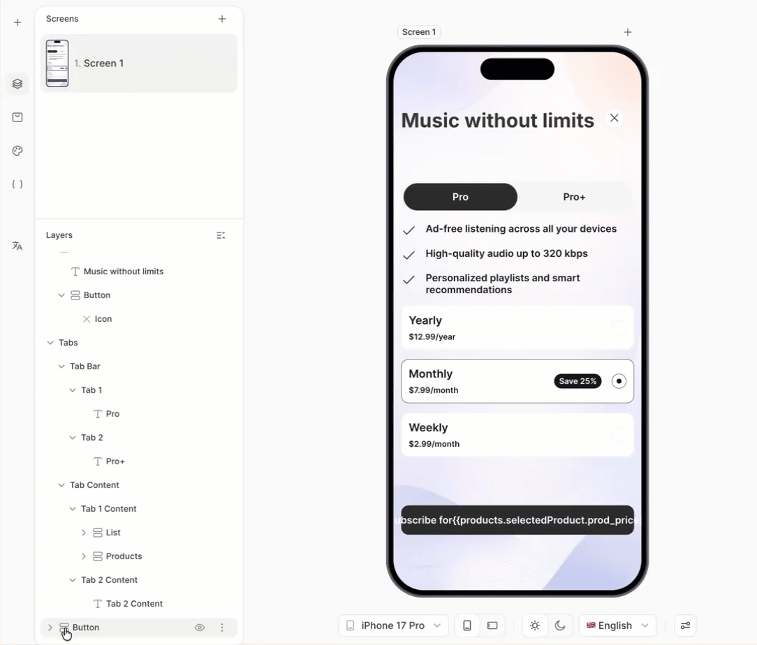
- Click + > List and choose a list preset. Icon List is the most compact for paywalls. The element appears at the end of the layer tree.
- With each row selected, edit the title in the Content field.
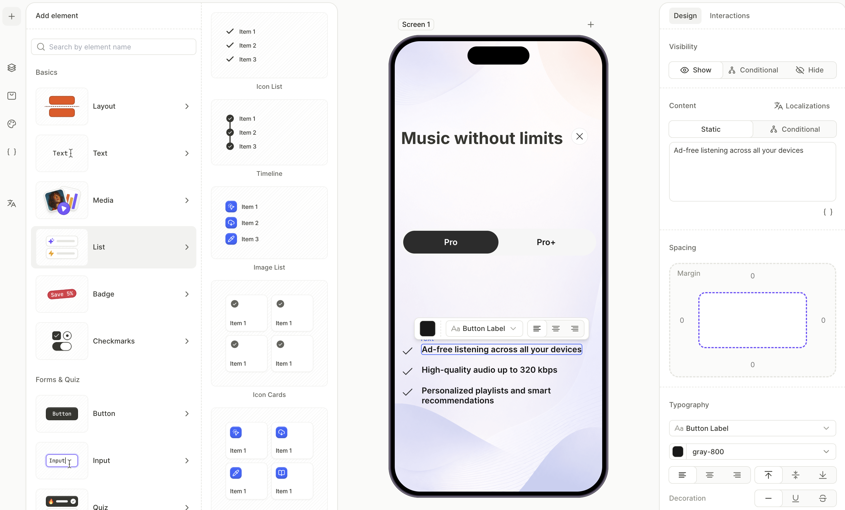
- In the Layers panel, drag the list into the first tab’s Content container.
6. Add the product list to the first tab
The product list shows the subscription options for the first tab. The Products element renders one card per product assigned to the screen and creates its own selectable group.
For more on managing products, see Set up purchases.
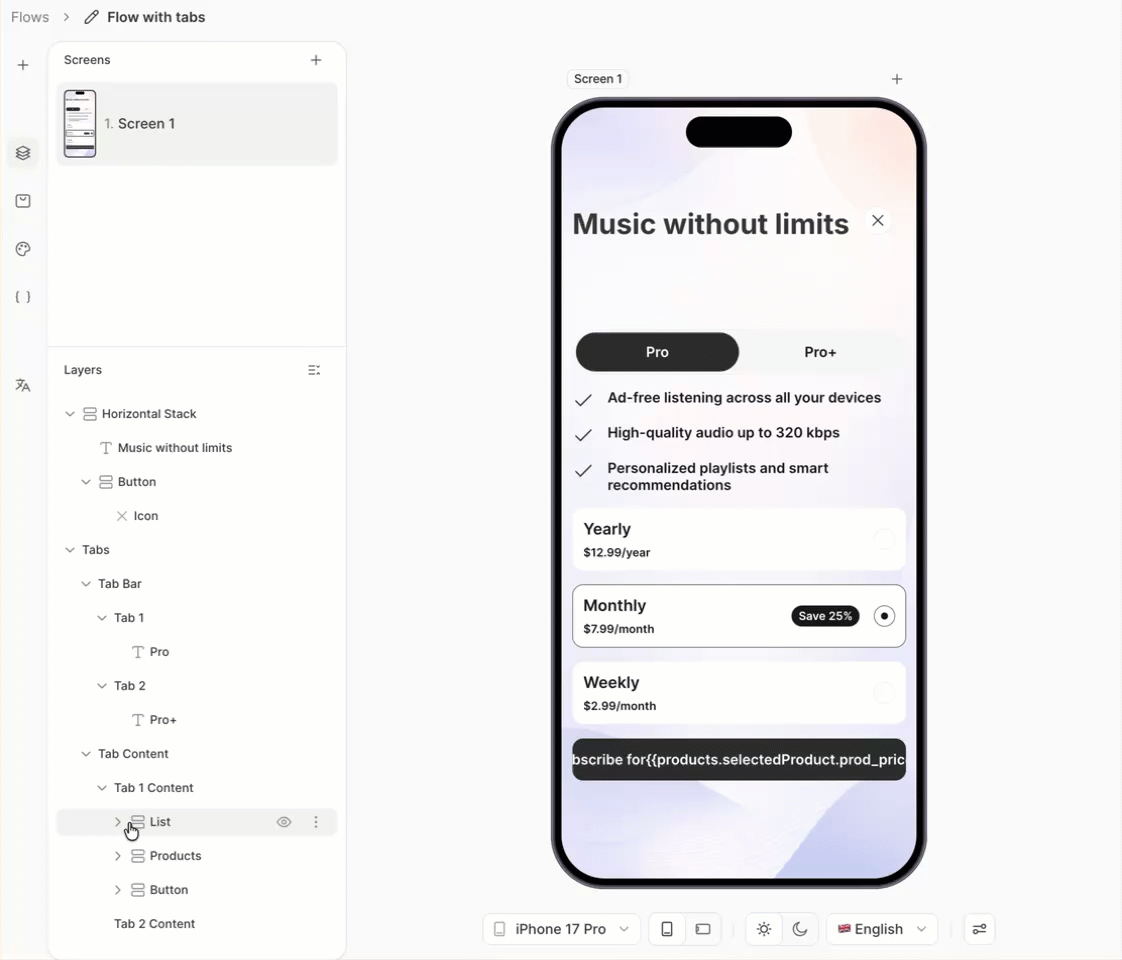
To add and configure products:
- Click + > Products and choose a layout preset. Vertical List works well for stacked plans. The element appears at the end of the layer tree.
- Select each product card on the canvas and pick a product from the dropdown in the Design tab.
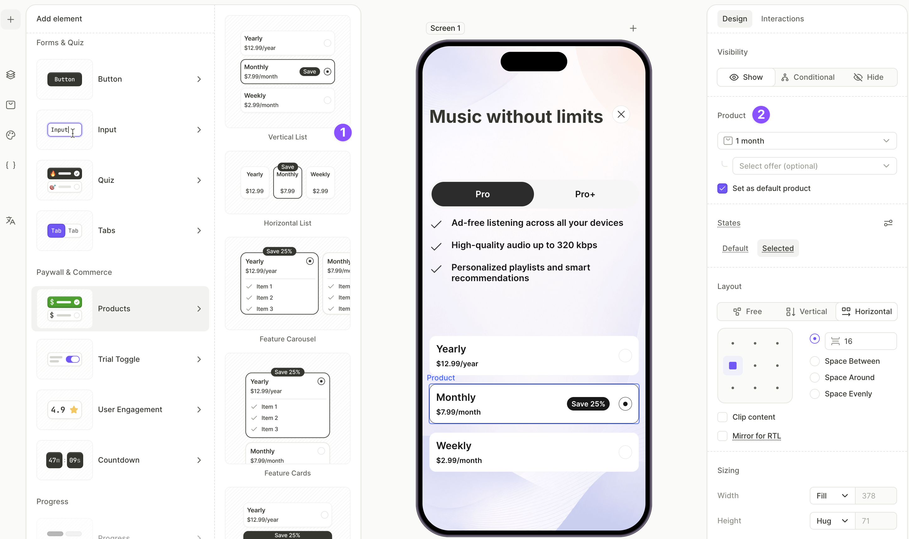
- In the Layers panel, drag the Products layer into the first tab’s Content container.
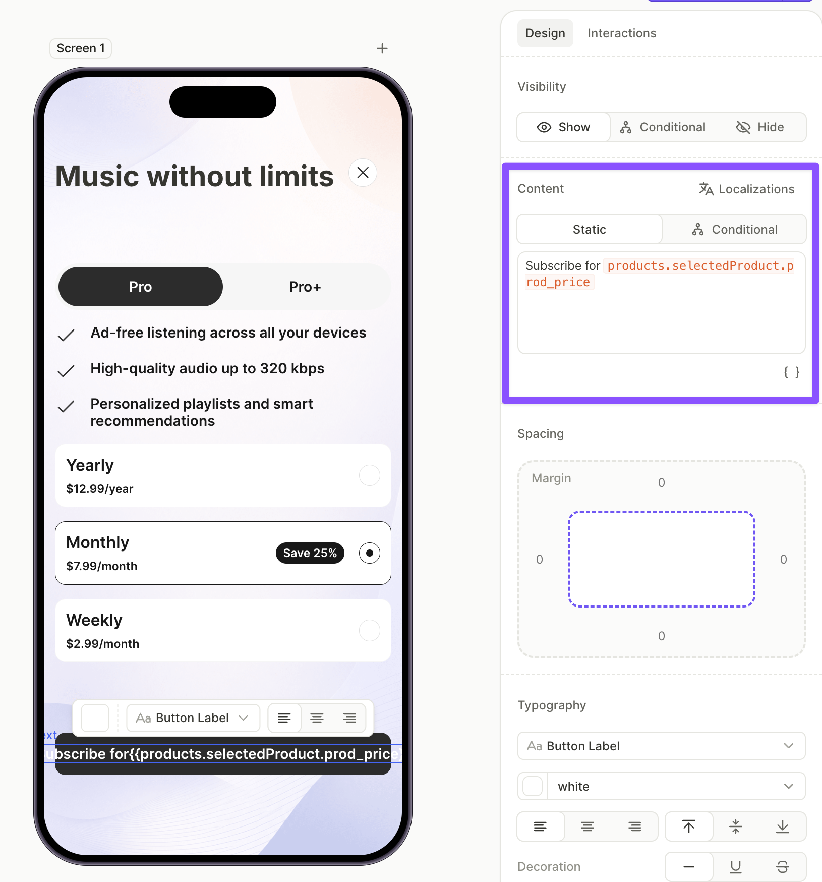
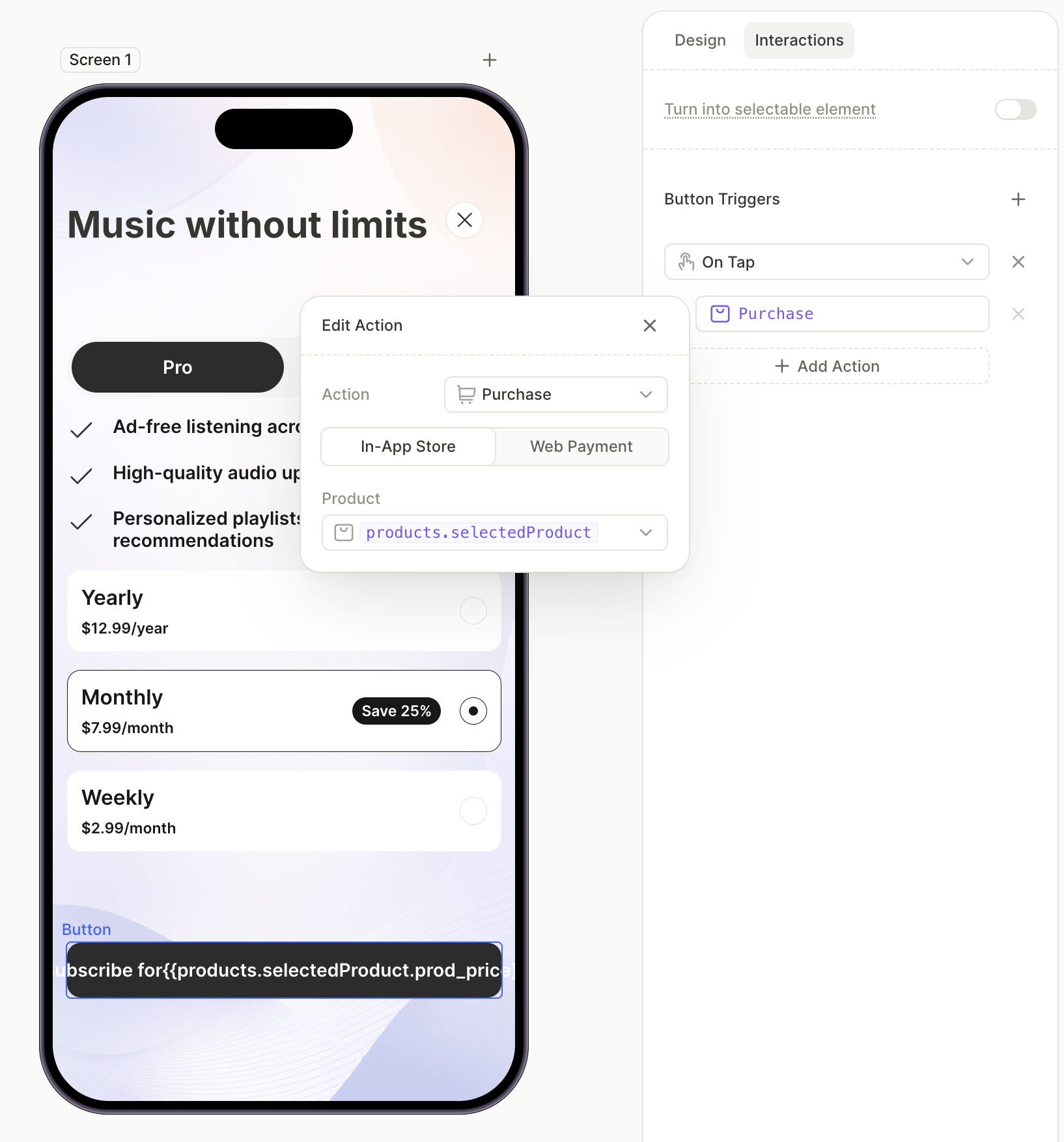
7. Add the purchase button to the first tab
The purchase button starts the in-app purchase for whichever product the user has selected inside the first tab. Its label uses the selected product’s price so it stays in sync with the user’s choice.
For more on the Purchase action, see Actions — Purchase.
To add and configure the purchase button:
- Click + > Buttons and choose a button preset. The element appears at the end of the layer tree.
- With the button selected, open the Design tab and place the cursor in the Content field. Click the variable icon
 , pick
 products.selectedProduct, then pick theprod_priceattribute — the full variable resolves toproducts.selectedProduct.prod_price. Surround it with the rest of the label — for example,Subscribe for {prod_price}.
- Switch to the Interactions tab and click Add trigger > On tap > Add action.
- Set Action to Purchase and Product to
products.selectedProduct.
- In the Layers panel, drag the button into the first tab’s Content container.
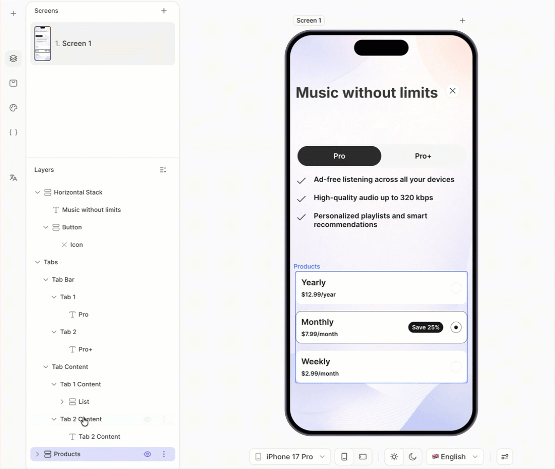
8. Copy the first tab’s content into the second tab
Rather than rebuilding the same structure from scratch, copy the feature list, product list, and purchase button from the first tab into the second tab. You’ll only need to update the values afterwards.
To copy the content:
- In the Layers panel, expand the first tab’s Content container.
- Select each element inside it (feature list, products, purchase button), copy it with ⌘C / Ctrl+C, and paste it with ⌘V / Ctrl+V. The copies appear at the end of the layer tree.
- Drag each copied element into the second tab’s Content container.
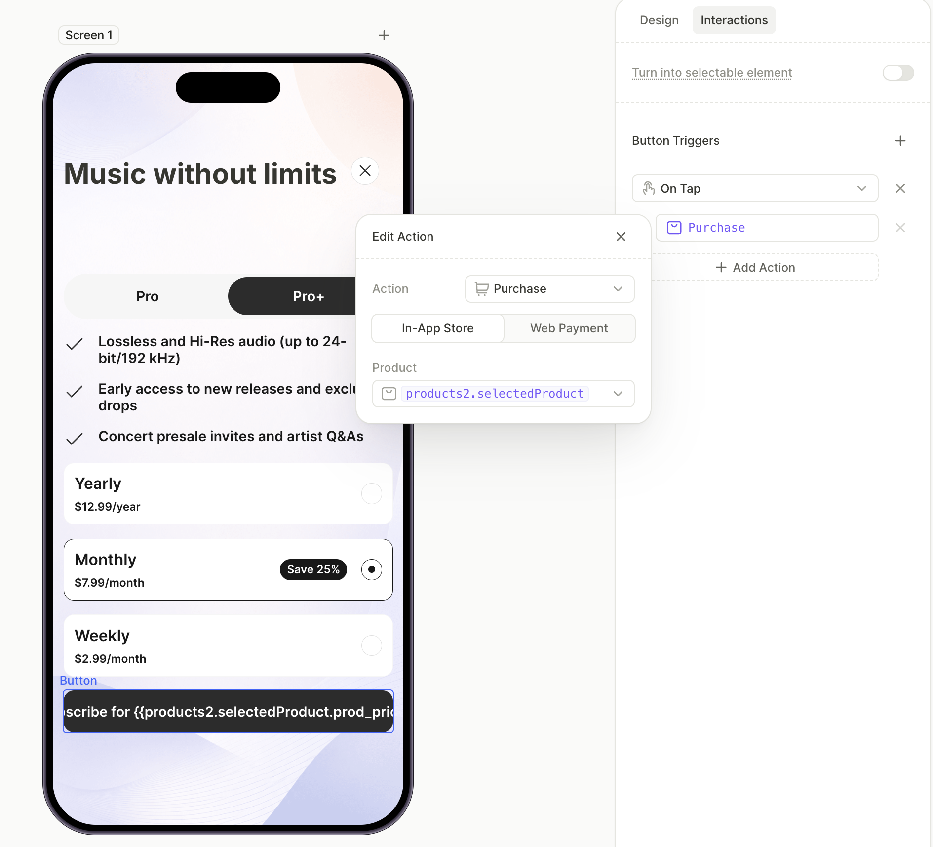
9. Update the second tab’s content
The second tab now mirrors the first one. Update each element so it reflects the second plan.
To update the second tab:
- Edit the feature list inside the second tab so the rows match the second plan’s features.
- Select each product card in the second tab’s Products element and assign the second plan’s products from the dropdown. This Products element automatically becomes a separate selectable group (
products2). - Select the purchase button in the second tab. In the Design tab’s Content field, change the price variable from
products.selectedProduct.prod_pricetoproducts2.selectedProduct.prod_price. - Switch to the Interactions tab and update the Purchase action’s Product from
products.selectedProducttoproducts2.selectedProduct.
10. Add the shared footer links
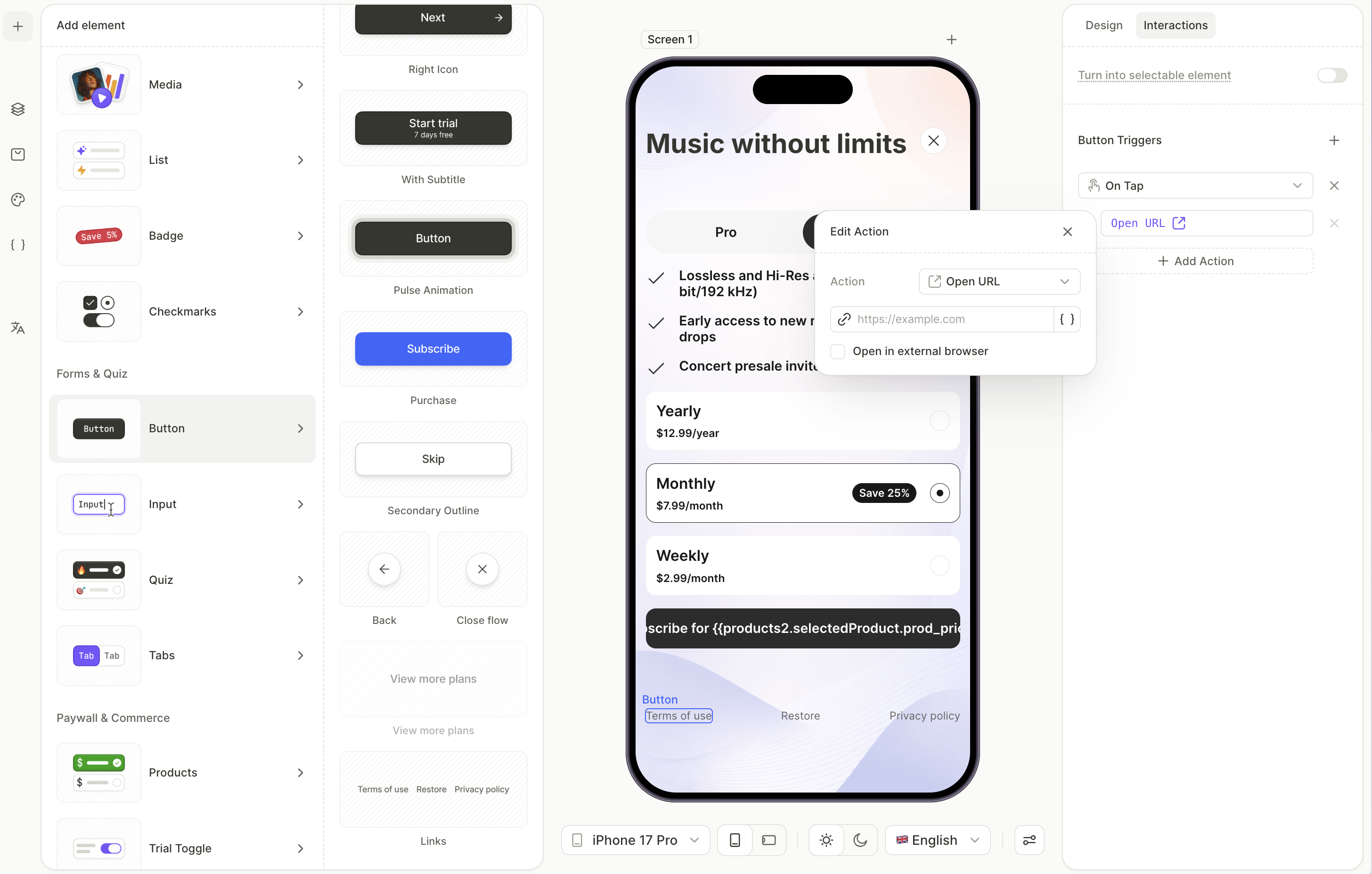
Terms of use, privacy policy, and restore purchases stay visible regardless of which tab is active. Add them at the screen level — outside both tab content containers — so they’re shared between the tabs.
To add the footer links:
- Click + > Buttons > Links. This adds a row with Restore Purchases, Terms of Use, and Privacy Policy at the end of the layer tree, which is where you want it — at the root of the screen, not nested inside a tab.
- In the Layers panel, select the Terms of Use button. Open the Interactions tab and paste your terms URL into the Open URL field.
- Repeat for the Privacy Policy button with your privacy URL.
- Leave the Restore Purchases link as is. Its action is preconfigured.
Next steps
- Save and publish your flow.
- Add the flow to a placement to start showing it to users.