Styles and appearance
The Design tab in the right panel controls each element’s visual appearance. The available properties depend on the element type, but most elements share common styling options.
For sizing, spacing, and positioning, see Layout and positioning.
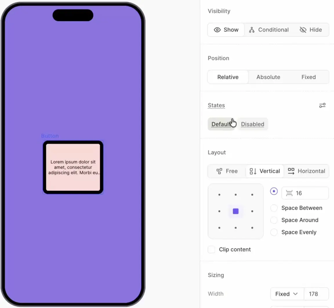
Visibility
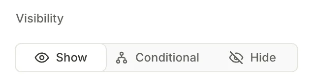
The Visibility toggle determines whether the element appears on screen.
- Show (default): The element is always visible.
- Conditional: The element is visible only when specific conditions are met. See Conditional visibility for more information.
- Hide: The element is always hidden. Use this to temporarily remove an element from the flow without deleting it.
Fill
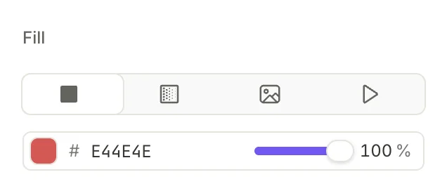
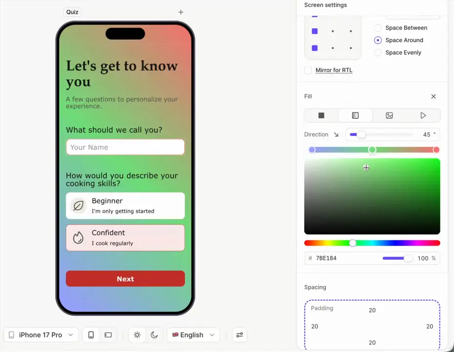
The Fill section controls the element’s background. Four fill types are available: solid color, gradient, image, and video.
Use this property to set the hero image / video for the entire screen.
- Solid color . Use the color picker, enter a hex value, or assign a project-wide color style. Adjust the opacity to make the background semi-transparent.
- Gradient . Add a gradient fill with two or more color stops. Drag the stops to adjust the transition, and change the gradient angle to control its direction.
- Image or Video . Set an image / video as the element’s background.
Border
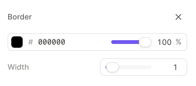
Borders are off by default. Click the next to Border in the right panel to add one. To remove a border, click the next to the Border heading.
When a border is present, configure:
- Color: Use the color picker, enter a hex value, or assign a project-wide color style. Adjust the opacity to make the border semi-transparent.
- Width: The border thickness in pixels.
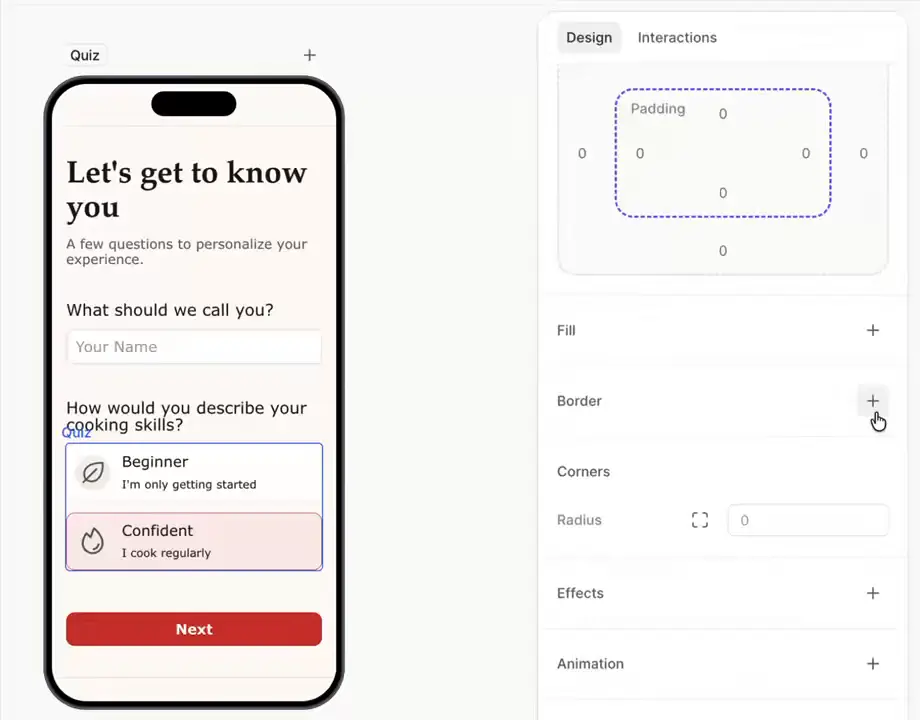
Corners
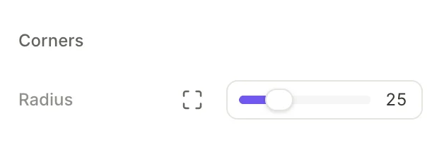
The Corners section controls the border radius (rounded corners).
- Radius slider: Set the same radius for all four corners
- Per-corner toggle : Enable to set a different radius for each individual corner
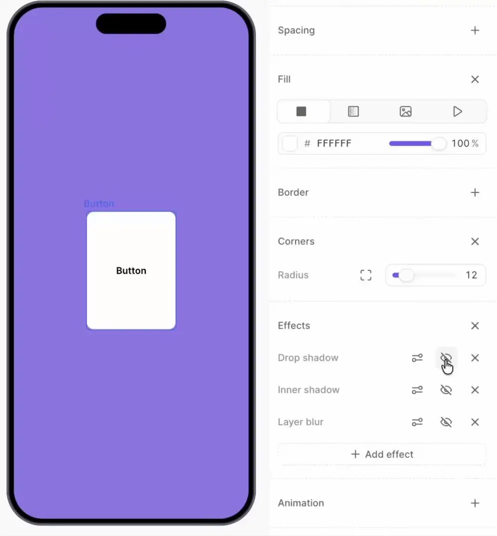
Effects
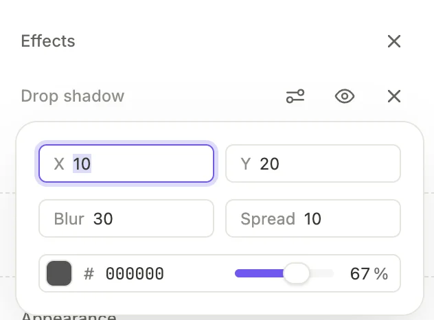
Click the plus button next to Effects to add one or more visual effects:
- Drop shadow: A shadow behind the element
- Inner shadow: A shadow inside the element’s boundaries
- Background blur: Blurs the background
- Layer blur: Blurs the element and its children
You can stack multiple effects on the same element. Toggle its visibility to temporarily disable an effect.
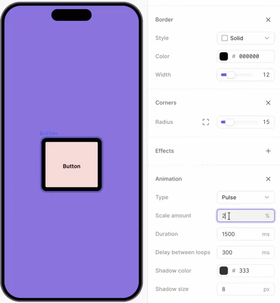
Animation
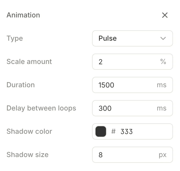
Click the button next to Animation to add an animated effect. Currently, Pulse is the only available animation — the element rhythmically scales up and down to draw attention.
Configure the Pulse animation with the following parameters:
| Parameter | Description |
|---|---|
| Scale amount (%) | How much the element grows relative to its original size |
| Duration (ms) | Length of a single animation cycle |
| Delay between loops (ms) | Pause between repetitions |
| Shadow color | Color of the pulsing shadow effect |
| Shadow size (px) | Size of the pulsing shadow |
Preview the animation
The builder shows static screens by default — animations stay still until you turn them on. Two ways:
- Click the Toggle animations button above the device preview. It turns the screen’s animations on or off — once on, they run continuously until you click again. The button only appears when the active screen contains at least one animation.
- Open the screen’s context menu (the three-dot icon next to the screen layer) and choose Play Animation.
Appearance
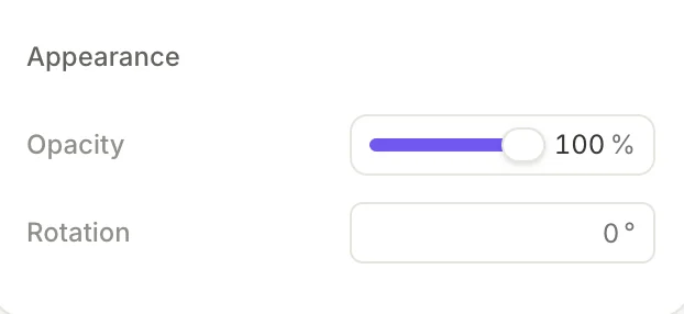
- Opacity: Ranges from 0% (transparent) to 100% (opaque)
- Rotation: Enter a value in degrees to rotate the element
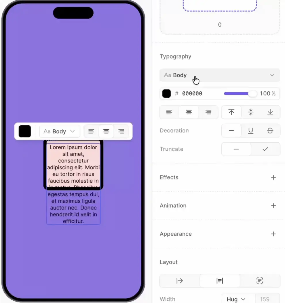
Typography properties (text elements)
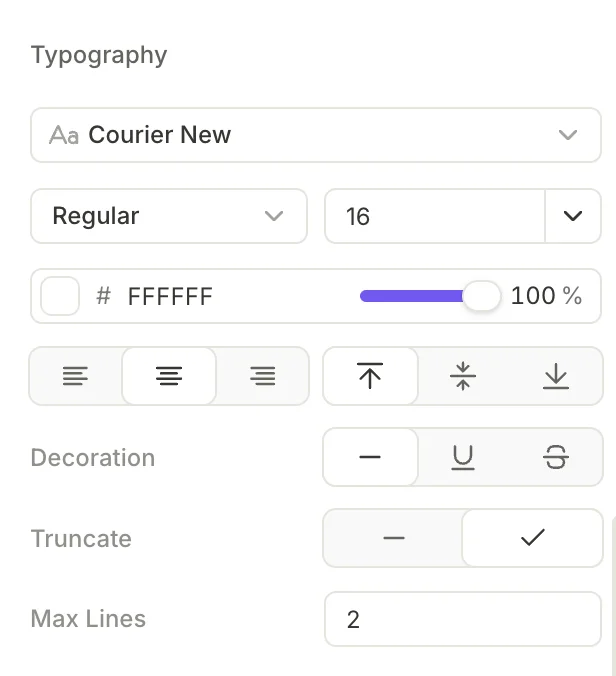
Text elements display a Typography section with the following controls:
Font
See also: Custom fonts
Click the font dropdown to open the font picker. It has two tabs:
- Styles: Lists your project’s saved text styles. Select a style to apply its full typography settings at once.
- Fonts: Lists all available font families. Search or scroll to find the one you need. Built-in fonts can render differently across devices — for consistent rendering, upload a custom font.
Size and weight
For custom fonts, the Weight, Bold, and Italic controls only affect the editor’s built-in preview. To display different weights and styles, upload each variation of the font as a separate file.
- Weight: Select a font weight from the dropdown
- Size: Select a size from the dropdown or type a custom value
Color
Click the color swatch to open the color picker. Enter a hex value, use the palette, or select one of the reusable styles. Adjust the opacity slider to make the text semi-transparent.
Alignment
Two groups of alignment controls:
- Horizontal: Left , Center , or Right
- Vertical: Top , Middle , or Bottom
Decoration
- None : No decoration (default)
- Underline : Adds an underline to the text
- Strikethrough : Adds a strikethrough line
Truncation
Enable truncation to cut off text that exceeds the Max Lines setting. This is useful when supporting multiple languages: if a translated string is longer than the original, truncation prevents it from breaking the layout.
When you select a text element, an inline toolbar also appears above it on the canvas. This toolbar offers quick access to font, weight, size, and alignment without scrolling through the right panel.
State-specific settings (interactive elements)
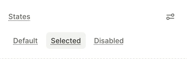
Interactive elements support multiple visual states. When you select such an element, a States section appears in the right panel. Switch between states to configure different visual properties for each.
Each state can override any visual property — fill, border, typography color, opacity, and more.
Selectable states
Main article: Selectable elements
Elements that belong to a selectable group (quiz options, products, tabs, trial toggles) offer two states by default:
- Default: The element’s normal appearance
- Selected: The appearance when the user has selected this option. Override properties like fill, border color, and text color to highlight the active choice
To style a selectable element when it’s not interactive, add a third state manually. Open States settings and add a Disabled state.
The Disabled state is condition-driven. Select it and click Set conditions to define when the element becomes disabled at runtime, for example when a required field is empty.
Input states
Input fields offer additional states:
- Default: Normal, unfocused appearance
- Active: The field is focused and ready for input
- Invalid: The entered value fails validation
- Disabled: The field is not interactive
Other state-bearing elements
A few elements expose state-specific styling outside the standard Default / Selected / Disabled pattern:
- Progress indicator steps — three states per step: Completed, Current, and Upcoming.
- Carousel dots — two color variants: Color for inactive dots and Active Color for the dot of the current slide.
Reusable styles
The Styles panel in the left sidebar allows you to define reusable styles that apply across your entire flow. Two types of styles are available: text styles and color styles. You need to use color styles to enable dark mode support.
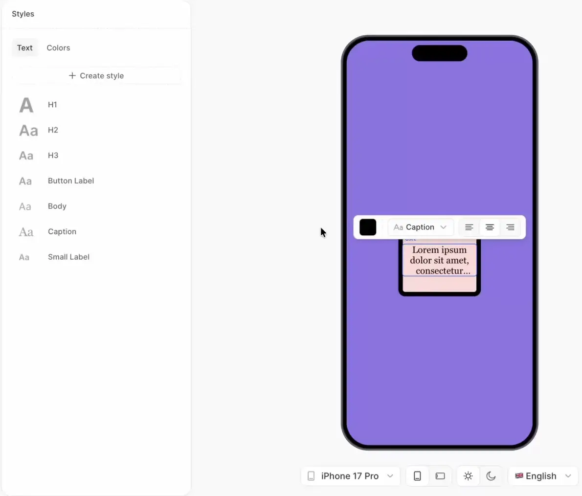
Text styles
Main article: Text content
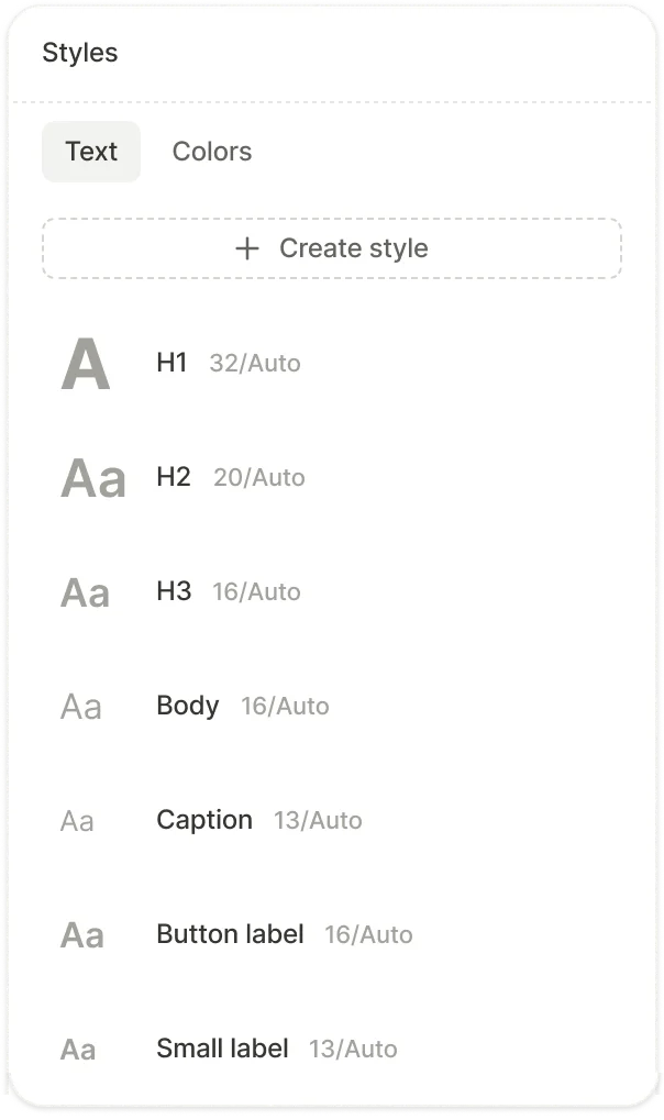
Text styles store a complete set of typography settings — font family, weight, size, line height, alignment, and decoration. Every flow template includes default presets, and you can create custom styles.
To create a text style:
- Open the Styles panel and select the Text tab.
- Click Create style.
- Enter a name and configure the typography settings.
- Click Create.
To apply a text style, select a text element and choose the style from the font dropdown in the Typography section.
Color styles
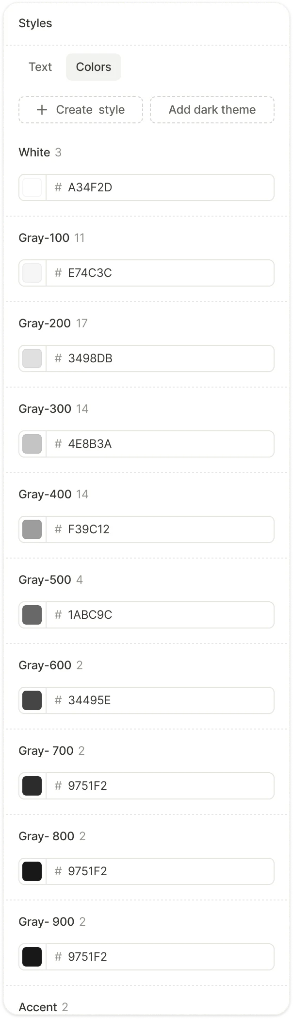
Color styles are named colors that you can reference throughout your flow. Each color style has a name (like “Primary text” or “Brand”), a hex value, and a usage count showing how many elements reference it.
To create a color style:
- Open the Styles panel and select the Colors tab.
- Click Create style.
- Enter a name and pick a color.
When you update a color style, every element that references it updates automatically.
Dark mode
Main article: Dark mode
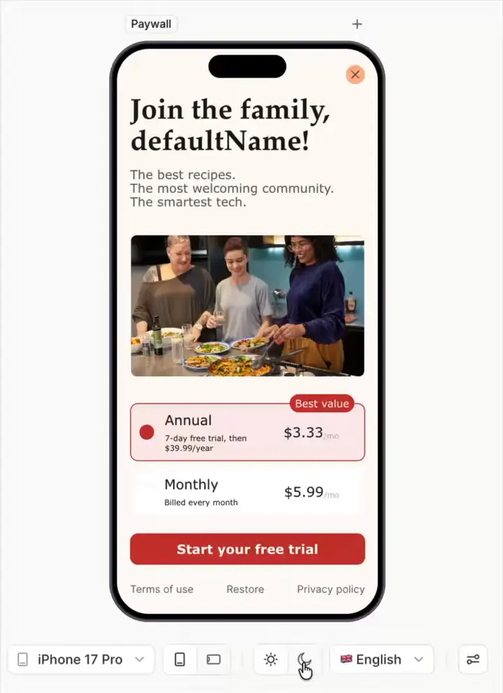
If necessary, you can add two variants to each color style — one for light mode and one for dark mode . The SDK automatically applies the correct variant based on the device’s current color scheme.
To preview dark mode in the builder, use the theme toggle in the bottom toolbar.