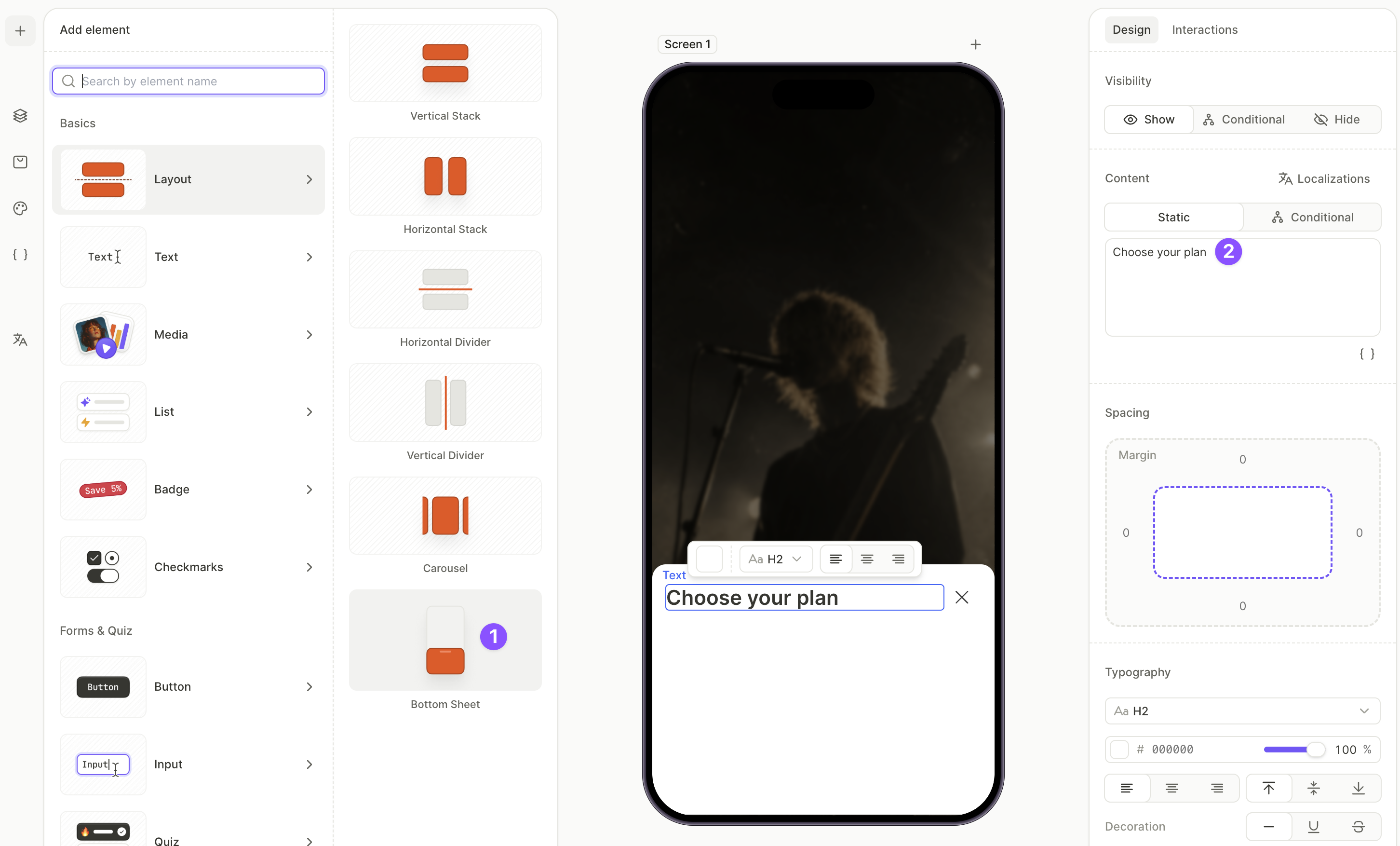
Layout elements: containers, carousels, bottom sheets
Layout elements group other elements together and control how they’re laid out on the screen.
:The Flow Builder includes five layout element types:
- Containers: arrange children along an axis — vertically or horizontally
- Carousel: a swipeable container that shows one slide at a time
- Bottom Sheet: a panel that slides up from the bottom of the screen and renders on top of the underlying content
- Footer: a panel pinned to the bottom of the screen, outside the scroll area
- Dividers: thin lines that separate rows or columns
Tabs also fall under this umbrella, but live in a separate article. See Tabs for details.
Containers
Main article: Layout and positioning
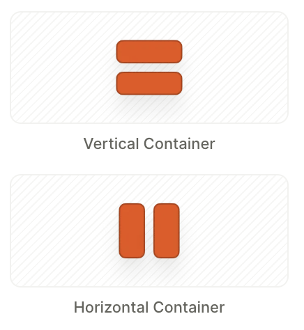
Containers group elements vertically or horizontally. The Vertical Container arranges elements as rows; the Horizontal Container arranges them as columns.
Nest containers inside each other to compose more complex layouts.
Change container direction
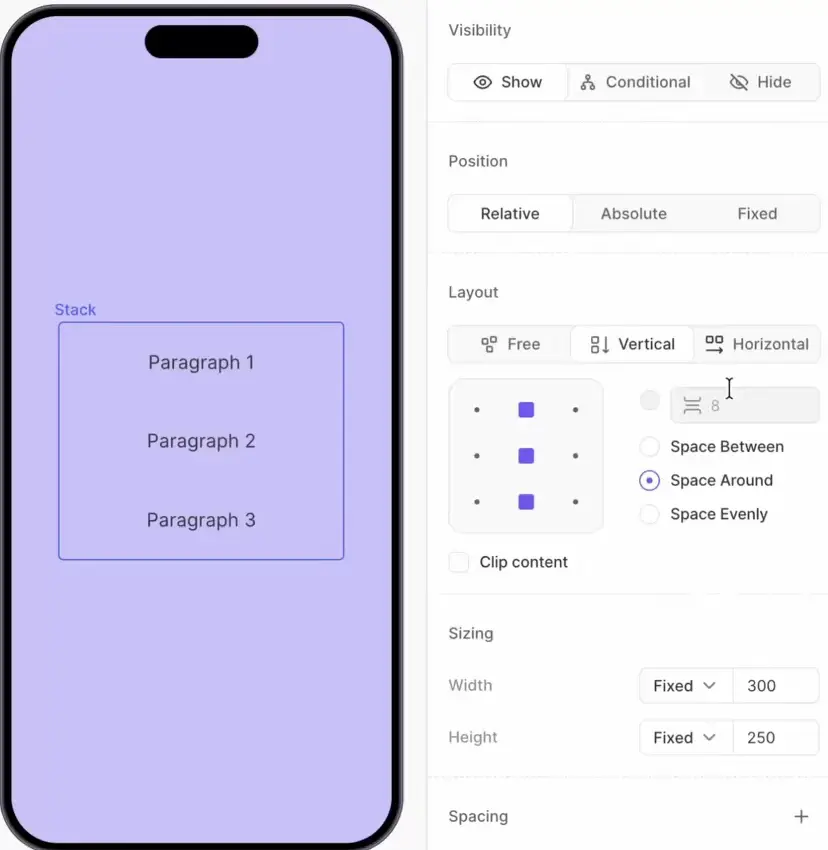
A container’s direction isn’t fixed. Switch between Vertical, Horizontal, and Free in the Layout section of the right panel at any time — no need to delete and re-create the container.
Configure spacing, alignment, and distribution in the same Layout section. Children render in the order they appear in the Layers panel — drag to reorder.
Wrap and unwrap
To turn an existing element into a container, select it and use the Wrap layer action. Drag additional elements into the new container from the Layers panel. To remove a container and promote its children one level up, use Unwrap.
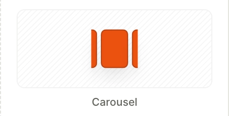
Carousel
A Carousel is a swipeable container that shows one slide at a time. The user swipes horizontally to reveal the next slide, or the carousel auto-advances on a timer.
A Carousel contains a set of Slide layers. When the slide is active, the elements on that layer appear on the screen.
Unlike Tabs, the carousel’s active slide is not exposed as a selectable group — slides can’t be referenced in conditions or dynamic text. Use a Carousel for visual rotation, not for user-driven branching.
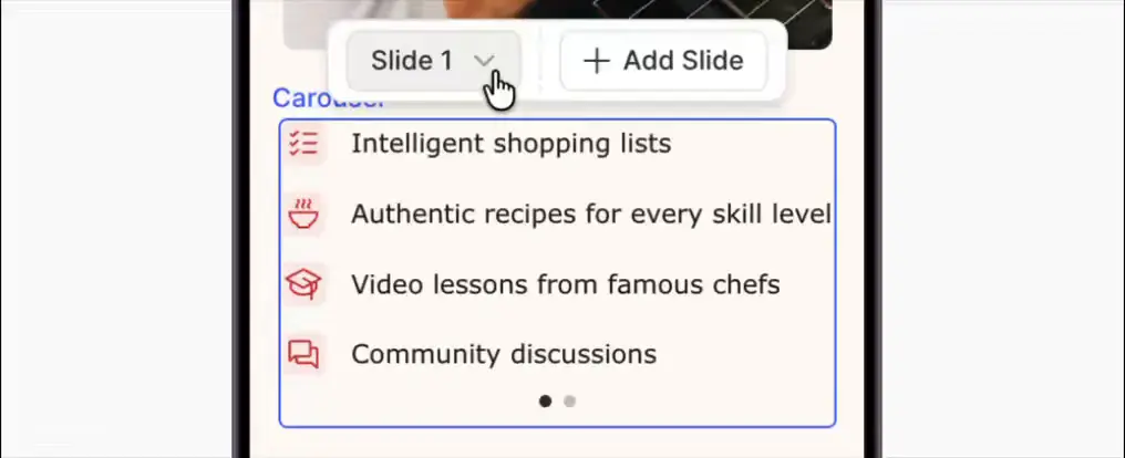
Change active slide
When you select the carousel, the builder displays a pop-up control bar with a Slide dropdown and a + Add Slide button.
- Click + Add Slide to add a new empty slide.
- Use the Slide dropdown to switch which slide is active on the canvas — or click the corresponding Slide layer in the Layers panel.
To reorder slides, drag them within the Carousel in the Layers panel.
Properties
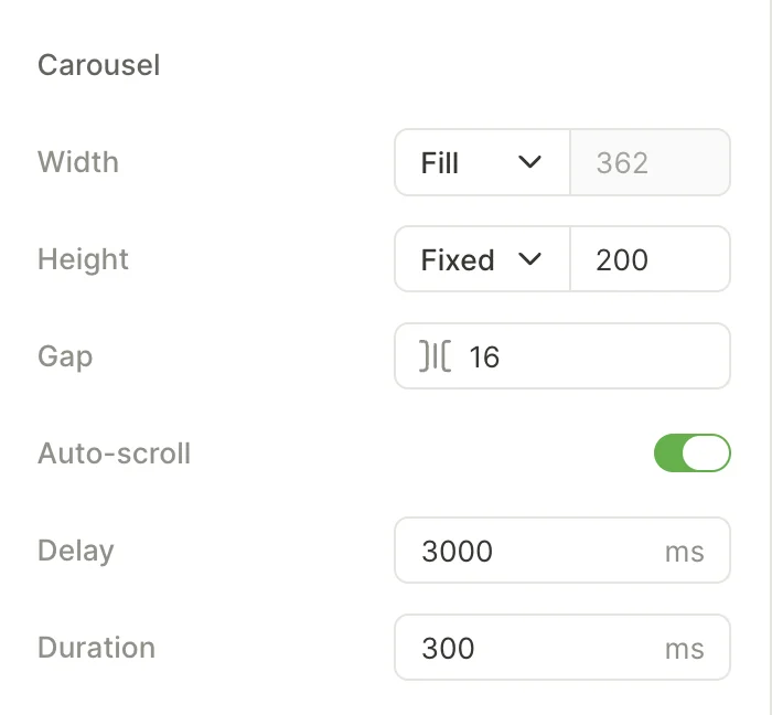
Auto-scroll
Auto-scroll cycles slides automatically — the user doesn’t have to swipe to see all the content.
Two timing controls determine its behavior:
- Delay — how long each slide stays visible (ms).
- Duration — how long the transition between slides takes (ms).
Carousel sizing
Dedicated controls determine the size of the carousel and the spacing between adjacent slides. Set Height to Fixed so the layout doesn’t shift as the user swipes between slides of different content lengths.
Slide sizing
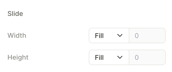
Per-slide Width and Height. Defaults to Fill so each slide tracks the carousel’s dimensions. Set a fixed width to create a peek effect where adjacent slides are partially visible.
Dots
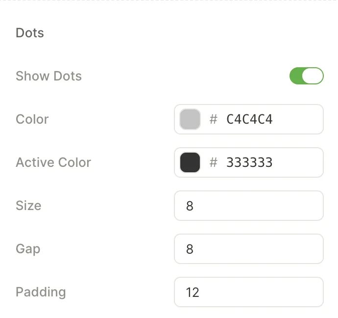
The page indicator at the bottom of the carousel. It tells the user how many slides exist and which one is active.
Turn off the Show dots toggle to hide the slide indicator. When dots are visible, the following properties control their appearance:
- Color — fill of an inactive dot.
- Active Color — fill of the dot for the currently visible slide.
- Size — diameter of each dot, in pixels.
- Gap — spacing between adjacent dots.
- Padding — space between the dot row and the carousel content above.
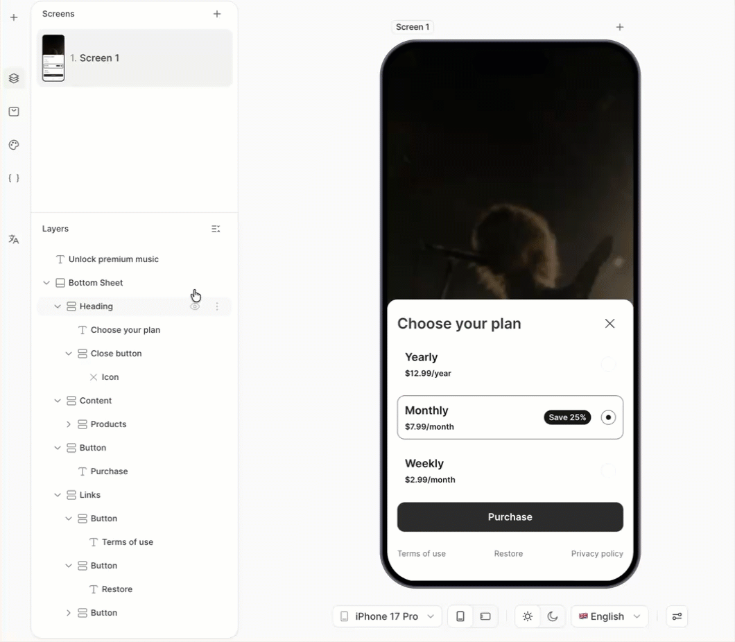
Bottom Sheet
Walkthrough: Show all plans in a bottom sheet
A Bottom Sheet is a layout panel that slides up from the bottom of the screen, on top of the underlying content.
The sheet always blurs anything behind it; the blur can’t be turned off. Trigger it on tap — for example, behind a Show all plans link — rather than on screen load.
Structure
A Bottom Sheet ships with two top-level layers:
- Heading — a container at the top of the sheet, prefilled with a Title text layer and a Close button . Edit or remove them as needed.
- Content — the main container. Drop products, buttons, links, or any other elements into it.
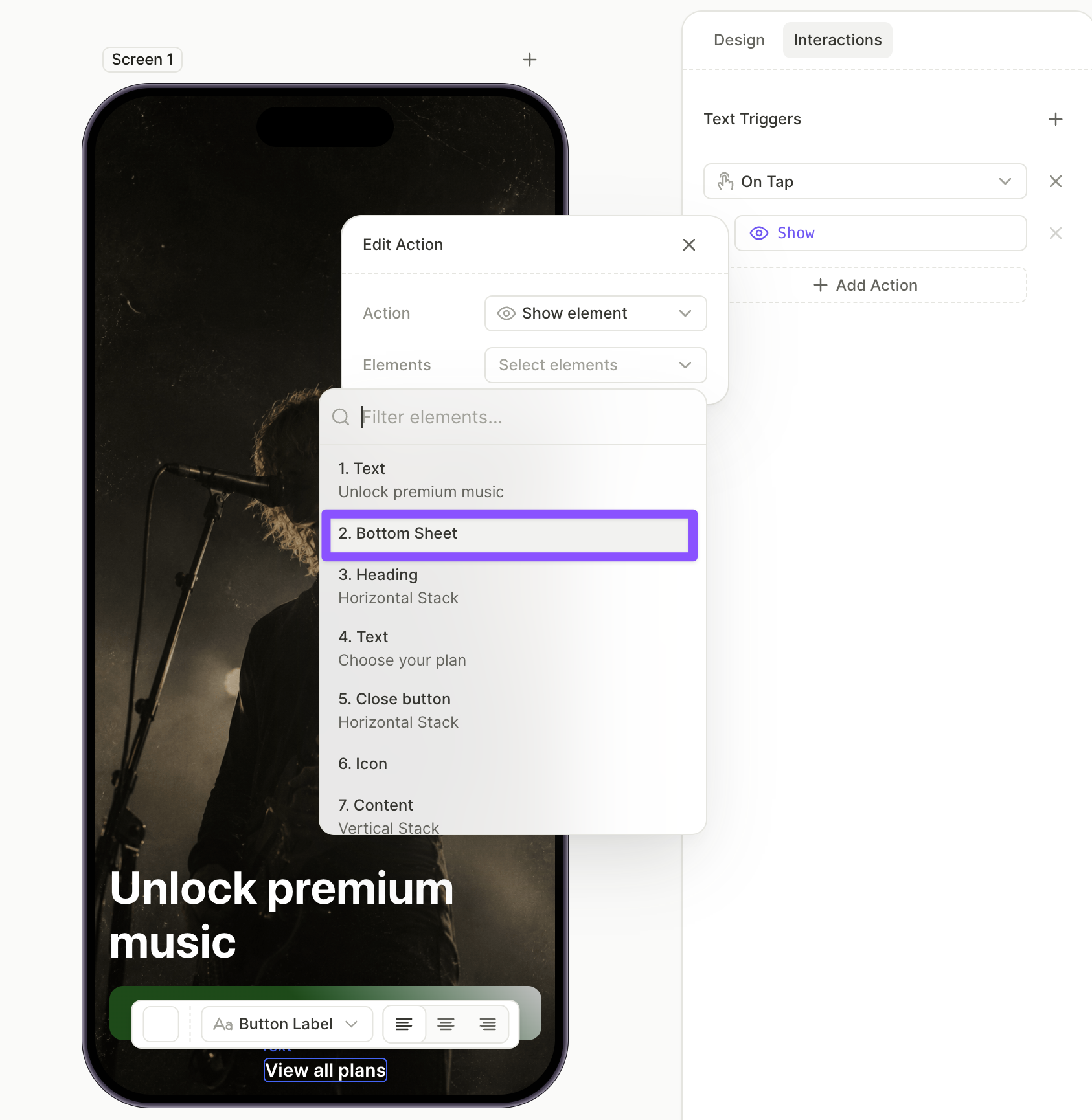
Initial visibility
By default, a bottom sheet appears as soon as the screen renders. To open it on demand instead:
- Build out the sheet’s content first — hidden layers can’t be edited, so the sheet has to stay visible until you’re done filling it.
- In the Layers panel, select the bottom sheet.
- Set Visibility to Hide .
The sheet stays in the layer tree but stops rendering on the screen.
Triggering the bottom sheet
To open a hidden bottom sheet, attach a Show action to another element:
- Select the trigger element (e.g., a button or text link).
- Open the Interactions tab in the right panel.
- Click Add trigger > On tap, then Add action.
- Set Action to Show and pick the bottom sheet from the dropdown.
Footer
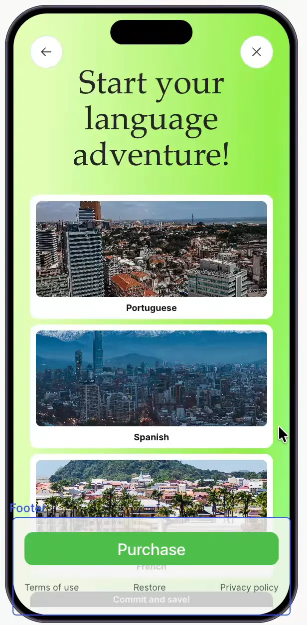
A Footer is a sticky container that occupies the bottom part of a screen. It can be of any height, and contain anything from a single button to multiple rows of text. Use the footer for content that must stay in place while the rest of the screen scrolls — CTA buttons, legal text, links.
Unlike regular elements, the footer reaches into the device’s bottom safe area: its background extends all the way to the screen edge.
Only one footer is allowed per screen. You cannot duplicate an existing footer, or add a new one.
Footer vs. a regular fixed element
Both stay on screen while content scrolls. Pick the option that matches what you need:
- Use a Footer for the screen’s main bottom bar (CTA button, legal text, links). It reserves its own height, so content always scrolls clear of it and never hides behind it, and it automatically covers the bottom safe area.
- Use a fixed element for something that should float over scrolling content rather than reserve space for itself, or that pins to an edge other than the bottom — a floating close/restore button, a persistent top banner, a scroll-to-top control. You manage its safe-area spacing yourself.
Dividers

The Horizontal Divider and Vertical Divider are thin lines that separate content. Use the Horizontal Divider to split rows, and the Vertical Divider to split columns inside a horizontal container. Adjust thickness, color, and length from the right panel.