Progress indicators and loaders
The Progress category provides two element types — one for step-based progress through a multi-screen flow, and one for in-place busy indicators.
Progress indicators
Indicator styles
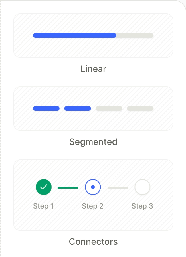
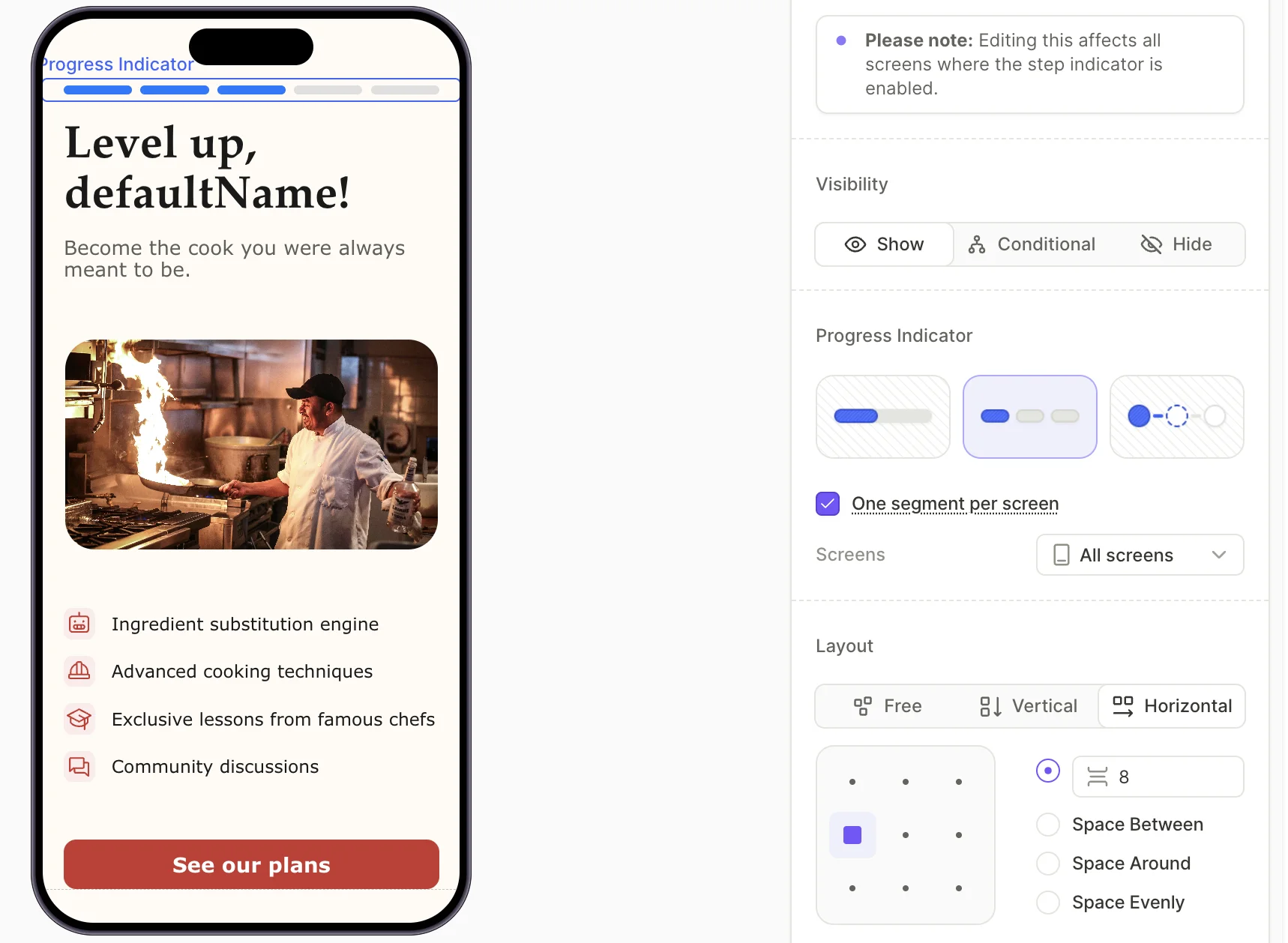
A Progress element shows the user’s position in a multi-screen flow. The category provides three visual variants:
- Linear — A single bar that fills as the user advances.
- Segmented — Separate bars for each step that fill one by one.
- Connectors — Labeled circles connected by lines (e.g., Step 1, Step 2, Step 3 in sequence).
Match steps to screens
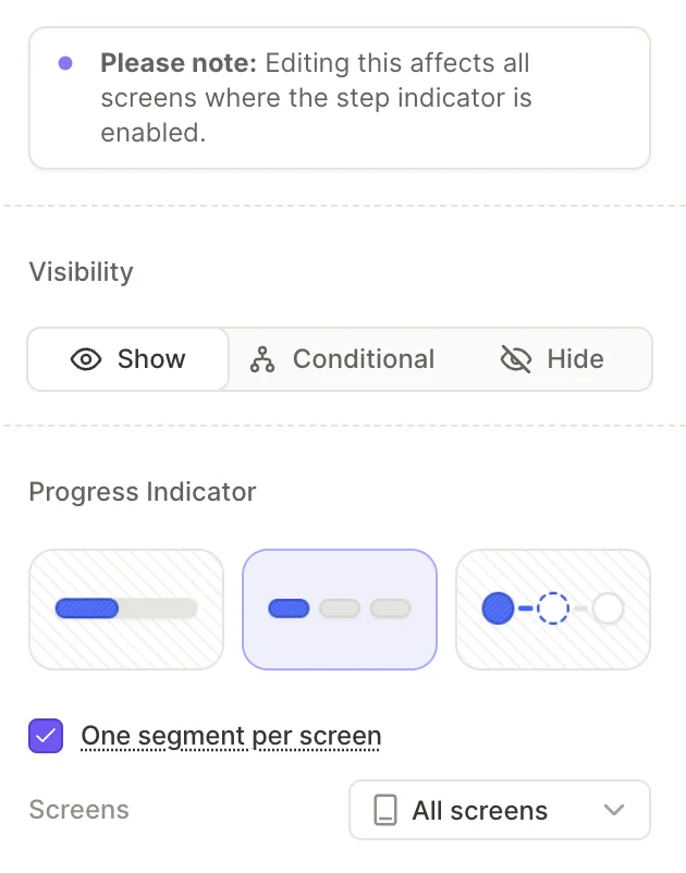
By default, the Progress Indicator tracks every screen in the flow. To restrict it to a subset, pick from the Screens dropdown. Alternatively, open the screen you want to exclude, and uncheck the Include screen in progress indicator checkbox.
Toggle One segment per screen off if you need finer control over the step count.
Step position follows the screen list — not the order the user actually sees. In non-linear flows, the indicator’s displayed step can jump ahead or backtrack.
Step states
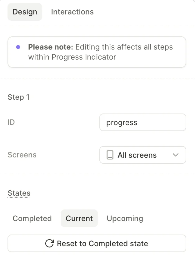
Each step has three states — Completed, Current, and Upcoming. Select a step inside the Progress Indicator to edit a state’s styling in the right panel. Use Apply changes to all states to copy your edits to the other two.
Editing one step affects every step inside the same indicator.
Layout and positioning
The Progress indicator is a global element, so you can’t place it inside a container. You also can’t set its position — it uses absolute positioning by default. When the user scrolls the screen, the indicator stays in place and the content scrolls beneath it.
To control the space around the indicator, use the Margin and Padding controls in the Spacing section instead of moving the element. If the layout looks wrong, adjust the margin or padding on both the indicator and its neighboring element.
Loaders
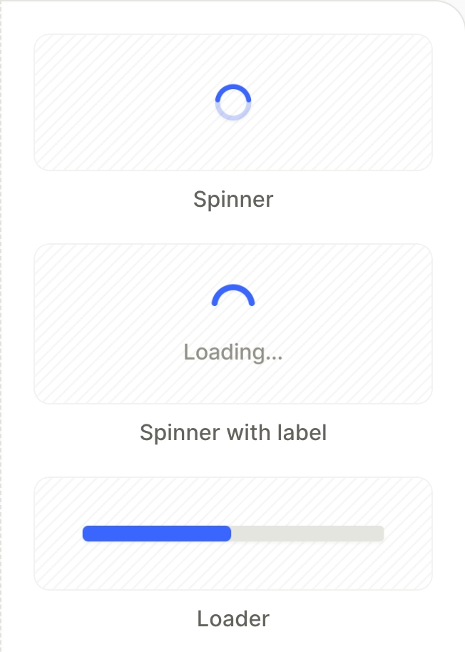
A Loader is an animated element that suggests that work is happening: for example, processing a user’s quiz answers to prepare a personalized plan.
The category provides three templates:
- Spinner — A circular spinner.
- Spinner with label — A circular spinner with a caption (e.g., “Loading…”).
- Loader — A horizontal bar that fills as the work progresses.
A loader requires a trigger to appear and disappear. Open the Interactions tab to set up this logic — for example, show it after the user submits a quiz.