Selectable elements and groups
Selectable elements are flow elements that users can tap to select or deselect. Their state can drive navigation, visibility, and other logic across the flow. Here’s what you can do:
- Use default selectable elements — quiz options, products, tabs, and trial toggles are selectable out of the box
- Make any element selectable — turn any element into a selectable one and assign it to a group
- Create and manage groups — organize selectable elements into single-choice, multi-choice, or toggle groups
- Use selected state in conditions — reference group values in conditions on any screen in the flow
Default selectable elements
Some element types are selectable by default — they already belong to auto-created groups and don’t need additional setup:
- Quiz options: Each quiz answer is a selectable element within the quiz group. See Quizzes.
- Products: Product cards in a product group. See Product block.
- Tabs: Tab items within a tab group. See Tabs.
- Trial toggles: A container that belongs to a group and gets a selected state. See Toggles.
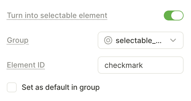
Make an element selectable
In some cases, you might want to make additional elements selectable. For example, you can add a Don’t ask me again checkbox that operates as an element inside a quiz group.
To make an element selectable:
- Select the element on the screen or in the Layers panel.
- On the right, switch to the Interactions panel.
- Select Turn into selectable element.
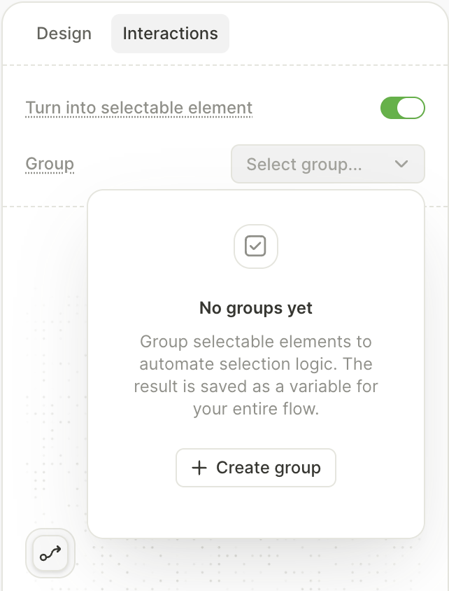
- In the Group dropdown, select an existing group or create a new one.
- Set the Element ID — a unique identifier for this element within the group.
- If you want this element to be selected by default, select the Set as default in group checkbox.
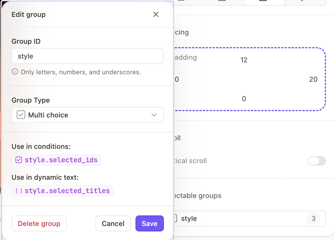
Create a group
Groups organize selectable elements on a screen and define how selection works — whether users can pick one option, multiple options, or toggle.
To create a group:
- Select an element and make it selectable.
- In the Group dropdown, select Create group.
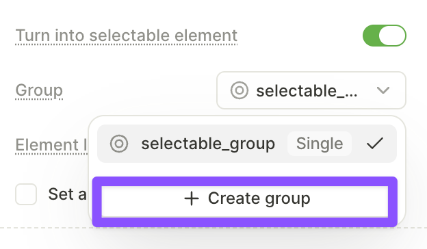
- Enter a Group name.
- Select the group type.
The group is now available in the Group dropdown for other selectable elements on the same screen.
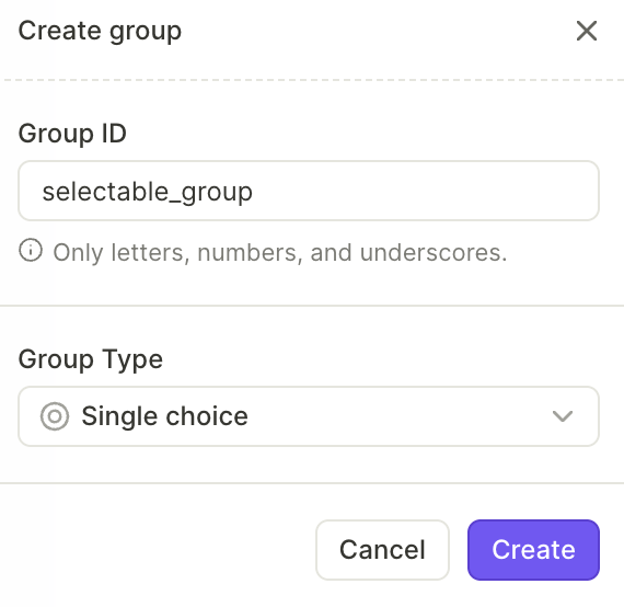
Group types
Most quiz presets are multi-choice by default. Change the group type to allow only one answer.
- Single choice: Only one element in the group can be selected at a time. Selecting a new element deselects the previous one.
- Multi-choice: Multiple elements can be selected at the same time.
- Toggle: Each element switches between selected and deselected on each tap, independently of other elements.
Manage groups
To view and edit groups, open the Screen settings panel and find the Selectable groups section. It lists all groups on the current screen.
Click a group ID to:
- Change the group ID
- Change the group type
- See how group elements are referenced in conditions
Use selectable state in conditions
You can reference a group’s selected state in conditions on any screen in the flow — not just the screen where the group is defined. For example: IF quiz.photo is selected, THEN navigate to the Photo screen.
All elements in a group must be on the same screen. You cannot add elements from different screens to one group. However, you can reference group values in conditions on any screen in the flow.
Use selectable state with:
- Conditional actions: Route users to different screens or trigger different actions based on selected elements.
- Dynamic navigation: Branch the flow based on quiz answers, toggle states, or other selections.
- Conditional visibility: Show or hide elements based on what users selected on previous screens.