Tabs
Tabs split a screen section into switchable content panels — the user taps a tab header and the panel below updates to match.
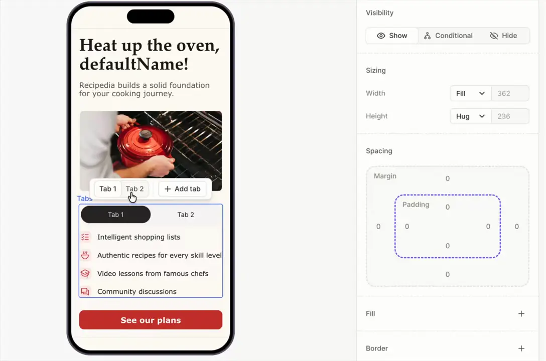
Add, remove, and select tabs
Each tab consists of two parts
- Tab header — the clickable label (Tab 1, Tab 2, etc.).
- Tab content — one container per tab. Whatever you put in a content container appears when its tab is selected.
Click Add tab to add a new tab. Each new tab gets a matching content container.
To make a specific tab active when the screen first appears, toggle Selected by default.
Style the tabs
Templates
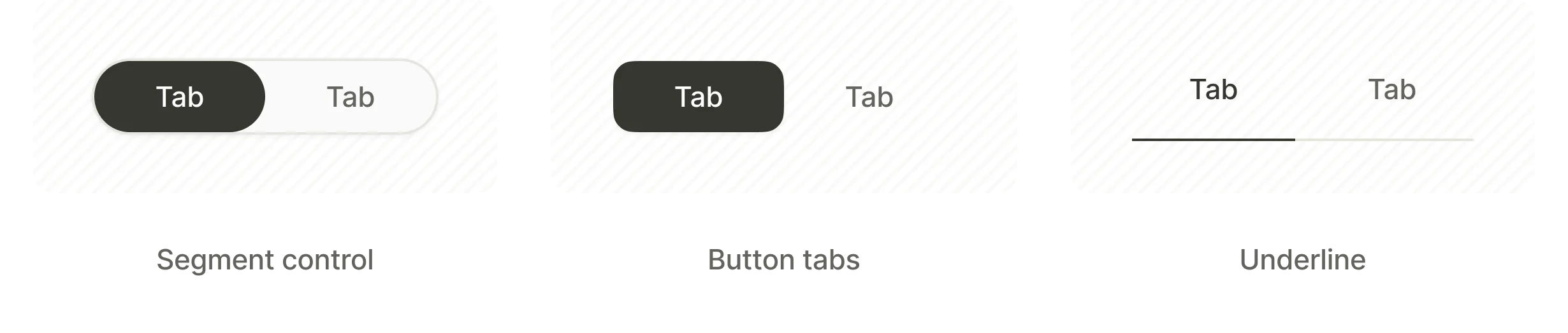
The Flow Builder offers three ready-to-use tab templates:
- Segment control — a pill-shaped switcher with rounded corners around the selected tab.
- Button Tabs — separate button-styled tabs.
- Underline — text labels with an underline marking the selected tab.
Tab states
Each individual tab has a state-switcher (Default / Selected) for styling the active and inactive states separately — typography, colors, fill, and border per state.
Selectable group
Tabs are a single-choice selectable group — exactly one tab is active at a time. Manage the group from the Screen settings panel, in the Selectable groups section.
The group exposes two variables:
tabs.selectedOptionId— the ID of the selected tab. Use it in conditions.tabs.selectedOptionTitle— the label of the selected tab. Use it in dynamic text.
Replace tabs with your custom Group ID if you renamed the group.
See Selectable elements and groups for the full picture.