Inputs and forms in the Flow Builder
Use inputs to collect typed data from users — such as a name, email address, or date of birth. Store responses and reference them elsewhere in the flow, such as addressing the user by name on a later screen.
Add an input
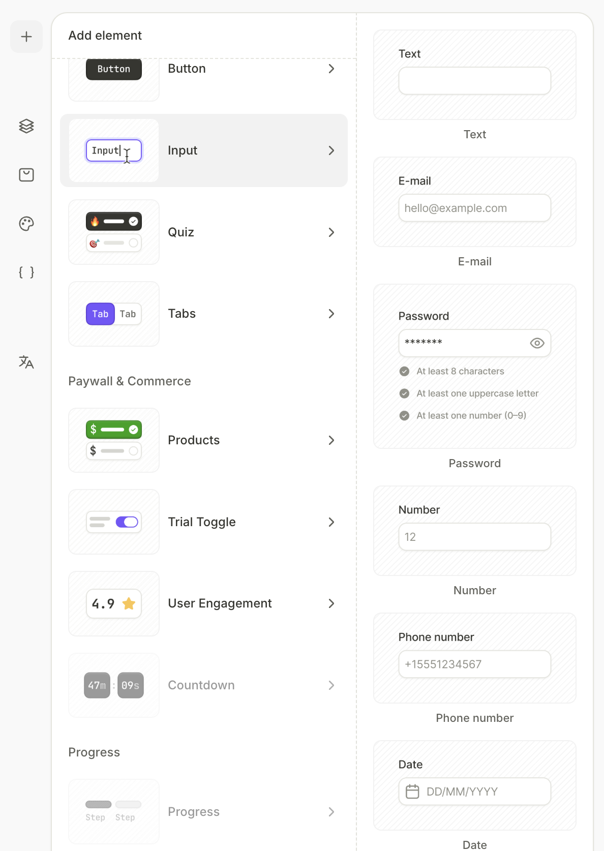
- Click + at the top left.
- Select Input.
- Choose the input type:
- Text: Any short text entry.
- Email: Email addresses, with optional format validation.
- Password: Secure text entry, with configurable requirements.
- Number: Numeric values, with configurable format.
- Phone number: Telephone numbers.
- Date: Opens a date picker.
- Time: Opens a time picker.
- Date and time: Opens a combined picker.
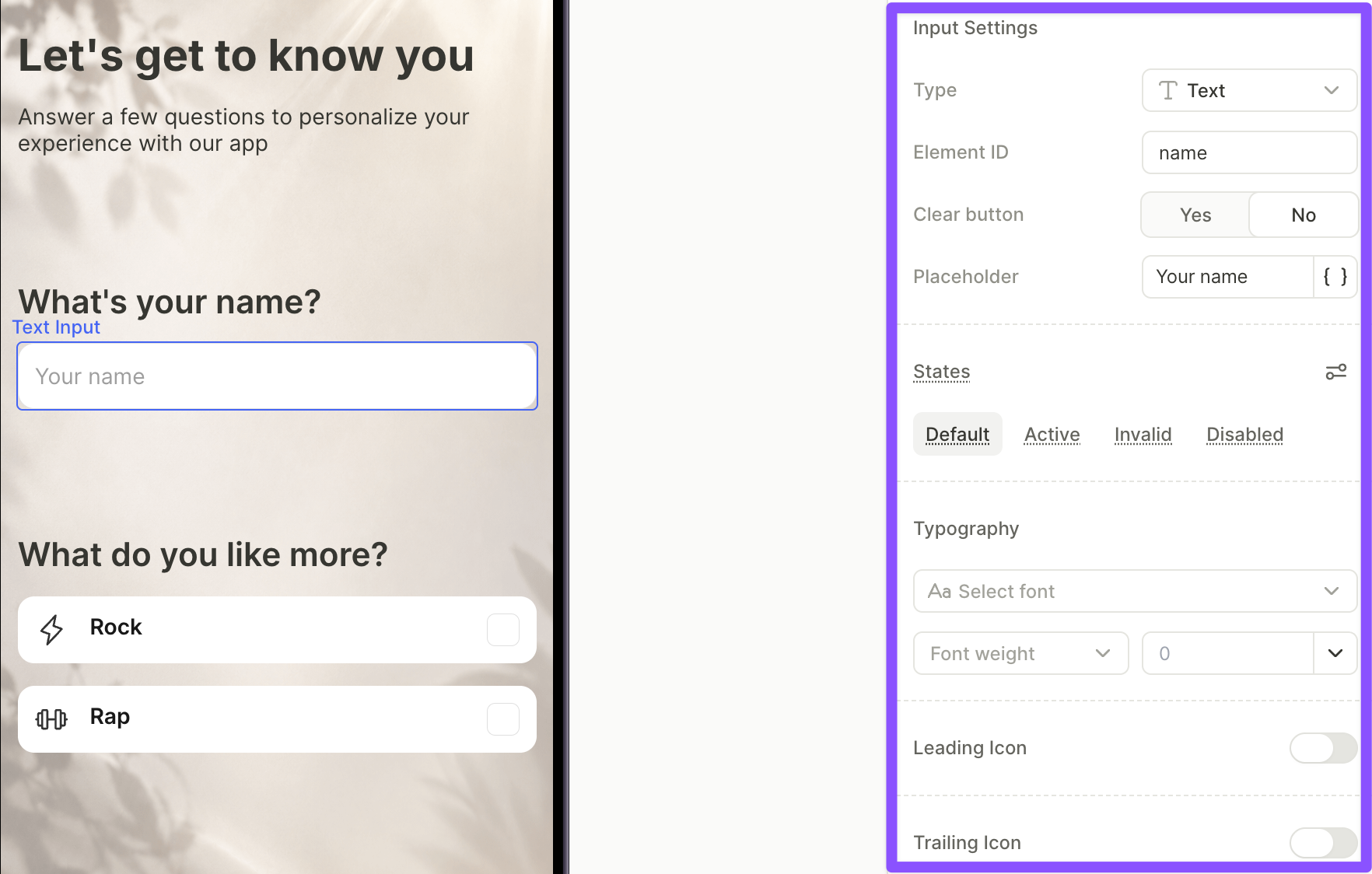
Configure an input
For more details about visual settings — layout, style, and visibility — see Styles and appearance.
For all input types, you can configure the following in the Design tab:
- Type: Change the input type (Text, Email, Password, Number, Phone number, Date, Time, or Date and time).
- Element ID: Identifier used to reference the input’s value elsewhere in the flow. See Use input values below.
- Placeholder: Hint text displayed inside the empty field.
- State: Define how the input looks in different situations. Switch between Default, Active, Invalid, and Disabled and apply different visuals to each.
- Typography: Text styling for the value displayed in the field.
- Leading and trailing icons: Add icons inside the input field.
Some settings are specific to certain input types:
| Setting | Input types |
|---|---|
| Clear button | Text, Email |
| Validate email format | |
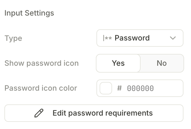
| Show password icon | Password |
| Edit password requirements | Password |
| Number format | Number |
| Date/time format | Date, Time, Date and time |
| Min and max date | Date, Date and time |
Use input values
Every input is automatically available as a variable — there’s no setup or On Submit action required. The value is referenced through the input’s Element ID, which you set in Input Settings.
To use an input value elsewhere in the flow (for example, to personalize copy, populate another field, or drive conditional navigation), insert a variable and choose:
Element > Screen > <elementId>.value
See the relevant guides to understand how to use saved input values:
Input validation
Validation behavior depends on input type. Every input exposes a read-only Boolean variable, <elementId>.isValid, that reflects whether the entered value passes the input’s validation rules. Use it in conditional actions or conditional visibility — for example, to hide a Next button until an email’s format is valid.
- The
isValidvariable is read-only — you can’t set it. - An empty input is always considered valid.
- Text inputs have no validation rules.
textInput.isValidalways returnsTrue.
| Input type | Validation behavior |
|---|---|
| Text | No built-in validation rules. |
| Optional. Enable Validate email format in the Design panel to check the entered value against an email-format check. | |
| Phone number | Built-in phone-number format check. Not configurable in the Builder — the rule is evaluated at runtime. |
| Password | Configurable. See Password requirements below. |
| Number | Format-based. The entered value must match the selected number format. See Number format below. |
| Date, Time, Date and time | Built-in. The picker only accepts valid date or time values. |
The Invalid visual state activates when the user submits the form — for example, by pressing Enter or Done on the keyboard. Until then, the input shows the Active or Default state.
Password requirements
Password inputs support configurable validation rules. Click Edit password requirements in the Design panel to open the rule editor. Enabled rules display as a live checklist below the input — each item gets a check mark the moment its rule is satisfied.
Available rules:
- Min length — minimum number of characters. Default: 8.
- Max length — maximum number of characters. Default: 32.
- Uppercase letter — at least one A–Z character.
- Lowercase letter — at least one a–z character.
- Number — at least one digit.
- Special character — at least one non-alphanumeric character (for example,
!@#$%).
The password is valid only when every enabled rule is satisfied.
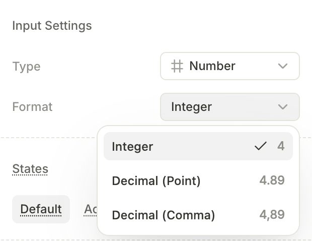
Number format
The Format dropdown in Number input settings controls how the entered value is parsed:
- Integer — whole numbers only (for example,
4). - Decimal (Point) — decimals with a period as the separator (for example,
4.89). - Decimal (Comma) — decimals with a comma as the separator (for example,
4,89).
Values that don’t match the selected format are considered invalid.
Trigger actions on input events
Main article: Actions
You can run actions in response to the user’s input via the Interactions panel:
- On changed — fires when the user changes the input’s value. Available on all input types.
- On submit — fires when the user submits a text input by pressing Enter or Done on the keyboard. Date and time pickers don’t have this trigger.