Analytics
Adapty Analytics is a powerful suite of tools for data visualization and analysis. Built for application development teams, it focuses on your app’s financial performance and user behavior.
In addition to standard metrics available in your store analytics (such as revenue or installations), Adapty calculates compound metrics: user lifetime value, cohort analysis, and more. Dedicated sections analyze user behavior that leads to revenue loss: retention graphs, billing issue resolution data. Browse the charts to gain insight into user behavior, and optimize your application with data-driven decisions.
Read the How Adapty Analytics Works guide to learn more about how data is sourced and processed. For a quick reference of all available metrics and how they differ from each other, see the Metric comparison table article.
Enable Adapty Attribution to upgrade the analytics capabilities of Adapty. Adapty Attribution uses marketing data to analyze the relationship between ad campaigns and user behavior. Its charts display a complete picture of your application’s economy, with ROI calculations and precise attribution data.
Overview
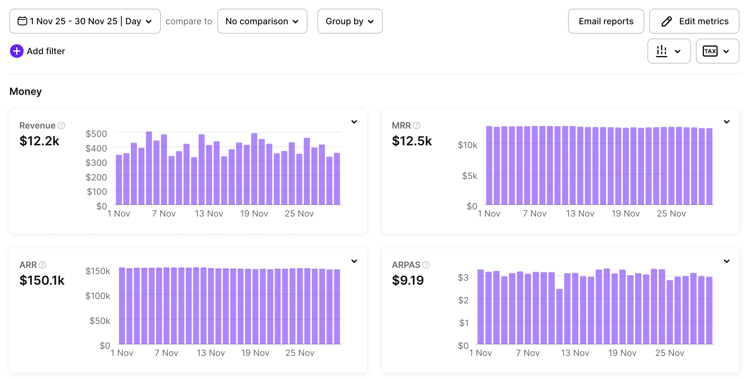
Main article: Analytics Overview page
The Overview page presents an at-a-glance summary of your applications’ key performance metrics. To customize the displayed charts, click Edit Metrics.
Charts
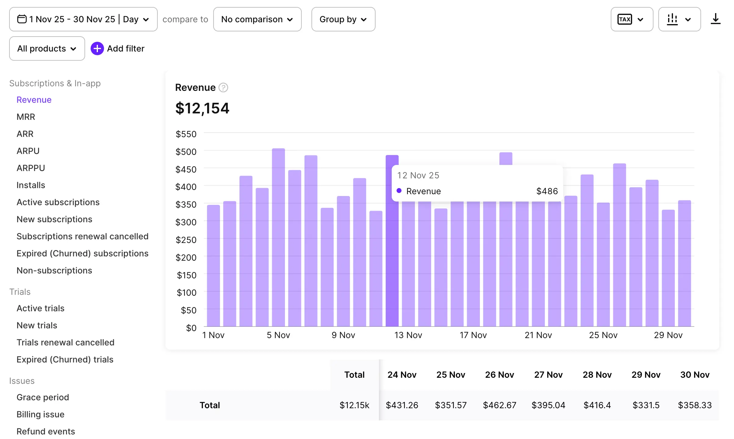
Main article: Analytics Charts
The Charts tab visualizes metrics related to revenue, subscriptions, trials, and billing issues.
LTV
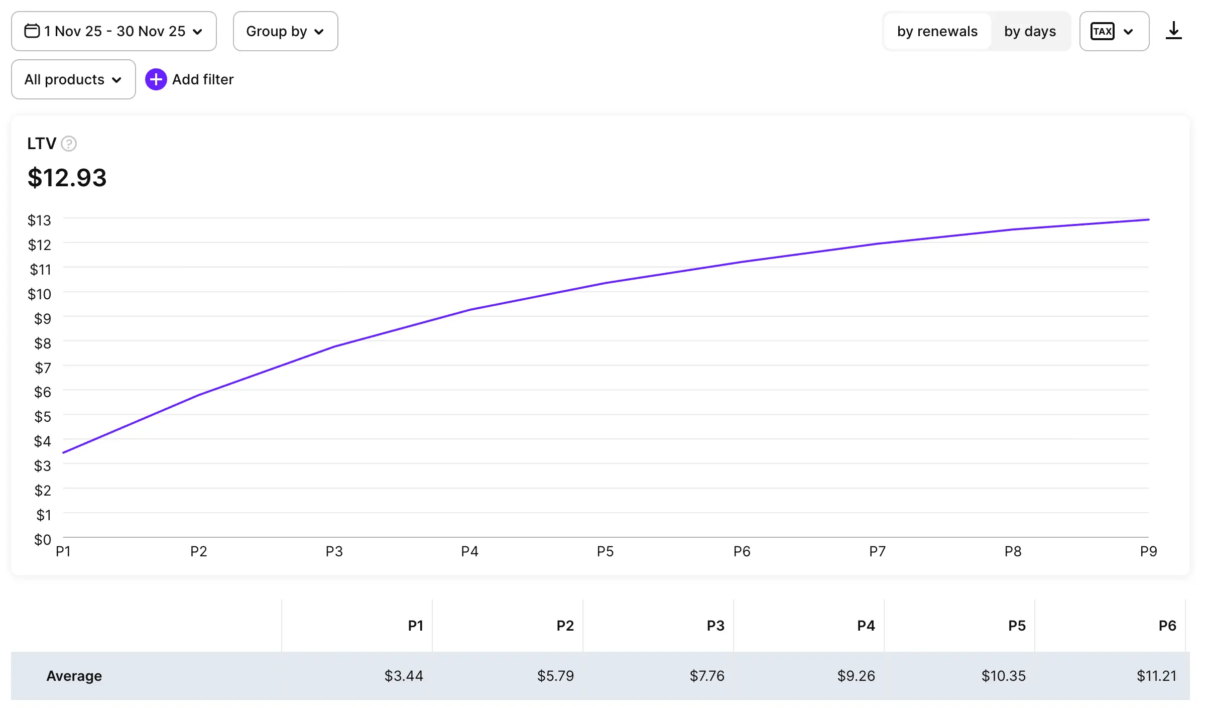
Main article: Lifetime Value (LTV)
The LTV tab displays a graph of your users’ lifetime value over time.
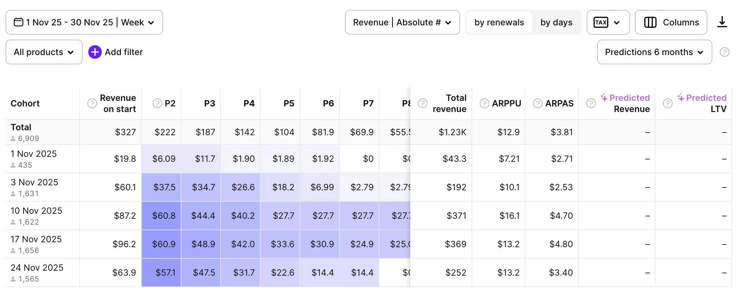
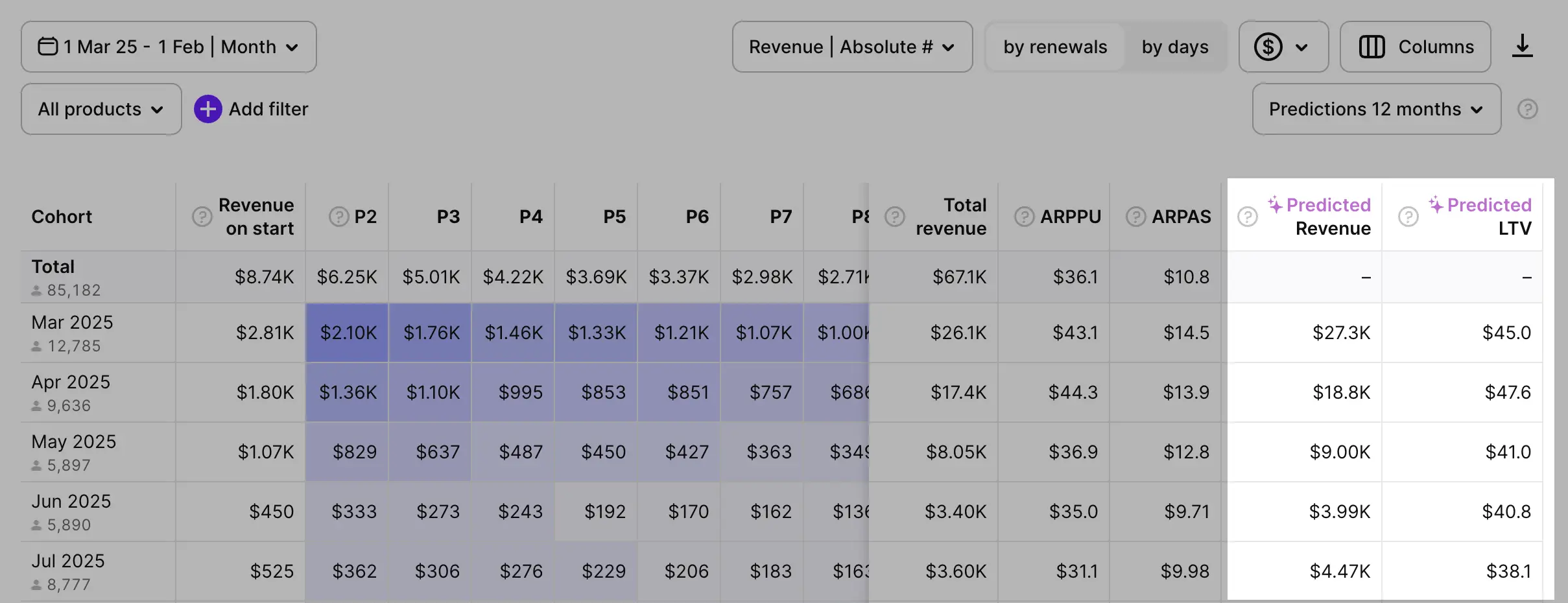
Cohorts
Main article: Cohort Analysis
The Cohorts tab allows you to isolate user groups based on installation date, and displays each group’s conversion rates.
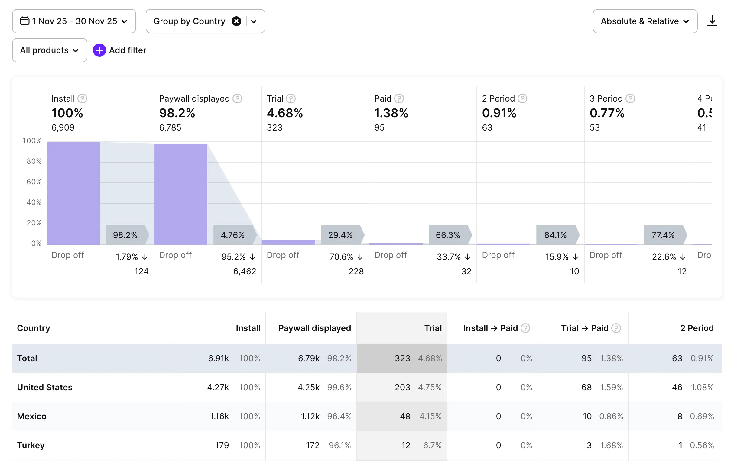
Funnels
Main article: Funnels
The Funnels tab visualizes the stages of user engagement with your app. You can see which proportion of installations result in subscriptions, and how long the users remain subscribed. Take note of common drop-off points to optimize your strategy.
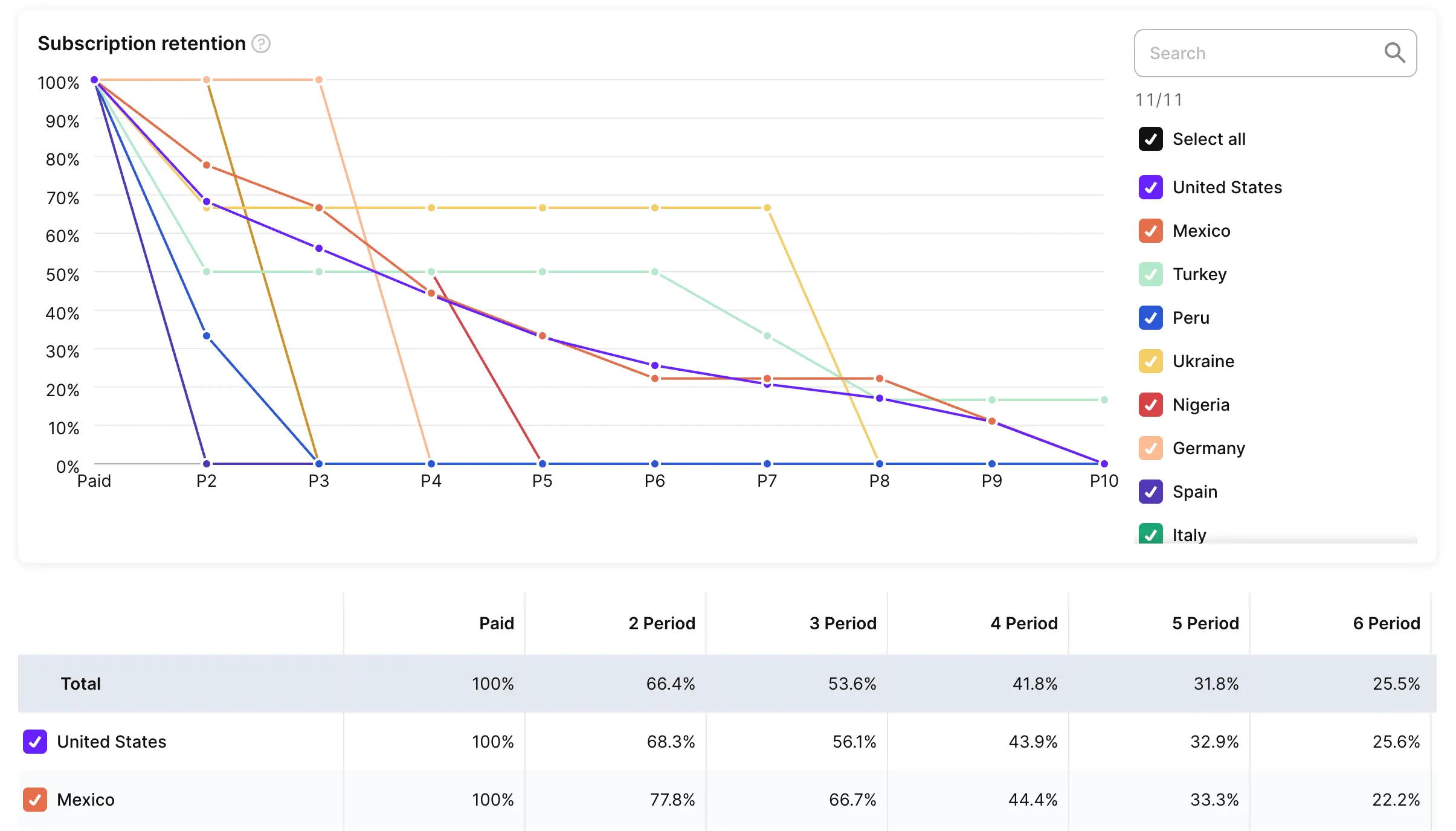
Retention
Main article: Retention
The Retention tab shows a graph of user retention over time.
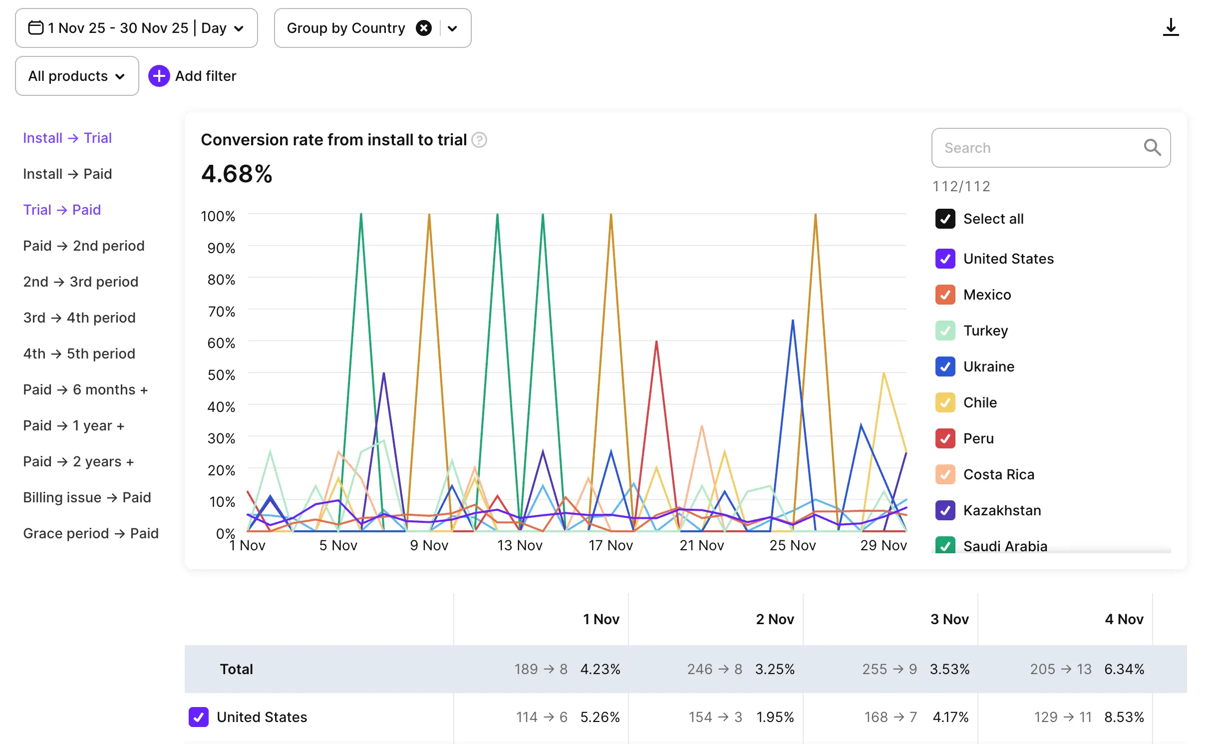
Conversion
Main article: Conversion
The Conversion tab displays graphs for conversion rates at different stages of the user journey. It highlights common user choices during transition points, such as from trial to subscription, or billing issue to successful renewal.
Predictive analytics
Main article: Predicted LTV and Revenue
Users of paid tiers can view predictions for cohort LTV (lifetime value) and revenue. Adapty analyzes historical data with advanced machine learning algorithms to estimate future values.
Filters and grouping controls
Main article: Controls
Use filters and grouping controls to view data for specific user segments. For example, you can filter the retention graph by store and compare user behavior between Android and iOS.
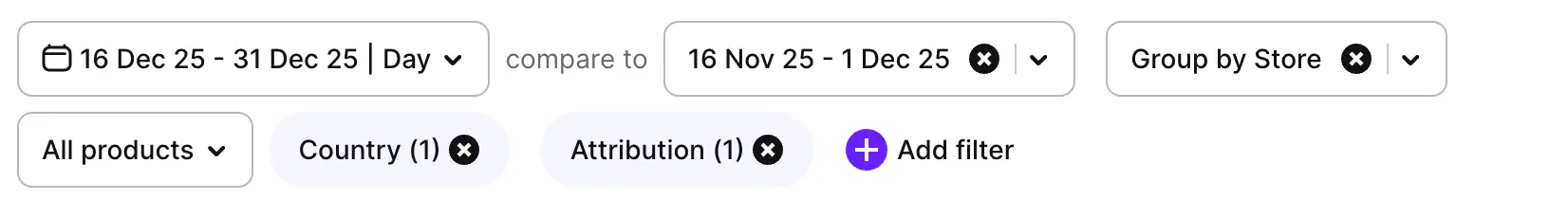
Within any Adapty Analytics view, you can:
- Change the date range for data visualization.
- Filter data by store, attribution, or other parameters.
- Group data inside the chart by country, user segment, or other criteria.
Charts also allow users to compare the same metric across two different time periods.
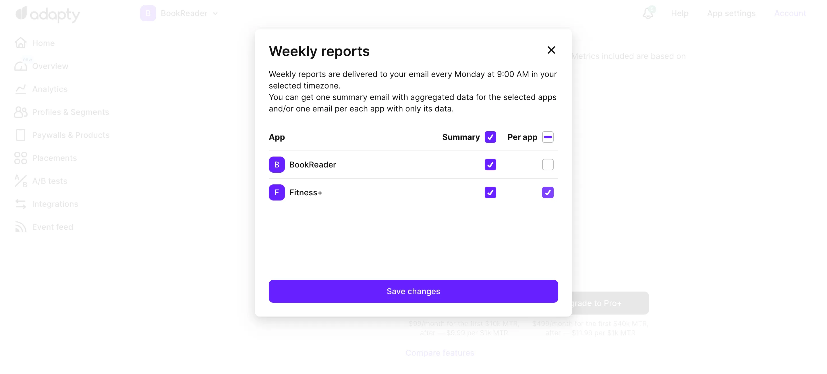
Receive automated analytics reports
Main article: Reports
Adapty can send automated reports with analytics data straight to your email inbox. You can configure the content and frequency of these reports.