Choose meaningful placements
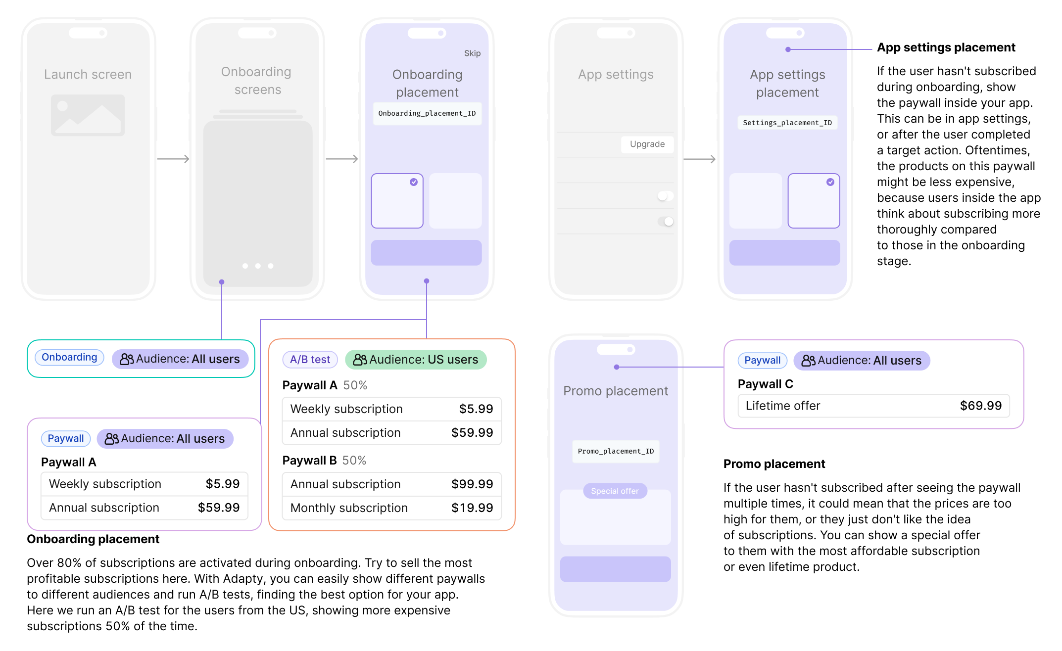
When creating placements, it’s essential to consider the logical flow of your app and the user experience you want to create. Most apps should have no more than 5 placements without sacrificing the ability to run experiments. Here’s an example of how you can structure your placements:

- Onboarding flow: This stage represents the first interaction your users have with your app. It’s an excellent opportunity to introduce your users to your app’s value proposition by using both onboarding and paywall placements here. Over 80% of subscriptions are activated during onboarding flow, so it’s important to focus on selling the most profitable subscriptions here. With Adapty, you can easily have different onboardings and paywalls for different audiences, and run A/B tests to find the best option for your app. For example, you can run an A/B test for users from the US, showing more expensive subscriptions 50% of the time.
- App settings: If the user hasn’t subscribed during the onboarding flow, you can create a paywall placement within your app. This can be in the app settings or after the user has completed a specific target action. Since users inside the app tend to think more thoroughly about subscribing, the products on this paywall might be slightly less expensive compared to those in the onboarding stage.
- Promo: If the user hasn’t subscribed after seeing the paywall multiple times, it could indicate that the prices are too high for them or they are hesitant about subscriptions. In this case, you can show a special offer to them with the most affordable subscription or even a lifetime product. This can help entice users who are price-sensitive or skeptical about subscriptions to make a purchase.
Most apps will have similar logic and placements, following the user journey and key points where paywalls, onboardings, or A/B tests can be displayed to drive conversions and revenue. You can configure them in each placement to experiment and optimize your monetization strategies.