Onboarding layout
The no-code mobile app onboarding builder offers two layout layers:
- Screen layout: global padding and grid via containers.
- Element layout: per-element spacing, position, borders, and shadows.
To reorder screens or elements, simply drag and drop them in the left pane.
Screen layout
You can adjust a screen in two ways:
Screen style settings
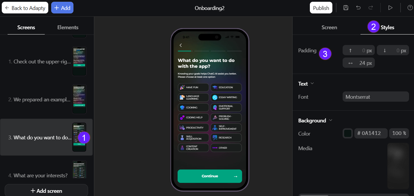
To reduce or increase the distance between elements and the screen edge:
- Select the screen on the left.
- Go to the Styles tab on the right.
- Set the top, bottom, and horizontal padding in the Padding section.
Containers
You may want to add side-by-side text and images, swipeable galleries, or modal pop-ups. Containers make this easy by letting you create columns, rows, carousels, and centered overlays.
To add a container:
- Click Add at the top left.
- Go to Containers and choose one:
- Columns: Split the screen into vertical sections for side‑by‑side content (e.g., two-column text or image-plus-copy layouts).
- Rows: Line up items in a single horizontal band with even spacing.
- Carousel: Let users swipe through a series of cards.
- Popup: Show content in a centered overlay above the page.
- Create the elements you want to add, then drag&drop them into the container from the left menu.
Element layout
To adjust each element individually:
- Select the element on the left.
- Go to Styles on the right menu.
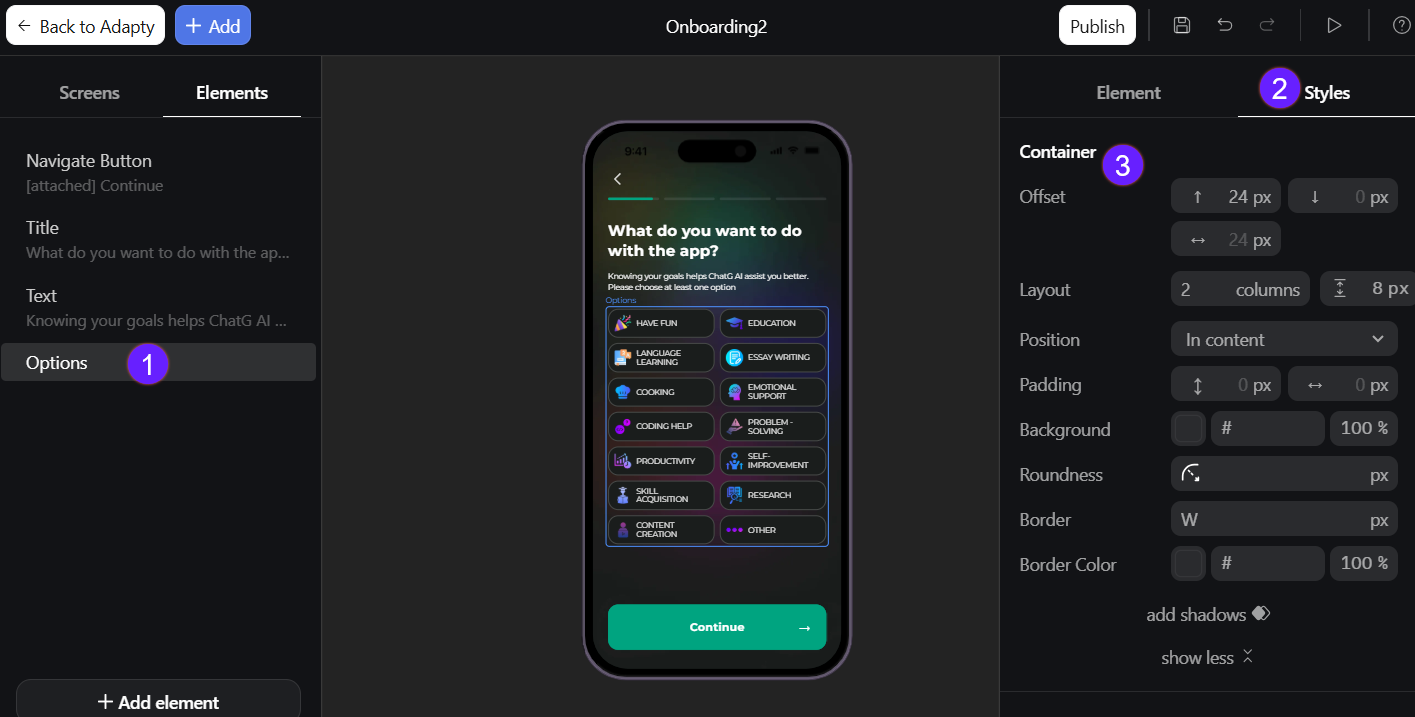
- In the Container section set:
- Offset: Shifts the element horizontally or vertically.
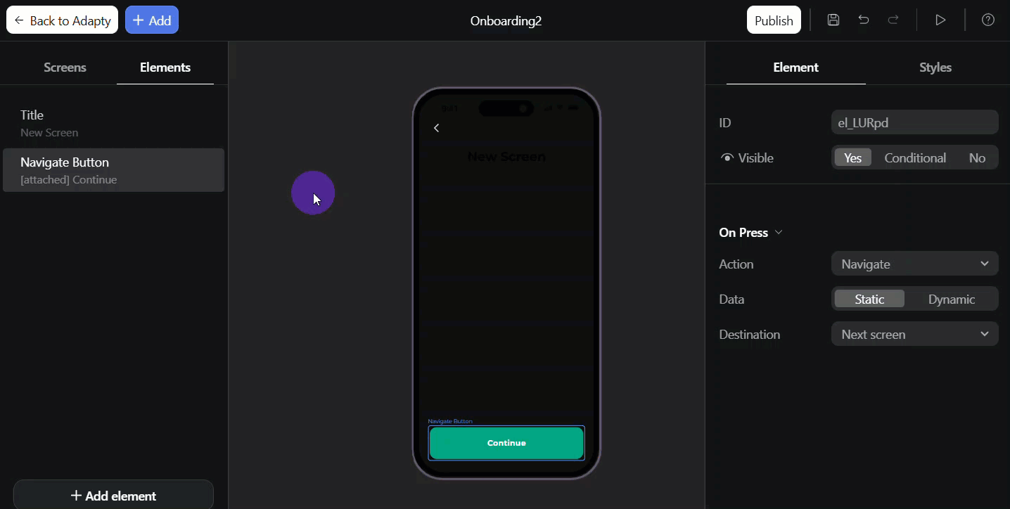
- Position: Sets the element’s anchor point:
- In content: Normal document flow
- Attached: Fixed position - stays visible in viewport (e.g., sticky button at bottom)
- Attached on scroll: Becomes fixed after scrolling into view (sticky behavior)
- Padding: Defines the inner space between the element’s content and its border.
- Background: Applies a solid color behind the element. Ensure your element background matches the screen background (e.g., use grey or black for onboardings with mostly dark screens).
- Roundness: Determines the radius of the element’s corners.
- Border: Adds a stroke around the element and specifies its thickness.
- Border Color: Specifies the color of the element’s border.
- Add shadows: Adds a single drop shadow with configurable offset, blur/spread, and color.
Screen background customization
The background affects not only your onboarding design but also the loading screen until the onboarding is fully loaded.
You can fill your onboarding background with a color or upload an image/video:
- Select the screen on the left.
- Go to the Styles tab on the right.
- In the Background section, select a background color or click the upload area to upload an image/video.
For media uploads, follow the supported formats and size requirements.
For smooth screen transitions, choose a background color that matches your overall onboarding design (e.g., use grey or black for onboardings with mostly dark screens) or customize the splash screen.