
Toggles and checkboxes
The Toggle category offers three elements that users tap to switch something on or off:
- Trial toggle: a switch that moves the paywall between standard and trial-based products.
- Checkbox: a checkbox paired with a text label, for consent and acknowledgement.
- Toggle: a switch paired with a text label, for any other on/off choice.
To add one, click + on the target screen, open Paywall & Commerce > Toggle, and pick the element. It lands at the root of the layer tree — drag it into the target container in the Layers panel.
Basics > Checkmarks also offers checkbox, radio, and toggle graphics. Those are static icons for decorating rows inside another selectable element, such as a product card. Use the elements in this article when the user selects something themselves.
Trial toggle
Apple may reject apps that use a pre-selected trial toggle. A toggle set to “on” by default can be flagged as a manipulative dark pattern under App Store Review Guidelines — it implies user consent to a free trial without an explicit choice.
To avoid rejection, set the toggle to off by default and let users opt in to the trial themselves.
A trial toggle lets users choose between standard and trial-based products on a paywall. When the user changes its state, it can trigger an action — such as swapping product groups, updating variables, or showing and hiding elements — instantly.
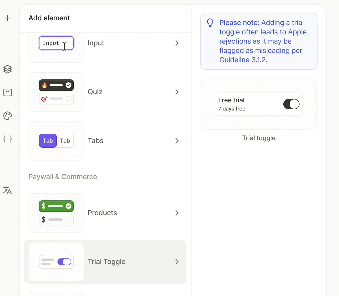
For a full walkthrough, including the conditions that keep the selected product in step with the switch, see Build a paywall with a trial toggle.
Checkbox
A checkbox paired with a text label, prefilled with I agree to the Terms and Privacy Policy. Use it where the user confirms something before the flow continues.
Toggle
A switch paired with a text label. Use it for on/off choices that don’t change the product — for example, opting into reminders before the paywall, or revealing an extra block of content.
Read the state in conditions
Each of these elements is a selectable element, and its group determines the variable that reflects its state:
- Toggle group:
<group>.isActive— True or False. - Single choice group:
<group>.selectedOptionId— the ID of the selected element, empty while nothing is selected.
Select the element and open the Interactions tab to see which group it belongs to.
To make other elements depend on the state, set a conditional action or conditional visibility based on this variable.
Your app can also receive the state through the SDK. Each time the user changes it, the SDK reports the new value, which your app can process internally or on your back-end.