App Store screenshots best practices that survive a test

TL;DR:
- Most App Store screenshots best practices are not practices. They are hypotheses that held up on someone else's app.
- Only two things are fixed: what Apple enforces, and what the store mechanically shows.
- Everything else you test on your own traffic.
- In Apple Ads that difference costs money, because you pay per tap.
- A weak asset set shows up as a pricier tap, not only as a weaker screenshot.
What actually counts as App Store screenshots best practices
App Store screenshots best practices sort into two piles, and mixing them is the common mistake.
Constraints are what Apple enforces and what the store mechanically shows. They are not opinions. Get them right once and stop rereading them.
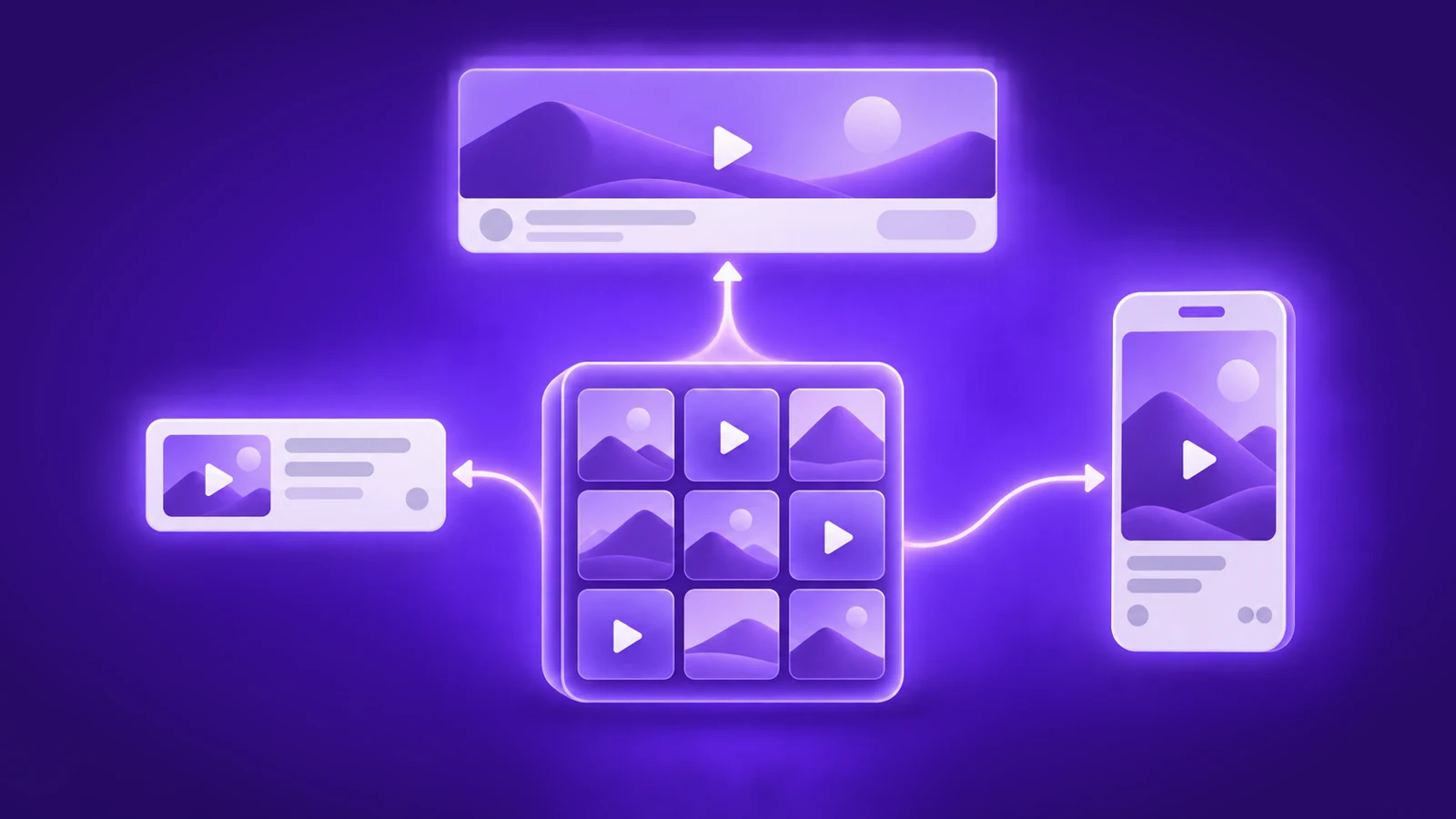
- Screenshots in search results. Depending on orientation, the first one to three images appear in search results, and only when no app preview video is available, per Apple's product page guidance. The rest wait until someone opens the product page.
- Sizes and formats. Apple's screenshot specifications set the upload bounds. Our App Store screenshot sizes and dimensions post has the working list.
- The app icon. It travels everywhere: search results, the page, the home screen. Depth in how to design an app icon.
- The app preview video. It autoplays muted, and up to three can sit on one page. When one is there, it takes the search-result slot your screenshots would have had. Apple's app previews page has the rules.
Key point: A screenshot rule outside the constraints layer is a hypothesis, not a best practice, until your own traffic says otherwise.
Hypotheses are everything else. Dark background. Captions on the first frame. A face in shot one. Feature order.
Each was validated on another audience with another search intent. On your app it is a guess with a nice screenshot next to it.
So sort every rule into one pile or the other before you brief a designer. Then treat the hypothesis pile as a starting point, never as a requirement. The ideas worth trying live in our App Store screenshots optimization post.
Why your screenshots decide what you pay in Apple Ads
Your screenshots decide what you pay because Apple Ads charges per tap, not per impression. Three separate inputs set the outcome, and it helps to keep them apart.
- Your bid is a ceiling. It caps what you can pay. It does not set what you pay.
- Relevance decides delivery. The keyword's semantics against your store listing govern whether you are eligible at all, before any creative question comes up.
- Asset response decides what an impression is worth. The app icon and the leading screenshots drive tap-through rate. The rest of the product page drives tap-to-download conversion.
Key point: A bid caps what a tap can cost. Relevance and asset response decide whether you are shown and what you actually pay.
Now the part that is observation, not documented mechanism.
What I have watched is that an app converting badly gets less volume and a pricier tap. Those are exactly the two things people try to fix by raising a bid. Apple does not publish this logic, so treat it as a pattern to watch rather than a rule to plan around.
The practical conclusion holds either way. A weak asset set is a price problem, not only a design one.
That is where asset work usually stops short. The redesign ships, and nobody goes back to check what happened to CPT or tap-through rate.
Custom product pages give each search intent its own assets
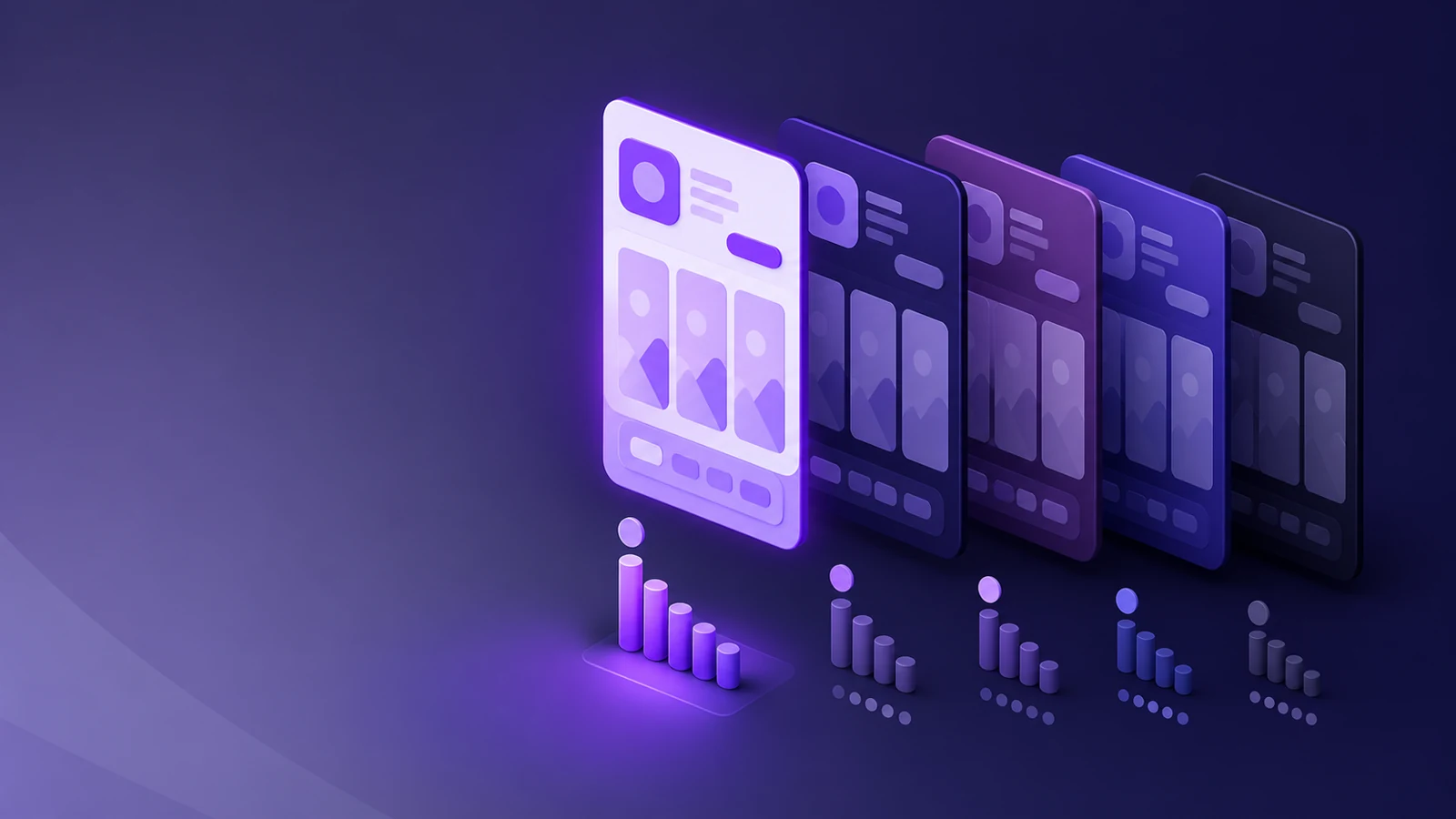
Custom product pages are product page variants that show a different asset set to different traffic, and an Apple Ads ad group can point at a specific one.
That matters because one default page serving everybody is an averaging device.
Someone searching your brand name and someone searching a generic category term are not the same person. Today they land on identical assets.
A starting hypothesis: the brand searcher wants reassurance, and the category searcher wants your difference in shot one. That is a place to begin a test, not a fact about how people behave.
Key point: Segmenting assets by search intent is what custom product pages make possible. What to say to each intent is what the test decides.
How many pages you need follows from your keyword themes, not from a target number. The natural candidates:
- Brand
- Competitor
- Category and generic
- Feature or use case
A theme with its own intent and enough volume can carry its own page. A theme without that volume is fine on the default one.
This is the single-keyword ad group argument applied to creative. Strong control where volume supports it, pure overhead where it does not. Not a rule to follow everywhere.
Mechanics are in custom product pages in the App Store and in Apple's custom product pages documentation.
How to A/B test App Store assets without guessing
An App Store asset test answers something only once the ad group behind it has real history. A handful of installs a month measures noise, not creative.
That is why a serious tool refuses to start without history. Upfront: I work at Adapty, so this is not a neutral take.
- History. Adapty Ads Manager's CPP A/B testing needs the source ad group to be at least 28 days old, with impressions, taps and installs over that period.
- Variants. A test compares 2 to 4 product pages. Your default page can be the control when you want to know whether a custom page beats your baseline. A test of custom pages only is fine too.
Traffic level also sets how fast variants rotate:
| Switch interval | Traffic level | Typical test length |
| Hourly | High (5,000+ impressions per day) | Days |
| Daily | Normal | Weeks |
| Weekly | Low (fewer than 400 impressions a day) | Months |
Low traffic does not block a test. It just means the answer takes months.
Key point: An asset test means something only once the ad group behind it has enough history to separate signal from noise.
To run one:
- Agree the deciding metric before launch, while nobody is looking at results yet. The variant table reports TTR, tap-to-download CR, CPT, CPA, spend, revenue and ROAS.
- Pick one ad group with history, so you can compare several pages against each other.
- Choose 2 to 4 variants, with or without your default page as the control.
- Set precision, the smallest conversion difference the test can detect. Options run 1% to 5%, default 5%; 3–4% is the balanced choice.
- Set confidence, from 80% to 99%, default 90%. Higher confidence needs more data and time.
- Start it. The system clones the ad group once per variant, runs one clone at a time, and rotates on your schedule. The original is restored at the end.
- Read the winner rule strictly. A variant is the overall winner only once it leads the deciding metric at 95% confidence or better. Before variants have comparable impressions, nothing is highlighted.
Apple's product page optimization covers testing against organic traffic. The process above is the paid-media version.
One thing we are still building: testing the ad creatives themselves for Apple Ads, not only the product pages. Not shipped yet.