How to design an app icon: best practices

Your app icon is the first visual element that potential users see, making it an essential component of mobile app success. After all, the saying goes “first impression is the last impression,” for a reason! And with over 2 million apps out there on Google Play Store and App Store, it’s more important now than ever.
But how do you exactly create the best app icon ever?!
In this guide, we'll take you through the crucial elements of app icon design, including color, shape, and visual style, and show you how to optimize your app icons for different app stores. We'll also share tips on using A/B testing to refine your design and create a mobile app icon that resonates with your target audience.
What is an app icon?
In simple words, an app icon is an image or symbol that shows up in a phone’s application menu to represent a specific mobile app. It’s an identifying marker for that app and acts as a recognizable brand image that users associate with the mobile app itself!
Just the way people associate your face with you, an app icon is an important identity for an app.
Therefore, your own app icon is a critical component of a mobile application's design and success. And so an eye-catching icon can play a significant role in driving your CTR (click-through rates), user engagement, and downloads!
Essential elements of app icon design
As you go through the app icon design stages one by one, keep a few essential elements in mind. Not only have Apple and Google clearly emphasized their importance in their own press releases, but you’ll also hear famous app developers swear by these design elements too!
Color and contrast
When it comes to your own app icon design, color, and contrast are essential elements that can greatly impact the icon's visibility and appeal. The right color scheme can help your icon stand out from the competition and attract users. However, it's important to choose visually appealing colors while staying on-brand for your app.
When it comes to contrast, don’t take it lightly either. It helps ensure that the icon is easily recognizable and distinguishable, even in tiny sizes. By using contrasting colors or adding borders, you can make your app icon pop and increase its visibility on the app store.
For example, the Spotify app icon uses a bold green color that contrasts with the black background, making it instantly recognizable. Plus, with the iconic use of sound waves to depict what the app is about, Spotify leaves little in the way of confusion.

Shape and composition
The shape and composition of your app icons can greatly influence how users perceive your app. The right shape can convey a sense of professionalism or playfulness, while the wrong shape can be confusing or off-putting.
But what do they mean? Composition refers to the way in which different elements within the icon are arranged in the space provided. And the shape is… well, shapes!
For example, the Evernote app icon uses a simple, clean shape that communicates its note-taking functionality. The Instagram app icon, on the other hand, uses a fun, rounded shape that complements the playful nature of the app.
When designing your mobile app icon, it's important to consider the overall composition as well. A cluttered or overly complex design can be difficult to recognize at smaller sizes, while a simple and balanced composition can help your icon stand out.
Here are some quick tips about the shape and composition of your own app icon to check off as you create one:
- Keep your icon minimally cluttered.
- Use shapes that are relevant to your app’s function or brand.
- Pay attention to the symmetry and balance of your design.
- Consider using negative space to generate a dynamic composition.
Visual style and branding
I mentioned this earlier but I’ll say it again! Your own app icon is the face of what your brand has to offer users. Using a somber visual style with dull colors for a playful social media app is a recipe for disaster. Why? Because it’s simply not giving you an accurate brand image.
The visual style and branding of your app icon are essential elements of app icon design that can significantly impact user engagement. A well-designed app icon that incorporates your brand identity can help to:
- Build brand recognition,
- Establish credibility, and
- Communicate the unique value proposition of your app to potential users.
When designing your app icon, consider incorporating elements of your app's overall visual style. This can create a cohesive and consistent brand identity across all touchpoints. Here are some elements that count as important parts of your visual style:
- Color scheme,
- Typography,
- Logo,
- Imagery.
You may also want to consider incorporating visual metaphors or symbols that relate to the app's purpose and functionality, further reinforcing your brand identity and enhancing the user experience. For example, if your brand has a specific and recognizable logo or symbol, consider incorporating it into the icon to reinforce brand recognition.
In the end, you have an app that stands out in the crowded app marketplace of today and drives downloads and user engagement.
App icon design checklist
| Design Aspect | Best Practice | Why It Matters |
| Simplicity | 1-2 main elements, no text | Scales better and increases recognizability |
| Contrast | Use high-contrast colors | Improves visibility at small sizes |
| Color palette | 2–3 colors max | Avoids clutter; stronger brand recall |
| Scalability | Test at small sizes (e.g., 29×29 px) | Ensures icon remains legible |
| Brand consistency | Align with app’s visual identity | Enhances recognition |
Optimizing your app icon for different app stores
Now that you’re familiar with what makes an iconic app icon— pun intended— let’s talk optimization. Did you know that according to multiple Google Experiments, about 80% of app icons fail in generating clicks?
Optimizing your app icons for different app stores is crucial for gaining maximum visibility and downloads. These rules and regulations make a great impact so it’s better to keep them in mind while designing your app icons. However, the optimization process can differ depending on the app store, especially when it comes to iOS vs Android.
iOS vs. Android
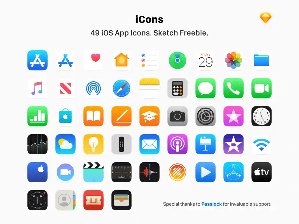
Ah, the age-old war of Android versus Apple. Did you know it trickles down into app icons too? With both systems offering their users a unique vantage point of technology, they also have some stark differences to note. For instance, this is what the iOS app icons look like:
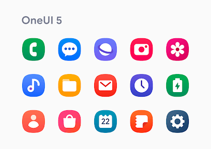
On the other hand, this is what a regular Android icon pack looks like:
Here are some of the key differences between iOS and Android app icon design guidelines:
- Shape: iOS icons are designed to have rounded corners, while Android icons have square corners.
- Size: iOS icons should be 180 x 180 pixels for iPhone and iPad, while Android icons should be 192 x 192 pixels.
- Grid system: Android icons should follow a grid system to ensure they scale well on different devices, while iOS icons have more flexibility in terms of layout.
- Shadows: iOS icons should have a subtle drop shadow, while Android icons should not.
- Visual style: iOS icons tend to have a flatter, more minimalist design style, while Android icons often incorporate more texture and depth.
Read up some more on how Apple describes their app icons' best practices.
App Store vs. Google Play
If you thought the differences were over, think again! When optimizing your app icon, it's essential to consider the design guidelines and requirements of both the App Store and Google Play.
The App Store generally favors clean, minimalist designs with bold shapes and colors, while Google Play allows for more complex designs with detailed graphics and shading. In terms of size, the App Store requires a 1024x1024-pixel icon, while Google Play only requires a 512x512-pixel icon.
According to a study by StoreMaven, icons that perform well on the App Store tend to have simpler designs with fewer details and less text. On the other hand, icons that perform well on Google Play tend to have more complex designs with more details and text.
Here’s a quick summary of the differences you need to keep in mind when considering your own app icons for Google Play and App Store:
| Specification | iOS | Android |
| Required Base Size | 1024 × 1024 px PNG | 512 × 512 px PNG |
| Scaling / density versions | Auto-generated by Apple | Multiple densities required (MDPI, HDPI, XHDPI, etc.) |
| Transparency allowed | No | Yes |
| Corner shape | Rounded by system | Adaptive / shape-mask supported |
| Color profiles | sRGB recommended | sRGB recommended |
A/B testing your app icon design
Do you have a prototype ready to launch? Before you make it official, don’t forget to test your own app icon with the A/B testing method! A/B testing allows you to compare different versions of your icon and determine which one resonates best with your target audience.
To make it even better, I’ll give out handy tips on how to conduct effective A/B tests and use the results to refine your own app icon for maximum impact.
But before I jump into the technical tidbits, do you know…
What is A/B testing?
A/B testing, also known as split testing, is a method of comparing two different versions of something to determine which one performs better.
Imagine you want to know which candy to stock up on for Halloween. You pick 2 famous brands of candy and survey the neighborhood kids to pick their favorites. At the end of the day, you can simply tally the score and know the clear winner.
In the context of app icon design, A/B testing involves creating two different versions of an app icon and showing them to different groups of users to see which one results in more downloads or engagement.
By measuring the results, app developers can make informed decisions about which design is more effective and use it to improve the overall performance of their app.
Why A/B testing is important
If I told you that A/B testing is perhaps the most important part of this entire process, I wouldn’t be lying. In fact, A/B testing can help you yield more benefits than you’d realize at first.
Here are 5 reasons why you need to conduct A/B testing for your customized icon is absolutely important.
Helps choose the perfect icon with valuable insight
A/B testing allows you to compare different app icon designs and choose the one that performs the best in terms of driving downloads and user engagement. It also provides valuable data and insights into user behavior and preferences, allowing you to make data-driven decisions about your app icon design.
Improves user experience
By testing different designs, you can gather data on which app icon resonates with users and improves their overall experience with your app. There’s nothing as crucial as unlocking your user’s minds to provide them with an app they actually want!
Saves time and money
A/B testing can help you identify design flaws early on, allowing you to save time and money that would otherwise be spent on costly design revisions. Instead of paying correctional fees for recreating app icons, you can immediately identify what needs to change for a better result!
Increases conversion rates, app downloads, and revenue
A/B testing allows you to optimize your app icon design to increase conversion rates and attract more users to your app. Once your click-through rates improve and you reach a larger audience, your app downloads will see a spike upwards.
Automatically, this will improve your app performance in the app store, leading to increased revenue!
Keeps you ahead of the competition
By constantly testing and improving your app icon design, you can stay ahead of the competition and attract more users to your app. A/B testing gives you the edge to beat your competitor’s app icon designs and create custom icons that have the potential to become one of the popular apps!
Best practices for A/B testing
Being a key element of any marketing strategy, market research comes with its unique list of best practices. Why wouldn’t you want to make data-driven decisions?

A/B testing is no different than the others and there are several best practices I highly recommend you implement when you’re testing the waters!
- Test one variable at a time: To accurately measure the impact of a specific change, only test one variable at a time.
- Use a large enough sample size: A small sample size may not be representative of your app's overall audience. Aim for at least 100 users per variation.
- Randomly assign users to test groups: Randomly assigning users to either the control group or test group will help ensure unbiased results.
- Test across multiple devices: Different devices can impact how your app icon is perceived, so test across various devices to ensure consistency.
- Monitor your results over time: Monitor your results over time to identify any trends or changes in user behavior.
- Use a reliable A/B testing platform: Use a reliable A/B testing platform to ensure accurate results and data analysis.
- Interpret your results carefully: Interpret your results carefully, and consider all factors that may have influenced your test outcomes, including external factors such as seasonality or marketing campaigns.
Take your app to the next level with Adapty
After drafting, trials, and tests, it’s time to push your app out to the world. If you want to boost your app revenue and make your mobile app a large success, let Adapty help you out!
Adapty is a powerful platform that can help app developers like you maximize your revenue and optimize user engagement. With its advanced analytics tools and comprehensive in-app purchase management system, Adapty enables you to track user behavior and preferences and tailor their app experience to meet their users' needs.
User acquisition, hello!
By providing detailed insights into user behavior, Adapty can help developers identify areas where they can optimize their app for better revenue generation.
Along with that, you can benefit from improved user engagement, including personalized offers and promotions, targeted messaging, and in-app surveys! With these tools, you get to create an engaging and rewarding user experience, leading to increased user retention and revenue.
Final thoughts
Designing effective app icons is a crucial aspect of mobile app success. With millions of apps available in various app stores, having an eye-catching and memorable app icon is essential to attract and retain users.
It's important to incorporate essential design elements like color, shape, and symbolism while ensuring that your icon is optimized for different app stores. Additionally, A/B testing can help refine your design and ensure that your app icon resonates with your target audience.
By following these best practices and continually refining your app icon design, you can establish a strong brand identity and stand out from the competition in the crowded app market.