App Store screenshots: best practices

App Store screenshots play a critical role in the success of your mobile app. Since most users won't bother with a demo version, these images are the closest thing they have to trying out the service. And even if the user acquisition campaign featured some real app footage, the screenshots still have to provide important context.
We've created this comprehensive guide to help developers and marketers optimize their online presence. Here we provide some useful design principles, specific examples, and some neat tips and lifehacks to make sure your app store screenshots stand out and lead to more downloads. Enjoy!
Why are App Store screenshots important?
What, snapping and uploading some screenshots is not enough? Not really. These images are an essential part of the App Store Optimization and should be able to do way more than just show off the app. Here are the key reasons you should care about them.
First Impression. The screenshots are the first thing users see when browsing the App Store. High-quality, visually appealing images can significantly impact the way a user sees the app, increasing the likelihood that they will download it.
Key Features. These pictures provide an opportunity for developers to highlight the main features of an application. By presenting a clear and concise snapshot of what the app offers, users can quickly determine if it meets their needs and preferences.
App Store Ratings Boost. App Store algorithms take into account the app's downloads and user engagement. Attractive screenshots can contribute to increased downloads, which in turn, boosts the app's visibility and ranking in search results, lowering the CPI for both organic and paid sources.
Demonstrate Ease of Use. Well-designed screenshots illustrate not just the user interface, but also what users can do with it. The images show how easy it is to use your application and what specific features people might enjoy trying.
Competitive Advantage. With millions of apps available in various app stores, standing out from the crowd is crucial. Eye-catching screenshots can set the service apart from its competitors and ultimately lead to more downloads.

How App Store screenshots influence downloads
In most cases, the visuals on the app page in the store are the last thing a user sees before deciding to download (or not) the application. They're an important visual peek that reveals the features, design, and user experience. These images are essential for making a strong impression and are analyzed and trusted by users more than the often misleading ads.
Great screenshots boost an app's visibility and drive downloads and user loyalty. These are not about intriguing the person: rather, they are here to ensure that the application is worth downloading. Flashy colors might work for games, but clear images that convey the value of the benefits perform better for non-gaming apps.
On the other hand, poorly designed or irrelevant images may scare users away. A cheap-looking presentation can harm your product's credibility, causing fewer downloads and lower rankings. That's why the app store screenshots deserve some attention.
Design principles for effective App Store screenshots
The screenshots convey the application's purpose, functionality, and unique features. When potential users browse the app store, they form an impression of your product based on its reviews, but mostly on its visual representation.
That's why it's important to use images that are visually pleasing yet informative. Here are some basic rules of design you can't ignore.
Rule of thirds
The Rule of Thirds is a fundamental principle in photography, but it can be applied to app store screenshots as well. To implement this rule, divide the frame into nine equal parts by using two equally spaced horizontal and vertical lines. The idea is to place the most important elements of your visuals along these lines or at their intersections (four points in the center) to create a balanced and visually appealing composition.
The most obvious way to benefit from these rules is to place the iPhone mockup between the vertical lines and along the top horizontal line. This way the image has some air, and the upper half has enough space for a short copy or a call to action.
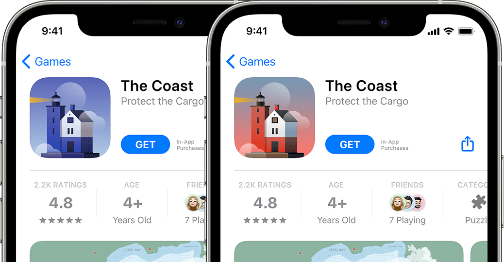
Color and contrast
Color and contrast make your app store screenshots stand out significantly. Use color schemes that are consistent with your app's branding to create a cohesive look and feel. If possible, try to coordinate the screenshots with the UA creatives as well, so that the user feels secure that he's downloading the correct app.
Be cautious, however, when using overly bright or clashing colors: they can make the content hard to read and unappealing. Instead, opt for colors that are easy on the eyes and create a harmonious composition, like with a triad color composition. You can use tools like Adobe Color to create an eye-pleasing color palette.
Feature order
Your app's page in the app store is essentially the ultimate landing page. And just like any other, it should convey information using a clear and logical hierarchy. Visuals are the first thing the users see, together with the short description and price, so make sure the screenshot is not overloaded with unnecessary info. Keep the text and the feature list to a minimum.
Another important point is the order of the images. At best, the users will see the first three app store screenshots, so showcase the features in order of their importance. The first two should show the most used or requested option, or new functionality added after an update. Some recommend putting the most important feature on the second image because it's in the center of the page.
Actual or simplified UI
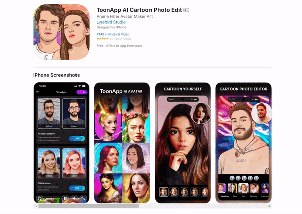
Using real, in-context screenshots is essential to show users the actual experience of using your app. Avoid using mockups or generic stock images, as they can make your app look inauthentic and unappealing. Instead, capture real screenshots of your app in action, showcasing its unique features and user interface. This approach will give potential users a genuine glimpse into your app's functionality, increasing the likelihood of them downloading and engaging with it.
Tips and tricks for optimizing App Store screenshots
While design principles are a must and are employed by most of your competitors, we've decided to share some extra tips to make sure your visuals are at their best. These can optimize your app's presence in the stores and positively impact the conversion to download rate. Make sure to spend some time trying out and implementing each solution.
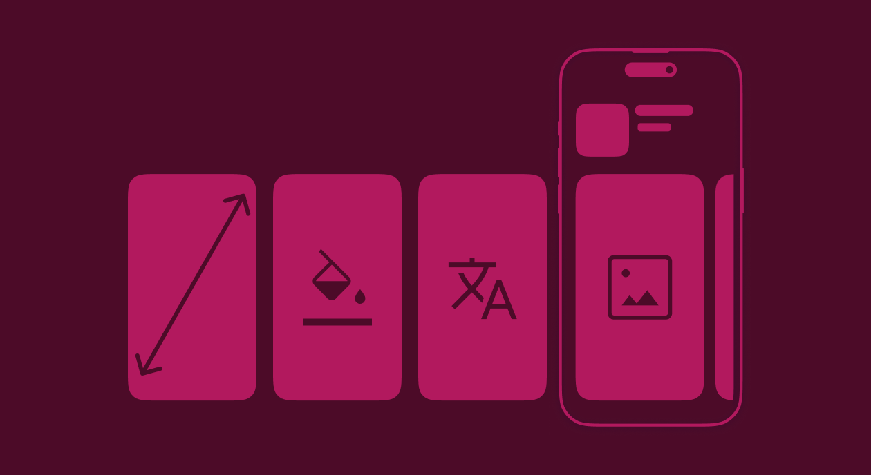
Highlighting key features by simplifying the UI
To create compelling app store screenshots, focus on showcasing the key features and benefits of your app. Rank the top three use cases for your app or game and make sure these are mentioned in the first three images, as most users don't scroll to see the other assets.
If you want to highlight a specific feature, you can simplify the UI to leave just the necessary buttons or other app elements. Cutting the screen in half to show before and after can also be an effective way to show what your app actually does.
Localizing screenshots for different App Store markets
Localizing your app store screenshots can help increase downloads and engagement in different markets. Create tailored images for each target country using local languages, people, or even memes. For example, if your app is available in several languages (and it should be), update the screenshots accordingly.
Be sure to resize and localize for every language and device type your app is available in. By catering to each market's specific needs and preferences, you can create a more personalized experience for users and improve your app's chances of success in diverse regions. If a person sees that the app is tailor-made for their country, they are more motivated to try it out.
A/B testing to find the best-performing screenshots
A/B testing is a powerful tool that helps not just to optimize your app store screenshots, but also to play out some communication ideas that later might be used in user acquisition campaigns. Later we will share some tools that allow testing several logo and image combos, but you can always start directly on the App Store page.
A/B testing is about comparing several sets of images (or even the same images but in a different order) against each other to determine which performs better in terms of downloads, engagement, and other metrics. By continuously testing and refining your screenshots, you can identify the most effective visuals and maximize your app's potential.
Using App Store videos
In addition to images, videos can be an effective way to showcase your app's features and functionality. A short, fun animation can provide a better understanding of its features and use cases and make it easier for the audience to decide whether to download the app. Videos are more engaging than static images, so if you have the resources, definitely add them.
Keep the video short, focused on one single feature or idea, and include specific UI. Don't use any voiceover, and if it's absolutely necessary, make sure to include subtitles. A simple way to create a video might be showing a feature in action, with animation of what happens after the user presses a button.
Keeping visual branding consistent
To create a cohesive and memorable app store presence, it's important that visuals in different media are similar and consistent. Make sure that your app's logo, color scheme, typography, and overall design elements align with your brand's identity. This consistency will help users associate your app with your brand and create a more unified experience across different platforms and marketing materials.

These tips might seem obvious to you, but most app developers are so easy working, that the app store page is often left overlooked. By spending just a couple of days on finetuning the visuals, localizing the assets, and testing out several options, you can dramatically improve your app's conversion and install metrics and spend the acquisition budgets with higher efficiency.
Best practices for App Store screenshot optimization
Choosing the right size and orientation
An important aspect of app store screenshot optimization is choosing the right size and orientation for your screenshots. People should be able to instantly visualize the app on their devices. Make sure to add updated screenshots for all supported devices in both orientations.
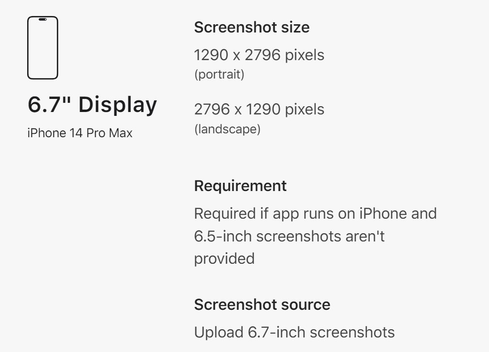
As each new generation brings new screen sizes and resolutions, be sure to always follow the latest official guides. As of May 2023, Apple recommends using screenshots that are 1284 x 2778 pixels for portrait orientation and 2778 x 1284 pixels for landscape orientation for the newest models.
Ensuring screenshots are easy to read and understand
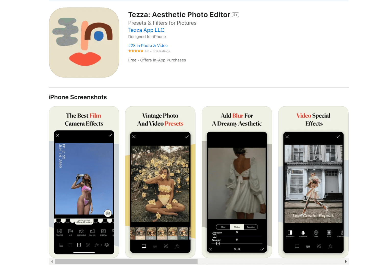
Another thing that may seem evident yet is often ignored is that the text on the images is quickly readable. This means using clear and legible fonts and avoiding cluttered designs. To highlight the most important benefits of your app, you may want to simplify its UI to let the user focus on the key features.
When designing your screenshots, keep in mind that potential users may only spend a few seconds looking at them. Even though the images are tappable and scrollable, most users ignore these options. That's why it's crucial to keep the text short and readable at a glance. Keep it under a sentence per image with a clear benefit or CTA.
Meeting App Store guidelines and requirements
Finally, it's crucial to meet app store guidelines and requirements when submitting screenshots. This includes avoiding any misleading or inaccurate information, using only actual (even if simplified) images of your app, and ensuring that they don't include any sensitive or inappropriate content.
Needless to say, the experience promised on the screenshots should be consistent with the actual app. It's a common problem for games, which often use misleading visuals in ads and in the store to entice the audience, only to have it bomb the app with negative reviews.
Apple has strict guidelines for app store screenshots, and failing to follow these guidelines can result in your app being rejected or removed from the app store. By carefully reviewing and following these guidelines, you can ensure that your app store screenshots are effective, accurate, and in compliance with all app store requirements.
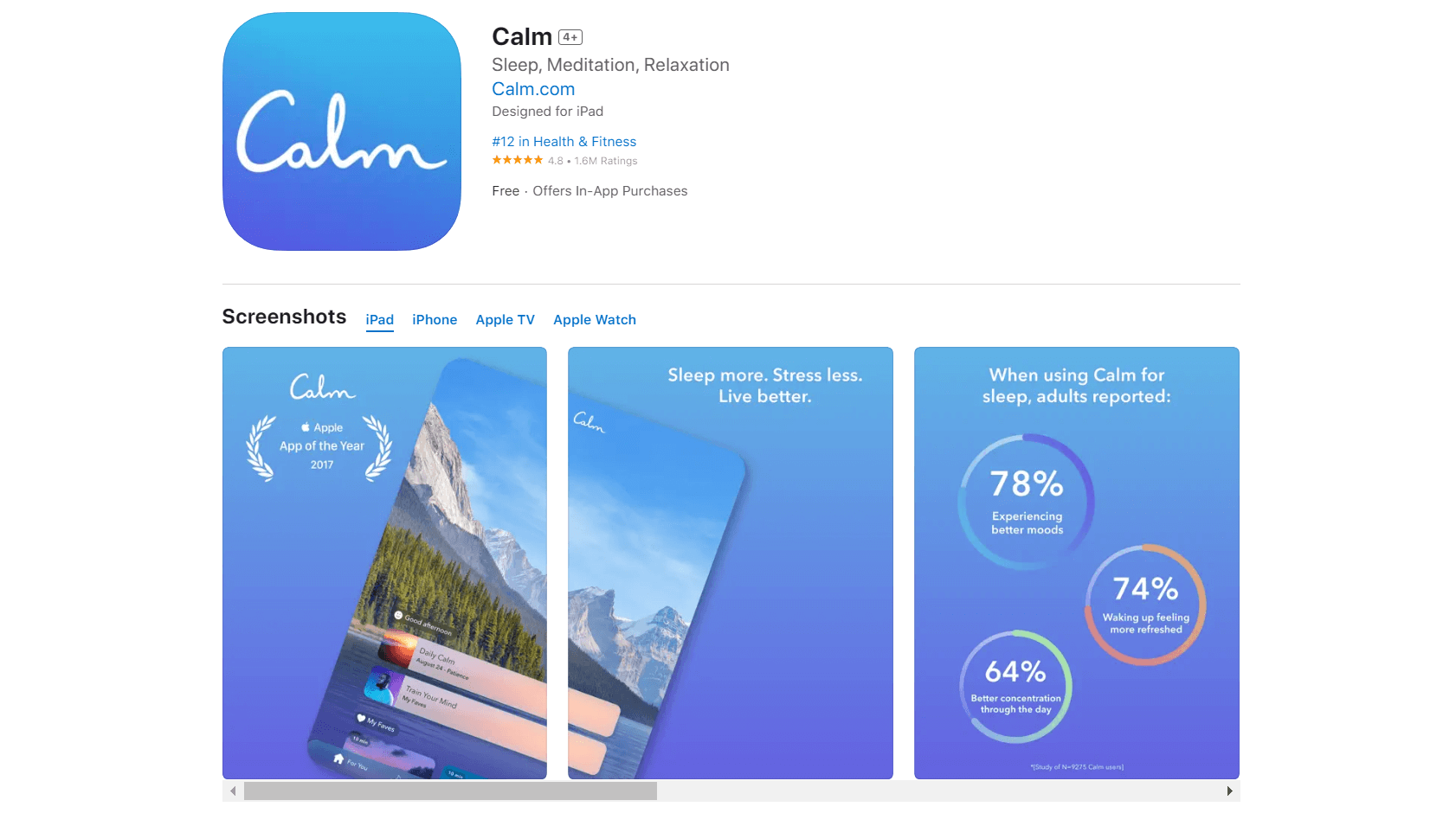
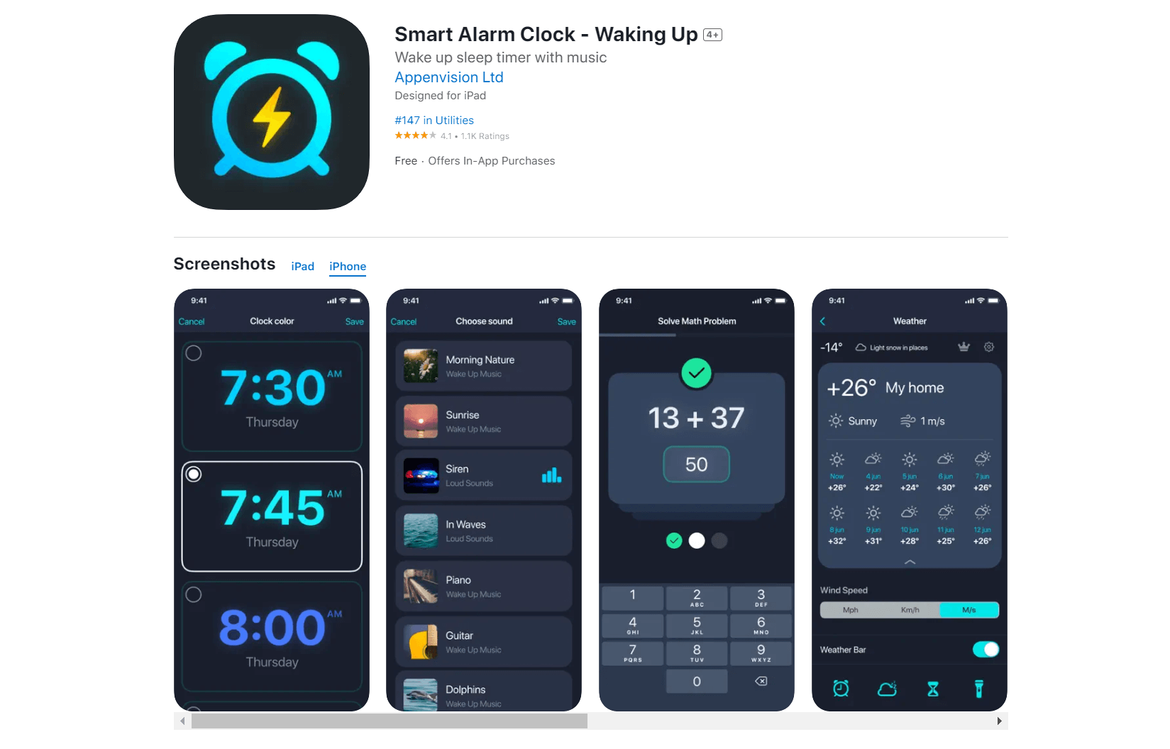
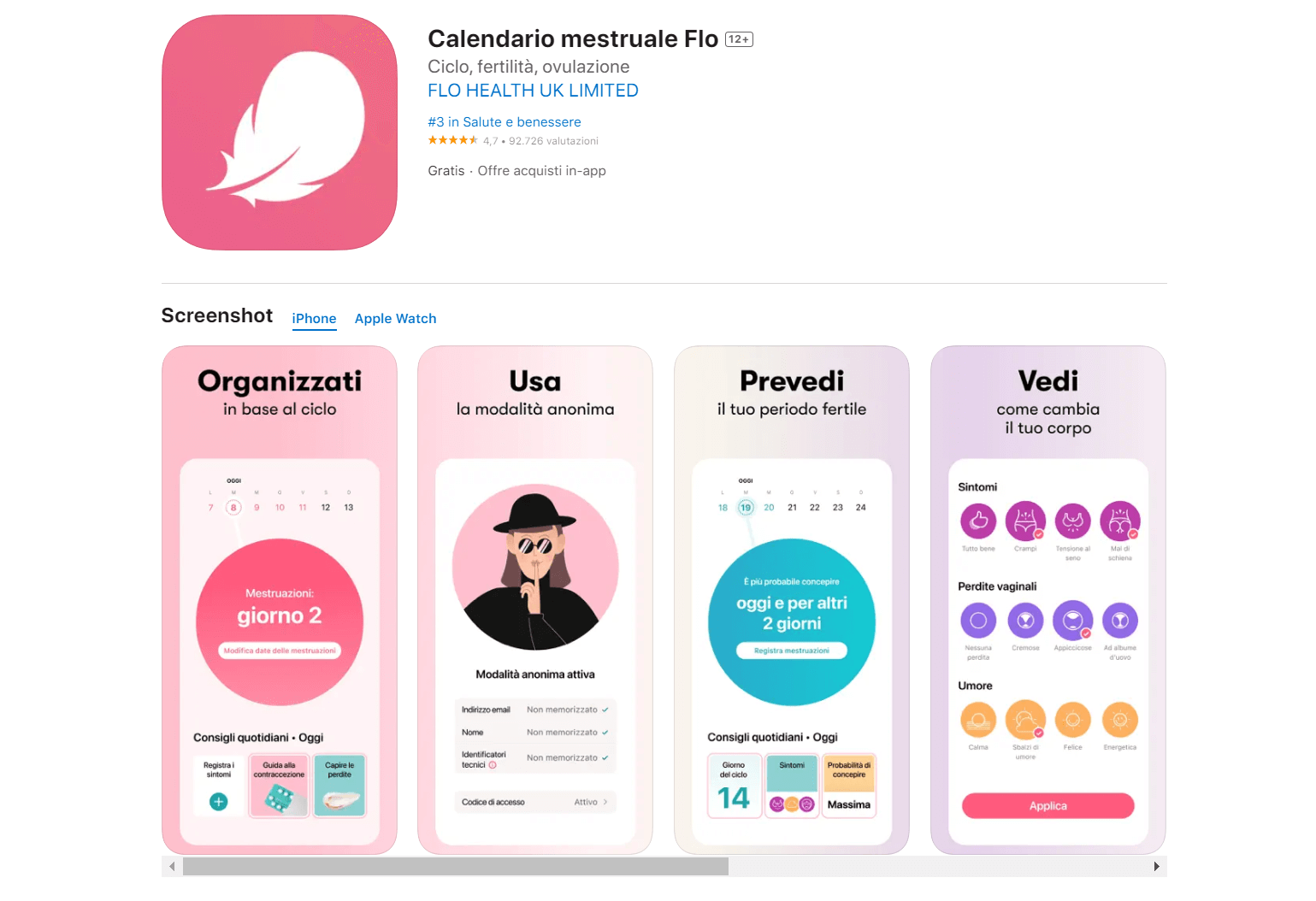
Examples and inspiration
Ok, the rules are clear: now what do you do? Before creating a blank page and staring at it for a while, it's better to start by looking at some examples. You can start just by opening the app store on your device and browsing the top apps. While you're there, you might as well find your competitors and check out their visual strategy might.
For some outside inspiration, feel free to peruse designer websites, like Dribbble, Behance, and Pinterest. There is a myriad of examples, and you can even filter them out by language or genre. Adapty also has a similar feature for paywalls, which we invite you to try out. These are not app store screenshots, but they definitely provide nice examples of structure and color scheming.
After saving the ones you love and trust, try to reverse-engineer the thought process behind them: why did the team decide to highlight these features and ignore others? Why these colors, these screens, these calls to action? Analyzing the best cases on the market will give you some insights into how to better market your own app.
What apps to use to create and test your screenshots
Design tools for App Store screenshots
This goes without saying: the best "tool" to design a series of app store screenshots is a professional graphics designer. What you will learn after long trials and errors are already evident to a designer with ASO experience. However, if you wanna try out some ideas by yourself, here's where you can start.
Canva: A popular online graphic design tool, Canva offers templates specifically tailored for phone mockups and screenshots. The tools are easy-to-use, and the service itself is available as an app.
Placeit: This Canva-like online platform has a dedicated panel to create app store screenshots with iPhone and iPad mockup generators. While some are quite flashy, a lot of extra elements can be deleted for a cleaner look.
AppLaunchpad: A dedicated tool for creating app store assets, AppLaunchpad provides various templates, device frames, and background options, making it easy to generate captivating screenshots.
Adobe XD: This is a simplified version of Illustrator, created specifically for mobile design and UI. The app has many phone-sized templates and plugins that allow it to grab screenshots from your app.
Sketch or Figma: For those looking for more advanced features, industry-standard tools like Sketch or Figma can be used to create custom app store screenshots from scratch.
The last two tools, Sketch and Figma, are often used to design the actual apps. So if you want to showcase some specific app screens or tweak the UI a bit, it makes sense to use the same service.
Testing tools for App Store screenshots
As we've mentioned before, the best way to test the efficiency of your screenshots is in real-life scenarios: directly on the App Store page. The difference in the conversion rate and the number of installs is the only surefire way to know whether the images you provide answer users' questions.
However, not every idea is worth all this hustle. Updating the App Store page on every whim might be tiresome, and extremely frequent updates might even flag the page for an impromptu review from the Apple or Google Play team. To test screenshots in a safer environment, you can always use some ASO and customer analysis tools.
StoreMaven is a popular ASO platform that offers A/B testing for app store creatives, including screenshots. It helps you compare various screenshot combinations, analyze user behavior, and optimize your app's presentation for maximum conversion.
SplitMetrics enables you to run tests on multiple variables such as image composition, messaging, and layout and gives you actionable insights to improve your app's visibility and conversion rates.
Google Play Console offers built-in A/B testing capabilities for app store listings, including screenshots. This feature allows you to run experiments on different screenshot variants and gather data on user engagement and downloads.
AppFollow is another ASO platform that offers A/B testing for app store creatives, including screenshots. It allows running tests on different variables and analyzing their impact on key performance metrics.
Needless to say, Adapty also has several features that are essential to any app developer who is keen on earning recurring revenue from their app. See how you can improve your users' LTV here.
One more time: work on your screenshots
Hopefully, this guide was inspiring enough to motivate you to work on your app store screenshots and thorough enough to explain how. In our practice, the perfect assets are ever-changing: by constantly testing out new hypotheses and updating visuals for new audience cohorts, you will make sure nothing is limiting your user acquisition resources. Just remember to keep the screenshots honest, inspiring, and well-designed. Good luck!