The conversion formula: a CRO playbook for subscription apps
TL;DR:
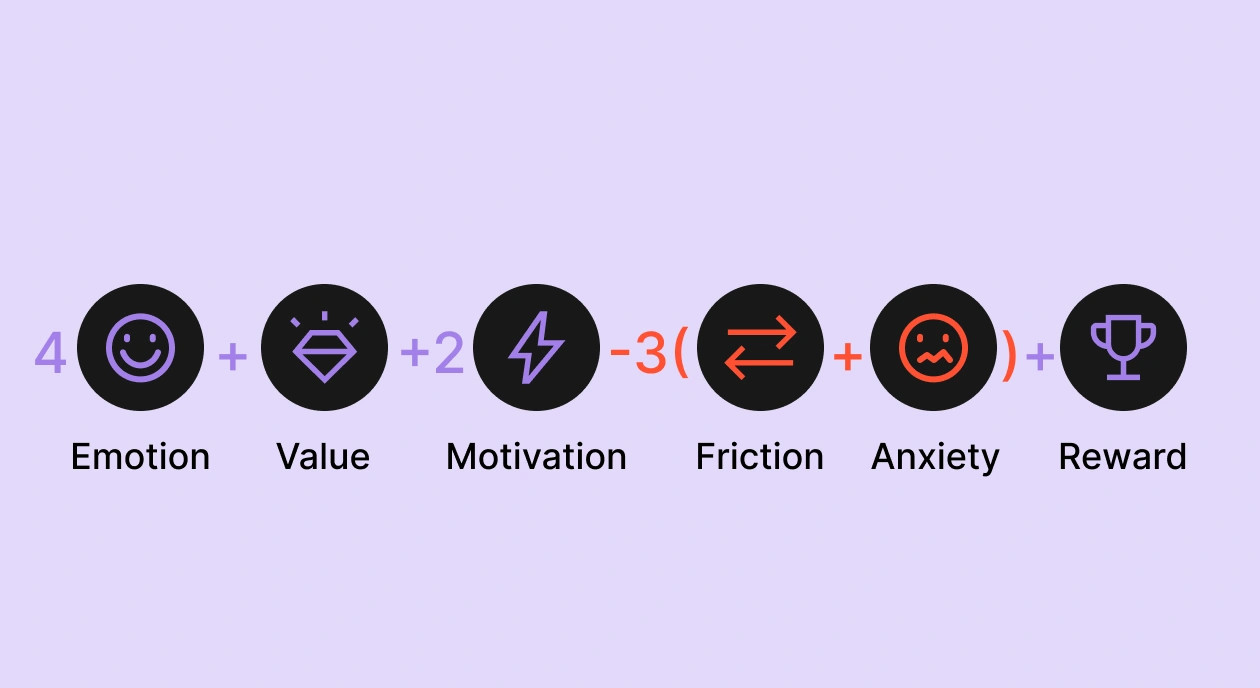
- Conversion probability is a function: C = 4E + 1V + 2M – 3(F+A) + 1R. Emotion (E), value (V), motivation boosters (M), and reward (R) add up. Friction (F) and anxiety (A) subtract.
- Teams over-invest in V (more features, more proof) and under-invest in F and A. Those two negative variables each carry a 3x weight. Fix friction and anxiety before you touch your headline.
By the time a subscription team is shipping 50+ experiments a year, the easy paywall wins are gone. You've already tested the headline, A/B'd the plan structure six ways over, and dialed in your trial duration. Conversion still plateaus.
What you're missing is a model. Most teams test variables one at a time without a framework that explains why some tests move conversion while most don't.
The framework below treats conversion as a function. It pulls from Robert Cialdini's principles of influence, Clayton Christensen's Jobs-to-be-Done theory, and Daniel Kahneman's behavioral economics, refined through years of paywall audits across thousands of apps and stress-tested against $3B in subscription revenue across 16,000+ apps.
What is the conversion formula for subscription apps?
Conversion probability (C) is a weighted sum of six inputs:
- E — how emotionally engaged the user is
- V — how clearly they see the value
- M — how many motivation boosters does the flow stack
- F — how much friction they hit
- A — how much anxiety the offer triggers
- R — how often they're rewarded along the way
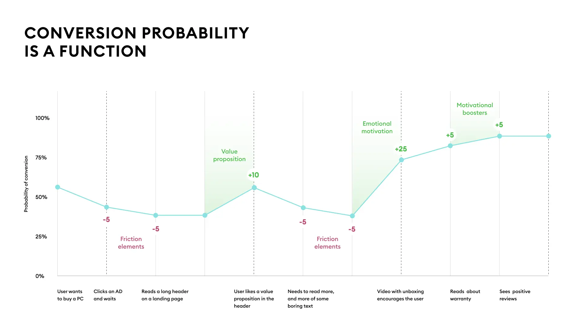
One user's running probability of conversion across nine onboarding screens.
| Variable | What it is | Weight | Why the weight |
| E | Emotional motivation | +4 | System 1 drives 95% of decisions. Emotion is the fuel. |
| V | Value proposition | +1 | The 1x is a warning. Teams over-index here. |
| M | Motivation boosters | +2 | Cialdini's seven principles. Compound when sequenced. |
| F | Friction | −3 | Every screen of friction costs you nearly what a screen of E gains. |
| A | Anxiety | −3 | The gap between wanting the value and trusting the transaction. |
| R | Reward | +1 | Most overlooked. The completion effect alone justifies its place. |
E is weighted 4x because emotional motivation determines whether a user reads your onboarding at all. F and A are each weighted 3x and negative, which means every friction point and every trust gap costs you almost as much as one unit of emotion gains.
Most teams treat the positive side of the formula (E, V, M) as marketing's job and the negative side (F, A) as engineering's problem. The result is that F and A get under-invested in even though they're the cheapest variables to fix and the ones that compound fastest across a flow.
Why is emotional motivation the heaviest weight in the formula?
E is weighted 4x because users operate in System 1, the fast unconscious mode of cognition that drives roughly 95% of decisions. System 2, the slower rational mode, handles the rest. An onboarding flow that fails to connect with System 1 is fighting for the 5% of cognition that isn't making the buy decision.
Kahneman laid this out in Thinking, Fast and Slow. Most subscription copy is written for that 5%: features lists, comparison tables, rational arguments about ROI. The 4x weight on E reflects how much conversion gets lost when an onboarding flow speaks to the rational mind while the actual decision is happening emotionally.
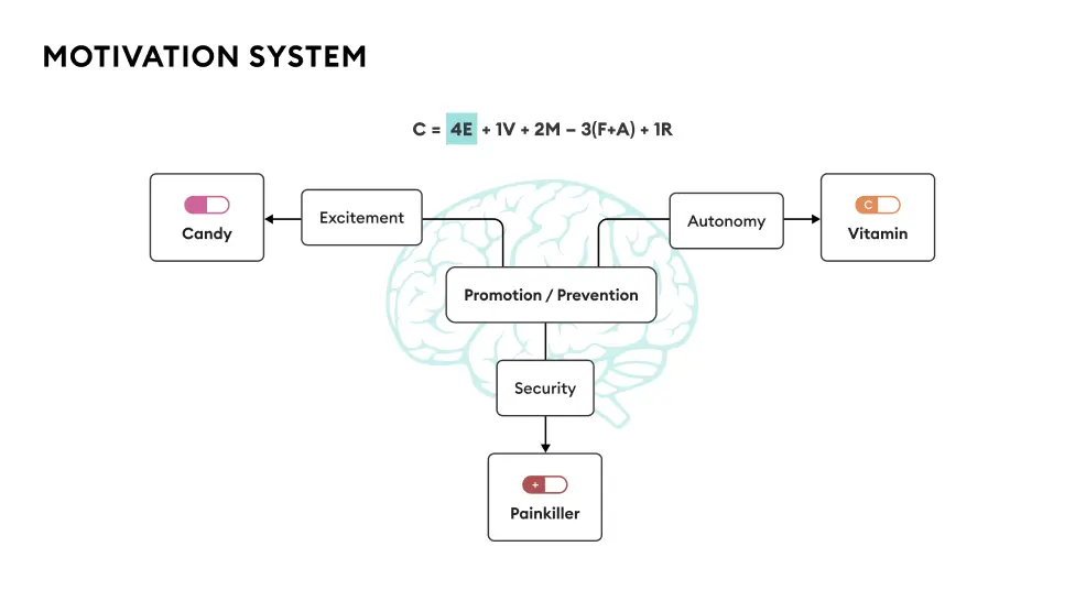
What are the three motivation systems?
Every subscription app maps to one of three core motivation systems.
- Security (painkillers): Apps that help the user prevent loss, danger, or anxiety. Health, sleep, finance, safety. The user comes in worried and wants relief.
- Autonomy (vitamins): Apps that give the user leverage over their own life: productivity, learning, and fitness apps with progression mechanics. The user wants to feel more capable than they did yesterday.
- Excitement (candy): Apps that solve boredom or low stimulation: entertainment, casual gaming, generative AI. The user wants to feel something new.
Your category determines your starting emotional fuel. Painkiller apps (health issues, sleep problems, financial stress) launch with a 50%+ probability of conversion before they've shown a single screen, because the user arrives with the emotional intensity already loaded. Candy apps (social media, casual games, generative AI) start near zero and have to manufacture every point of E from scratch.
The risk of picking wrong is that your entire flow misaligns with what your user actually wants. A meditation app pitched as candy ("have fun with meditation!") leaves security-seeking users cold. A productivity app pitched as a painkiller ("* stop drowning in your inbox*") reads as melodramatic to users who just want to organize their workweek.
What does emotional copy look like?
The mistake is writing copy about your product category when the user is feeling something specific. "The #1 fitness app" is category copy. "You bought clothes that don't fit anymore" names a feeling the user already has.
A wellness flow built in Flow & Paywall Builder opens with "Still can't quiet your mind?" The line lands on a 2 am experience the target user knows from the inside, and they tap "I'm ready" before deciding whether they want to subscribe.
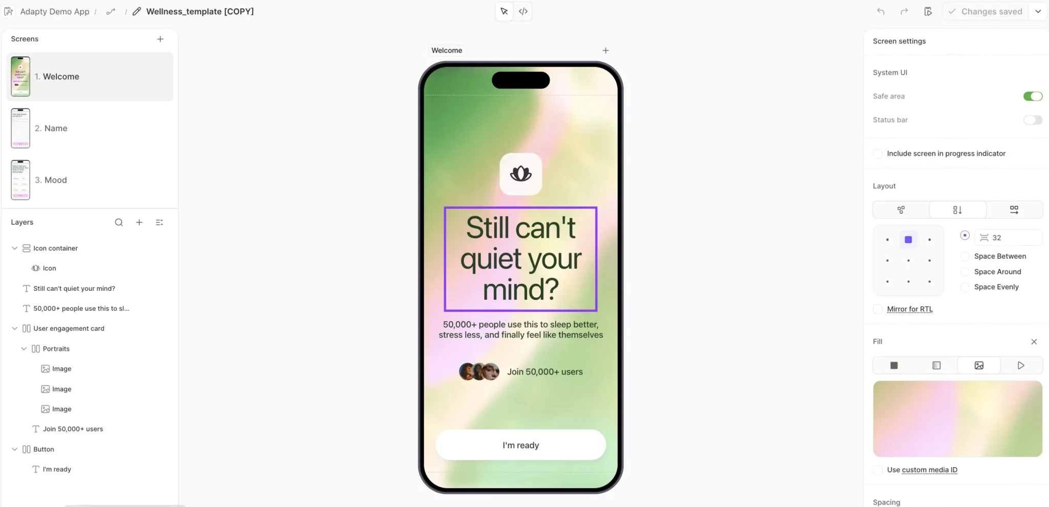
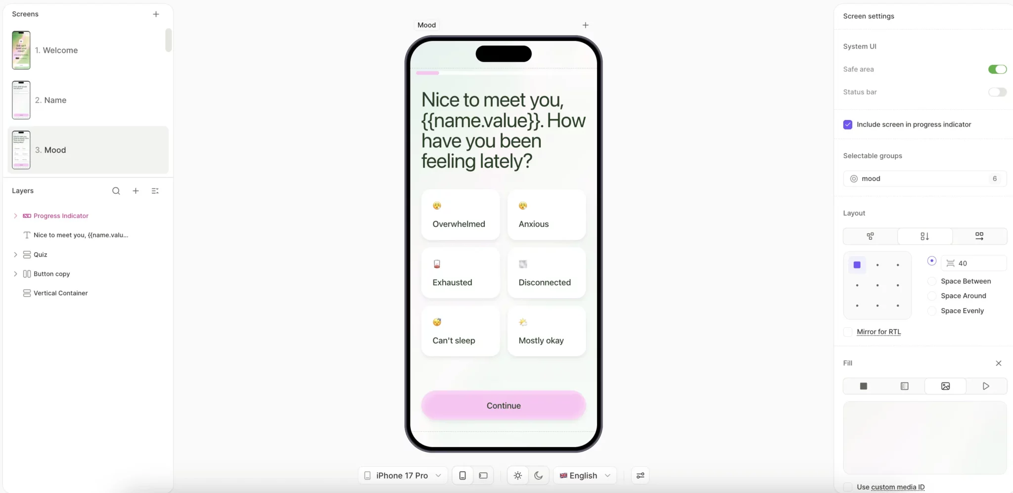
The flow then references the user's name at key moments ("Nice to meet you, {name.value}"), which carries the emotional connection from screen one all the way to the paywall.
How do you ramp up emotional motivation?
Three patterns lift E across product categories.
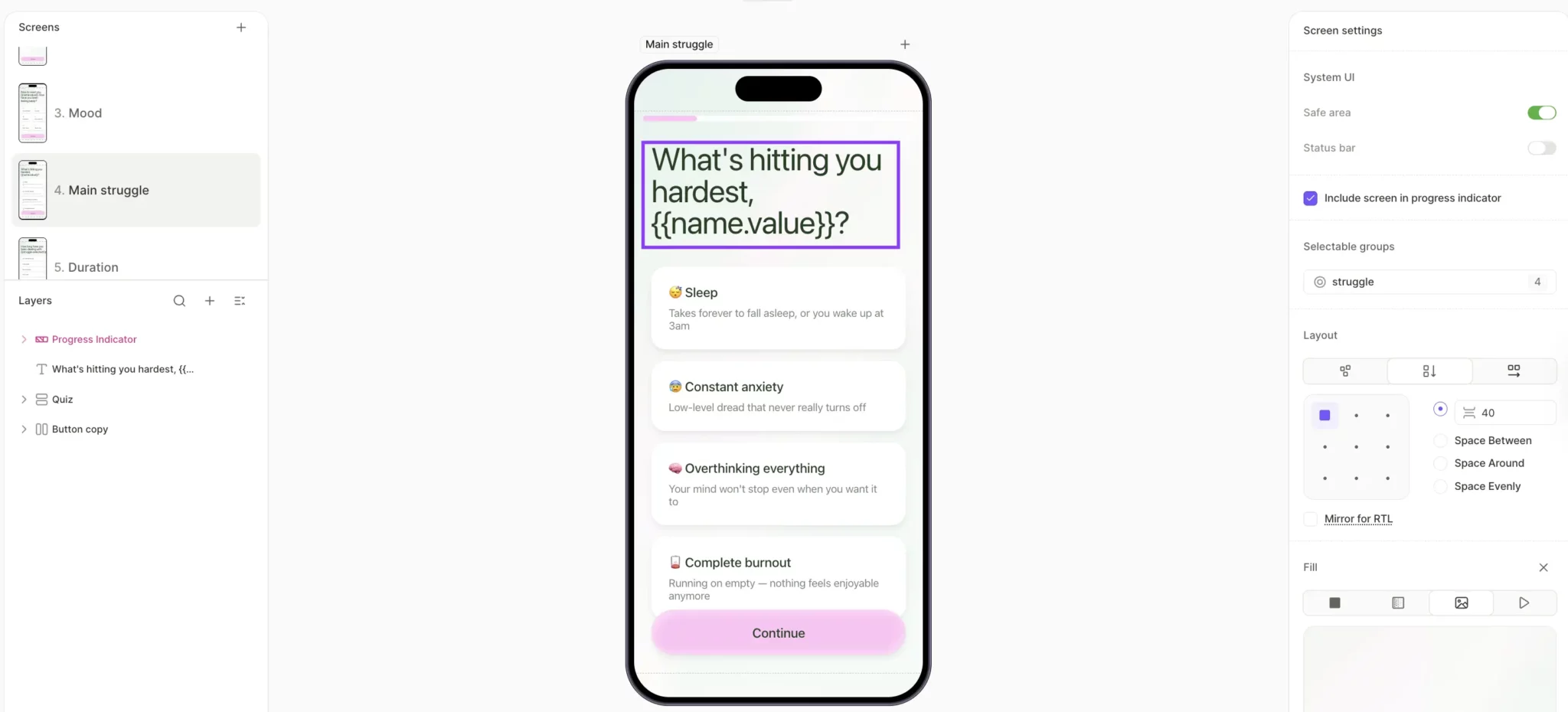
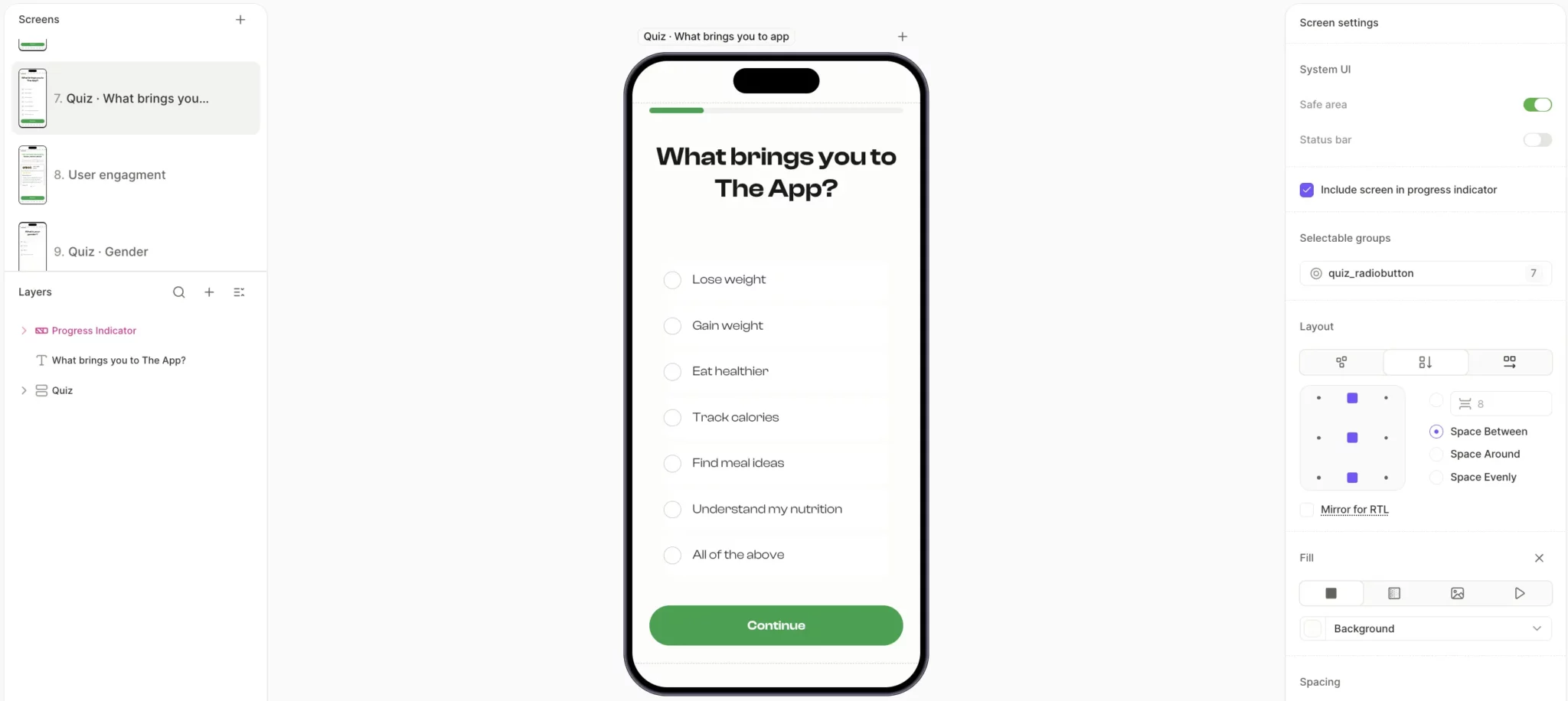
- Name the pain in the user's words. A wellness flow asks "What's hitting you hardest, {{userName}}?" and offers options like "Constant anxiety," "Overstimulated," "Burnout." These are the actual words your target user would use to describe their week to a friend. Each option is doing recognition work: The user sees their own state reflected in the language and gets emotionally engaged with the flow before they've encountered a single feature claim.
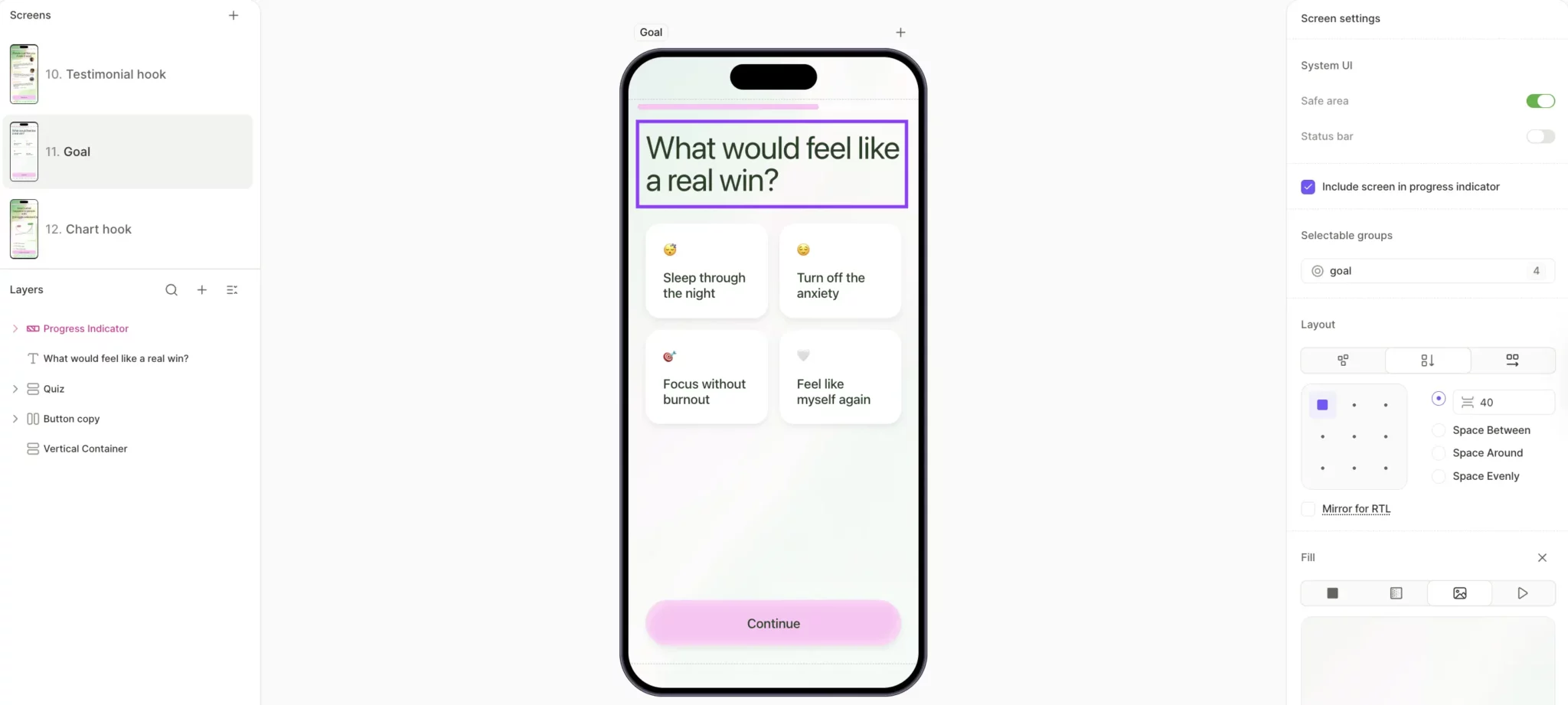
- Show the user their own future state. A wellness flow asks "What would feel like a real win?" and offers four outcomes to pick from, like "Sleep through the night" or "Feel like myself again." The user picks one and has now committed to a specific emotional outcome, before they've seen a single guided session.
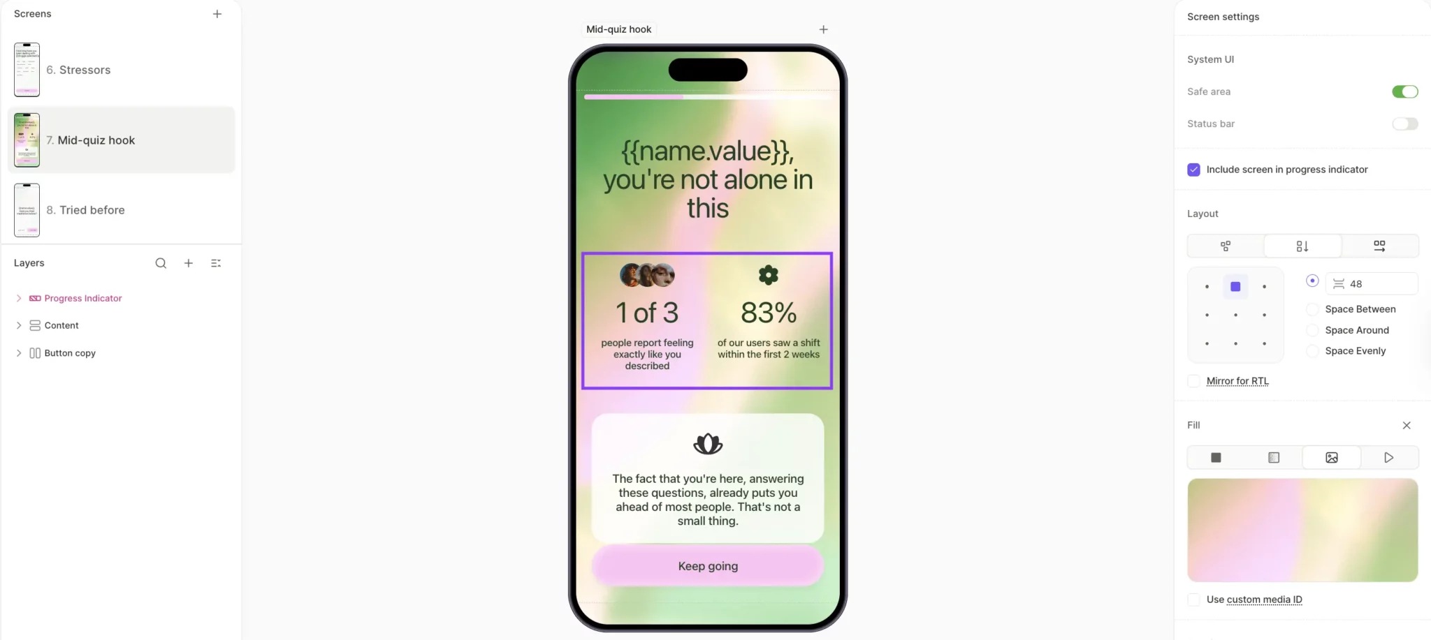
- Use mid-flow reassurance to prevent doubt from compounding. A social proof screen mid-quiz shows the user two stats: "1 of 3 people report feeling exactly like you described. 83% of our users saw a shift within the first 2 weeks." The user moves to the next question, carrying a new question of their own: whether they'll be the one who follows through.
The discipline behind all three patterns is making emotion tangible. System 1 processes imagery, faces, and lifestyle context faster than it processes text, so the screens that convert hardest pair short emotional copy with visuals the user recognizes from their own life.
Why is the value proposition only weighted 1x?
V is weighted 1x because by the time you're optimizing conversion, the value proposition already exists. Your app has been live for months, users have downloaded it, and the market has decided whether your value claim landed. Rewriting the headline an eighth time won't move that judgment.
The operational implication is to stop rewriting claims of value and start showing the value in the onboarding flow itself, before the paywall asks for anything.
What is the JTBD framework for subscription apps?
Jobs-to-be-Done is a framework for figuring out what job the user is hiring your app to do. Most teams answer at the category level ("they want to lose weight") and stop there. The framework rewards specificity. A weight-loss app's real job is helping the user get out from under a frustration they wake up with every morning.
The user is hiring you to bridge the left and the right of the JTBD map. The middle column is the work they'd take on themselves if you weren't in the picture. Competitors can match your feature list, but the transformation from one side of the map to the other is what keeps a user paying.
Name the alternative the user is currently hiring. If you're a meditation app, your real competition is whatever the user currently does to wind down. Instagram before bed, one more episode, the glass of wine on the nightstand. Naming that alternative makes the trade concrete.
How do you compress time to value?
Strong value still loses if the user has to wait days to feel it. Every hour between subscribing and feeling the product work is an hour the user can rationalize a refund.
The move is to make the user feel the value before they pay. Collect their inputs and surface those inputs back as proof that the product is already working on their behalf.
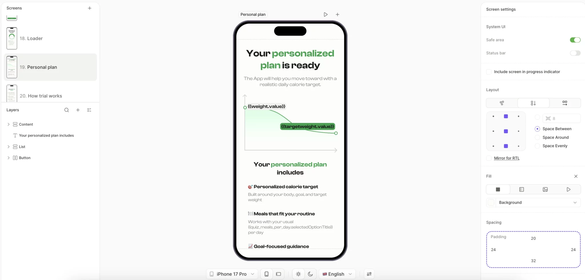
A sport flow asks for the user's height, weight, target weight, and fitness level, then runs a 2-4 second loader before landing them on a results screen with their data reflected back as a personalized goal projection.
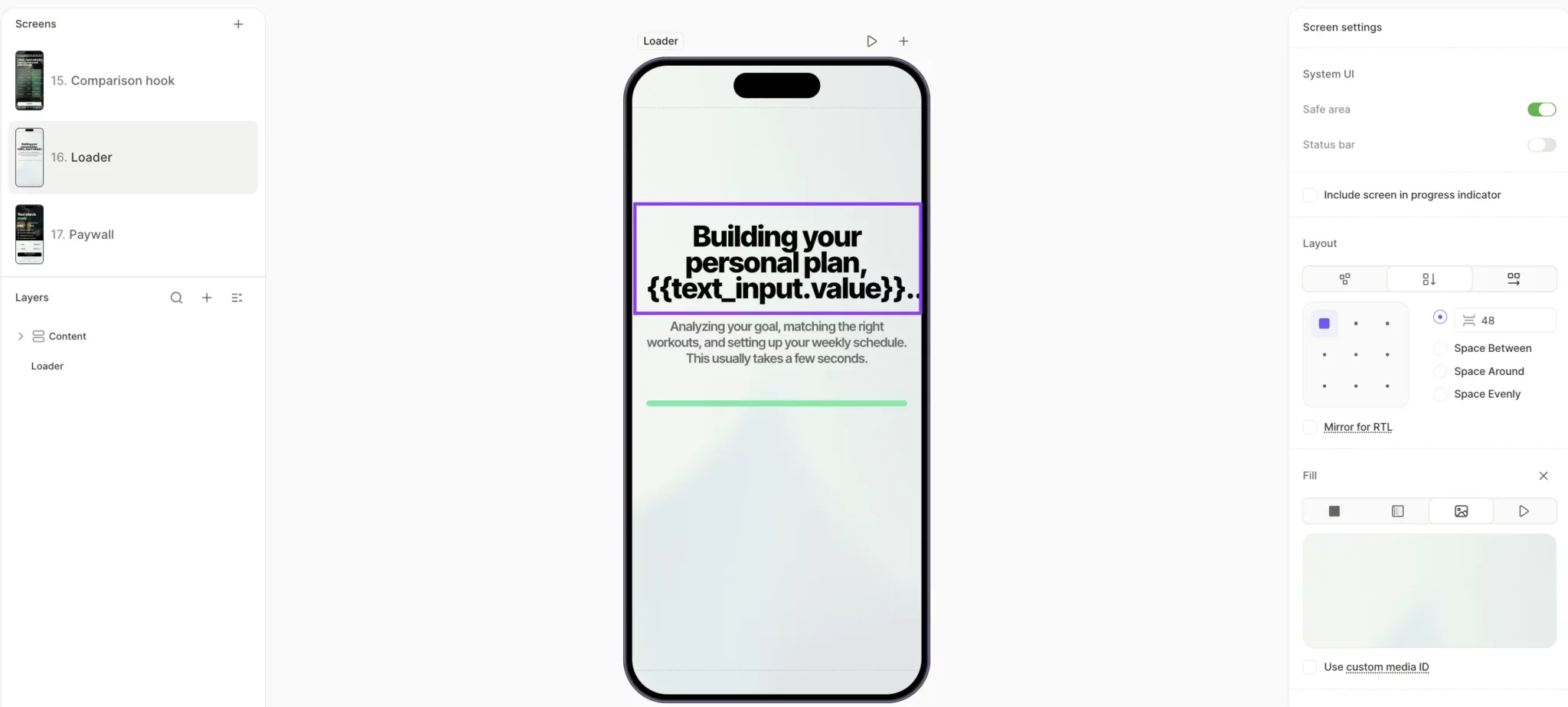
The user hasn't paid or started any workouts, but they've already felt the product produce something specific to them in roughly four seconds. That's value manufactured before the ask.
How do Cialdini's principles drive subscription conversion?
Robert Cialdini's seven principles of influence translate directly into onboarding mechanics, each one acting as a small nudge toward the buy decision. M earns its 2x weight when those principles are distributed across the flow, each in its own high-attention moment, rather than stacked on the paywall.
What are Cialdini's seven principles?
Ranked roughly by leverage in subscription onboarding:
- Commitment. The highest-leverage principle in onboarding. Once a user has answered five questions about their goals, they're invested in the outcome, which makes them less likely to abandon at the paywall.
- Social proof. Works hardest when the user can identify with the source. "78% of users with a similar goal and age range" runs on the same mechanism as "2M+ users," but it lands harder because the mirror is narrower.
- Authority. Use it only when the credentialing source is tied to the user's specific JTBD. A nutrition expert backing a meal tracking app reads as relevant. The same expert endorsing a meditation app reads as borrowed credibility.
- Reciprocity. Give the user something of value before asking for the subscription. A personalized plan delivered before the paywall creates a small psychological debt that the user will look to repay.
- Liking. Liking is the cheapest M principle to implement. A name variable in the copy and imagery that matches the user's self-concept is enough to activate it.
- Scarcity. Scarcity is the principle most likely to backfire. Real limited-time offers and countdown timers work because they create genuine loss aversion. Fake versions get noticed faster than teams expect, and the trust loss is permanent.
- Unity. Frame the purchase as joining a group the user wants to belong to. The move works hardest in categories where the user's identity is bound up with the activity (fitness, creative work, niche hobbies).
How do you sequence motivation boosters?
Distribute the principles across the flow so each one lands at the moment the user is ready to receive it.
A meal tracking flow built in Flow & Paywall Builder stacks principles across roughly 25 screens:
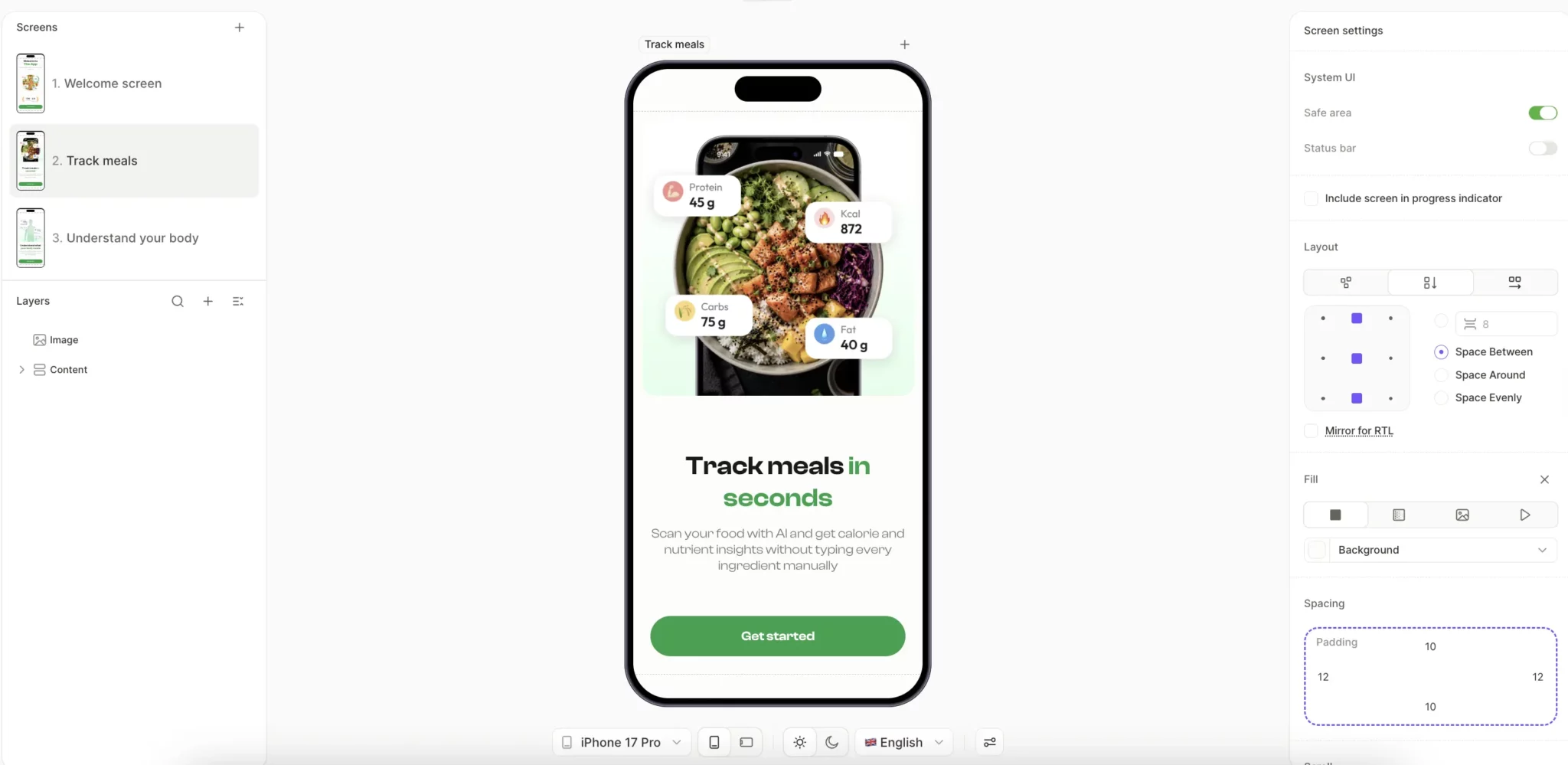
- Screen 2, Value proposition. "Track meals in seconds," paired with the explanation that AI scans food automatically, resolves the user's biggest unspoken concern about meal tracking apps: manual logging effort.
- Screen 7, Commitment via easy question. The user picks a primary goal from a single-tap list of options. The act of choosing is the first commitment, and it costs the user nothing.
- Screens 9-17, Continued commitment via personalization. Current weight, target weight, eating habits, and schedule constraints. Each answer the user gives makes the outcome they're describing feel more like their own plan than the app's pitch.
- Loader screen, Authority and reciprocity. "Adjusting your personalized journey" with four named sub-tasks animated in sequence. The user sees real work happening on their behalf, which makes the plan reveal that follows feel earned.

- Plan reveal, Liking and commitment payoff. "Your personalized plan is ready," with a weight projection chart and three named plan components built from the user's quiz answers. The user sees their own inputs reflected back as concrete custom output.
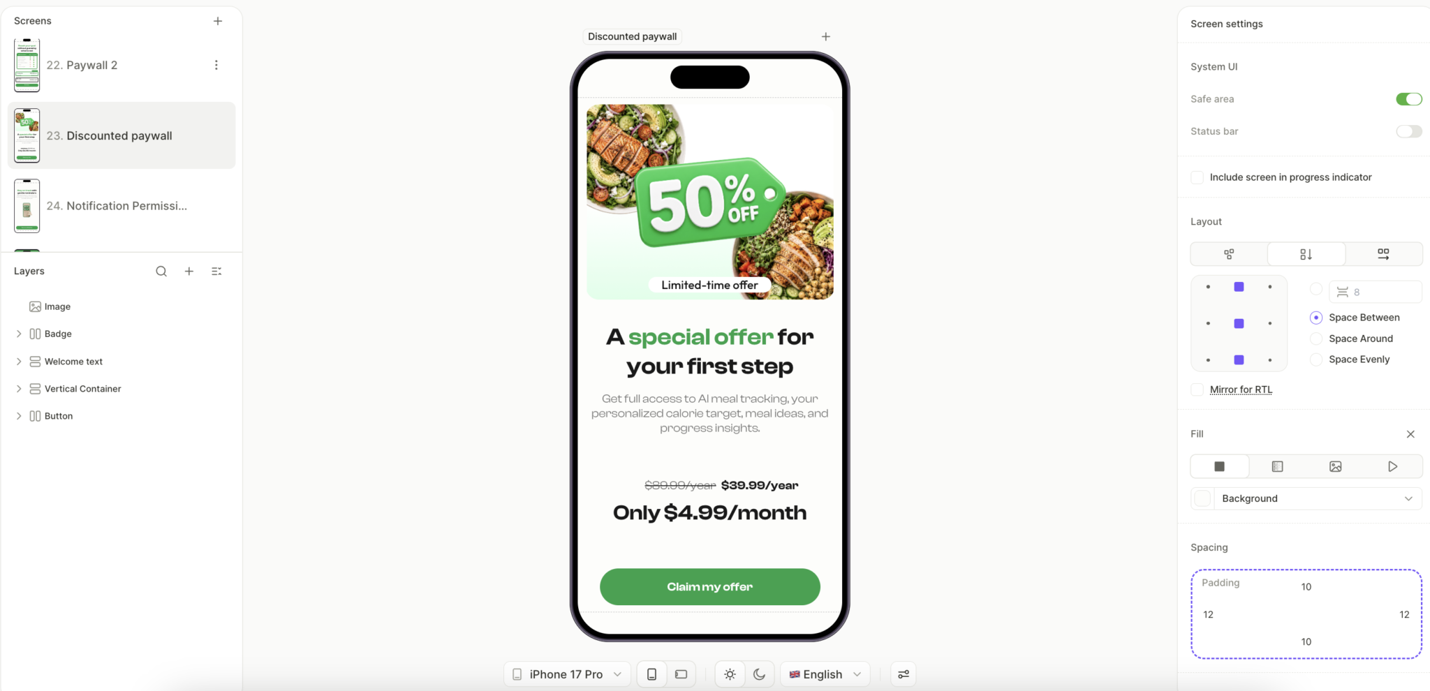
- Paywall, Scarcity. A "50% OFF" badge, "Limited-time offer" tag, and anchored pricing ($80.99 crossed out, $39.99/year reframed as $4.99/month) converge at the decision point. The user has multiple reasons to act and few left to wait.
Each principle has a moment in the flow where it lands hardest. Easy commitments work early, when saying yes costs the user nothing. Scarcity earns its place at the paywall, where delay is the user's main weapon against you. Social proof belongs in the middle of the flow, where doubt typically surfaces before the user is ready to commit.
Why is friction the most under-respected variable?
F is weighted 3x. Every screen of friction costs you almost as much as a screen of emotional motivation gains. The reason teams underinvest in fixing it is that friction doesn't appear in dashboards as a labeled metric. It appears as a drop-off with no obvious cause.
Friction is invisible to the team that built the product. After designing and testing the onboarding hundreds of times, the team knows what every button does and why every screen exists. The first-time user has none of that context. They land on a screen of unfamiliar copy and unfamiliar pricing, and within the first second, they've decided whether to keep going.
What's the difference between physical and cognitive friction?
Two kinds, both weighted 3x. They look different in the UI.
Physical friction is the cost of steps. Too many form fields, slow page loads, and videos the user can't skip. The path from A to B exists; it just takes longer than it needs to.
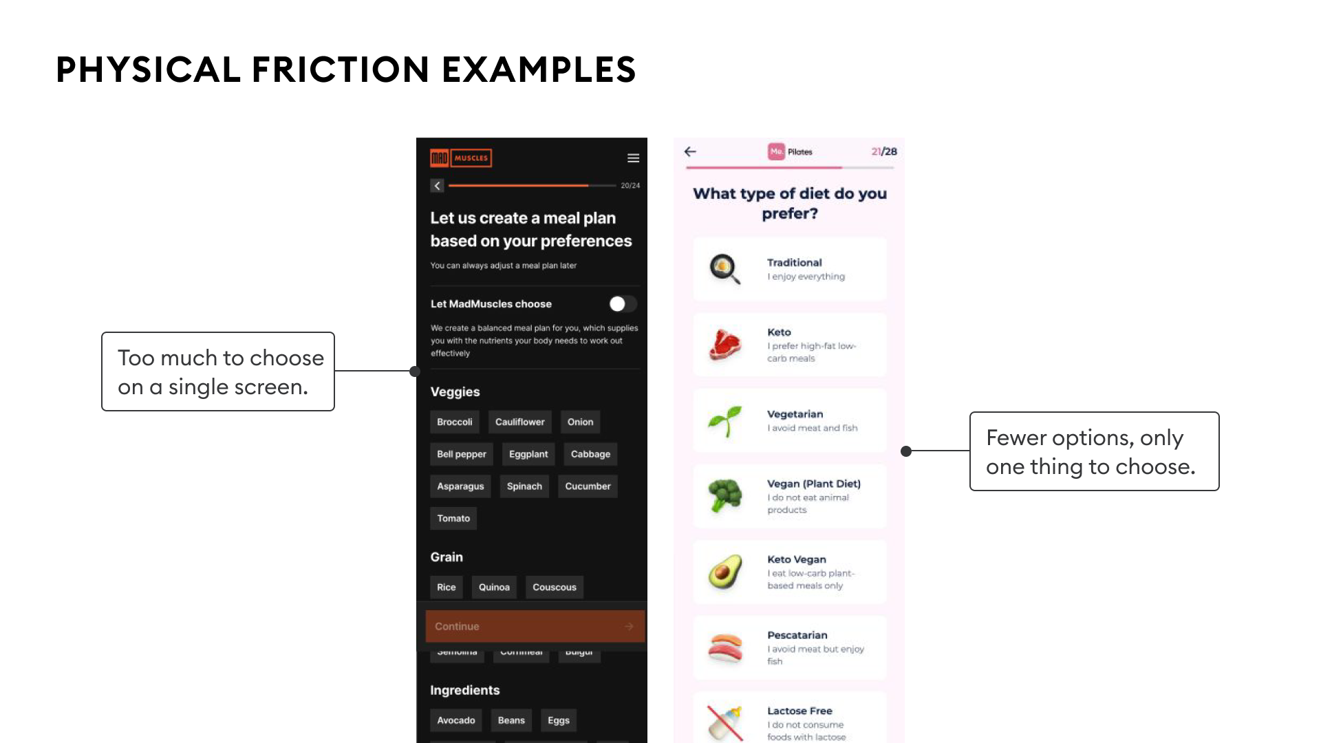
Cognitive friction is the cost of uncertainty. The user doesn't know what to do next, or has to think about it before they can act. Ambiguous copy makes them pause. Two CTAs that look identical force them to think. Each pause is friction that the team didn't intend to add.
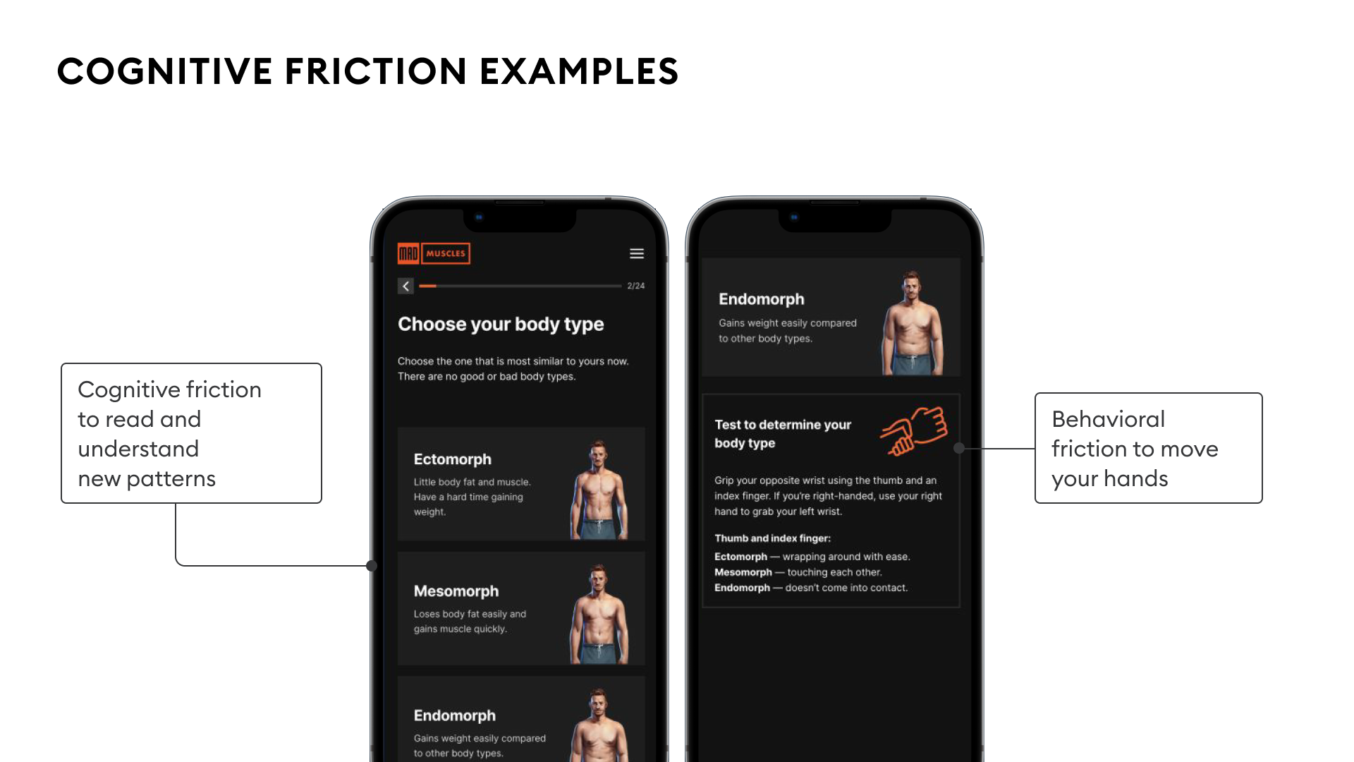
Cognitive friction costs more per occurrence because it pulls the user out of System 1 (autopilot) and into System 2 (effortful thinking). The moment the user starts thinking about your interface instead of their goal, you've lost them. Physical friction wears users down across a long flow, while cognitive friction can stop them on a single screen.
How do you reduce friction?
Collapse the path and remove the thinking.
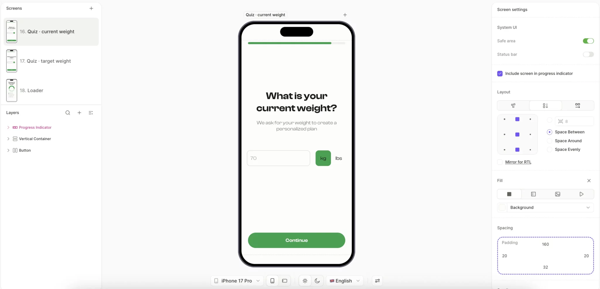
Ask one question per screen. A typical signup pattern asks for height, weight, goal weight, and goal type on one screen. That's four decisions before the user has felt anything. Splitting the same questions across four single-purpose screens converts higher, even though it adds screens. The user makes one small decision at a time, and the completions compound.
A sport flow runs this approach across seven screens: goal selection, biological sex, height, weight, target weight, fitness level, and workout frequency. Each tap moves the user forward without asking them to weigh the next decision.
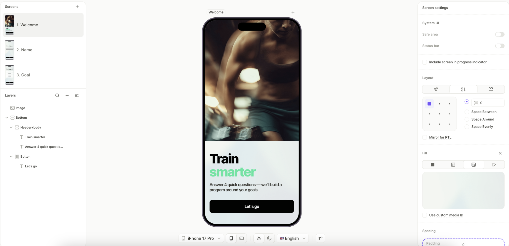
Use foot-in-the-door as the entry move. Screen 1 should be the easiest possible decision the user could make. A sport flow opens with the headline "Train smarter," the promise "Answer 4 quick questions — we'll build a program around your goals," and a single "Let's go" button. The CTA is the only thing the user can do, and the "4 quick questions" framing tells them upfront how small the commitment is.
Make your CTAs unmistakable. Familiar UI patterns beat clever ones. If your CTA looks like every other CTA the user has tapped this week, they'll tap yours without thinking. A button that's novel, beautiful, and unexpected in its design will make the user pause, and the pause is where the friction lives.
Audit your copy too. The most common cognitive friction triggers in subscription onboarding are clever metaphors, rhetorical question openers ("Are you tired of...?"), headers that wrap to three or more lines, and copy that requires the user to read it twice. State what the screen is for in two lines or fewer, in language a first-time user would actually use.
How does anxiety kill subscription conversion?
A is the other 3x negative variable. Friction is the cost of steps. Anxiety is the cost of doubt. The user wants what you're offering. They've felt the emotion, seen the value, registered the motivation boosters. Then they see the $79.99 annual price, and their hand stops.
That pause is anxiety, and it's specific enough to diagnose and addressable enough to fix. Anxiety accumulates across the entire flow, and the paywall is the moment where it either resolves or compounds into the refund the user requests three days later.
What kinds of anxiety do users feel?
Five distinct anxieties show up at the paywall, and each one has a specific remedy.
- Quality. Will the product work for me? Have other people like me had success?
- Trust. Is this a real company that will deliver, or does this app look like it might disappear?
- Bargain. Am I getting fair value for the price, or could I get the same outcome cheaper somewhere else?
- Time to value. How long until I feel this was worth what I paid?
- Security of transaction. Can I cancel easily, or is this app's churn flow built to trap me?
Teams over-invest in solving quality anxiety with more testimonials and more before-and-after content, while leaving bargain anxiety and security-of-transaction anxiety untouched. The two under-addressed anxieties are the cheapest to fix and the ones that compound across every paywall view.
How do you reduce price anxiety?
Bargain anxiety responds well to a small number of pricing-presentation moves:
Per-day pricing. Show $0.22/day instead of $79.99/year. Same total price, different cognitive load. The user reads $79.99 as a discretionary purchase they need to justify. They read $0.22/day as below the threshold of worth-thinking-about, comparable to a single notification on their phone. The decision moves from System 2 (compare against the budget) to System 1 (skip and continue).
Price anchoring with an "ugly" option. Place a monthly plan at $19.99 next to an annual plan at $79.99. The annual plan now looks like the obvious value because you've engineered the comparison to favor it.
A meal tracking flow built in Flow Builder runs this pattern at the paywall. The screen displays a feature comparison table showing what Premium unlocks over Free (AI meal scanning, macro tracking, personalized meal plans, recipes, progress insights), followed by two pricing options. The yearly plan at $89.99/year reframes as $4.43/month, slightly less than the monthly plan at $4.99/month. The monthly plan exists primarily to make the yearly plan's per-month price look like the obvious choice, while the feature table reduces quality anxiety in parallel.
![]()
Buy-now-pay-later framing. Show "Due today: $0.00. Charged in 7 days." on the paywall. The user can commit without parting with money at the moment, which removes most of the bargaining anxiety from the point of decision. The anxiety doesn't disappear; it gets relocated to day 7, when the user has already invested a week of habit-building.
How do you reduce trust and security anxiety?
Trust and security anxiety respond to three specific moves. None of them requires more testimonials.
Money-back guarantees as the floor. A 30-day money-back badge near the payment button establishes baseline trust without requiring testimonials or before-and-after content.
Future-state visualization. Show the user a specific predicted outcome before they pay. A meal tracking flow's goal projection screen displays a personalized timeline of how the user's weight will change over the next 12 weeks based on their inputs. The screen answers the user's biggest internal question (will this work for me?) before the payment screen appears, which means the user reaches the paywall with quality anxiety already largely resolved.
Place trust elements before the paywall. Money-back guarantees, authority badges, and payment system logos (Apple Pay, Google Pay) belong on the screen that precedes the paywall. Bury them in fine print on the paywall itself, and they fail to do the work they're capable of. By the time the user sees the price, every visible trust signal should already have appeared earlier in the flow.
Why is reward the most overlooked positive variable?
R shares the same 1x weight as V, which is why both variables get less attention than they should. Most teams put their effort into E and M, treat them as the real levers, and let R show up by accident. The problem with that approach is that R compounds differently than the other positive variables: it stacks across every screen rather than peaking at a single moment.
Most teams treat onboarding as a transaction that the user has to get through to reach the value. Architected well, onboarding becomes the reward itself, screen by screen, through the completion effect. A user who feels rewarded at screen 4 is psychologically primed to push through screens 5 through 16. A user who feels nothing reaches for the close button somewhere around screen 7.
What are the three reward mechanics?
- Completion. A completed process feels like a reward on its own. Progress bars, checkmarks, and "Step 3 of 5" indicators all tap into this, which is why a multi-screen flow can convert better than a single-screen form. Each completed step compounds with the next.
- Variability. Vary the reward across screens so it stays interesting. Different copy, different micro-animations, different visual confirmations for similar actions. When the user can't fully predict what comes next, they pay closer attention and feel a small anticipation lift on every new screen.
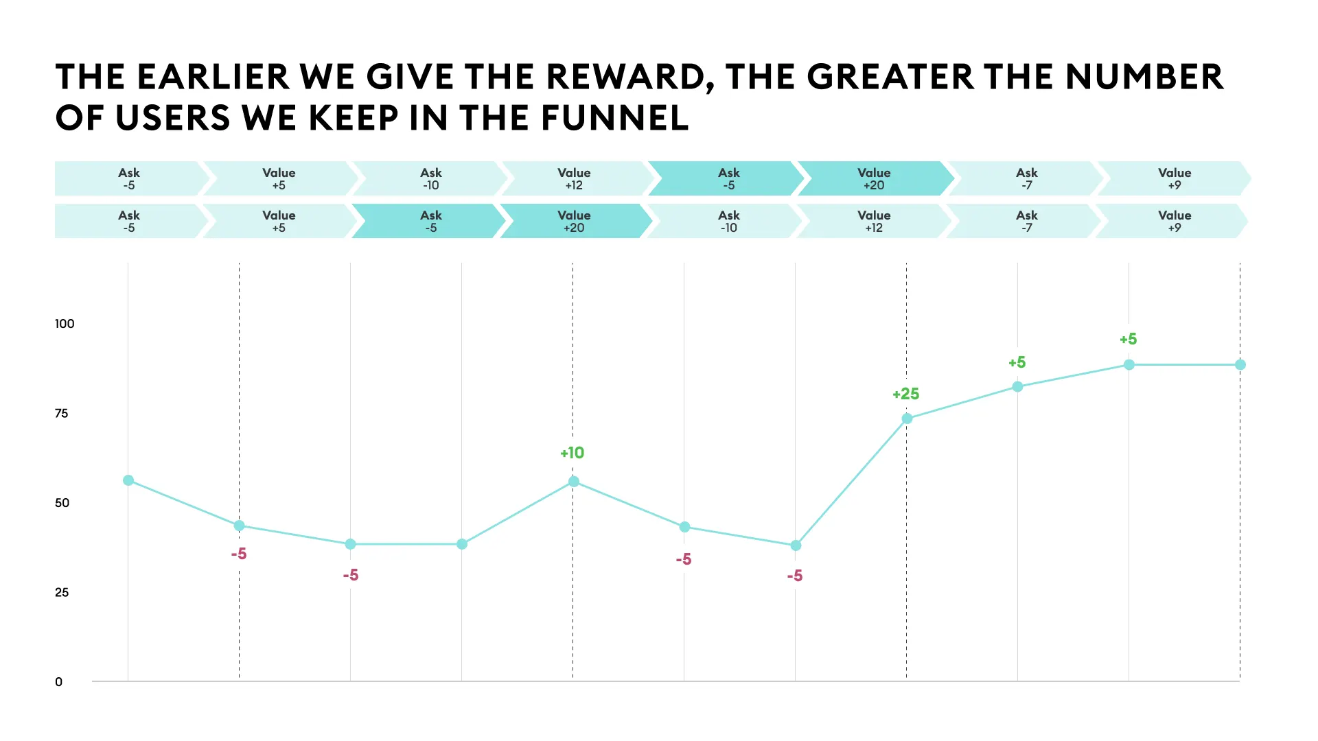
- Earliness. Give the reward before the ask. A cheer-up screen between a sensitive question and the next personalization step lowers anxiety while adding R, so the user enters the next decision with momentum.
How do you build the formula into Flow & Paywall Builder?
The formula tells you what to test. Flow & Paywall Builder gives you the construction kit to build variants quickly.
Mature CRO needs a third piece on top of that: an experimentation engine that monitors performance, suggests which variable to test next based on where the formula is leaking, generates the variant, runs it at the flow level, and feeds the results back into the next suggestion.
Adapty builds this loop with Flow & Paywall Builder, Growth Autopilot, and the attribution layer working together. Most teams reading this are running pieces of the loop already. The unlock is connecting them into a single closed feedback system.
CRO at the flow level means testing entire onboarding-to-paywall sequences as one unit instead of isolated paywall variants. Apps running 50+ experiments per quarter generate 18.7x more revenue than apps running just one experiment, which suggests the rate of iteration matters as much as the quality of any single test.
Channel-aware flow targeting changes the equation again. A user arriving from a specific Apple Ads keyword has a different starting intent profile than a user from a broad Meta interest campaign. Different emotional state, different anxieties, different value comprehension. The formula doesn't change, but the weights you should be optimizing for shift by channel, so the same flow can underperform for one cohort while converting well for another.
Want to see this run on your app?
Book a 30-minute call with the Adapty team. We'll run the formula across your top onboarding flow, identify the three highest-leverage fixes, and show you what changing them would look like inside Flow & Paywall Builder.