Paywall product list
The product list is a key element of your paywall, showcasing your offerings and products in an organized, attractive manner. This list is crucial in guiding users towards making a purchase. Let’s explore how to configure and enhance the product list to maximize its effectiveness.
The Content tab contains the products that will be displayed in the paywall. Those are absolutely the same products, you've added to the paywall when created it. You can adjust the list of products, and this will affect the list of products in the General tab of the paywall.
After you reviewed the list of products:
- Choose which product should be preselected by default in the Selected product field.
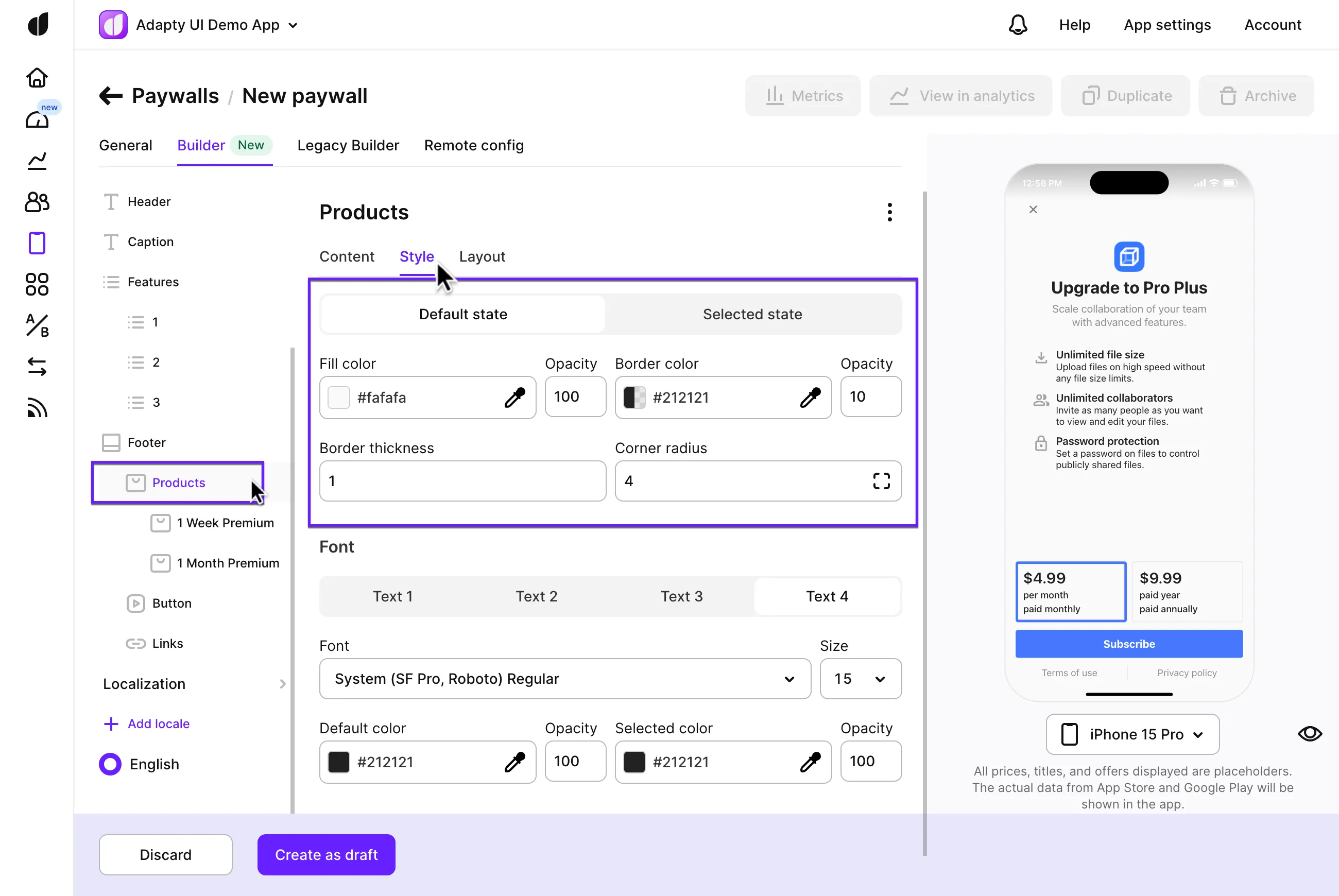
- Define how a product should look if it is selected or not in the Style tab of the Products section.
- Configure the overall view of the block in the Layout tab.
This section describes the new Paywall Builder, which works with iOS, Android, and React Native SDKs version 3.0 or higher, and Flutter and Unity SDKs version 3.3.0 or higher. For information on the legacy Paywall Builder compatible with Adapty SDK v2.x or earlier, see Legacy Paywall Builder paywall products.
Product view customisation
Enhancing the visual appeal of specific products can significantly rebalance user attention. Highlighting a product or special offer can encourage users to focus on it. Let’s look at some powerful customization options.
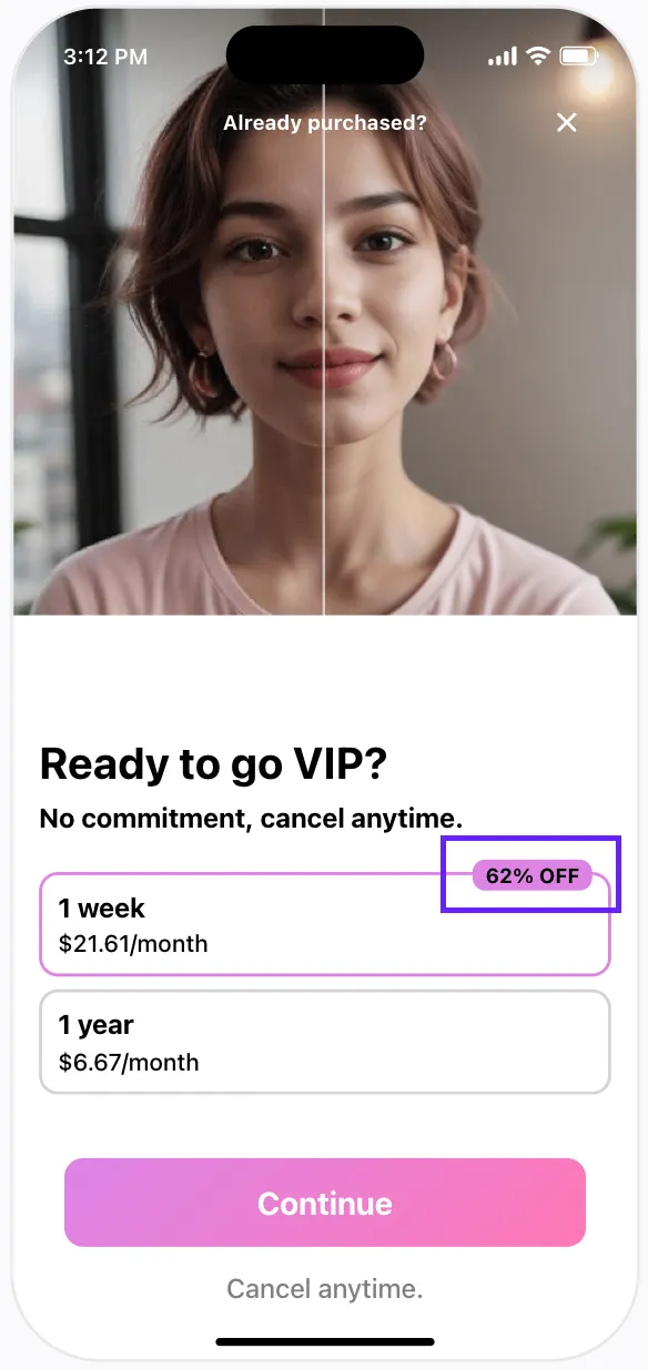
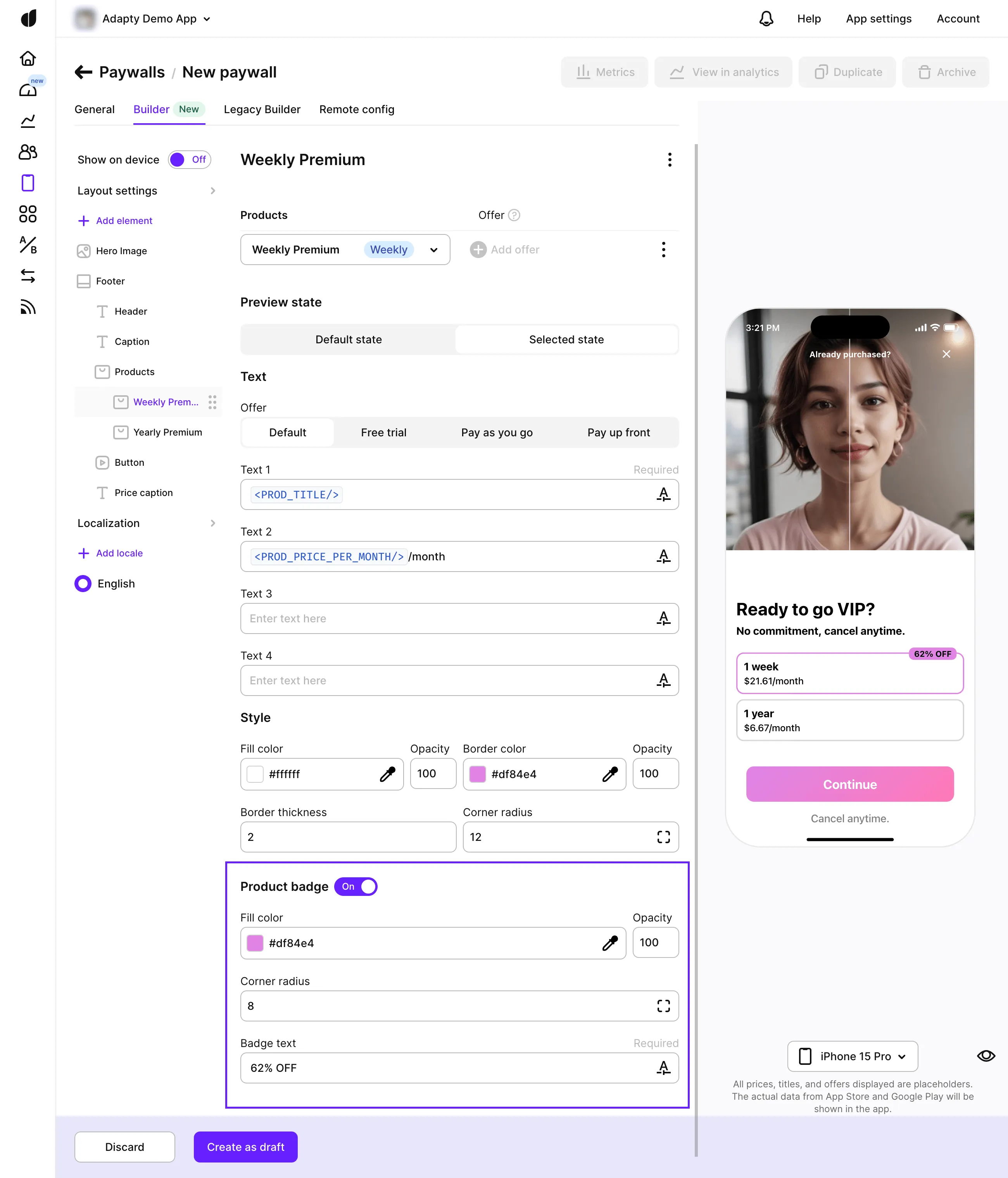
Product badge
A product badge is a small label that can be added to a product. This badge can provide additional promotional info and direct users choice. The badge size automatically adjusts to fit the text, and its position is optimized for your paywall layout.
To add a product badge:
- Turn on the Product badge toggle in the setting of a specific product.
- Customize the badge view and text to suit your design needs.
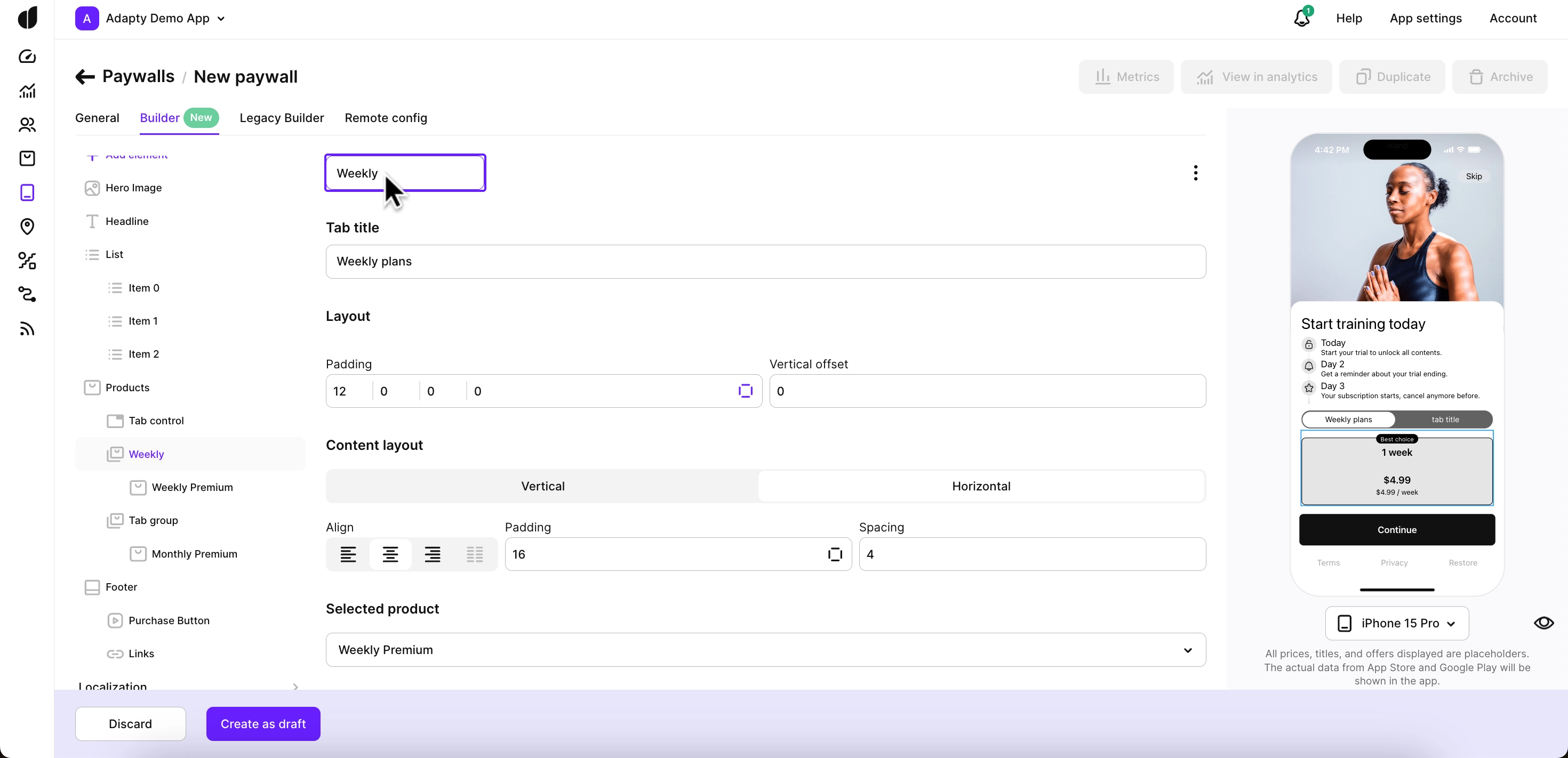
Selected product
For the Products as list + purchase button purchase flow, you can preselect a product to gently nudge users towards it. This can be especially effective in directing user choice.
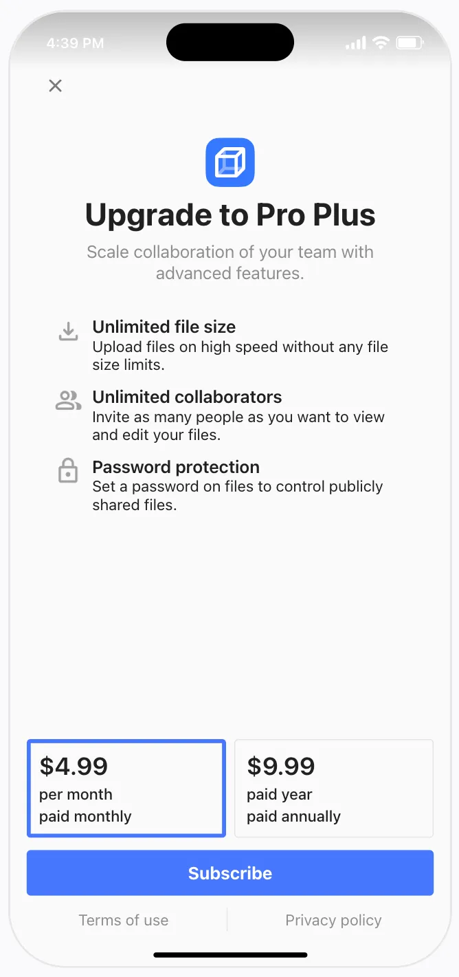
To preselect a product:
- Open the Products element.
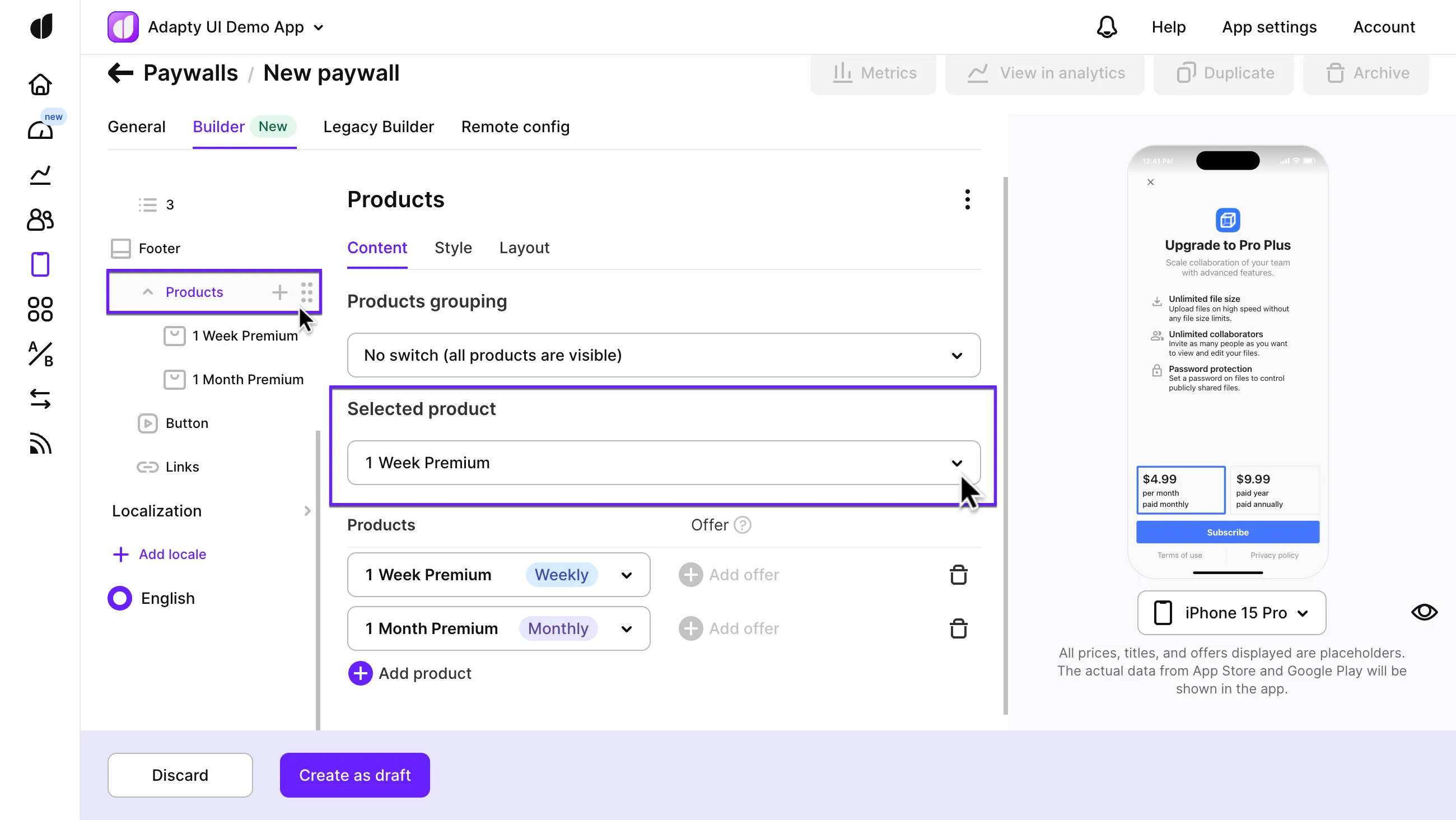
- In the Content tab, choose the product you want to preselect from the Selected product drop-down list.
- Adjust the view of the selected product as well as the default view of other products in the Style tab if necessary.
Highlighted product
For the Products as purchase buttons purchase flow, you can highlight a preferred product to make it the primary choice, drawing immediate user attention..
To highlight a product:
- In the left pane, choose the product you want to highlight.
- In the Style subsection, adjust the design to make the product stand out more..
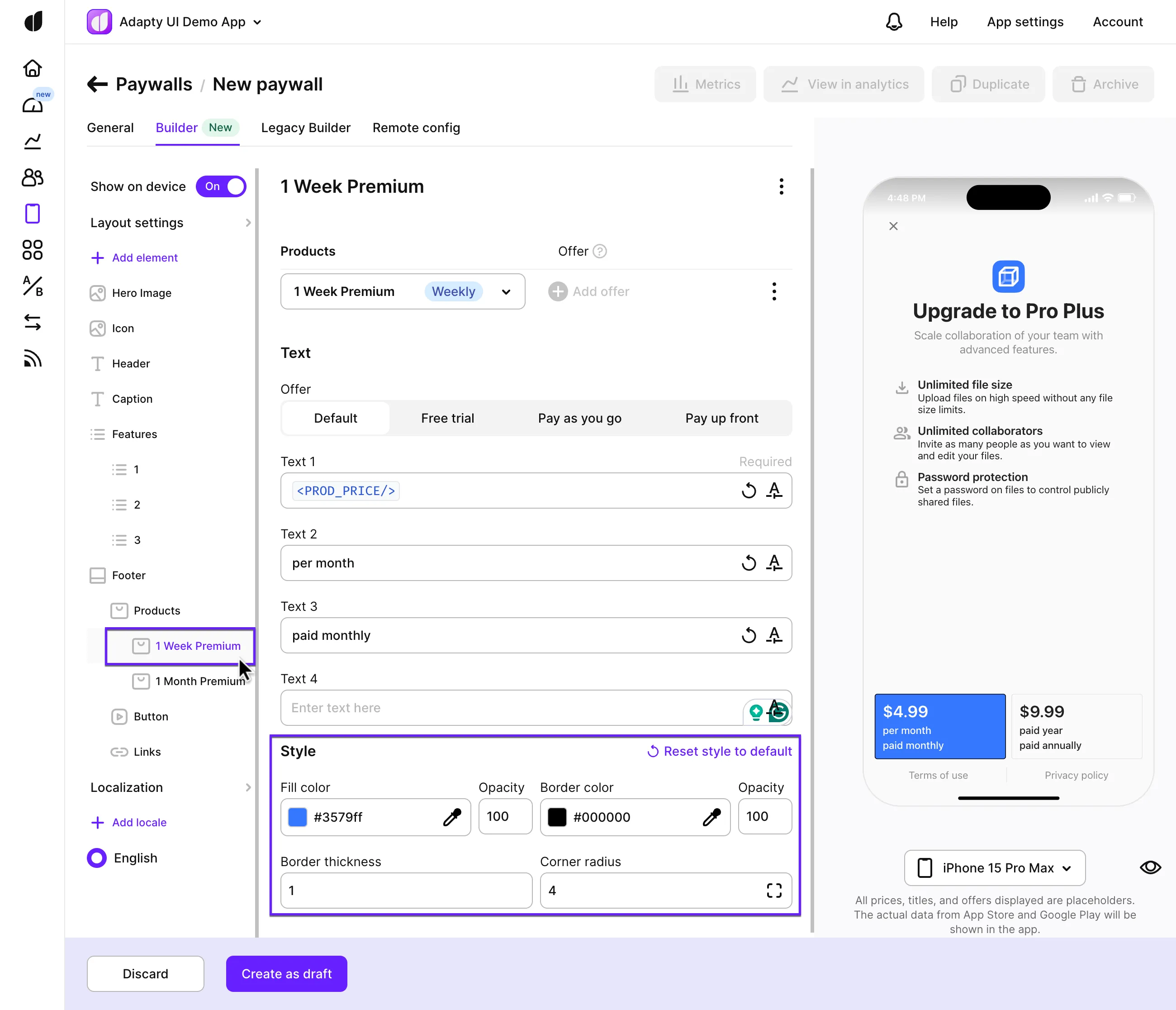
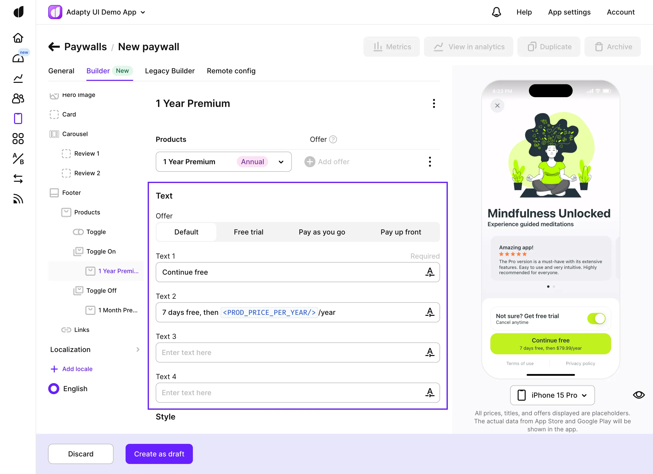
Product offers
Each product can feature different text for offers in the Text subsection. The Default tab contains the text displayed without an offer. This is the perfect place to use tag variables or custom tags for dynamic, localized content. Start typing with a triangle bracket, and Adapty will suggest available tag variables to insert localized data from the stores
Switching between 2 product sets by trial toggle
For a versatile user experience, you can allow users to switch between two sets of products using a toggle. This is especially useful for differentiating between standard products and trials.
To add a toggle:
- In the Products element, change the Products grouping option to Toggle (for free trials and other offers). This will add two subsections: Toggle on and Toggle off.
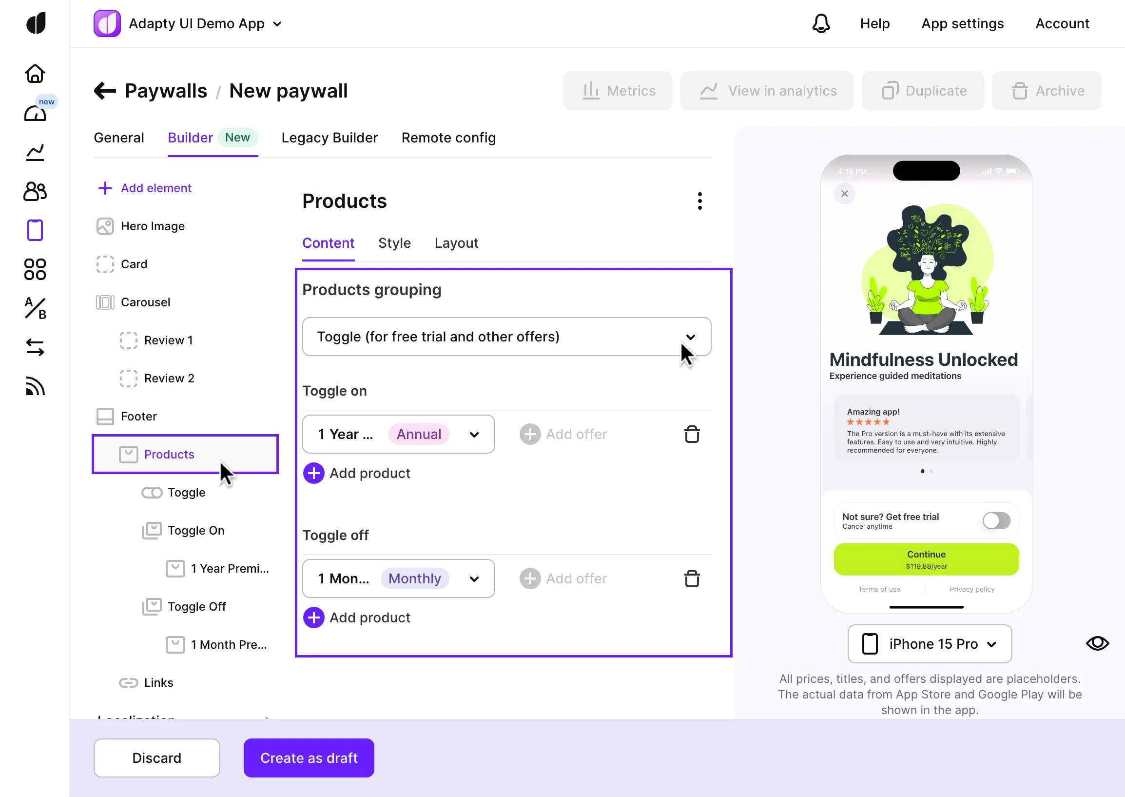
- Add products to both subsections to create views for when the toggle is on or off.
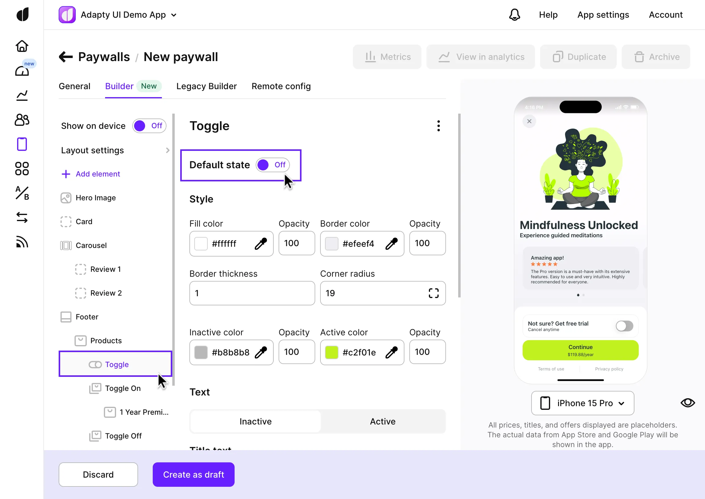
- In the Toggle element, set the Default state to choose whether the toggle should start as on or off in the paywall.
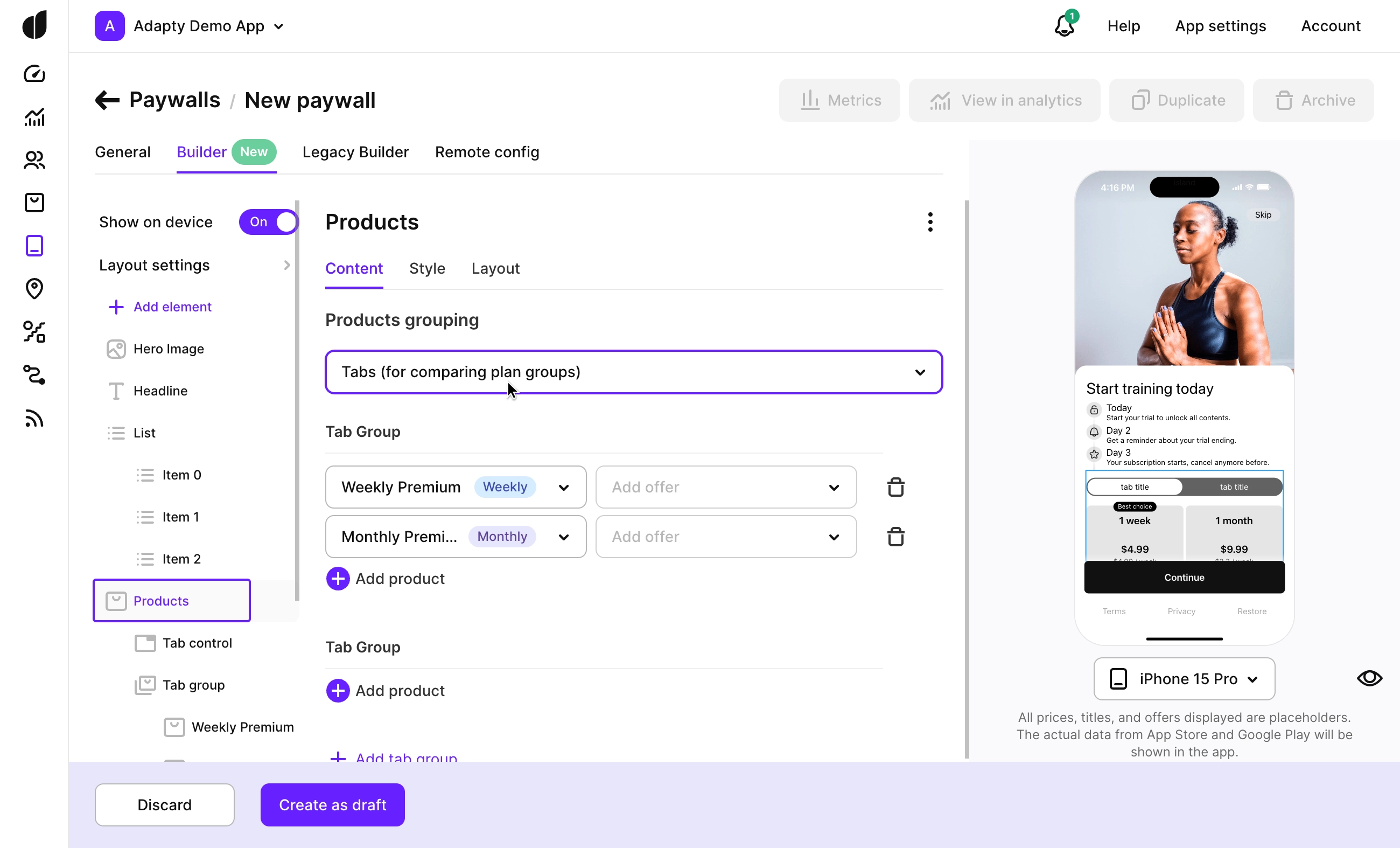
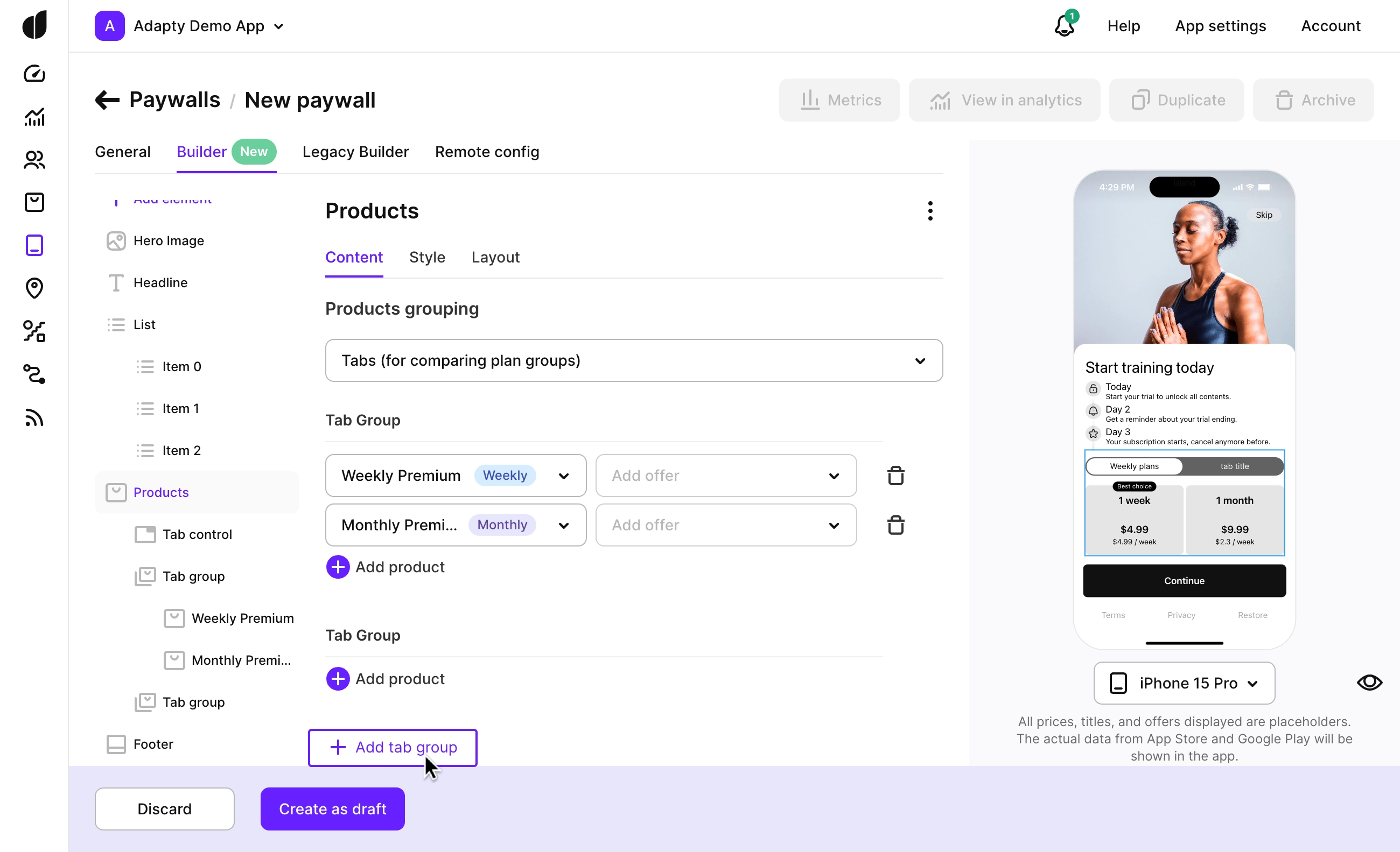
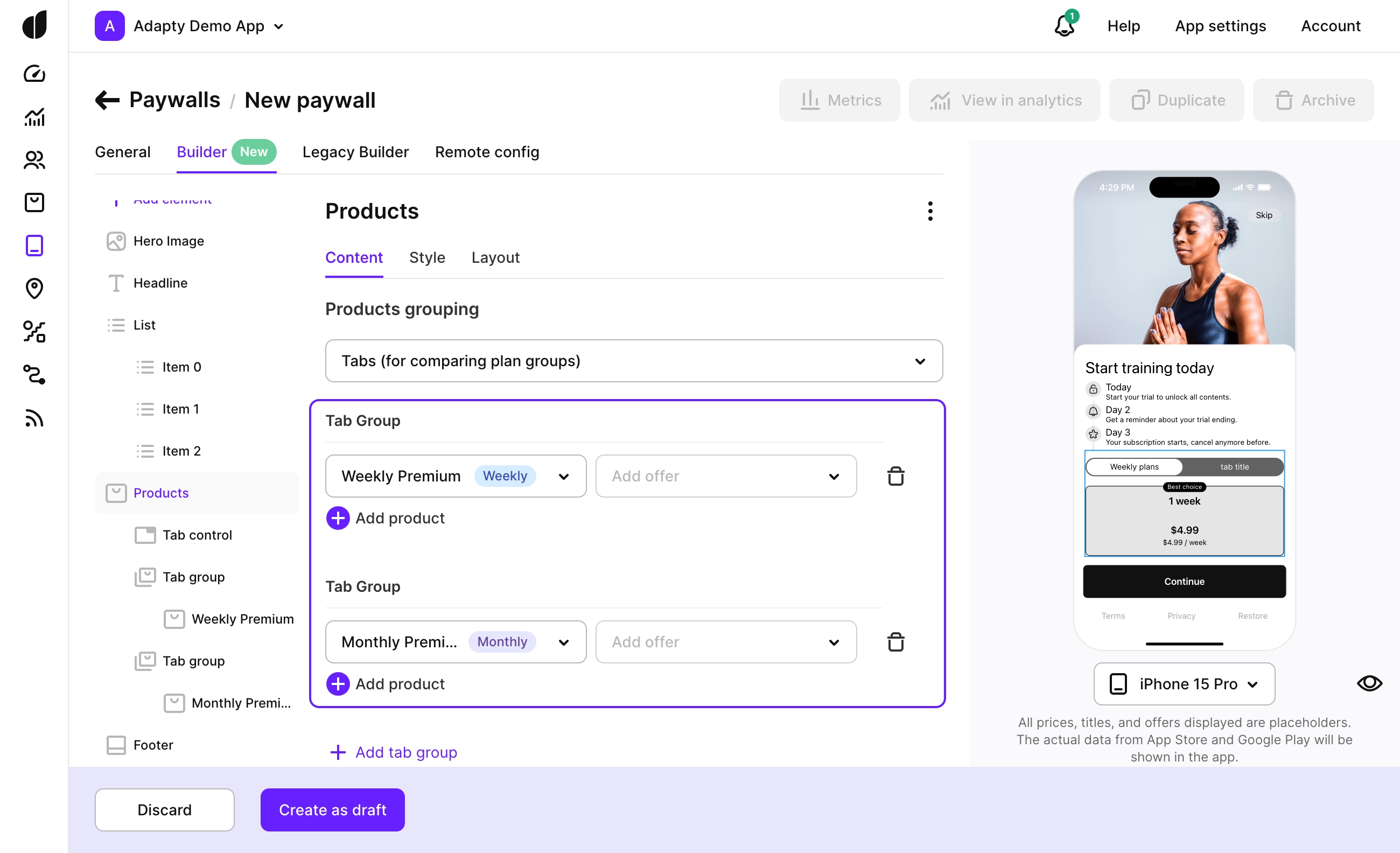
Switching between product sets by tab
Paywall tabs let you group your plans into a few categories, highlighting all the possible options for your users. They’re especially helpful if:
- Your app offers multiple weekly, monthly, or yearly plans
- You have different tiers like Plus, Gold, or Premium
You can also add elements like feature lists in tabs to help users see the differences between tiers.
To add tabs:
-
In the Products element, set Products grouping to Tabs (for comparing plan groups). This will split your products into two initial tab groups.
-
If you need more tabs, click Add tab group.
-
Organize your products within these tabs.
-
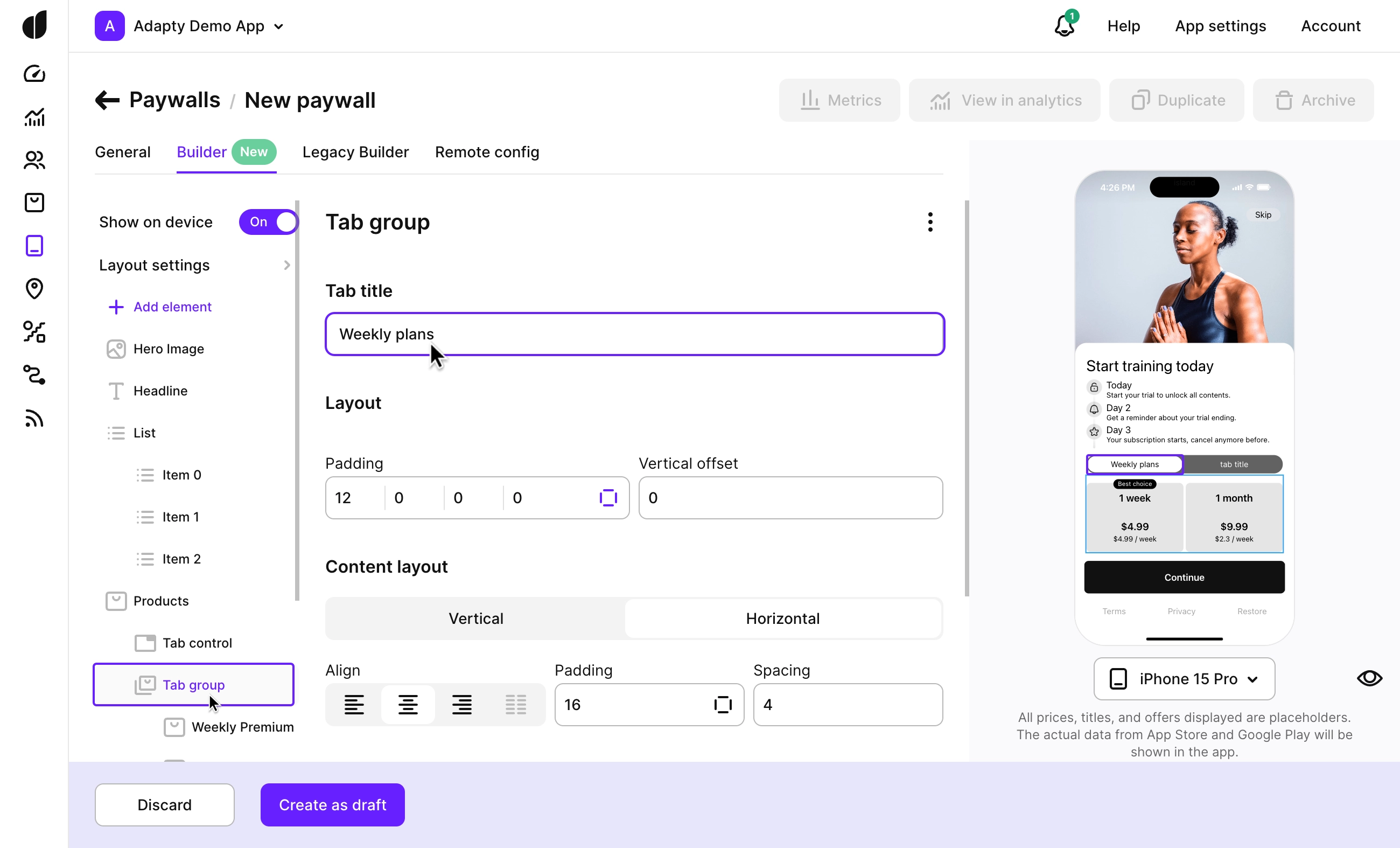
Open the first tab group, and in the Tab title, enter the name that will appear on the paywall.
-
Give an internal tab name in a separate field for easy reference. This name won’t be visible on the paywall but can help you identify the tab in lists.
-
Repeat steps 4-5 for each tab.
-
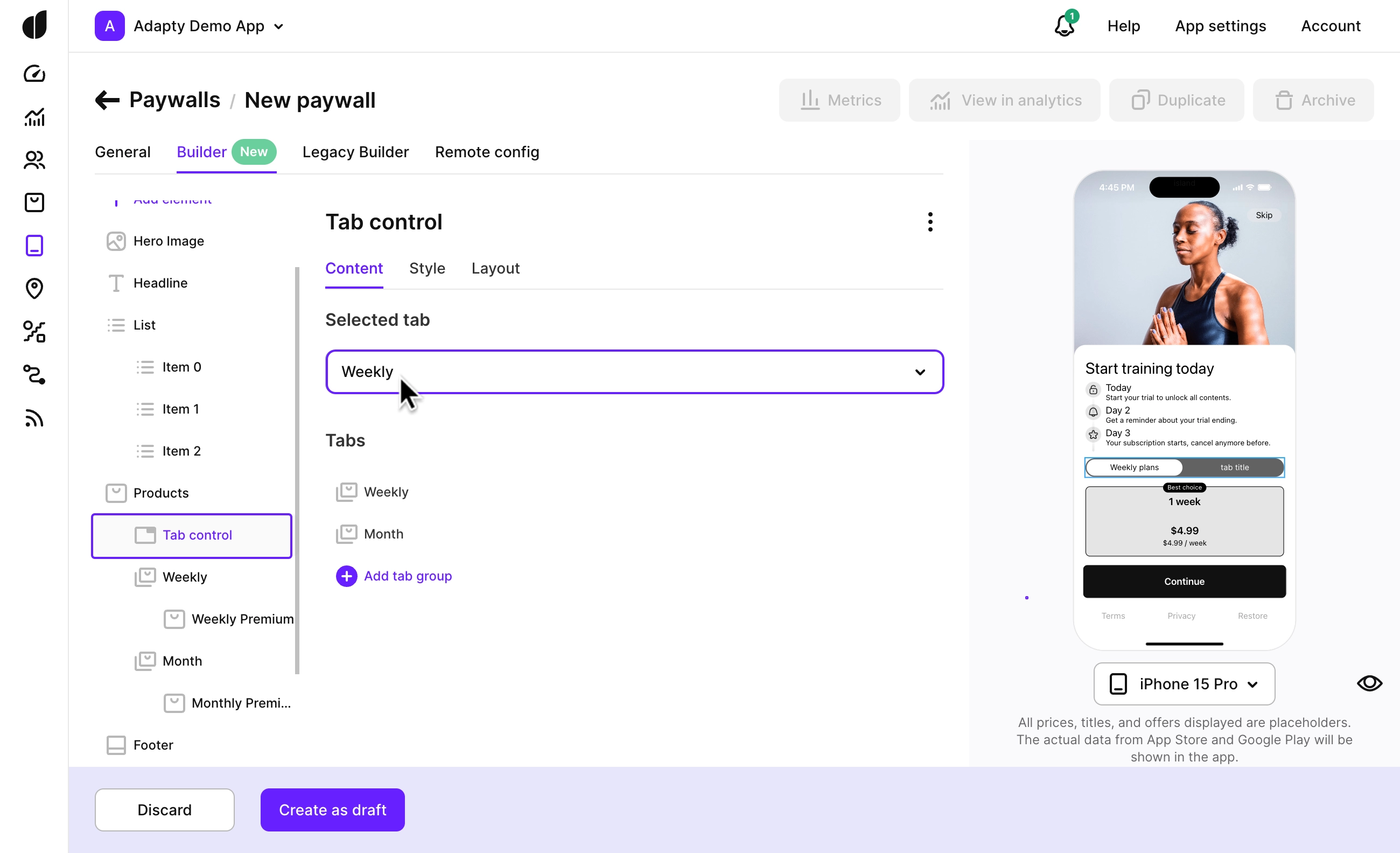
Choose which tab will be active when the user opens the paywall. Go to Tab control and select the default tab from the Selected tab list.
Showing extra plans under a button
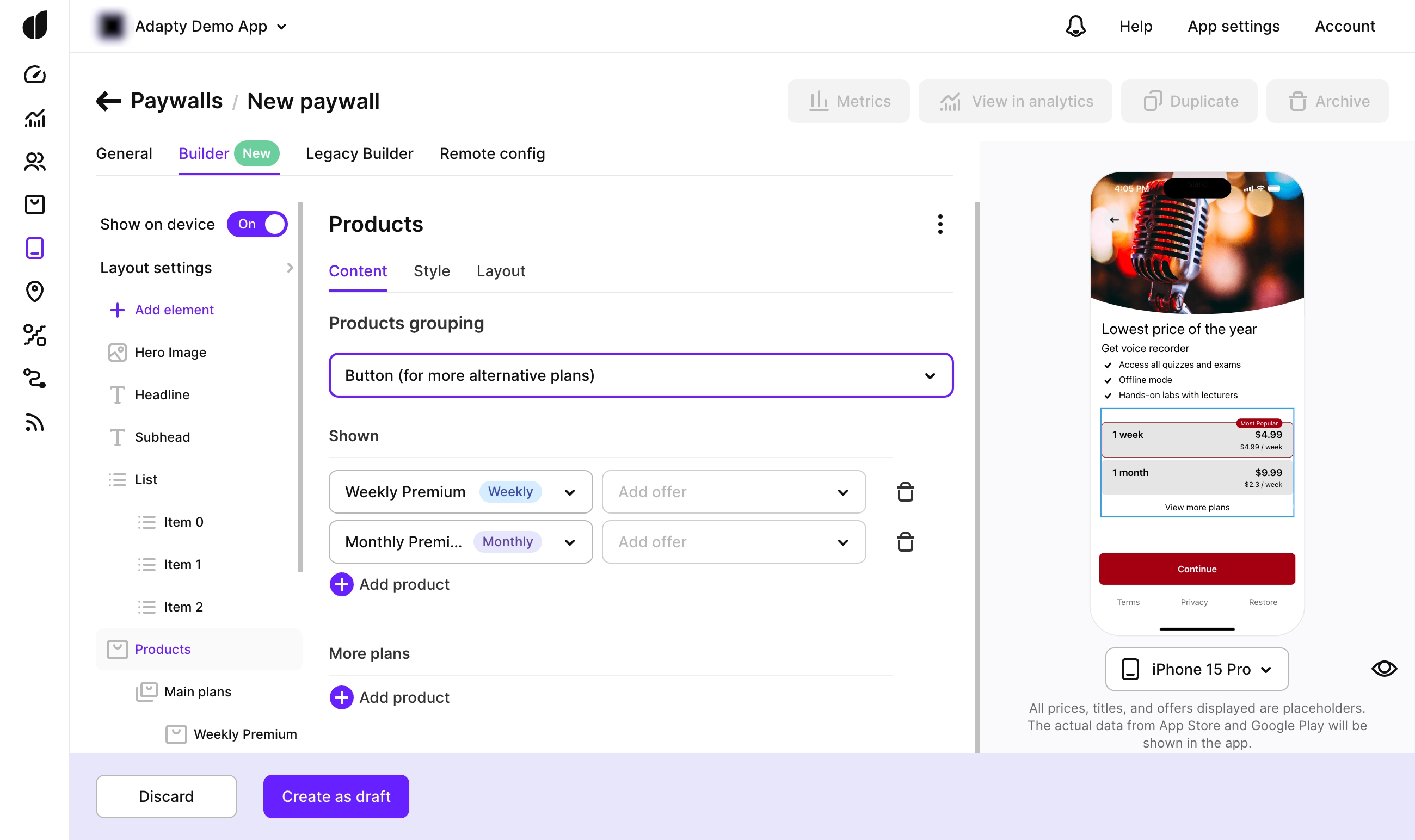
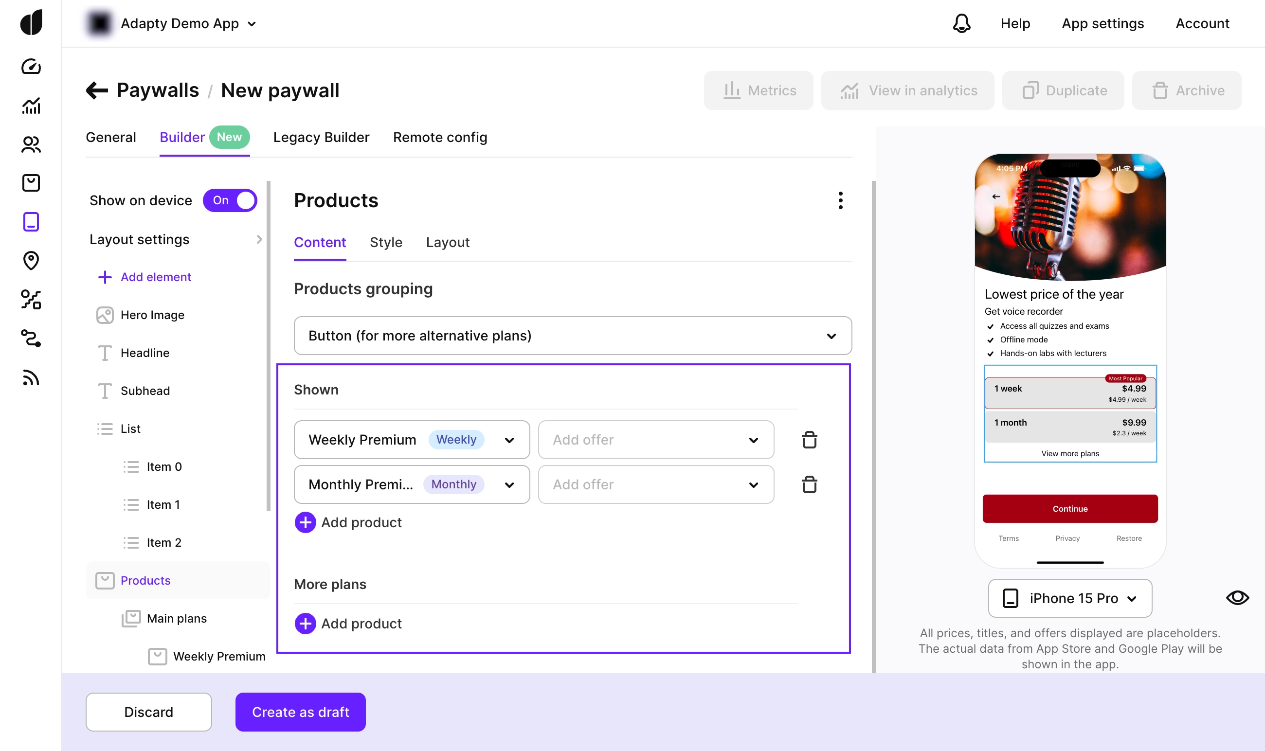
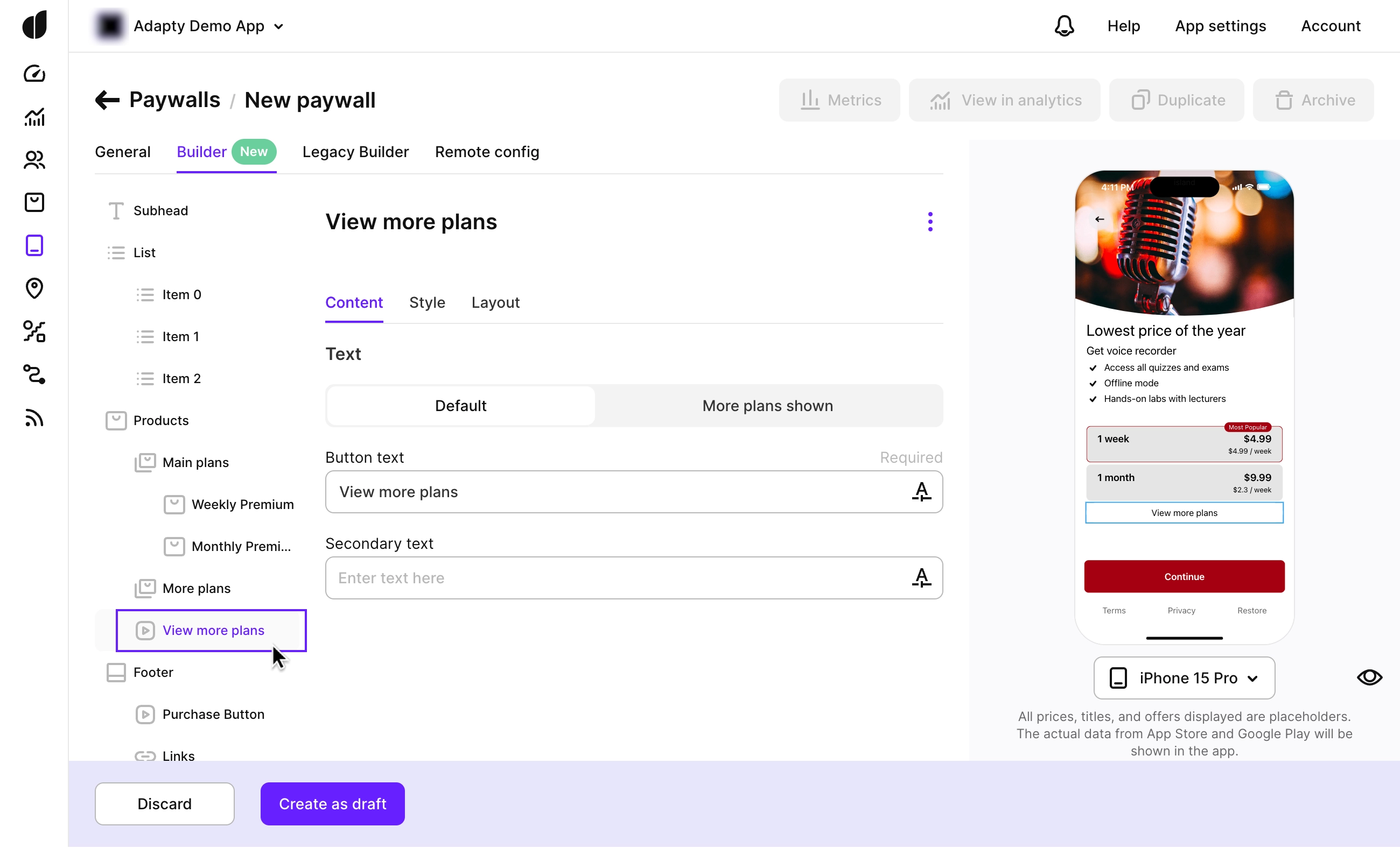
To keep things simple on your paywall, you can hide some products under a button (like "View more plans" or any label you prefer). This helps users focus on your top options first, while still allowing them to explore other plans if they want. It's a great way to make the paywall cleaner and improve conversions.
Here’s how:
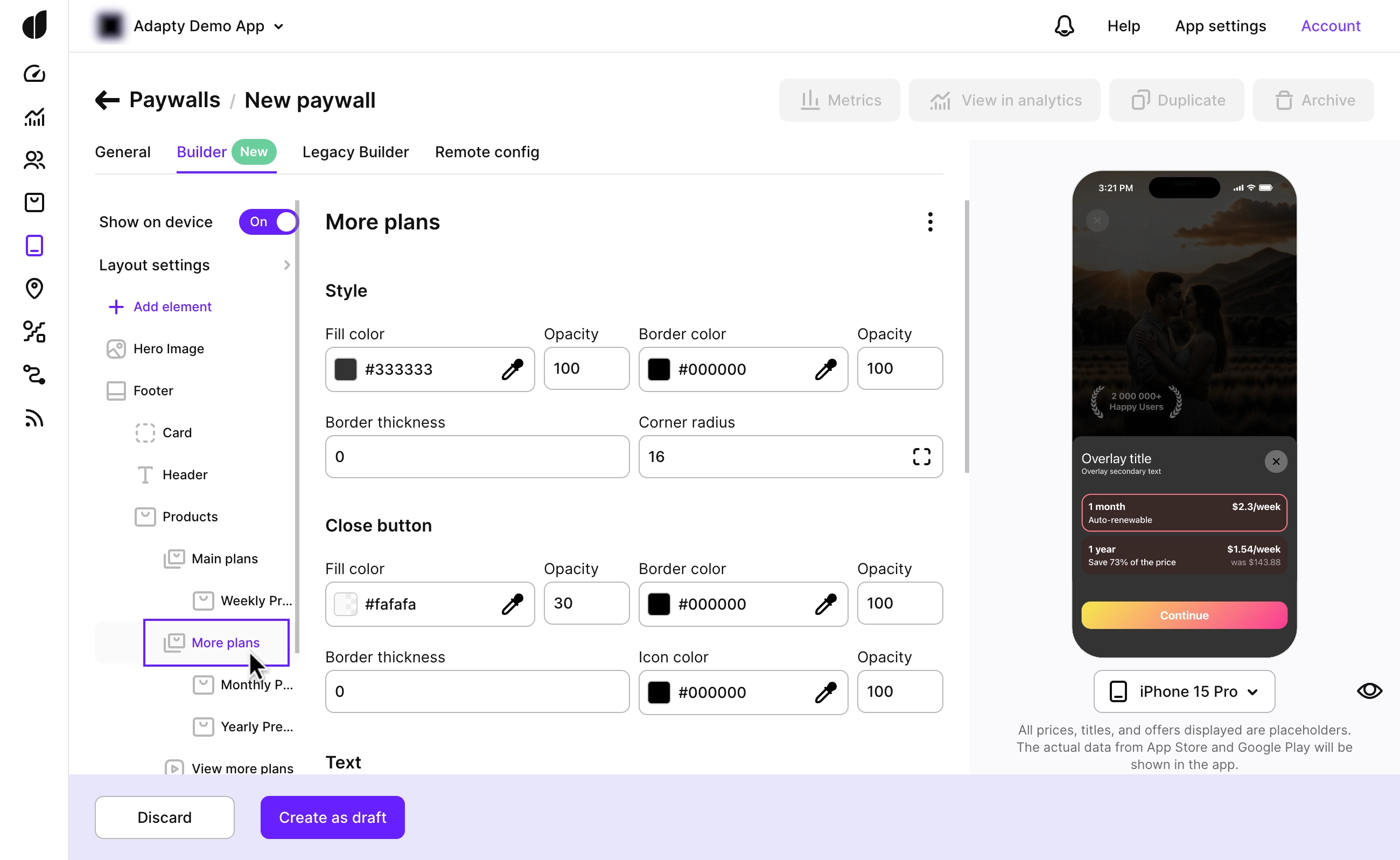
- In the Products element, set the Products grouping option to Button (for more alternative plans). This will split your products into two groups: Shown and More plans.
-
Distribute your products between these groups. Shown is for products you want displayed right away. More plans is for products hidden behind the button, shown only when users click it.
-
Customize the text and layout of the button in the View more plans element to suit your needs.
By mastering these customization options, you can create a compelling, visually appealing product list that guides users towards making a purchase effortlessly.
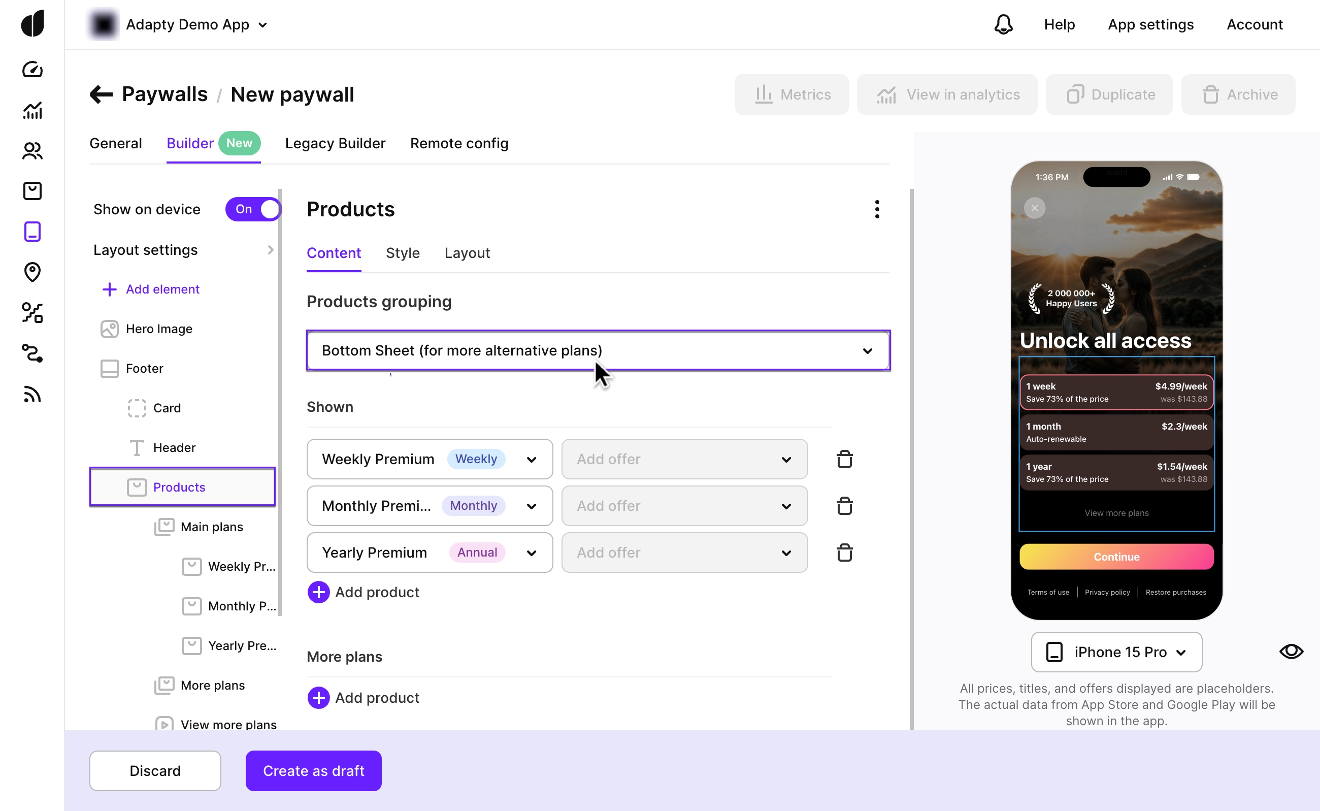
Showing extra plans in a bottom sheet
To simplify your paywall, you can hide some products and display them only when users click a button (like "View More Plans" or any label you choose). This action opens a sliding bottom sheet with the hidden products. This setup helps users focus on your main options first, while still giving them the flexibility to explore additional plans if they’re interested. It’s a effective way to declutter the paywall and potentially boost conversions.
Here’s how:
- In the Products element, set the Products grouping option to Bottom Sheet (for more alternative plans). This will split your products into two groups: Shown and More plans.
-
Distribute your products between these groups. Shown is for products you want displayed right away. More plans is for products first hidden, shown only when users click the button.

-
Customize the text and layout of the button in the View More Plans element to fit your design and messaging.

-
The bottom sheet will automatically use the same product list display format as your main paywall, whether products are separate purchase buttons or each product acts as a button. You can customize the bottom sheet’s layout, text, style, and default product selection.
By mastering these customization options, you can create a visually appealing and user-friendly product list that makes purchasing simple and intuitive.