Paywall layout
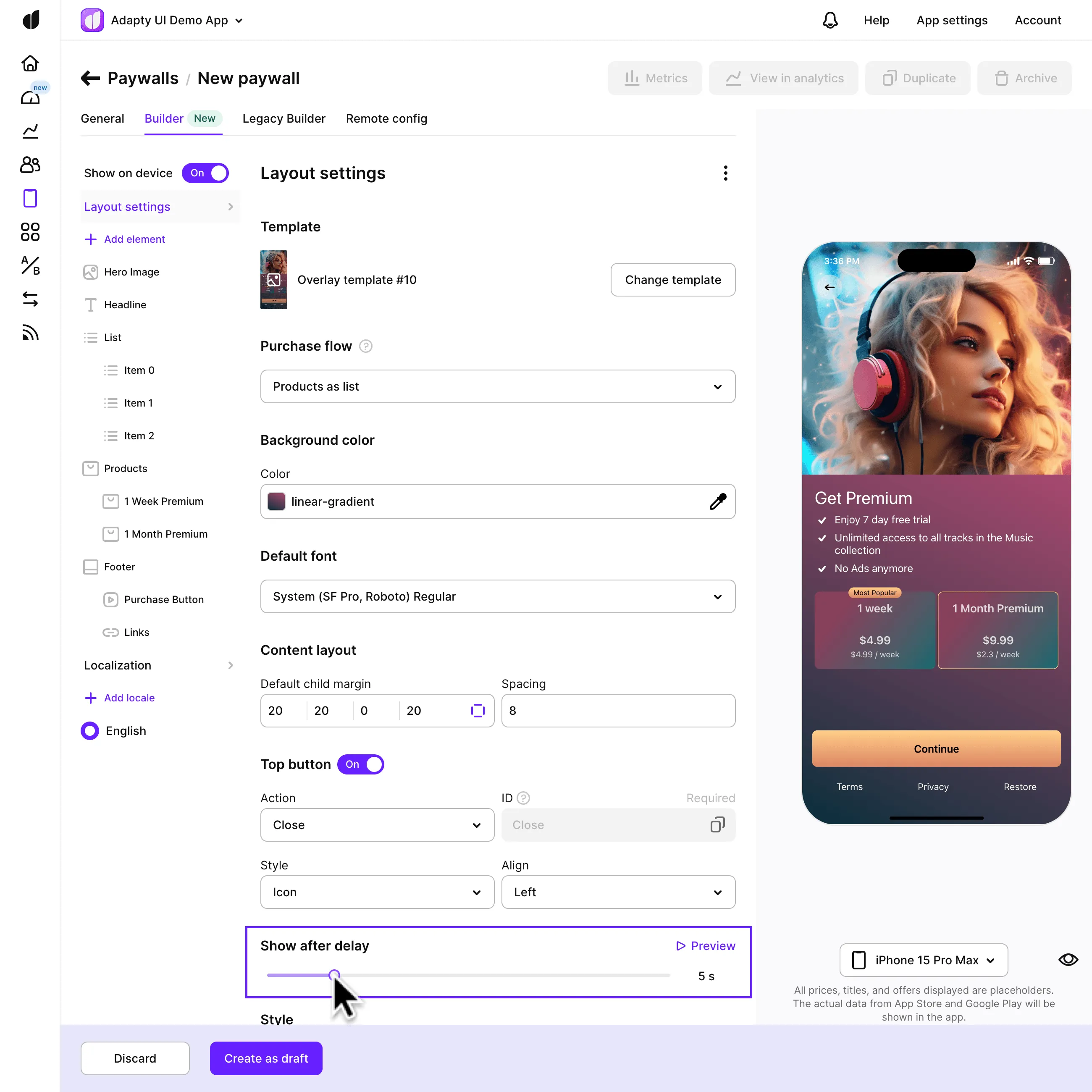
After selecting a template for your paywall in Adapty's Paywall Builder, you can customize the paywall's visual appearance to match your brand's style. The Layout settings provide a variety of controls for adjusting the layout, background, and overall look of the paywall. Let's explore these settings: The layout settings control the basic aspects of the paywall, including the template, background color, default fonts, purchase flow, and top buttons.
This section describes the new Paywall Builder, which works with iOS, Android, and React Native SDKs version 3.0 or higher, and Flutter and Unity SDKs version 3.3.0 or higher. For information on the legacy Paywall Builder compatible with Adapty SDK v2.x or earlier, see Legacy Paywall Builder paywall layout.
Purchase flow
Decide how users will complete purchases. There are two options:
-
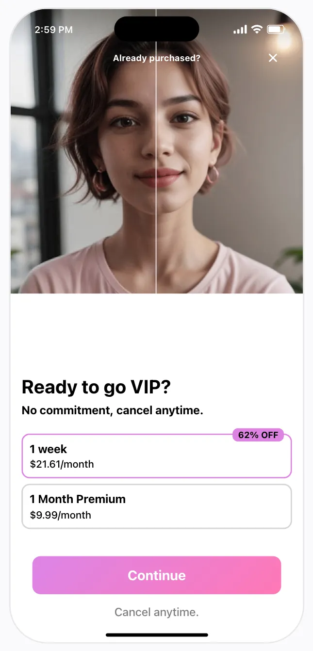
Products as list + purchase button: Users select products first, then click the buy button to start the purchase.
-
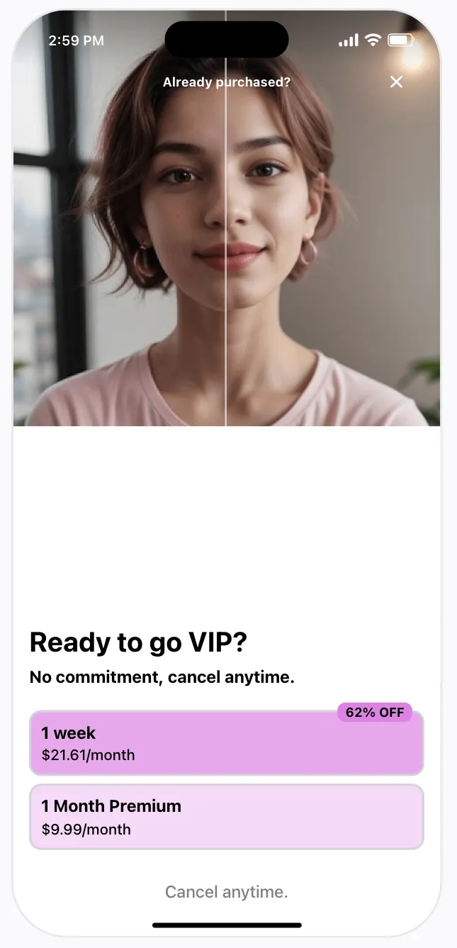
Products as purchase buttons: Each product is a button, and the purchase begins when the user clicks a product button.
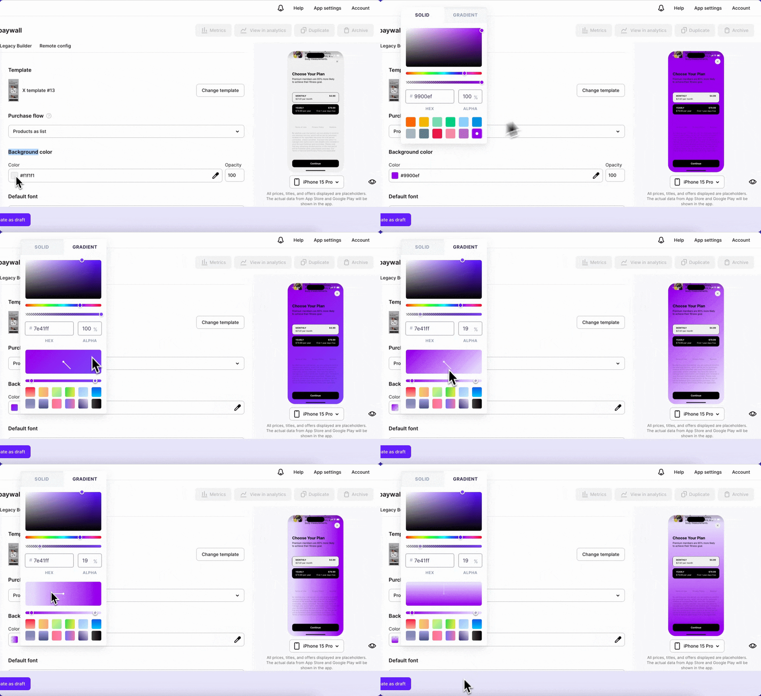
Background color
Maintain visual consistency by setting a default font for your paywall. Options include the system font (SF Pro for iOS, Roboto for Android), available common fonts, or uploading a custom font.
Font settings of your paywall
It's important to keep your paywall visually consistent with the rest of your app — and one of the biggest visual factors is the font that you're using. You can choose to simply have a system font for your paywall (SF Pro for iOS, Roboto for Android), use one of the available common fonts, or upload your own custom font:
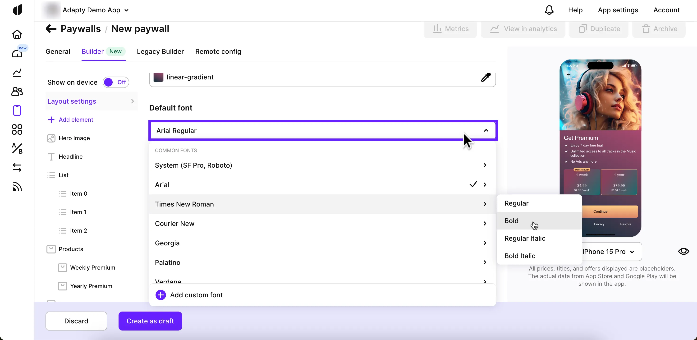
Font settings in the Layout settings apply to all paywall components by default. You can override these settings for specific elements, such as text boxes or lists, when editing those elements individually. If you change the default font in the Layout settings, it will not affect elements with individual fonts. Learn how to upload a custom font here.
Top buttons
Add up to 2 top buttons to your paywall to provide users with options like closing the paywall. Customize their appearance and behavior as follows:
- Enable the Top Button or Top Button 2 toggle.
- Choose the button's look and position. The preview will update instantly.
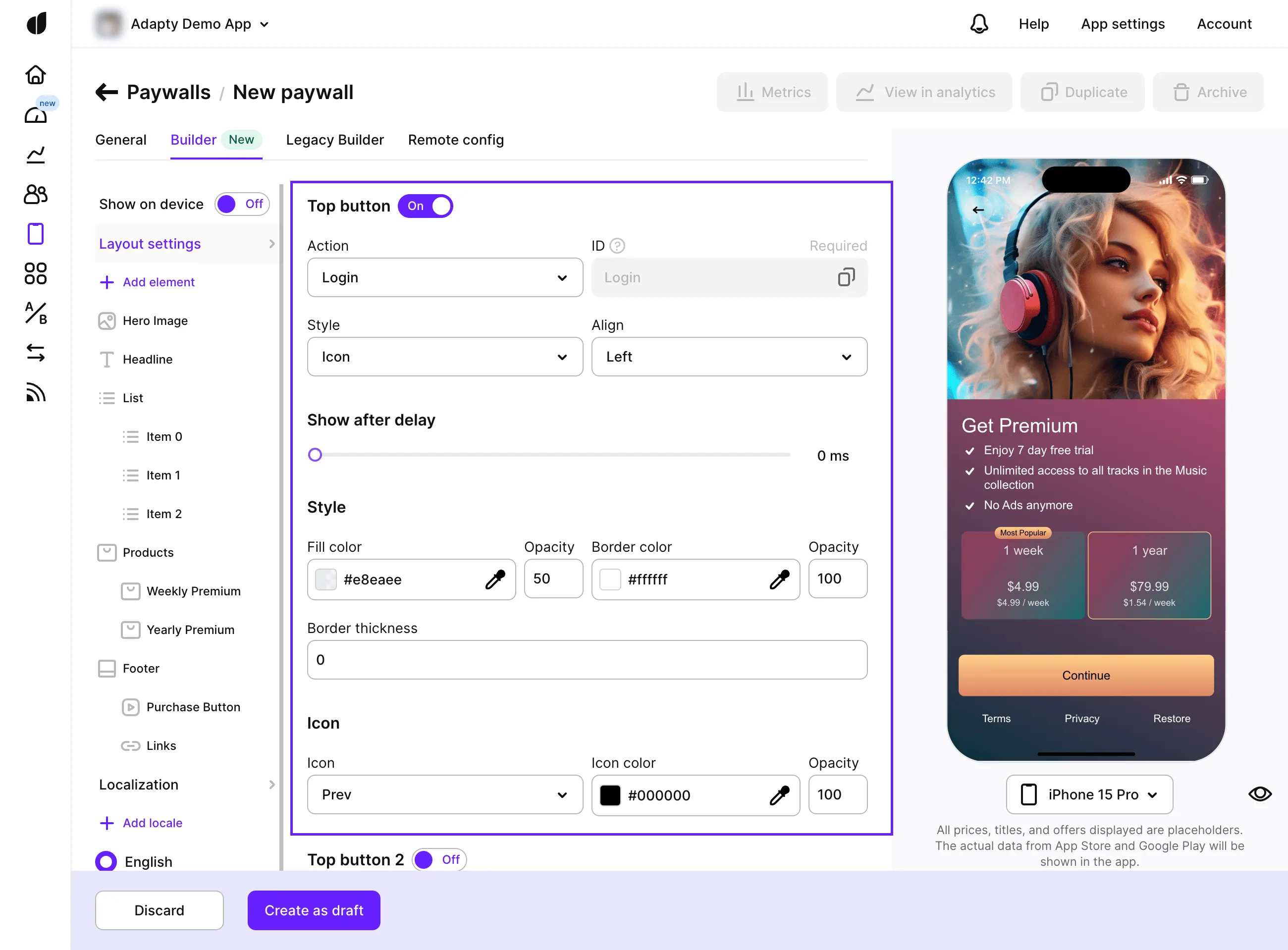
| Button setting | Description |
|---|---|
| Action | Choose the action that the paywall should perform when a user clicks this button. If you choose standard actions, the paywall will generate a standard event you will be able to handle in a standard way in your mobile app code. If you choose a custom action, you will need to process the action by its |
| Style | Choose if you want the button to look like an icon or have a text. If you choose an icon, choose the icon type in the |
- To delay the appearance of the button, adjust the Show after delay slider.
