Black Friday for subscription apps: a segment-by-segment playbook


TL;DR:
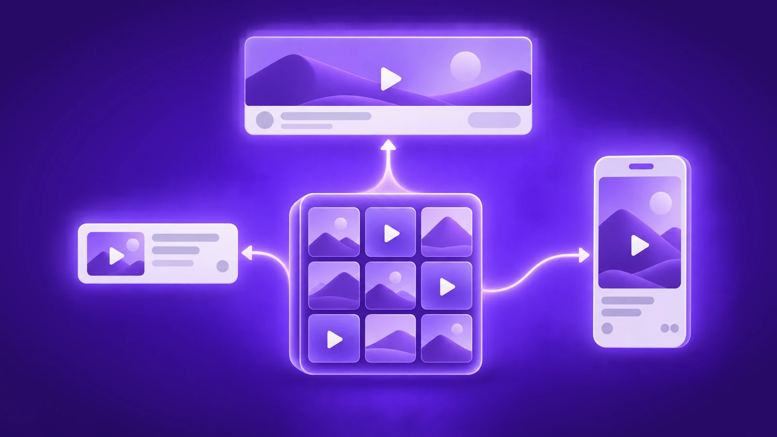
- Split it into four campaigns: new users, active freemium users, churned users, and current subscribers. Each one needs a different channel and a different offer.
- Everyone ran the same offer in 2025, roughly 50% off the first year of an annual plan with a countdown. Assume your competitors run it again and test against it.
- Placement did as much work as design. I counted 10 separate moments when apps opened a Black Friday paywall.
- Plan from the first week of November through New Year. Black Friday itself is one Friday in a two-month season.
By late November your users have seen the same offer twenty times. 50% off, annual plan, countdown, "ends soon."
They know the pattern well enough to wait for it.
Almost every app I reviewed sent that one offer to everyone: the person who installed that morning, the free user who's opened the app daily since March, the one who cancelled in spring, and the subscriber who already pays.
These four people need different things from you.
A new user needs a reason to start. Someone who left needs a reason to come back. A current subscriber can't redeem a new-subscriber discount at all, so for them the screen was decoration.
So below is Black Friday split by segment: what apps sent each group last year, and which parts are worth copying.
ℹ️How did I review Black Friday? Between early November and early December last year, I met these campaigns the way a user does: installing apps, opting into email and push, watching paid social, and opening every paywall I was shown. I logged each touchpoint by channel (ads, push, email, in-app banners, paywalls) and noted where in the app the offer appeared. The dates below are the dates the messages reached me.
When should you start your Black Friday campaign?
First week of November, and plan through New Year.
Calm opened on November 2 without mentioning a sale. The email was about the clocks going back, with "Early access: 50% off Calm Premium" sitting at the bottom. Then November 5, 19, 25, 28, 30, and into December. The paywall in those emails said the offer ended on December 1, and the emails kept arriving after it.

Simple spent one loud week instead:
- November 24: up to 85% off, "only one day, only 70 spots"
- November 25: the launch, at 70%
- November 26: a spin-the-wheel giveaway
- November 28: "LAST CHANCE, ENDS TODAY," back up to 85%

Early birds got a better deal than the sale, and the deadline moved four times. Users notice the second one. If you plan to extend, pick a reason in advance, such as a Cyber Monday offer or a smaller final discount, so the extension reads as a new thing rather than a deadline you didn't mean.
How do you reach new users during Black Friday?
A new user meets you in three places: your ads, your store listing, and the first paywall in onboarding. Skip the offer in any one of them and you've broken the promise that got you the tap.
Ads
Almost every Black Friday ad used the same three ingredients: the event, the number, the deadline.
- Adobe's Instagram story ran 60% off plus an extra 20% for students, first year only, ending November 28.
- The Economist cut it down to "Black Friday offer. Act now and save," which is about as far as you can strip it.

Bonus tip: organic posts are the cheap version of this. The Brave Way posted 30% off its annual plan with the code BF25 and told people to comment "BLACK FRIDAY" for the link.
Every comment feeds the algorithm, and some of the people commenting weren't following the account yet.

Store listing
Temu, AliExpress, and BUYMA all ran Black Friday screenshots in the Japanese App Store.

Put this in the release plan early: on iOS, a new icon or screenshot set ships with a version submission, so it needs to clear review before the last week of November. Google Play lets you change the listing whenever you want.
Onboarding paywall
Someone who tapped a "50% off" ad should hit the discounted screen first, not your usual one. Several apps kept a second, cheaper paywall in reserve for anyone who closed that first screen.

ℹ️Every screen in one board. I collected the Black Friday promos from 30 subscription apps into a Figma board: paywalls, banners, push, emails, ads, store listings. Calm, CapCut, Suno, Yazio, VSCO, Life360, Peachy and two dozen more, organized by app. Black Friday paywall library →
How do you convert active freemium users?
These are the users you can reach for free, and the ones you'll annoy fastest. Push and in-app placements carry this segment, with email behind them.
Push
Most Black Friday push copy ran on urgency: "Ends soon," "The discount is about to expire," "Claim before it's gone," usually with a fire or hourglass emoji attached.
A few apps sold the product instead of the deadline. One sleep app offered "50% off science-backed tools for better sleep."
Angel bundled five free months with free movie tickets, which is the only push I saw that gave a reason to open the app rather than a reason to hurry.

Test the copy the way you'd test a paywall headline, and save the deadline messages for the last 48 hours.
In-app banners
The range here runs from a full-width header down to a single pill.
- Calm put its banner directly under the home screen hero: "Get 50% off over 10,000 sessions. Offer ends December 1."
- Findmykids ran a top banner with a live countdown.
- A workout timer app relabeled its top bar "BLACK FRIDAY -30%," and a photo-sharing app added a small "Black Friday" pill to its feed header and left everything else alone.

Paywall triggers
These are the moments apps opened a Black Friday paywall:
- In onboarding, after the user closed the first paywall
- In the middle of onboarding
- On app open
- After an in-app ad
- On tapping "Subscribe" anywhere in the app
- On trying to use a premium feature
- After the user closed a previous discount paywall
- On tapping an in-app banner
- On opening a push notification
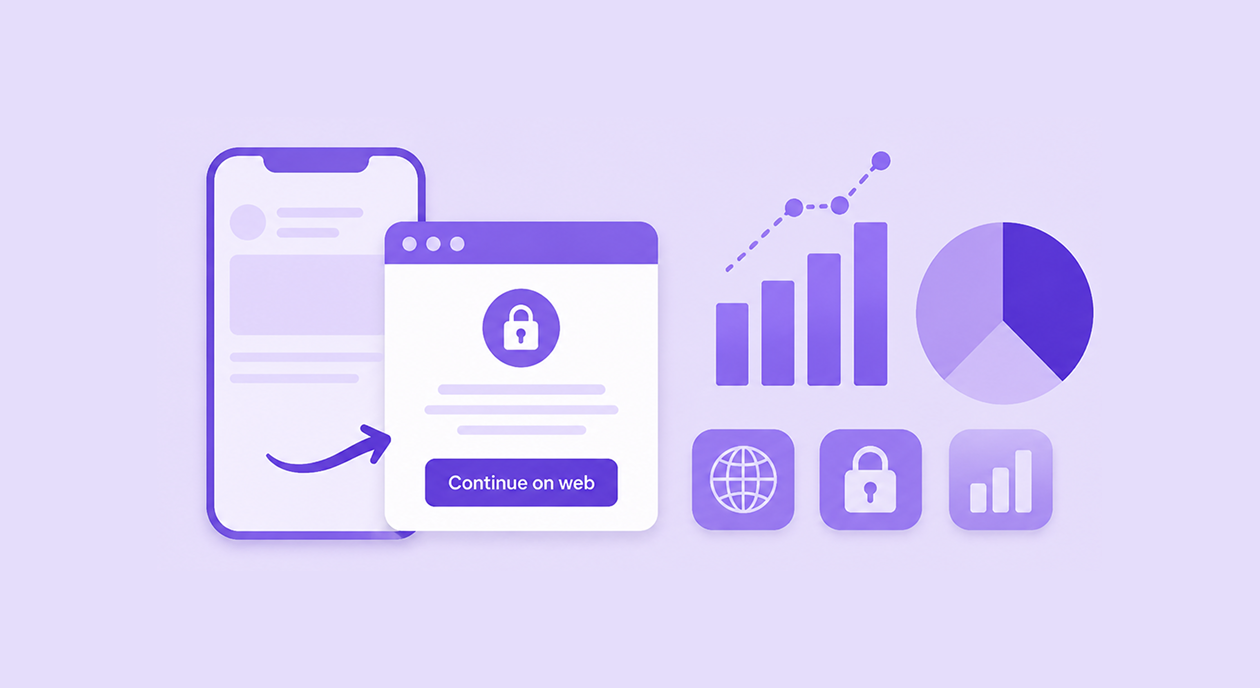
- On tapping a button in an email, which led to web checkout
The first two are for new users. The other eight hit your existing free users, and one person can run into five of them in a single session. Pick a cap before launch.
ℹ️Our guide to the 10 types of mobile app paywalls covers which formats suit an interrupt and which suit a user who asked to see prices.
How do you win back churned users?
They don't open your app, so email carries this segment, and the offer has to be built for someone who already left. Your new-user paywall won't work on them.
The winback copy was the best writing of the season. One Cyber Monday email opened with "It's been a while since we heard from you" and told the reader to hit the delete-offer button if their goals had changed. A kids' learning app took the opposite route and sent a push straight to a comeback paywall: "75% off forever," 12 months for $19.99 against $6.66 a month.
One weight-loss app went after the group next door, the people who started onboarding and never paid. Its November 28 email told them their personalized plan was almost ready, with the discount waiting at the end of setup.
That's the segment with the best odds in the whole article. They already gave you their goals, their weight, their target date. Ask them to finish, and the discount is the reason to do it today.
ℹ️On iOS, Apple's win-back offers let you show lapsed subscribers a discount inside the App Store and in your app, and promotional offers cover existing and lapsed subscribers. Our Apple subscription offers guide covers eligibility and setup for each.
What should you offer current subscribers?
Not a discount on what they already buy. They can't redeem an introductory offer anyway, and cutting the price of their current plan just costs you the difference.
Move them up instead.
- Tier upgrades. One Cyber Monday push offered 50% off the top-tier subscription, which is the cleanest version of this: same user, bigger plan, no new acquisition cost

- Plan badges. Wakie split the discount across three plans and labeled them "BLACK," "FRIDAY" and "OFFERS," with the 6-month option marked as the best deal.
- Add-ons. Apps with virtual currency went at it differently: discounted coin packs, or the same price with more coins, like 25,000 gems plus 7,500 free.

The best upsell of the lot is still a monthly subscriber moving to annual at the Black Friday price. They pay less per month, and you collect a year up front instead of chasing eleven more renewals.
What discount do subscription apps offer on Black Friday?
About 50%, on the first year of an annual plan. The full range ran from 20% to 90%, but 50% turned up most often, probably because nobody needs a calculator for it.
Two other patterns held almost everywhere.
- Annual plans carried the offer while weekly and monthly ones sat at full price.
- And the discount covered the first period only, with one VPN app spelling it out on the paywall: $29.49 for the first year, then $62.99 a year after that.
Since everyone shows a percentage, the offers that looked different changed the shape instead.
- One app sold a 2-year plan at 74% off with three extra months on top: $80.73 for the first 27 months, down from $312.93.
- A French course priced its year as "1+11 months," which sounds gentler than the 90% it actually was, 356 US$ crossed out to 35,49.

What does a Black Friday paywall contain?
Your normal paywall with an event layer bolted on. Across everything I opened, that layer was built from:
- The event name in the headline, often with a "limited time" or "exclusive" label
- The discount in large numerals, with the price in smaller type below
- A strikethrough price, or "Previously $57.47" in place of the strikethrough
- A countdown timer, either at the top of the screen or on the plan card itself
- Social proof, such as "D***z subscribed 19 mins ago"
- Value bullets listing what the plan includes
- Renewal terms under the button: "$9.99 first year, then $14.99 per year"

Two apps went further. A study app switched its paywall to a dark "black mode" and added a Free vs. Premium comparison table. Calm barely changed anything: it kept its standard paywall and added a "Black Friday Offer" label.
Before launch, check the failure cases we ran into:
- A Black Friday banner that opened the regular paywall. Angel's banner promised a sale, and the tap led to its standard membership screen. The user who tapped expected a discount and didn't see one.
- A hero image that didn't load. One Picsart variant showed a broken-cable placeholder where the offer graphic should have been.
- Unclear plan math. One paywall listed "Yearly, $22.90, 24% off" next to "One year, $39.99," with no explanation of the difference.
- The renewal price hidden in small print. Apple's review guidelines require the price and renewal terms to be clear, and a user who feels tricked in December requests a refund in December.
ℹ️For more on how layout and plan structure affect conversion outside the holidays, see what a high-performing paywall looks like in 2026.
What comes after Black Friday?
Cyber Monday, then the December holidays, then January. Most apps extended the Black Friday offer through Cyber Monday instead of launching a new one. Adobe ran a separate Cyber Monday story ad, and one app opened its Cyber Monday push with a question: "Let's start with Cyber Monday?"
Here are some other dates to plan around:
The dates to plan around in 2026:
| Date | Event |
| Nov 8 | Diwali |
| Nov 11 | Singles Day |
| Nov 26 | Thanksgiving (US) |
| Nov 27 | Black Friday |
| Nov 30 | Cyber Monday |
| Dec 4–12 | Hanukkah |
| Dec 12 | Double 12 |
| Dec 25–26 | Christmas, Boxing Day |
| Dec 31 | New Year's Eve |
If your users are in Asia, Singles Day and 12.12 carry more weight than Thanksgiving. Shopee, for example, ran a 12.12 app icon.
Run four campaigns, not one
Ideas were never the problem. Every app I reviewed had plenty. What they ran into was the calendar.
A new-user paywall, a freemium banner, a winback screen and an upgrade offer are four separate builds. They all land in the weeks when your release queue is already full, half the team is on holiday, and App Review is slower than usual. So teams cut it down to one screen for everybody, which is where this article started.
Adapty's Flow & Paywall Builder takes the release out of it. You design each screen in the editor, set who sees it by segment and placement, and publish it live. No build, no review queue, no waiting for users to update.

My favorite part, and I say this as someone who can't open Figma without help: you can do all of it from a prompt.
Adapty's skills plug into whatever coding agent you already use, read your live flow, and build the next screen from a sentence.
It saves a draft for you to look at rather than pushing anything live, and it won't invent a price.
Four Black Friday screens stop being a design request with a two-week queue in front of it.

Your competitors will ship one Black Friday screen this year. You have time for four.
Book a demo and have your Black Friday screens ready before November starts.