Paywall texts and buttons
Adapty Paywall Builder simplifies the process of creating paywalls—specialized screens within your app where users can make purchases. This tool eliminates the need for technical expertise or design skills. You can effortlessly customize how your paywalls look, the messages they convey, and where essential buttons are positioned. What’s more, you can even make real-time changes to these screens while your app is running — without App Store/Google Play reviews.
Moreover, Adapty empowers you to optimize your paywalls further with A/B testing. Alongside the Paywall Builder, this allows you to test different variations of your paywalls to find the most effective design and messaging. Whether you’re striving to increase sales, promote content, or grant access to exclusive features, the Paywall Builder provides a user-friendly solution to accomplish these objectives.
This section describes the legacy Paywall Builder, compatible with Adapty SDK v2.x or earlier. For information on the new Paywall Builder compatible with Adapty SDK v3.x or later, see Paywall buttons in new Paywall Builder.
In this section, we will discuss the customization of buttons and text elements within your paywalls.
Buttons
In the buttons tab, you have the ability to define and customize various buttons that play a crucial role in guiding user interactions and enhancing the overall user experience of your paywall. This tab empowers you to configure primary Call to action (CTA) buttons as well as secondary buttons that can direct users to essential legal information. You can enable or disable the appearance of the secondary buttons. Let’s deep dive into the options available for customization in the buttons tab:

Primary call to action button
The primary call to action button serves as the key action that you want users to take. You can tailor its appearance and text to align with your paywall’s goals:
- Button text: Define the text that appears on the primary call to action button.
- Text font size: Adjust the font size of the button text to ensure optimal readability.
- Button color: Choose a color that stands out and draws users’ attention.
- Button roundness: Modify the roundness of the button’s corners for a unique aesthetic.
- Button text color: Select a text color that complements the button’s background and enhances legibility.
Secondary buttons
In addition to the primary call to action button, you can include secondary buttons that direct users to essential legal information. These buttons typically appear at the bottom of the paywall and provide users with access to important resources such as terms and privacy of the app usage. You can configure each secondary button with the following settings such as text, text size, text color, and URLs.
Apart from the traditional button configurations, the Restore and Login buttons provide specific functionalities:
- Restore: This button is used to allow users to restore their previous purchases or access content they’ve previously owned.
- Login: The login button facilitates user authentication and access to personalized content.
Texts

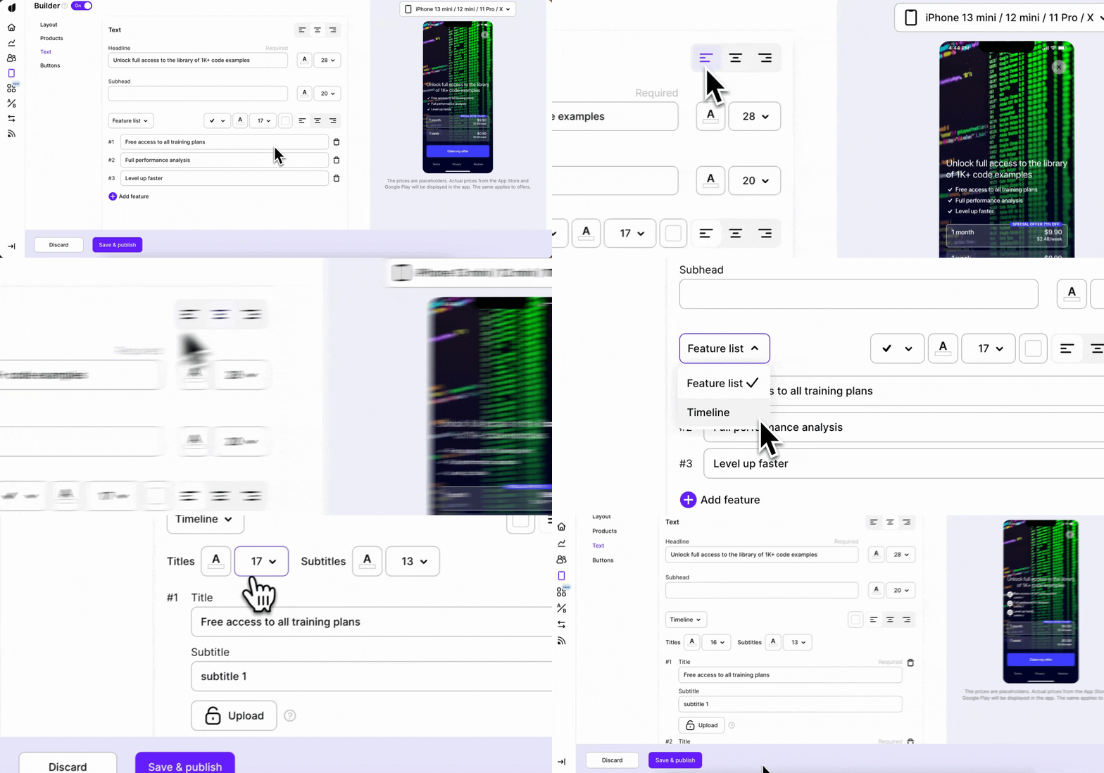
In the texts tab, you can make your paywall sound attractive and clear. This tab helps you tell users why your paywall is awesome. Just choose your words, make them look nice, and guide users through the cool stuff they’ll get.
Feel free to use custom tags to personalize your UI text and custom fonts to make your paywall blend in more with the rest of your app’s design.
Here are the main elements of the tab:
Headline and subhead
Make a catchy title and a small introduction that sets the mood. Keep it short and interesting.
Main features
Under the headline and subhead, show what cool stuff your paywall offers. You can do this in two ways:
- Feature list: Make a list of cool things users get with your subscription. You can add icons to show what each feature is about.
- Timeline: Show how things get better over time. Give each step a title, a small description, and an icon.
For all of these elements you can control the alignment with the page, text size, and color individually.