Mobile app onboarding: How-to, best practices, and examples
TL;DR:
Mobile app onboarding is introducing users to a new app and ensuring they understand how to use it. Your mobile app onboarding experience ties directly to your initial user engagement, conversions, and retention. Here's how to go about it.
Most new app users abandon an app right after launching it for the first time. In the third quarter of 2022, Android apps had an average Day 1 retention rate of 22.6%. This number was only slightly higher for iOS, with a retention rate of 25.6% on the first day after installation. These retention patterns align with what we have consistently observed: apps lose about 75% of users within a day.
However, even in the same category, apps vary significantly in their retention rates.**The ones that hook users from the start are much more likely to keep them than those that don't.
And what exactly lies at the heart of your app’s first-run experience?
You’re right: It’s your mobile app onboarding.
Your mobile app onboarding experience ties directly to your retention rates and revenue. And in today's article, we’ll see several ways you can optimize that. In this mobile app onboarding guide, we'll see how you can create user-friendly and delightful mobile app onboarding experiences that your users will love. We’ll:
- explore five mobile app onboarding models and their unique features and strengths (actually, there’s a bonus sixth model, too!).
- look at mobile app onboarding examples that execute these models just right.
- discuss mobile app onboarding best practices to always keep in mind.
We’ll also review the app onboarding workflow that apps typically follow, the metrics to monitor for measuring an app onboarding experience’s effectiveness, and how running experiments on the paywall during onboarding can boost subscriptions.
But before we get to these, let's answer the question: "What exactly is mobile app onboarding?"
What is mobile app onboarding?
Mobile app onboarding is the process of:
- introducing a new user to a mobile app,
- showing them how the app works so they can use it,
- getting them familiar with its features and benefits that will help them unlock its value.
In other words, mobile app onboarding means training new app users so they can accomplish what they set out to achieve with an app.
Mobile app onboarding involves securing necessary user permissions and consent, getting users to set up the app, and helping them personalize or customize their app experience.
You could say that a mobile app’s onboarding ends when a user has a happy first-run experience.
Google’s Material also gives a fascinating definition of mobile app onboarding:

Why is mobile app onboarding the key to retention?
When a user needs an app, they often start by searching for a few keywords. This is also why so many app downloads can be traced back to how they were found in the app store.
And this is also why you need to optimize your app listing to get good visibility in the app store(s).
However, users rarely settle for a single app. Instead, they download a bunch of apps.
So if a user is interested in beginning intermittent fasting, for instance, they might search for "intermittent fasting" in the app store and install many apps from the organic and paid results that help with it. Then they'll try each to find the right "one."
Ankit Jain (formerly the head of search and discovery for Google Play) explains this user behavior. He shares how users try different apps, quickly determine if an app is worth their time, and decide within the first few days of using it:
Given that this is how users behave, getting your mobile app onboarding right is essential, as only seamless onboarding can ensure good retention during the crucial first few days.
The key lies in designing your onboarding to get users to do the things in your app that you know will increase initial engagement and retention. One such in-app action item for a weight loss app could be logging the current weight. If you have historic in-app behavior analysis data, you’d know what actions tie positively to retention. You must ensure these are encouraged during onboarding.
Now that you know what mobile app onboarding is and how it ties to retention, let’s look at the main mobile app onboarding models. While you can broadly classify mobile app onboarding into these models, most apps don’t strictly stick to one. They use a combinational style.
Five types of mobile app onboarding
“Quickstart” onboarding
In the quickstart mobile app onboarding model, you typically only ask a user to sign up as part of the onboarding workflow. Here, users learn their way around an app by using it on their own. Quickstart onboarding works for apps that don't need to be "set up" and use standard user interface (UI) practices that users can figure out without any help.
With this model, users can launch an app – even when running it for the first time – and start using it.
The video and photo editor app InShot does a great job of getting users started quickly. As soon as users download the app and launch it for the first time – the first run – InShot lets them get going by themselves and offers no help or guidance. New users can immediately dive into using the app as it’s clear that they can either create or edit a video, photo, or collage with it (thanks to the app’s intuitive UI):
While we’re at it, let’s talk about InShot’s paywall too. So InShot is a freemium app, and new users only see its really impressive paywall when they try accessing its pro effects, filters, and stickers.
As you can see, InShot’s paywall offers three plans. It encourages users to try its annual subscription and offers a free trial for pushing the same:
A good way to measure such an app’s onboarding experience is studying its Install → Trial metric. Skip to the last section for more on this.
“Self-select” onboarding
In the self-select mobile app onboarding model, you ask your users to set up the app, as apps that use the self-select style are customizable. Here, you use a handful of onboarding screens and present your users with options to make their app experience more meaningful – a.k.a. customization and personalization. Some of these screens may also ask the user about their data preferences and if they agree to the app's terms and conditions and privacy policy.
The reading app Blinkist follows this model well. As the first step, this app asks its new users to get started:
Next, the app asks users about their interests. Blinkist also features its key benefits using a carousel here to encourage more users to get to the next onboarding step:
Before launching its 3-step onboarding process, Blinkist also seeks its user’s permission to show notifications:
Blinkist needs to prompt its users to return to it, so being able to send push notifications is essential.
Here’s some more on the role of push notifications during onboarding
Most apps now begin their onboarding workflow by asking for permission to send push notifications. By doing so, they are able to bring users back to the app. For example, if a user only completes this step and abandons the app onboarding process, the app can still show them a push notification and bring them back so they can continue their onboarding journey. Push notifications reduce onboarding drop-offs this way.
Additionally, push notifications encourage new visitors to return during the 7-day period. This helps build the initial engagement.
Beyond this, push notifications also encourage more people to sign up for paid plans or trials.
While push notifications enjoy high opt-in rates (81% on Android and 51% on iOS), users get dozens of them daily. So you may even need to persuade your users to enable notifications for your app.
The intermittent fasting app Fastic does this well:
Adapty + Push notifications
Adapty integrates with push notification services like OneSignal and Pushwoosh to help you send timely and targeted push notifications, like a new user special offer, during onboarding that can get you more conversions.
Let’s return to Blinkist’s onboarding.
So after getting permission to show push notifications, Blinkist walks its users through its 3-step app setup process. The app tells that there are only three steps and also uses progress indicators to encourage users to complete them:
 |  |  |  |
For an app like Blinkist, the setup part of the onboarding process is very important. Unless Blinkist knows its users' preferences, it can’t suggest relevant “Blinks.”
Immediately upon completing the setup steps, users see that Blinkist is finding the books they’d like to learn about:
Once users complete Blinkist’s onboarding, they see the app’s paywall. Unlike InShot, however, new users don’t get a feel of the app before they see the paywall:
Hitting the back icon takes users to the app:
Blinkist also doesn’t offer a trial or multiple subscription plans on this paywall. It only pushes its monthly plan.
But Blinkist seems to be experimenting a lot with its paywalls.
When a new user returns to the app, they might get to see a special offer paywall too. Below you can see how the app, as part of its new year promotions, is offering up to 60% off on its annual plan:
Given that “deals” are a key reason freemium subscribers turn premium, they boost paid purchases/subscriptions.
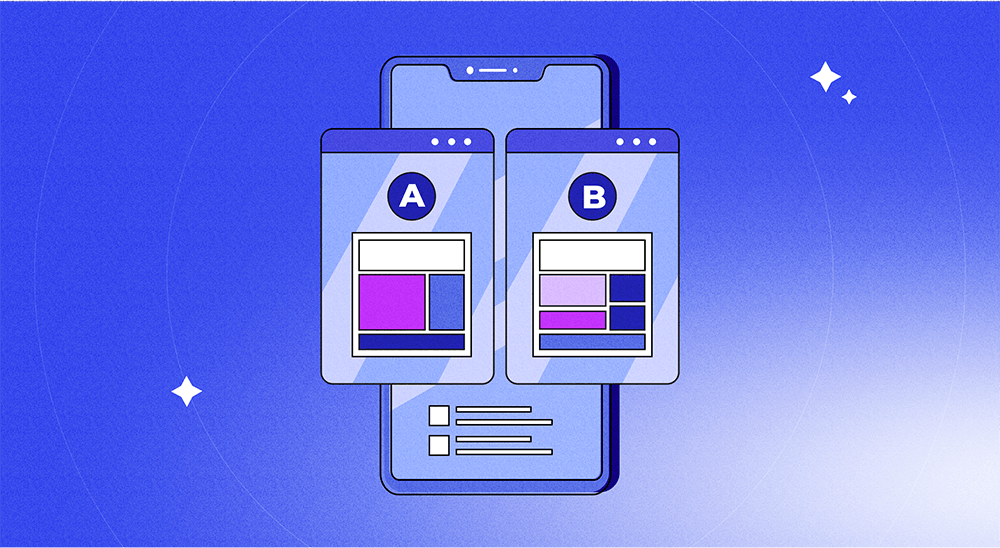
Add paywall experimentation to your app onboarding mix:
With Adapty, you can run A/B tests on your paywalls and try different onboarding offers on the fly. Learn more about how Adapty’s paywall testing works.
“Top user benefits” onboarding
In the top user benefits model, your onboarding workflow shows your new users the key benefits of your app. Here, you use a video, slider, or an automated storyboard to show your users your app’s top benefits during onboarding.
Google recommends demoing up to three primary user benefits when using this style. Google also suggests including your app's "toothbrush features" – these are features you see your users using once or twice daily – with this model.
Depending on your app, you might also add a few setup steps to your onboarding after you’ve walked users through your app’s key benefits.
One app that shines at the top user benefits model is Calm.
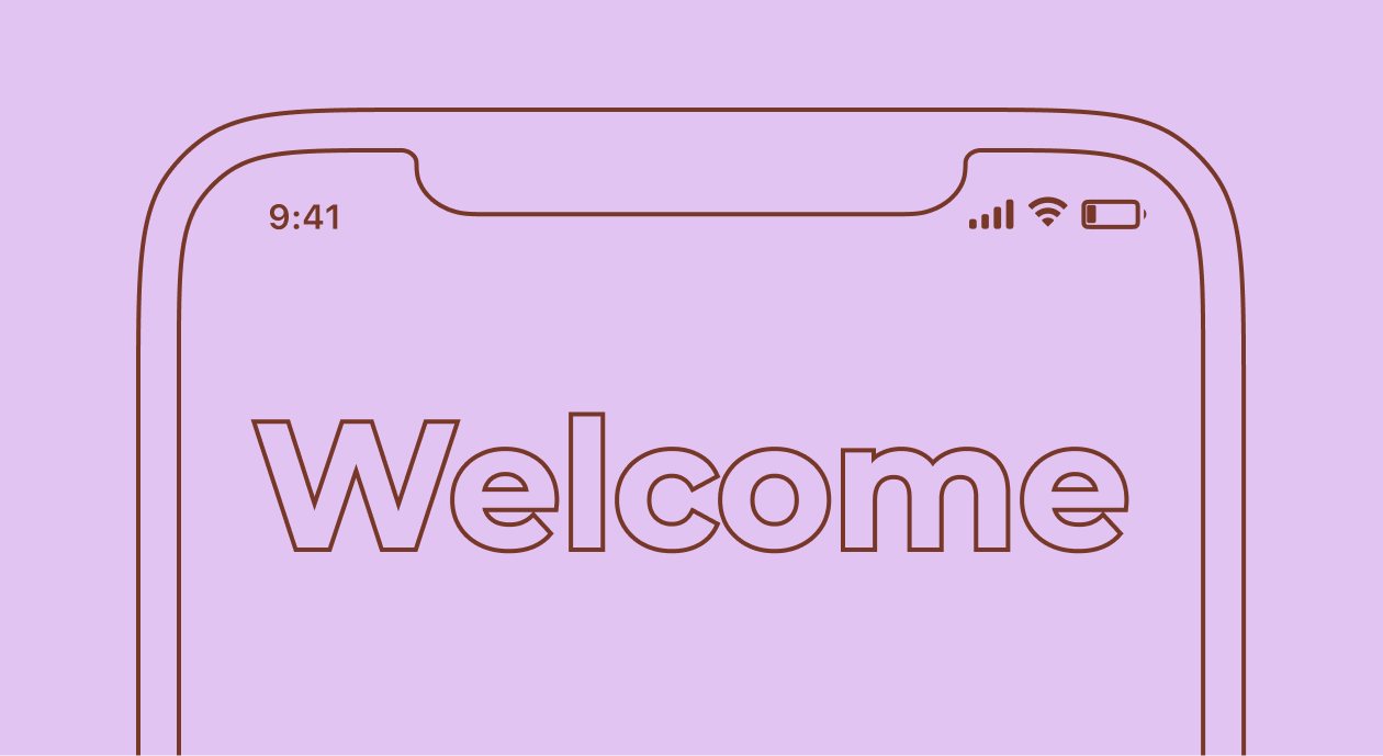
On the first launch, Calm sets the tone with this welcome screen:
Next, Calm features its main benefits in an auto-advance carousel and also uses the “dots” navigation to tell users there’s more they need to know about Calm and to persuade them to complete the onboarding:
 |  |  |  |
Calm is also experimenting with its onboarding workflow. Below, you can see two variations of one of its onboarding setup steps:
 |  |
Next, Calm asks you to create a user account:
A quick note about asking users to sign up
Many apps skip the push notification permissions step and instead make the signup step the first step of the onboarding process.
Here apps ask users to create an account with their emails or phone numbers.
As an app creator, this is your chance to build your zero-party database. When you ask your users for their names and details like their email or phone number, you can use multiple channels to reach them. Also, because zero-party data is explicit and declared, you can use it for everything from marketing to sales. Mobile paywall personalization is one common use case.
That said, the signup step can also be a “leak” in your onboarding workflow, where you see drop offs, as many of your users won’t exactly be keen about making yet another account, setting up yet another password, or even simply sharing their email. Anecdotally, many of us would agree!
You can reduce some friction here by offering options to sign up with Google and Apple when you can. Another tip that Apple offers on this is delaying asking for this information before letting users get a feel of your app:
Like Blinkist, Calm, too, needs to prompt its users to return to the app for its sessions, making seeking permissions an essential step in its onboarding workflow:
Upon this, users hit Calm’s paywall. Calm’s paywall simply offers a single annual plan:
Calm doesn't offer a discount for signing up within its app, but it does follow up with an email offer. The email offers 40% off the Calm’s plan.
Also as part of its onboarding workflow, Calm asks its users about how they discovered the app:
 |  |
“Key functions” onboarding
The key functions mobile app onboarding model is a lot like the top user benefits model. It’s just that here, as soon as a user launches your app for the first time, you show them your app’s essential functions instead of its key features. Like the “top features” mobile app onboarding model, this onboarding method uses videos, sliders, and animated storyboards to show users the app’s key core functionalities.
Here’s the skincare app FeelinMySkin using this model and demoing its primary functions while onboarding its new users:
When new users sign up and log into the app, FeelinMySkin gives them a functional onboarding tour. FeelinMySkin’s “Get to know the app” onboarding is designed around the app’s three key functionalities: creating a skincare routine, tracking product usage, and monitoring progress. While the app’s design is pretty intuitive, the optional functional onboarding can assist anyone looking to learn their way around the app even sooner.
Let’s talk about FeelinMySkin’s paywall now. Like the above apps, this one is also freemium. New users hit its paywall when they log into the app or when they try to access its premium features:
FeelinMySkin offers a 7-day free trial period on its monthly and annual plans. The app also uses a clear “Try Free & Subscribe'' call to action copy where users clearly understand that their paid subscription begins at the end of the trial.
“Progressive” onboarding
In the progressive mobile app onboarding model, your onboarding workflow quickly gets the user to your app’s main user screen and then tells them how it works as they explore the different app areas, features, or functions. Here, you use design tools like tooltips, hotspots, overlays, pop ups, and slick animations to educate users about the functions or features they’re checking out.
As you can tell, this onboarding model doesn't overwhelm users with a list of features or functions like a few of the other onboarding models. As a result, it significantly reduces the users’ cognitive load while offering education in context to the actions users perform inside the app.
DuckDuckGo is a slick example using the progressive onboarding model.
This app’s first onboarding step is taking the users’ permissions for notifications:
Post that, DuckDuckGo takes its users directly to its main browser window and explains how searching and browsing through it is privacy-friendly, unlike other search engines:
Next, DuckDuckGo asks its new users to visit a website:
The app’s value is instantly clear right in the onboarding when DuckDuckGo shows a site’s trackers and also blocks them:
The app now prompts its new users to purge any data their browsing session may have generated. And a slick animation "burns" it all:
Being a browser/search engine, it’s important for users to be able to access DuckDuckgo right from their homescreens. This explains why this app’s onboarding process asks users to add the app’s search widget to their home screen:
 |  |
When users return to the app, they get to learn even more about the app. Searching for a keyword for the first time, for instance, tells new users about how the app’s search works:
This way, DuckDuckGo “progressively” onboards its new users through its different features and functions. DuckDuckGo also offers to “hide” the onboarding/general app tips.
The “No onboarding” onboarding model is also a thing…
In yet another mobile app onboarding model, the onboarding doesn't quite exist as such.
Somewhat like the quickstart model, “no onboarding” onboarding is also a way to onboard new mobile app users. In fact, the audience insights firm Nielsen recommends that you must eliminate onboarding when you can. Nielsen bats for building a “learnable” UI that needs no guidance:
Users always need (often minimal) time to learn a new app, but that doesn't mean that all apps require separate onboarding flows or lengthy explanations. For most mobile apps, users should be able to learn the interface by using it.
To go about this, Nielsen recommends tracking new user in-app behavior to understand users' first-run experiences better. If you detect any issues, try fixing them with design changes. If design fixes can't help, go with an onboarding workflow.
And even when you launch an onboarding process, look at how it impacts your retention rate.
Before we wrap up, let’s talk about two more mobile app onboarding steps that are now part of most apps’ onboarding workflows.
Getting users to agree to your app's terms and conditions and privacy policy
Many apps make it clear on the paywall itself that users implicitly agree to their terms and conditions by downloading or using an app.
However, we’re now seeing apps increasingly becoming more transparent with such practices. Most apps now add a dedicated “terms and conditions” step to their onboarding process. So as part of a user’s first-run experience, they must agree to an app’s terms. Here’s an example from Fastic:
Here’s an example from Fastic:
The privacy policy, too, takes a step.
Again, this is an example from Fastic:
Apple, however, recommends against displaying licensing details within your onboarding flow. Apple asks you to leave this part to the App Store:
“Let the App Store display agreements and disclaimers so people can read them before downloading your app. If you must include these items within the app, integrate them in a balanced way that doesn’t disrupt the user experience.”
Let’s now see how you can analyze your onboarding experience.
Three metrics that help you analyze your onboarding experience
When it comes to analyzing your onboarding experience, here are three metrics to track as your onboarding experience has a direct bearing on them. If you use Adapty to power your in-app events like trial signups, in-app purchases, and subscriptions, you get such reporting right out of the box.
Install → Trial
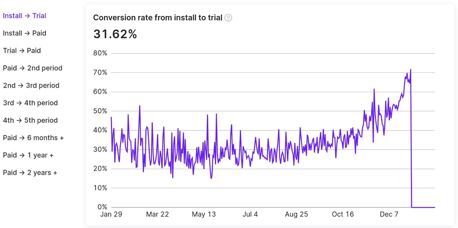
The Install → Trial conversion metric gives you the percentage of your users who sign up for your app’s trial after installing it. So if you get 100 app installs and 20 of those who install sign up for a trial, your conversion rate would be: (20 / 100) * 100% = 20%.
Install → Paid
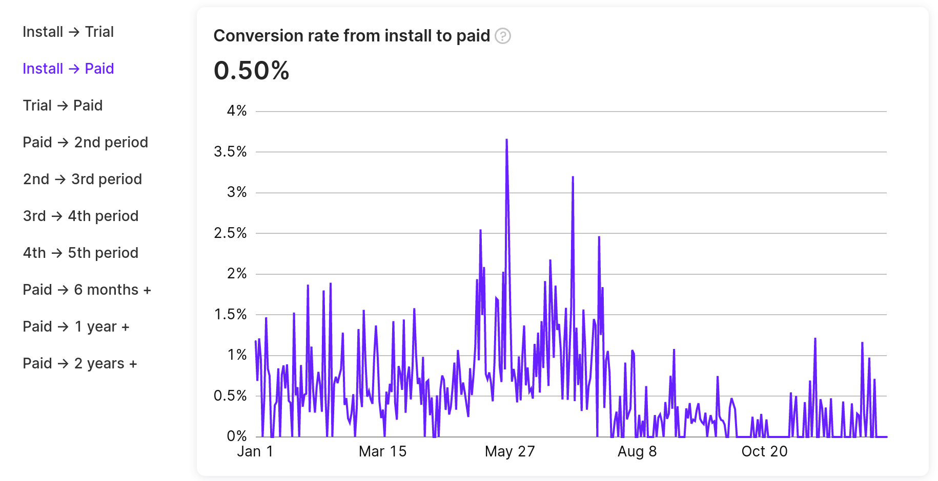
The Install → Paid conversion metric gives you the percentage of your users who sign up for a paid plan of your app. So if you get 100 app installs and 20 of those who get on a paid plan, your conversion rate becomes: (20 / 100) * 100% = 20%.
Trial → Paid
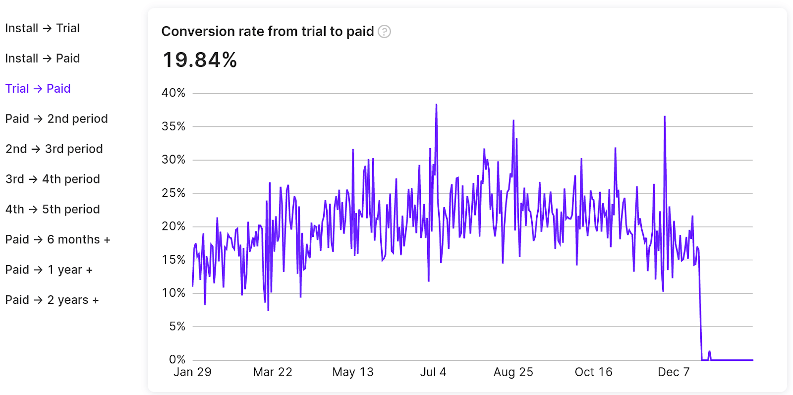
The Trial → Paid conversion metric gives you the percentage of your users who get on a paid plan after signing up for your app’s trial. So if you get 100 app trial signups and 20 of those who start the trial make their first subscription payment, your conversion rate would be: (20 / 100) * 100% = 20%.
Besides these, you can use mobile app analytics tools like UXCam for learning qualitative and quantitative insights into how your users find your onboarding process.
Wrapping it up…
As you can see, there's no standard way to onboard new mobile app users. For the same reason, there's no correct number of onboarding screens or length. You need to take as long as it takes to familiarize your new users with your app and show them how they can benefit from it.
The key lies in finding the perfect balance between providing the necessary information/ instructions without overwhelming users.
Competitive analysis can help you here. See how competing apps onboard their users. Explore the models and workflows they use. They might offer a good starting point.
Also, do check out Adapty. With Adapty, you can measure all the metrics that matter during user onboarding (and across the entire subscription/purchase lifecycle) right out of the box. Learn more about Adapty’s in-app purchase infrastructure here.