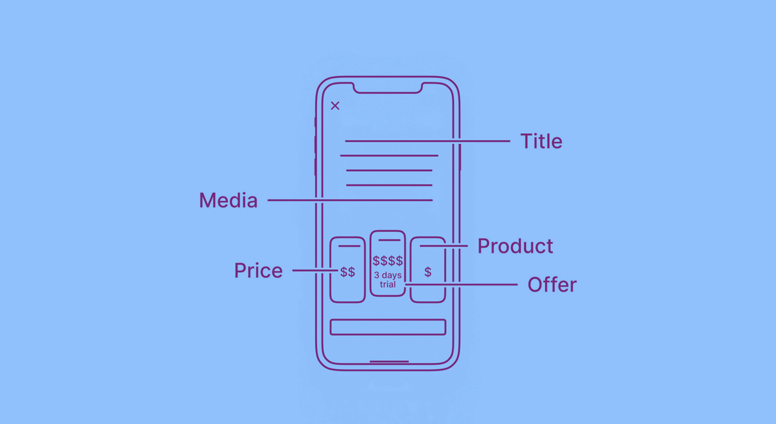
Besides facilitating payment logistics, your paywall needs to function as a great sales page with all the conversion elements necessary to get users to make in-app purchases or subscribe.
After all, your paywall sits at the heart of your mobile app monetization. Anything you add to it — copy, graphics, videos, and elements like buttons and carousels — ties directly to your conversions. But having all the essentials in place isn’t enough. It’s also important to optimize them for conversions.
In today’s post, we’ll see how you can build a conversion-friendly paywall that has everything to get a user to convert and optimize it for even higher conversions.
Add a header banner, slider, or video to your paywall
If you browse through our mobile paywall library, you’ll notice that about 90% of the paywalls go with a loud header and ditch text for a slick banner, slider, or video.
This is primarily due to space constraints when designing a standard mobile app paywall. As you’ll see, adding the essentials (that we share on this list) alone can pose a problem. There’s only so much you can add to the “360 x 760” average mobile viewport.
Banners, sliders, and videos are great solutions here. They help make better use of the limited mobile screen space. Let’s look at each in detail.
Banners
Compared to text, images are processed much faster by our brain. According to MIT’s research, people take just 13 milliseconds to process image content.
A text translation of the same content can take several words and seconds to comprehend fully.
So it’s no surprise that most mobile apps use banners in their headers to convey their most important marketing message. A good example is PicJointer’s paywall. The app uses a simple banner: (Also, as you can see, the headline gives some great context to the banner.)
Although images express more than text (and so much faster), not all images are created equal. So what constitutes good image content? Follow Nielsen Norman Group’s seminal research on using photos as content for guidelines. Here are a few takeaways:
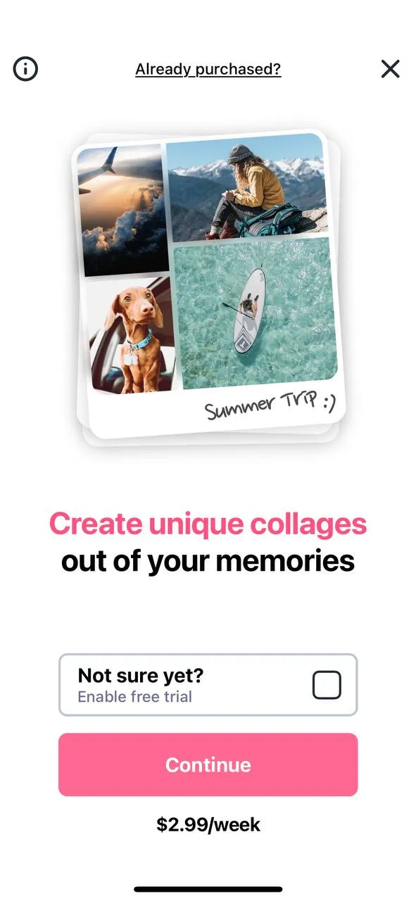
- People photos = good (if they’re real people). App paywalls commonly use high-quality stock photos that look like real app users, which works well.
- Product details = good. Showing the app in action via app screenshots is a common feature — and it just works.
- Information-carrying images = good. In most apps, captions accompany images, so banners get even more effective.
Nielsen Norman Group recommends avoiding multiple banners using sliders if a single banner would suffice. This is perfectly captured in the app above (PicJointer).
Sliders
If you have lots of content to share, a slider can help.
When designing mobile carousels, Nielsen Norman Group recommends limiting the number of frames to 3 or 4 and placing the most helpful (or valuable) information first. It’s also recommended that you avoid using auto forwarding. Additionally, using cues (like arrows, dots, and lines) to indicate users to swipe to access the next frame (and more content) is a great practice.
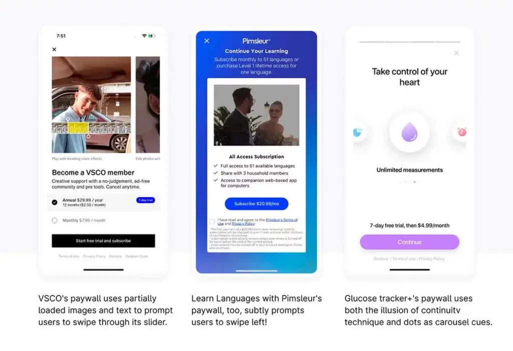
Use what Nielsen Norman Group calls the “illusion of continuity” to prod users into swiping. And what’s that? You may have noticed that when you see partial images and get the feeling that there’s more to discover by swiping, you swipe. This “illusion of continuity” technique taps this natural tendency to find out what’s not fully visible by using partially visible images or text messages. These three apps use this principle well. There’s clearly more available with swiping:
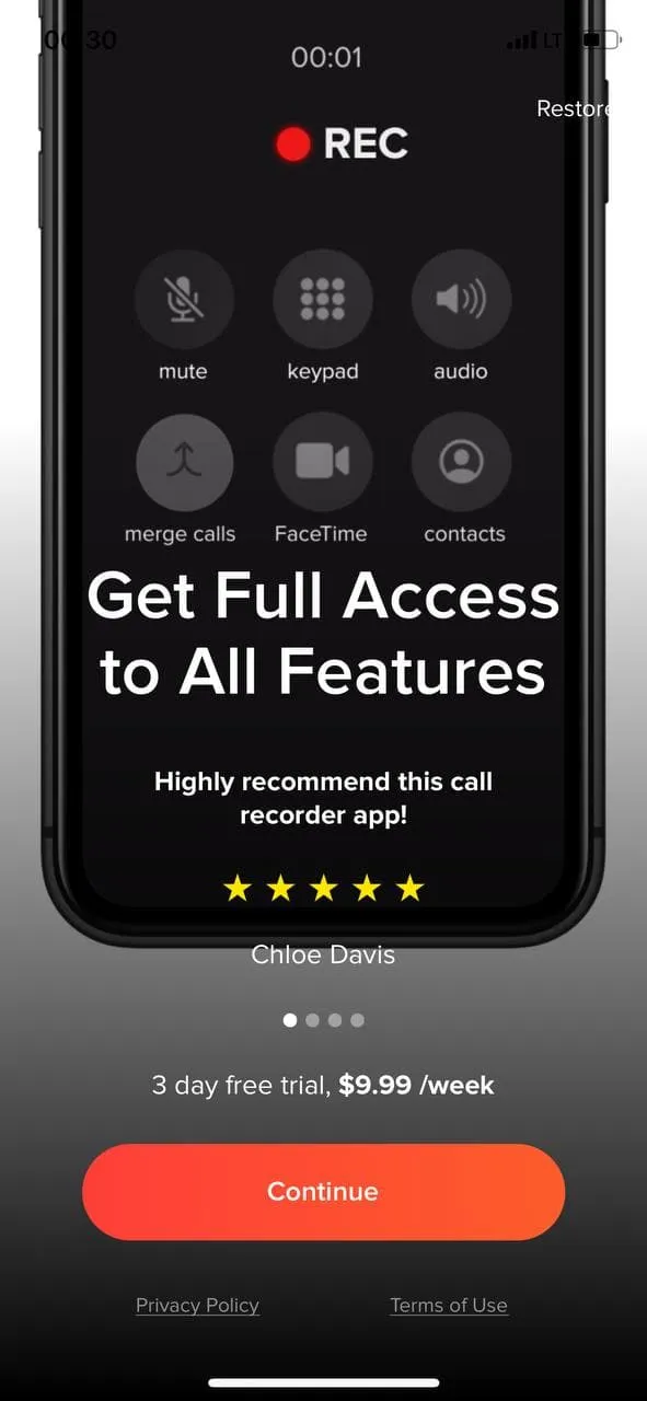
With paywall sliders that don’t use such cues, swiping might not be the most natural thing for users to do on the slider. iCall’s paywall is one example:
Videos
When you want to convey even more information, including a video might be a good idea. BIGVU is one of the best examples:

Here are some best practices to keep in mind when using a video on the paywall:
- Create a mobile-first or mobile-friendly video. Your video will definitely be viewed on a mobile device! Remember that most people use mobiles with their audio turned off. Add subtitles and captions to ensure it’s understandable even without audio.
- Make sure your video preview is good. It influences whether someone will watch your video at all.
- Keep your videos at the right length. Video formats like shorts and stories have redefined how long is too long when it comes to videos. In general, anything under 30 seconds should work well — a tip straight from LinkedIn’s video ad guidelines. Facebook video ad guidelines can also help you here. Facebook recommends keeping videos short and really optimizing the first 3 seconds.
Copy
When it comes to the main paywall copy, most paywalls include three key pieces.
The headline (usually along with a subhead)
First up, you have the headline.
Paywalls for many apps feature generalized headlines like “Go pro,” “Unlock full/all access,” and “Get Premium.” This is a missed opportunity.
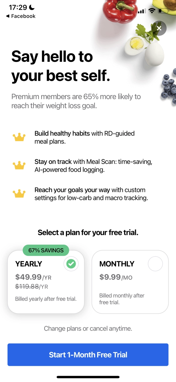
The more optimized paywalls use headlines that succinctly summarize how premium users get more value from the app. A headline like this is the most effective way of marketing the upgrade and its benefits. Take, for instance, the MyFitnessPal app. Its headline — actually a subhead here… but you get the drift — makes an excellent case for upgrading: “Premium members are 65% more likely to reach their weight loss goal.” In other words, it says: Go pro!
Also, did you know that your best headlines come from your app users (and not copywriters)? In fact, the best copywriters use a technique called “review mining” to create headlines that connect with users. Here, you simply swipe a headline directly from a happy testimonial. Take a cue from W1D1’s app paywall:
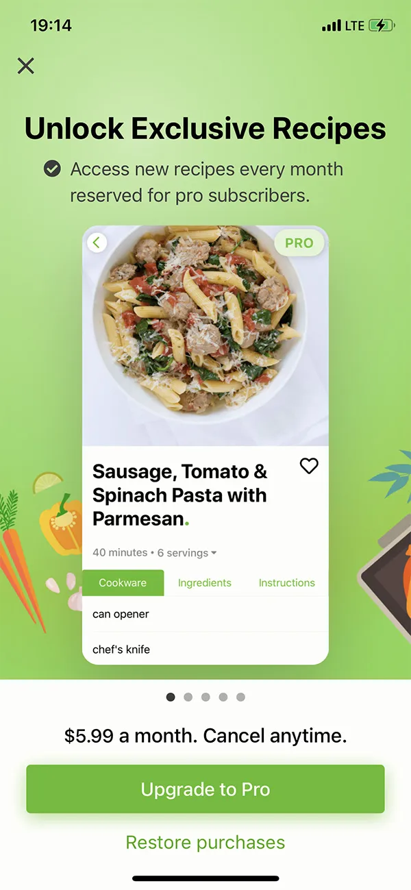
The paywall headline should at least emphasize the app’s key premium feature. Here, you get straight to the point (no frills!). The Mealime Meal Plans & Recipes app nails this one. “Unlock Exclusive Recipes” — plain and simple. (Using content to pitch an upgrade works well across all niches, as it’s one of the top reasons free mobile app users upgrade.)
A short blurb
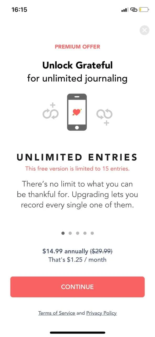
After the headline and subhead, most apps add a short blurb that highlights the premium version’s most valuable and popular features or benefits. With its text, Grateful’s paywall draws attention to how limited the free version is:
Features/Benefits
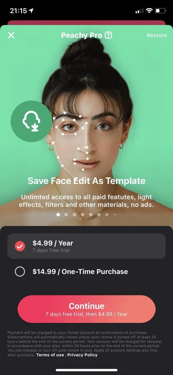
Almost all apps show a list of features or benefits their pro versions bring. There’s no one right way to present features and benefits — many styles work well. Look at the following paywalls for inspiration. Each uses a unique style:
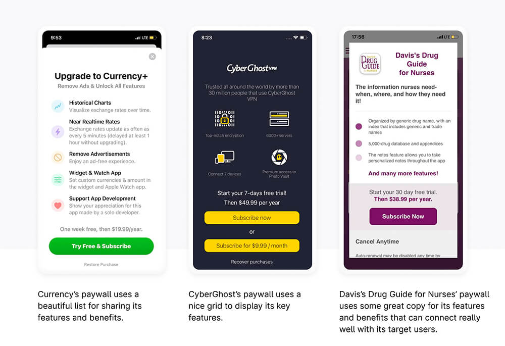
App paywalls commonly use sliders to highlight the apps’ key features and benefits. Peachy’s paywall is a shining example. Each feature gets a frame, in this case. However, the best practices of slider design should be kept in mind when designing these:
Use heatmap analytics to determine if your key features are being seen the way you want them to be.
A call-to-action button
Next comes the call-to-action (CTA) button. And it can be a problem, especially with the try-for-free apps, whether freemium or paid. Why? Because freemium or paid apps with free trials aren’t technically free. When users sign up for a trial, they actually sign up to be billed a certain amount once the trial period ends. But often, this doesn’t reflect clearly in the paywall’s button copy. This is so because, typically, paywall buttons use the following templates for their call-to-action copy:
- Start free trial
- Start free trial to subscribe
- Start free trial and plan
- Subscribe now
- Activate trial subscription
- Try X days for free
- Try free & subscribe
- Continue (the most ubiquitous one!)
These don’t tell users that they will be charged (automatically) as soon as their trial ends.
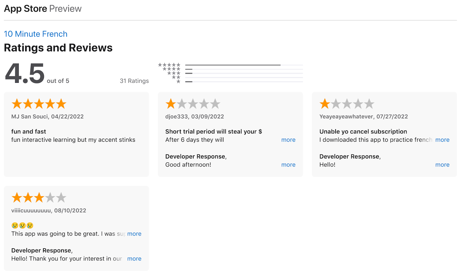
Check out the 10 Minute French app’s paywall. This new and promising app (with an average rating of 4.5) uses some standard CTA button copy:
Now, look at the app’s featured reviews on its app store listing. Sadly, three out of the five featured reviews are negative and are clearly about the billing that started post the trial:
This can hurt new apps the most. Here are a few solutions:
- First, you can use some more explicit CTA copy, like “Start your X-day free trial (then $X/mo or year)”.
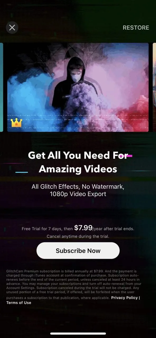
- Another way to go about it is to add a small disclaimer just above or right below the CTA button, where it’s practically unmissable. Check out the GlitchCam’s paywall. The app makes it abundantly clear how the users will be billed $7.99/year once the trial ends:
- Yet another solution is to add a trial end reminder to your app and ask users if they want to be reminded before their trial ends and they get billed. This is a common feature with apps that use the timeline paywall type.
Additionally, email notifications can be used with all these approaches.
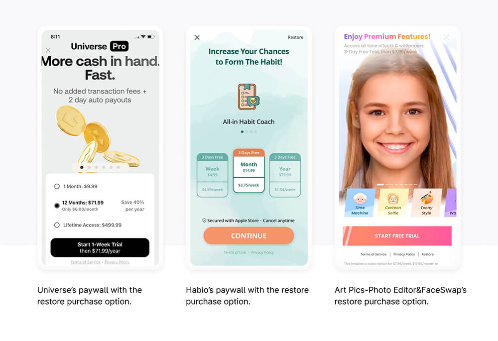
Restore option
When iPhone users 1) uninstall an app and then reinstall it, 2) do a factory reset of their phone, or 3) switch to a new device, they need to regain access to their in-app purchases (manually). For this reason, Apple asks app makers to include a “restore” option in their iOS apps. That’s why “Restore purchases” options are a standard feature on iOS app paywalls. Usually, restoring is also accessible via the app’s settings.
Apps from Google Play can generally skip adding restore options on the paywall (as most Android apps automatically restore any eligible purchases a user may have made). Some may, however, by design require users to request restoring, in which case, they do need the restoration option.
Apps typically place their restore options under the main CTA button, along with links to their terms and privacy policy. Placing the restore icon at the top left or right corner is also common. Both work well as they make the restore option readily available to users who might need it. But at the same time, they don’t get in the way of the rest. Here are a few examples:
Link to your privacy policy
Both Google Play and App Store need you to make privacy-related disclosures inside your app. It’s crucial to inform your users about what information you collect, how it’s collected, and what you do with it.
You’re also supposed to state if you’re sharing data with third-party solutions for advertising, analytics, or development purposes.
Policies regarding data retention and deletion, as well as steps users can take to stop sharing their data and request its deletion, are also essential.
Freemium app users often upgrade from freemium to premium versions for privacy reasons, so adding a privacy policy can also help with conversions. Don’t let the fact that users tend not to read privacy policies deter you from implementing one that’s user-friendly. (Just for fun: Put your app’s privacy policy in this cool readability calculator. And let us know how you score!)
Link to your terms and conditions
In the same way that privacy policies protect users, terms and conditions protect businesses. Your terms and conditions will protect you if you need to navigate any legal situations.
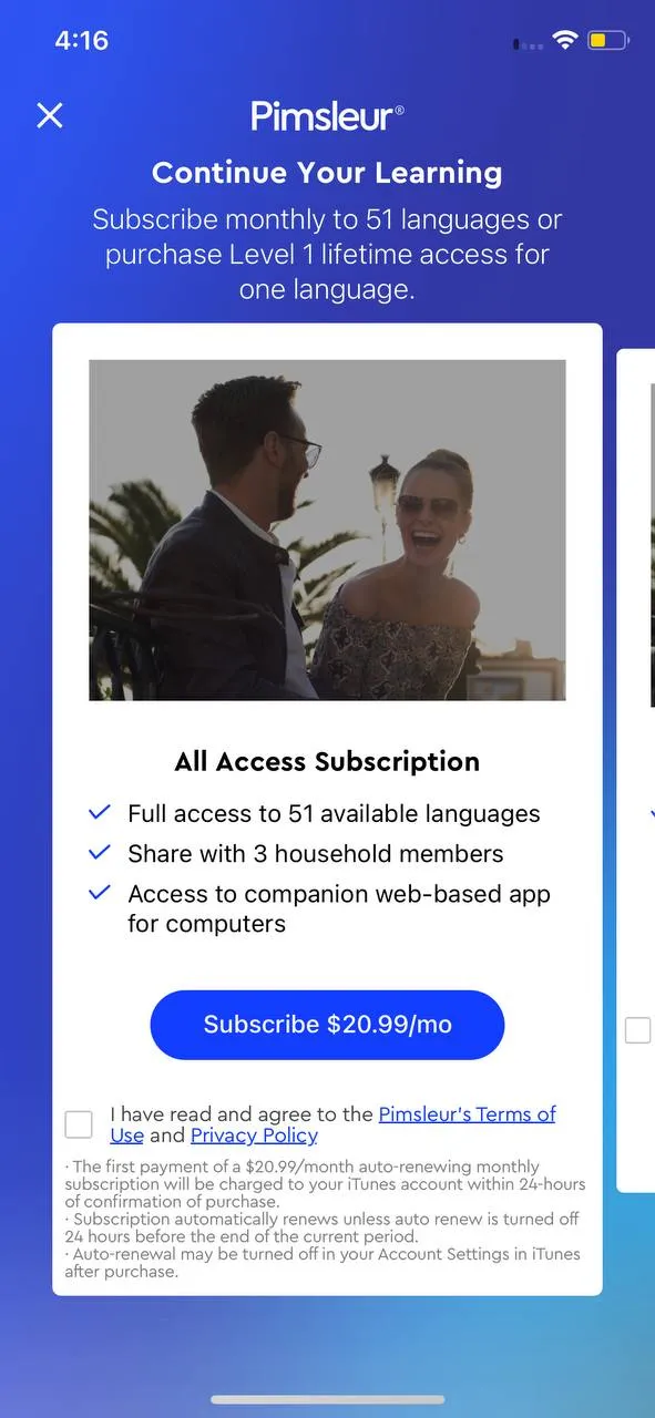
Some apps need users to “Click to agree” to their terms and conditions before they allow app signup. Learn Languages with Pimsleur’s paywall does this:
However, as all apps don’t do this, linking to the terms and conditions is essential. Most apps state on this page that simply using the app means agreeing to its terms, which means they collect the permission implicitly.
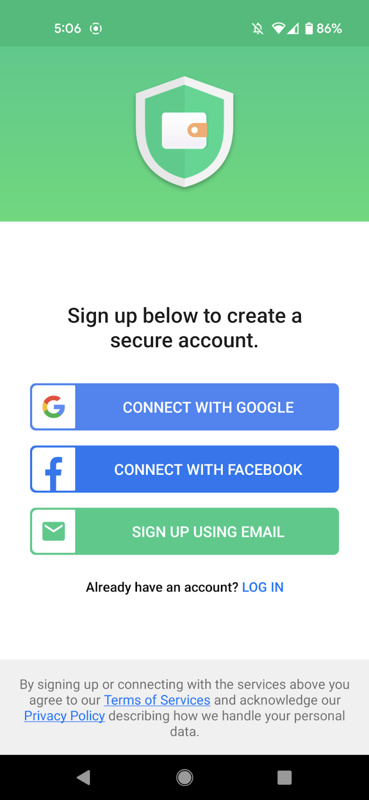
It’s also common to add a disclaimer to let users know that they agree to the app’s terms and conditions by signing up for the app. This is good for transparency. However, some users can put off the signup for later due to it. Also, note that this happens even before users see the paywall. Wallet goes with this approach:
Experimenting
If you try to incorporate all the elements a paywall needs (that we just saw above), you’ll hit an obvious constraint — SPACE. Naturally, you don’t want your users to have to scroll or swipe and would like to accommodate everything within the mobile viewport – instantly available.
While the standard paywall type works well, you need to know which elements carry the maximum weightage in your case so that you can place them better. Also, you’d want to discover layouts that work the best for you. You’d also like to know, at the more granular level, if changing your copy or design might get more conversions.
All of this ties back to testing. Unless you run tests on your paywall, you can’t tell if you’re using the best paywall type, layouts, or elements.
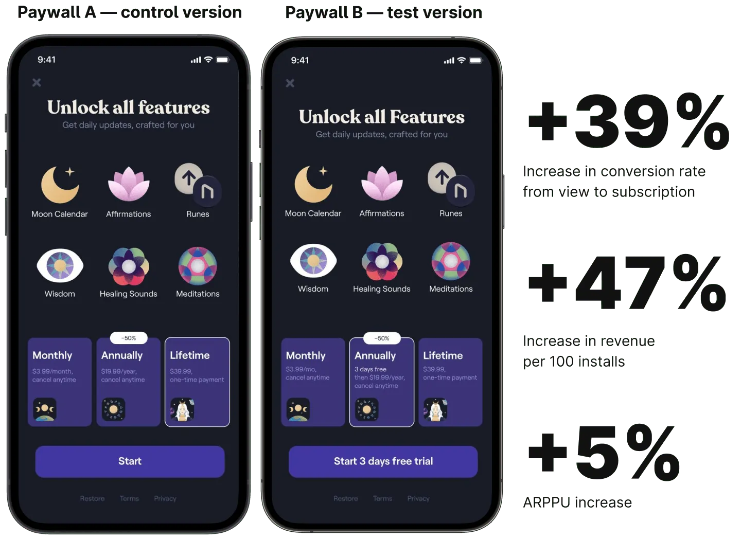
When Moonly, a spiritual wellness app, increased its annual subscription plan pricing, it noticed a drop in its conversion rate. Moonly hypothesized that users didn’t seem to want to commit to a higher yearly plan without trying the app and that adding a trial to the annual plan would get more conversions. This was when Moonly thought of running an experiment on the yearly subscription with a trial offer. Moonly’s experiment — read the full story here — got a 39% increase in the conversion rate. Not just that, the trial offer successfully pushed more people to go with the annual plan, getting the app a 5% increase in ARPPU.
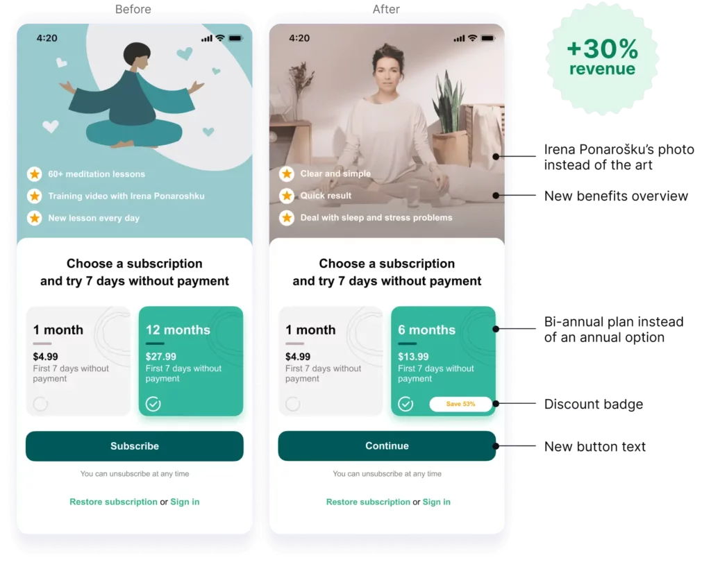
In another case, Prosto, a meditation app, used to offer two plans: a monthly plan at $3/mo and an annual subscription charging $30/year. When Prosto analyzed its sales data, it saw that its users found the annual subscription to be a bit expensive. They hypothesized that adding a $15 plan might bring more subscribers. Prosto ran a test on its paywall to see if its hypothesis would hold and swapped the $30 12-month plan with a $15 bi-annual plan. The new plan seemed to be very popular with the app users (as hypothesized) and resulted in a 30% monthly revenue increase for the app.
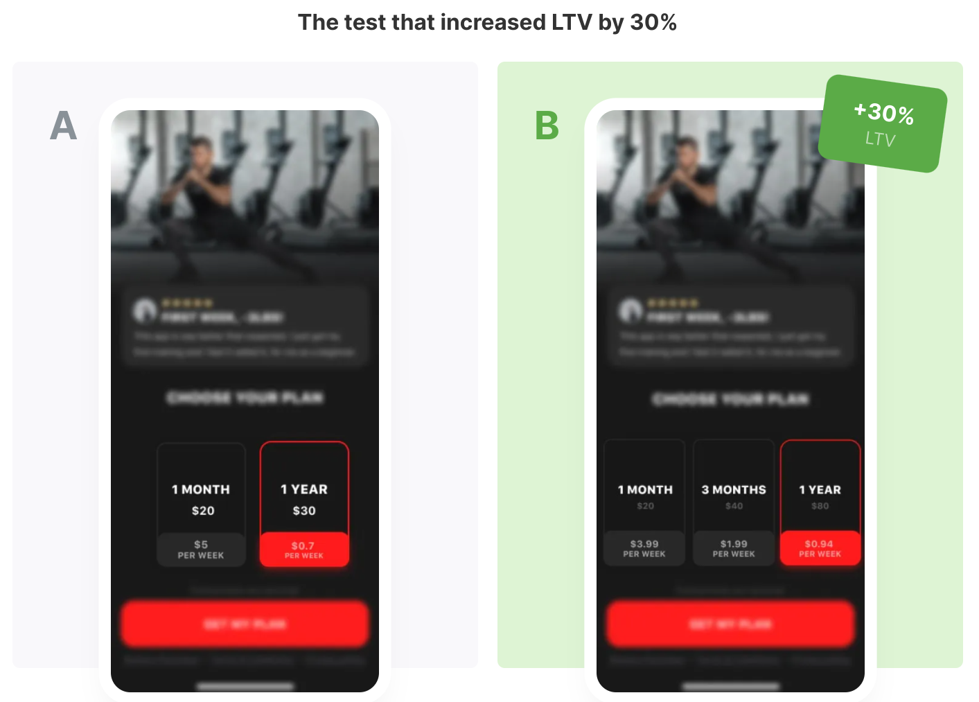
In yet another app paywall experimentation success story, app maker Union Apps secured a 30% increase in the LTV for OctaZone, its partner fitness app. In this experiment, OctaZone added a 3-monthly subscription to its original monthly and annual plans. It also increased the price of the yearly plan to make the 3-monthly option look more appealing. Users indeed skewed toward the 3-monthly subscription, which boosted the app’s net revenue as hypothesized. The decoy effect is at work here. We’ve discussed this bias in detail in our earlier post on paywall types — do check it out!
Said another way…
Experiments on your paywall have a direct bearing on your app business revenue.
With a paywall solution like Adapty, you can start launching paywall tests within a day. Check out Adapty.
One thing to note here is that only data-driven hypotheses lead to winning experiments. So keep a tab on your app key conversion metrics and user behavioral data. These hold the key to what your users want to see or will value on your paywall.
Wrapping it up…
Whatever elements you place on your paywall impact your app business’s bottom line. You’d be surprised to learn that even simple cosmetic changes (like changing the button of your CTA button can) can make a difference.
And, of course, the more data-backed experiments (e.g., testing new pricing plans) can produce even better results.
The only way to know if you’re using the most conversion-friendly app paywall is to test everything you put on it. At Adapty, we power paywalls and paywall A/B tests and experimentation for thousands of apps just like yours. Discover how Adapty can help you grow your app business.