Optimizing your mobile app paywall for more conversions begins with choosing the right type of paywall. Why? Because mobile app paywalls come in many forms.
For example, if an app’s top user acquisition channel is offering free trials, it’s best if the app uses a trial-focused paywall – one that clearly explains how the trial works and the value the user can get out of it. Likewise, a premium app might be better off using a longform paywall over the standard version if it takes a lot of convincing to sell. And if an app is looking to quickly get a few upgrades, adding an “offer” paywall is a good hack.
Said another way: You need to be intentional when planning your paywalls. And to help you do that, today we’re rounding up ten of the most popular mobile app paywall types. In addition to discussing the different paywall types, we’ll also see the various conversion principles they use.
The 10 most popular mobile app paywall types with examples
1. Standard non-scrollable
2. “Landing page”
3. Modal
4. Trial
5. Trial toggle
6. Single plan
7. Multiplan
8. Offer
9. Donation
10. Personalized
1. Standard non-scrollable paywall
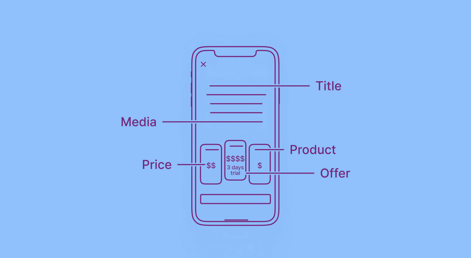
This is the most common mobile app paywall you get to see. Here, the mobile viewport is all the space you have. This is also why this paywall type works – everything your users need to see is available immediately. The information displayed on this paywall often includes:
- The main headline (explaining why a user should purchase your app)
- The app’s key features and benefits
- Elements of social proof
- Plans
- Offers (if applicable)
- A call to action button
- Links to relevant content (like your privacy policy, terms, and FAQs)
Moonly’s paywall is a great example: it comes with a good headline (that clearly states the benefits of purchasing), a beautiful grid highlighting all the premium features, plans, a CTA button, and links to the necessary resources:
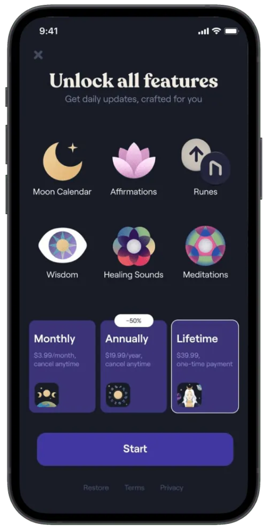
However, because of space constraints, this paywall type can only accommodate so much. In this case, Moonly ditches elements of social proof. And why is it a problem? This is a problem because app ratings and reviews are excellent social proof that convinces people to pay for your app. Did you know that 80% of mobile app users read at least one review before downloading a paid app? Since users rely heavily on reviews, posting social proof on your paywall can drastically improve your conversion rate.
Some publishers work around this limitation by adding carousels and videos to the paywall. These elements help offer much more information, even in this paywall type’s compact space.
2. “Landing page” paywall
This is a deviation from the standard non-scrollable mobile app paywall. Here, you don’t cram everything into a single screen but go with a “longform” format. You treat your app paywall like a mobile landing page.
Napper is an excellent example:

If you review Napper’s paywall, you can see how easily it accommodates all the essentials. Napper’s longform paywall highlights all the things that work for such “landing page” paywalls:
- You can easily add elements of social proof (from the number of app users you have to your average app ratings and reviews).
- You can better explain your app’s features and benefits, as space isn’t a constraint.
- You can better explain the premium version’s value in comparison with the free version.
- You can implement conversion tactics like using pricing layouts that kick in the user biases and influence your users’ buying decisions. (More on this later.)
- You can address common user concerns via sections like FAQs (think questions around app data privacy, subscriptions, refunds, etc.)
Here’s one more example of such a paywall from the Meditopia app:

One obvious challenge with this approach is getting the length of the paywall right: If it’s too long, users can be quick to abandon it. It’s also essential to follow a solid messaging framework when creating the copy. Longform paywalls can also lose users if they don’t use clean and focused layouts.
3. Modal paywall
Here, mobile app paywalls appear as modals or popups. To proceed, users need to either continue with a purchase on the popup or close it.
A modal paywall typically gets even lesser space than a standard paywall (that we mentioned above). So if you need to say a lot on your paywall, you must either go with a longform modal or add a carousel.
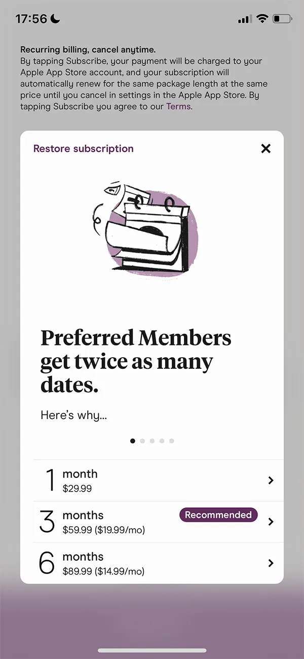
The Hinge dating app uses a slick modal/popup paywall. As you can see, Hinge goes with the carousel workaround to make up for the lack of space and explain the different benefits of going premium:
4. Trial paywall
Trials are one of the top user acquisition channels for mobile apps. When Google surveyed mobile app users, 17% of the respondents said they moved to premium plans as they ran out of the trial period.
When it comes to mobile apps, trials work in two ways:
- If it’s a paid app, a user can download the app (for free). But to use the app, they need to sign up for its free trial, which includes agreeing to the billing terms that apply post the trial. A user can, however, cancel the billing agreement anytime during the trial.
- And if it’s a freemium app – which has a fully functional “lite” free version – each time a user tries to access a premium feature, they hit the paywall where they see the option to try the app for free.
In both cases, app stores need app publishers to transparently state the pricing post the trial.
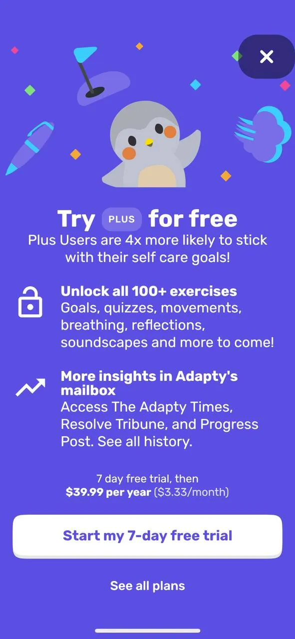
So let’s see what a typical trial paywall looks like. This is Flinch’s simple yet effective trial paywall (Flinch puts you on the annual plan when the trial ends):
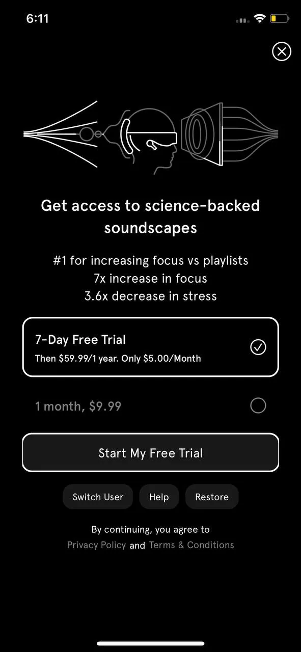
Below you’ll see yet another free trial paywall for a paid app. In addition to “selling” the trial, this app also helps users understand that they’re automatically signing up for a good deal if they take up the trial offer, as the trial is available on the yearly plan (which is noticeably better than the monthly option).
No matter how well you explain your trial offer, it can still confuse users. And if they fail to cancel – and you can’t process a refund – you’re looking at critical reviews. Such reviews don’t just affect your app store visibility but also hurt downloads and conversions. The solution? Some app publishers have found the answer in the “timeline” trial paywall.
Here we have the language learning app Loora using a beautiful timeline paywall:
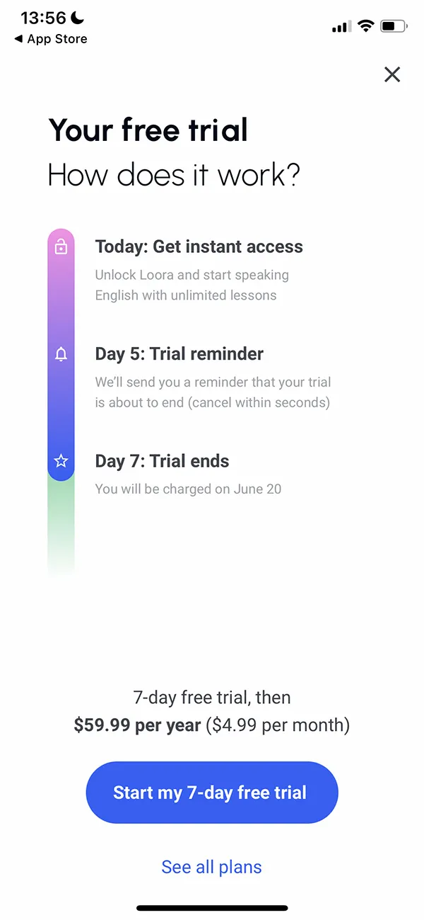
With this paywall type, users can:
- See what they’re getting with the trial
- Know that they will be reminded before their trial expires (and before they’re automatically billed)
- Learn when they’ll be charged and how much
A variation of this timeline paywall type uses a toggle switch and lets users decide if they want to be reminded before their trial ends and they get billed.
As you can tell, for this paywall type to work well, the trial period needs to be just right. Usually, when users get a lengthy trial – say, when they get an app for 3 months – they tend not to use it immediately. They know they have many months to try. As a result, they don’t see the value. On the other hand, a shorter trial forces them to explore the app and decide if they want to get the paid plan or end the trial. The FOMO (fear of missing out) factor kicks in with shorter trials.
All that said, the best way to find the ideal trial length is to test!
5. Trial toggle paywall
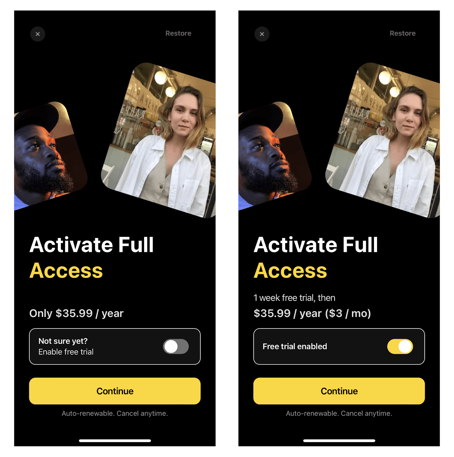
This is a variation of the trial mobile app paywall with a twist – or a toggle switch.
As with the regular free trial paywall, you offer a free trial here as well. But in this case, you make it optional. So on your paywall, users can either pick a paid plan or choose to unlock a free trial offer by toggling the switch.
The toggle switch makes users feel like they’re getting a risk-free deal. The Lensa: Photo & Video Editor paywall leverages the trial toggle nicely:
6. Single plan paywall
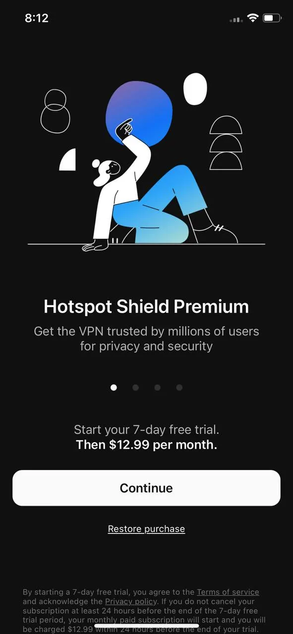
This might seem surprising, but a vast number of apps only offer a single pricing plan. It’s simple: Here, the app is only available in a single plan, billed weekly, monthly, or yearly. Take the HotspotShield VPN & Wi-Fi Proxy app’s paywall, for instance. This paywall offers a single subscription plan – the only one that the app has:
The wellness app Calm, too, only comes with one subscription plan:
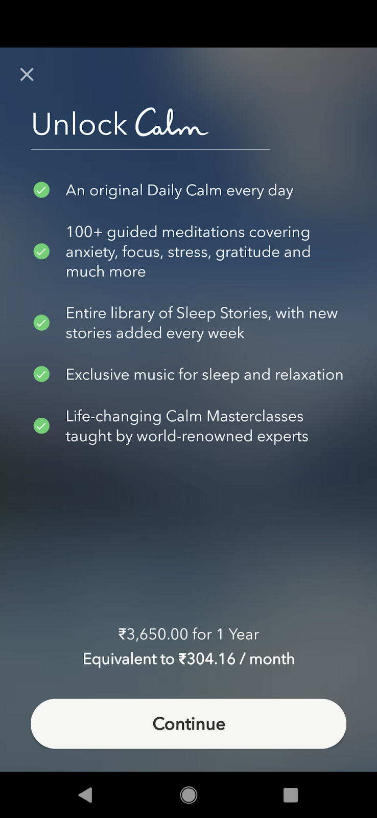
One plus with the single pricing paywall (or app business) is that users don’t need to think and compare multiple plans and choose the one that offers the best value – an exercise that can cure analysis paralysis.
7. Multiplan paywall
When it comes to offering multiple subscription plans, again, there’s no standard way. There are apps offering everything from two to five subscription options. But before we proceed to explore the popular approaches, let’s have a look at the fresh data from our 2023 report that shows the revenue distribution by the number of products on paywalls.
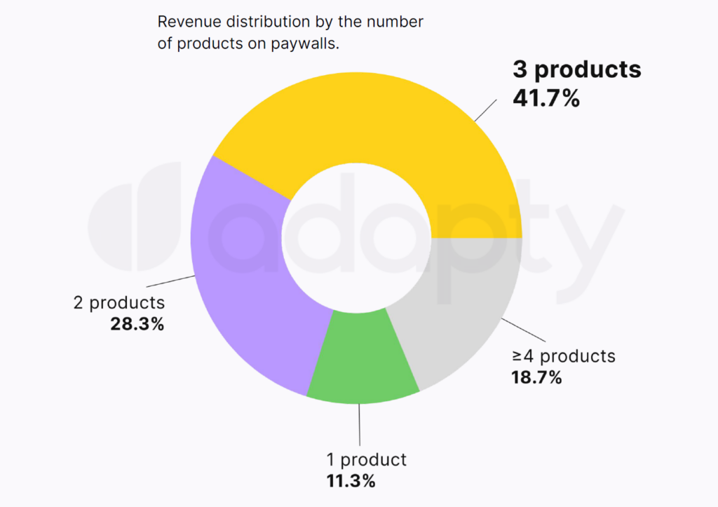
It’s pretty clear that the most profitable paywall is a combination of 3 products, so it might be a good idea to start from that. However, much depends on the app audience and niche, so it’s not the rule. Make sure to further check out the 2023 subscription report to find more insights and useful data like this.
Now, let’s still take a quick look at the most popular paywall combinations.
Offering two premium plans
The simplest multiplan pricing structure in mobile apps is offering a monthly plan along with a heavily discounted yearly plan. This is an excellent example of price anchoring: Once the user sees your monthly pricing, they can calculate the value for a year. And then, based on that, the yearly subscription plan looks like an easy decision as it’s usually heavily discounted. The Asana Rebel app does this well:
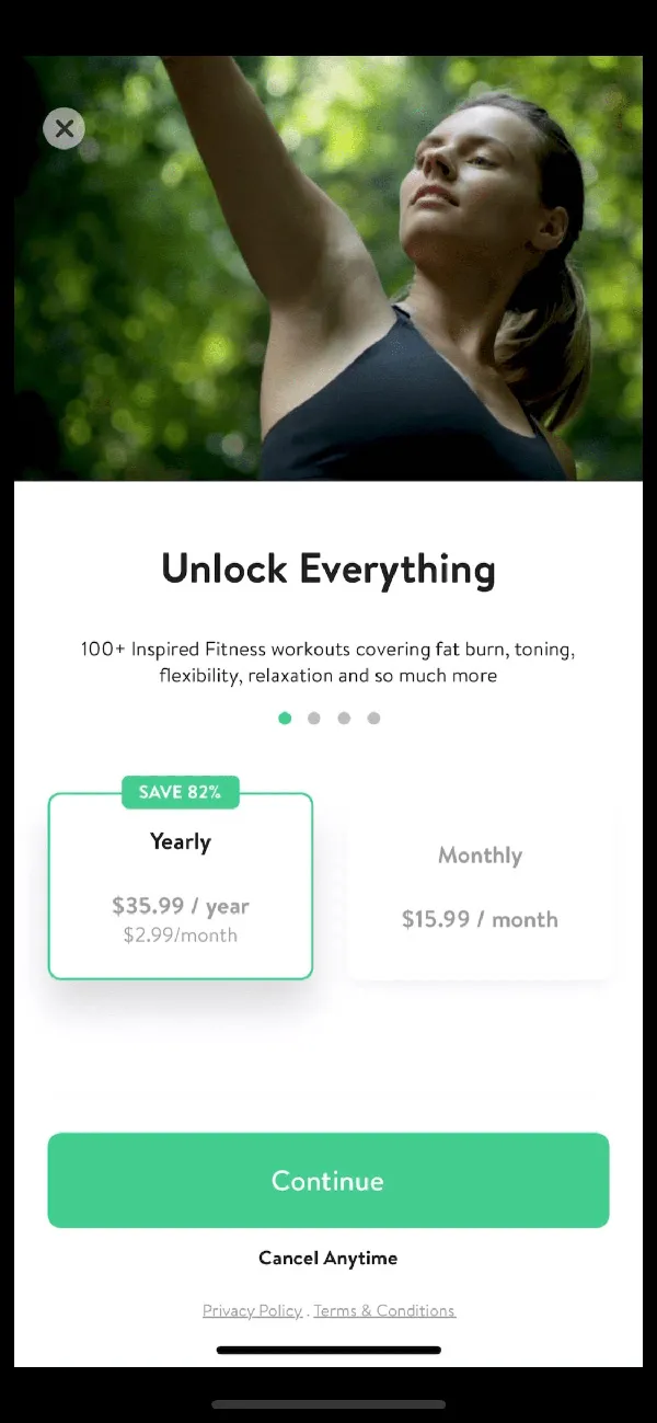
The “Save 82%” tag is difficult to miss. As you can see, the annual plan costs you only $2.99/month compared to the $15.99 you pay for the monthly subscription.
Here’s yet another app that offers monthly and annual subscription options, but unlike the above app, MEYA’s paywall doesn’t do any math for the users and doesn’t even try to get users to buy a specific version:
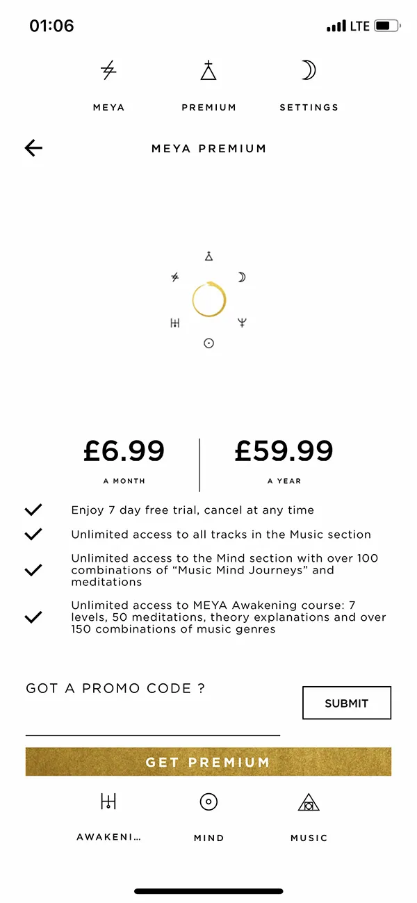
Also, did you notice that both these apps use charm pricing? Charm pricing takes advantage of the “left digit bias,” which leads people to believe that $2.99 is a more attractive price than $3! Most mobile apps use this charm pricing technique — check it out for yourself.
Offering three plans
Look at any SaaS product, and you’ll likely see three plans. Have you ever wondered why businesses always gravitate around the number “3” when offering purchase options?
The answer lies in the decoy effect. With the decoy effect, you have two pricing plans that are noticeably more difficult to consider, given an easy third choice. In fact, the third choice is designed in a way that it appears to be a much better deal than the other options.
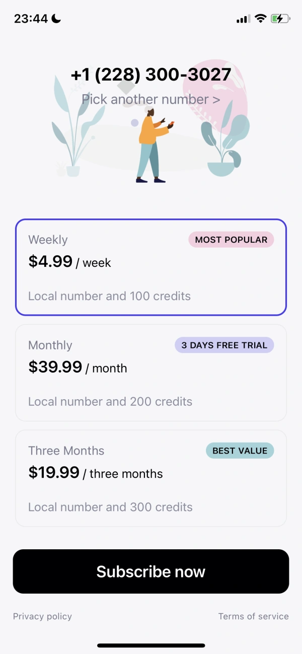
Mobile apps widely use the three-plan scheme. Here, you typically give your users a choice among weekly, monthly, and three-monthly plans. Another hack you get to use with this approach is tagging your best-value plan. Adding visual cues like “most popular” or “best-selling” labels on the plans you want to promote skew your users’ decision. When users see a plan to be the most purchased, they tend to believe it offers the best value. This is also using social proof for selling.
The Second Phone Number ™ 2nd Line app’s paywall makes an excellent example of offering multiple paid plans:
It’s also common to see monthly, quarterly, and annual plan options. The Go Fasting health app paywall is a noteworthy example:
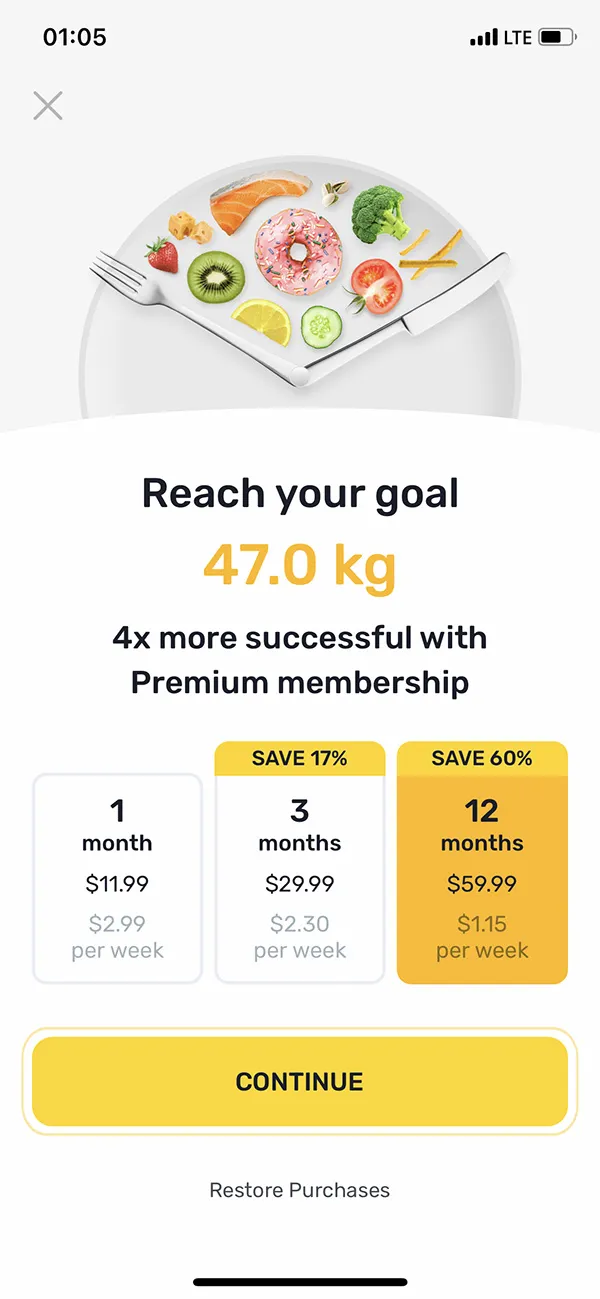
You can see this app makes choosing the yearly option almost a no-brainer. Do the math: For the cost of two months, you’re covered for the entire year.
Note that sometimes, the annual discount offer may only apply to the first year. Memrise’s paywall makes this clear:
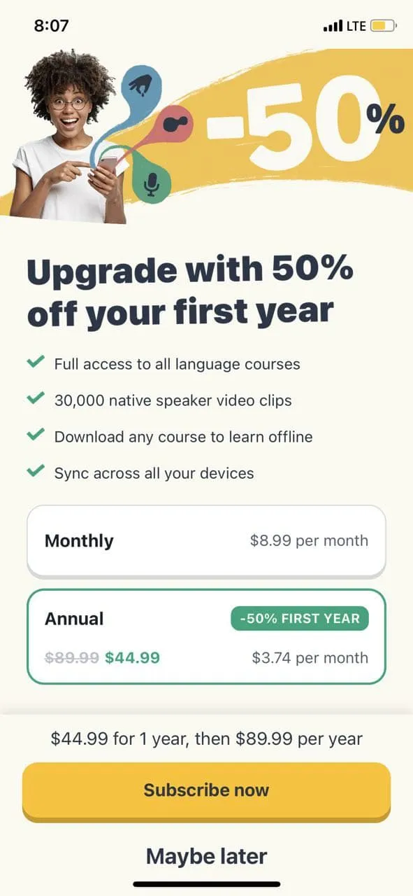
If this is the case with you, it’s best to state so transparently.
Offering the lifetime premium option
Another plan that you routinely get to see in premium apps is the lifetime access plan. Here, users get a one-time purchase option along with monthly and annual plans.
The lifetime business model doesn’t suit every app, but it can appeal to many users, especially if they see themselves using the app for some time. The Motionleap by Lightricks app makes a great example:
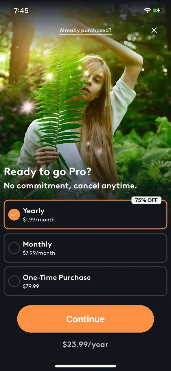
This app, however, doesn’t push its users to go with the lifetime plan. It’s making the yearly plan look like the winner. Perhaps the lifetime plan is only there to get the users to choose the annual plan, which seems like a better deal.
Unlike this app, many apps that offer lifetime plans show them as the plan of choice. Cosmic Insights Astrology is one example:
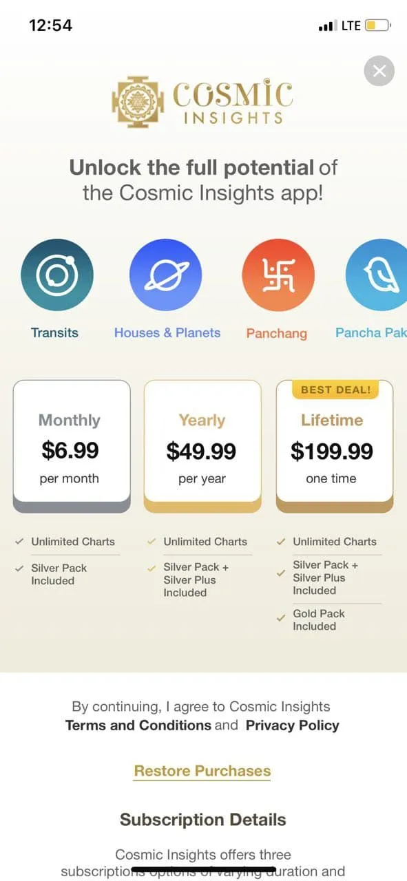
8. Offer paywall
Did you know that 23% of app users upgrade to a paid subscription because of a fantastic upgrade offer? Making a great offer is an effective conversion hack, as discounts simply work.
The Balance app uses a smooth offer paywall to get lifetime subscribers. It also prominently promotes its offer throughout the app (see the first screenshot):
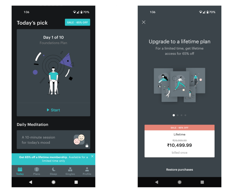
Terms like “for a limited time only” add an element of scarcity to the offer and get more users to convert.
It’s crucial to sort a few things before planning this paywall, namely:
- What discount will work best for your audience?
- How will you present your offer? Get X% off vs. Save X% can produce different results! If your users would love to get a discount, the first option will work better. If your users would like to avoid a loss, the second option will be ideal. You need to know your subscribers well to choose messaging that will resonate with them.
- Will they value a lifetime offer? If so, how much would they be willing to pay for lifetime access?
9. Donation paywall
Some app publishers offer very generous trials, often extending for up to a year. And there’s no catch – the fully featured app is for the user to use for the whole year.
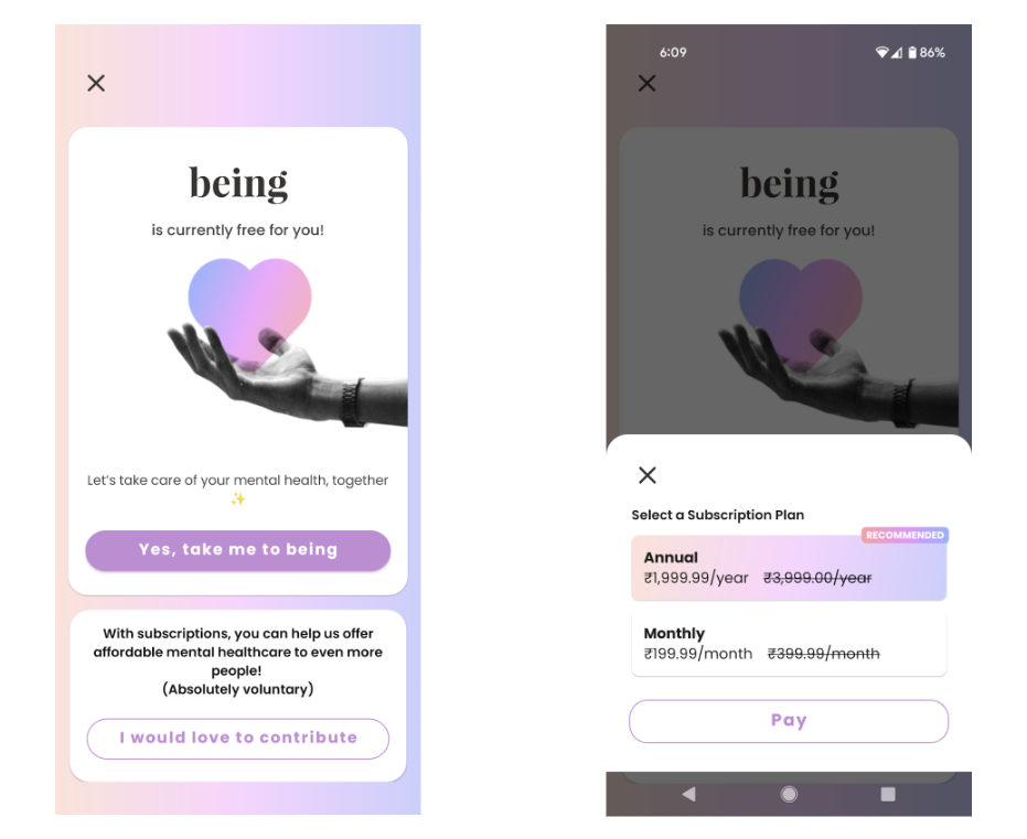
However, most of such apps ask for voluntary contributions. And when the user chooses to pay, they’re presented with the app’s subscription plans or options to pay other amounts.
The mental health app being is a shining example of such a donation paywall:
Balance, which also works with the same model, uses a slightly different approach. Here, it explains to its free app users the cost of making the app available for free for a year. And post that, it gives options for contributing:
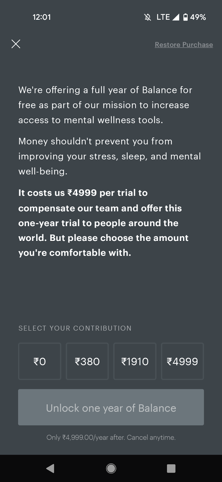
This helps users decide how much of a donation they must make if they want to support the app. It’s a clever nudge to inspire users to make a meaningful contribution.
10. Personalized mobile app paywall
The personalized mobile app paywall is a special kind of paywall. Here you pick your most popular user segments and design the paywalls customized for them.
Here’s how it works:
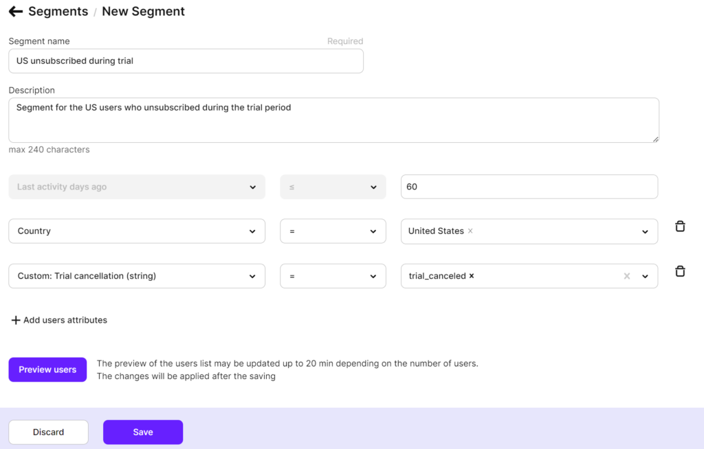
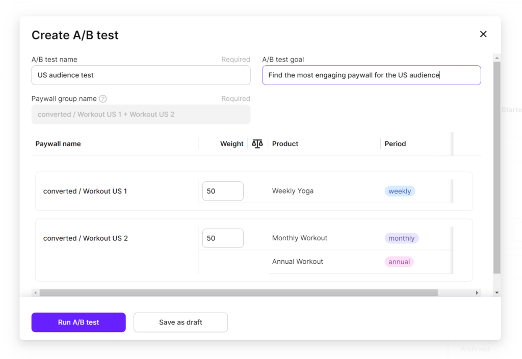
First, you identify different segments that exist in your audience. With an app SDK solution like Adapty it’s pretty easy:
Next, you hypothesize messaging, layouts, and offers that will likely work best for each segment. Note that you’d want to create two versions (A and B) for each segment.
Finally, you add the paywalls you prepared inside your test builds and then show each segment the paywall personalized for them:
Paywall types comparison
| Paywall Type | Best Use Case | Main Advantage | Key Risk | Typical Apps |
|---|---|---|---|---|
| Full-screen static | Simple offers | Fast clarity | Low flexibility | Utilities |
| Scrollable landing | Complex value prop | Strong persuasion | Longer time to convert | Wellness |
| Trial paywall | Lower entry barrier | High CVR | Low ARPU risk | Fitness |
| Multi-plan | Price anchoring | Higher ARPU | Decision overload | SaaS |
| Contextual | Feature-driven | High intent | Limited reach | Editors |
Wrapping it up…
As we just saw, each paywall type has its strengths and challenges. And depending on your use case, one As we’ve seen, each paywall type comes with its own strengths and trade-offs, and the best choice depends on your specific use case. There is no universal solution. The optimal paywall is the one that aligns with your app’s business model, user behavior, and monetization goals.
To find the right paywall type for your mobile app, start by forming hypotheses about which options may work best. Use insights from your business model, primary conversion channels, and existing user data to guide these assumptions. From there, run controlled experiments to identify the paywalls that drive the highest revenue and long-term value.
However, paywall optimization does not start at the paywall itself. The way users are onboarded into your app plays a critical role in how they perceive value and whether they are ready to convert.
With Adapty’s App Onboarding Builder, you can design and customize onboarding flows that introduce users to your app’s core value before they ever reach a paywall. By highlighting key features, benefits, and use cases early on, onboarding screens help warm up users and increase their likelihood of converting once a paywall is shown.
Once users are in the app, Adapty Autopilot helps take monetization optimization a step further. Autopilot automatically adapts paywalls, pricing, and offers based on user behavior and performance data. Instead of manually managing experiments, you can let Autopilot continuously optimize paywall experiences to maximize conversions, in-app purchases, and subscriptions.
Together, Adapty’s paywall management, onboarding customization, and automated optimization tools allow you to experiment across the entire user journey, from first launch to purchase, and continuously improve your app’s monetization performance.
