All the apps published in the App Store are reviewed for compliance with Apple’s rules. Sometimes the process can be delayed if the developer violates one or a few of them. The violations can be rude, like the app containing prohibited content, or rather small, like a mistake in the description of an in-app purchase.
Together with Dmitry Kuznetsov, head of a mobile software development department for multimedia playback and processing, we’ll try to figure out what may help you quickly and easily pass the review of a subscription-based app.
What you need to know about the App Store reviews
An application gets reviewed every time a new version is published, even if the changes are minimal. The developer can swap a couple of buttons without touching the main features of the app at all, but it still has to be rebuilt and submitted for review.
The App Store is very thorough with their reviewing process, as they’re responsible for the quality of apps. The users cannot be exposed to poorly performing, dangerous, or misleading content. Apps for children are subject to particularly close scrutiny, as they shouldn’t contain any prohibited content or hidden features.
The store can review an already published app on its own initiative or based on the users’ complaints. Such extraordinary reviews are quite rare but they allow Apple to identify apps made by unscrupulous developers that contain hidden features.
Also, experts can pay attention to the application, whose users often request a refund for purchases. If there are too many such applications, this is a sign that something is wrong with the application.
Apple removes old apps from the store that aren’t updated or reviewed for a year. The developer of such an application first receives a reminder to release a new version within 90 days. If they don’t, the app is removed.
App Store Review checklist
| Category | Check |
|---|---|
| App stability | ✅ No crashes or blocking bugs |
| Metadata | ✅ Title, description, keywords updated |
| Screenshots & preview | ✅ Match current app version |
| In-app purchases | ✅ Correct setup and descriptions |
| Login methods | ✅ Sign in with Apple added if required |
| Privacy | ✅ Privacy policy linked |
| Test account | ✅ Provided to Apple |
| Compliance | ✅ Regional laws covered |

Which verifications an iOS app goes through
In order for the app to get reviewed, you need to upload its build, that is, a ready-made application file, to App Store Connect. There it goes through processing – automatic review on basic parameters and scanning for malicious code. For example, the application must not read and transfer the program code to the user’s device – it’s prohibited by the store rules. An exception is made only for educational purposes: if the user learns to develop in the app, then a code editor can be used inside it.
The processing reveals even small technical inconsistencies with the rules. For example, an app might fail the verification because it was built using an outdated version of Xcode. In this case, the developer will receive a message saying that the application needs to be rebuilt and resubmitted for review. If the processing reveals several violations, they will all be listed. The whole process usually takes an average of 20 minutes, but sometimes it can last longer – up to several hours.
When the processing is finished, you need to confirm sending the app for review and wait for it to start. Starting 2022, App Store Connect has a new verification process: the developer can submit for review in-app events, in-app product pages and tests without creating a new version of the app. Those items that have failed the review can be temporarily hidden, and those that got through successfully can be published.
Apple doesn’t disclose what exactly happens during the review, but 100% of the time the app is reviewed by the employees of the review team. They don’t test the whole app, but check the main use case scenarios, several screens, and see how in-app purchases work.
The review waiting time depends on the availability of the review team. Before big holidays and long weekends, such as Christmas and New Year, there are fewer employees, so the waiting gets longer and the process itself gets more time consuming.
On average, waiting for a review in the App Store takes about 9 hours, and the review itself takes about a day, according to the Runway data.
Specifics of the first App Store review
Reviewing the very first version of an app can take longer, up to 1 month, especially if it has non-standard user flow or unusual features. During the first review, the store employee may have questions about the operation of the app. In this case, the process will be paused and the developer will receive an email containing certain questions.
If the app requires signing in, the review team employee will ask you to send a login and password to access the test account. To avoid this, it’s better to specify the necessary info in the build description beforehand. The store employee may also want to clarify the target audience of the app or for what purpose it will be used for.
Sometimes the review team asks for more information on how the app works. In this case, you can describe the functionality in text or record a screencast for better understanding.

Another frequent request is how and why user data is processed. For example, when an app requests access to contacts or geolocation, but doesn’t explicitly use them.
During the review, you need to confirm that the app doesn’t violate anyone’s copyrights. The developer must provide documents that allow them to use music, videos, trademarks or any other intellectual property. The right to publish the app will also have to be confirmed if it’s not developed by the company that owns the brand.
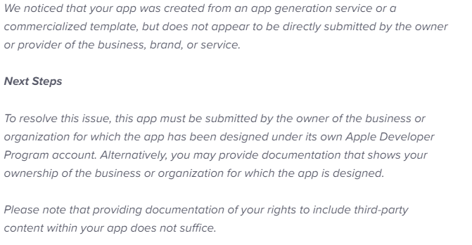
You’ll also need to provide the documents on the data encryption algorithm if your app uses non-standard for iOS encryption methods.
Reviews of subsequent versions of the app, especially those with small updates, usually take much less time. If you tweak only in-app purchases, you don’t have to send the whole app for review. In App Store Connect, an app developer can now initiate a review process for a new subscription option, product page, or specific pages. It means that you won’t need to create a completely new version of the app – only specify the elements that need to be reviewed.
Why an app can fail the iOS review
First and foremost, an app fails the review if it violates the App Store policies. If the expert finds a violation during the review, they reject the app and indicate the reason. In this case, they refer to at least one of the store rules, but don’t always specify what exactly needs to be changed. So the developer has to guess which element of the app seemed violating to the reviewer.
The human factor can also be an influence during the review, which can be both good and bad for the developer. In some cases, the expert may miss a violation, for example, if it doesn’t appear in every use case scenario. On the other hand, they may reject an app for a formal reason in an ambiguous situation.
If the developer is sure that no requirements are violated, they can appeal the expert’s decision. To do this, they need to provide evidence that the app complies with all the rules. Sometimes it helps to build a new version with minimal changes, as there’s a chance it will get tested by another, less biased specialist and successfully pass the review.
Some developers deliberately violate the rules and insert hidden features in the app that can be enabled remotely or run by timer after the app is reviewed and published in the store. Such apps are sooner or later found and removed, with their developers receiving sanctions up to account blocking.
More reasons for rejection:
- Bugs, too long content loading time or unstable work
- Not all functions are properly implemented, e.g., unresponsive buttons
- Privacy violation – the app trying to access the user’s data for no reason
| Rejection reason | App Store guideline | Why it happens | How to fix |
|---|---|---|---|
| Crashes on launch | 2.1 App Completeness | App not fully tested | Test on real devices |
| Incomplete metadata | 2.3 Accurate Metadata | Missing or misleading info | Update App Store Connect |
| Broken links | 2.3.3 | Invalid URLs in app or metadata | Check all external links |
| Hidden paywalls | 3.1 Payments | No clear disclosure | Explain pricing upfront |
| Missing Sign in with Apple | 4.8 | Third-party login used | Add Apple login |
| Guideline violations | Multiple | Policy misunderstanding | Review Apple guidelines |
How to make sure your app passes the review
The first thing you need to pay attention to before submitting your app for review is the App Store guideline, which describes all the publishing rules. They are updated from time to time, so it is important to follow the news for developers. For example, the most recent update to the posting rules concerns the ability to delete the user account and all the data associated with it. If there’s no such feature in the app, it won’t be able to pass the review.
For a subscription-based app, special attention should be paid to the requirements for the design and content of the in-app purchases. The store makes sure that the users’ receive exactly what they expected after the purchase: unlocking new features, getting access to new content, or activating a subscription.
What you need to successfully pass the review:
- Show all subscriptions or product options on one screen
- Describe each product clearly and fully so that the user understands what they purchase and at what price
- Even if the purchase terms take up a lot of space on the screen, they must be written in a readable font
- The terms must be visible at least partially without scrolling the screen
- Correctly indicate the cost and currencies of the purchase for the countries the app is available in
- Highlight the main, most beneficial subscription or purchase option
- Check that the description matches the content of the in-app purchase
- Correctly translate the product descriptions into all the languages used in the app
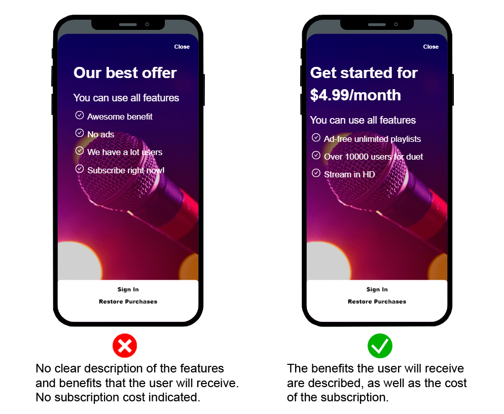
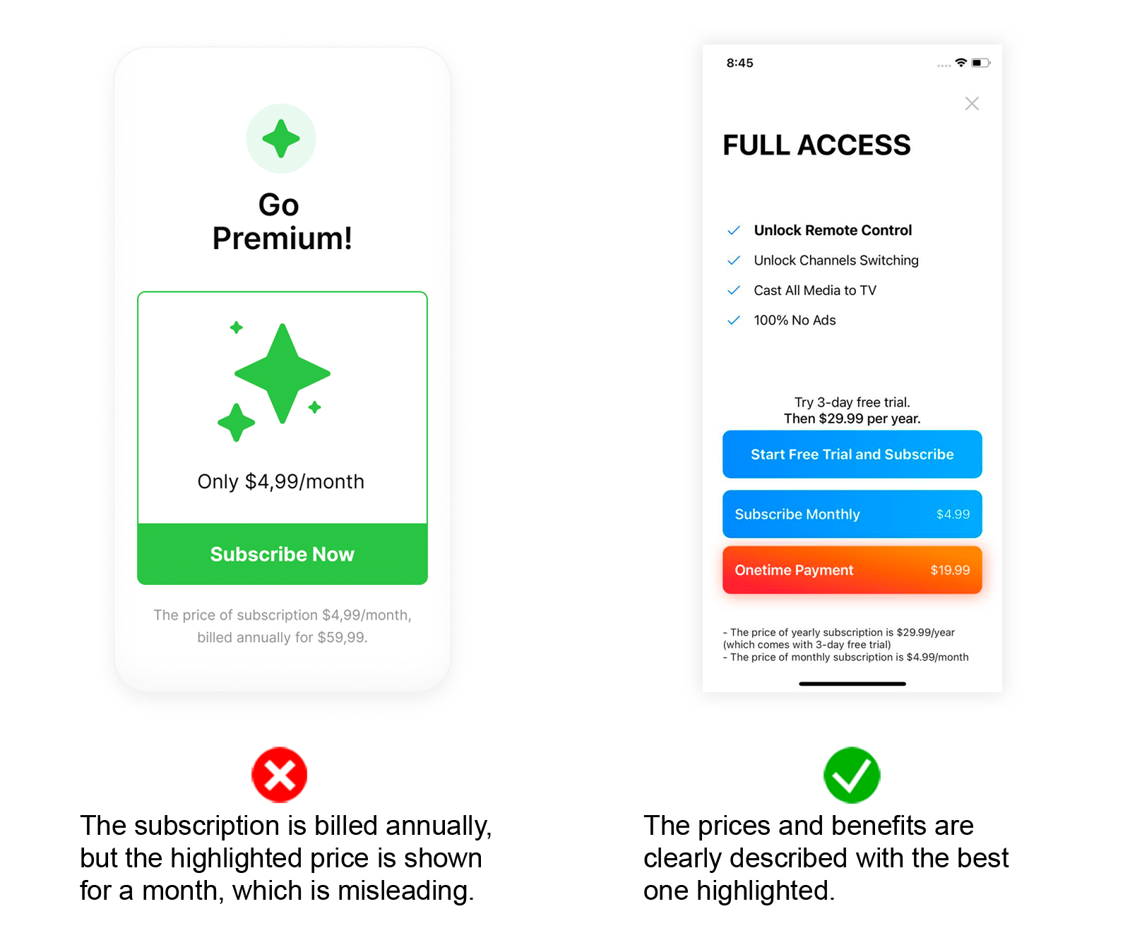
Additionally, it’s worth checking that the app has a “Restore Purchases” button, links to the privacy policy and terms of use. You should also remember to insert all the products and subscription options available on the purchase screen into the app itself.
Subscription and paywall requirements
| Requirement | Apple expectation |
|---|---|
| Pricing clarity | Price and billing period shown |
| Auto-renew disclosure | Clearly stated |
| Free trial | Conditions explained |
| Restore purchases | Visible option |
| Terms & Privacy | Accessible from paywall |
| Cancellation info | Explained clearly |
How to avoid unnecessary reviews
With every new version of the app, which may only bring a few minor changes to the build, you need to send your app for review. But there’s one way to completely avoid unnecessary reviews, and you may resort to it when editing your paywall.
Solutions like Adapty offer to build paywalls around the remote config feature, that enables developers to make changes to every paywall element remotely within seconds and no need to create a new version of the app. You simply need to attach placeholder values to every element of your paywall beforehand and then simply substitute their content with the help of a convenient JSON editor.
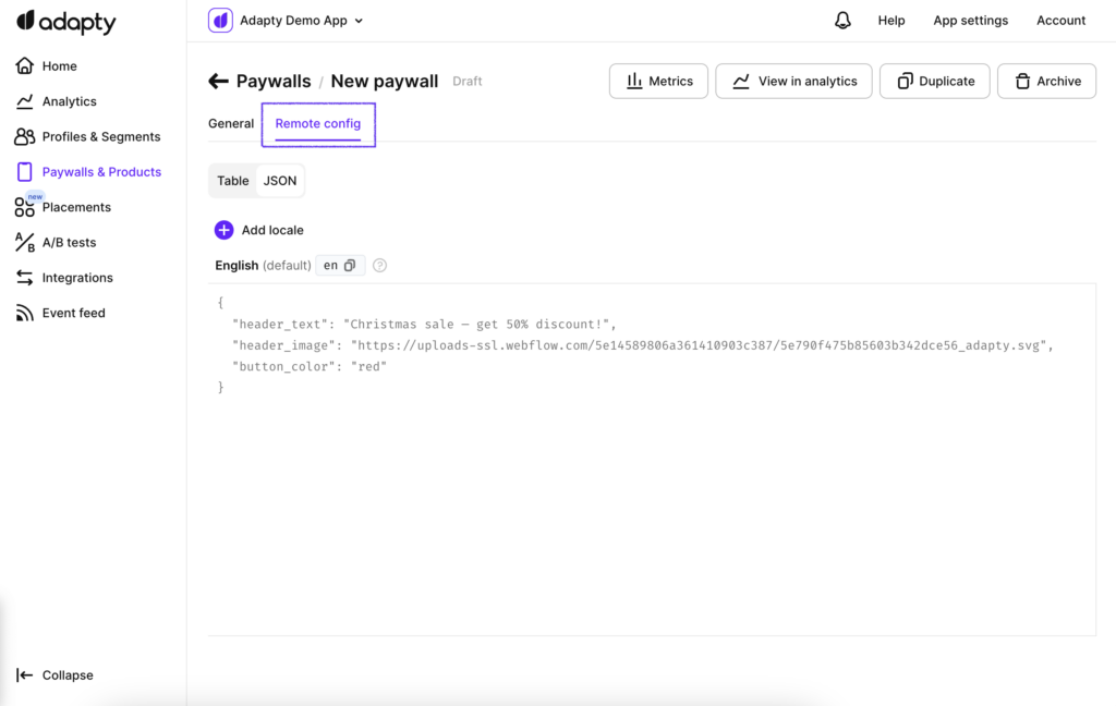
Another way is to create your paywall from scratch with the help of Adapty’s Paywall Builder. Using this tool, you’ll be able to choose among numerous templates and then adjust every element in a more user-friendly visual paywall editor with no code or designer help required. Create a paywall in 5 minutes and then either make it live in the app or create one more and start an A/B test to see which one performs better. Anyway, if you decide to make any changes to the live paywall made with the builder it will be a piece of cake that will also work based on the principle of remote config but in a more convenient manner.
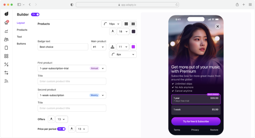
So if you plan on running paywall A/B tests or simply like the idea of applying changes to your app’s paywall without the need to send it for another long review – make sure to check what Adapty is about in our docs.
