In March 2021, California passed a bill that prohibits the use of “dark patterns” in the interface and thus brings this concept into the legal environment. Together with Adapty, a service for tracking and analyzing subscriptions, we have examined the most “popular” tricks of developers in mobile apps.
Join Adapty on Twitter and Facebook. Get the latest news about mobile subscriptions.
The concept of “dark pattern” was coined by Harry Brignull back in 2010 to distinguish the tricks in products that force a user to behave differently from what they would like to — for example, to persuade them to buy or sign up. He also identified 12 types of such patterns — from the extra product in the basket to subscriptions that can only be canceled on Mondays of a leap year.
Forbidden dark patterns
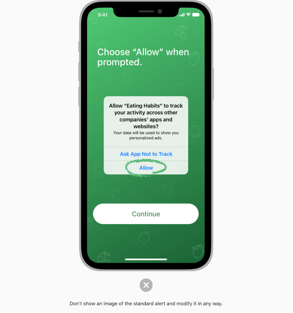
Fortunately, there are almost no such aggressive types of dark patterns in mobile products, largely due to the app stores’ policies that prohibit misleading users during the payment stages or when requesting access to user data.
The dark patterns that the reviewers still overlook are “bait and switch” and “misdirection”.
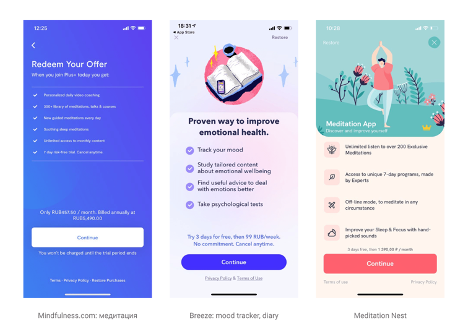
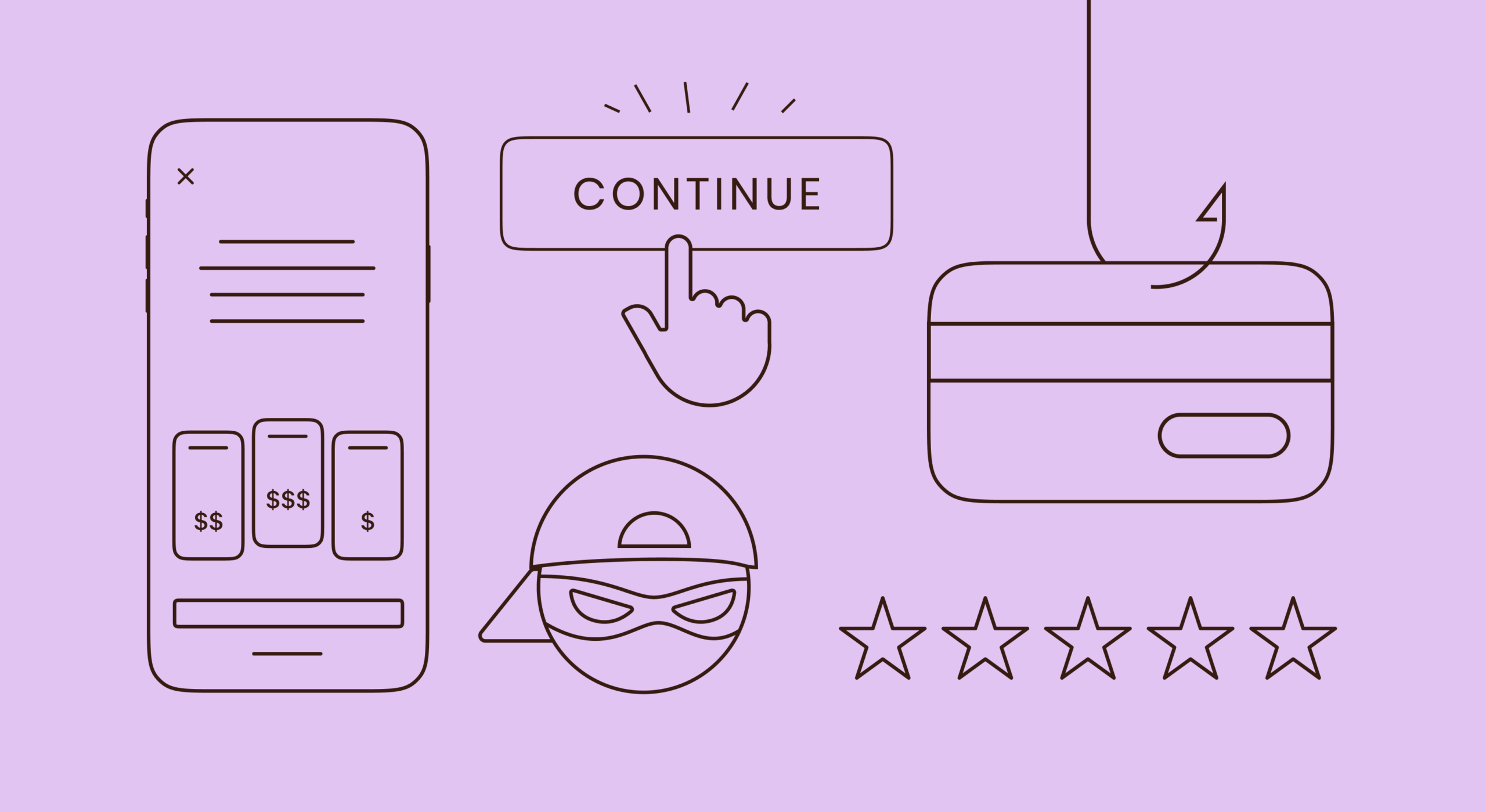
Misdirection is a design that focuses your attention on some object to distract you from unwanted (for product owners) choices. Previously, it was actively used to divert attention from the product’s price — it was written in small print next to the button on the paywall, or the partial price was highlighted (for a month or a week, for example), but not the full price that you will have to pay.
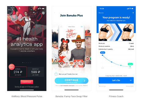
Nowadays, the use of these patterns is becoming less common, because, in the last year and a half, Apple prohibited manipulating the price this way — it must be indicated in full size, clearly, and in large print. You may also get a reject for the “Continue” version on the paywall button.
Moreover, during WWDC 2021, Apple said that they will allow developers to file complaints about the violation of guidelines by other apps, so the use of dark patterns will be detected and punished even faster.
Permitted tricks and manipulations
But this doesn’t mean that the products, in order to increase the conversion in purchase, will refuse to use other tricks — those that are based on our patterns of behavior and cognitive biases.
So far, there is no direct ban on their use in stores’ guidelines — after all, this is not a “misdirection” literally. Therefore, each developer decides for themselves whether to use these tricks in their product and in what quantity.
The three most popular ways to influence a user are scarcity, anchoring, and social proof.
We all felt the impact of scarcity on ourselves — this includes all offers with a time limit that came to mobile from offline and web.
Lost profits are worse than losses, so opportunities are considered more valuable if their availability is limited.
Quite a classic, even hackneyed, trick that is still effective.
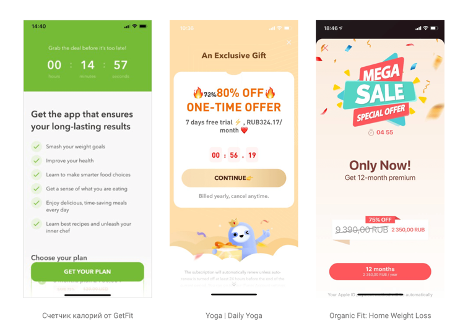
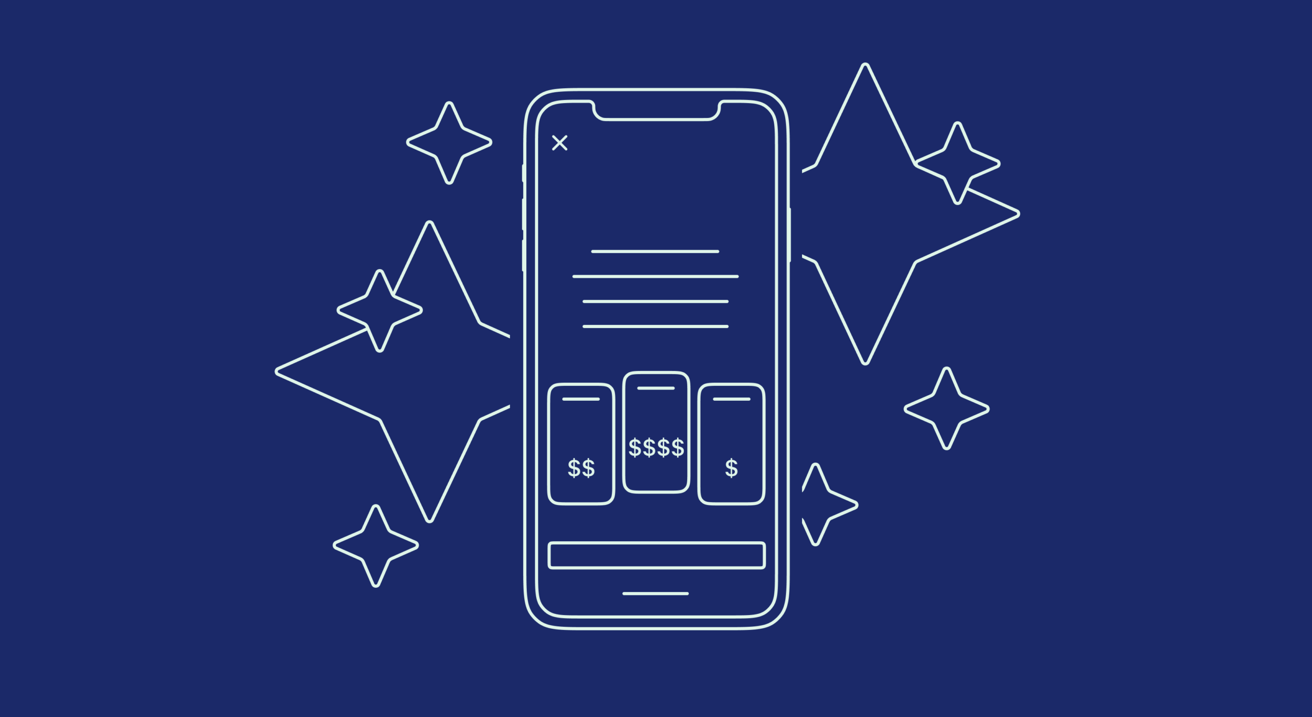
Anchoring includes all manipulations related to the price: for example, you can add a very expensive purchase of the full version of the app for a more vivid contrast to subscriptions, or raise the price per month to make the yearly subscription look more attractive (recalculation of the cost in months is mandatory here).
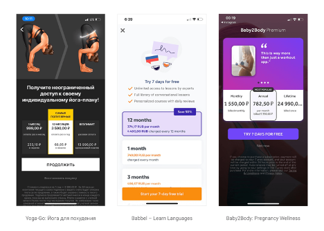
The principle of social proof states that when there’s uncertainty, we look at how other people act to make our own decision, and the more we relate to these “others”, the more they influence us.
Due to this principle, paywalls now have rating stars, and it’s not even necessary to indicate that this is an app rating or someone’s review — just showing stars will also work.
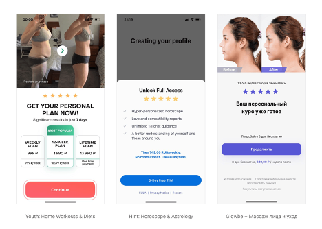
User reviews will work even better.
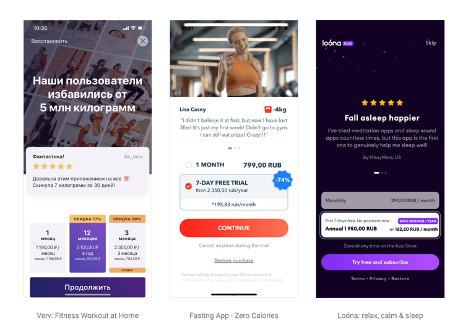
Sometimes this principle is used even more obviously — and the product says “do this, because everyone else does it”. You can find examples in requests to allow notifications.
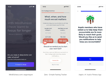
Or on paywalls as the “Most popular” badge according to the plan selected by default.

These are just three of the methods that I’ve encountered most often during my work with mobile products, but there are many more combinations and options, and new ones appear every day (you can find more examples on my Telegram channel Pimp My Paywall). Some of them are harmless (if your app has a wonderful rating, why not tell this?), and some of them use our natural negligence and cognitive biases and, quite likely, may also be banned at some point.
Each product is unique, and one or another method may work perfectly in your app, or may not work at all. In any case, experiments with paywalls, such as changes of products, prices, images, texts, etc., are the most important part for optimizing your business. Iteration speed and measurement accuracy are crucial, and in Adapty, you can conduct experiments with paywalls and measure the effect without having to release your app, right on the fly, instantly.
I’d like to know how you feel about such techniques, whether you use them and whether they work with your product.
Feel free to DM us on Twitter or Facebook!
