Paywall Newsletter #4
The 4th issue of the paywall newsletter containing insights on:
- trial period,
- price display,
- creatives, and more.
Paywalls of the issue are commented by:
Alice Muir, Senior Consultant at Phiture, together with the Phiture Retention Team.
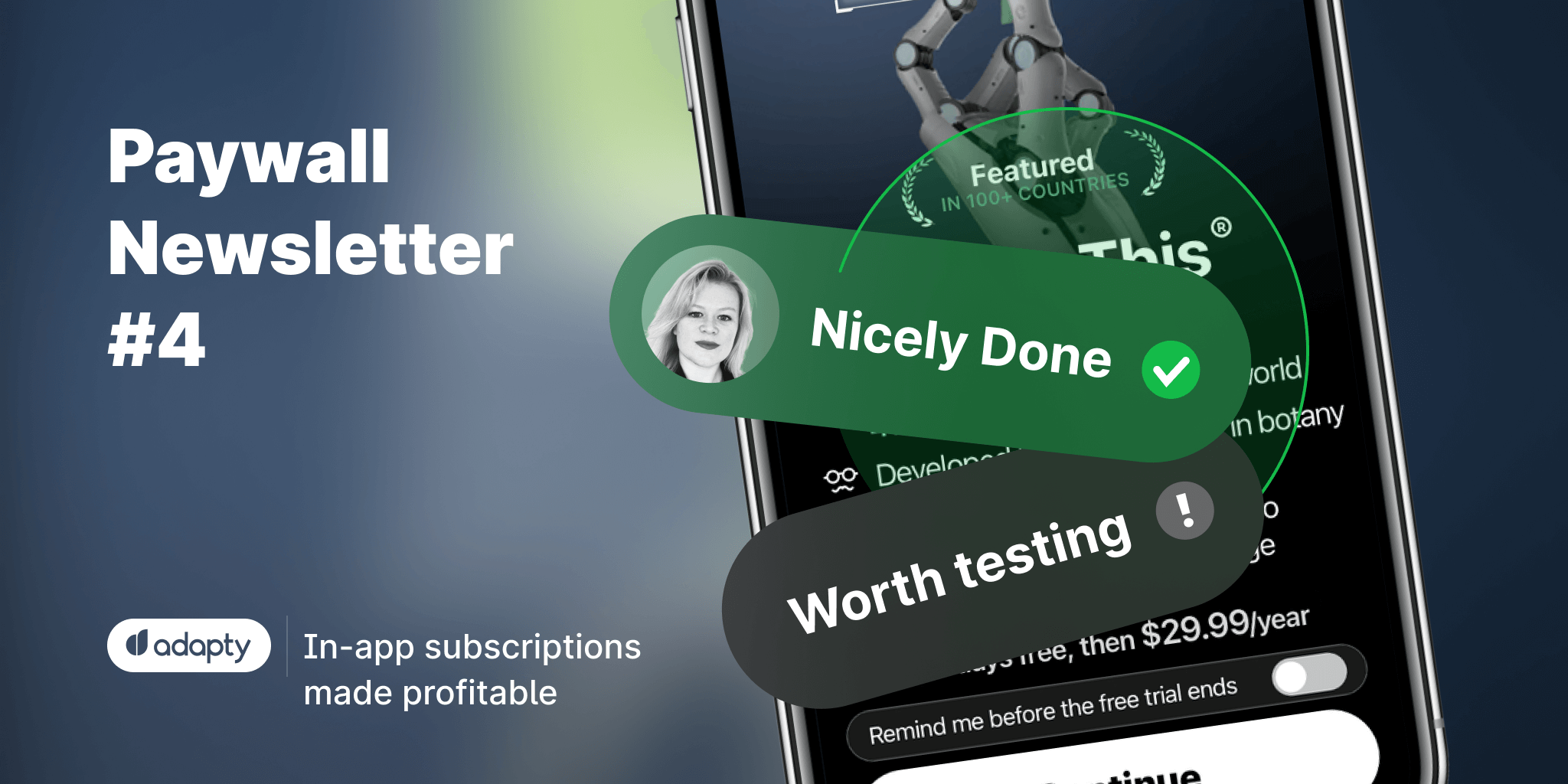
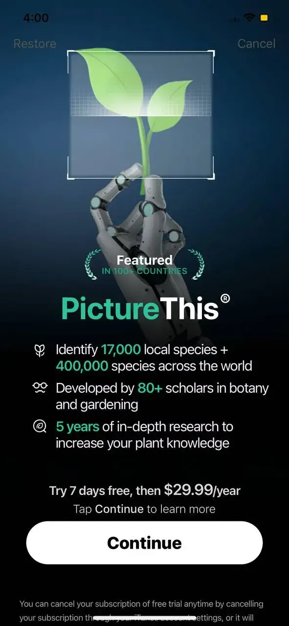
Picture This: $5m a month, still there is room for testing
Nicely done:
- High-contrast design
- Clear value proposition
- Permission toggle that evokes trust and transparency
Worth testing:
- Highlighting the 'Cancel' button or adding 'not now' button under the CTA. The 'Cancel' button is not clearly visible now and probably makes the paywall look a bit forceful
- Highlighting benefits rather than features, such as saving time on research
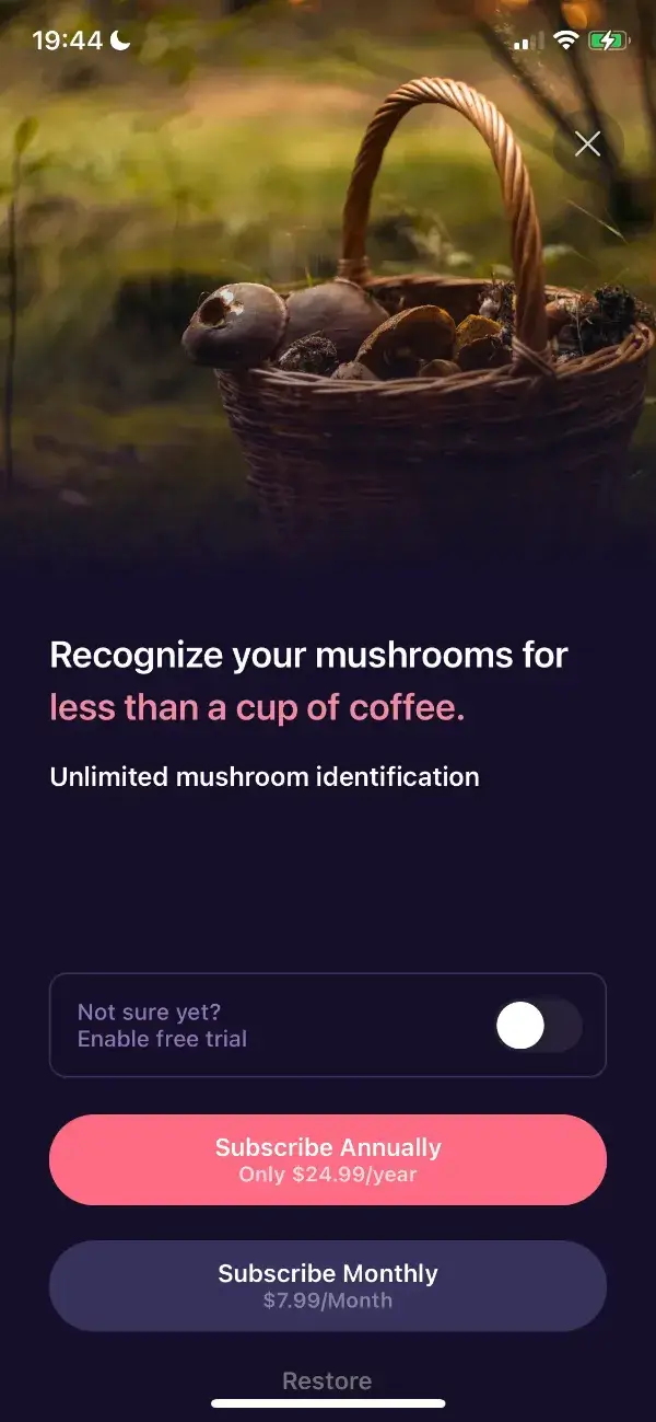
Mushroom Identificator: subscription or a cup of coffee?
Nicely done:
- Simple and straightforward design
- The CTA is clear and highlights the best deal for the user
- The interactive toggle is a nice psychological trick that's likely to bring a bit of “surprise and delight” to the user
- Comparing the monthly price to something that most people would passively pay for (cup of coffee)
Worth testing
- Highlighting the % saved with the yearly option (roughly 74%)
- More clearly stating the value proposition and what the benefits to the user are
- Making the information about free trial clearer: how long the trial lasts, if the trial is available for yearly or monthly subscriptions or both, etc
SubCap, that uses numbers in a both convincing and confusing ways
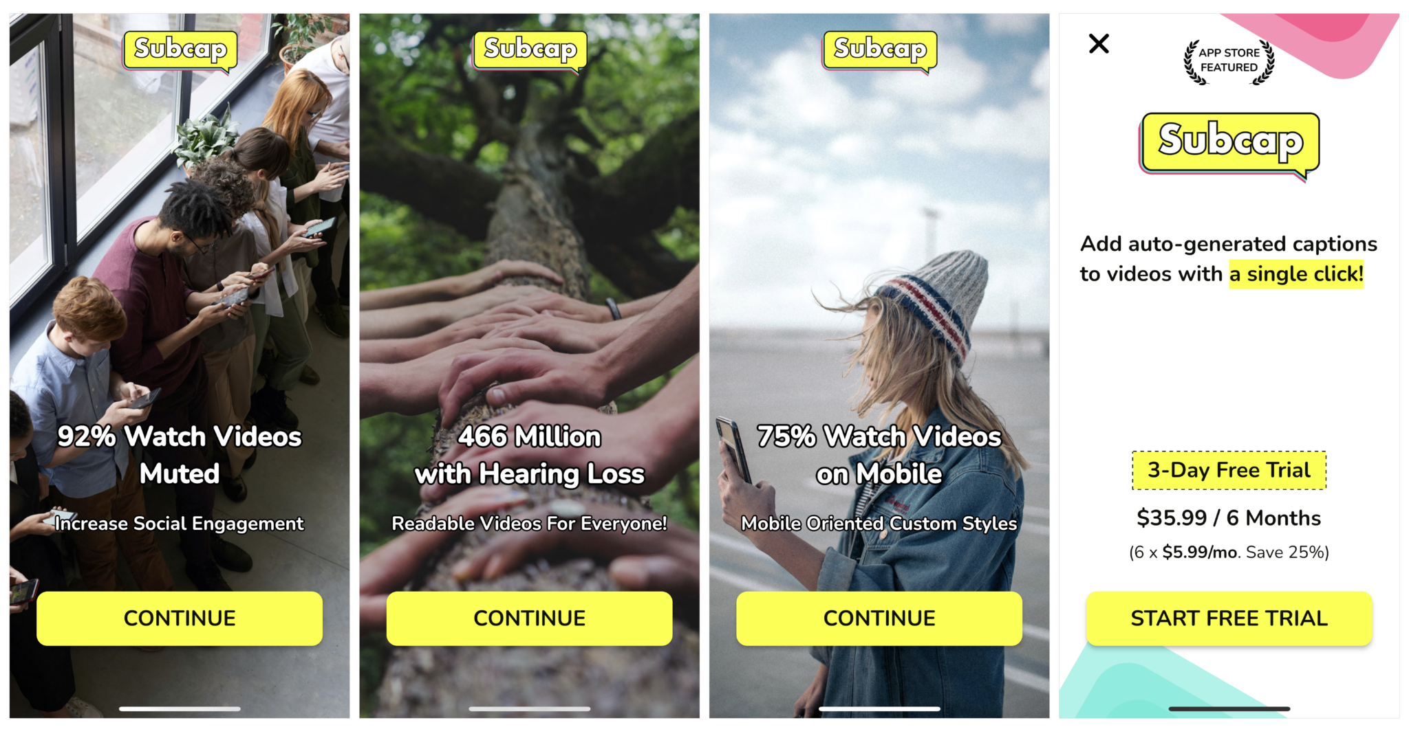
Worth testing
- Highlighting the CTA in a color different from the rest of the screen, as opposed to yellow
- Reiterating the facts from the onboarding screens on the paywall screen itself
- Highlighting some more of the stats and benefits mentioned on the App Store: Get 17% more reactions compared to non-subtitled videos
- More transparent price since 6*5.99 is not equal to 35.99$
- **It’s unclear where the 25% savings come from **since there is only one subscription option shown on this paywall
Nicely done:
- The onboarding uses data to convince users that captions are important: 92% people watch videos muted, 466 million people are hearing impaired, 75% users watch videos on mobile.
- Clear and simple design with the highlighted CTA
- Clear understanding of the main value proposition (e.g. “add captions to videos with a single click”)
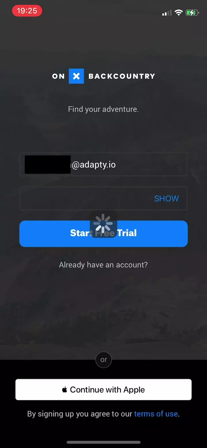
OnX BackCountry: showing a paywall upon registration
They meet the user with a registration form showing the 'Start Free Trial' button, instead of a 'Sign Up' button. The user fills out the form, hits the button, and sees the paywall.
Nicely done:
- Nice and simple design
- Great use of transparency with regards to how the free trial works while highlighting the value of the premium vs. free experience
- The “Maybe Later” option is ideal for retargeting users at a later stage
- Nice use of a colorful CTA button which stands out against the clean background. We also know from the industry that this psychological trick can increase conversion rates, perhaps because the user’s eye is drawn directly to the button
Worth testing:
- Highlighting the price text a bit more or making the text slightly bigger, to avoid suspicion from users
- Adding creatives related to walking and maps, so that the user can better visualize the benefit of the premium version
Enduco: they ride, but don't run
Nicely done:
- Good use of the user-focused wording (e.g. “train more effectively”)
Worth testing:
- Personalization. For example, showing a running creative to the users who have expressed an interest in running
- Including 'cancel anytime' at the bottom, where it says “free trial for 14 days”
- Positioning of the 'all advantages in detail' button to maximize visibility
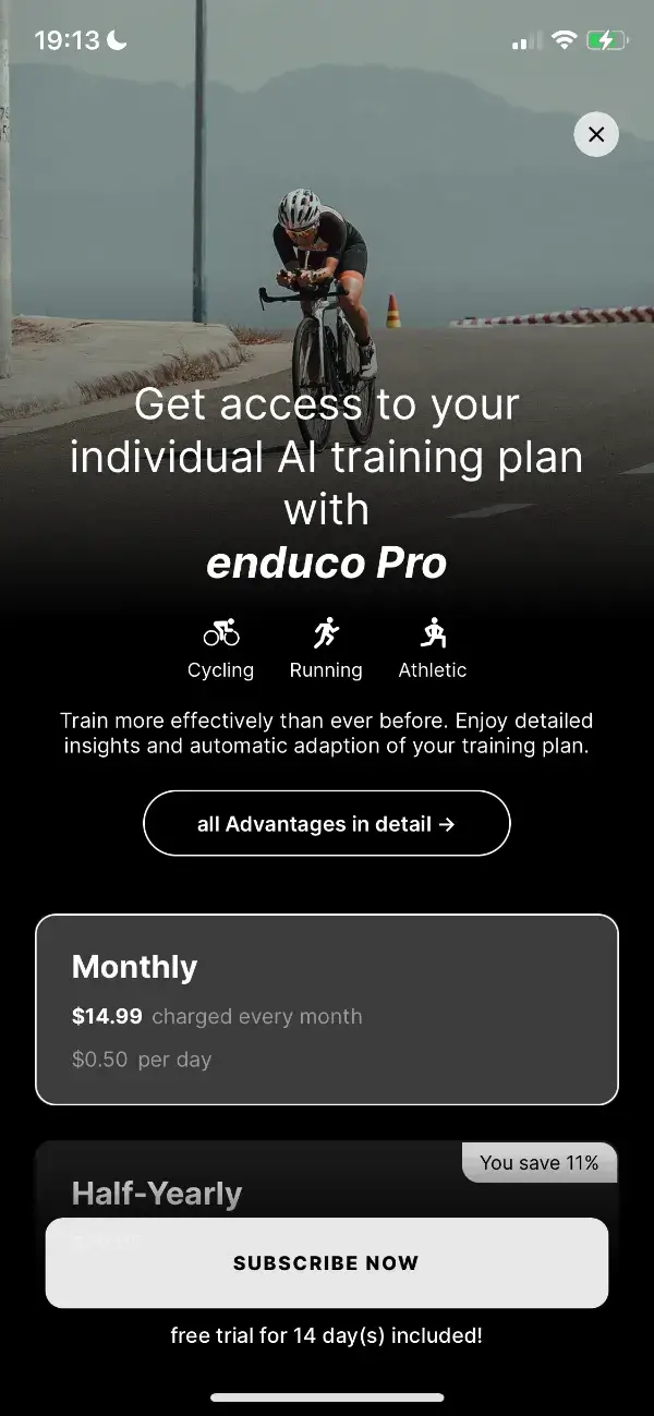
Something to consider:
This paywall is triggered only after completing a certain number of onboarding screens. If you skip or don’t complete these screens, the paywall doesn't appear, unless you search for it. We know from the industry that the majority of subscriptions happen on D0. Therefore, the publisher should ensure that the paywall triggers for the majority of users in that first session (to maximize visibility).
MyMP3: a week-long trial on a week-long subscription
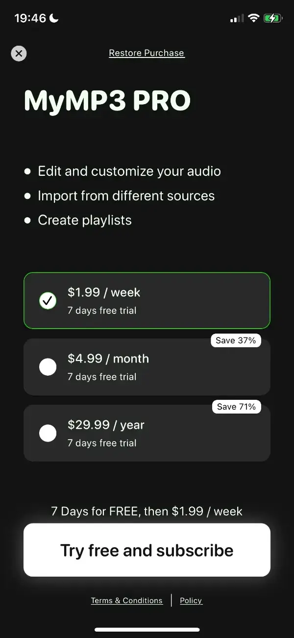
Nicely done:
- A good attempt at highlighting the discounts for users
Worth testing:
- A shorter trial period (e.g. 1-3 days). The publisher offers a week-long trial on a week-long subscription. Users might have maximized the value during that 7-day trial period and no longer have the need to subscribe
- Highlighting the best offer (yearly) with either a different color or by putting a colored box around it
- Pointing to the functions and benefits of the premium plan
- Adding “cancel anytime” to increase transparency instead of repeating the cost and trial terms above the CTA