Paywall Newsletter #11
TL;DR:
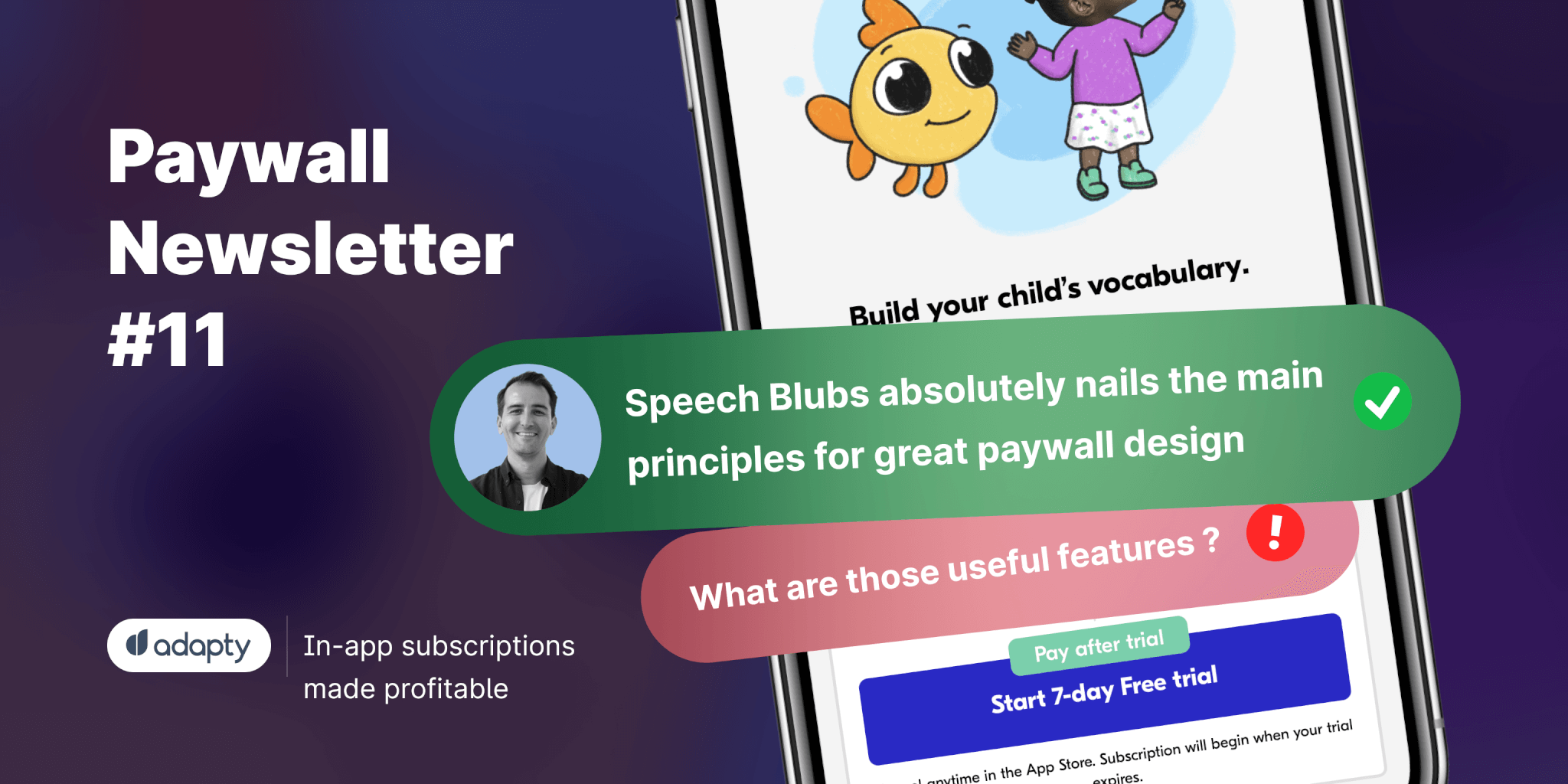
In the 11th issue of the paywall newsletter, you’ll find a paywall by Speech Blubs that ‘absolutely nails the paywall design’ along with some not-as-perfect paywalls that could win by adding more social proof, removing unnecessary information, and adding images.
In the 11th issue of the paywall newsletter, you'll find a paywall by Speech Blubs that 'absolutely nails the paywall design' along with some not-as-perfect paywalls that could win by adding more social proof, removing unnecessary information, and adding images.

Paywalls of the issue are commented by…
… Volkan Taban, Co-founder and Growth Lead for Gamester Kids.
Speech Blubs absolutely nails it
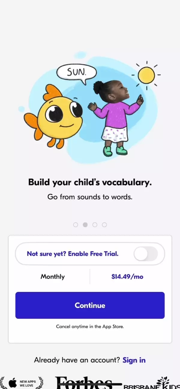
Speech Blubs absolutely nails the main principles for a great paywall design with:
- A statement of a clear value proposition
- Appealing imagery and sliders
- Clean, short, and effective copywriting
- Clarity, a great layout, strong contrast, and a soothing color palette
- Social, corporate, and academic proof
I especially liked the idea of using a "free trial toggle" as a limited-time trial offer trigger after the second visit. It creates a great urgency to start the trial. (If I were in their shoes, I would probably also test limited-time price discounts.)
Here's what I would test more to see if I can improve conversion (I'm sure the talented Speech Blubs team has already tested all these ideas, but hey, this is my take ?):
- Presenting two subscription options or at least a way to see the yearly subscription option.
- Alternative CTA text such as "Start Your Free Week" since the "trial" keyword is mentioned twice both in the button and above. (I sincerely understand the concern for support and reviews ?)
- Lastly, a close button for the paywall (I'm very curious about the drop-off rate of the current paywall) and limited freemium content before pushing for monetization to effectively demonstrate the value proposition.
Sleeptot motivates users with a sleeping baby
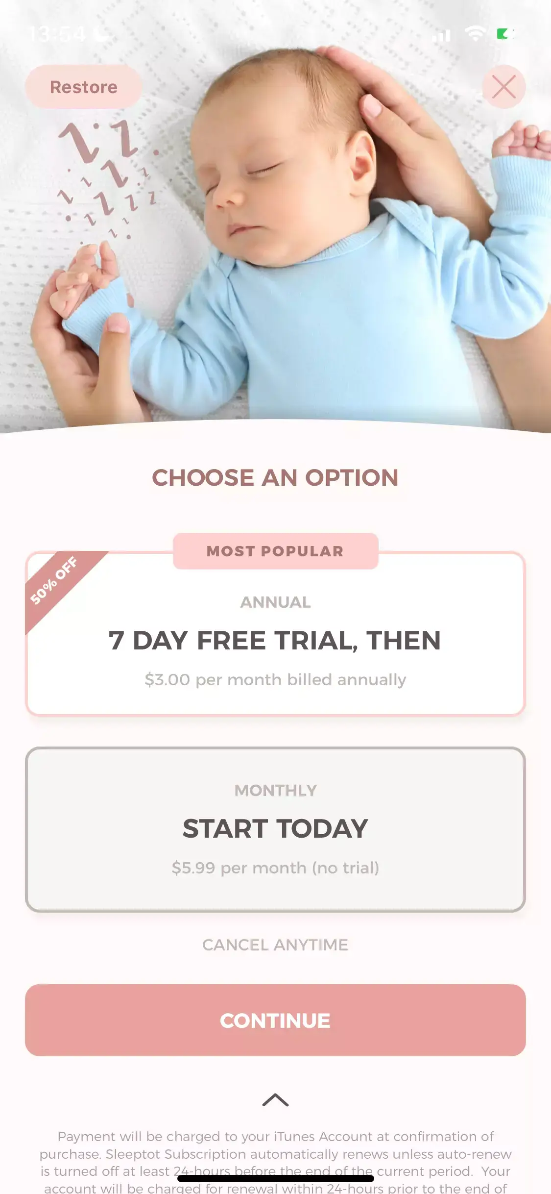
The paywall appears immediately after launching the app, without any onboarding process. This means that **the lack of a clear value proposition **and benefits can make it difficult for the users to make a purchase decision.
While the imagery of a little sleeping cutie melts my heart and showcases the main benefit of the app, I would still suggest testing the addition of more benefits and social proof to improve conversion.
The overall design and color scheme are appealing, but there are some dark patterns that can be improved for a better user experience.
Here are some suggestions:
- The price of the annual subscription should be clearly stated for better transparency and user experience. The current design could be rejected during App Store reviews for being misleading.
- The main purchase button is labeled "Continue", which goes against App Store review guidelines and may lead to rejection during the review process.
- The close button is difficult to see with the current design and could benefit from better contrast.
- The "Restore purchase" option is placed too high on the screen and may be better suited to being located under the main subscription button for a better flow.
Face Exercise made a too-long list of benefits
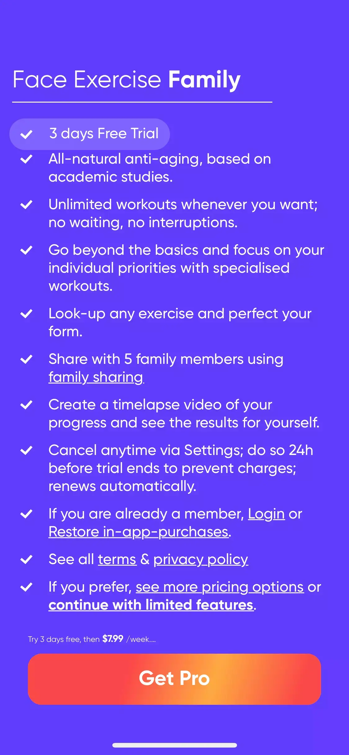
This paywall seems to be a variation of the classic "Calm" paywall. While it includes the value proposition and features of the app, as well as options to log in or restore purchases and a close function, all of these are listed as bullet points.
I would suggest focusing on the benefits rather than trying to include all the content in bullet points and shortening the text to make it more readable. With so many bullet points and so much content, it may be hard to convince users.
Additionally, I recommend implementing the following changes:
- Adding a clear and visible close button instead of a bullet point.
- Using a larger font size for the pricing and free trial lengths.
- **Presenting different subscription **options together.
- Testing alternative button text and color to improve conversion.
Quizlet's discount wants to be highlighted
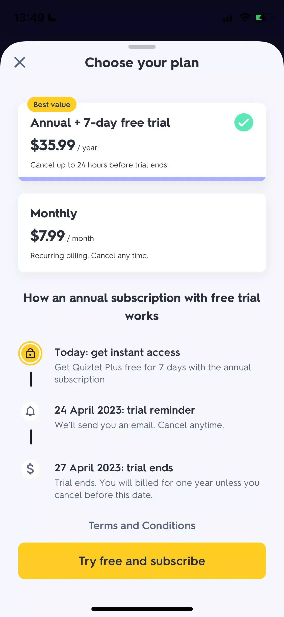
The Blinkist-style paywall has become the industry standard and is known to increase conversion with transparency and clear messaging.
I like the clear design; however, the lack of imagery made this paywall less attractive to me, especially for a gamified learning application.
During the onboarding, right before the paywall, there is a popup stating the value proposition with appealing imagery, but I would suggest testing it on the paywall itself.
Plus, I found the size of the main button a bit smaller compared to the pricing options on top. At first glance, the focus is mostly on the pricing options rather than the main action button placed below. So, testing with a bigger button size and color and text variations might offer a better conversion, I suppose.
My last two cents would be on emphasizing the discount for the yearly subscription option. There is a huge discount for the yearly plan, but it's not emphasized here. "Best Value" is not very convincing compared to "60% Discount".
Cardi Mate can try a longer trial
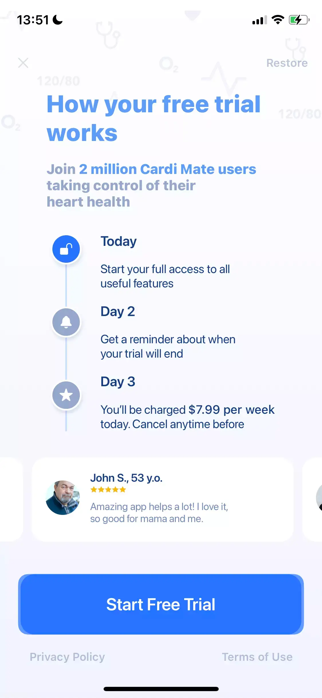
Here's yet another example of a Blinkist-style paywall. In this example, the developer chose a 3-day trial option and presented it in the Blinkist way. However, in this case, the Day 2 trial reminder might be a bit late, given that the Appstore asks users to cancel the trial before the last 24 hours.
According to our tests, there is also a significant conversion change between 3 and 7-day trial lengths, so I would suggest testing the 7-day trial option as well for a better user experience and higher conversion.
The main focus of the paywall is on the free trial process, but the value proposition and benefits are not clearly highlighted. In the first bullet, it's written that "Start your full access to all useful features," but what are those useful features?
The top part of the paywall can be utilized better. I liked the social proof "Join 2 million users," but still, the value proposition is a bit weak. I would suggest using the top area for value proposition and benefits.
They also used testimonials, but again, the testimonial text does not reveal much in terms of what to expect from the app.
Lastly, the close button placed on the top left of the paywall with low-contrast design is a bit misleading. I would suggest adding more contrast to decrease the drop-off and cancel rates.
MathPapa's paywall needs more design
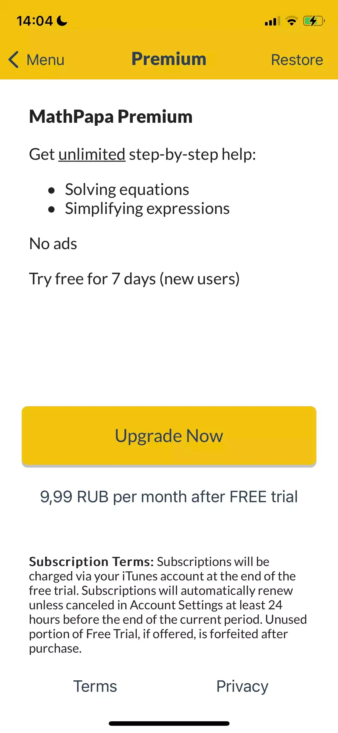
There are no misleading elements and the content is clear and to the point. However, it appears that the developer could benefit from the help of a designer to make it even more attractive. At first glance, I thought I was looking at the Apple Notes UI.
Here are some suggestions to improve it:
- The value proposition and benefits are solid and listed as the main elements of the paywall. However, a designer's touch can make them more appealing and meaningful.
- The bottom of the paywall is filled with unnecessary legal text. This space could be utilized better.
- Consider adding more subscription options.
- Consider adding** appealing imagery** to create more contrast.