Paywall Newsletter #3
TL;DR:
The third issue of the paywall newsletter containing a perfectly polished paywall of a big app, a paywall with the darkest pattern, a horizontal paywall
The third issue of the paywall newsletter containing:
- a perfectly polished paywall of a big app which leaves almost no room for future testing,
- a paywall with the patterns so dark, you'll need a flashlight,
- a horizontal paywall, because why not?

Paywalls of the issue are commented by…
Alex Bauer, Head of Product & Market Strategy at Branch, the author of the Mobile Growth News.
Let's see if there are any ideas you can borrow!
MyFitnessPal, how big companies do it
If you want a quintessential example of a perfectly optimised, A/B-tested, 'big company' paywall…here it is. There's basically nothing left to do here, but that won't stop them trying: I saw several slightly different variants of the text on this one just while testing it out.
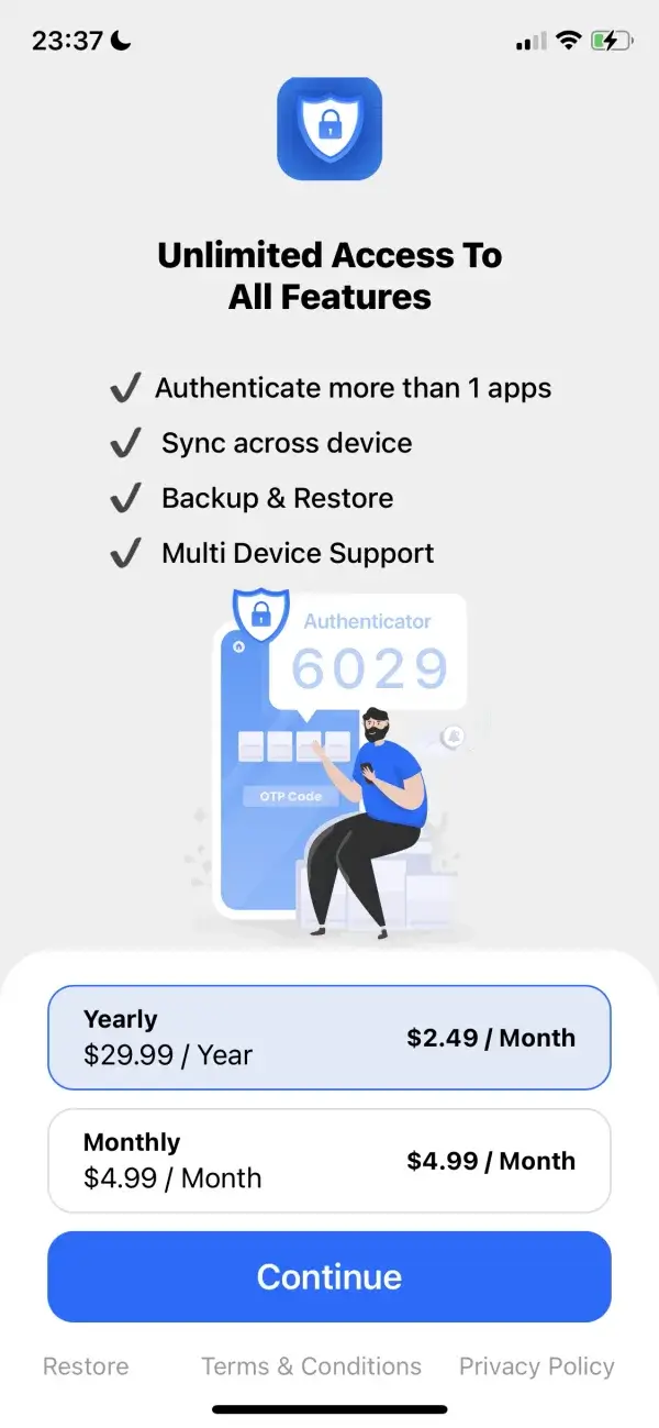
Authenticator, shiny on the surface
At first glance, this paywall looks polished. But details matter, and issues start to appear as one looks closer.
I appreciate the bullet points that highlight a few benefits of upgrading, but the numerous basic copywriting errors quickly make me doubtful about the quality of the app. And since this paywall pops up immediately after the first launch (and the X button to dismiss it is minuscule and doesn't appear until after a very long delay), the action I'm most likely to take is deleting the app.
If I were to continue, listing two different prices for each subscription option is unnecessarily confusing and makes it difficult to be sure about how often I should expect to be charged.
I'd rate this paywall as moderately unsuccessful. It's not intentionally deceptive to the user, but the app is most likely betting on people confusing it with other, better-known apps that have a similar name.
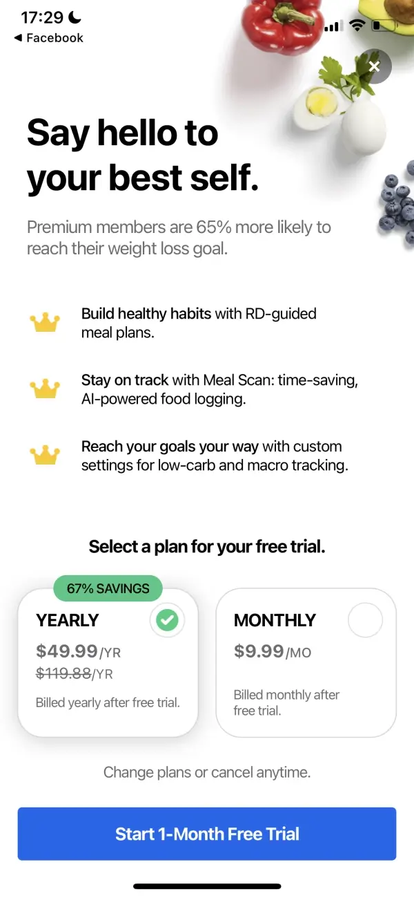
SimplyPiano, no one said paywalls have to be vertical!

Including the App Store awards for social validation is a good call, and I like that this paywall comes at the end of the carousel that explains the benefits of the subscription (because this allows to show far more details than would fit in a few bullet points).
The only minor critique: there is just a lot going on here. Many different prices, a bunch of possible subscription combinations, and I'm still not quite sure what to make of the two 'free apps' offered on the left side.
Magic Charger, it doesn't get worse than this
I have nothing complimentary to say about this paywall. The design isn't terrible, but the UX is actively manipulative and full of dark patterns.
This app is clearly doing everything possible to trick users into an extremely expensive, recurring subscription.
I've been hoping for years that Apple will crack down on such predatory behavior, and I'm surprised that this app passed even theexistingbar for approval.

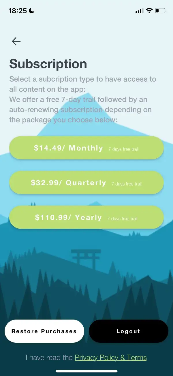
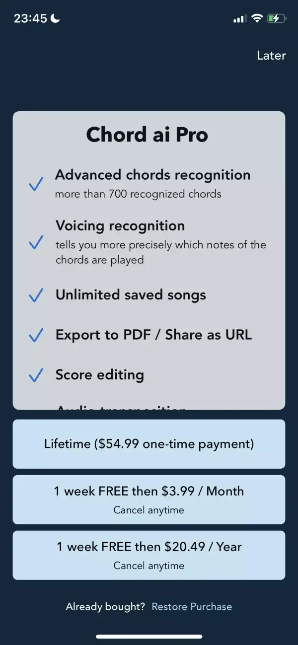
Chord ai, who even needs design anyway?
Even though this one isn't flashy, all the bones of a great paywall are here.
There's clearly some room to improve in the design department, but this might still be one of the most successful paywalls in the collection today because the app honors the most important rule of subscriptions: build something users will want to pay for, and then let them give you money for it in a simple and non-manipulative way.
Clear Minds, functional but such tiny text
This paywall would be immediately improved with just a little bit of TLC from a designer: things like improving the contrast of the copy, boosting the font size (did you even notice there's a free trial here?), and better spacing.
For extra credit, I'd like to see a few reminders of what the subscription includes, something to show that the longer options provide a discount, and perhaps a highlight for the preferred 'best offer' of the three.