Paywall Newsletter #9

The special issue of the paywall newsletter featuring 3 female mobile growth experts, 6 mobile paywalls, and 1 extraordinary dark pattern.

Peggy Anne Salz
Chief Analyst and Founder of
MobileGroove, nine-time author, and Forbes Senior Writer.
Two-screen paywall with a message from the future by Fabulous
Calling me by my first name is not a ploy. It’s part of a smart personalization approach that addresses me as an individual and inspires me to be all I can be (with the help of this app).
Put simply, this paywall is subtle and incredibly smart.
It’s irresistible. After all, who doesn’t want to be healthy and worry-free?
It’s comforting. My app is my companion, and it will be with me every step of the way. Who doesn’t want a companion that has their back?
It’s convenient. Just tap to start, and it’s “super easy to cancel”.
But there is a downside.
Membership is billed every 12 months. Does this mean signing up for membership at $3.33 per month commits me to pay the full amount in one go? Or do I pay monthly and have the option to cancel before the 12 months are up? Will the remaining amount be refunded? I can’t be 100% sure, and the language isn’t clear.
This is a little unsettling if we consider this app has made the promise to be my best friend and help me be a better version of myself… There shouldn’t be secrets between friends, and I feel the language here could be more upfront.
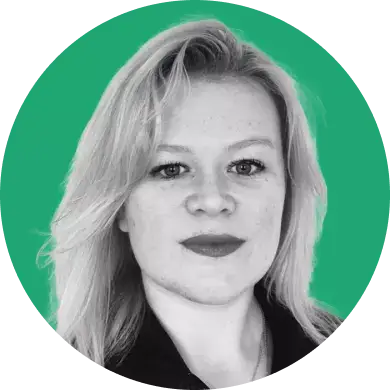
AI chatbots are hot, but this paywall isn't
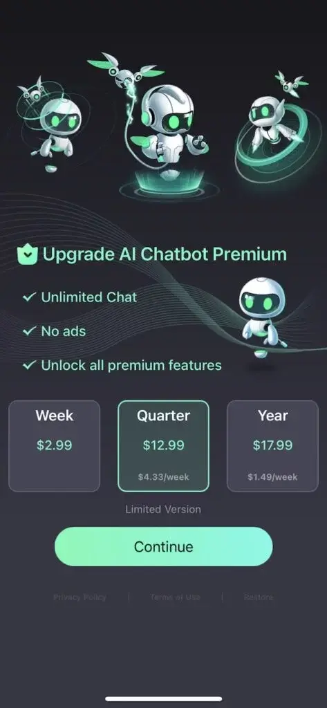
The creative is vague (could be a mobile game), and I don't fully understand what I can achieve with this bot and its bird.
If we leave the odd branding aside, we are left with the reasons why I would upgrade:
- Unlimited Chat
- No ads
- Unlock all premium features
BUT I don't know what the premium features are. It begs the question: what am I subscribing to in the first place?
The pricing options are visually clear, but that's where it ends for me.
The week costs $2.99 – that’s clear enough.
The $12.99 per quarter is clearly more expensive, which prompts me to ask: 1) why highlight it as it isn't a bargain? 2) what does the "limited version" mean or include? Could it be that "limited version" also has nothing to do with the $12.99 offer and it is merely centered on the screen and ended up under the quarterly package purely by accident?
The best value for money is the annual package, but the company doesn't highlight it. A "value of xx" badge or similar callout would grab my attention and possibly even convince me to purchase that subscription offer.
On the positive side, this is a company that knows its price and doesn't dilute its pitch with a free trial. The jury is out on whether a free trial is the best way to create a habit and, ultimately, convince users to commit to recurring costs.

Natalia Shakhmetova
CEO/CMO at Woofz, the must-have training app for all dog owners & owners-to-be
Prequel: a cool paywall with room for testing
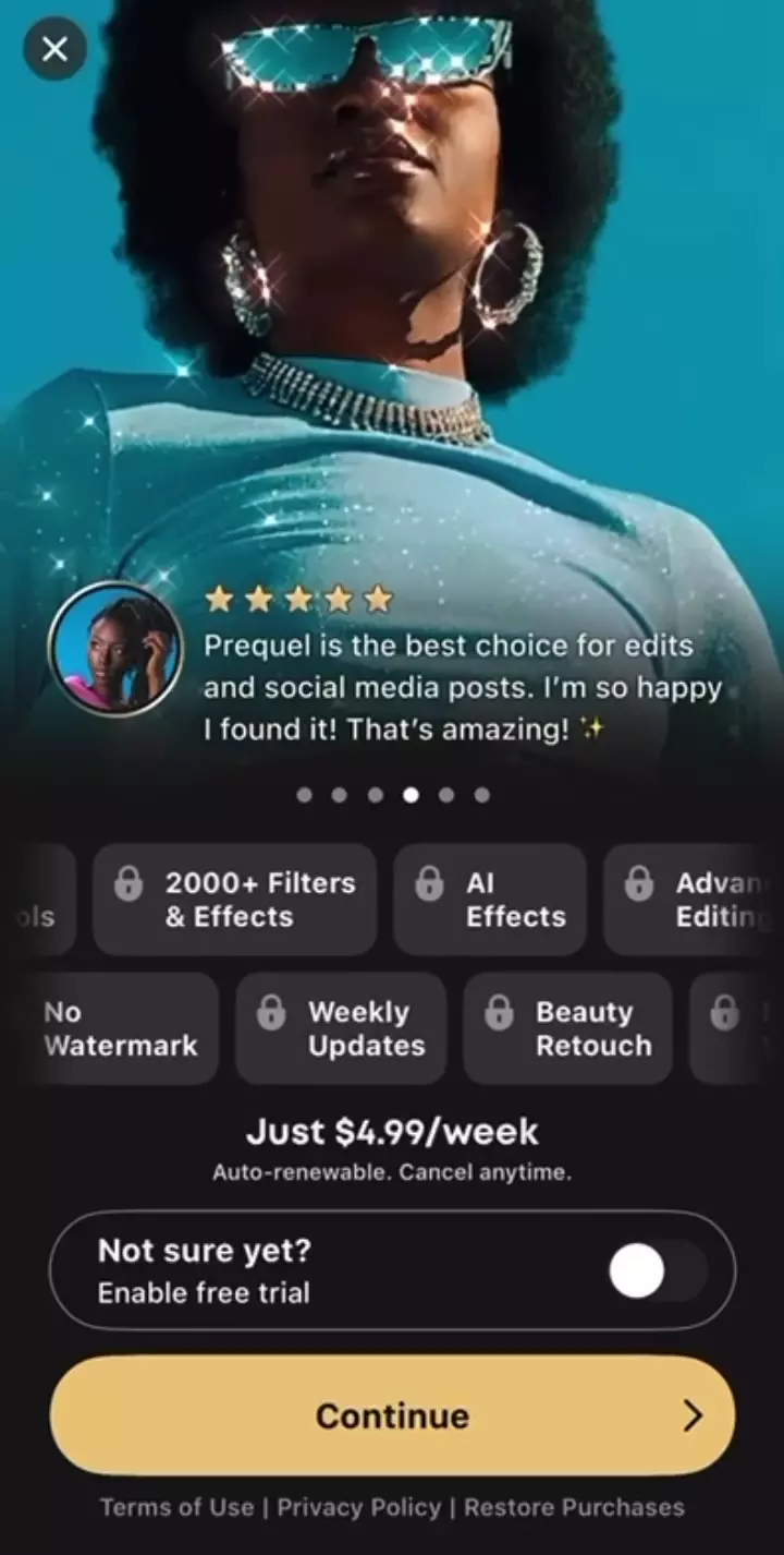
The category of photo and video editor apps is highly saturated, so following major players is a safe bet for achieving a 100% successful payment screen. Prequel is one of such players.
Prequel has a cool dynamic paywall at the end of its onboarding process, featuring several beautiful elements:
- Dynamic image changes: examples of effects, user reviews, and ratings create a nice hook.
- A toggle for switching non-trial subscriptions to free trial ones.
- A big button with a haptic and the best-selling text (in my opinion).
- A big cross that saves the app from Apple Reject.
However, there are some points to consider for testing:
- Premium effects and features locked behind a paywall look not so attractive to me as a user.
- Offering only a weekly subscription for $4.99 may not be the best option for increasing LTV, especially for a large application. A more diverse and complex price matrix should be tested to increase LTV.
Koloro: there is an easy way to increase conversion
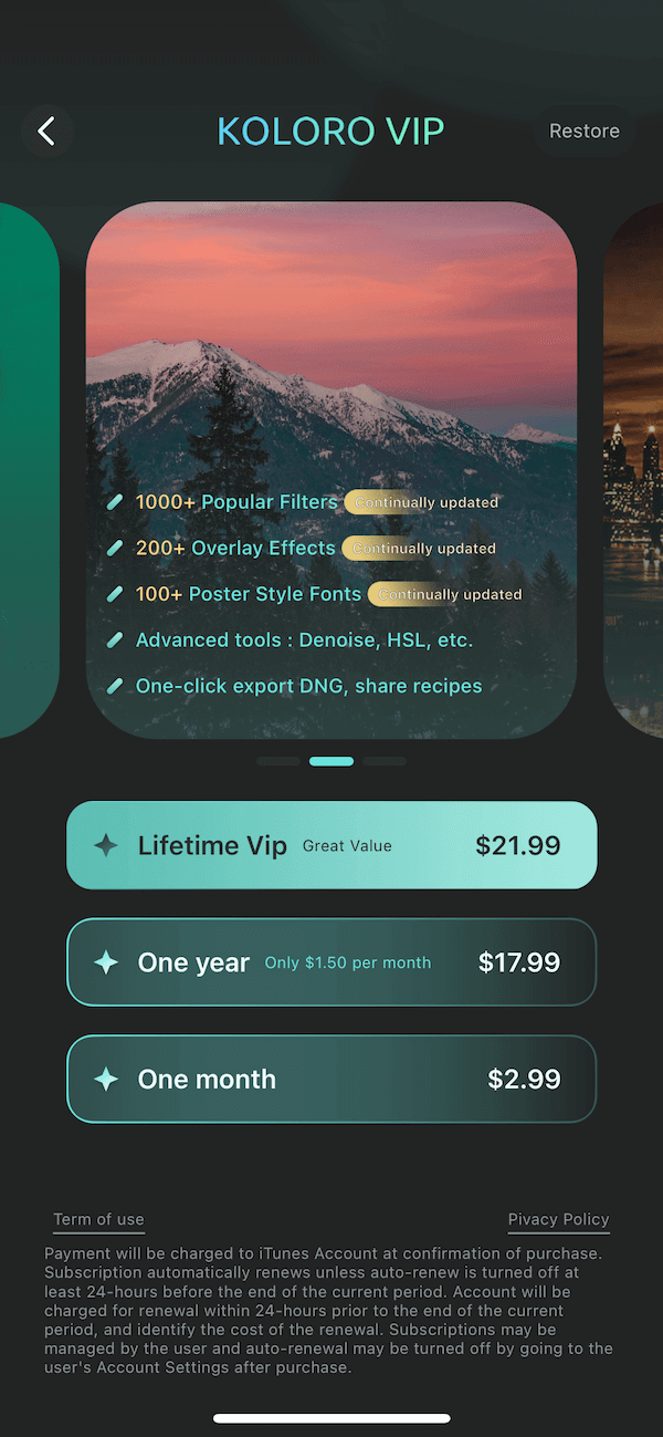
You know there is nothing easier than copying a selling screen from a big player in your niche. I advise all indie developers to just copy their first payment screens without any hesitation.
Now let's move on to this particular screen. Unfortunately, they do not follow my advice.
There isn't anything cool about their screen, and there is plenty of room for improvement:
- Where is the button? I bet that adding a button could boost their conversion by at least 10%.
- They need to work on the design of selling points; everything is currently unreadable. There's a huge accent on the picture of the sunset and a small accent on the features they provide.
- Priorities in the price box section need to be changed. Benefits (free trial period, discount size, etc.), name of plans, etc., should always be designed using uppercase and bigger fonts. Details of the plan and prices can use thin and small fonts.
- Less legal text, please. You can carefully pack it in laconic links.
- Replace the arrow with a cross. In my opinion, the arrow might confuse users.
- Add at least one trial plan. Users will be more willing to convert with this option available.
Alice Muir
Senior Consultant at Phiture, App Marketer of the Year 2022
Less Web needs more ideas for their paywall
While this paywall has a clear and simple design, it perhaps lacks a description or clearly outlined benefits of the premium version. The publisher could try highlighting the following premium features to see if there is an increase in conversion.
However, we do recommend that these features should be highlighted from the perspective of how they benefit the user, as opposed to simply stating the premium features themselves:
- Full anonymity
- Protection from being tracked
- No more intrusive ads
- Data compression
- Battery saving
- Comfortable use
- Tabbed browsing
- Convenient settings
The yearly subscription option has a significant cost-saving benefit, and it would be worth highlighting this on the paywall to draw attention to the percentage saved. This is especially beneficial for the developer if more users are drawn to the longer-term subscription plan, and therefore the developer has more predictable revenue.
The creative is vague and could be confusing. Something that resonates more with the app’s core use case could build more trust and transparency for the user.
Bonus by Adapty Team: a trick by Lensa
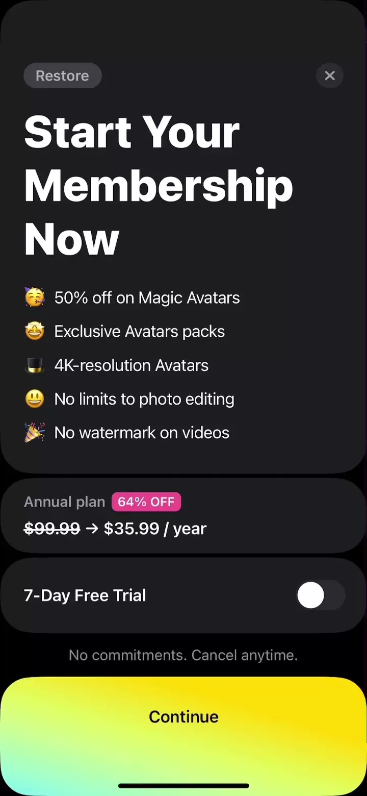
Have you ever seen such a trick before?
The "Continue" button on Lensa's paywall motivates users to scroll, but upon scrolling, they are shown a payment confirmation screen.
We don't encourage our subscribers to use dark patterns, but this design is definitely worth a look.