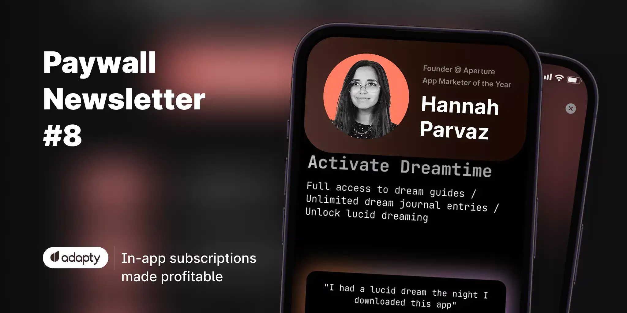
Paywall Newsletter #8
TL;DR:
In the 8th issue of the paywall newsletter: a lesson in transparency, a FREE trial for the wrong subscription plan, and a paywall that makes users search for it.
This is the 8th issue of the paywall newsletter in which we'll see:
- A lesson in transparency,
- A FREE trial for the wrong subscription plan,
- Paywall that makes users search for it.

Paywalls of the issue are commented by…
Hannah Parvaz, a winner of the App Marketer of the Year by App Growth Awards, and a founder of Aperture.
Sporty girls, personalization, and a free offer
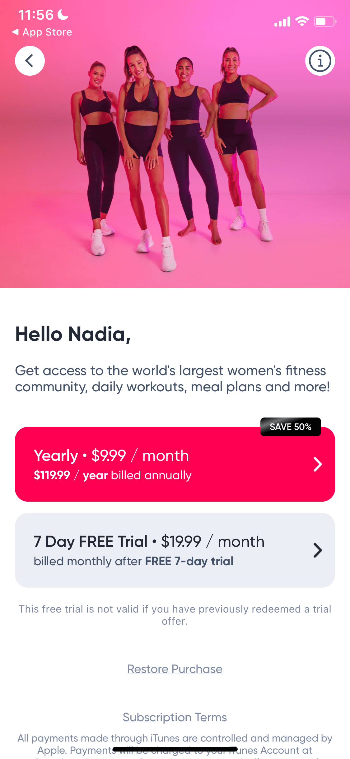
Bright colors and partially dressed women capture the eye in this one. I’m interested in the use of the name on this screenshot, as this is atypical. I would assume it’s only there after a lot of testing, but I’ll be trying this out.
This paywall makes me wonder what the monthly vs yearly subscription split is, as both options are made to look appealing.
Most products I’ve worked with want to push as many people to yearly as possible, so I’m shocked to see a free trial only on the monthly subscription. FREE is written there twice, and it’s very eye-catching.
On top of that, it seems to me as though the yearly plan is selected, but there is messaging underneath which refers to the free trial.
To increase yearly subscriptions, I would add a free trial to that plan and remove it from the monthly one.
A paywall that makes users search for it
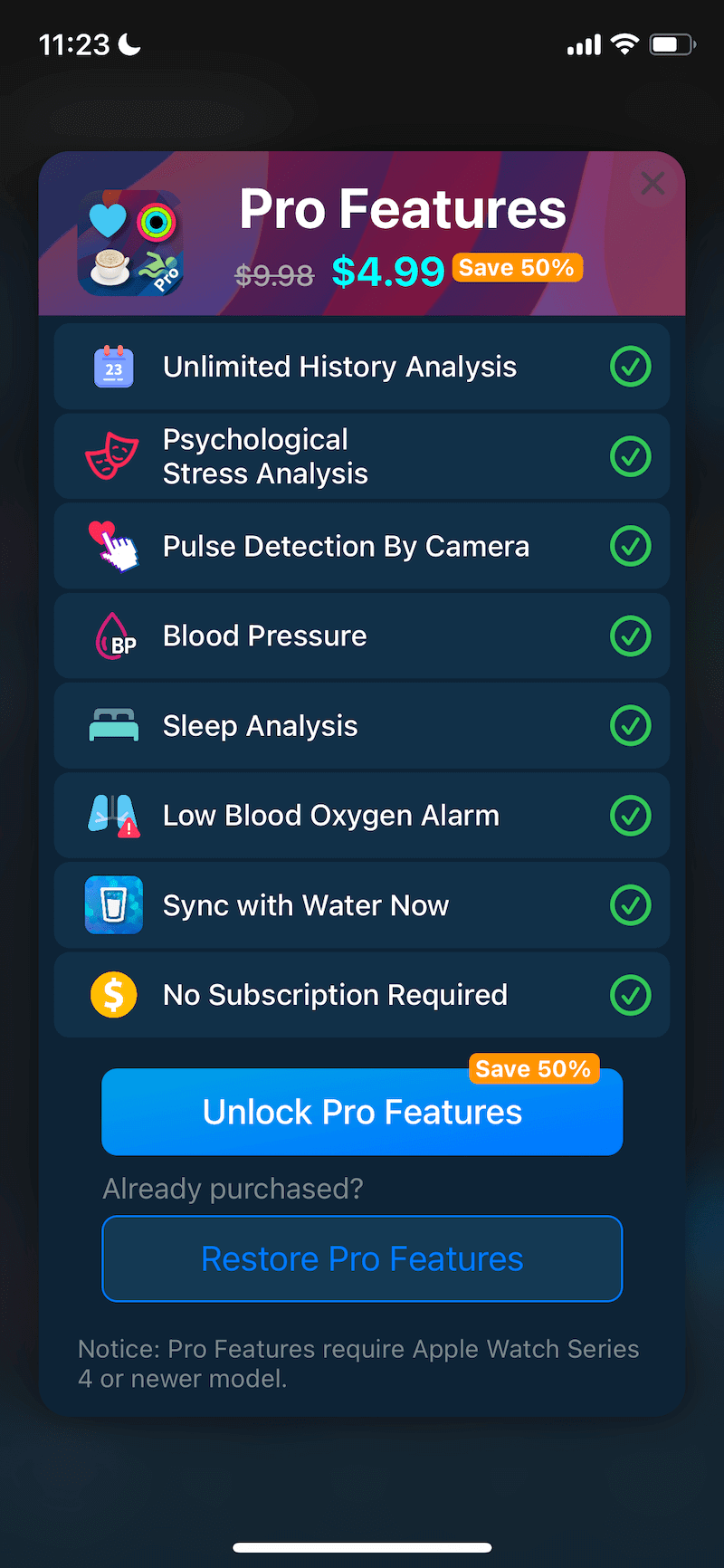
This paywall doesn’t appear quickly enough in the journey. The user has to click onto “Upgrade to Pro” to see it. So, the first thing I’d do is make the paywall appear automatically at some point during the initial user journey, even before the sign up.
There is no trial on the paywall, which is why it may be hidden: there may be the rationale that someone would only be willing to pay after they’ve tried out the product, but making the paywall at least a little easier to access would make a big difference here.
On top of this, there’s a lot of text on the paywall which makes me feel a bit overwhelmed. The key things I’d do here are:
- Have this screen appear as a part of the onboarding flow, or at least on every subsequent launch.
- Introduce a trial to encourage customers to engage.
- Decrease the amount of text to highlight the key features.
- Include educational comms about the rest of the features.
- Include tooltips and contextual paywalls when someone engages with a locked feature.
A Blinkist-style paywall that is still a thing
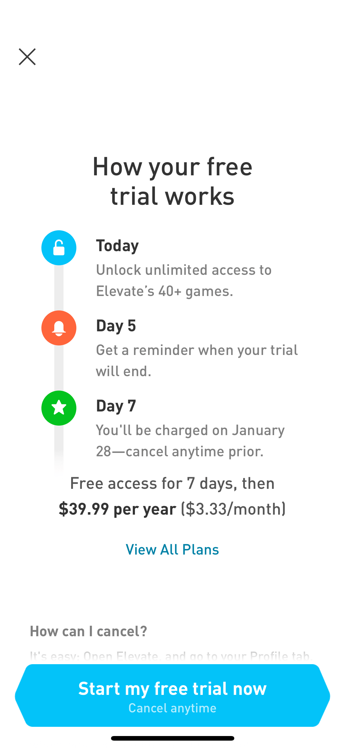
The Blinkist-style countdown paywall has shown to increase conversion both to trial and from trial to paid. This template, which is a masterclass in transparency and clarity, has been borrowed by Elevate.
From this screen alone, it’s very hard to tell which product I’m looking at, so it could be worth including a logo or a clearer brand name.
On top of this, the focus of this paywall is solely on the free trial and there's nothing that highlights any subscription benefits. There’s a lot of clean space on this paywall, so this could easily be fixed with a line describing the perks of paying for premium.
The CTA copy is great, having experimented over the last decade with copy, this one is amongst the top performing copies we’ve seen. The only way we’ve seen to improve the CTA copy is to include the length of the trial (Start your 7-day free trial).
They shape your dreams, so they should their paywall
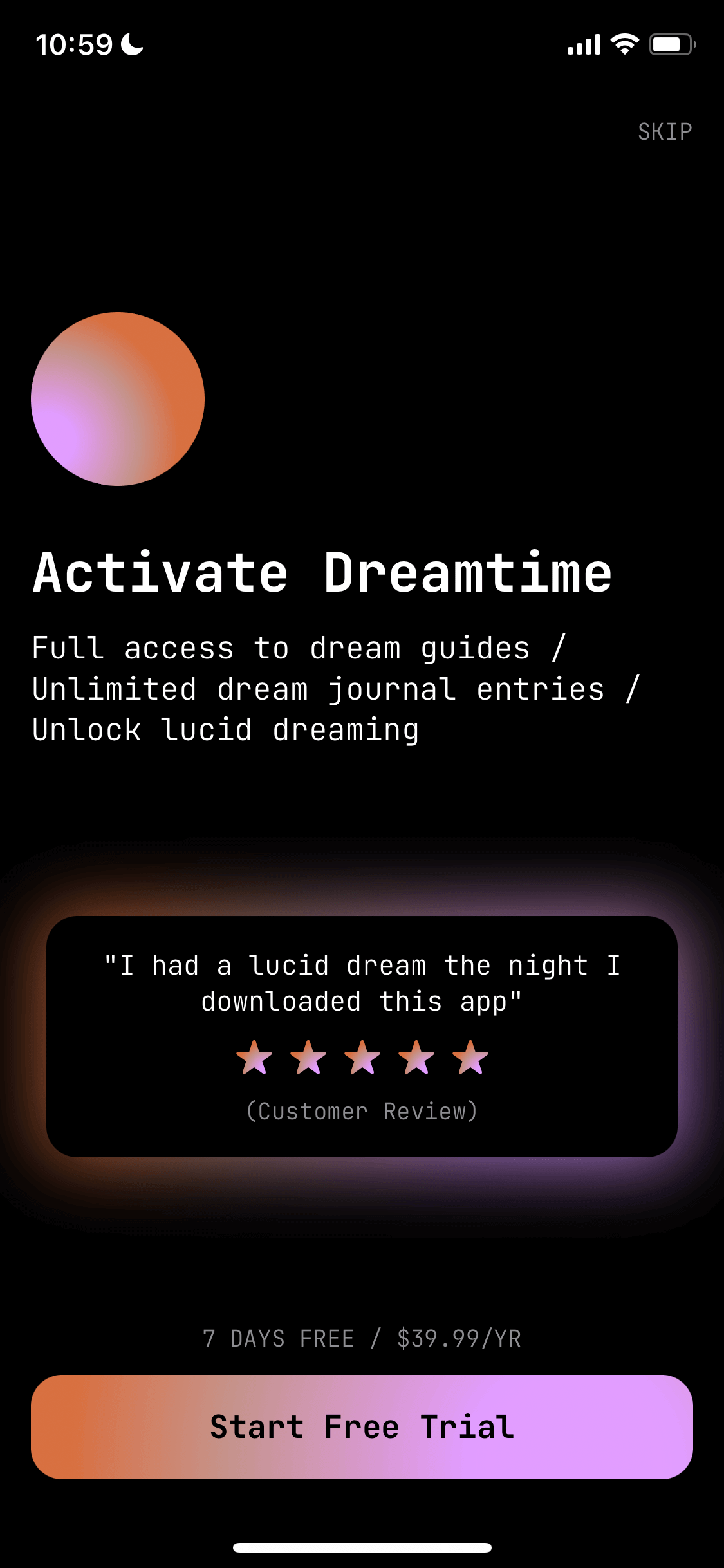
There are a lot of good things about this paywall: social proof, free trial, CTA mentioning the free trial, and the list of benefits.
However, there are also many aspect to improve. Although the paywall features social proof, the message could be more convincing. I’d love to know what the customer is trying to accomplish by lucid dreaming and include this as a part of the social proof.
Compared to the clarity and transparency of the Elevate x Blinkist, this Shape paywall makes it very hard to see both the price and the length of the trial.
There’s also a lot of free space availble at the top of the screen, which could be used more wisely, for example to expand out a few of the the benefits of upgrading.