Paywall Newsletter #17

Updated: December 10, 2024
6 min read
This is the 17th issue and it’s dedicated to the most popular intro offer – free trial. We’ll take a look at the paywalls of several popular apps and see how they approach it. You’ll find:
- Wise use of paywall space,
- Free trial as a separate product,
- Paywall that’s too humble,
- And more!

Paywall insights provided by…
Daniel Layfield, Growth and Product Management Expert, the Creator of Subscription Index.
1. Flowkey: Explaining before selling
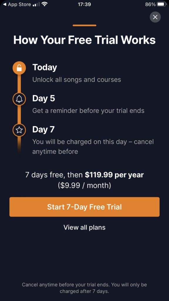
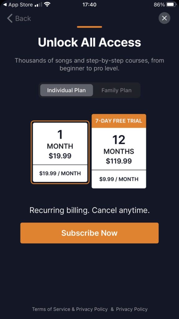
This app for learning how to play the piano has a complex paywall where the first screen shows how the trial works and offers a yearly subscription with a 7-day trial. Other options for individual and family plans are available on the next screen after tapping “View all plans”.
Overall, it does a great job of clearly explaining how the trial process works and making the upgrade seamless. I think the next level of growth could be unlocked by testing the ratio of prices between the annual and monthly plans.
MRR >$500k
2. Voloco: Smart use of space
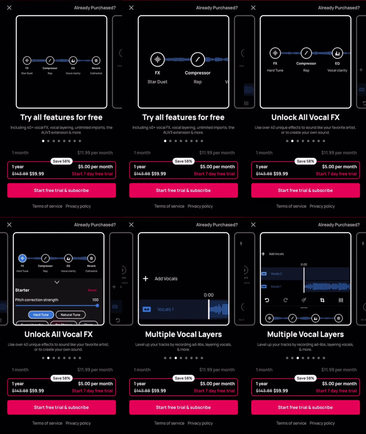
Voloco, an app for recording and editing vocals, has a bit different approach. Its paywall is more focused on visually explaining the app’s premium features with the help of a manually scrolled slider.
The app uses one screen and does a great job visually conveying a product in a really tight space, but the only piece of clarity that could be helpful here is explaining how the trial works and having more focus on how long I have to try the product before I pay.
Voloco: Vocal Recording Studio
MRR >$200k
3. TuneIn Radio: Clear and simple
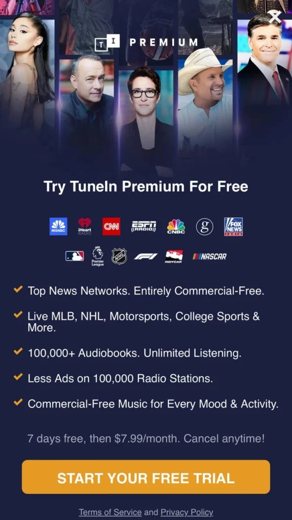
Things are always easier with apps that provide media content – most of the time you install them because you already know they will grant you access to your favorite series, channels, or podcasts, so they don’t have to induce you too much. Yet, they almost always offer a free trial, which is nice of them.
Love that they clearly articulate the content that I get access to in this product. The fact that they only give you a monthly plan makes sense assuming that they can retain users for more than 12 months, which is really hard to do. If they have under 12-month retention they should think about adding an annual plan with the appropriate level of discount.
MRR >$1M
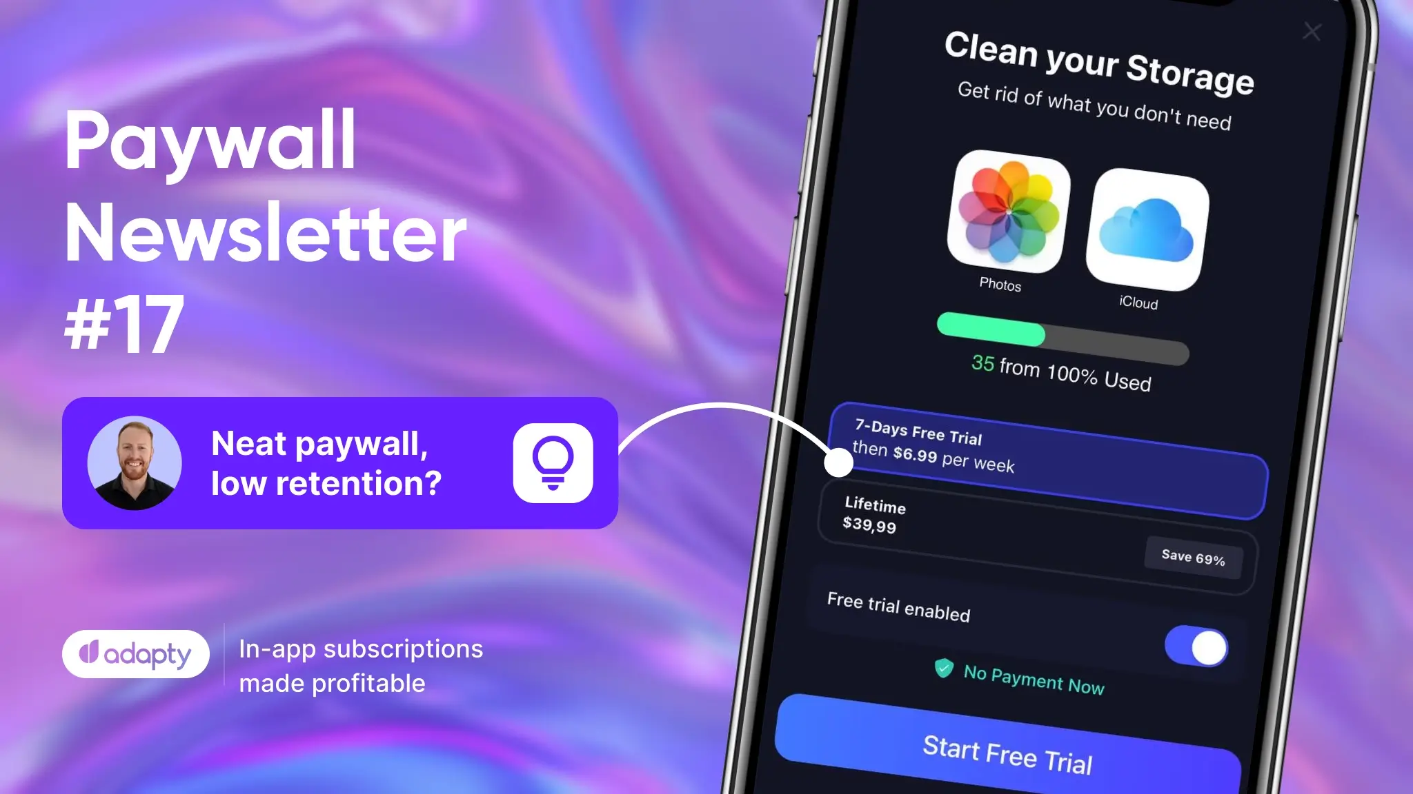
4. Cleaner Guru: Neat paywall, low retention?
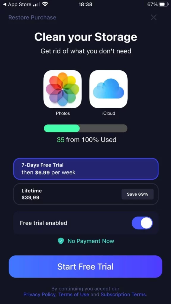
This phone-cleaning app is also doing a great job at clearly conveying the value of the product in the tight space that they have for the paywall. It’s neat, comprehensible, and convincing. But perhaps there’s a reason this app uses the weekly subscription over monthly.
The low value of the lifetime plan makes me think that its subscription retention is not very high. But if they are retaining users for more than 6 months, then they should raise the price of their lifetime plan.
MRR >$500k
5. EPIK: One yearly option is not enough
This is another great example of conveying what the product does concisely through the animated slider. It’s pretty common for photo- and video-editing apps.
The design pattern of having a yearly trial as a separate price option is a bit confusing to me. What’s also interesting is that it’s the middle card that’s selected by default, not the one with the trial. I might suggest adding a 7-day free trial only for the annual plan, this might help mix the plans as well as clean the screen up a little. Although considering the app’s MRR, their approach seems to be working.

MRR >$5M
6. FacePlay: Too shy to ask for yearly?
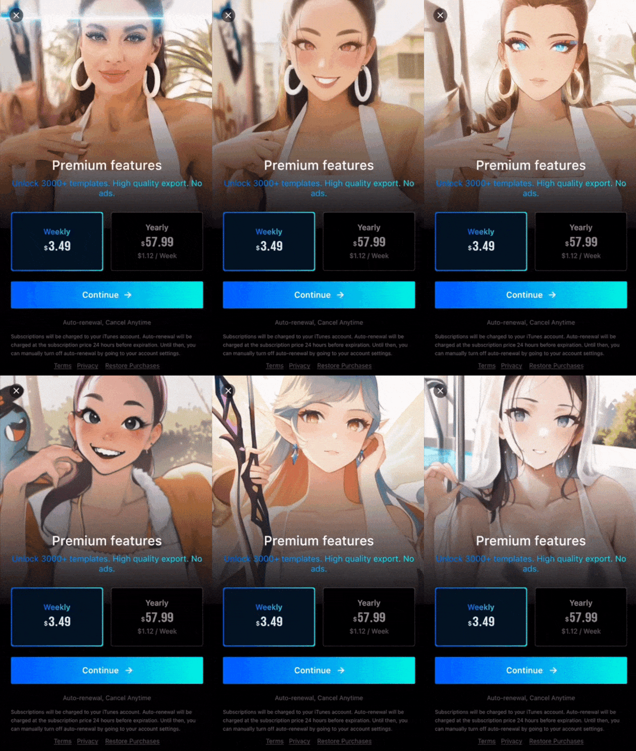
Remember what I just said about media-editing apps? Right, this one also has an animated paywall, and it’s still a great choice for apps in this niche.
My biggest piece of feedback on this paywall is that it’s defaulting me into the weekly plan instead of the annual one. They might have tested this and found that this is the right path forward, however, you should always use the default selection of each screen intentionally to your benefit. Might as well have the user start with the annual plan and switch to the weekly plan if they want to.
MRR >$200k
Summing it up
Here’s what we’ve learned from today’s paywall examples:
- Explain how the trial works. To hook the user by offering a free trial, make sure to provide more details about it.
- Use the paywall space wisely. The paywall screen is rather limited, but you can always add a slider to add more visuals.
- Simple paywalls also work. Apps that provide media content tend to have less flamboyant paywalls.
- Separate product for trial. It may look odd, but why not try it?
- Pre-select wisely. If you have 2 or more products on your paywall, pre-select the one that will bring you more revenue.
What’s your take on the free trial? Share this issue and your thoughts with your friends and colleagues 👇
Recommended posts
Trends-insights
3 min read
September 19, 2024


