Paywall Newsletter #16

TL;DR:
In this issue of the Paywall Newsletter, we'll try to find the balance between paywalls with minimum information and the ones that are overloaded with it.
In this issue of the Paywall Newsletter, we'll try to find the balance between paywalls with minimum information and the ones that are overloaded with it. Here's what you'll see:
- The most minimalistic paywall with an unorthodox design,
- The longest paywall we've ever encountered,
- The paywall that has a separate screen for premium features,
- And more!

Paywalls of this issue are commented on by…
Mikayel Mirzoyan, Senior Performance Marketing Manager at Appvertiser.
1. Chegg Study: Plain, Simple, and Effective
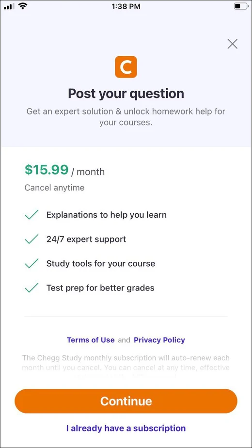
The homework helper app offers to make students' lives easier by providing useful educational materials as well as enabling them to post questions and get answers from experts.
Overall, the paywall has a commendable presentation of benefits, concise and motivating for users, which may explain its $1M MRR. However, it would be interesting to try to increase this figure by offering 2 to 3 subscription options, including monthly (already available), 6 months, and a yearly option for increased user commitment and higher LTV.
Chegg Study - Homework Helper
2. Anatomy Learning: The Pinnacle of Minimal
Bet you thought the first paywall was simple, well – here's a surprise for you. If this paywall still looks like this in 2023, it probably works, but there's a huge room for improvement and testing.
Primarily, I'd enhance the visual appeal, making it easier for users to differentiate and select the packages. It would be great to clearly show the benefits or contents, maybe by using checklists to transparently outline what each package includes. Adding and testing a CTA is also a must.

3. Gaia: The Longer, the Better?

Want to finally see something more complex? Here's one of the longest paywalls we've ever encountered.
Judging by MRR, the app seems rather profitable, but from the perspective of user comfort, its paywall looks challenging. I'd recommend avoiding overwhelming users by displaying all options in a single screen view – it's better to minimize the need to scroll and compare. It's also necessary to get rid of excessive redundancy and confusion, especially in the annual and monthly plan pricing.
4. EveryDollar: Trying to Find the Balance
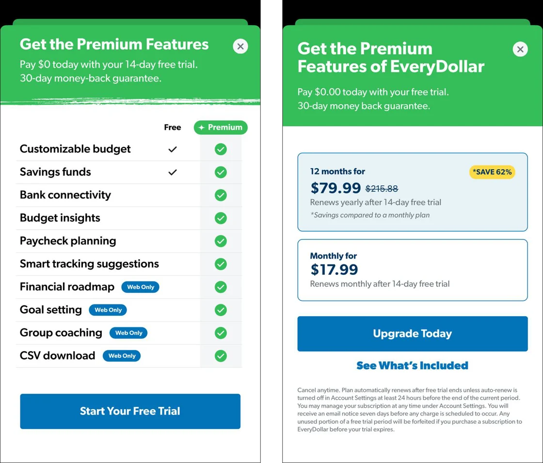
This budgeting app shows you the comparison table shortly after the launch, but the decision-making process has to take place on the next screen. Not that convenient, but at least the UI doesn't suffer, plus, you can always go back and forth to make things clear.
Since it's a budgeting app, its paywall can probably benefit from:
- Aligning the package pricing sequences for consistency.
- Adding 2 to 3 additional subscription options.
- Emphasizing 3 main subscription options and offering a discount on one (keep in mind the psychological devaluation).
- Encouraging simplification and consolidation of the subscription model.
EveryDollar: Budget Your Money
5. Plant Parent: Finding Ways to Be More Likable
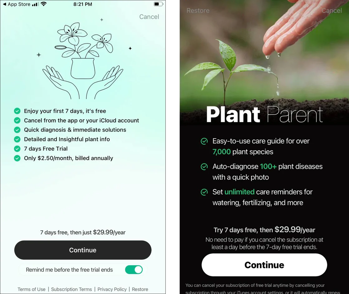
This plant-care app showcased two different paywalls on its first two launches. The offer however remained the same, only the design part changed. Perhaps to see which variant visually correlates more with the user.
For both variants,I'd consider removing the trial option to encourage user commitment. On the other hand, given the app's nature, it could also be worth it to explore the enticement of a weekly subscription, which may reduce commitment but will drive higher revenue from those subscribers who forget to cancel.
Plant Parent: Plant Care Guide
Summing It Up
Let’s recap the insights from today’s exploration:
- Simplicity Works: Even a basic paywall can be profitable if it clearly communicates product value.
- Design Matters: Minimalistic paywalls can stand out, but tried-and-true templates often yield better results.
- Avoid Overwhelming: Lengthy paywalls can deter users. Streamlining options and features can boost revenue.
- UI vs UX: Splitting paywall and feature tables aids UI but can compromise user experience.
- Test & Iterate: Presenting varied paywall designs can pinpoint what resonates with users.