Paywall Newsletter #6
This is the 6th issue of the paywall newsletter containing dark patterns, smart design, a personalization example and more.

Paywalls of the issue are commented by…
Artem Smirnov, Head of Marketing at Union Apps, a mobile non-gaming app publisher dedicated to converting subscription-based apps into full-scale profitable business.
Rise: the dark pattern of offering a free option
General impression
The paywall has all the essentials. It seems like you’re choosing between a 7-day free trial and a 1-month paid subscription, when in fact, both of the options are annual. The difference is that the Free one gives you a 7-day trial first, and the 1-month variant offers a lower price for the first month, but in the end you’ll have to pay annually for any of them. Though, if you linger a little longer on the paywall, you’ll see a special offer with a 14-day trial.
These guys are in the top-100 grossing Health & Fitness apps in the US. I wonder how they passed the Apple review with such a paywall. Anyway, they’re masters of dark patterns, so I’d recommend checking on their future paywalls for sure.
Pros:
- “Recommended By” as well as “Join 1 million people” are great social proofs that elevates the users’ trust. We tested such things ourselves on landing pages and they sure worked.
- “Money Back Guarantee”. The refund is actually carried out by Apple, not the app. This element is added to lower your hesitation and make the purchase.
- Hiding real prices surely contributes to the higher conversion rates on the paywall, so I would use something like that.
- It’s a hard paywall – you can’t go past it. It’s a great solution that definitely improves the conversion to purchases. Apple forbids making paywalls without a closing button, but we understand it a bit differently – you can’t deprive the user of moving from your paywall screen, including backwards. Which means you can make a hard paywall and put the “go back” arrow to let them go to the previous screen, but never let them move forward to the app’s content.
Cons:
- The trial reminder is on by default. I think it’s better to leave it off initially, so that the user has to do the job of turning it on.
Rise: Energy and Sleep Tracker
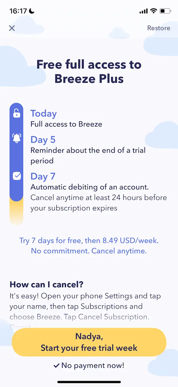
Breeze: name personalization on the CTA button
General impression
The look of this paywall is a 2022 trend. Getting notified about the trial ending on the 5th day seems pretty tempting, but in reality, not all apps keep this promise. The first glance impression is that I don’t understand right away how much I’ll have to pay, but I’m ready to take the trial. Placing the price higher above the CTA button is a nice dark pattern.
Pros:
- Look at the CTA button – it has the name personalization. Beautiful!
- There's an additional intensifier under the button, saying “No payment now!”.
- Explanation of how the trial works is an effective persuasion method for any product.
Cons:
- There's a closing button on the paywall. I’d turn it into a hard paywall to increase the conversion rates.
Heartify: a video paywall with a catchy button
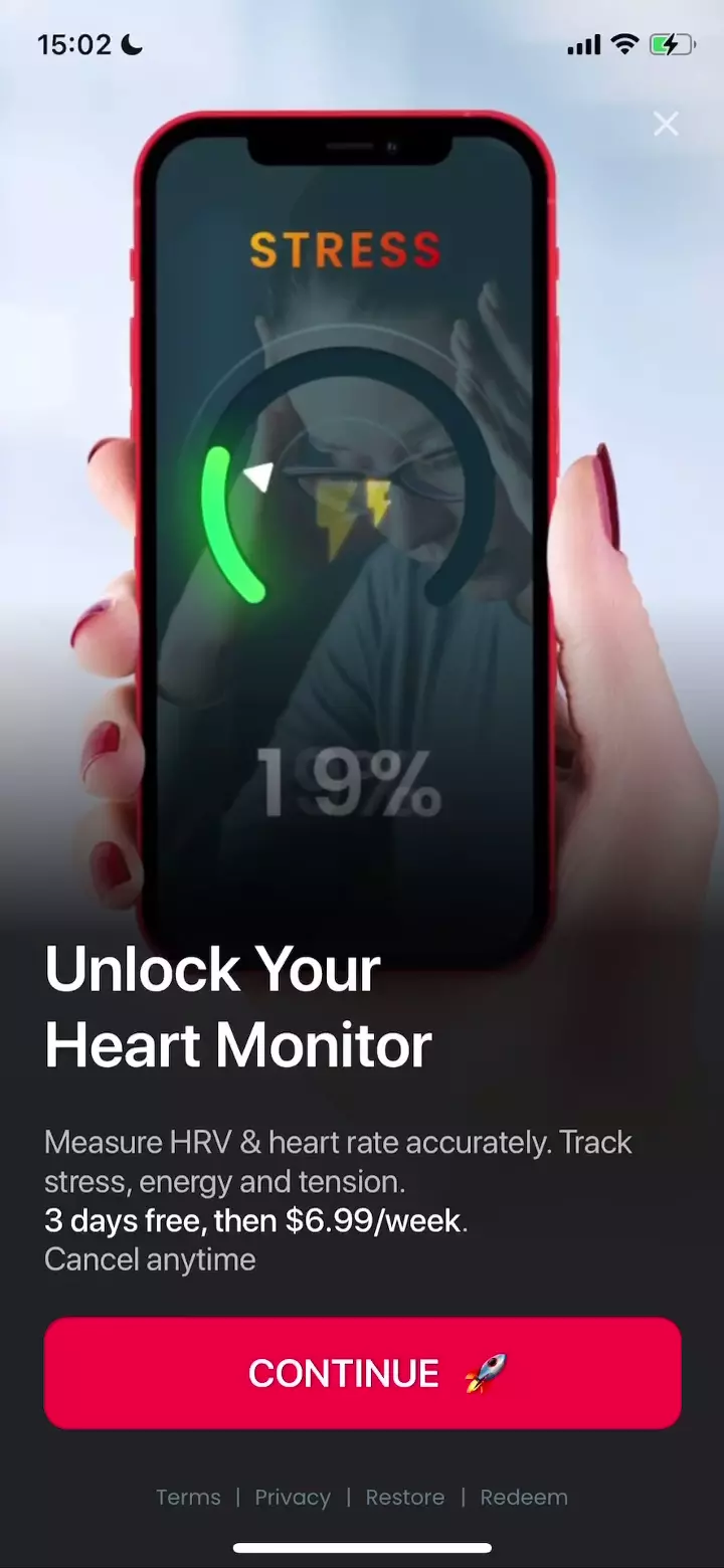
General impression
A video paywall with good color contrast, where the video explains how the app works. There’s a red “Continue” button with an emoji, which really makes you want to tap it. The design is smart: the button grabs your attention first, then you notice the video, the title text, the price, and the grey text above it in the end.
Pros:
- The “Continue” button surely increases the conversion.
- The price is placed within the text, not near the button, which also contributes to the higher conversion rate.
- The overall design – the attention is grabbed to the right places.
Cons:
- No social proof. It would be great to add something like “X number of users are already enjoying the app”.
- Not a hard paywall. I’d turn it onto a hard one to increase the conversion to activation
Heartify
Muscle Booster: a tricky special deal
General impression
It's clearly a hard paywall with a blinking “Continue” button. It’s pretty obvious the developer promotes the 3-month and 1-year subscriptions, by highlighting them with the “Popular” and “Best Value” tags. There’s also an interesting “Special Deal” option, which hides a 6-month promo offer behind a 3-month subscription. The picture above has been thoroughly chosen: the same assets are used for the user acquisition creatives. It shows that using the same assets for creatives and paywalls is a great idea.
Pros
- It’s a hard paywall.
- The most profitable for developer options are highlighted.
- The “Continue” button instead of a button with a price.
- 3+3 promo offer (first payment for 6 months, then as a 3 month subscription). Basically, they sell a 3-month subscription higher than the original 3-month subscription ($39.99 vs $29.99). Users are often inattentive, so when purchasing the 6 month offer, they may neglect or forget that after the 6-month period they’ll have to pay for the chosen offer as a 3 month subscription for $39.99.
Cons
- Social proof is missing. It would be good to add the user feedback underneath the title text.
- Switch the images with the photos of real people in the before/after format – it’s an effective approach.
Muscle Booster
Nomorobo: a 'two months free' trick
General impression
This paywall looks rather weak:
- All the attention is drawn to the logo.
- There’s too much empty space.
- The slider-switching points are too close to the black block.
If we proceed to the next screen, we’ll see a hard paywall with 2 subscription options. The annual one says “2 months free”, when in fact, there’s no 2-month trial, it’s just their way to show the benefit the user gets from paying for the whole year – a nice dark pattern.
Pros
- Hard paywall – the user can move only to the previous screen.
- Non-existent 2-month discount for the annual subscription.
Cons
- Poor design and layout (different fonts, too much space).
- Description of how the auto-renewed feature works (you don’t have to mention it anymore).