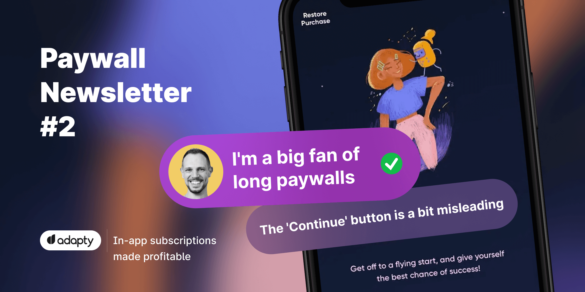
Paywall Newsletter #2
This is the second issue of the paywall newsletter with: landing page-like paywalls, trial toggles, videos, and more commented on by our special guest.

Paywalls of the issue are commented by…
Thomas Kriebernegg, Managing Director and a co-founder of App Radar.
Let's have a look at guys who got into the newsletter this time!
Napper that lets users scroll as long as they can
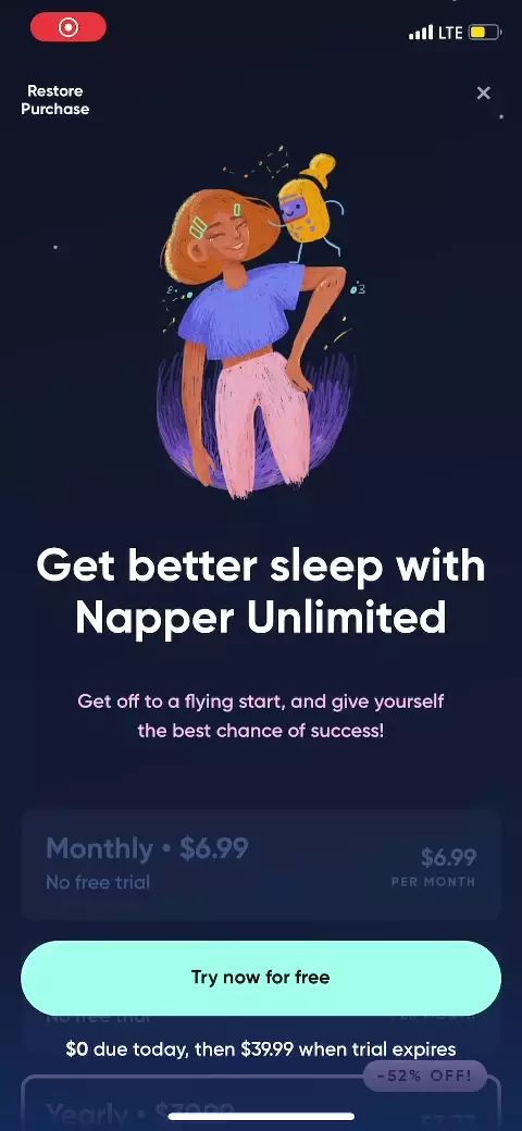
I'm a big fan of long paywalls because they are more than just sales screens, I'd consider them full-scale landing pages.
Napper shows a clear pricing structure followed by the Apple's featuring info, some social proof, and a comparison table of the free and paid versions, to highlight what you get after you've paid.
Lensa, that lets users decide if they want a trial
Providing an optional trial via a toggle might be a good idea, to convince people to give it a try, who otherwise might not take the subscription.
However, the current paywall doesn’t highlight any reasons or benefits of upgrading besides “Activate Full Access”.
I think this is left out potential and could maybe added to the bottom of the page, to not disturb the otherwise clean style of the screen.
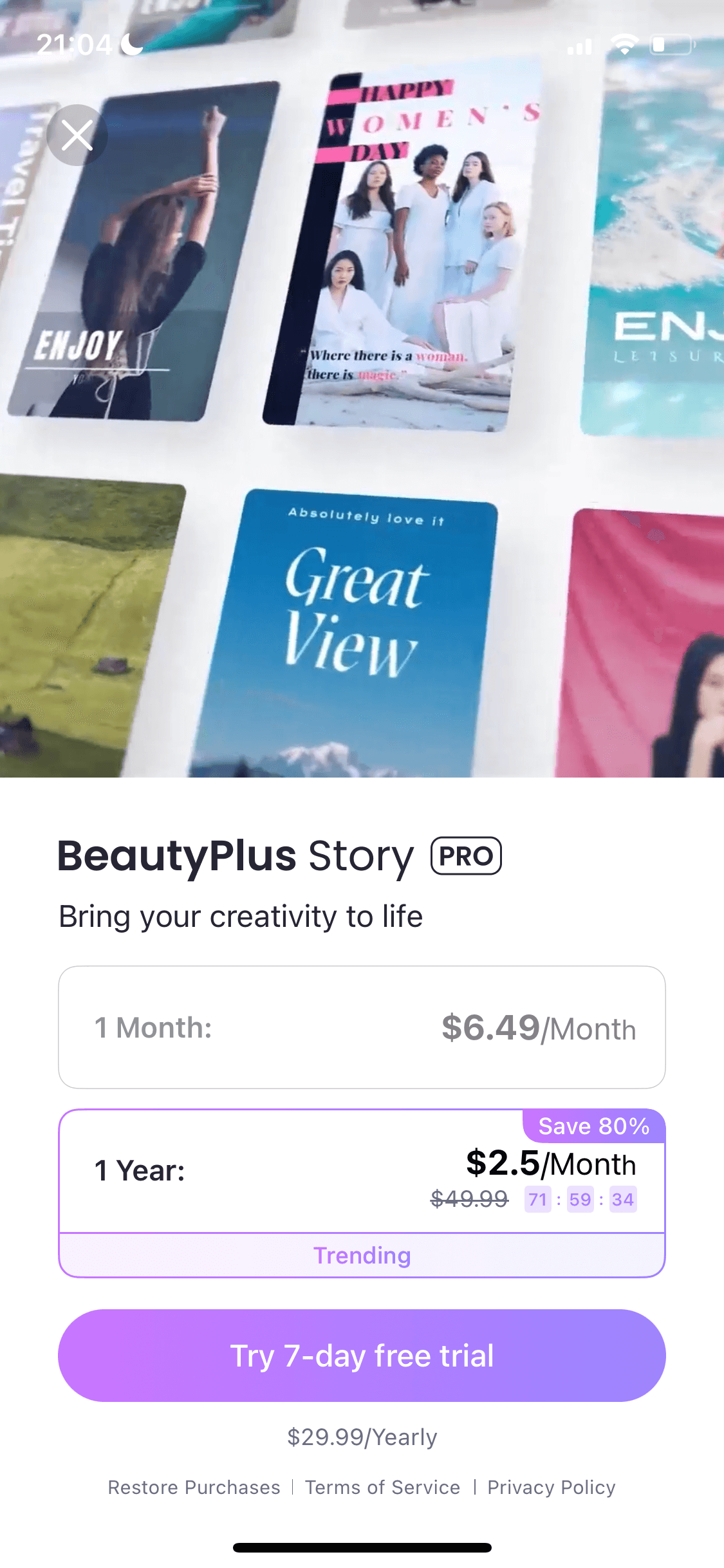
BeautyPlus that makes users do the math
A discount can be a good leverage to convince people to go for the subscription who otherwise might not do it.
However, at least I am having a hard time understanding how the 80% discount is calculated. No matter which price I look at, I never get to 80% discount.
In my eyes this is a dark UX pattern and should be avoided, since it might scare off people, because they think they could get even a better offer then the one described.
BeautyPlus
Asana Rebel shows users people, but not the app
Having a video on the paywall can be a big booster for the conversion rate. However, besides only showing kind of stock images, it would be beneficial to also show the app, especially the awesome features that you unlock when you go for the paid version.
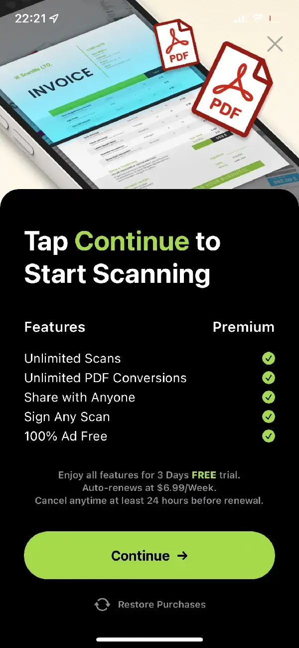
Camera Scanner that tests users' attentiveness
Nice highlighting of the benefits you get with the subscription. However, the very high price is quite hidden and also the Continue button is a bit misleading.
Looking at the revenue of the app, I think we can state that the app is good in generating money, but if you also look at the reviews, you see, that most of it will come from the grey-hat optimization of the paywall screen.
Babbel that is being transparent and nice
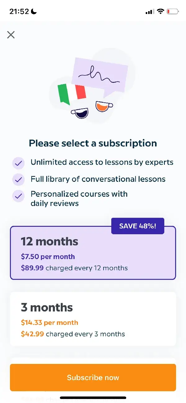
I like the clean style of the paywall which also highlights the benefits of the subscription as well as gives a good overview of the different subscription possibilities.