Apple’s peer group benchmarks: are they any good?
In March 2023 Apple released a new feature for App Store Connect called Peer Group Benchmarks. It’s a user-friendly analytics dashboard with a limited number of metrics that should help app developers better understand the performance of their apps in the App Store. Is it a real attempt from Apple to grab a piece of the pie from third-party app analytics tools or just another attention-grabbing dashboard? Let’s find out.
What is app benchmarking?
App benchmarking is the process of measuring the performance of a mobile application against a set of predefined standards or metrics. The primary goal of app benchmarking is to identify areas where an app's performance can be improved, from both technical (load times, response times, crash rate, etc.) and marketing (conversion rate, retention rate, etc.) perspectives.
App benchmarking is an essential part of app development, as it enables developers to identify areas for improvement and optimize app performance for a better user experience. It also helps developers understand how their app compares to similar apps in the market and make data-driven decisions to improve their app's performance.
How do Apple peer group benchmarks work?
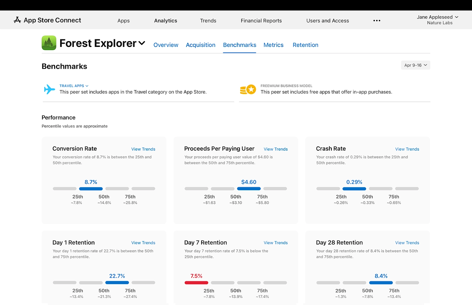
Apple released a dashboard with several key metrics: conversion rate, crash rate, retention rate (day 1, day 7, and day 28), and** average proceeds per paying user.** The “peer group” implies that the data comes from comparing your app to the apps that are similar to yours. There are 3 main criteria your app is compared to the other ones:
- Category (photo & video, finance, lifestyle, etc.)
- Business model(free, freemium, paid, paymium, and subscriptions)
- Download volume (low, medium, and high download volume)
The dashboard enables you to check the data on any category your app is presented in, the business model (applied automatically), and the download volume, as long as there are enough apps in those peer groups. Every metric in the dashboard is split into 4 bars with 3 percentiles (25th, 50th, and 75th) in between them. Each percentile shows the value related to the peer group of your app, which means you’re not getting a blind result, but can actually see the average values for this or that metric within your peer group, which adds more credibility. Now let’s have a closer look at each metric, see how helpful they are, and how much improving them can actually help developers from the financial perspective.
Conversion rate
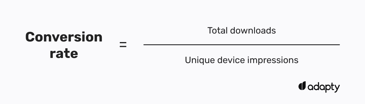
This metric shows the views/downloads relation and is calculated as total downloads divided by unique device impressions. It represents the quality of your App Store page, so if your rate is below the 25th percentile it’s time to think about optimizing its visuals: changing screenshots, adding or editing the existing video, and rewriting the description copy. The best way to check if your new ideas work is, as Apple kindly suggests, through A/B-testing with their native product page optimization tool.
The weird thing is that on the one hand, this metric looks pretty useful and easy to understand, but on the other – having fewer downloads than views may not be a problem for your app’s health overall. There are cases where the app is “not for everyone” and it may generate not so many downloads, but still be pretty profitable for the developer, as its core audience compensates more than enough by paying a decent subscription price.
Proceeds per paying user
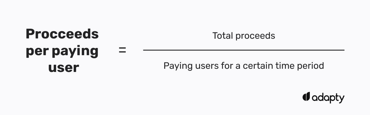
This is a rather useful and convenient metric to have, in theory. Proceeds per Paying User, which is the same as ARPPU (Average Revenue per Paying User), is calculated as the total proceeds divided by paying users for a certain time period. This metric may help you understand if your pricing strategy works fine or needs improvement and re-assessing. Among all the metrics listed in the dashboard, the improvement of this one may actually positively affect your app’s economy.
However, the calculation formula behind this metric seems to currently have a little problem – it doesn’t seem to take subscription renewals into account. This was confirmed by our internal experiments and is relevant on the date of publication. Apple provides the following example: “if your app’s total proceeds for a period are $100, and your app has 100 paying users, your proceeds per paying user are $1”. It basically means that if you have only one subscription in your app, you will always have the same value (which is your subscription price minus Apple’s cut). It implies that this metric currently accounts for new purchases only, which is not how it should be in real life. If you have a subscription-based app, you may also have subscription renewals take place within the same period, which, practically, must add to the period proceeds as well. In this case, the final value for the Proceeds per Paying User must be higher.
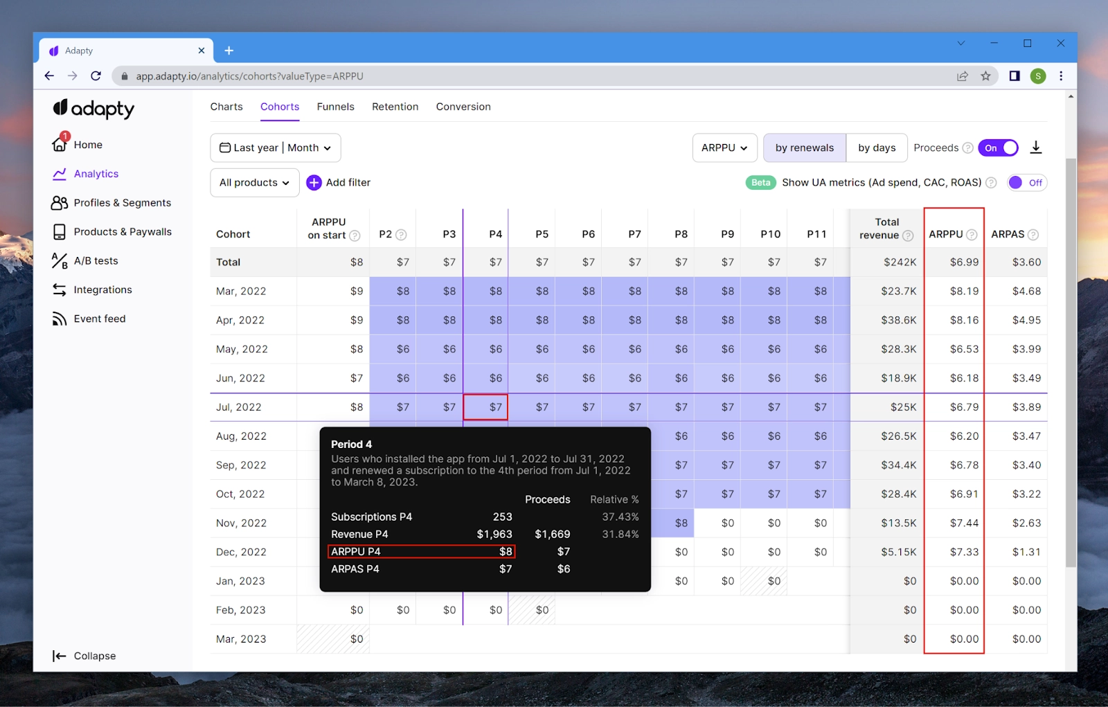
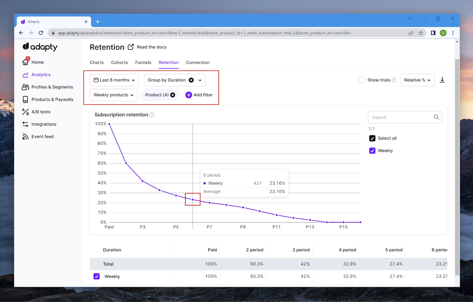
As a result, such a metric doesn’t help much with understanding LTV or the long-term profitability of your app, as it doesn’t take into account subsequent renewals. To paint a bigger picture, one should turn to a more prolific analytics system. Here’s how the ARPPU cohort analysis is presented in Adapty, for example:
Crash rate
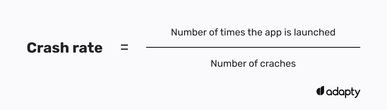
It may seem strange to see the crash rate metric calculated for a peer group – it’s unlikely there’s a correlation between an app category and a crash rate, but it’s another metric that shows how well your app performs in comparison to the competitors, so it must be useful. Anyway, if your app shows low results even within your peer group – it’s time to take action. This is another place where Apple suggests you should go back to the App Store Connect’s toolshed and take a look at your crash logs.
Overall, this metric is not that crucial for your app’s monetization. Yes, it opens up the questions of users deserving a better UX, getting negative comments on your page, and playing roulette with your karma in general, but if the app shows good conversion to purchase – fixing crashes may wait.
It’s worth noting that the metric value even for the 75th percentile almost never surpasses 1%, apart from the apps that work with multimedia, but even there it’s no more than 1,2%.
Retention day 1, day 7, and day 28
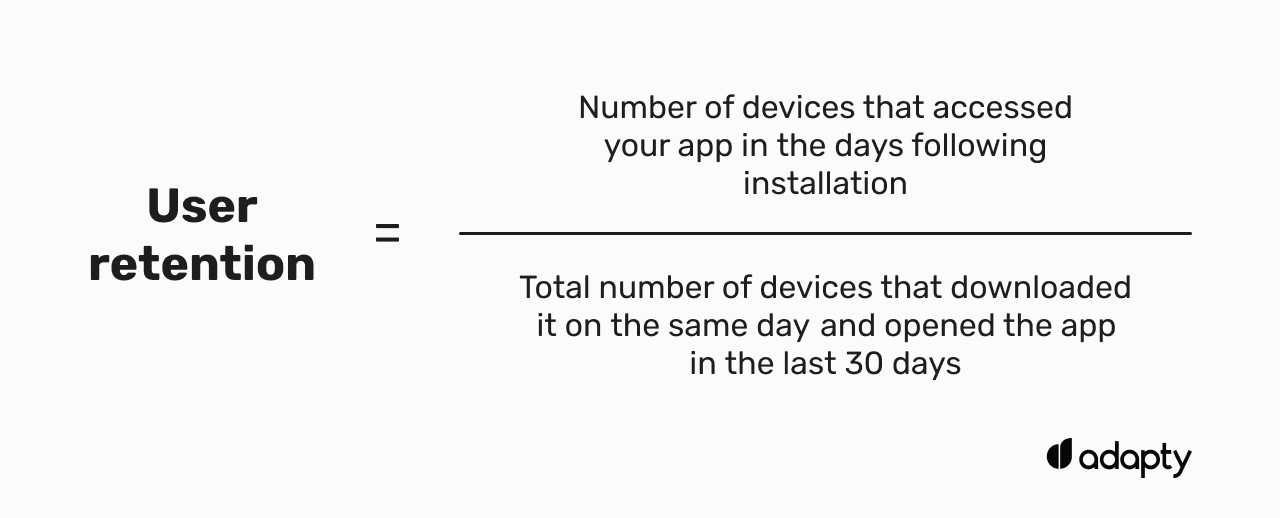
Retention is a metric used to determine user engagement with your app over a period of time. The calculation involves dividing the number of devices that accessed your app in the days following installation by the total number of devices that installed it on the same day and then considering those that opened the app within the last 30 days. To put it simply – the higher the rate, the more people use your app on a daily basis. Moreover, having separate tabs for day 1, day 7, and day 28 enables you to better understand how well the app performs in terms of engagement both in the short and the longer run.
However, if we get a little deeper, what is this metric really good for? Primarily, retention has not so much to do with revenue (apart from tier 1 apps, of course). If you have a paid app or sell a lifetime subscription – you couldn’t care less about your app’s retention as long as it sells well. But even if you sell weekly/monthly/annual subscriptions it doesn’t mean the user must be constantly and every day engaged in your app – simply because not every app is Netflix or Spotify. But this is exactly what Apple’s retention shows. Let’s say 100 people installed your app on day 0, and then 13 people engaged with your app on the 7th day, this means your day 7 retention is 13. But on days 6 and 8 this number may happen to be much higher, but it doesn’t matter because that’s not how this metric is calculated, it takes only the value of a certain day.
It would be a much better idea to add the subscription retention metric to the dashboard. Seeing actual renewals for every product would help better plan your financial strategy. Still, visualized in the current form (split into 3 percentiles), it wouldn’t provide much help. For instance, here’s how helpful this metric could be displayed:
Overall, designed by Apple, retention is another seems-to-be useful metric within the dashboard that has nothing to do with improving the monetization of your app.
Final thoughts
Apple’s peer group benchmarks dashboard currently looks like an attempt at making complicated analytics more user-friendly, but at the same time struggling with making it work the right way. As of now, it feels rather raw, unclear in some places, and even flawed, if taking into account the ARPPU model. Moreover, although it looks like a useful and effective tool for finding weak spots in your iOS app, it doesn’t even think of helping you solve your monetization issues. Improvement of all the presented metrics will unlikely result in a revenue increase for the developer but will be significant for the App Store itself. Imagine thousands of app owners who will start immediately improving their App Store pages, fixing crashes, designing new in-app events, and refreshing their onboardings just to get out of the red zone – a masterful way to have a spring cleaning by the hands of the users.
Benchmarking your app's performance is great, but don't forget to track when you'll actually get paid. Use our Apple payment dates tool to see the exact payout schedule and plan your budget with confidence.