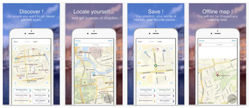
Have you ever come across an app without screenshot previews? No, nobody has!
Submitting screenshots is a requirement when listing your app on the App Store. And the reason they’re compulsory is that screenshots are one of the main determinants when it comes to convincing users to download and use your app. Plus with over 2 million apps out there, it’s tough competition, and you have to stand out one way or the other.
So in this blog, we’re walking you through the App Store screenshot sizes and requirements in 2026. Over time, these requirements have changed, and it’s essential that you have the latest information about app store screenshot requirements!
App Store screenshot sizes and dimensions for iOS Devices
Luckily for app developers and marketers, Apple’s guidelines regarding app screenshots are fairly simple and to the point. Regardless of your device, you’re limited to only 10 screenshots per localized listing. So, you can have 10 different screenshots for a Spanish audience as compared to 10 screenshots for your English-speaking market!
It’s not required that you use up all 10 screenshots since each app is different, but you should use as many slots as possible to convince potential users to download and use your app.
Another rule by Apple is that you’re only allowed to use images or videos captured from within your app. That means you can’t submit screenshots taken from external cameras or images that don’t actually appear within your app. This prevents any situations around clickbait, which serves users positively!
Last but not least, Apple’s screenshot also must be in one of the three formats:
- PNG,
- JPEG, or
- Video format.
Now, let’s talk specifics about different Apple devices and their screenshot requirements:
iPhone screenshot sizes and requirements
Apple officially reached a billion-user mark in 2020 and a large chunk of those users are iPhone owners. This makes the iPhone one of the largest demographics any app developer can target in the App Store. Here are the iPhone screenshot sizes and requirements:
| Device group | Logical resolution (px) | Screenshot size (px) | Aspect ratio | Notes |
|---|---|---|---|---|
| iPhone Pro Max (6.7″) | 1290 × 2796 | 1290 × 2796 | 19.5:9 | Covers Pro Max devices |
| iPhone Plus / Pro (6.5–6.7″) | 1242 × 2688 | 1242 × 2688 | 19.5:9 | Optional, legacy support |
| iPhone Pro / Standard (6.1″) | 1179 × 2556 | 1179 × 2556 | 19.5:9 | Most common size |
| iPhone Mini / SE (5.4″) | 1080 × 2340 | 1080 × 2340 | 19.5:9 | Low priority |
iPad screenshot sizes and guidelines
Many apps in the App Store are targeted towards iPads, especially when it comes to productivity or entertainment apps. If that’s where your target audience resides, you’ll want to consider the following resolutions and guidelines for your app screenshots:
| iPad model group | Resolution (px) | Orientation | Notes |
|---|---|---|---|
| iPad Pro 12.9″ | 2048 × 2732 | Portrait | Largest iPad format |
| iPad Pro 11″ | 1668 × 2388 | Portrait | Covers most Pro models |
| iPad / iPad Air | 1640 × 2360 | Portrait | Safe universal option |
| iPad Mini | 1488 × 2266 | Portrait | Optional |
Apple Watch screenshot sizes and dimensions
Recently, there have been many apps that target Apple Watch users, especially when we look into the fitness niche. After all, the rise of smart health gadgets is on the rise and Apple Watch is a strong contender in that niche. Here are the screenshot sizes you’ll want to adhere to if you’re focusing on the Apple Watch:
| Device | Screenshot Size |
| Apple Watch Ultra | 410 x 502 px |
| Apple Watch Series 8, Series 7 | 396 x 484 px |
| Apple Watch Series 6, Series 5, Series 4, and SE | 368 x 448 px |
| Apple Watch Series 3 | 312 x 390 px |
Mac screenshot sizes and requirements
Last but not least, the Mac is one of the prevalent devices Apple offers and hence, it has its own range of screenshot sizes and requirements you must fulfill. It’s important to remember that the rules mentioned earlier in this blog still apply to all devices:
| Use case | Recommended resolution (px) | Notes |
|---|---|---|
| Minimum accepted size | 1280 × 800 | Apple’s minimum requirement |
| Standard Retina Mac | 2560 × 1600 | Best balance of quality and weight |
| Large display / Pro apps | 2880 × 1800 | Suitable for complex UIs |
| High-end showcase | 3072 × 1920 | Optional, use only if UI benefits |
Minimum screenshot sets for App Store submission
| Platform | Required sizes | Optional |
|---|---|---|
| iPhone | 6.7″ + 6.1″ | 5.4″ |
| iPad | 12.9″ | 11″ |
| Apple Watch | Per model | — |
App preview video sizes and guidelines
App Preview videos, allowed by Apple for app listings, aim to enhance user engagement. Apple provides clear guidelines regarding the format and specifications for these videos.
Developers can submit videos in either H.264 or ProRes 422 (HQ only) formats, aligning with resolution recommendations similar to those for screenshots. The duration of the video should be between 15 and 25 seconds, and its file size should not exceed 500 MB.
Each app listing can accommodate up to three videos, which can be either in portrait or landscape orientation. Depending on the video’s orientation, it may replace the first screenshot on the product page or appear in the app store’s search results.
For instance, portrait-oriented videos occupy the first position on the app listing, while landscape-oriented ones are visible in search results.
Apple imposes restrictions on app preview videos, requiring them to be on-screen recordings. This means developers cannot submit third-party captured or digitally rendered promotional videos to the App Store. Additionally, it’s essential to avoid including copyrighted materials in the submissions to comply with Apple’s policies.
App screenshot colors and backgrounds
Strategic use of colors and backgrounds in-app screenshots can profoundly influence user perception and engagement while enhancing the overall visual appeal of app listings. Colors play a pivotal role in conveying emotions and messages, allowing developers to evoke specific feelings or associations with their apps.
For instance, vibrant colors may create a sense of excitement or urgency, while softer hues can evoke calmness or trust. By aligning colors with the app’s branding and target audience preferences, app developers can strengthen brand identity and establish a connection with users.
Moreover, contrasting colors between the app interface and the background can effectively highlight key features, drawing users’ attention to specific elements and enhancing usability.
Backgrounds also play a crucial role in setting the tone and context for app screenshots. Whether using solid colors, gradients, or subtle textures, backgrounds provide visual context and contribute to the overall aesthetic appeal of the screenshots.
Consistency in color schemes and backgrounds across screenshots reinforces brand coherence and professionalism, contributing to a cohesive and polished app listing.
App Store screenshots styles
Classic
Perhaps one of the simplest styles, the Classic screenshots are in-app screenshots without any editing or redesigns. It comes off as easy and quick to create while clearly showing exactly what your app looks like, but they’re not as engaging as other screenshot styles. So if you’re newly launching an app, classic screenshots might not be the best approach.
Solid
As the name suggests, the Solid style employs bold, uniform backgrounds to make content stand out. This style is particularly effective when you want to create a strong visual impact and draw attention to specific features of your app. Solid backgrounds provide consistency across screenshots, reinforcing brand identity and making your content pop.
Blurred
The “Blurred” style artistically blurs backgrounds to focus attention on specific app features or content. Achieving a balance between aesthetics and clarity is crucial in this style, ensuring that the blur effect enhances the overall user experience without obscuring important details.
Blurred backgrounds create a visually appealing backdrop that highlights the key elements of your app.

Connected
The Connected style features screenshots that form a continuous visual story or theme when viewed in sequence. This style enhances user engagement and understanding by guiding users through the app experience step by step.
To create a cohesive narrative across screenshots, ensure that there is a logical flow between them and that they collectively communicate the app’s functionalities and benefits. For apps with complex features or functionalities, this style may not be the perfect fit and can make it difficult to capture features linearly.
Tutorials
The Tutorial style uses screenshots to guide users through app functionalities or features step by step. Clear annotations or overlays provide guidance without overwhelming the user. Sequential screenshots walk users through key interactions and demonstrate how to use the app effectively.
Photography
The Photography style emphasizes high-quality images that showcase the app in real-life scenarios. In this style, you select images that resonate with the target audience and depict the app being used in authentic contexts.
App developers can use this style to create a personal and emotional connection with users and demonstrate the practical benefits of using your app. However, this often means that you need access to professional photography or high-quality stock images, which can be costly.
Combinations
Now, if you think you have to stick to one of these styles frigidly, think again! As the name suggests, a combination style screenshot combines two or more types of screenshots, giving you creative freedom.
You can play around with different styles and experiment with variants that resonate with you the best. While you can create appealing looks and get high engagement with the visual styles, it’s also quite easy to overdo the visual appeal!
How do App Store screenshots influence ASO?
You might be wondering why we’re placing all this emphasis on app store screenshot sizes and requirements. The reason is that screenshots influence your app store optimization strategy!
App Store screenshots play a significant role in App Store Optimization (ASO), affecting visibility, user engagement, and download rates. Let’s talk about how each of these is affected by screenshot sizes and styles.
When it comes to visibility, screenshots are often the first visual element users see when browsing the App Store. Compelling screenshots can grab users’ attention and entice them to learn more about the app.
Furthermore, App Store algorithms may consider user engagement metrics, such as click-through rates on screenshots, when determining search rankings. Engaging screenshots can improve visibility by encouraging users to click on the app listing.
This brings us to user engagement, an important aspect to consider if you want people to hit download. Screenshots provide an opportunity to showcase the app’s features and benefits visually. Clear and captivating screenshots can effectively communicate the app’s value proposition to users. Engaging screenshots can lead to higher conversion rates, as users are more likely to download an app that they perceive as valuable and useful based on the screenshots.
Lastly, well-designed screenshots can influence users’ decision-making process, convincing them to download the app. Users may be more inclined to download an app if they believe it offers the features and functionality they need, as demonstrated in the screenshots.
Plus, they’re less likely to uninstall an app that stands true to its screenshot representation!
Now since app screenshots are crucial to your ASO, it’s also important that you conduct A/B testing and implement user feedback in your screenshots to further optimize your app in the App Store. With A/B testing, you can identify which designs resonate best with your target audience (and which don’t)!
Iteratively refining screenshot designs based on user feedback can lead to higher user satisfaction and increased download rates over time.
I’ve been mentioning a lot of important metrics that you should keep in mind while adjusting your screenshot strategy, and you might be wondering, “How am I supposed to calculate or figure those numbers out? What are good numbers in these KPIs?”
For that, you can rely on Adapty to answer all your data questions with essential metrics, and monetization effectiveness as well as analyze how your core metrics change over time. Our Analytics and Paywall Builder can supercharge your monetization strategy and help you make informed data-driven decisions along the way!
Best practices for the App Store screenshots
Creating effective App Store screenshots is crucial for showcasing your app’s unique selling points and enticing users to download it. And to make things better, I’ve got 4 tips for you to up your app screenshot game:
1. Highlight key features clearly
Clearly identify and prioritize the most important features of your app in your screenshots. Use visually striking elements such as arrows, callout boxes, or overlays to draw attention to these features. Emphasize how these features solve user pain points or enhance their experience, getting to the point before the user loses interest.
2. Test different variations
Experiment with different screenshot variations to see which ones perform best with your target audience. Test variations in layout, design elements, and messaging to identify which combinations result in the highest conversion rates. Use A/B testing tools to gather data and make informed decisions about which screenshots to use.
3. Localize for different markets
Tailor your screenshots to resonate with users in different regions by localizing them for specific languages and cultural preferences. Consider using localized text, images, or symbols that are relevant to your target audience in each market. Localizing your screenshots can help you connect with users on a deeper level and increase engagement and conversions.
For instance, FiftyThree localized their Paper app for the Chinese market and gained a 33% conversion increase!
4. Optimize for mobile viewing
Since most users will view your screenshots on mobile devices, ensure that they are optimized for smaller screens. Use large, legible text and avoid overcrowding the screen with too many elements. Test your screenshots on various devices to ensure they look good and are easy to read on different screen sizes.
Common App Store screenshot mistakes
| Mistake | Why it’s a problem |
|---|---|
| Using outdated resolutions | Screenshots rejected or blurred |
| Uploading too many sizes | Extra work without ASO benefit |
| Mixing aspect ratios | Inconsistent App Store preview |
| Ignoring safe areas | UI elements cropped |
Final Thoughts
App screenshots can really make or break your app when it comes to the cut-throat competition within the Apple App Store. With engaging and accurate screenshots by your side, your app can pick up a higher download rate and gain positive ratings and reviews. But to put in these screenshots, you have to adhere to Apple’s guidelines.
In this blog, we tackled all the guidelines you need to keep in mind when capturing and uploading your screenshots for your app. Not only do they improve your app preview and app listings, but they can also impact your app store optimization!


