Let’s say you’re searching for an app in the App Store. How long will you spend to make a decision and why won’t it be more than a few seconds?
As users with an app market as big as the ocean, we’re overwhelmed with choices. Nobody wants to go into the nitty-gritty details of an app. Most of the time, you look at a few sentences of the description, the logo, and maybe a review or two to make a decision.
But as an app dev, this can be quite the issue. How do you retain your users to download the app you spent countless hours working on? The answer lies in writing a compelling app description.
App descriptions are made of many surface-level texts and graphics that attract users to view and possibly download your app. 5 main components make an app description, including:
- Title,
- Subtitle,
- Icon,
- Screenshots,
- 4000-Character Description.
That said, in this blog, I’m handing you the secret recipe to become a winning wordsmith. From writing a compelling app title to optimizing your app descriptions with ASO, let’s jump into how you can write your best app store description!
App Store vs Google Play metadata comparison
| Element | Apple App Store | Google Play Store |
|---|---|---|
| App Name/Title | 30 characters | 30 characters |
| Subtitle | 30 characters | N/A |
| Short description | N/A | 80 characters |
| Long description | 4,000 characters (not indexed) | 4,000 characters (indexed for search) |
| Promotional text | 170 characters (editable without update) | N/A |
| Keywords field | 100 characters (hidden, indexed) | N/A |
| Description indexing | NO – not indexed for search | YES – indexed for search |
| Screenshots (min/max) | 1-10 per device | 2-8 per device |
| App preview videos | Up to 3 per localization | 1 promo video |
Crafting a compelling app title and subtitle
Repeat after me: less is more. Nobody wants to read a sentence for an app title! And most certainly, nobody will read past the first paragraph of your app description…
And so, this makes the app title and subtitle one of the most crucial elements of an app description. The app title and subtitle play a crucial role in grabbing users’ attention, conveying the app’s purpose, and improving its discoverability.
A memorable, concise, and descriptive title can significantly impact an app’s success.
The good news is that you’ll see this realistically in all of the successful apps. For example, the app “Headspace: Meditation & Sleep” effectively communicates its purpose while being concise and descriptive.
The title mentions both meditation and sleep, indicating its focus areas. The subtitle further clarifies the app’s offerings with the phrase “Guided meditation and mindfulness.”
Here are some things to get you started on writing a catchy title and subtitle for your app:
- Reflect the app’s purpose: Ensure the title aligns with the app’s core function and communicates its value proposition. Use keywords that describe what the app offers.
- Keep it concise: Choose a title that is short and easy to remember. Avoid lengthy or complicated phrases that may confuse or bore potential users.
- Be descriptive: Include words or phrases that clearly describe the app’s key features or benefits. This helps users understand what they can expect from the app.
- Consider branding: If possible, incorporate your brand name or a distinctive element into the title to improve brand recognition.
At Adapty, we know the importance of A/B testing every step of the way so you’re on the most profitable path! So when you’re writing a title and subtitle, make sure to perform A/B testing by using gems like Google Optimize or Optimizely to ensure you’re on the right track!
Designing an eye-catching app icon
Do you remember the App Store’s short description for your favorite app or its unique icon?
Did said app icon pop up in your head? It’s just as important to learn how to write an app store description as it is to create an attractive app icon. In fact, around 80% of app icons fail to generate clicks– and you certainly do not want to be part of that demographic!
Your app icon is a vital element in driving downloads and fostering interactive user engagement. It’s the face of your brand and the first impression they will have of what your app is about. So, you want to give them an authentic and unique feel of what the app is truly about.
Tips for creating an icon
Create an app icon that stands out from others with these hot tips:
- Keep the design clean, uncluttered, and easily recognizable even at smaller sizes.
- Aim for an icon that is distinctive and sets your app apart from competitors.
- Ensure the icon aligns with your brand’s visual identity, using consistent colors, typography, and overall style.
- Design an icon that maintains clarity and impact when scaled down to smaller sizes.
- Check how your icon appears on different backgrounds to ensure it remains visible and distinct.
- Familiarize yourself with platform-specific design guidelines to ensure compliance and optimize visibility.
- Avoid trendy or overly complex designs that may quickly become outdated or lose relevance.
- Gather feedback and conduct A/B testing to refine your icon based on user preferences and performance.
Learn how to design an app icon with best practices aligned with writing the best app descriptions for your app!
Examples of successful app icons
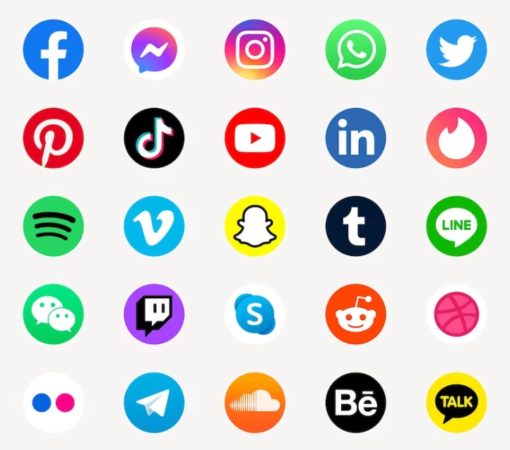
Instagram’s camera outline against a vibrant gradient, Snapchat’s ghost-shaped “Ghostface Chillah,” Spotify’s green circle with sound waves, Slack’s hashtag symbol, and TikTok’s music note on a gradient ring are all examples of successful app icons.
These icons effectively represent their brands and app functionalities. They are visually appealing, memorable, and instantly recognizable. And how do they relate to the app’s use itself?
Instagram’s camera signifies photo sharing, Snapchat’s ghost reflects its playful nature, Spotify’s waves represent music streaming, Slack’s hashtag symbolizes collaboration, and TikTok’s music note showcases short-form music videos.
Showcasing your app with great screenshots
When it comes to app descriptions, screenshots play a pivotal role in capturing users’ attention and sparking their interest. These visual snapshots of your app provide a glimpse into its interface, functionality, and overall user experience.
Screenshots serve as a powerful tool to highlight key features, showcase the app’s unique design, and demonstrate its usability. Users can visualize how your app looks and works, and whether it suits their preferences!
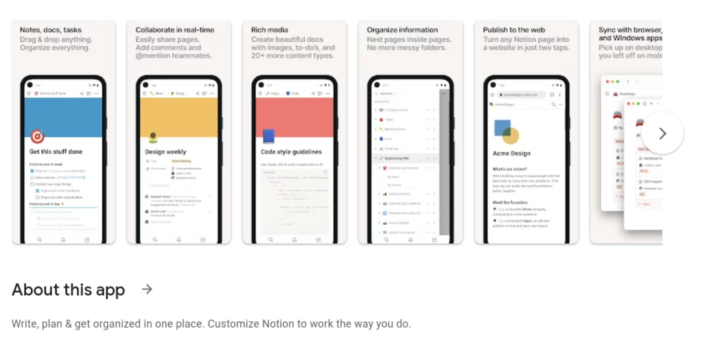
By presenting an engaging visual narrative, you can effectively convey the core of your app and compel users to take the next step and hit that enticing “Download” button. Let’s be honest… who wants to go in blind-sighted?
So what makes a screenshot good enough to be part of the app store description? Here are 3 things you should look out for in your screenshots:
- Is this visually appealing at first glance?
- Are the visuals clear for users?
- Is the screenshot concisely providing valuable information?
This is even more important if you want to get into mobile app monetization at some point! Your customer should see their money’s worth in these screenshots because if they don’t, you can wave that extra income goodbye!
Arrange the screenshots strategically, highlighting the most compelling aspects first and adding brief captions or callouts to draw attention to specific features. As for creating high-quality and optimized screenshots…
Screenshot size requirements
| Device | Apple App Store | Orientation |
|---|---|---|
| iPhone 6.9″ (mandatory) | 1320 x 2868 px | Portrait |
| iPhone 6.7″ | 1290 x 2796 px | Portrait |
| iPhone 6.5″ | 1242 x 2688 px | Portrait |
| iPhone 6.1″ | 1179 x 2556 px | Portrait |
| iPad 13″ (mandatory) | 2064 x 2752 px | Portrait |
| iPad 12.9″ (legacy) | 2048 x 2732 px | Portrait |
| Device | Google Play Store | Notes |
|---|---|---|
| Phone (min) | 320 x 480 px | Minimum dimensions |
| Phone (max) | 3840 x 2160 px | Maximum dimensions |
| Recommended | 1080 x 1920 px | 16:9 or 9:16 ratio |
| Aspect ratio limit | 2:1 maximum | Cannot exceed |
Tips for creating high-quality screenshots
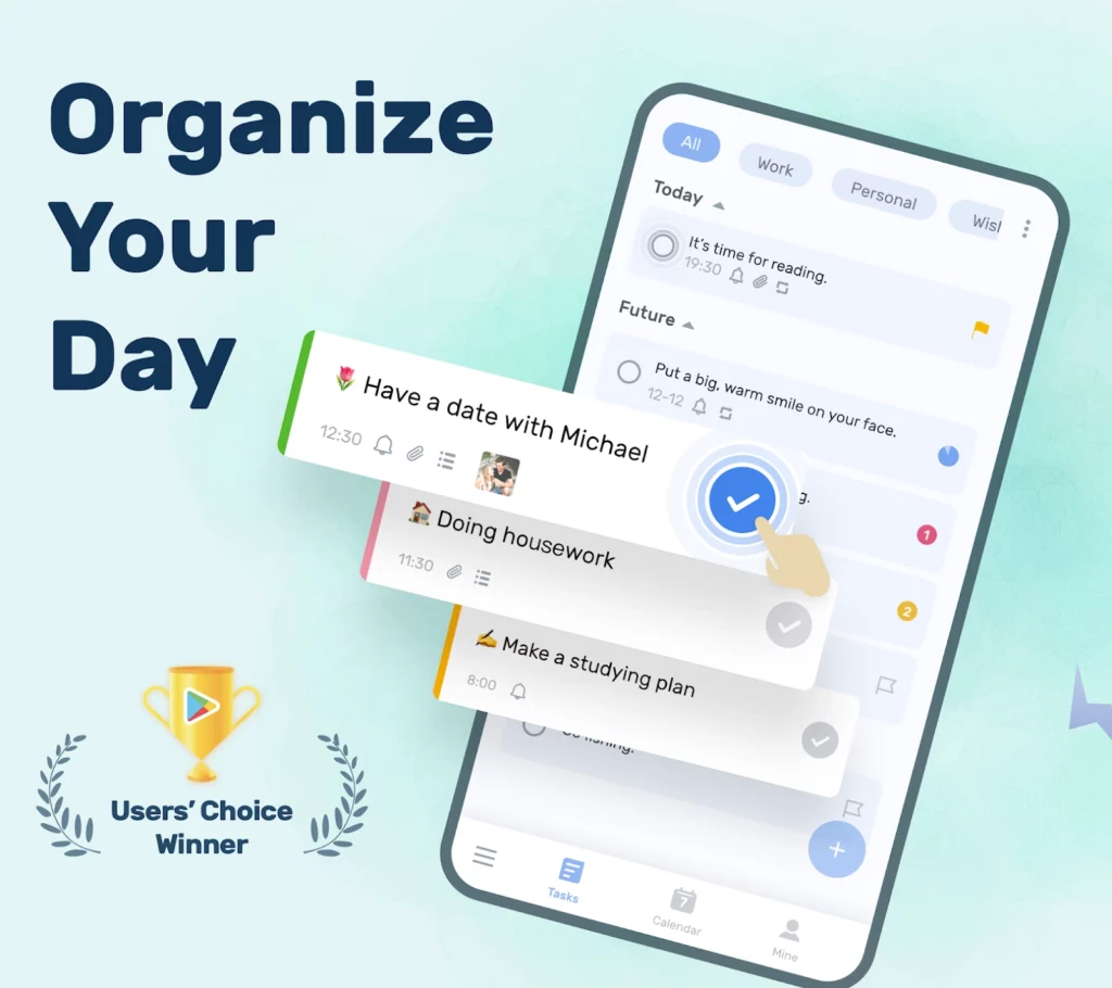
High-quality screenshots don’t just mean crisp colors. There’s more to creating high-quality screenshots than just those! Here are a few tips to get you ahead in the screenshot game:
- Highlight key features: Choose screenshots that effectively demonstrate the core features and functionalities of your app. Focus on the most compelling aspects that differentiate your app from others.
- Show real-life use cases: Present screenshots that depict your app in action, showcasing how it can be used in real-life scenarios. This helps users visualize the app’s practicality and value in solving their problems or meeting their needs.
- Use engaging visuals: Design visually appealing screenshots with captivating colors, clean layouts, and attractive typography. Use high-resolution images to ensure clarity and detail.
- Incorporate captions or overlays: Add concise and descriptive captions or overlays to guide users’ attention and provide context to the screenshot. Clearly explain the benefits or functionalities featured in each screenshot.
- Display variety: Include a diverse range of screenshots to cover different aspects of your app, such as different screens, features, or user interfaces. This offers a comprehensive view of your app’s capabilities.
- Maintain consistency: Ensure that the design and style of your screenshots align with your app’s branding and visual identity. Consistency across screenshots creates a cohesive and professional impression.
Examples of successful app screenshots
What’s a better way to learn what a successful app screenshot looks like than a visual representation? Here are 4 of the best app store descriptions’ screenshots!
Calm
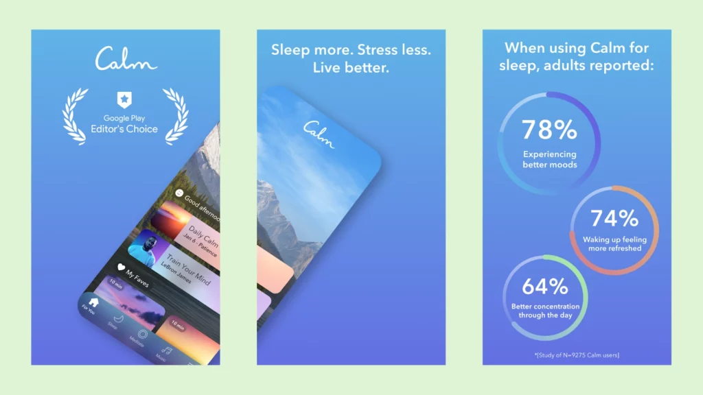
The second you lay eyes on this wellness app, you’re intrigued by how calm it looks. They use an ideal slice of the screenshot, giving out helpful information on its award-winning status while giving a sneak peek into the app’s layout!
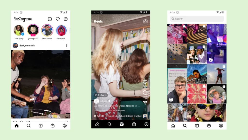
See how the first few screenshots of Instagram feature women? That’s because the app targeted the demographic since 60% of its users are female!
Netflix
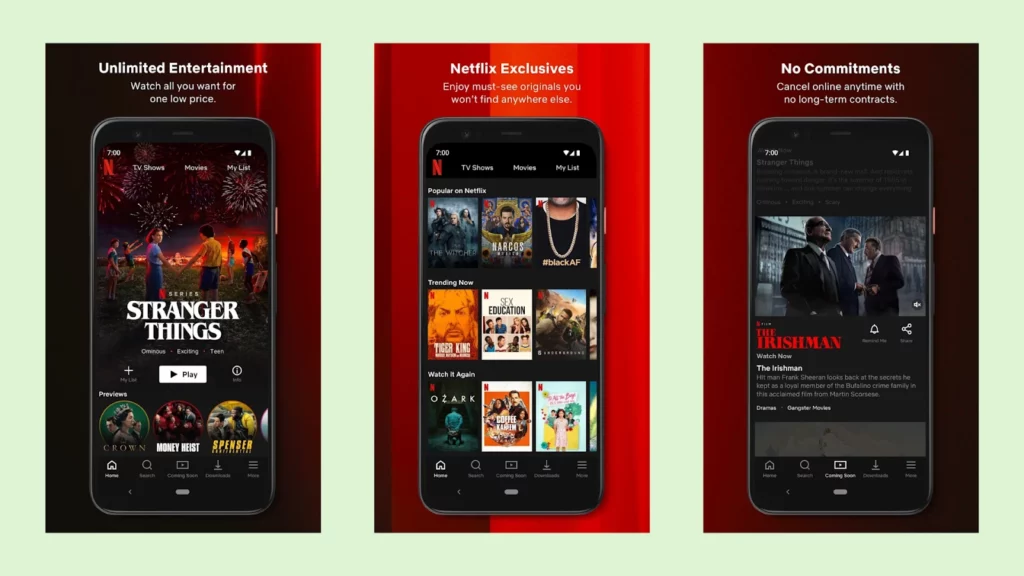
Netflix is a prime example of diving into the main features of your app within the first images a user might see. They get a view of what the app’s layout looks like while a callout on top discusses some of the main benefits of signing up with Netflix!
Uber
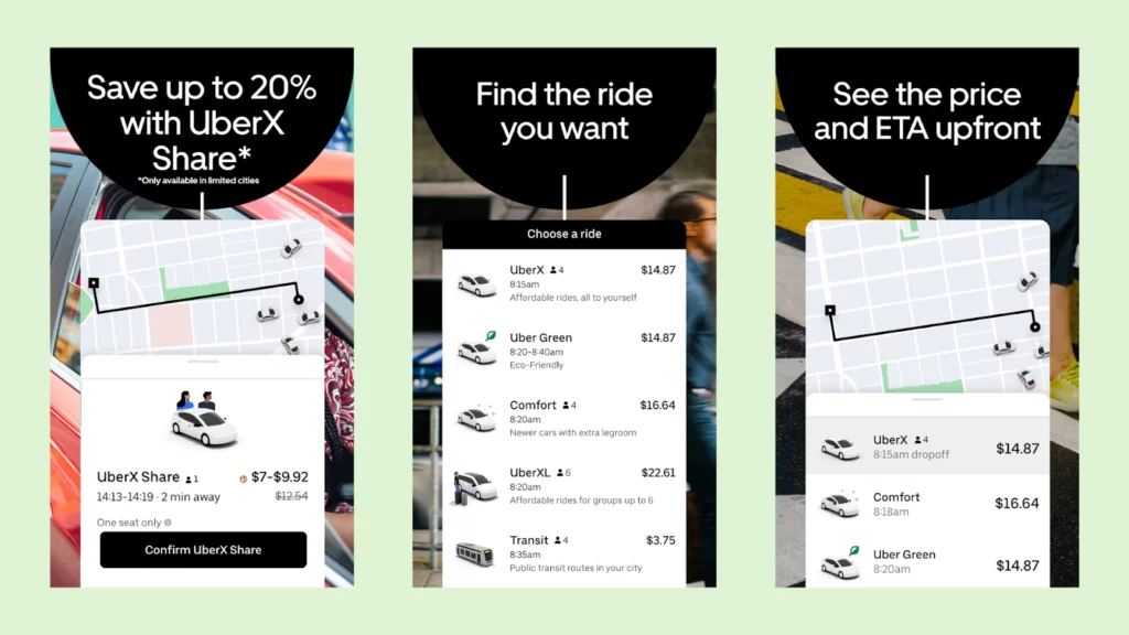
Amplifying the concept of callouts can be seen in Uber’s screenshot here. The font contrasts perfectly against the background while the graphics relay that this is a ride app! Plus, you get a view of the main types of rides Uber offers.
Writing a compelling app description
App descriptions are nothing short of a valuable multi-fold marketing tool. After all, it’s showcasing the app’s strengths, differentiating it from competitors, and building trust with users.
It’s one of the strongest ways to put the value proposition of your app to potential users and influence your conversion rates, success rates, and viability!
The best app descriptions highlight the app’s key features and appeal to the target audience, making them more likely to download and engage with the app. The description for an Android app is perhaps the best place to communicate important information, such as compatibility, updates, and support.
Guided by Android app description guidelines, an engaging application description contributes to improved visibility, user engagement, and downloads, making it an essential aspect of app marketing and success.
Tips for writing a description
There’s nothing such as an app description template you can follow or an app description where you fill in the blanks. The creativity is all yours and being a wordsmith is part of the job.
But what you have are some tips straight from the experts!
- Identify your unique selling points: Determine what sets your app apart from competitors. Is it a unique feature, a specific target audience, or a particular problem it solves? Clearly articulate these unique selling points in your description.
- Focus on benefits: Highlight the benefits and advantages that users will gain from using your app. Explain how it improves their lives, saves them time or money, enhances productivity, or provides entertainment. Use concrete examples and language that resonates with your target audience.
- Use clear and concise language: Write in a way that is easy to understand and avoids technical jargon. Keep sentences short and to the point, highlighting the most important information. Use bullet points or subheadings to break down features and benefits for better readability.
- Prioritize key features: Highlight the most impactful features that users will find valuable. Explain how these features solve their pain points or fulfill their needs. Focus on benefits rather than simply listing technical specifications.
- Incorporate social proof: If available, include positive reviews, testimonials, or statistics that demonstrate the app’s success and user satisfaction. This helps build trust and credibility.
- Consider user persona: Tailor your description to your target audience. Understand their needs, preferences, and language to effectively communicate how your app meets their specific requirements.
- Utilize visuals: Include screenshots or images that showcase your app’s interface, features, or benefits. Visuals can help users visualize the app and enhance the overall impact of your description.
- Test and iterate: Gather feedback from users and analyze app store metrics to understand the effectiveness of your description. Continuously iterate and refine based on user responses and performance data.
Description structure template
| Section | Character allocation | Purpose |
|---|---|---|
| Opening hook | 150-200 chars | Grab attention, state value proposition |
| Key benefits | 500-800 chars | Core features and user benefits |
| Features list | 800-1000 chars | Detailed feature breakdown |
| Social proof | 300-500 chars | Awards, reviews, user count |
| Call to action | 100-200 chars | Download prompt, update highlights |
| Legal/Contact | 200-500 chars | Privacy, support, requirements |
| Total | 2,000-3,200 chars | Optimal range |
Examples of successful app descriptions
App description examples are an excellent way to understand how successful apps of today are targeting their users with their descriptions. It’s even recommended that you research the app store promotional text examples from your competitors to get a better idea.
Here are some of the best app store description examples to take notes from!
TripAdvisor
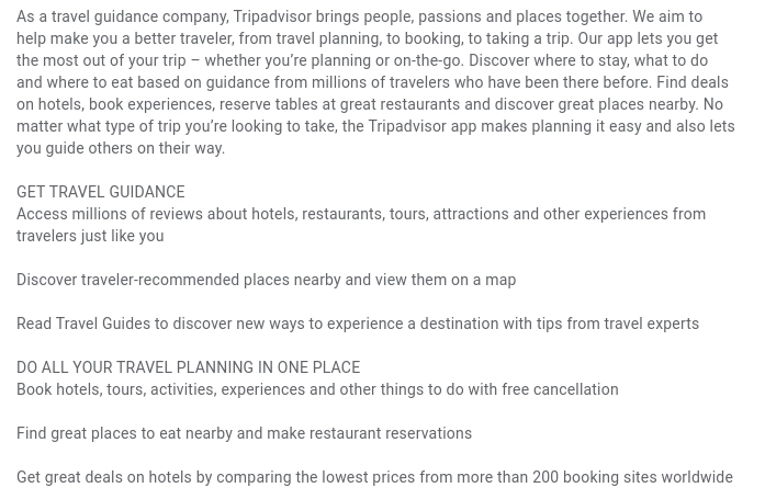
Tripadvisor’s app description stands out as a strong example for several reasons. Firstly, it starts with a clear statement of purpose: bringing people, passions, and places together to make users better travelers.
This immediately communicates the app’s value and its comprehensive approach to travel guides.
The app’s versatility is highlighted, allowing users to plan, book, and navigate their trips seamlessly. It emphasizes the power of millions of traveler reviews to help users discover the best accommodations, attractions, and dining options.
Notice how the description emphasizes convenience with features like hotel deals, activity booking, restaurant reservations, and access to expert travel guides.
Duolingo
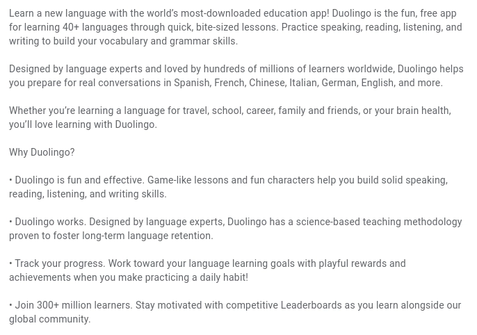
Duolingo’s app description is an excellent example of effective marketing. It starts with a captivating opening, highlighting its position as the most-downloaded education app for learning 40+ languages.
The description emphasizes the app’s fun, bite-sized lessons for practicing speaking, reading, listening, and writing. It showcases Duolingo’s credibility by mentioning its design by language experts and its popularity among millions of learners worldwide.
The description also highlights the app’s effectiveness in fostering long-term language retention and its interactive features like progress tracking, rewards, and a global community.
Optimizing your app description for app store SEO
App Store Optimization (ASO) is crucial for app discovery and downloads. With millions of apps available, ASO helps your app stand out from the crowd.
By optimizing various elements, such as app titles, keywords, descriptions, and screenshots, you increase your app’s visibility and improve its chances of being found by users searching for relevant apps.
ASO involves thorough keyword research to understand the terms users are likely to search for. Incorporating these keywords strategically in your app’s metadata and app description can boost its visibility in search results.
Engaging and optimized descriptions, coupled with captivating screenshots, attract users and drive downloads. In fact, Google Play Store description guidelines specifically recommend inserting trending keywords in your app store description!
ASO also considers factors like app ratings, reviews, and download velocity. Positive reviews and high ratings not only enhance your app’s reputation but also influence users’ decision-making.
Oh, and optimizing your app’s size, loading speed, and compatibility ensures a smooth user experience, improving user satisfaction and retention. In the vast realm of app stores, ASO acts as a compass, guiding users toward your app amidst the sea of alternatives.
So, think of ASO as the secret sauce to unlock your app’s potential and win the battle for downloads. Don’t let your app get lost in the app store wilderness; optimize, optimize, optimize!
Tips for optimizing your app description for ASO
ASO for the description app means a lot of things. Having a checklist might help if you’re feeling lost so I made one for you:
- Conduct keyword research to identify popular search terms related to your app. Incorporate these keywords naturally in your description to improve discoverability.
- Grab users’ attention with a compelling opening sentence that highlights the key value of your app.
- Include positive reviews, ratings, and testimonials to build trust and credibility among users.
- Bullet points and subheadings are your best friend. Keep the description concise, focusing on key features, benefits, and unique selling points within the bullet points!
- Tailor the description to different languages and regions to reach a wider audience with your localization.
- Experiment with different variations of your description and analyze user engagement metrics to identify the most effective version.
If you want to dive deeper into app store optimization, check out what SEMrush suggests!
ASO element impact by platform
| Element | App Store impact | Google Play impact |
|---|---|---|
| App title | ⭐⭐⭐⭐⭐ (highest) | ⭐⭐⭐⭐⭐ (highest) |
| Subtitle | ⭐⭐⭐⭐ | N/A |
| Keywords field | ⭐⭐⭐⭐⭐ | N/A |
| Short description | N/A | ⭐⭐⭐⭐ |
| Long description | ⭐ (conversion only) | ⭐⭐⭐⭐ (indexed) |
| Promotional text | ⭐⭐ (not indexed) | N/A |
| Ratings and reviews | ⭐⭐⭐⭐⭐ | ⭐⭐⭐⭐⭐ |
| Screenshots | ⭐⭐⭐⭐ (conversion) | ⭐⭐⭐⭐ (conversion) |
| Update frequency | ⭐⭐⭐ | ⭐⭐⭐ |
Examples of successful ASO strategies
Airbnb
Airbnb serves as an exemplary case study for successful ASO strategies. The company’s app has achieved remarkable success by implementing various tactics:
- Strategic keyword placement: Airbnb’s app optimizes its title, subtitle, and description with relevant keywords, such as “vacation rentals,” “travel accommodations,” and “home sharing.”
- Compelling app icon design: Airbnb’s iconic app icon features a recognizable symbol representing a house, helping it stand out among other travel and hospitality apps.
- Positive ratings and reviews: The abundance of favorable reviews enhances the app’s credibility and persuades potential users to choose Airbnb for their travel needs.
- Localization for global reach: Airbnb understands the importance of localization and offers its app in multiple languages, tailoring the descriptions and content to specific regions.
Headspace
How did this simple yet effective meditation app reach its peak? The meditation and mindfulness app has effectively implemented the following tactics:
- Engaging app description: Headspace’s description effectively communicates its unique value proposition, highlighting benefits like stress reduction, improved focus, and better sleep.
- Captivating app icon design: The app’s simple yet distinctive icon, featuring a serene blue background with a white outline of a head, stands out among other meditation apps, catching users’ attention and reinforcing its brand identity.
- Strategic keyword placement: Headspace strategically incorporates relevant keywords like “meditation,” “mindfulness,” and “stress relief” in its title, subtitle, and description to improve its visibility in app store searches.
Localizing your app description for international markets
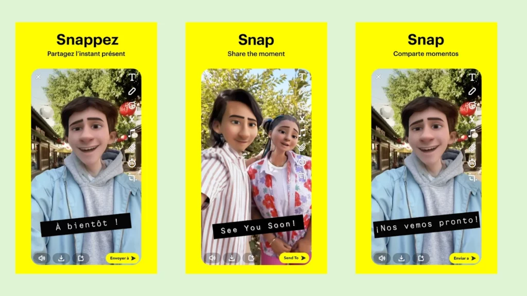
You aren’t indulging in the best play store app description format unless you’re localizing your app description for international markets. It’s basically cutting yourself down on purpose!
There are several benefits to localizing your app for different geographical demographics. Firstly, it enhances user experience by providing content in users’ native languages, making it more accessible and relatable.
Nothing screams “I care about you” like speaking in their language!
Secondly, it increases discoverability as localized descriptions improve your app’s visibility in relevant app store searches. It also builds trust and credibility among users as they feel a stronger connection to an app that speaks their language.
Lastly, it expands your global reach, tapping into new markets and attracting users from diverse regions.
Tips for adapting your app description
When adapting your app description for different cultures and languages, consider the following tips:
- Understand the cultural nuances and customs of the target audience. Adapt your messaging and tone to align with their values and preferences.
- Seek assistance from native speakers or professional localization services to ensure accurate translations and cultural appropriateness.
- Conduct keyword research for each target language to identify relevant terms and phrases used by local users. Incorporate these keywords naturally in your description for improved visibility.
- Collect feedback from users in different regions to understand their expectations and preferences. Use this feedback to refine and optimize your localized descriptions.
Examples of successful app localization strategies
Localization doesn’t have to be boring and technical. In fact, some of the biggest household names used localization as one of their most creative spaces. And it garnered quite a positive response as they etched into globalizing their app!
McDonald’s “I’m lovin’ it” slogan
When McDonald’s expanded to non-English speaking countries, they localized their famous slogan to resonate with local audiences.
For instance, in France, it became “Venez comme vous êtes” (Come as you are), showcasing a clever adaptation that maintains the brand’s essence while embracing local culture.
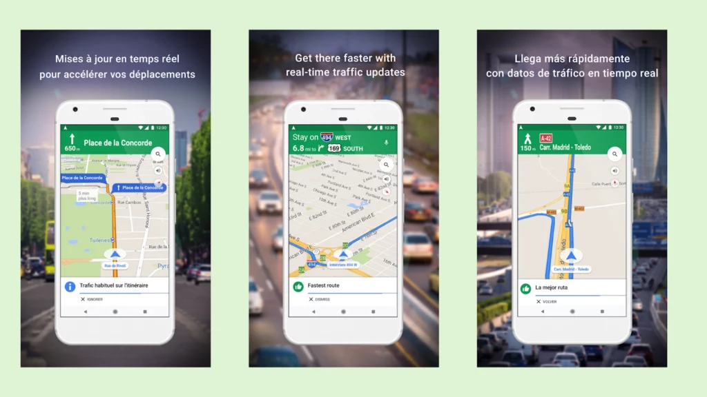
Google Maps’ localized icons
Google Maps incorporates localized icons and symbols to represent landmarks and points of interest. For instance, in Japan, a sushi icon marks sushi restaurants, while a pagoda icon signifies temples.
This playful approach adds a touch of humor and makes the app more engaging and relatable for users.
WhatsApp’s multilingual support
WhatsApp offers multilingual support with over 60 languages, allowing users to communicate in their preferred language. This inclusivity and flexibility contribute to the app’s popularity worldwide and create a positive user experience.
Duolingo’s gamified language learning
Duolingo leverages gamification and humorous elements to engage language learners. Through quirky animations, amusing characters, and playful challenges, the app makes the language learning journey more enjoyable and encourages users to continue practicing.
Use analytics to understand your user behavior
I’ve already mentioned how research and A/B testing are key elements in creating the perfect app descriptions and app icons. With this scenario, you need someone who can crunch those numbers for you reliably and paint you the honest picture.
Adapty’s subscription analytics help you see how your user behaves. When you can see what drives them to you and away, you can improve your strengths and weaknesses! And once you have those tackled, you can go into effective app promotion strategies…
Total win-win, right?
Conclusion
The journey to app success begins with an engaging app description. Remember, app descriptions are a hidden asset that gives you the chance to make a powerful first impression and captivate potential users.
Craft a description that highlights your app’s unique value proposition, showcases its features, and speaks directly to the needs of your target audience. Optimize it with relevant keywords and consider localizing it for different markets to expand your reach.
And hey, don’t forget about the power of eye-catching screenshots and an irresistible app icon! Everyone loves a good and informative photo that saves them from those tedious paragraphs…
Learn more about monetizing your app and paywall systems at Adapty, your one-stop resource for all things apps!

